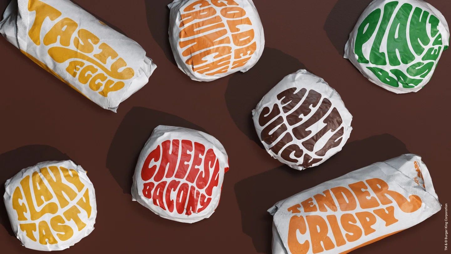
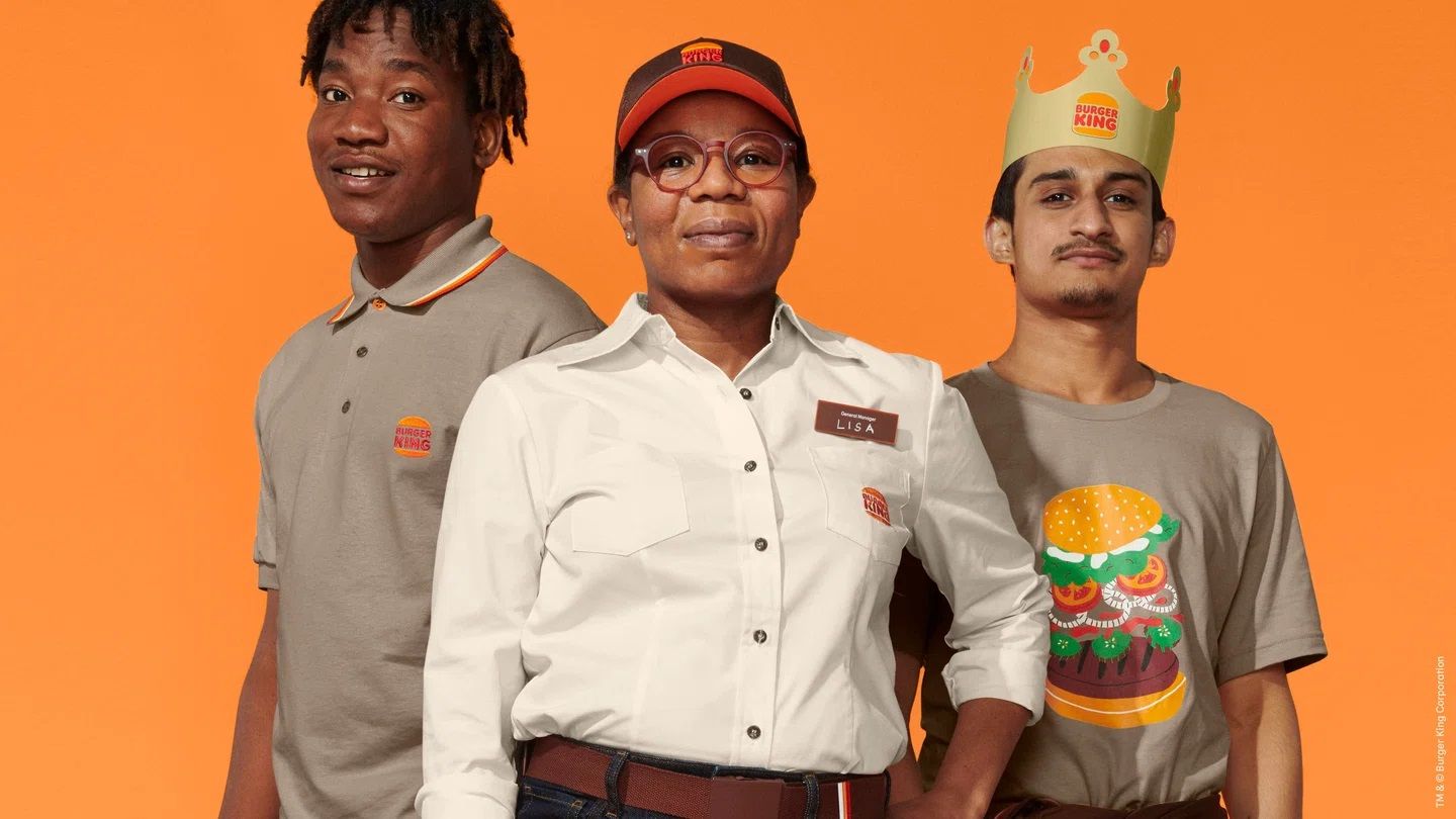
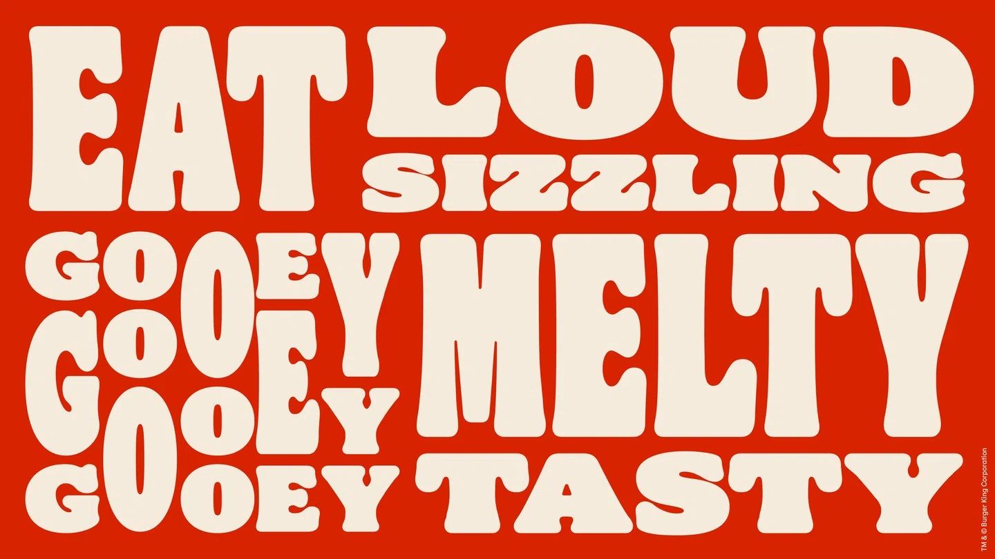
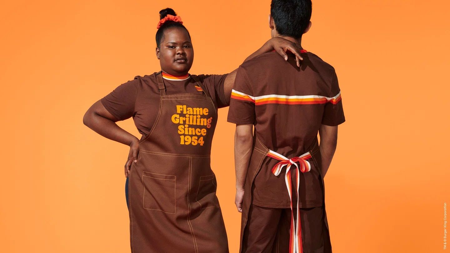
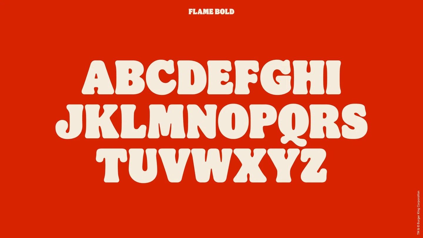
Over 20 years, Burger King’s appearance has gotten a bit worn out: it adapted to the requirements of the market and has gotten impersonal, thus it was time for a new beginning. The basis of the fast food chain’s new visual identity is provided by a brand new font, taking us back to ‘60s America right away, while the new colors and communicational materials further enhance this feeling.

Two main tendencies can be observed in the rebranding of large companies over the past years: a retro approach and minimalization. This one checks out for both.
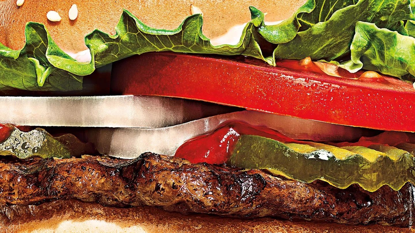
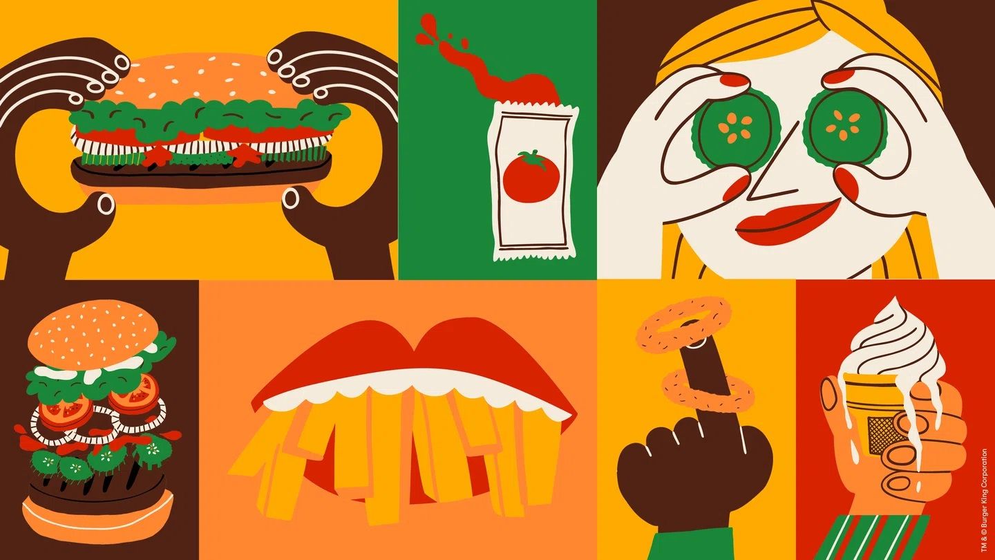
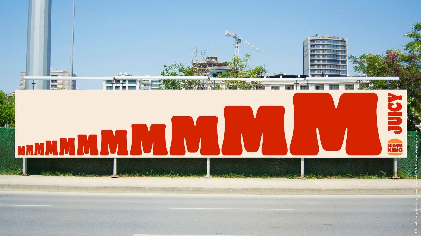
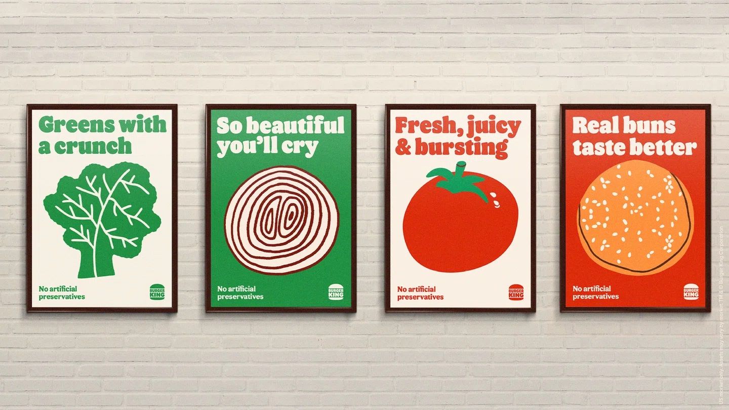
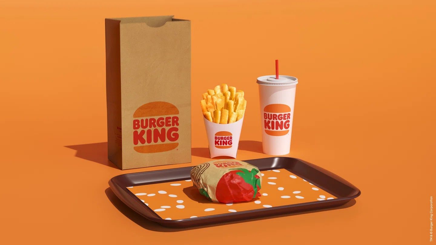
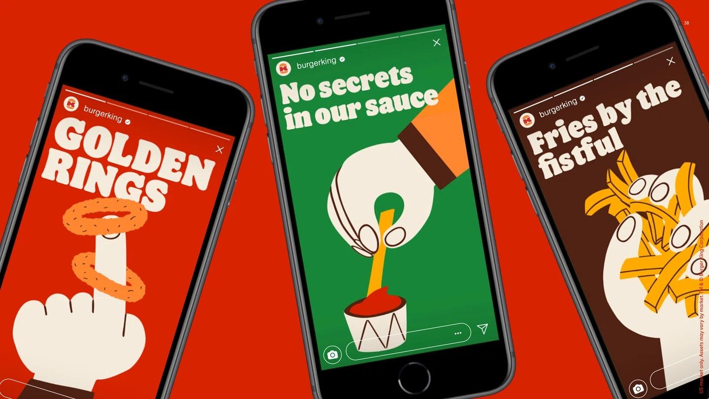
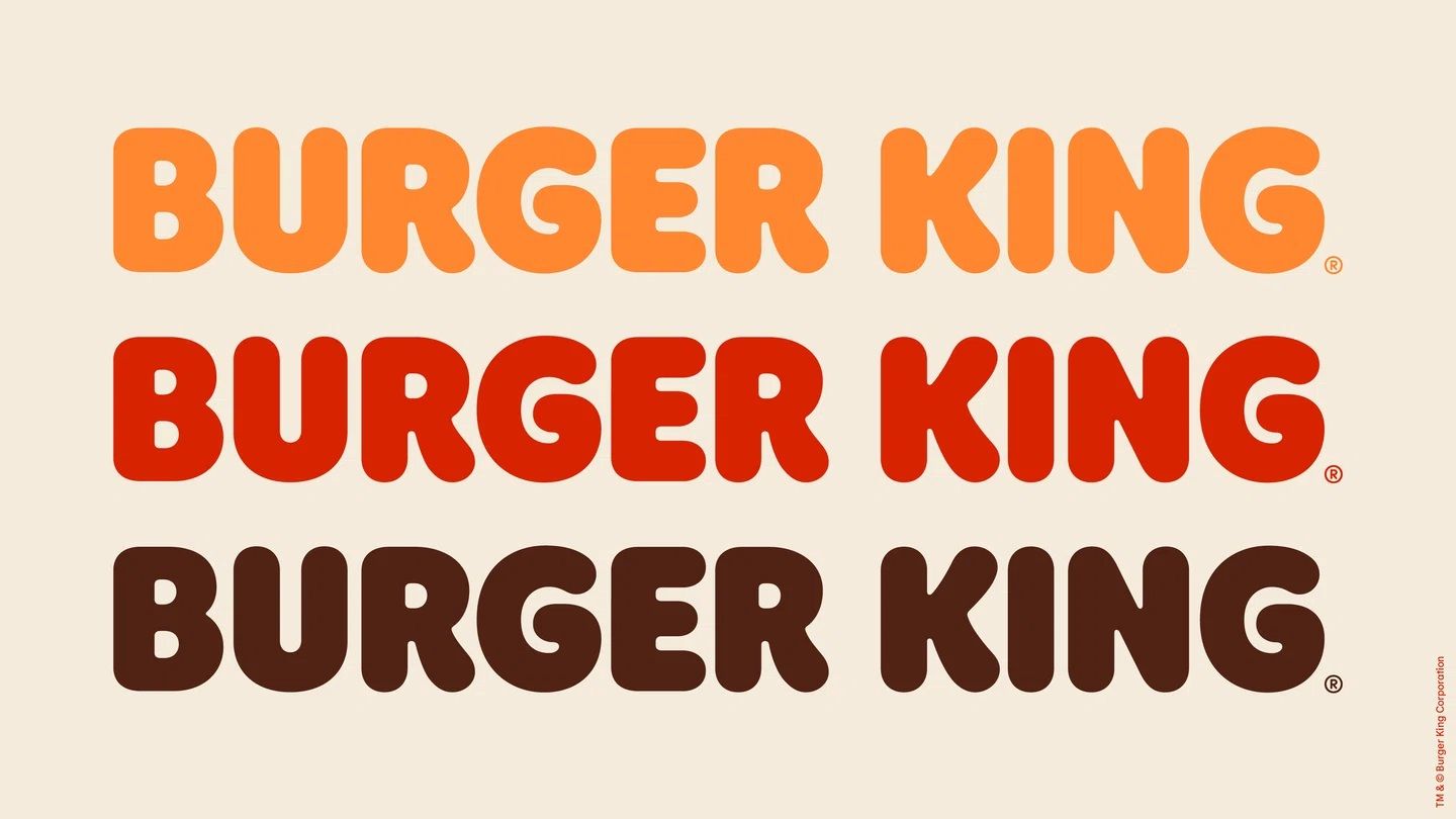
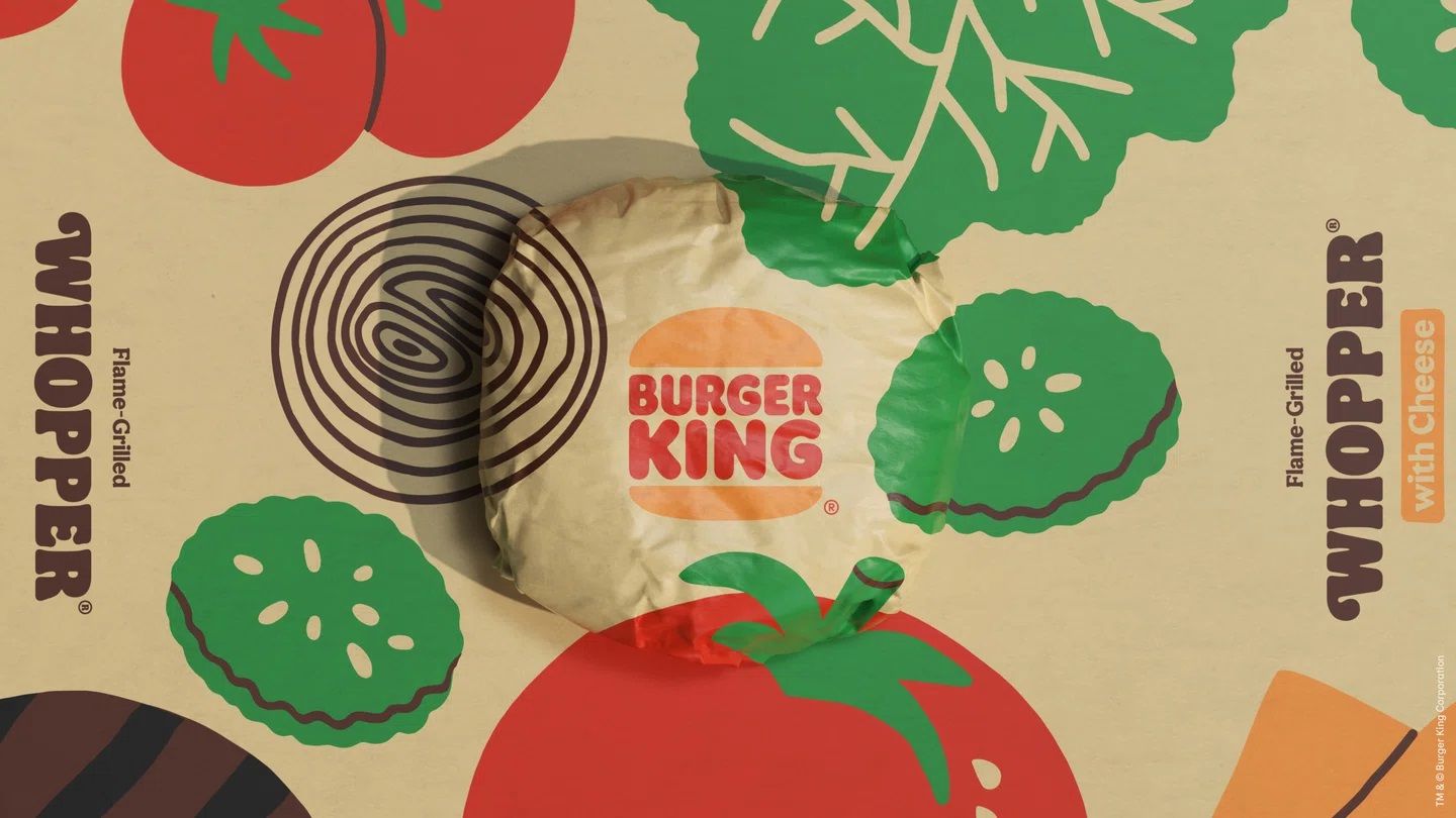
The redesign synthetizes 2 years work of JKR New York and Burger King’s in-house design team: they designed a modern, digital-friendly appearance that is a faithful representation of the brand’s playfully irreverent personality. The new brand font—recalling the well-known Cooper Black for many— and the exciting illustrations all draw on the shape of the company’s primary product, the hamburger.
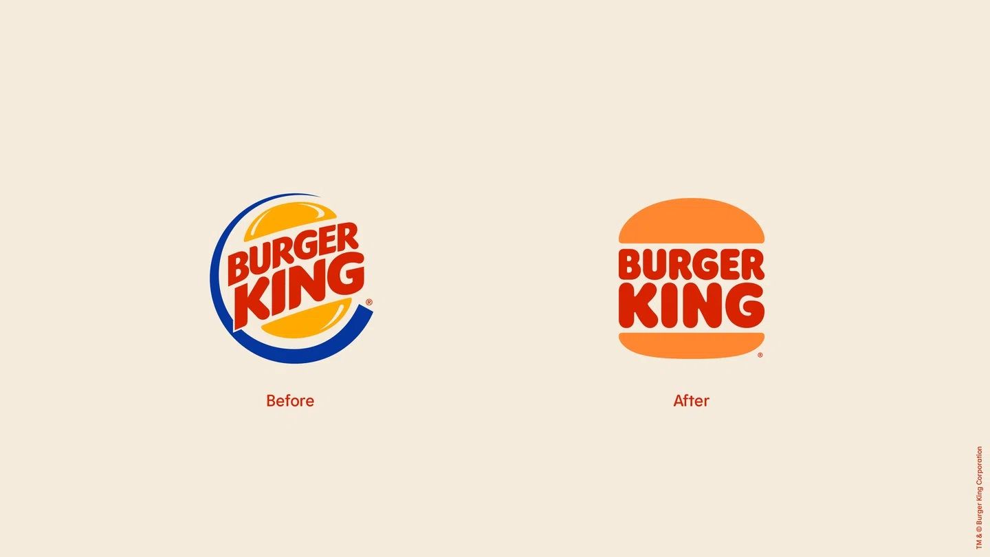
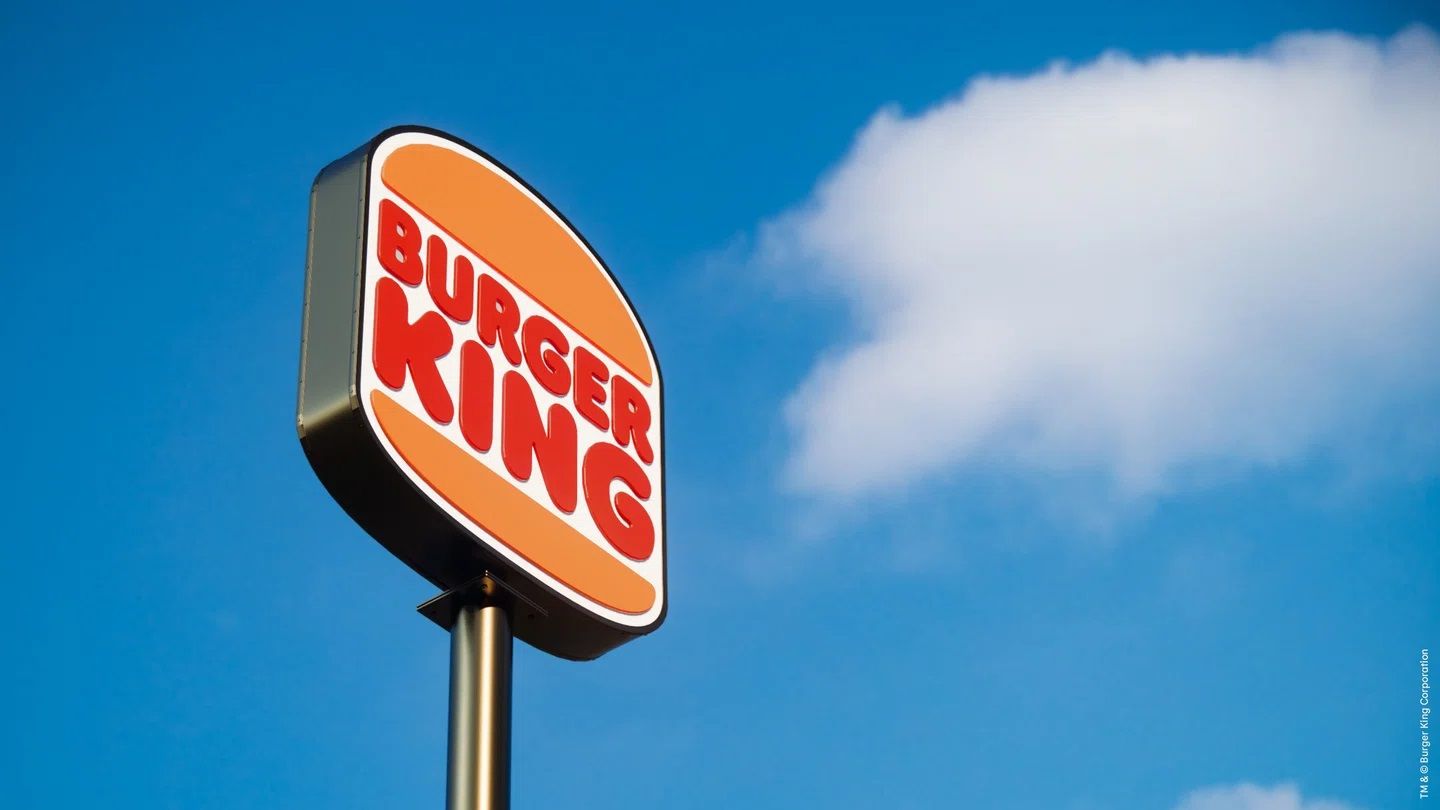
The most substantial change took place in the logo: it gave up its former spatial shape and became an incredibly simple emblem centered around typography. In effect, the new logo design gives new life to the 1969 emblem.
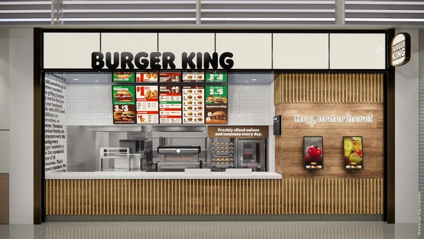
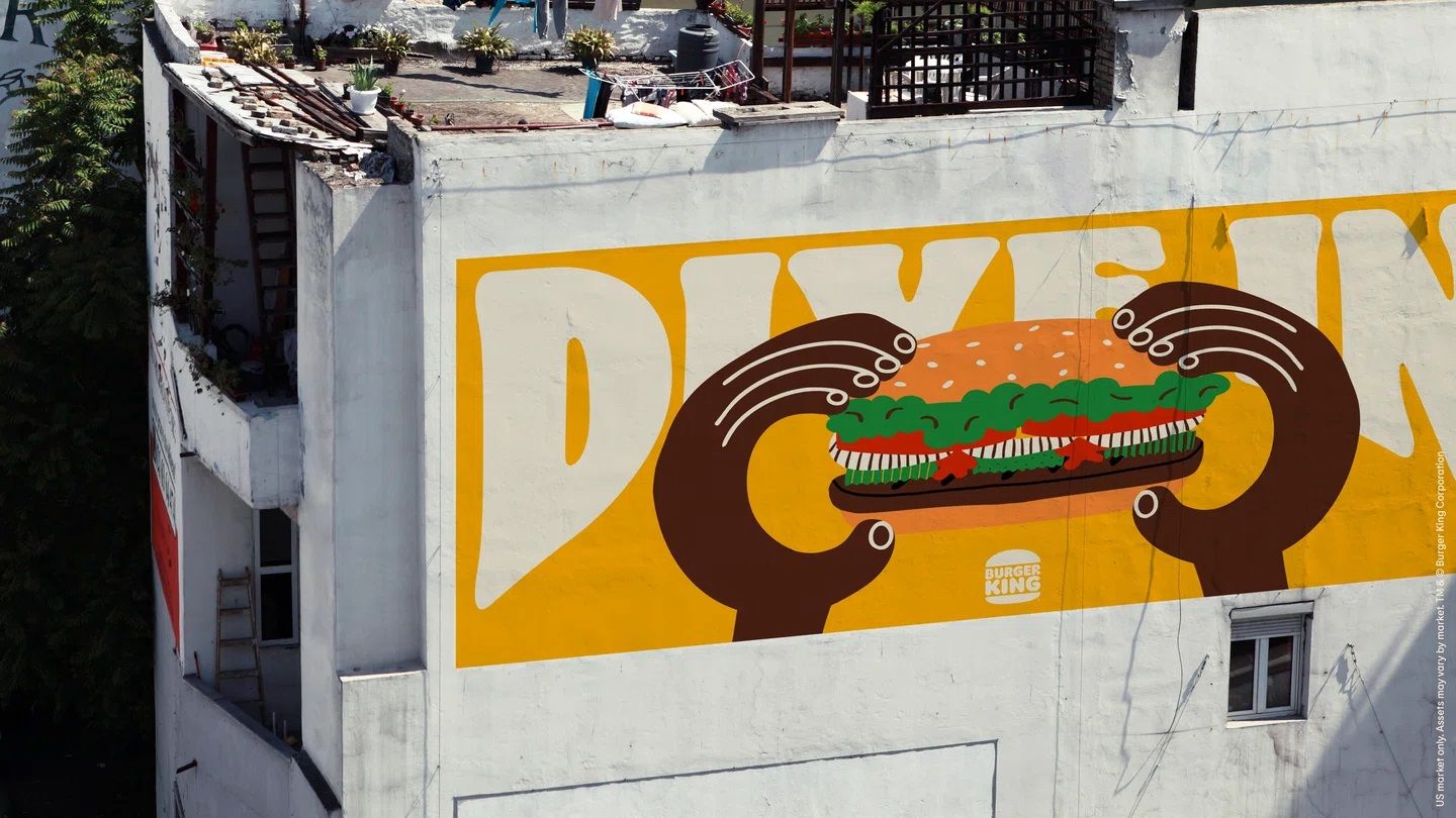
The new visual identity evoking a retro feeling is expected to roll out in the favorite restaurant of burger fans in the near future.
Source: It’s Nice That
Four new posters for saving neon signs | CSŐ!

Just like a comfortable car ride | MIXD