The new visual identity of the Czech city of Svitavy with a population of almost 17,000 was designed by Markéta Steinert and Jakub Gruber. In the framework of the restricted tender, the members of the jury selected the best from amongst the designs of five studios, but now we will also present the projects that didn’t come out winning.
As we have already discussed in a previous article, and as it was already explained by CZECHDESIGN editor in chief Veronika Pařízková in her interview: more and more Czech cities are starting to realize the need for a fresh visual identity. On top of all that, many times it’s not about redesigning the already existing coat of arms, but a comprehensive visual communication strategy where the town can be viewed as a brand.
After Luhačovice and Litoměřice, now the city of Svitavy is also a proud owner of a new visual identity, once again facilitated by the team of CZECHDESIGN. In the case of tenders of these kind, it’s kind of a convention that they only present the winning project to the audience, but at the same time it can be quite edifying to get to know the designs of the other entrants, too.
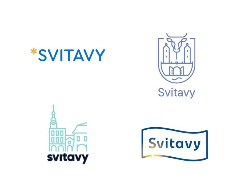
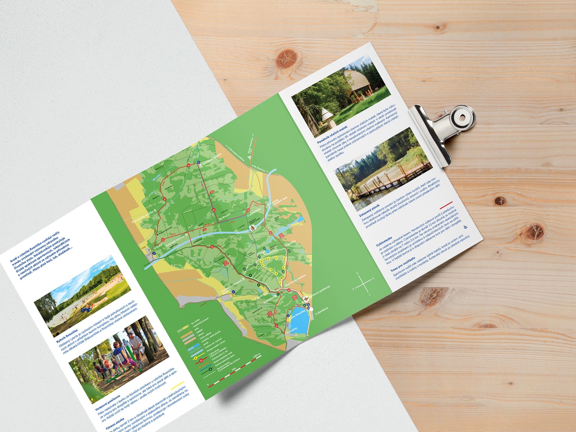
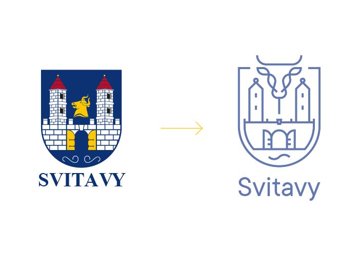
The village established by the Premonstratensians in the 12th century was named after the Svitava river, was granted township in the 13th century, and was surrounded by a wall with three gates thereafter – this symbol also occurs in the coat of arms of the city. The five studios invited to the tender created their designs starting from the blue-white and golden tones of Svitavy: some of them created a simple and clean visual identity, while others opted for a lighter and more illustrative style.
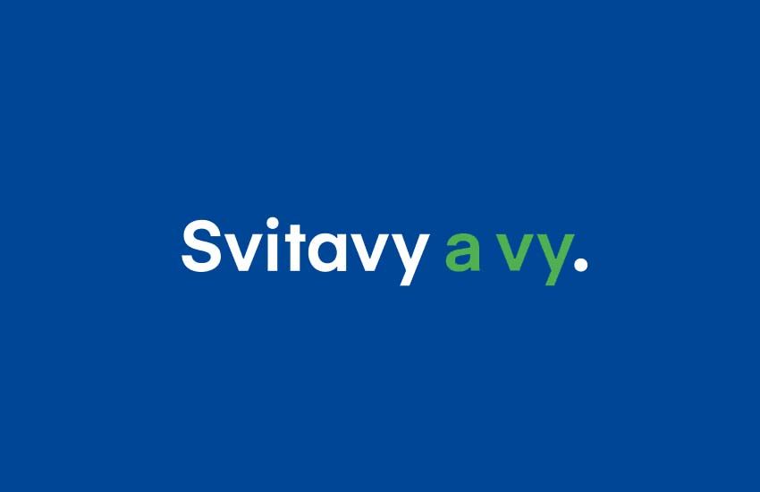
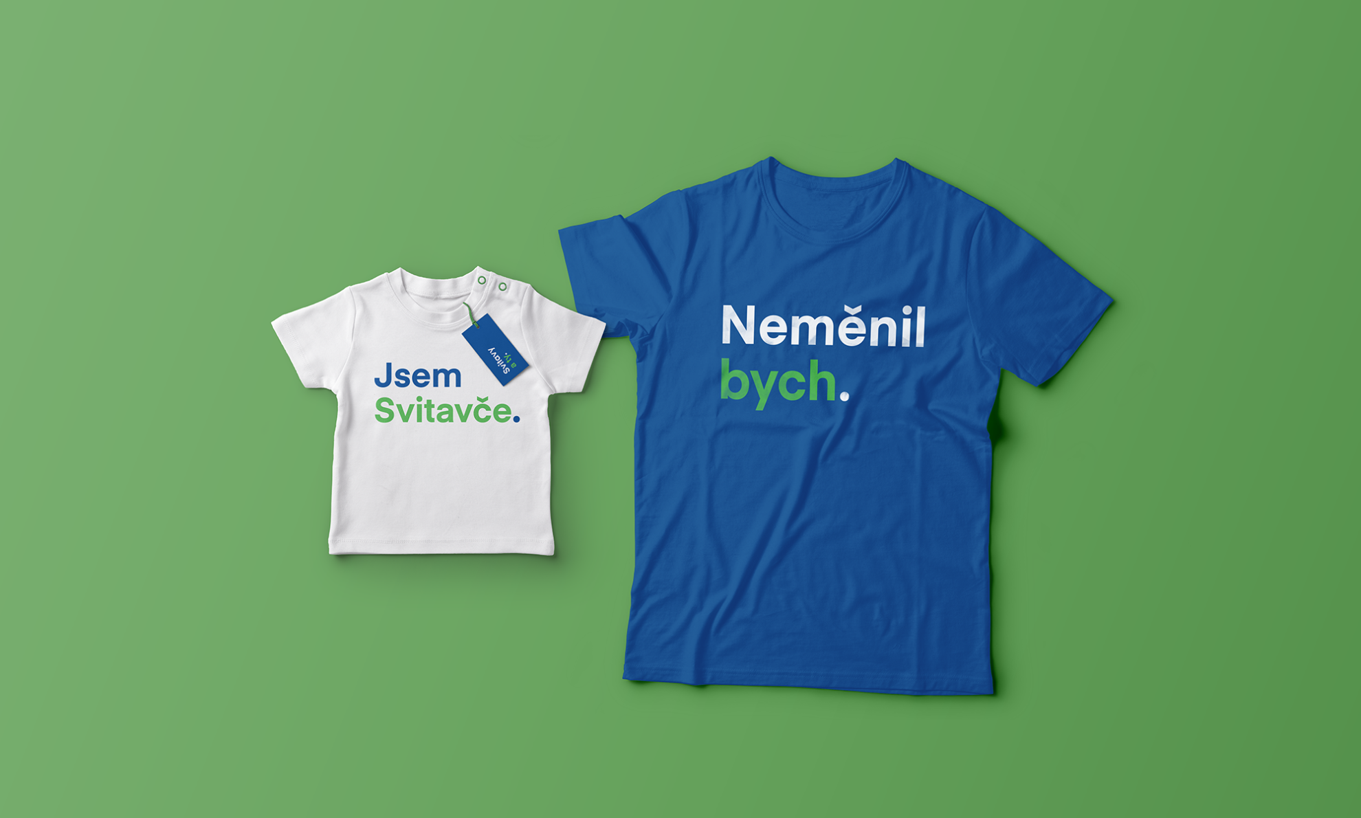
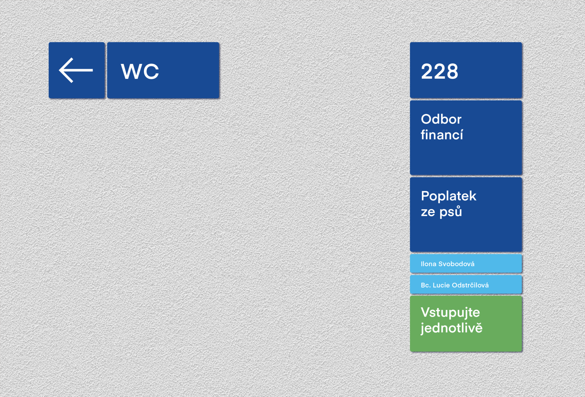
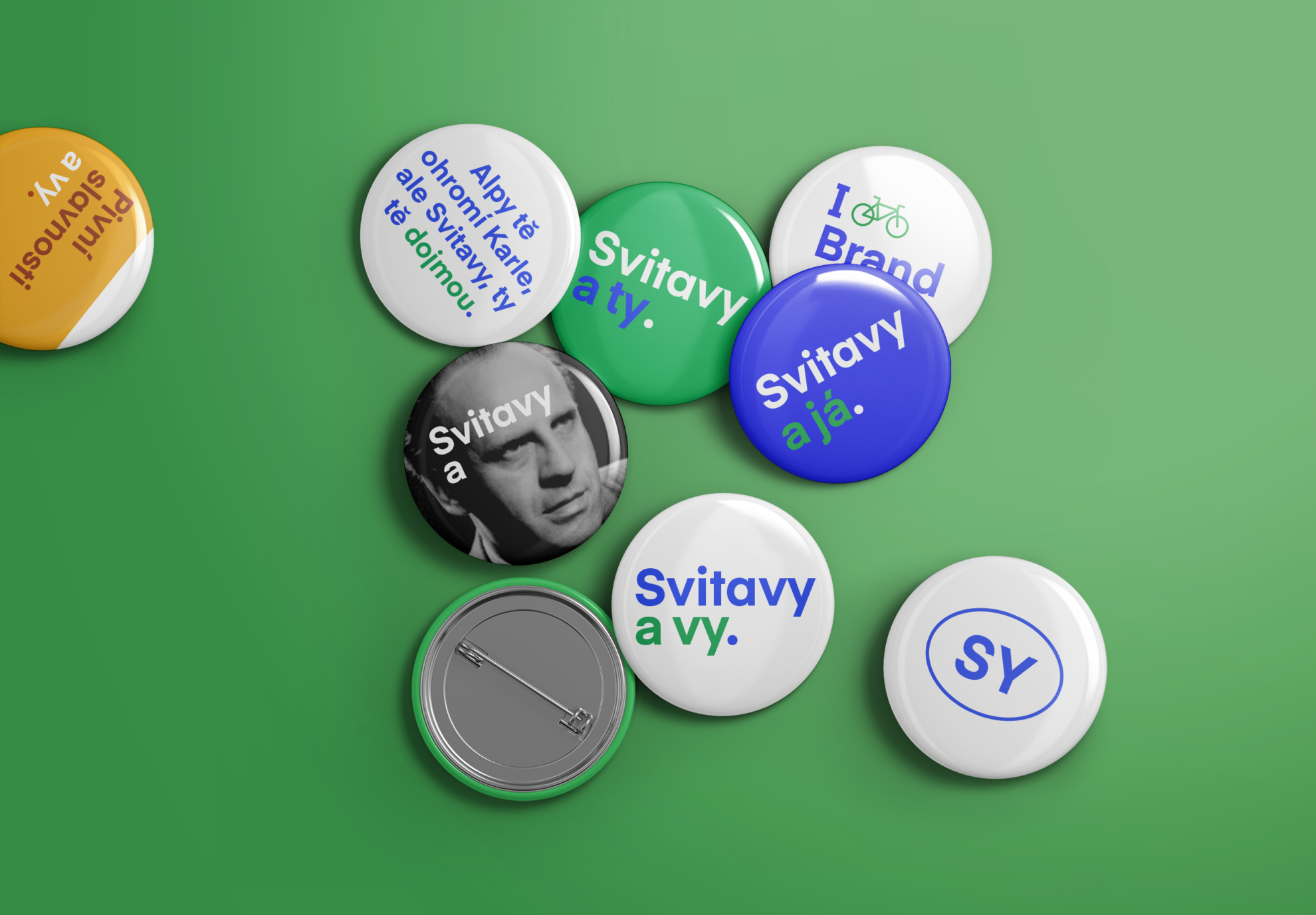
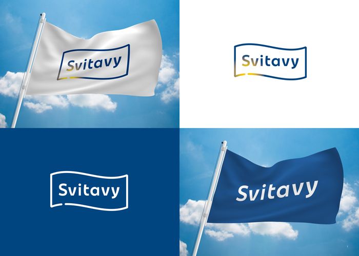
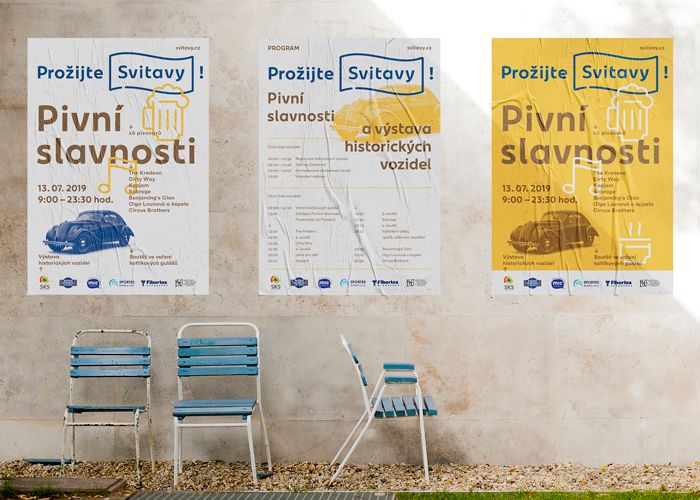
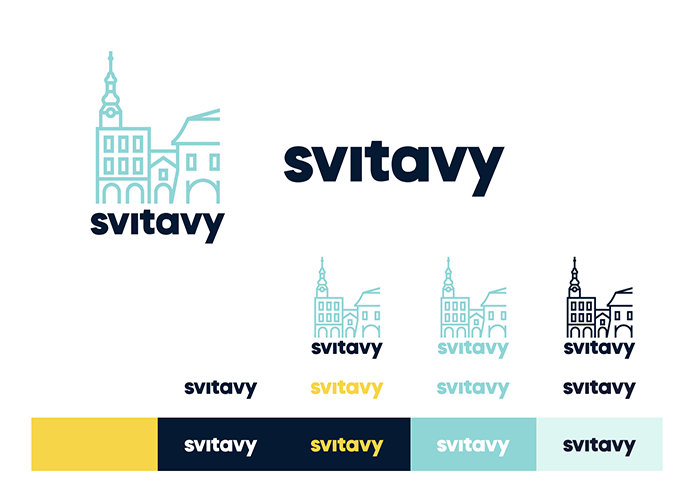
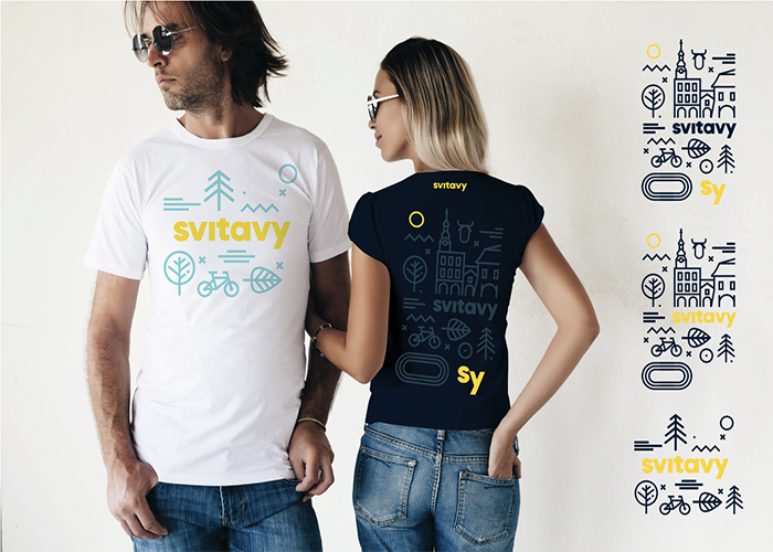
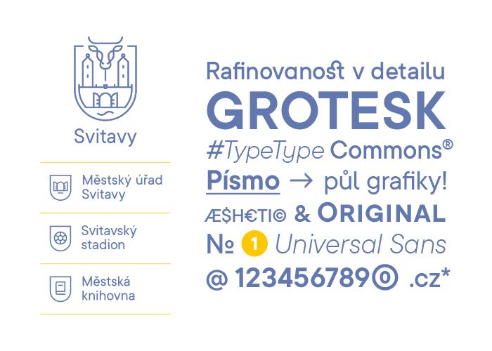
Markéta Steinert and Jakub Gruber designing the winning project chose the „Forest Green” tone to complement the existing ultramarine colors, thus alluding to the unmatched natural environment surrounding the city. The designer duo, who are the grad students of UMPRUM Prague (Academy of Arts, Architecture & Design in Prague – the Ed.), created the new logo starting from the pun hidden in the name of the city („Svitavy a vy”, that is „Svitavy and you”), and chose Eina 01 Linotype to be their new font. The motto displayed by them can be dynamically changed depending on what message the city would like to communicate to its habitants and to the tourists, at the same time, the new visual identity distances itself from the obvious clichés that dominated Svitavy’s perception so far (city wall, river).
Artbureau creative studio reinterpreted the gated city wall: in the reduction of the designer Jakub Wdowka, the line surrounding Svitavy (literally) breaks off at a point thus alluding to the city gates allowing free access to the city. At the same time, the city wall “undulating” in blue is a reference to the river itself and the slight golden glittering could also make viewer think of the starry sky.
The star motif also appears in the work of another entrant: Věra Marešová‘s design puts the simple graphical symbol of the star in the center, as legend says the name of the city comes from the light of Svitava flowing through the landscape.
Graphic designer Pavel Šmerda incorporated one of the city’s main sights, the long archway and the structures of the same into his logo design. The designer created a visual identity building on youthful and playful symbols focusing on the historical sights of the old town: the second longest archway in the Czech Republic stretches “underneath” the houses lined up next to each other on the oblong main square of the city, however, the professional jury did not find this idea emphatic enough to include in the new logo of the city.

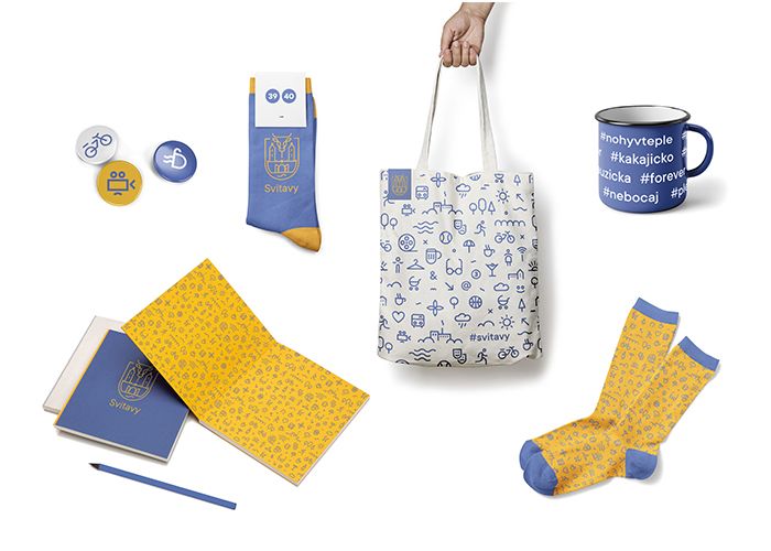
VOALA graphic design studio focused on lovely pictograms as well as redesigning the coat of arms of the city: the project of Pavel and Blanka Kulišťák is playful and jolly, instead of ultramarine and golden tones, they work with purple-ochre colors, and the designer duo also made the coat of arms simpler and friendlier.
And even though they did not win the tender, paper maniacs should probably remember their name – the repertoire of the brand offers notepads, pocketbooks, and journals.
Source: czechdesign.cz
Czech design in the Costa Rican jungle | Atelier Villa
Elektrėnai | The clone of Chernobyl