


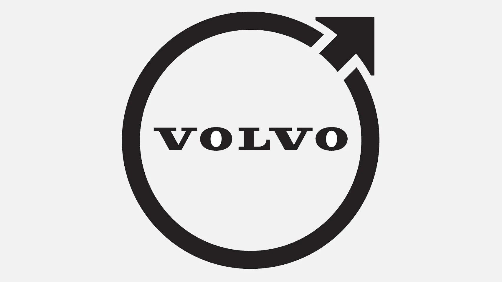
The flat design movement isn’t over yet: after several car brands—such as Toyota, Nissan, Peugeot, Opel and BMW—Volvo has now joined the ranks and reimagined its iconic logo.
Swedish car manufacturer Volvo has also unveiled a less colorful version of its iconic logo. Following the flat logo concept, the new logo debuted in a simplified two-dimensional black and white design. The visual design still follows the circular shape and upward-pointing arrow motif first used by the brand in 1927, symbolizing man, iron, quality and durability. It will be displayed in the center of the steering wheel and on the wheel hubs of all new Volvo models and will also appear on all communication materials.
Source: dezeen
more to read
interior design
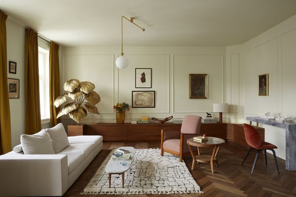
Personal living spaces—Interview with Marta Chrapka, founder of Colombe Studio
Warsaw-based Colombe Studio offers a complex interior design service, from personalized and selected antique pieces to metalworking and upholstery, all using the highest quality raw materials. And the end result, within the distinctive interior raises a thousand questions: it’s hard to look at the projects the studio has completed
art
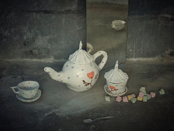
Everyday objects, intimate moments by the Czech Křehký
Teapots, cups, vases and plates. An infinitely simple system of everyday objects. We use them so often that we tend to completely overlook their aesthetic appearance. Yet a carefully made, individually designed porcelain or glass object can bring color to the greyness of everyday life. Meet the Křehký brand and

architecture
A Czech alternative to suburban villas
Two neighboring residential houses were reborn and merged in a historic part of a small town in southern Bohemia, designed by Atelier 111 architekti. The building complex is hidden in the narrow streets next to Kozina Square from the hustle and bustle of the surrounding traffic, a few steps from