


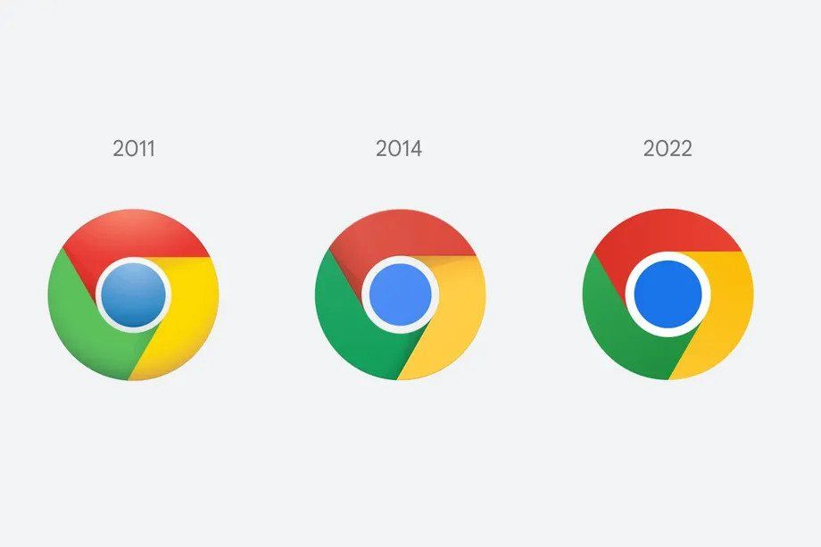
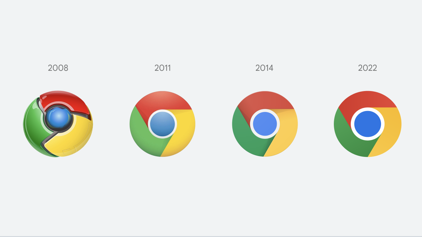
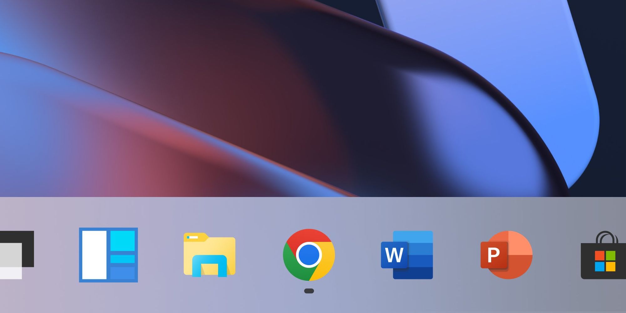
Google introduced subtle changes to the icon that has been known since 2014.
Google Chrome’s logo hasn’t changed drastically since 2014, and this year’s facelift was also more of a subtle update. The shadows between the colors have been removed and the colors themselves have been made brighter, with a slight transition. In addition, the size of the central blue circle has been increased.
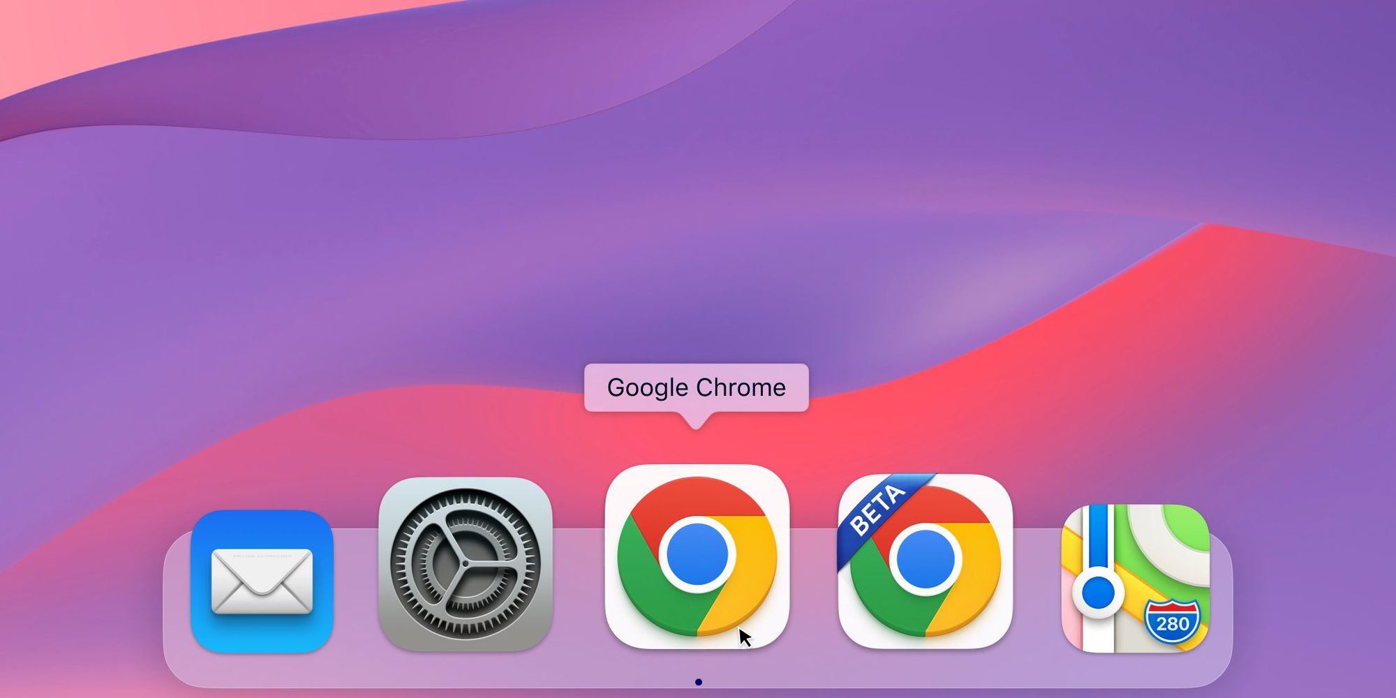
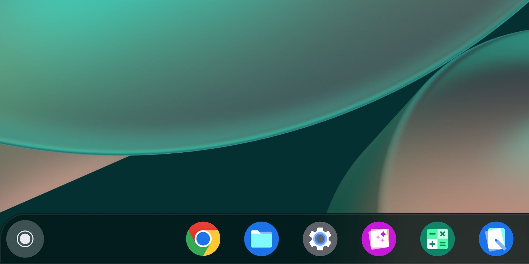
However, the icon is expected to appear differently on various operating systems. To match the look of the interface, you can expect a 3D effect on Apple, lighter shades on ChromeOS, and stronger transitions on Windows 10/11.
Source: Designboom
more to read
graffiti
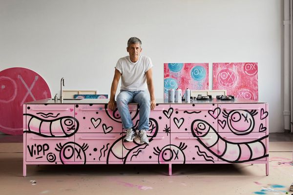
Bins deserve a little love too | Patterns from André Savaria meet the iconic products of Vipp
The stage where cooking takes place, i.e. the kitchen, can be picturesque, and its often ignored, albeit most useful item—the bin—equally deserves our love and attention. Strengthening these sentiments arrives the collaboration between graffiti artist André Savaria and the Danish brand Vipp where the quirky nature of
paradigma ariadné
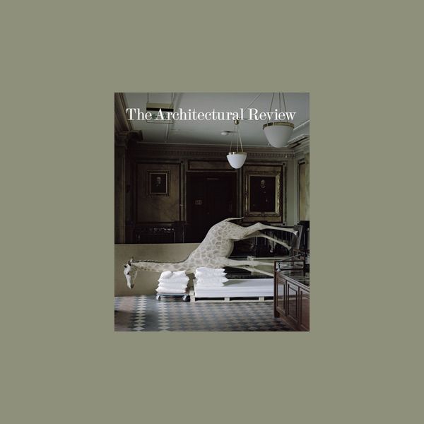
After 40 years, Hungarian architects are featured again in one of the world's most important architecture magazines
Paradigma Ariadné’s Bivalyos Tanösvény in Sándorfalva is featured in The Architectural Review 2022/2 by Dániel Kovács. More than 40 years have passed since the magazine last wrote about a homeland project of a Hungarian architect.
Since its foundation in 1896, The Architectural Review has been an international reference

workshop
Enter the coffee machine heaven! | The eventful story of Gergely Nezvál and the La Marzocco
Why does the pure Italian espresso machine have such a big hype? What is the story behind the devices that “produce” divine nectar? We visited Gergely Nezvál, the Hungarian distributor of La Marzocco, who is at least as happy to call himself a coffee machine mechanic as a salesman—with