Remember the guys who designed FINA’s identity in 120 days? While we were on holiday, they quietly scooped four Red Dot Design Awards! Interview.
I arrive at Graphasel Design Studio’s offices near Széll Kálmán Square in Budapest, entering through what one might call a private staircase. The bright, large windowed studio space is full of friendly, smiling faces, many still immersed in the last touches of the day’s work. But behind a door, a new dimension opens up: this is the tiny Graphasel-sanctuary, every employee’s dream. Here you will find “the bar,” where, Graphasel-designed coffee and alcoholic beverages await the weary workers. But the cherry on top is a giant red hookah glowing on the coffee table. This is where we meet with the studios’s two founders, László Ördögh and Dávid Drozsnyik.
So is this how the day ends around here? Is a regular stretch of the brain essential for creativity?
Dávid Drozsnyik: The hookah is more of a weekly routine that we usually have on Fridays, but today was a long day (laughs). And we have many of our branded packaging in the bar, so its existence is sort of a necessity for professional reasons as well.
László Ördögh: The reason why we love wineries and master distillers is that in their cases, there is always some passionate Hungarian initiative in the background. We can conjure up an origin story behind each of them that can be visually encoded but which still reveals a more profound message. After all, these drinks are not interesting primarily because of their alcohol content but because how they convey a lifestyle.
Can we say that this lifestyle characterizes you at a company level?
L.Ö.: If by this lifestyle we mean telling stories visually, then absolutely, yes. Our main thrust is to find the story in an identity. For us, it’s an adventure, a style study, an exciting social game.
What does the creative, artistic process behind creating a design look like?
D.D.: The creative process is broken down into well-defined stages, what we call the “four D-s.” They stand for Discover, Define, Design, and Deliver. The first stage is a research process where we do interviews, analyze competitors, and consider a variety of aspects. The second is focused on understanding and creating the brand foundations; this is where we define, among other things, the target audience, persona, message, values—this is Define. Should we have an agreement with the client at this stage, then we move on to how we can visualize this, which is the Design phase, and then we move on to the implementation, which is Deliver.
How do you decide whether to take on an assignment?
D.D.: It depends on the challenges and how exciting it is for us. But it also depends on whether we want to show ourselves in the project because there should be mutual sympathy with the client.
L.Ö.: We like the tasks where we can create a new brand from scratch, where we have to create an abstract personality: we design the attributes, the tone of voice that the brand represents. But many things come into play here, which is more marketing, market analysis, price analysis. It’s all a big matrix. The more time we have to deal with it, the more exciting the game becomes.
Speaking of games, you’ve made quite a splash this year on the Red Dot game. What’s the story behind the four Red Dots you’ve won in a year?
D.D.: The short story is that we wanted to bring home at least one this year, so we submitted five entries. We ended up winning four of them (laughs).
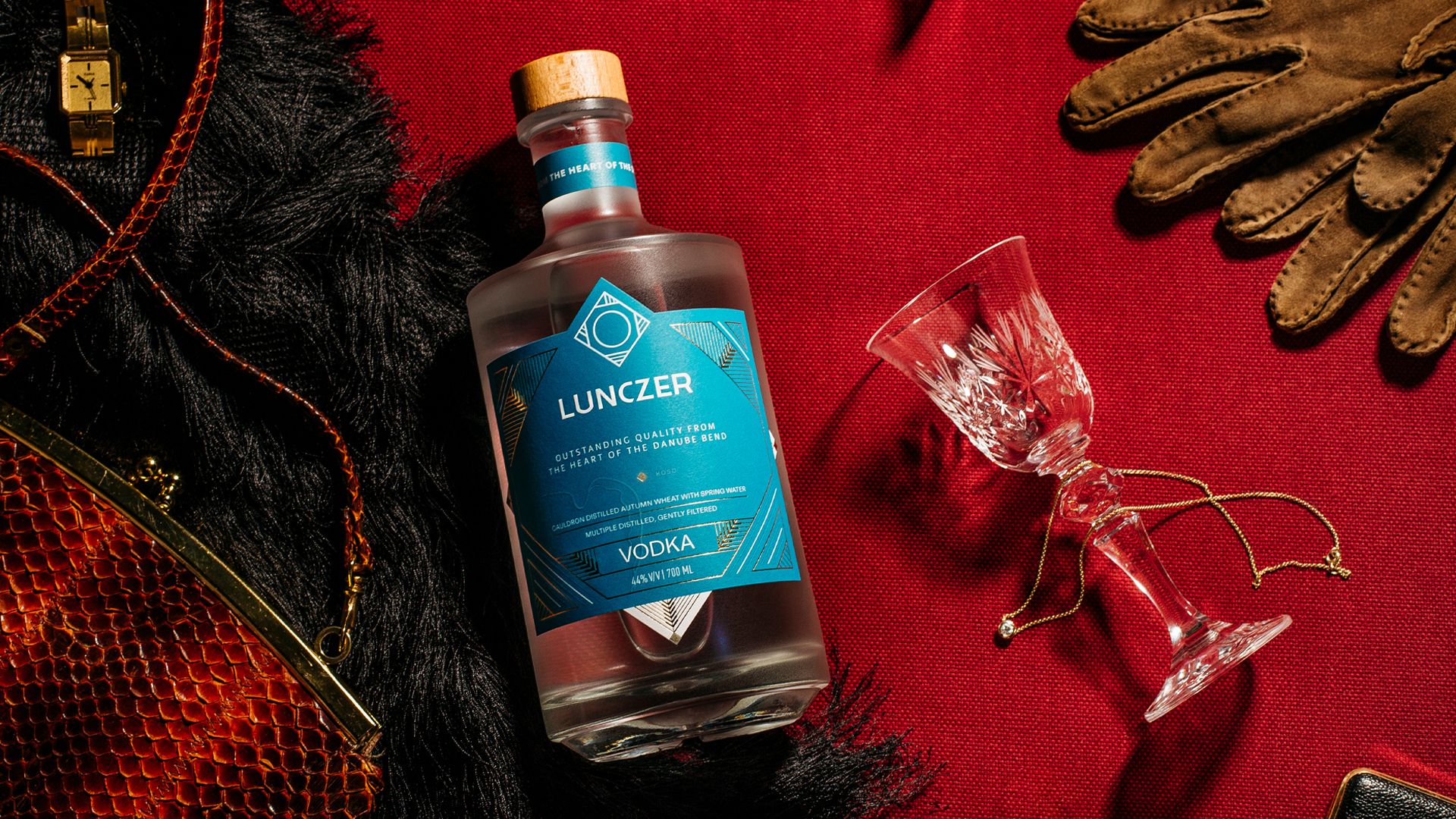
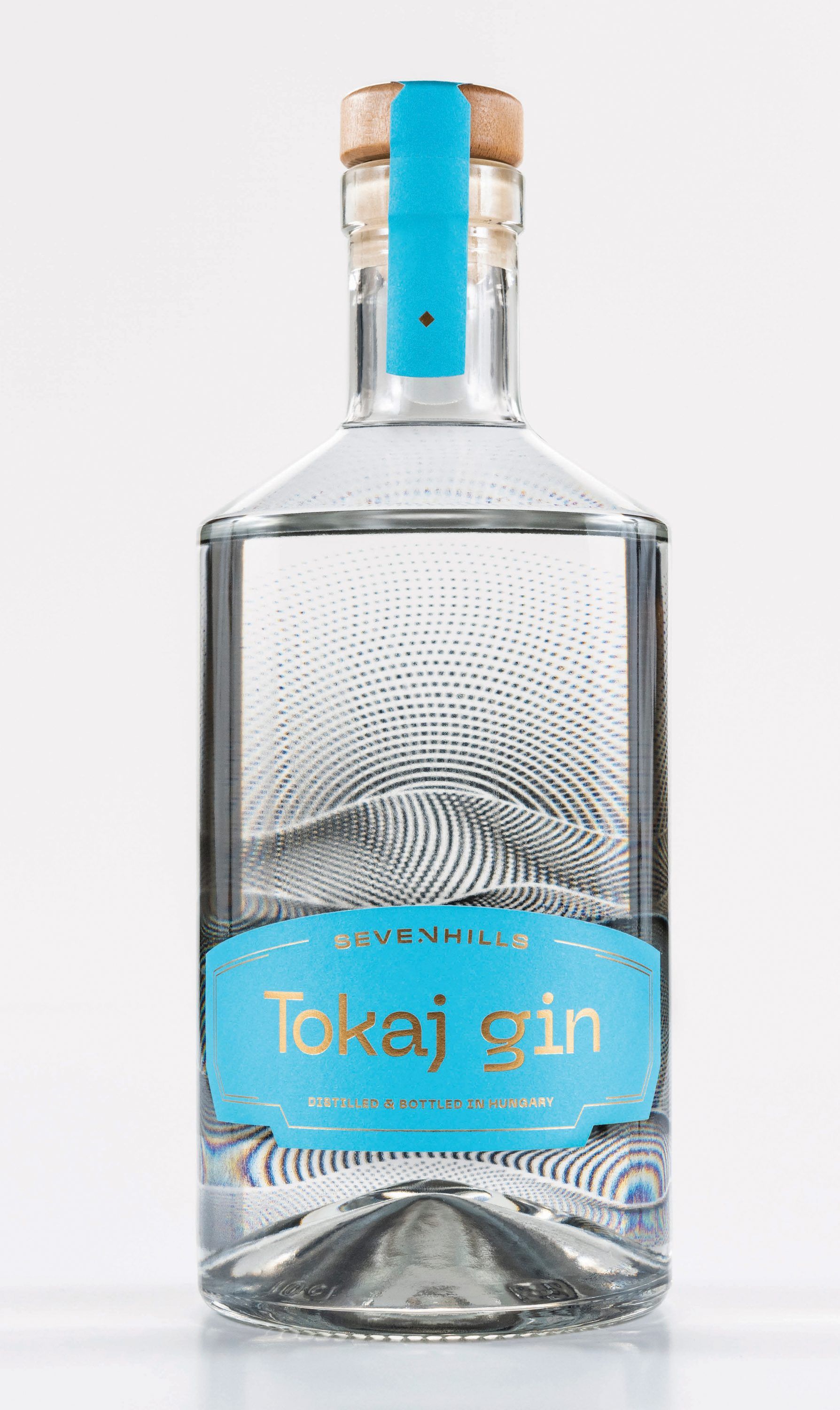
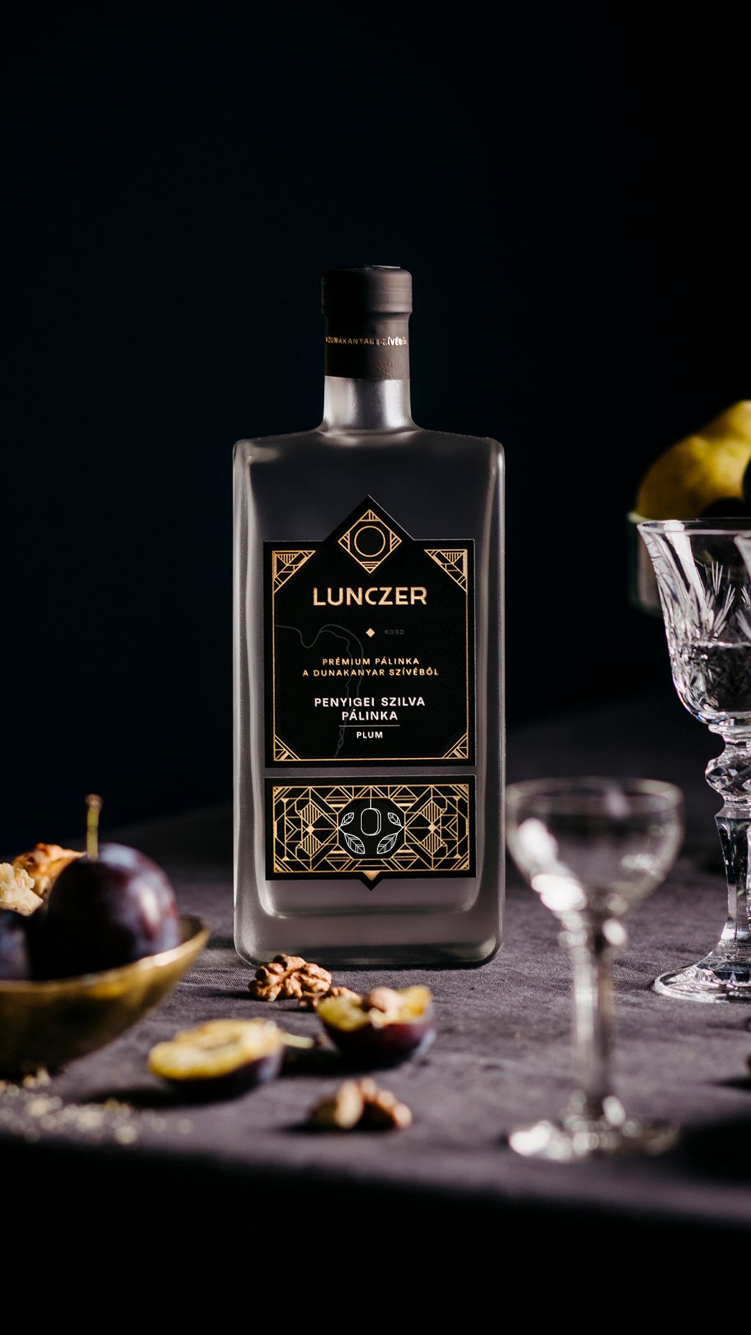
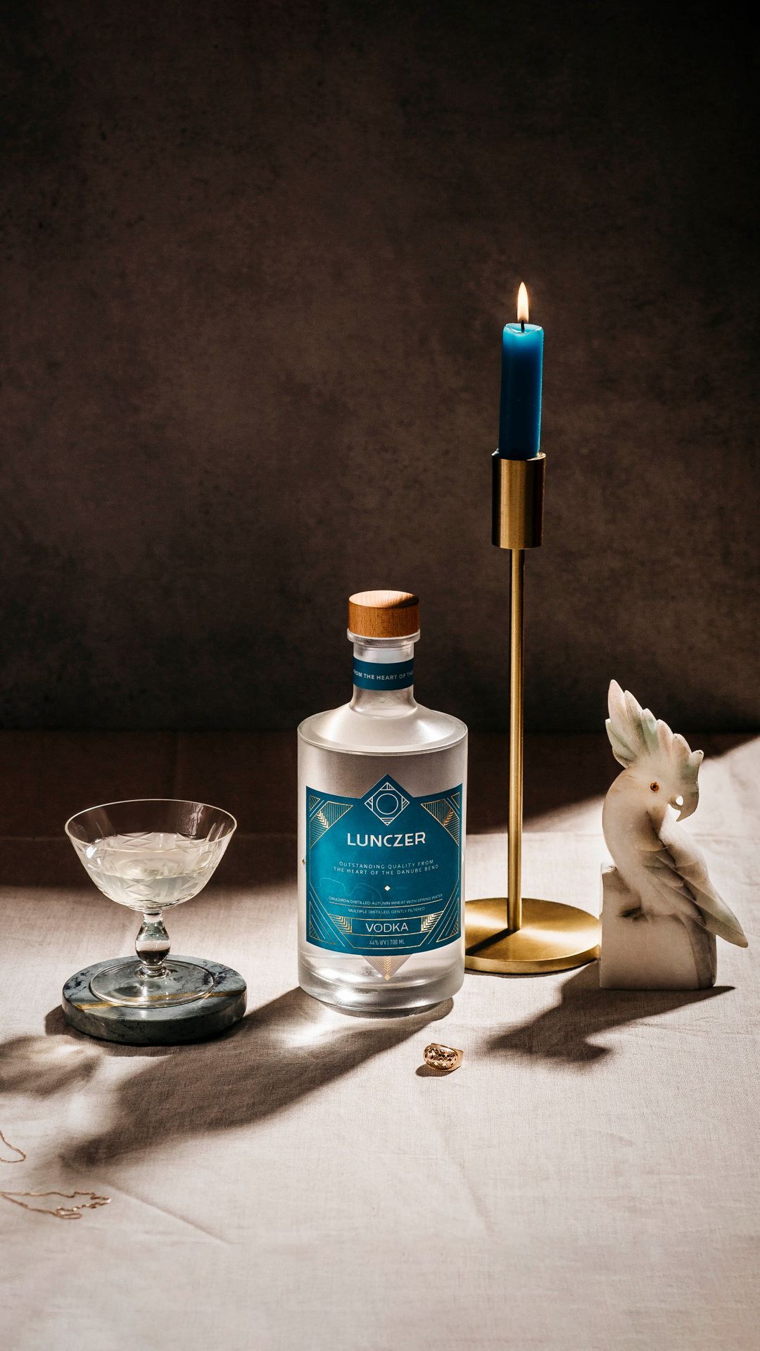
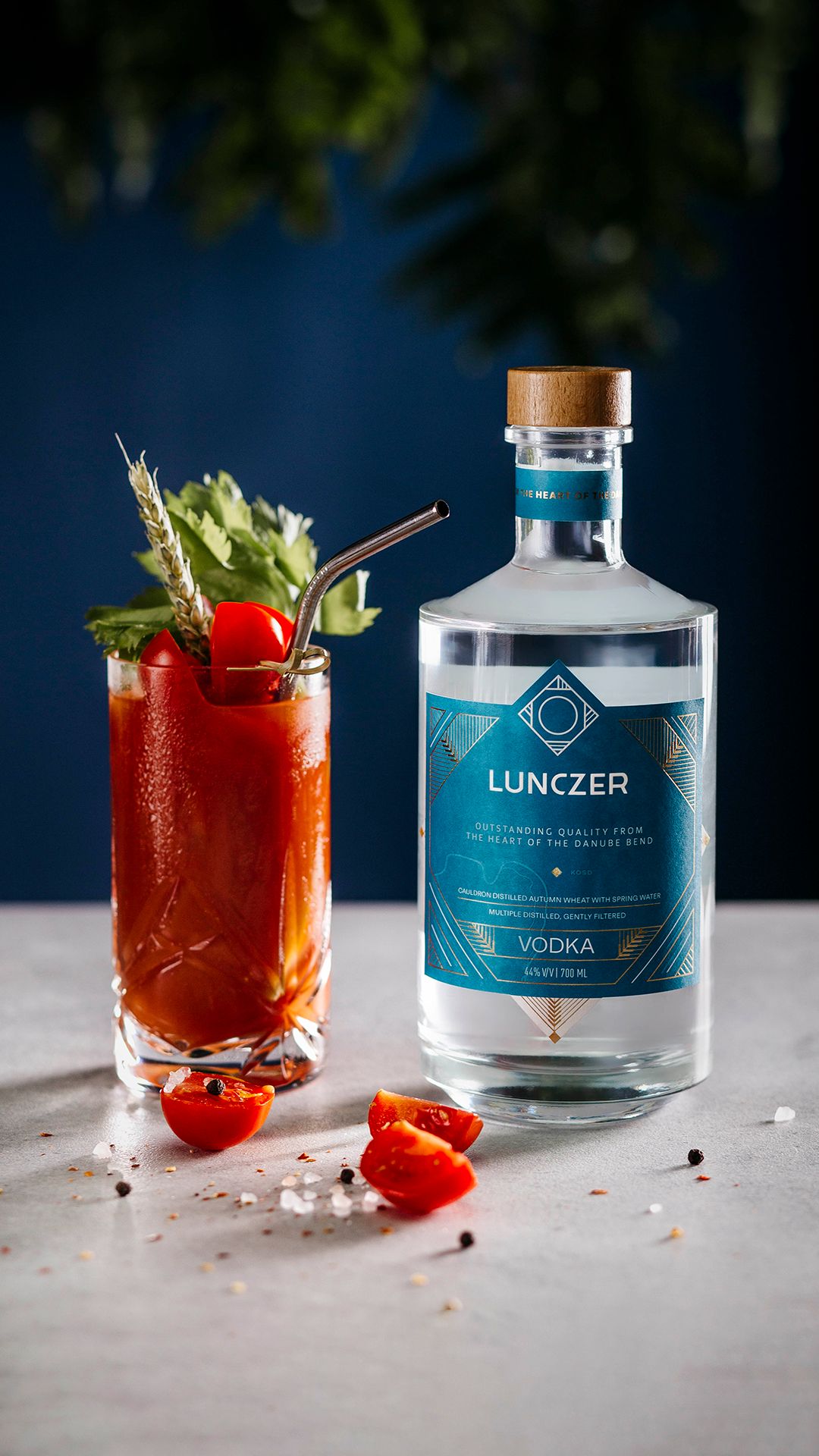
L.Ö.: We’ve been submitting three or four a year for about 15 years now, and the trend so far has been that we’ve won one of these, if any. It was essential for us to enter work by our artists who hadn’t won before because we want as many team members as possible to benefit from this success. Dorka Perneczki, for example, is a well-deserving winner of the award. She was behind the design of both Lunczer Pálinka and Lunczer Vodka (we wrote about them earlier here—the Ed.), and we are very proud of her. But in the case of Péter Morvai, the designer of the packaging for Tokaj Gin, it’s particularly interesting that this design was a continuation of his thesis, with which he had also won earlier.
What are these works about, and what do you think is the reason for their Red Dot certification?
L.Ö.: Our experience is that the jury in this competition is particularly keen on authenticity. Usually, they consider a design worthy of showing the world if there is something local, something original in it.
Péter Morvai’s work, Tokaj Gin, is a kind of experimental graphic pattern that we have made part of the packaging using a lensing effect. With this method, we were able to depict the slopes of Tokaj-Hegyalja and the wine region, and it seems to have been a success: the 24-member international jury certainly judged it that way.
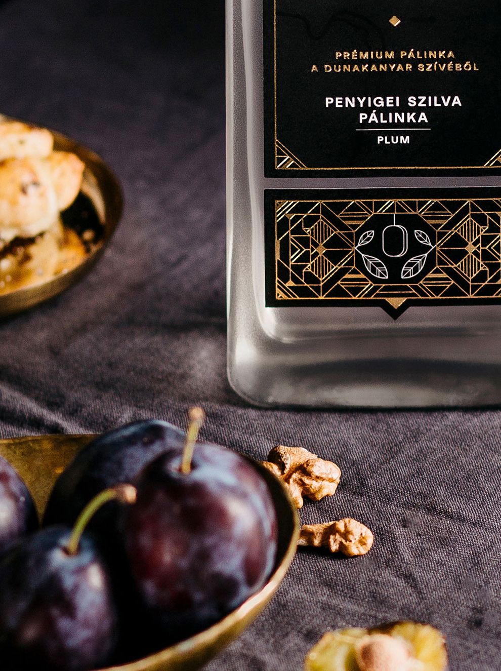
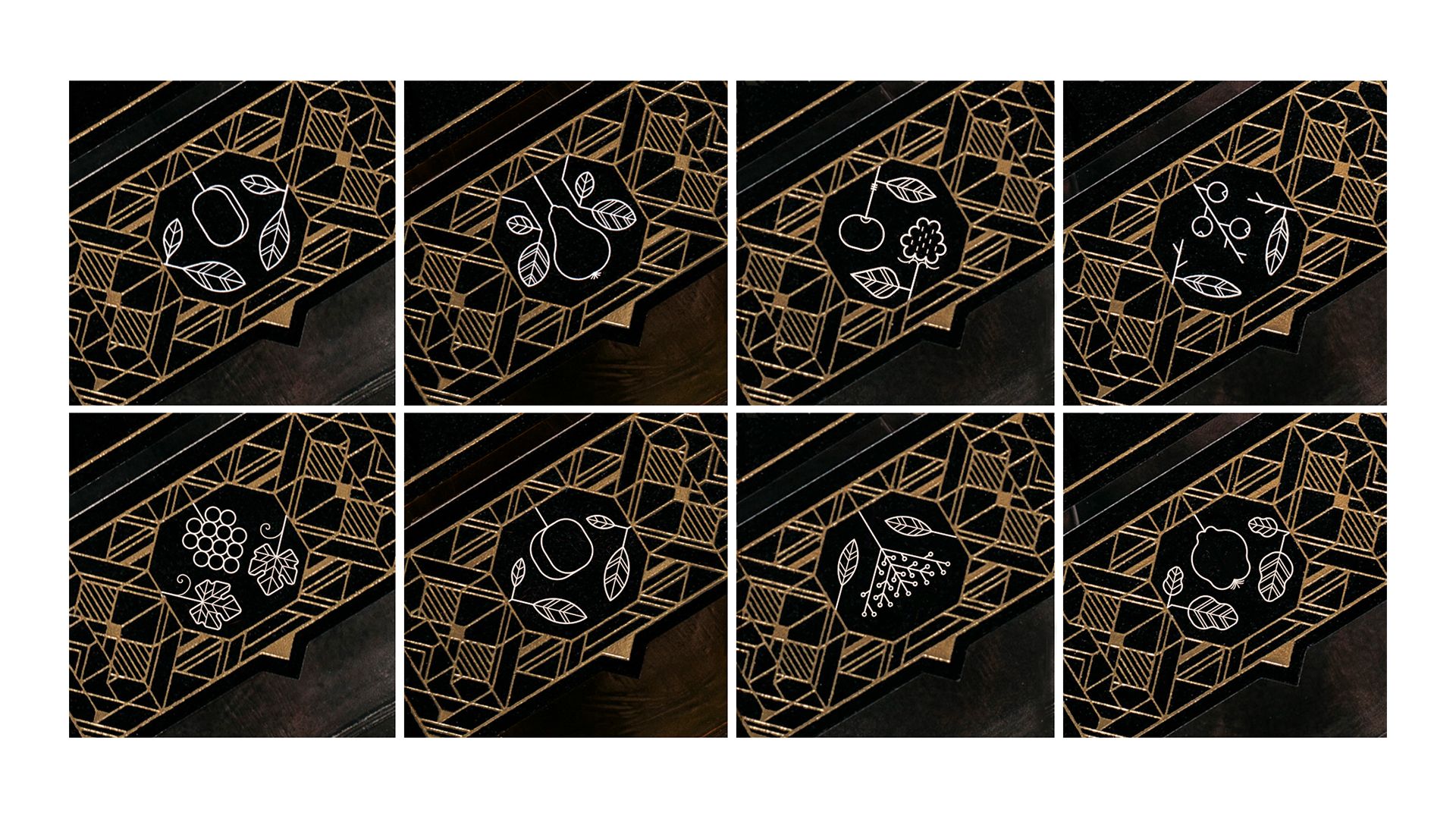
The other two winning labels are the works of Dorka Perneczki, both products of the Lunczer company. The peculiarity of Lunczer Pálinka is that the manufacturer positions these fruit spirits so high that they almost amount to a kind of perfume. This has given birth to a concept that goes back a little to Art Deco and Art Nouveau with its visual language. When looking at this bottle, you see a more feminine, elegant design, which invokes a sophisticated product. Of course, there are many other layers to it: the label shows an embossed Danube bend where the product is made, and of course, the fruit is also featured in the geometric section.
The Lunczer Vodka also follows the same refined and Art Deco graphic style, except that it being a grain spirit, we’ve created a similar effect with the depiction of ears rather than the fruit. Here too, we are working in many layers, which is really important in order to tell as much as possible with the label, to tell a story, and to give the product a root.

A completely different genre is the wayfinding system of the MVM Dome. You have won the fourth Red Dot in this category. Why is design important when creating a wayfinding system?
D.D.: We have been submitting projects in this category for many years, and we underwent a huge learning process. It has been very exciting to collaborate with the architects and interior designers; we are becoming more and more conscious in our approach to these tasks. The first real breakthrough was with Puskás Arena, the first Hungarian project to win in the category. The current prize was won by the MVM Dome’s wayfinding system, whose design was led by Mátyás Beke within the team, just like with the Puskás project.
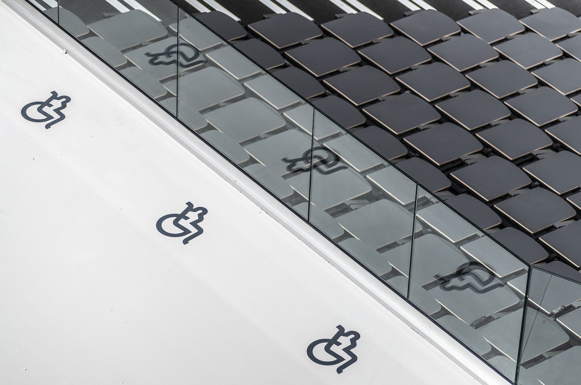
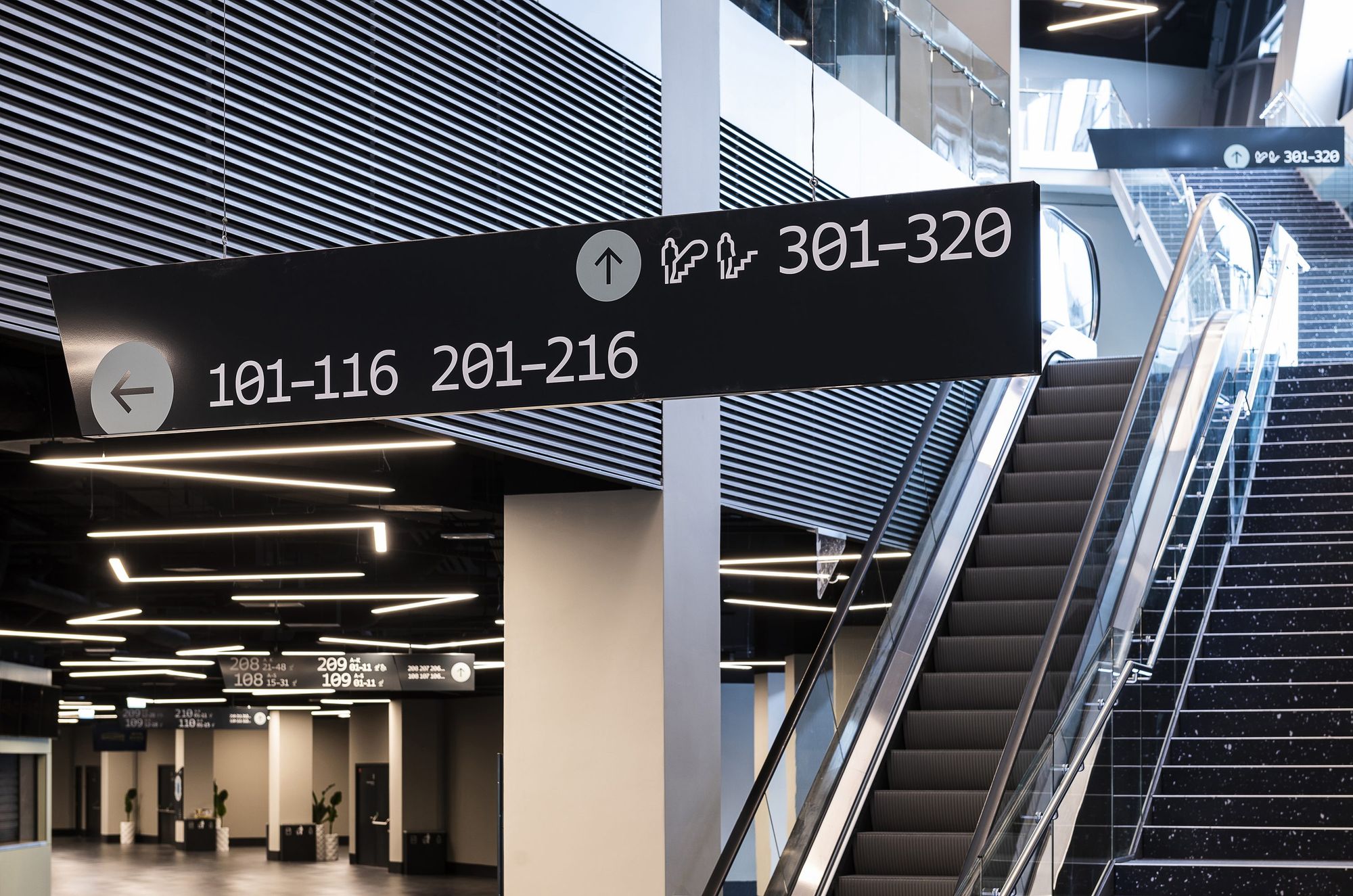
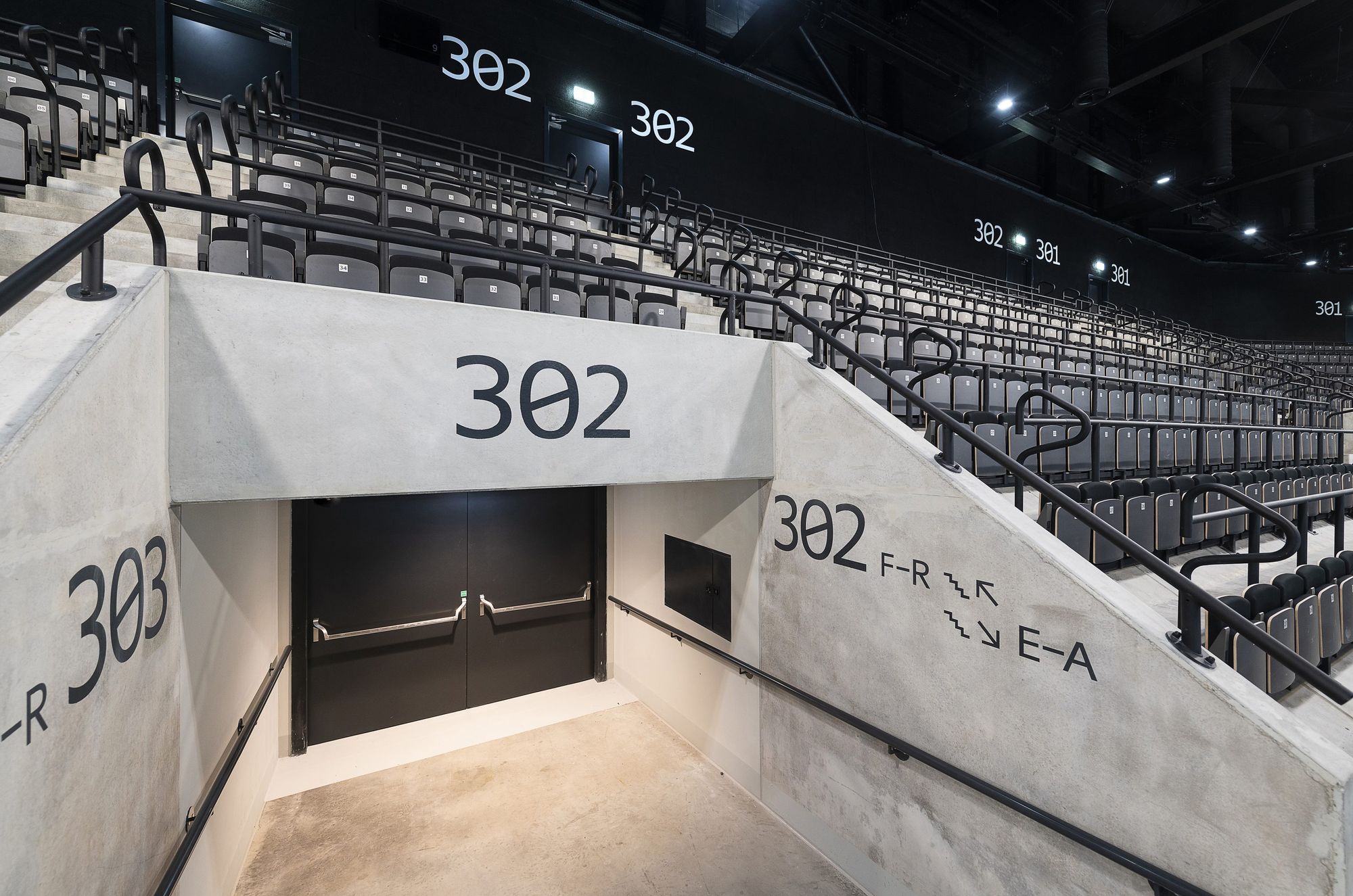
With a wayfinding system, it’s more about functionality than aesthetics. It’s basically a spatial UX (user experience) design. It includes ergonomics, visibility, logical design, structuring. We are talking about an extremely complex system, which could be described in a way that when you enter a building with, say, a companion and a ticket in your hand, you have to get from the entrance to your seat without even being aware of the process. We are exposed to such stimuli that we don’t even have to think about whether we entered through the right gate, climbed the right stairs, stood in the right spot, etc. This includes typography, the exact font size of the signs, or the information hierarchy. In this case, Red Dot values intelligent design over the aesthetic.
What does such recognition mean for the company, and what does it entail for the artists?
L.Ö.: It’s crucial for the company, as we are constantly looking for feedback on our work, so it’s obviously a source of pride, and of course, it strengthens the team.
D.D.: This is basically the Champions League. If a team is a favorite to win the league, they’re more likely to sign players. And it’s not only us but also the client, who takes a lot of pride in having made the right decision in choosing us.
How much of an achievement is it for you to win such at an international competition of such magnitude as a Hungarian company?
L.Ö.: It would be an exaggeration to say that Hungary is a design superpower, but more and more colleagues are achieving good results this year as well, we are aware of other Hungarian winners, and we would like to congratulate them. In the case of all international awards, it is not only the merit of the individual, nor only the team, but also the whole country, something to be proud of.
So what’s next? What will be the goal for next year?
D.D.: We want to grow. It’s a long-standing dream of ours to make it to the international scene. The motto for this year was also self-improvement, we are constantly improving the team. We believe that if we deliver high-quality projects well and consistently, it will lead to more and more recognition.
L.Ö.: Of course, in order to do that, we are constantly looking for ways to step out of our comfort zone. Many times we can’t believe we are doing so many things, but when we are faced with the fact that tomorrow is another day and the team needs another exciting project, we don’t look back at what we have done so far, but strictly forward.
MVM Dome:
Art Directors: László Ördögh, Dávid Drozsnyik
Designers: Mátyás Beke, Péter Morvai
Photographer: Attila Balázs
Client: Market Zrt.
Production Company: Alustart Kft., Kameleon Art Dekor Kft.,
Tokaj gin:
Art Directors: László Ördögh, Dávid Drozsnyik
Designer: Péter Morvai
Photographer: Attila Balázs
Client: Sevenhills Distillery
Production Company: Yeloprint Nyomda, Saverglass, Fátyolüveg
Lunczer:
Art Directors: László Ördögh, Dávid Drozsnyik
Designer: Dorottya Perneczki
Brand concept: Nóra Katona
Photographer: Alexandra Heim
Client: Lunczer Pálinkafőzde
Production Company: Yeloprint Nyomda, Nap nyomda
Graphasel | Web | Facebook | Instagram
One day with Martin Žák in Prague
Success requires a new and distinctive design