Three distinct lines, three simple strikes. This is the visual sign the residents of Prague can see every single day – or at least those visiting the third district of the city. The new visual language of the district was designed by Jakub Vaněk Studio.
District III of Prague announced a public tender for redesigning the image of the district back in last fall. CZECHDESIGN (of whom we also think highly) helped in the realization of the tender, as they have already managed several projects of the kind.
It looks like the number of city image design/redesign tenders have increased across the Czech Republic: Litoměřice, Svitavy and Luhačovice are all proud owners of new images, amongst others. So, either the propaganda activity of CZECHDESIGN has reached its goals, or the city leaders must have realized the importance of the task – of course, it doesn’t really matter in terms of the result.
A total of 81 applications were submitted to the competition announced by district III. In the two-round selection process, finally the design of Jakub Vaněk Studio was selected as the winning application out of the three shortlisted ones.
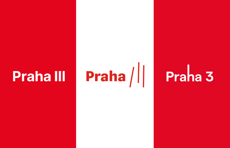
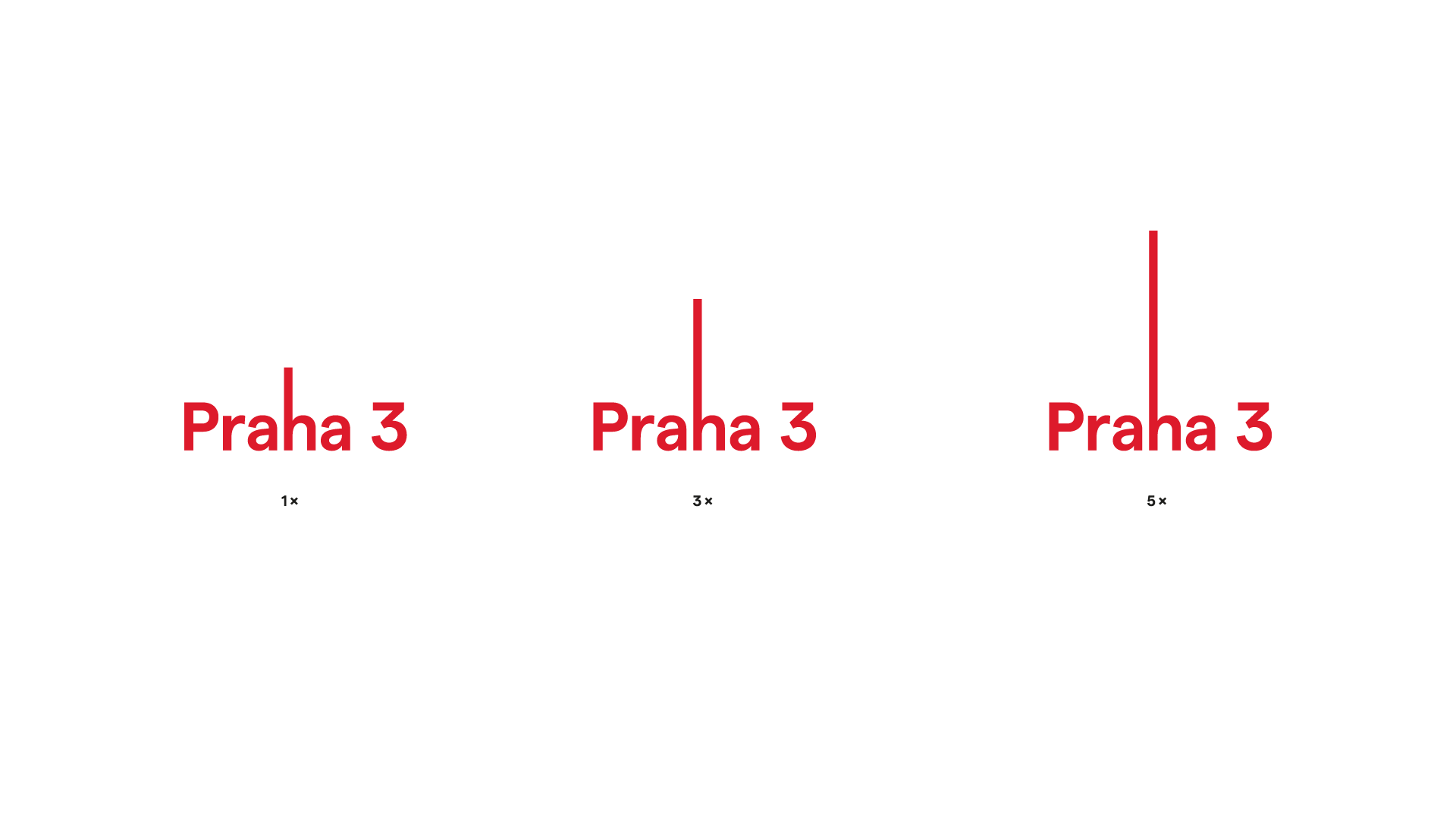
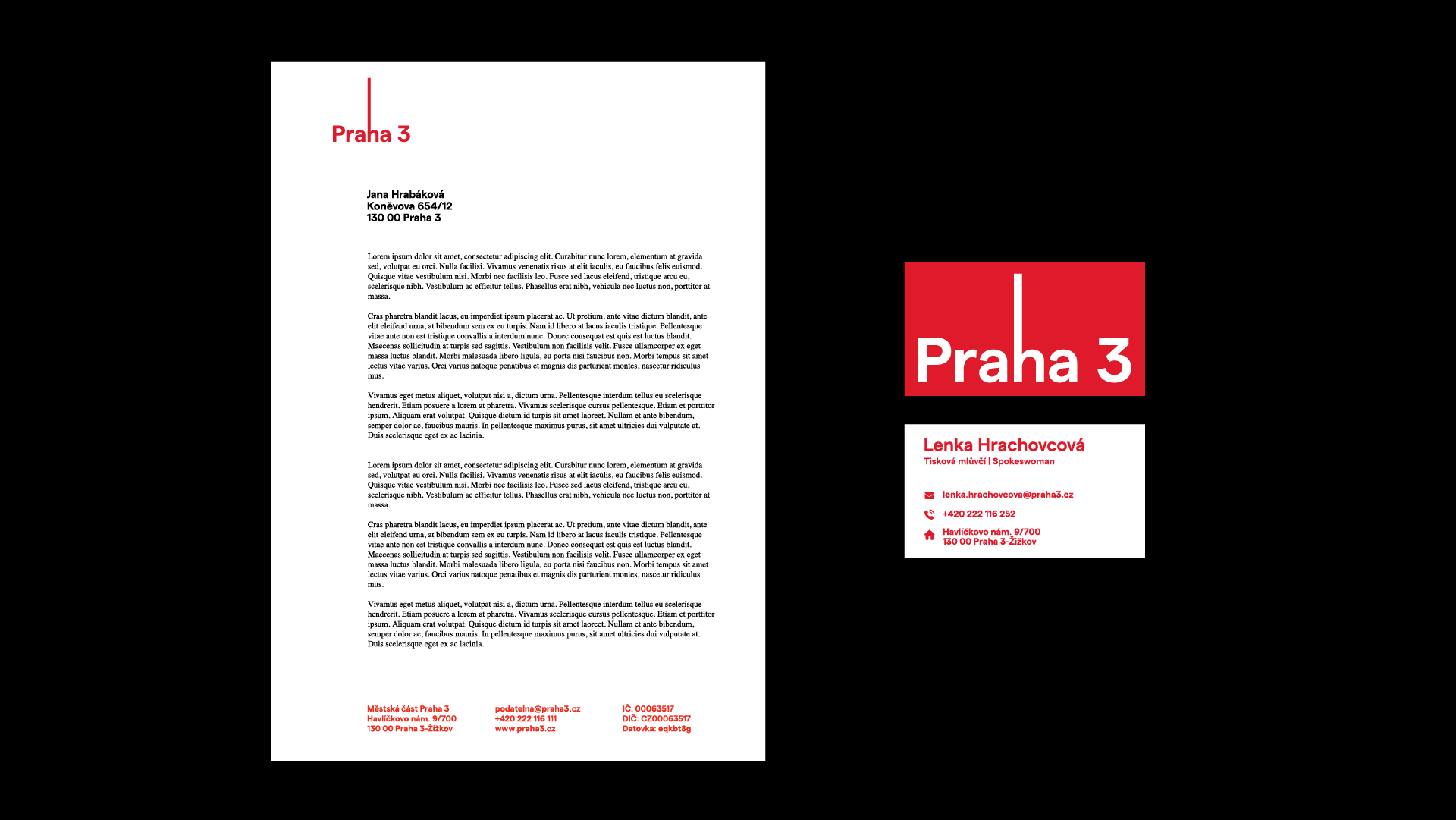
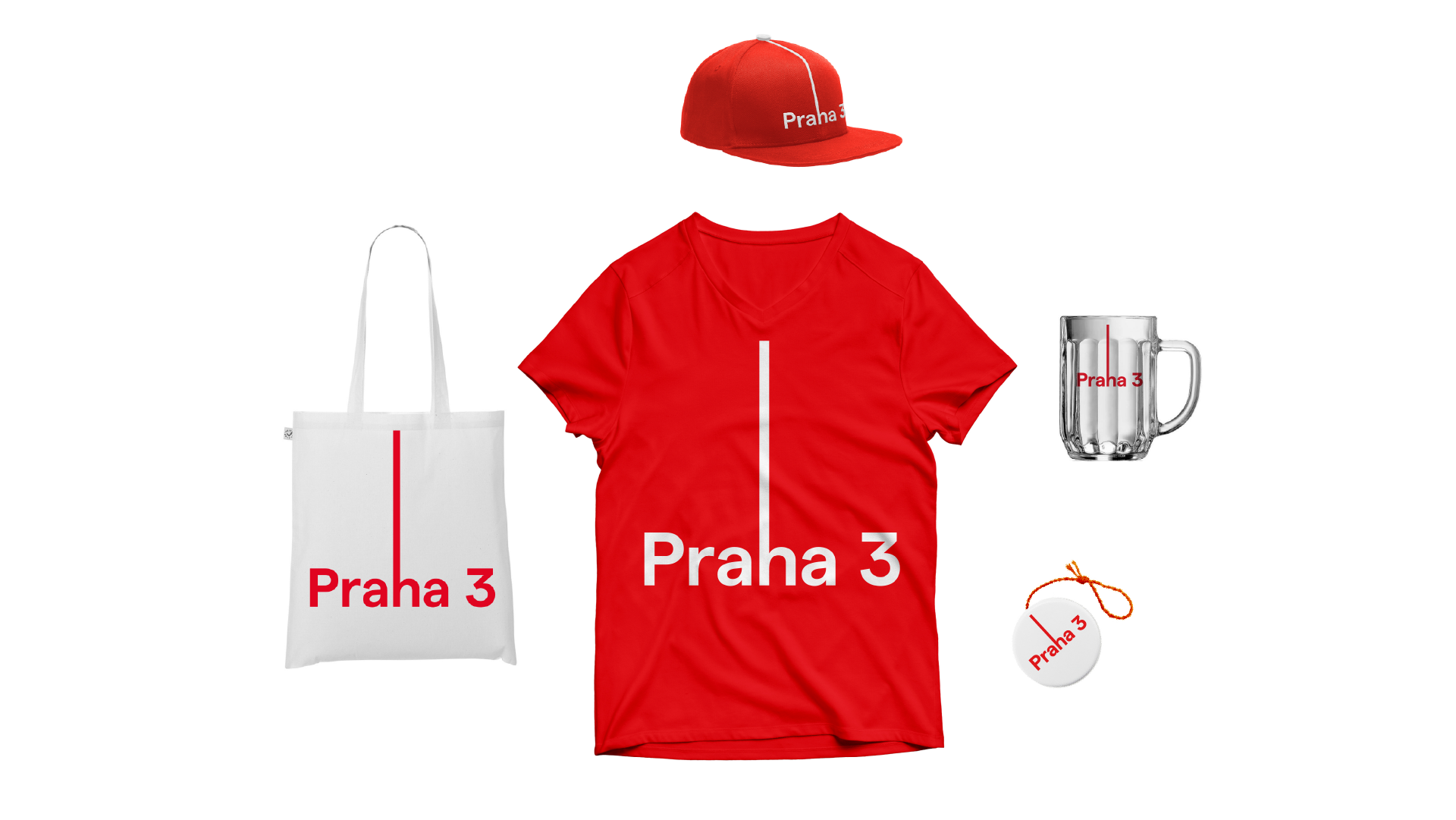
The team of Bros in Trikos achieved the third place on the competition. Michal Beneš and Nikola Ivanov, the graduate students of UMPRUM (the college of industrial arts – the ed.) drew inspiration from one of the iconic buildings of the district, the TV tower rising to the sky in Žižkov quarter: they lengthened the letter “h” in the Praha sign.
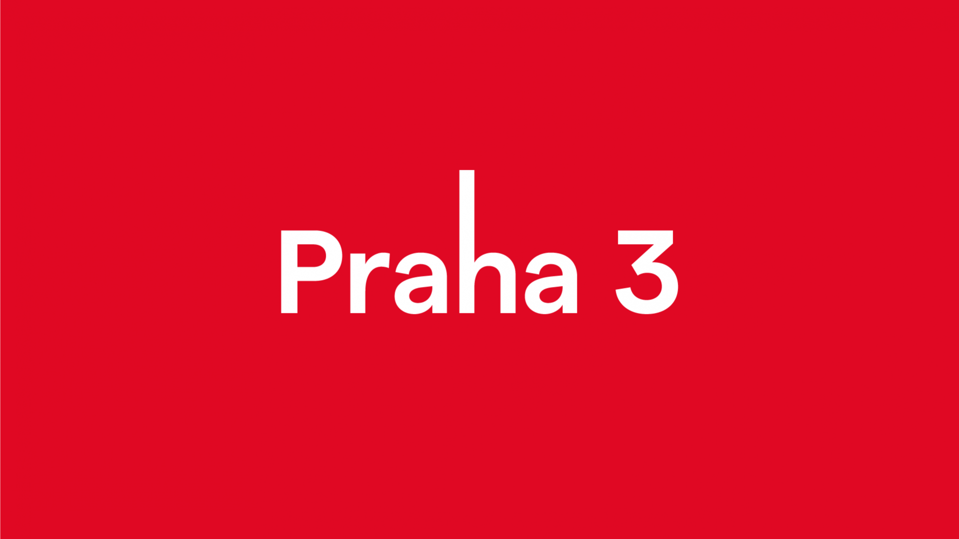
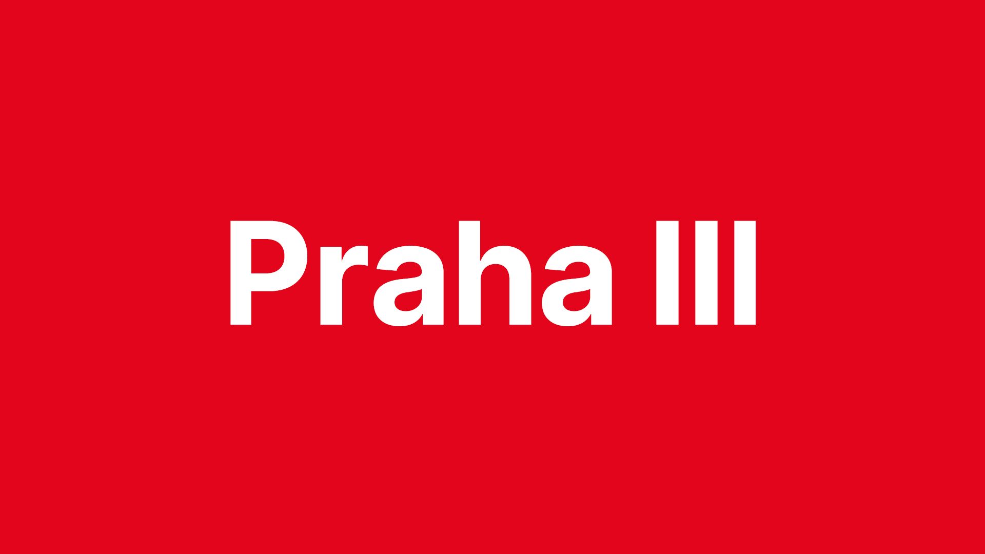
The second place winner of the tender was Martin Poláček, who designed a functional and adaptable logo for the district in the spirit of minimalism. Similarly to the work of Jakub Vaněk Studio, an adapted version of the number three is featured in the design, in the form of Roman numerals.
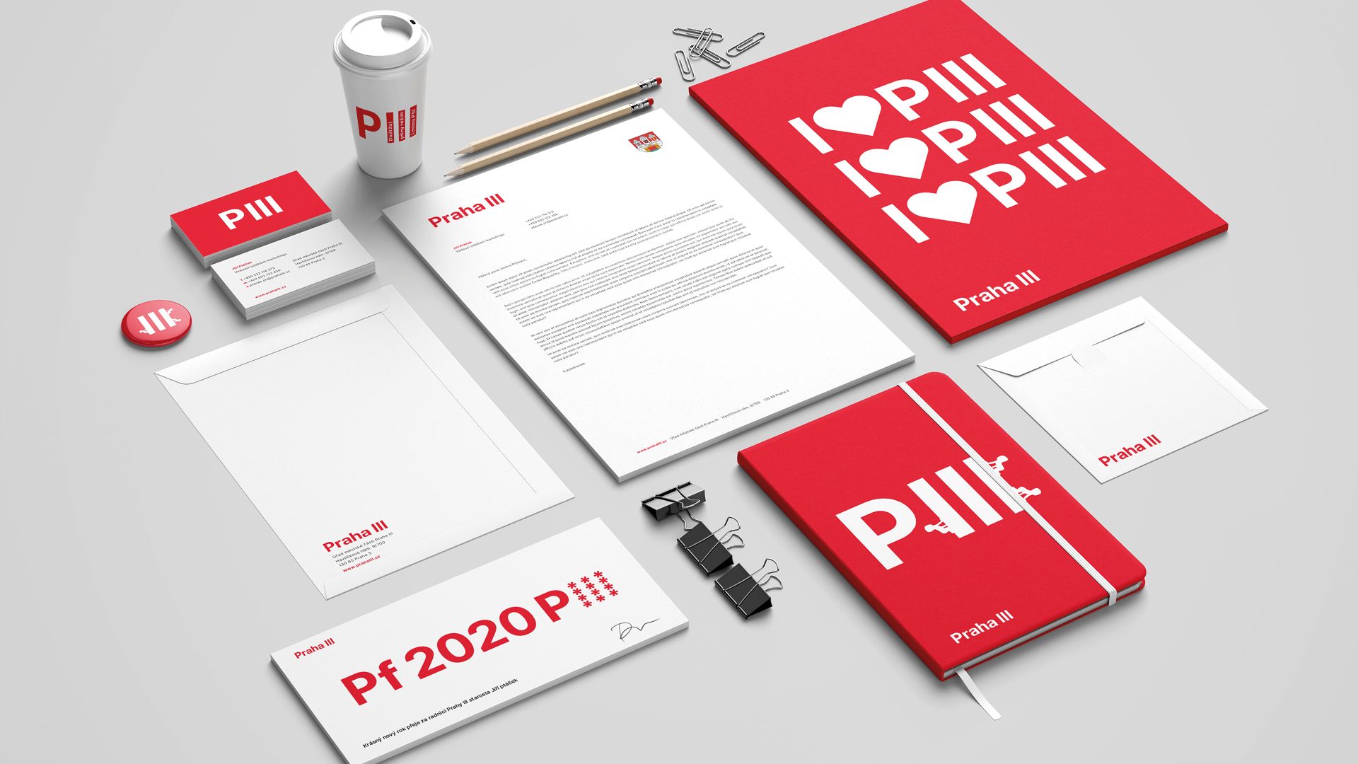
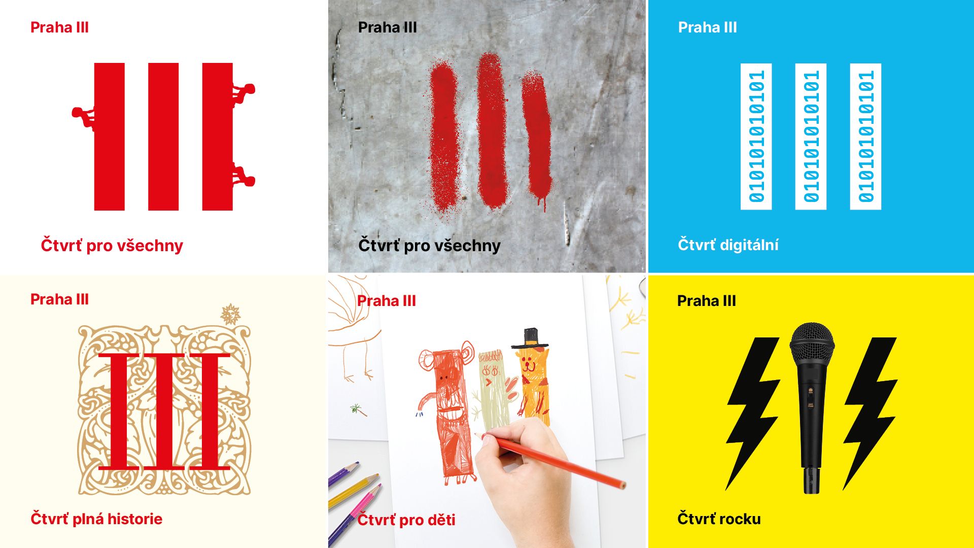
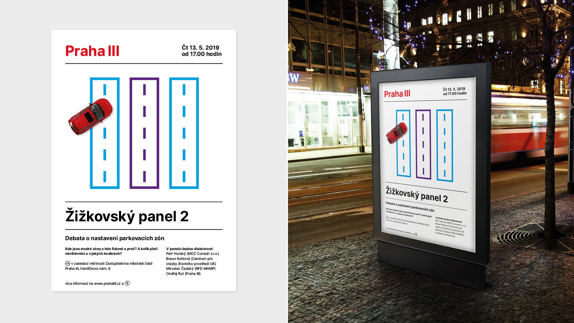
The designers of Jakub Vaněk Studio wanted to create a language that is easy to recognize and remember: this is how they came up with the three strikes, and they opted for the “Vegan” font to complement it. The nicely chosen red and green Pantone shades resemble the colors used in the coat of arms of the district. The use of strikes as a motif is particularly interesting because it makes us think of human mark-making: a mark that wanted to be perfect, but as it is drawn by a human hand, it will never be identical.
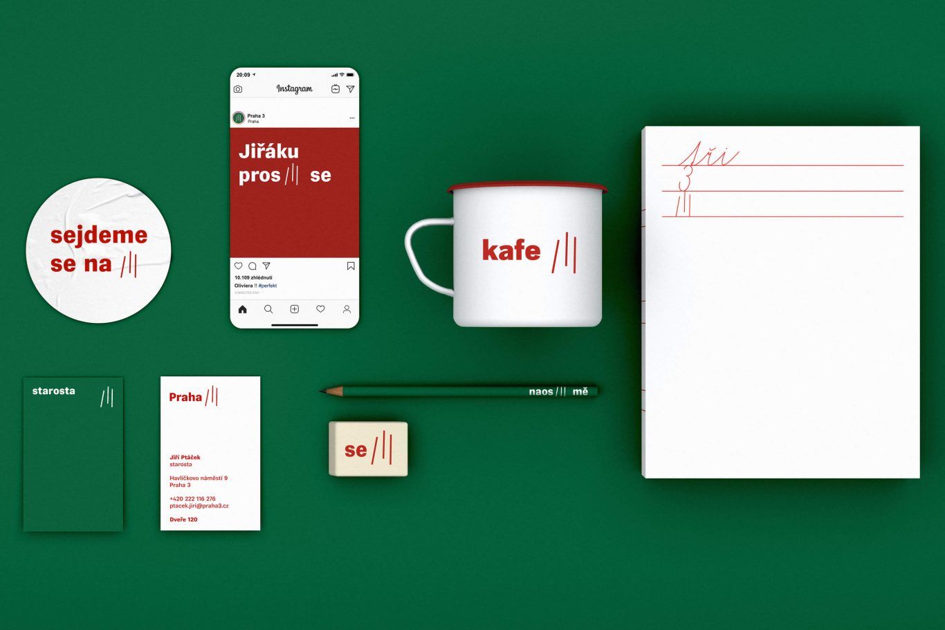
In line with the requirements of the tender, designers Jakub Vaněk and Barbora Micajova not only replaced the old logo to a new one, but they came up with a complex system that the habitants of the district will grew to like owing to its simplicity. Actually, the fact itself that a city, a district or a place has an independent image and visual style enhances the feeling of togetherness in people. The visual campaign amplifies that the city does not only comprise of streets and roads, but from places where one can feel at home. Go and check out the campaign video!
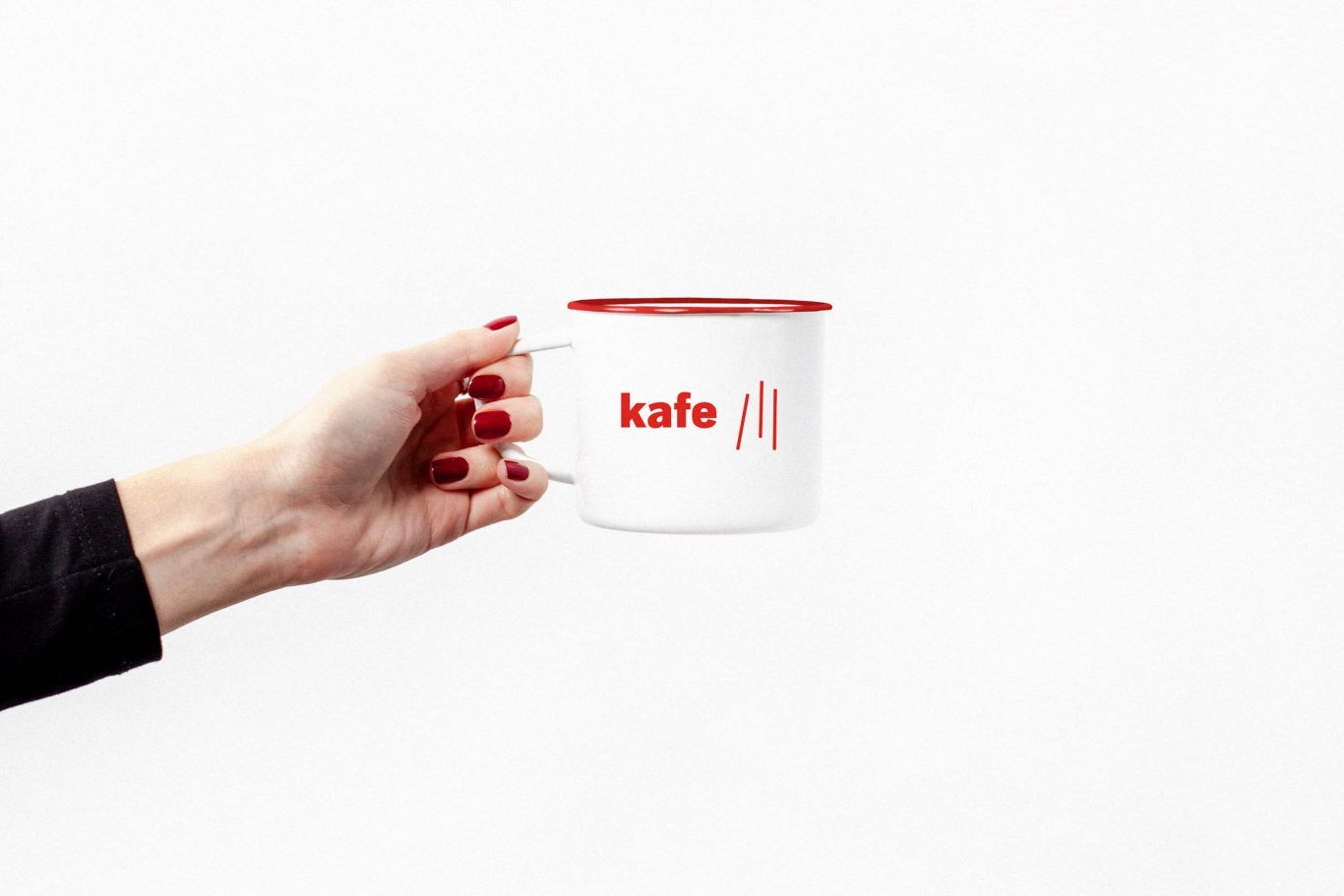
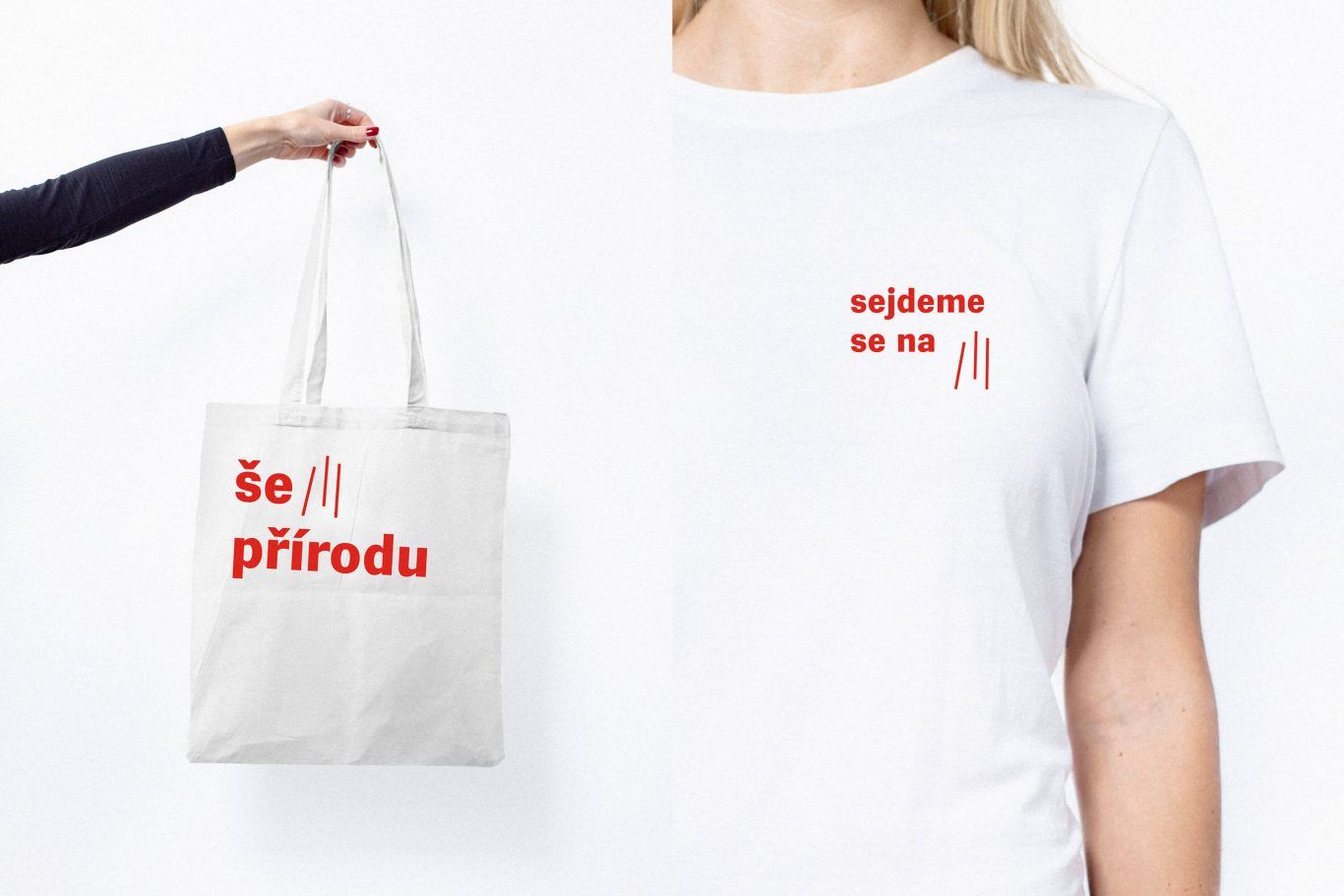
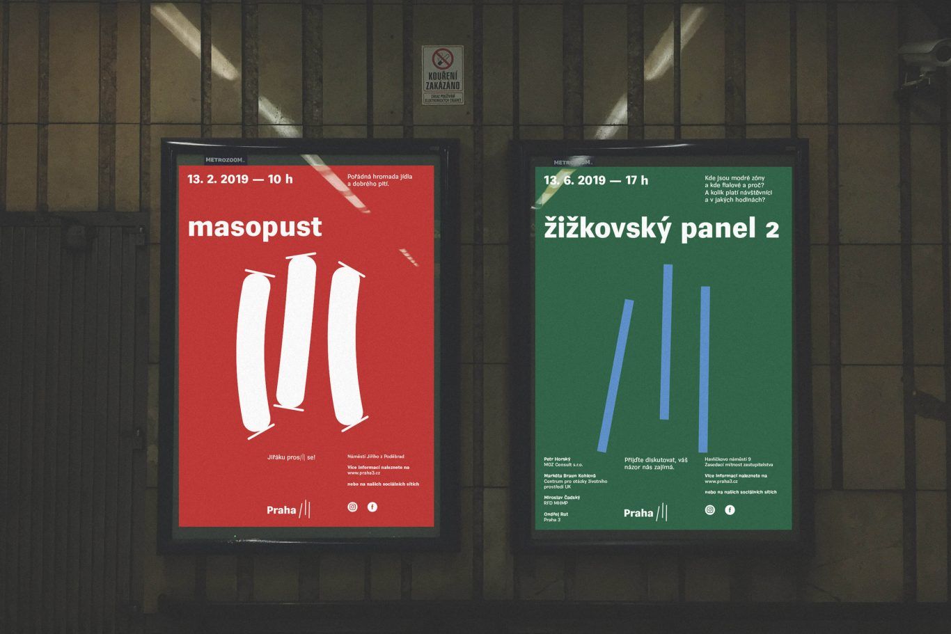
The image designed by Jakub Vaněk Studio is very minimal – at the same time, it also offers an endless possibility of variation. In spite of their static nature, the strikes can be formed flexibly, therefore, for example, they promote the city carnival named „Masopust” with a poster where they replaced the three strikes with three sausages („Masopust” is a little like busójárás in Hungary: they also say farewell to the cold winter, and prepare for the fast period at the same time – the ed.).
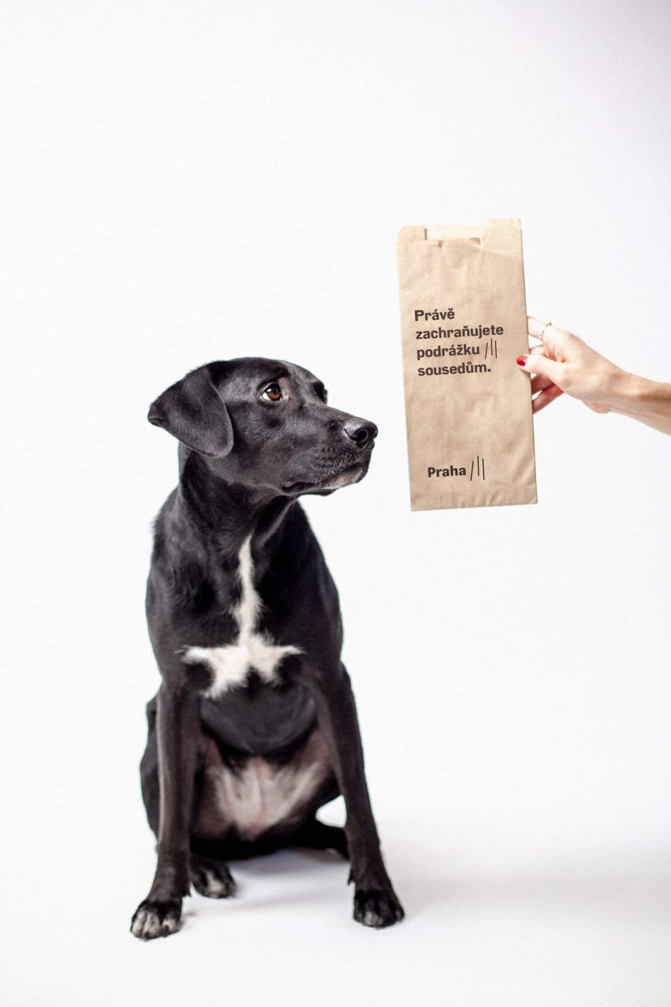
And finally, our personal favorite is the dog poop bag with a funny wording created for urban doggos, where the sign means something like this: ‘Protect the feet of your neighbors from accidents‘:
Transcendental floating and land art | The success of a Hungarian engineering firm in Vienna
House in the mountains | Poland
