See through the chaos: Frontira’s expert tells you what an ecosystem map is for and even how to make one! Read on for part seven of the series.
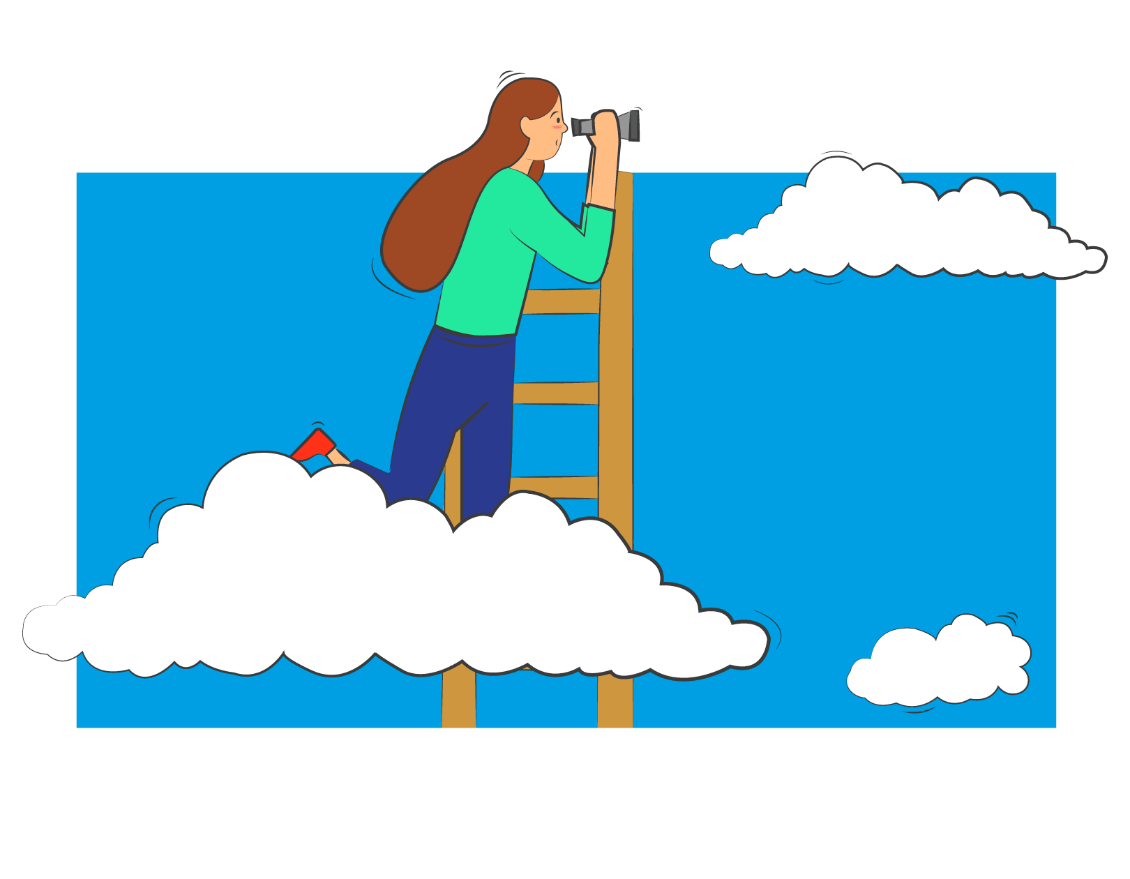
An ecosystem map is like a house we live in: we can never say it’s finished because we always change something. We repaint the boring walls, rearrange the furniture, or plant a new flower in the garden. In an ecosystem, the actors are also always on the move, with new ones coming in, old ones disappearing or transforming. We, ourselves, and the things surrounding us never exist as independent elements in the world but are part of a constantly moving and changing broader context that interacts with each other.
Think holistically, draw an ecosystem!

An ecosystem is an intertwining of people, systems, technologies and platforms, that, on the surface, may seem to be independent of each other, but once they get on a map, it becomes clear where they are connected.
At Frontira we have experienced how useful and challenging it is to reveal and map every element of such an ecosystem. The last time we turned to this tool was when we started to collect emerging trends in healthcare and the products and services that respond to them. The more innovations were put on the board, the more we could see that the different areas and actors were closely overlapping and that we could draw some kind of connection between them. In turn, this also revealed the missing links. In order to find our own place in the system, we had to shift from product-centered thinking to a holistic approach and focus on the bigger picture. In the case of healthcare, the bigger picture is gigantic. This is why we introduced a form of gigamap, the ecosystem map.
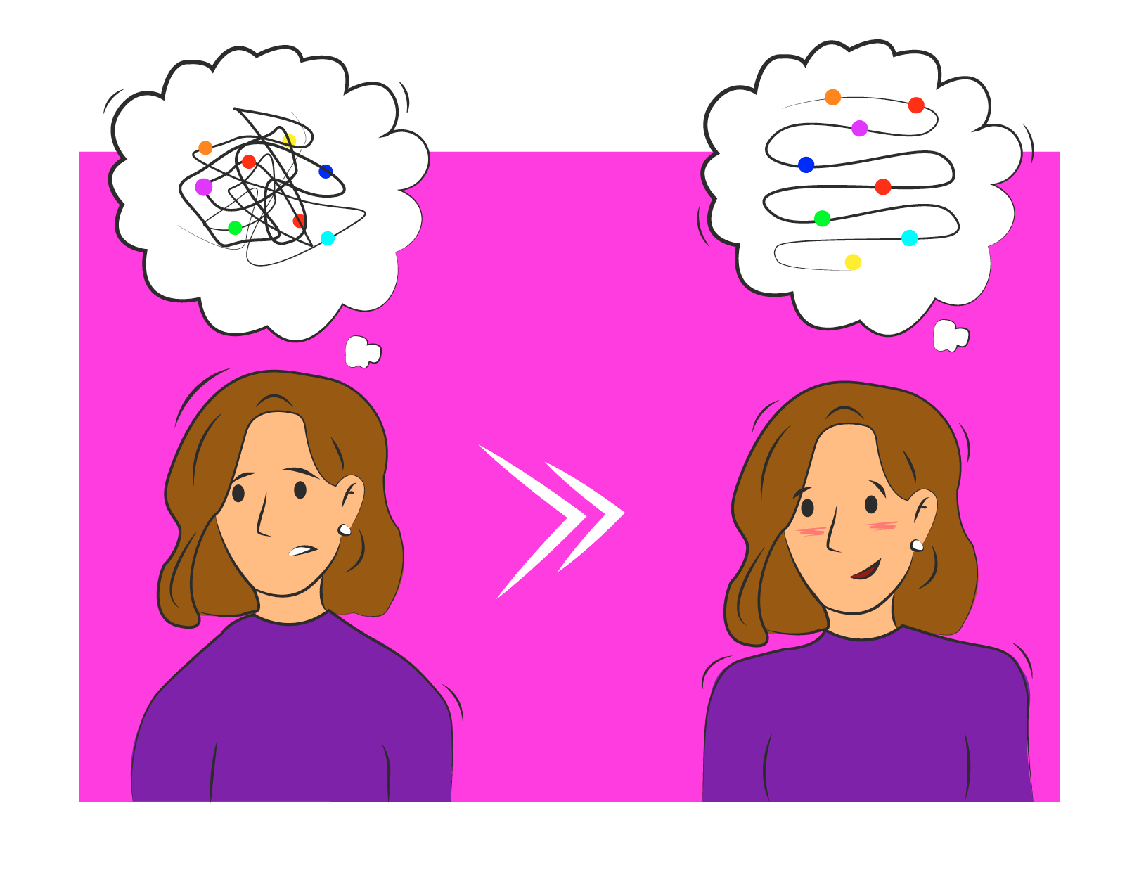
Why should you use this tool?
It reveals opportunities for innovation: an ecosystem map shows you what motivations, needs and pain points each actor has, including how they are in harmony or in conflict with each other. The biggest advantage of the tool is that we can foresee how changing one element will affect the others.
As the players on our map started to multiply, we saw where the innovation points in the system were, where the introduction of a new service or product could trigger significant improvement and tangible change to the patient journey in several areas at once. When we put adherence on the map, it became clear that this issue not only has a direct impact on patient’s lives but also has an immediate impact on pharmaceutical companies, pharmacies and health insurance companies, or even private healthcare, and solving this problem is, therefore, a fundamental interest for all stakeholders.
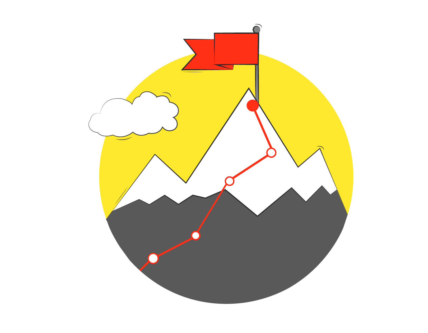
It helps to understand processes: we can trace the path of specific actors or elements through an ecosystem map or even sketch the possible route for a new product or service. If we are launching a new medicine or patient support device, for example, we can use the map to simulate the risks and opportunities for optimization.
How to get started?
1. Define the objective: before you do anything, find answers to the two questions: why are you drawing the map and who are you addressing? You will save a lot of energy and time when drawing if you know the answer to whether you want to create a throwaway or a permanent map. Are you aiming it just to help your own team understand it, or would you like to show it to other industry players? By doing this, you’ve already gone through the most difficult step of the process.
2. Get a lot of post-its and a whiteboard: start writing down all the actors, institutions, organizations, groups that have an impact on the ecosystem. If you offer a service or a product, put the customer at the center. We first put the patient in the center of our health ecosystem map, then all other locations and actors.
3. Do your research: identify as many actors, entities as possible who may be involved in the system. It is best to vary the sources: do desk research on the topic, then use the knowledge gathered to find stakeholders, who are directly involved in the system, and others who are only indirectly involved but can add a different perspective. In our research, we talked not only with doctors and pharmacists but also to healthcare consultancies, investors, and start-ups.
4. Draw the connections and their direction: There can be several types of connections between actors, such as exchanging information, money, interests. You can visually mark these with lines of different colors and thicknesses.

5. Step back and look at the chaos: Notice where the interesting connections are and where there are white spots and missing arrows. You can mark the pain points and insights that are clearly visible. You can make things easier by working on a virtual board or using an erasable marker, as the details of the map will change as you get new information. We used the Miro board for this purpose.
6. Validate: find people who can see through the system and help you fill in any missing or questionable areas. For the first version of our map, we thought it important to ask for feedback from health professionals. This helped us better understand the type or direction of the relationship between the actors.
Keep the goal in mind
The biggest lesson for us in the process was that it is not the map itself that is most important, but knowing what you want to do with it. Many fruitless discussions about how to present the map to external actors made us realize that it is difficult for us because the map is primarily designed for our understanding. But what is valuable to our understanding may not be valuable to others.

Our map aims to show healthcare actors how patients’ needs and pain affect the system as a whole and how the system affects patients. To do this, we shouldn’t strive to pile all existing knowledge onto one picture, as we will never know more than the industry players. We can provide a pair of glasses to help people see the familiar terrain from a different perspective.
We design our house, but we also want our guests to feel comfortable in it and see what is important to us. But they will only see the big picture of what we want them to see, not the effort behind it, not the misplaced nail in the wall. We, however, have already learned how to hit it next time.
Author: Nóra Lenner | Researcher | Frontira
Frontira | Web | Facebook | Instagram

In our monthly series, we explore the various fields of design with the help of Frontira to understand the role of design beyond industrial design. What role does design play in building up human behavioral patterns? How can a service be a good experience and what digital product design toolset do we need for it? Calling itself the “company of strange problems,” Frontira answers questions like this, in an exciting manner and comprehensible form.
Cyberspace in the physical space

Safety and determination—the new timeless collection of the Manuela brand
