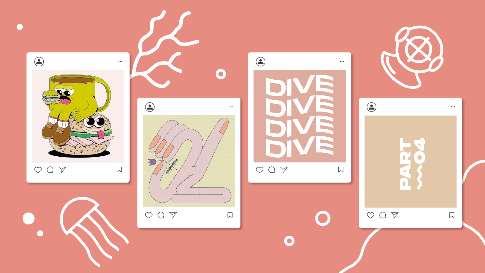
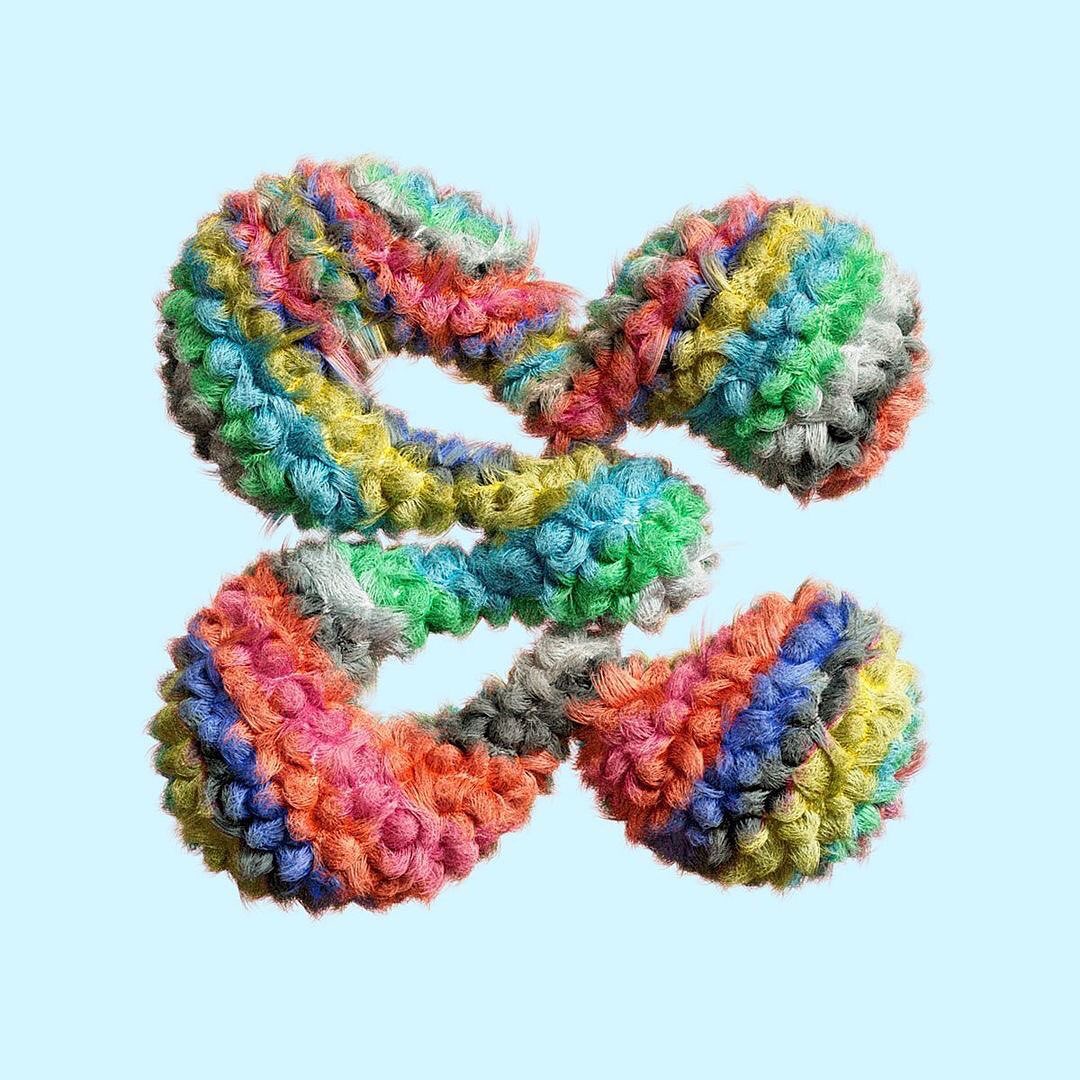
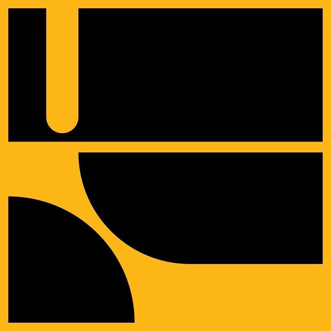
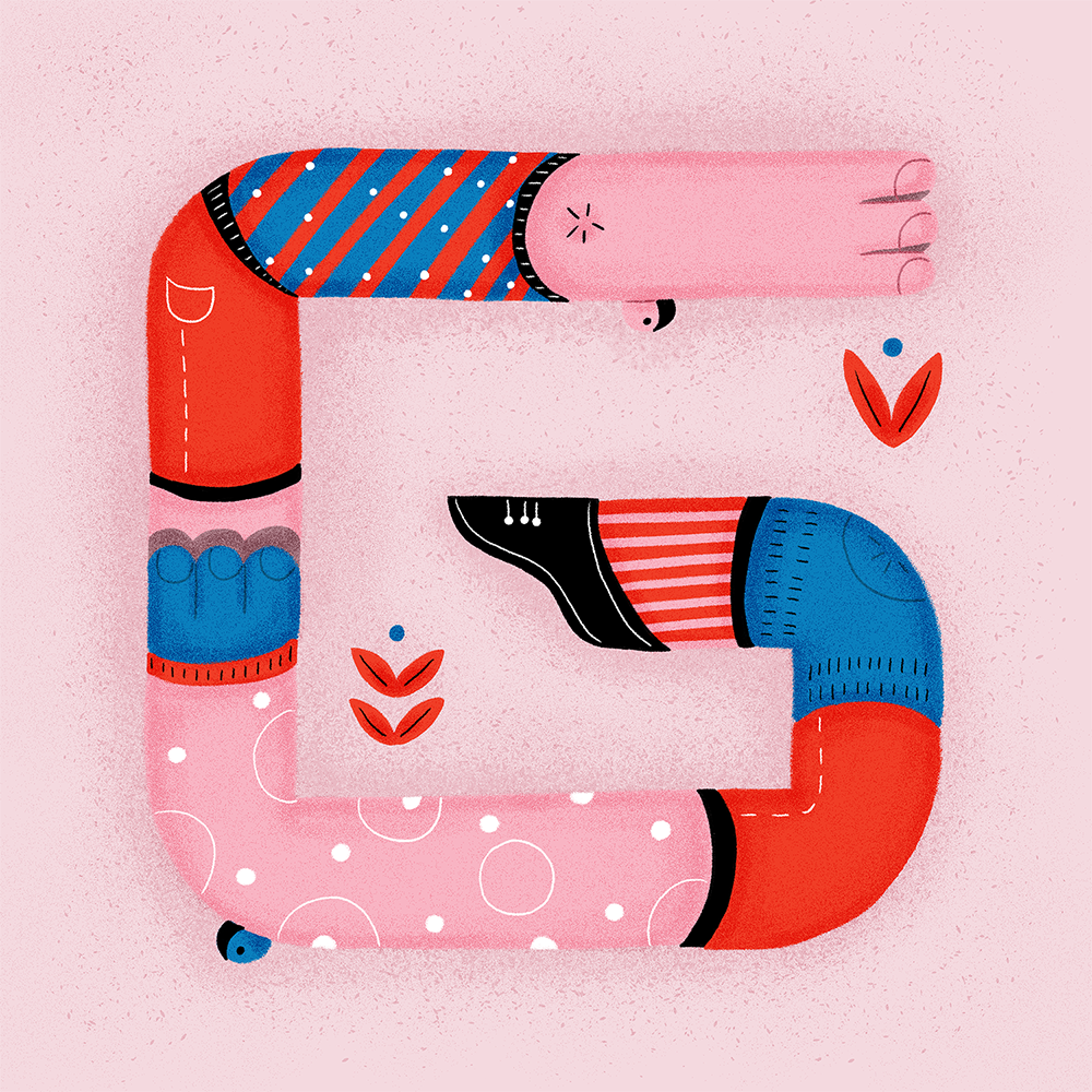
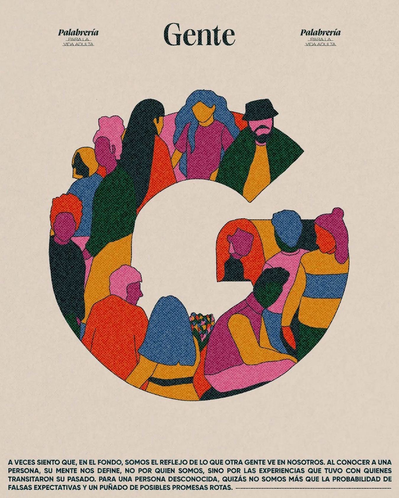
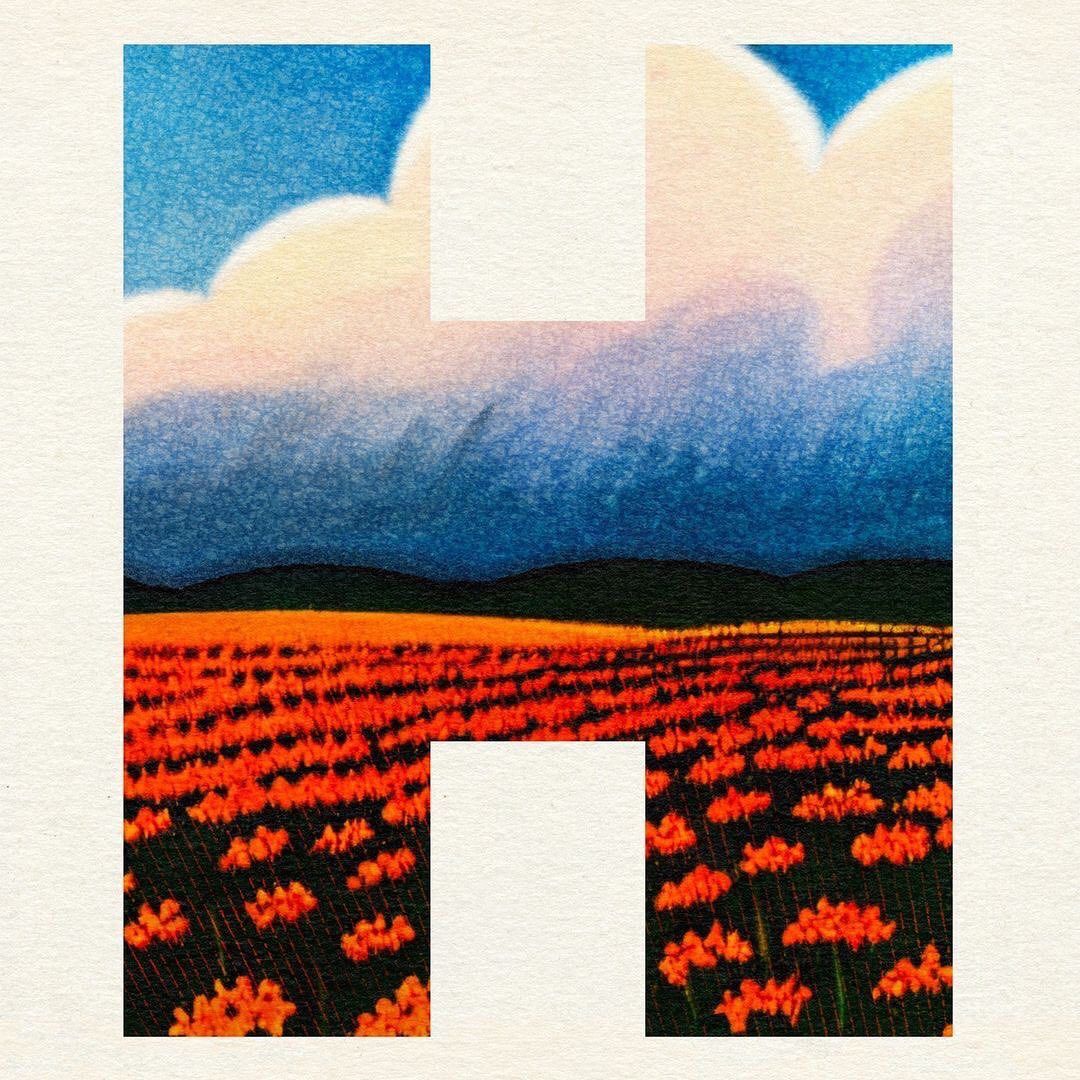
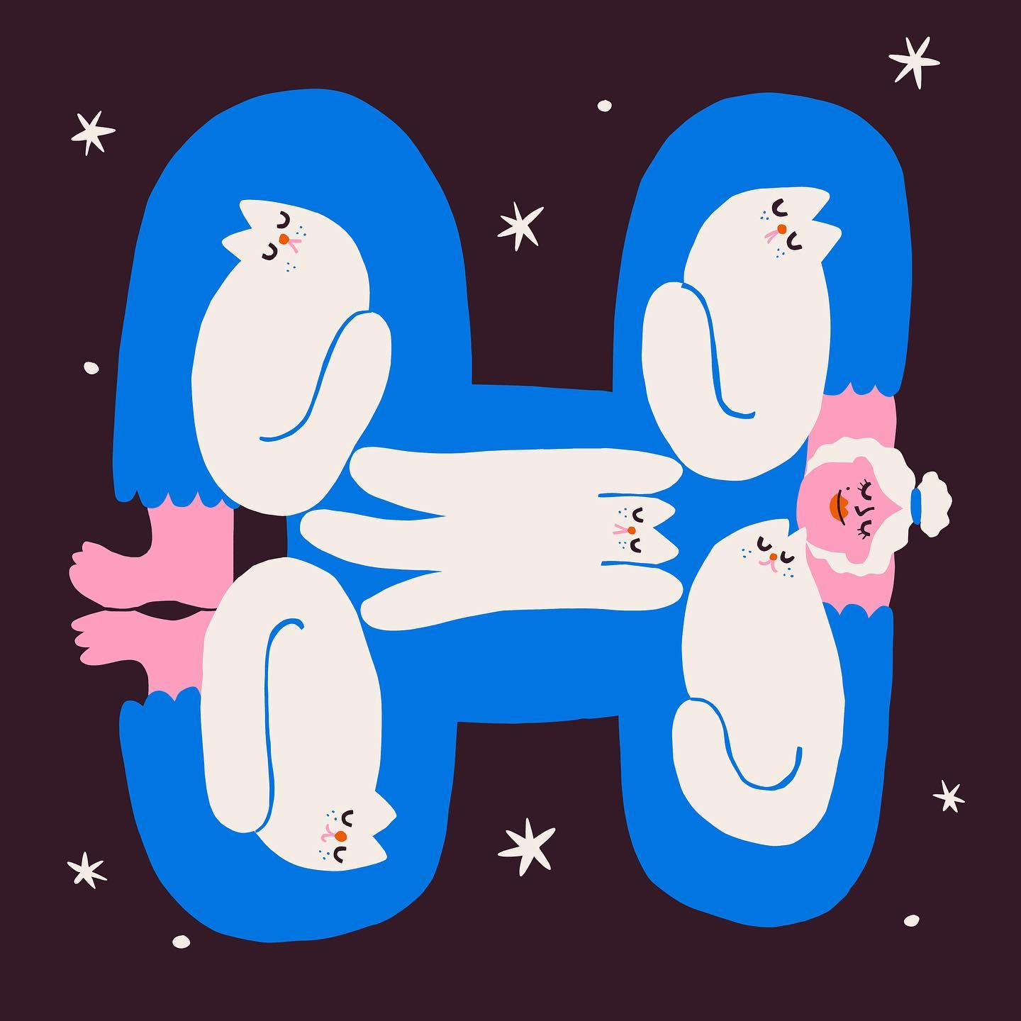
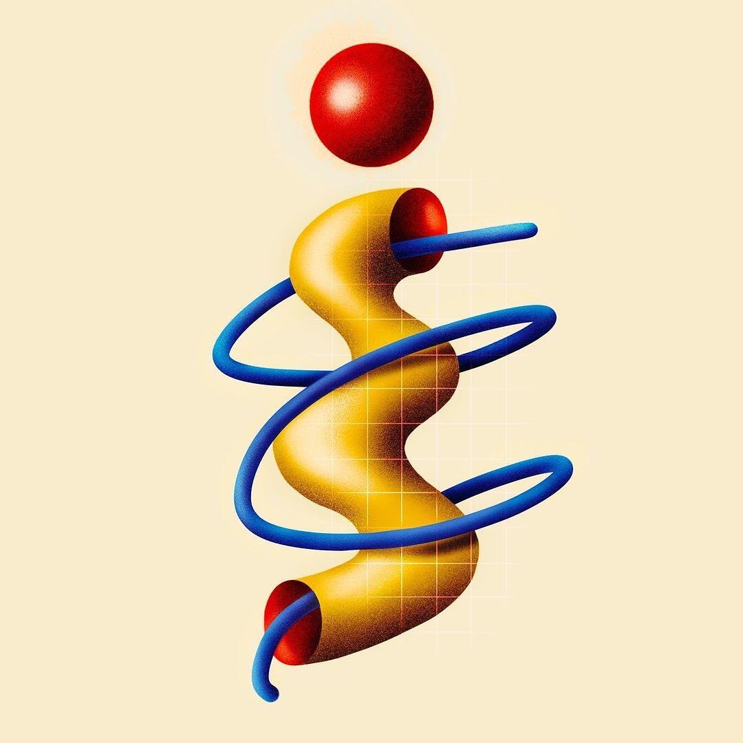
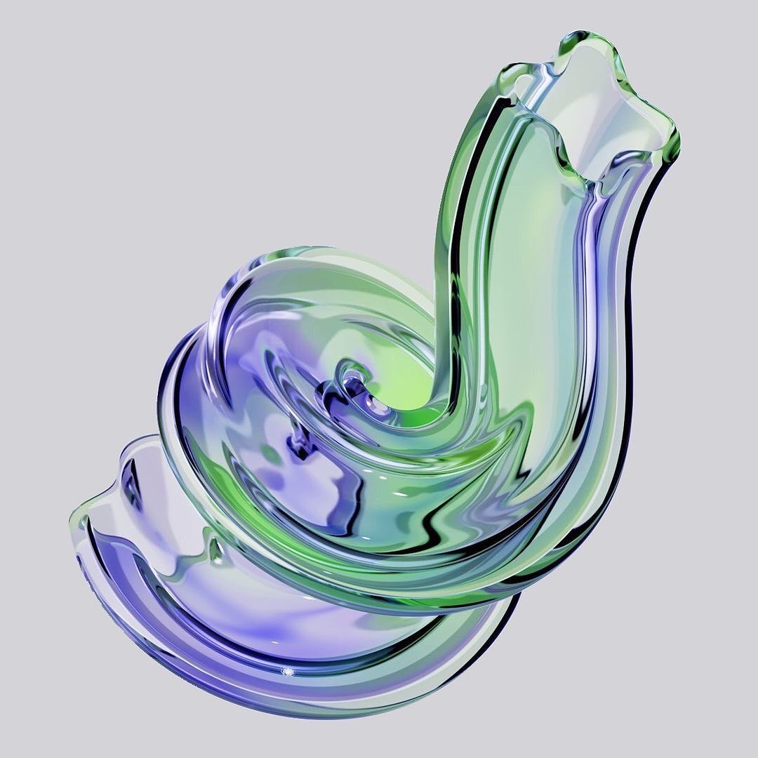
On 10 April, the 36 Days of Type initiative was launched again, with a new letter every day and artists from around the world attempting to reinterpret the alphabet. In the latest episode of our DIVE series, we invite you to dive in again. Dive in!
In our bi-weekly DIVE series, we descend into the murky waters of Instagram and bring you some of the accounts worth following.
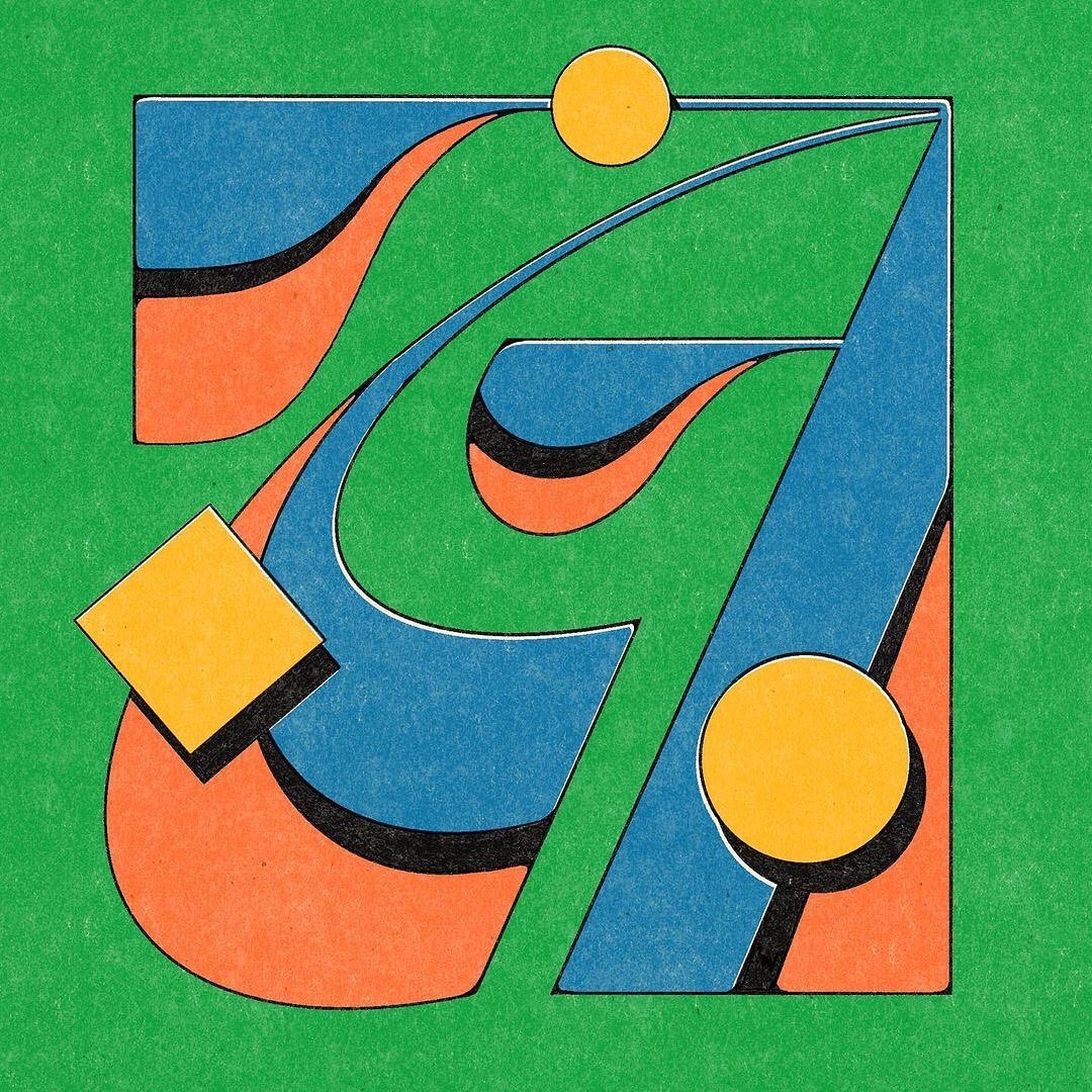
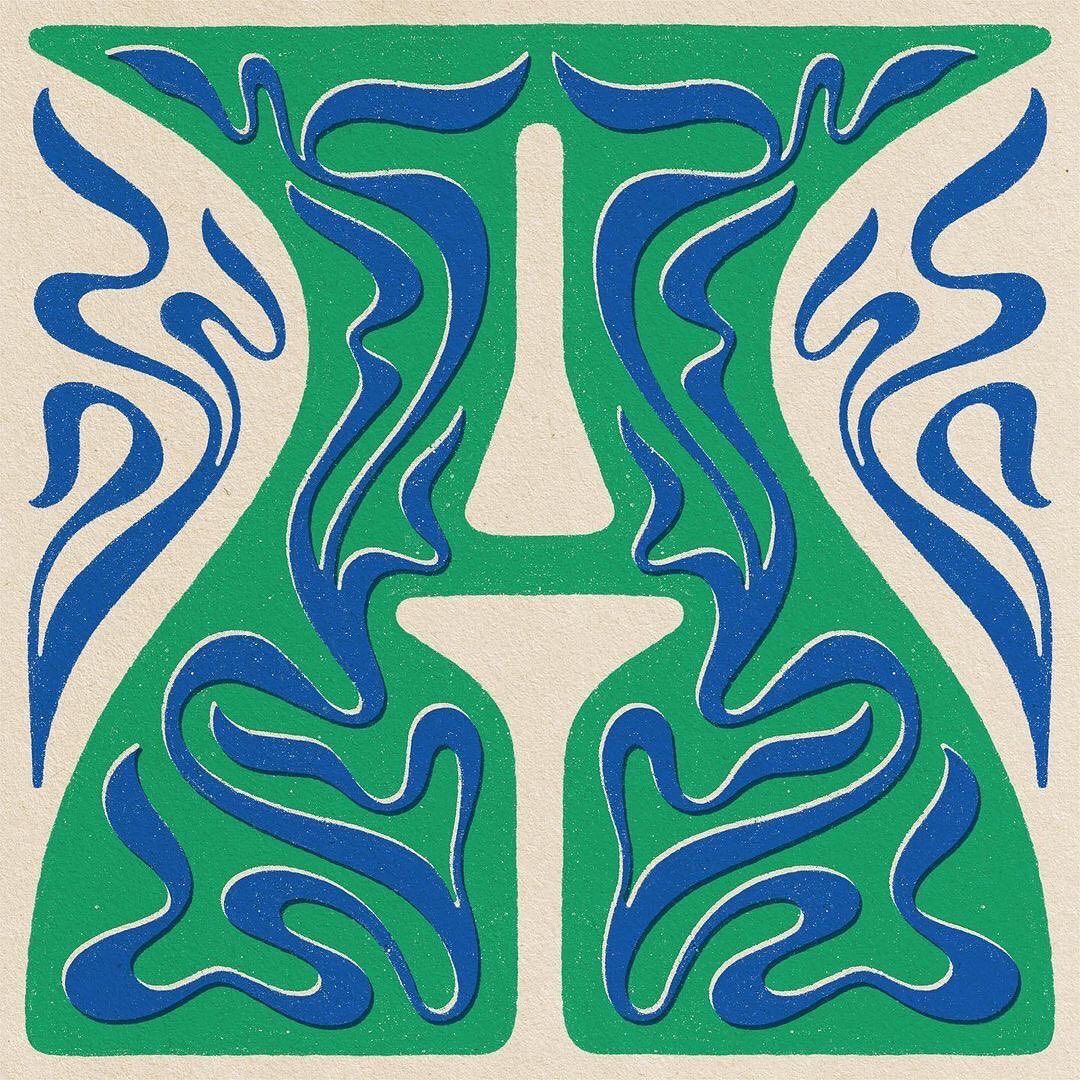
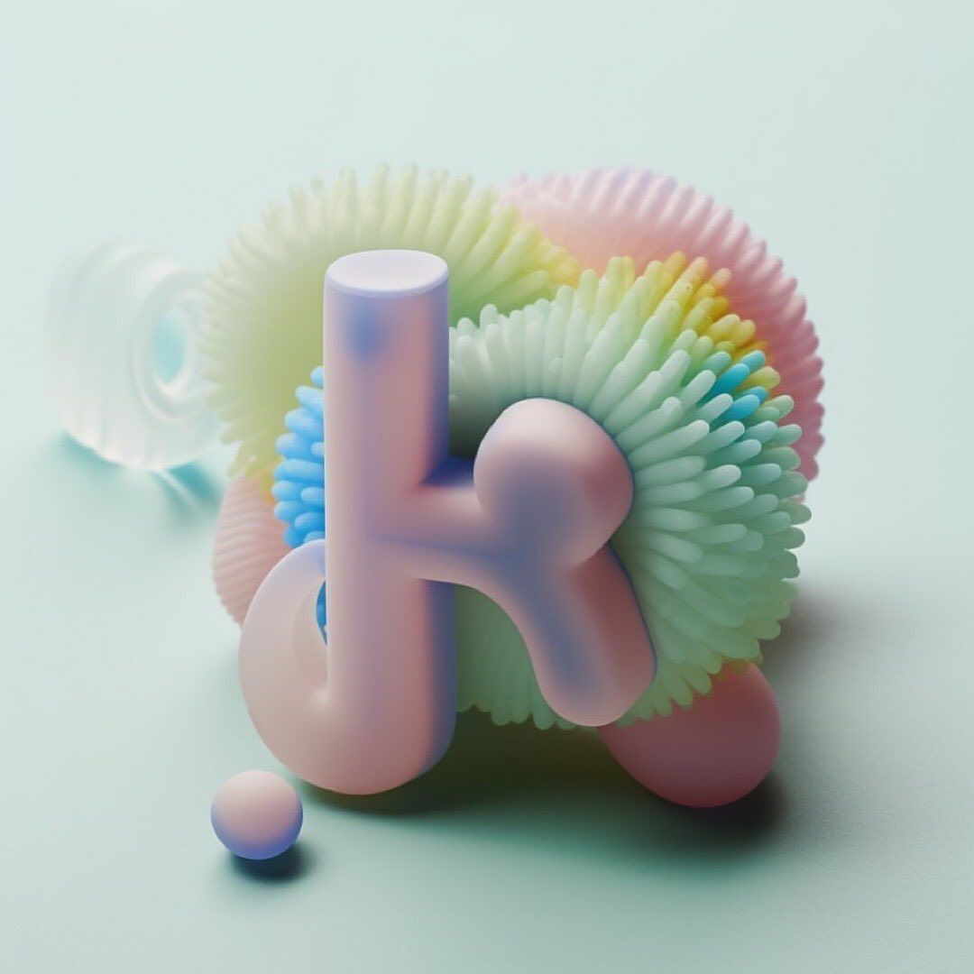
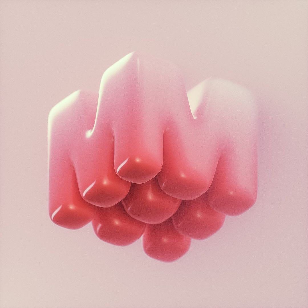
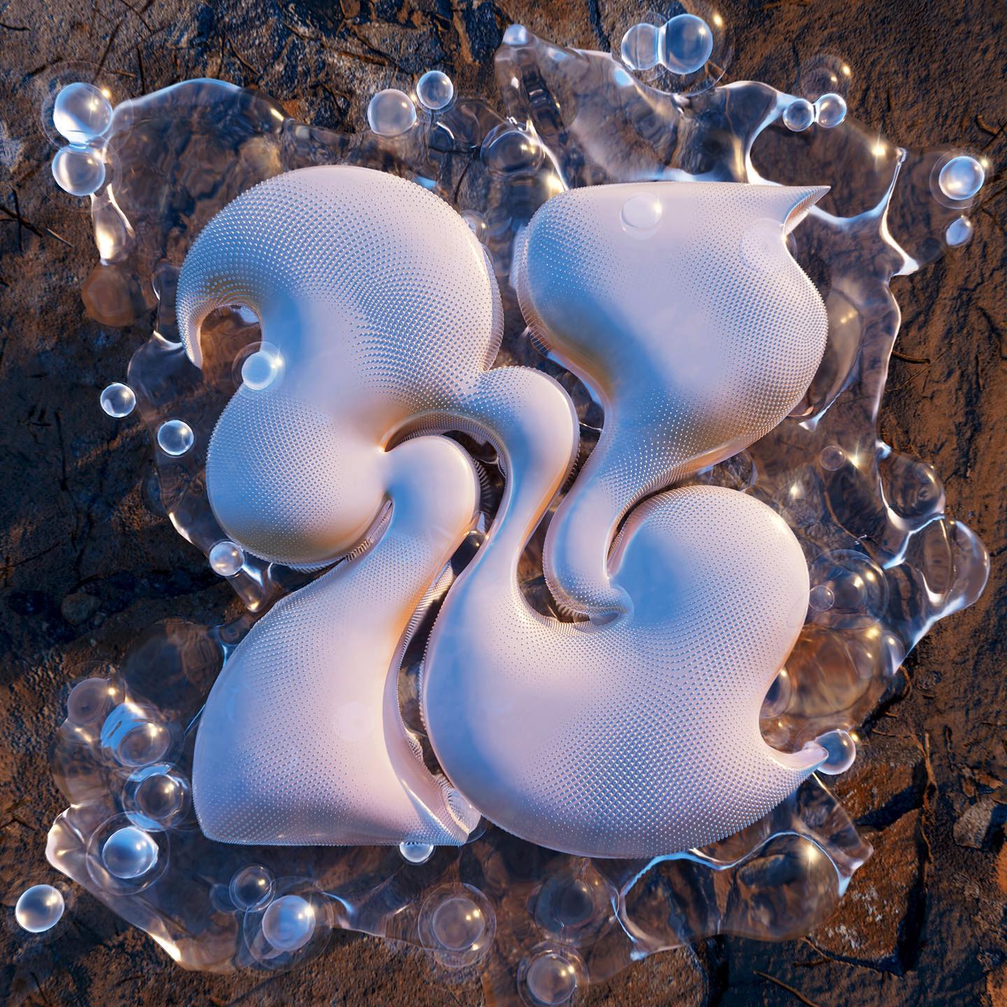
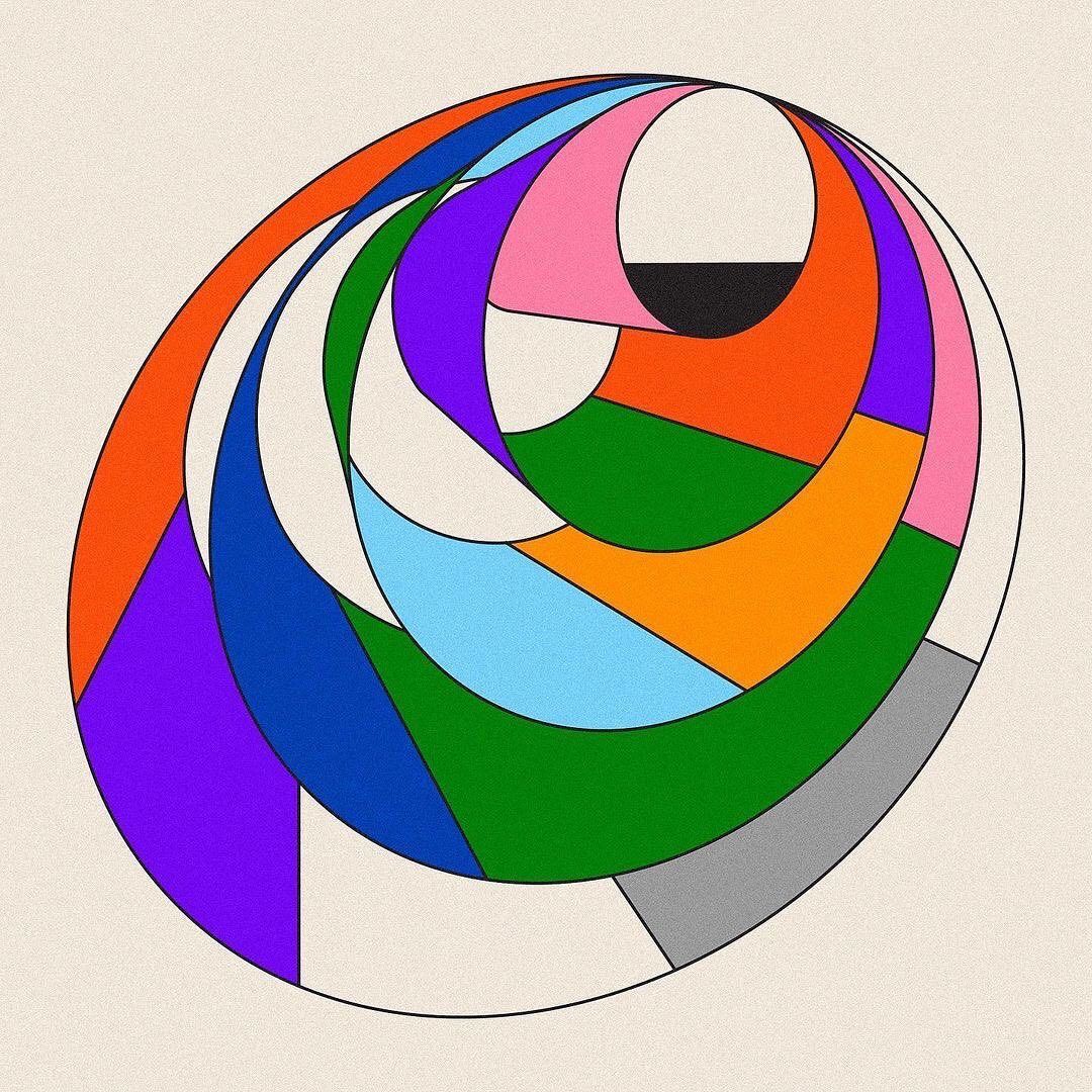
Every year since 2014, typography lovers have been on pins and needles for the 36 Days of Types graphic design bash to begin between February and April. For thirty-six days, works from all over the world will be presented, all paying homage to the tradition of typography.
The initiative, which has now grown into a movement, was first launched as a solo project by graphic designers Nina Sans and Goicoechea. They wanted to motivate themselves to create and experiment with new things every day for over a month. Nine years later, they inspire hundreds of artists every year to do the same.
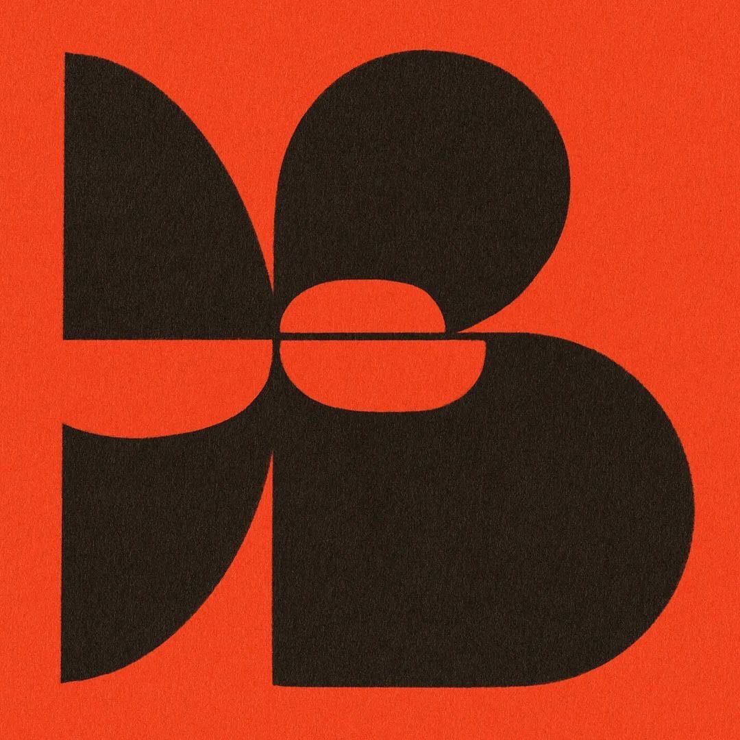
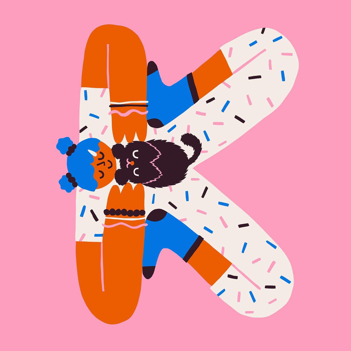
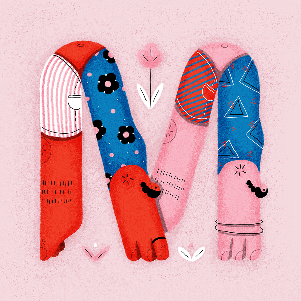
Hungarian graphic designer Barbara Katona is also taking part in this year’s project. She believes it’s fantastic that such a program exists because artists can finally express their creativity without constraints, as the graphic design profession can often feel very monotonous and restrictive.
“On the other hand, it’s a great exercise to consistently carry a project through, staying as close to the style as possible. In the end, when we put these pieces together, the whole visual concept becomes coherent,” Barbara explains.
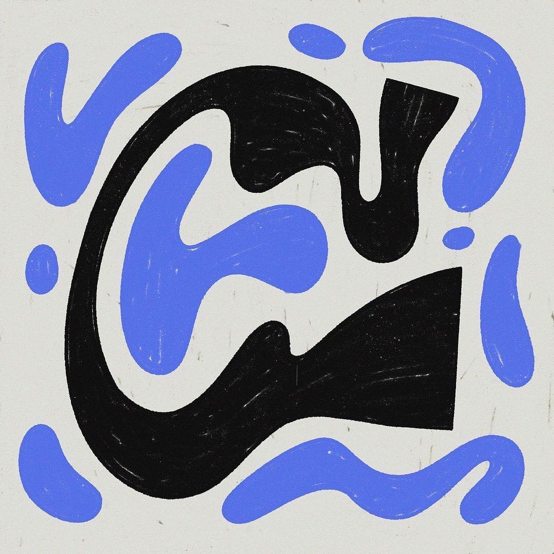
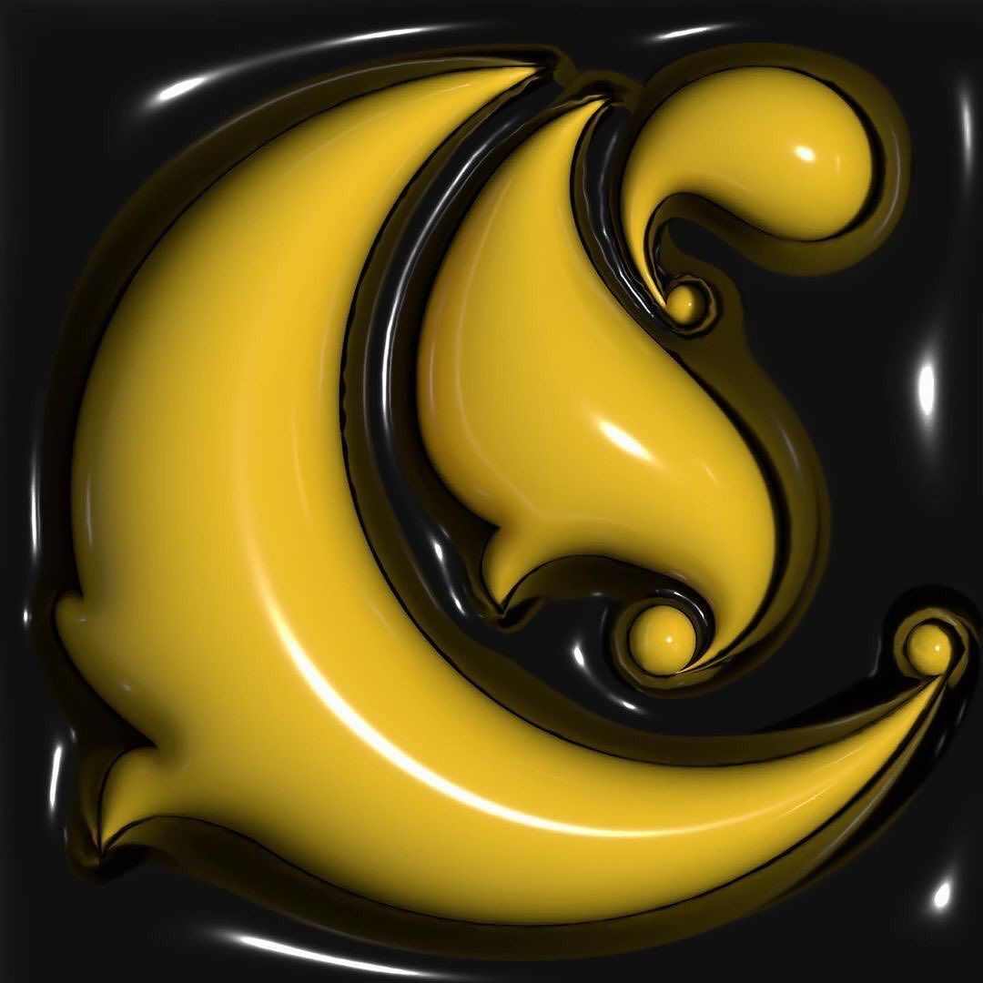
But it’s easy to lose sight of what surrounds us every day, which is why it’s crucial to get out the letters and study them every year. If we take the time to look at the feelings, moods, and associations we have with them, we can create beautiful things.
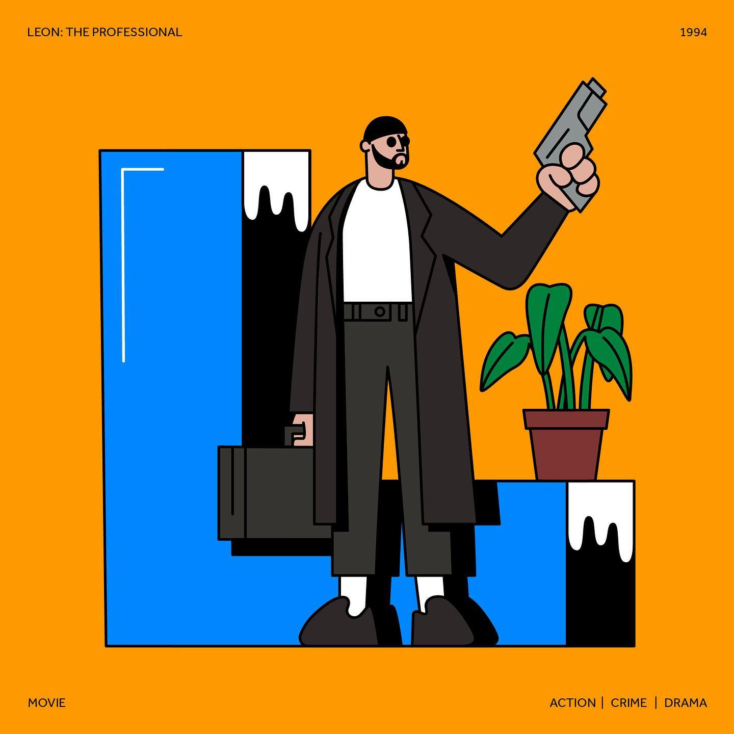
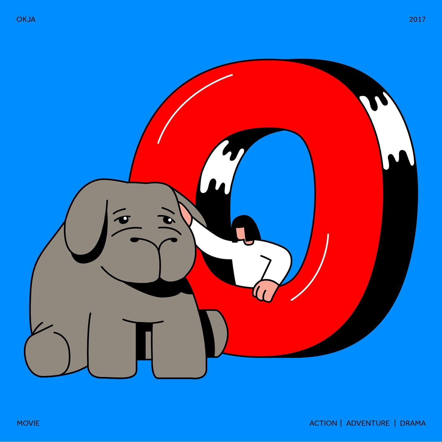
For example, Serbian graphic designer Danilo Trbojevic—see letter L—has associated each letter with a famous film. For instance, for the letter L, he chose Léon: The Professional, and for the K he chose Kill Bill.
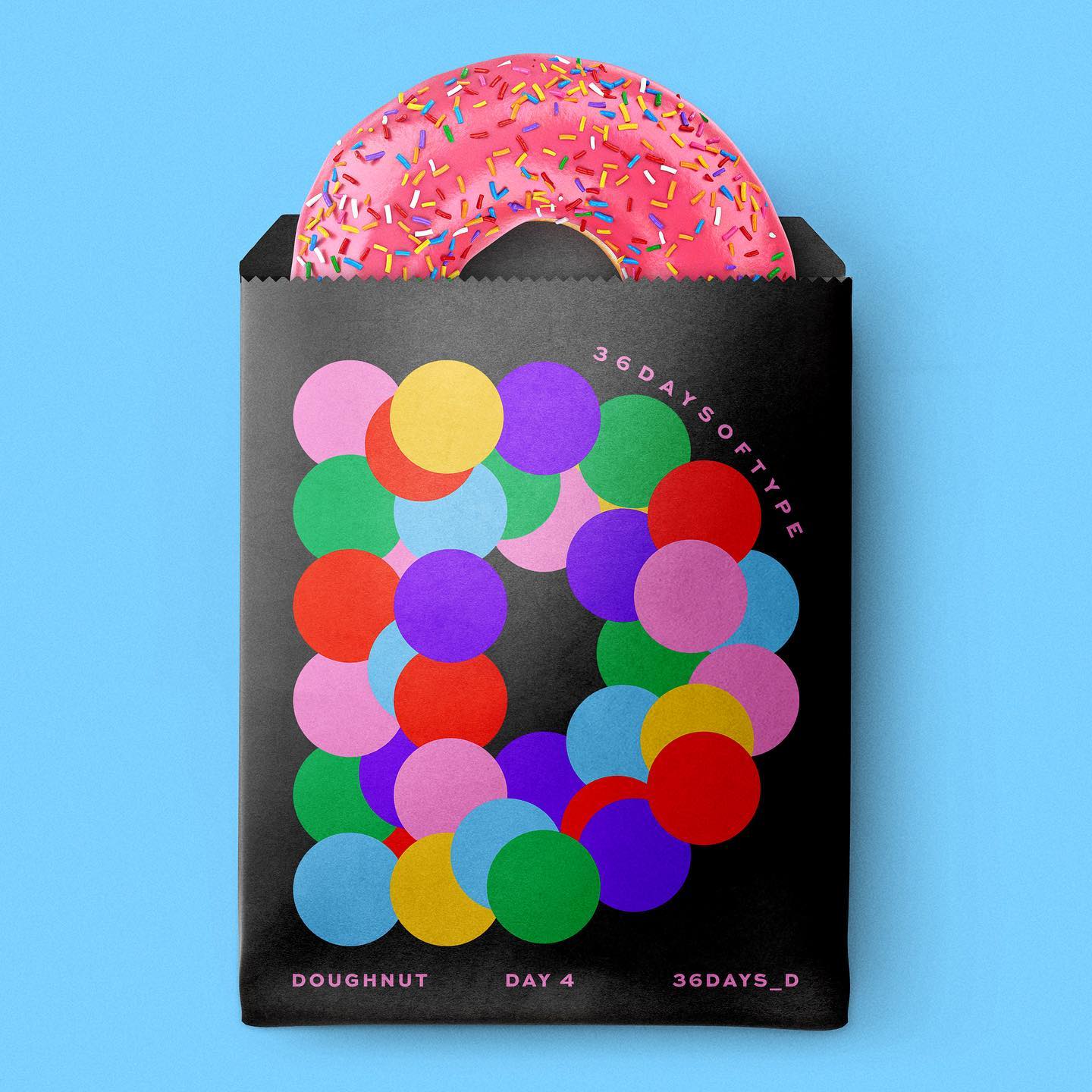
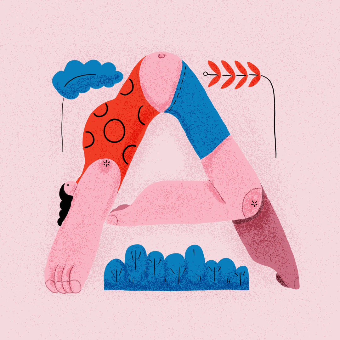
Barbara’s favorite letter among her works is A—see the beginning of the article—because she created it years ago, but didn’t have the guts to start the project then. This year, however, she thought she had to finish it. Each letter in her concept represents an androgynous character, with a mixture of masculine and feminine features. “I wanted to express that everything is fluid, everything can be anything and nothing at the same time. Everyone can apply whatever character traits they want to these illustrations,” Barbara explained.
This attitude is in fact an analogy that can be applied to the whole project: the graphic designers have complete freedom in their creations, everyone can give the letters whatever characteristics they want.
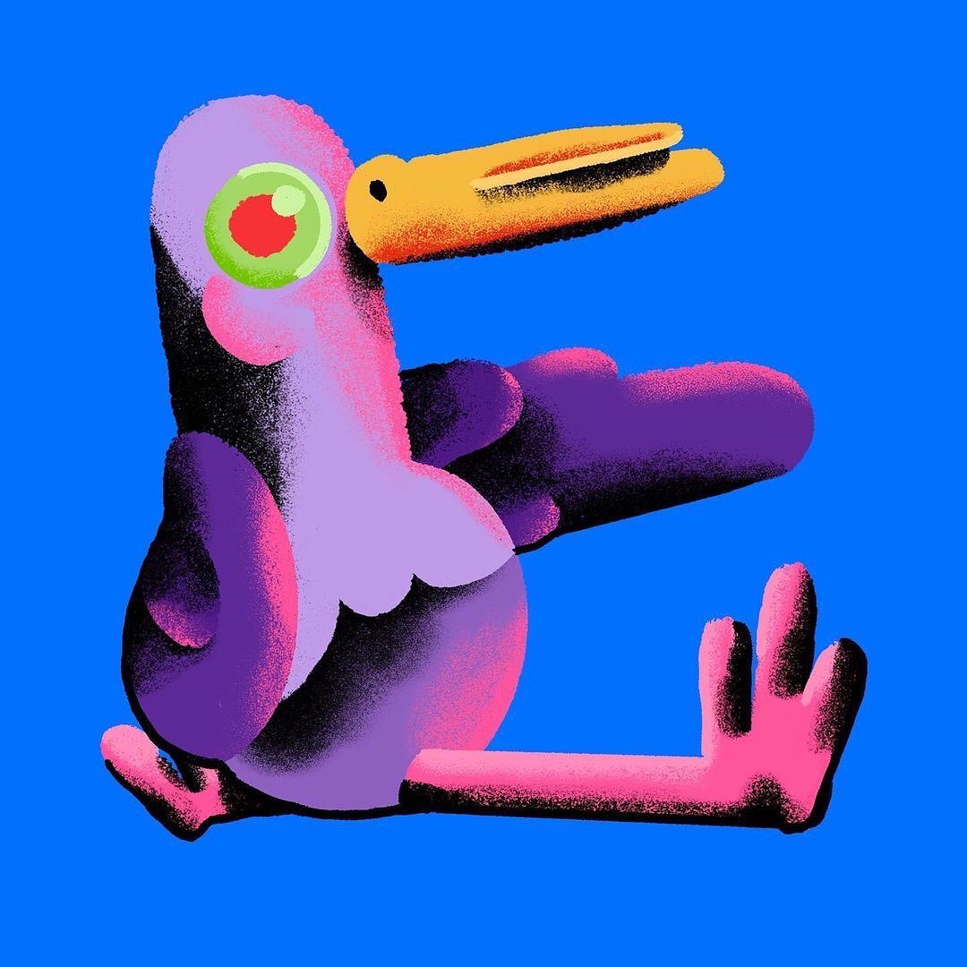
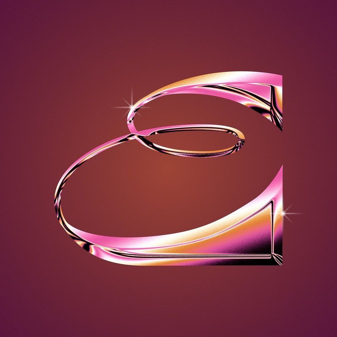
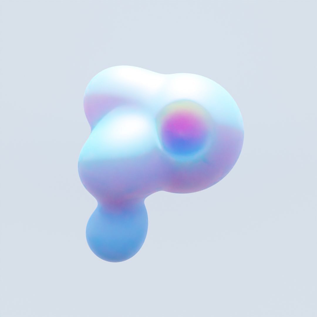
In two weeks, we’ll be back with the background story of another Instagram page, but until then, dive into the previous episode of our DIVE series, in which you’ll get a closer look at Jared Pike’s liminal cosmos.
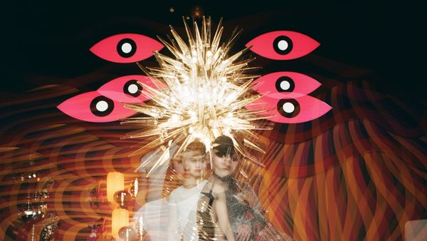
Monumental spaces, bold characters
