Glass pavilion in the middle of the Spanish Gorafe Desert | OFIS Arhitekti

Glass pavilion in the middle of the Spanish Gorafe Desert | OFIS Arhitekti

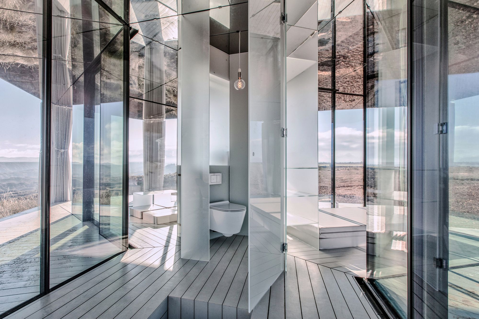
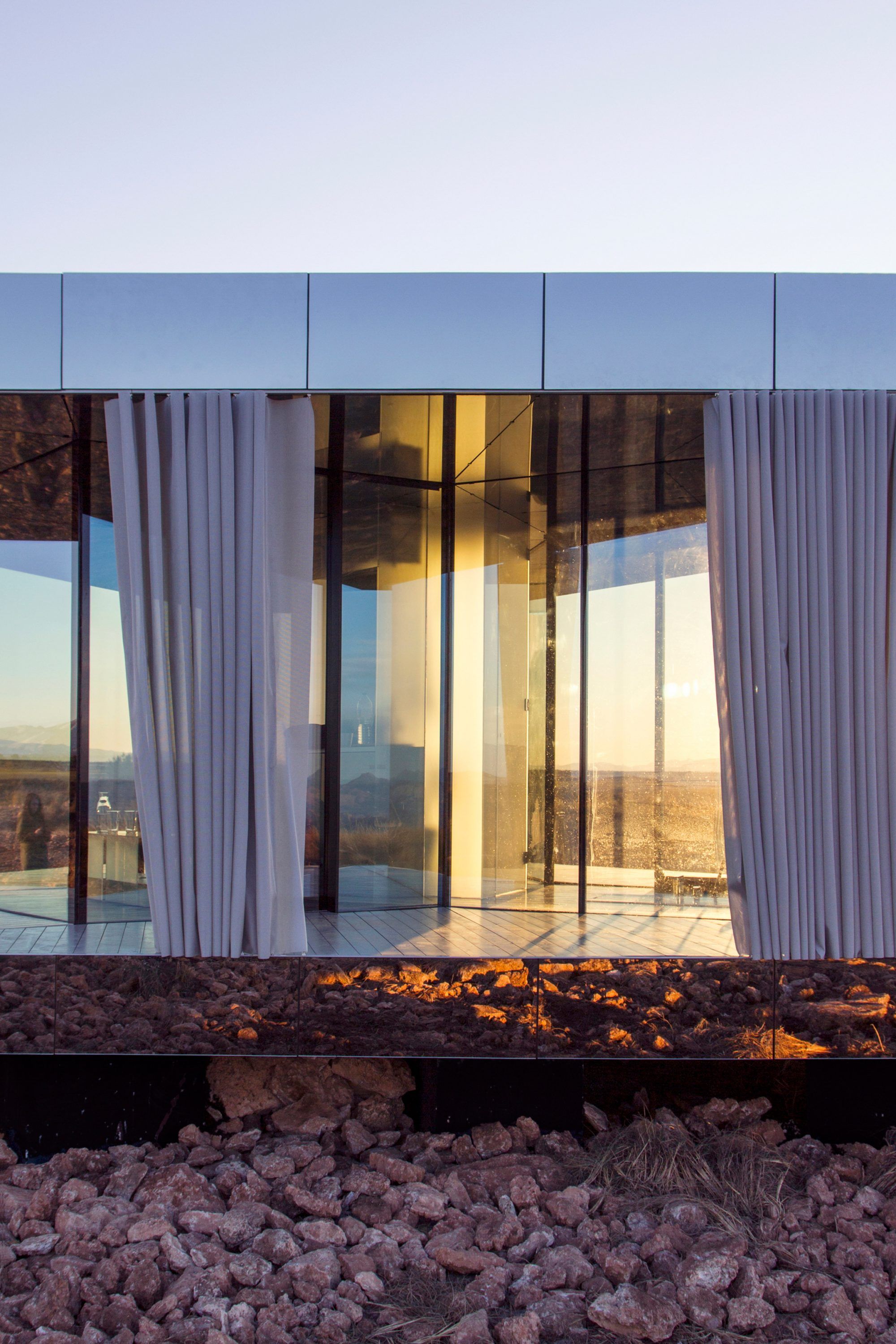
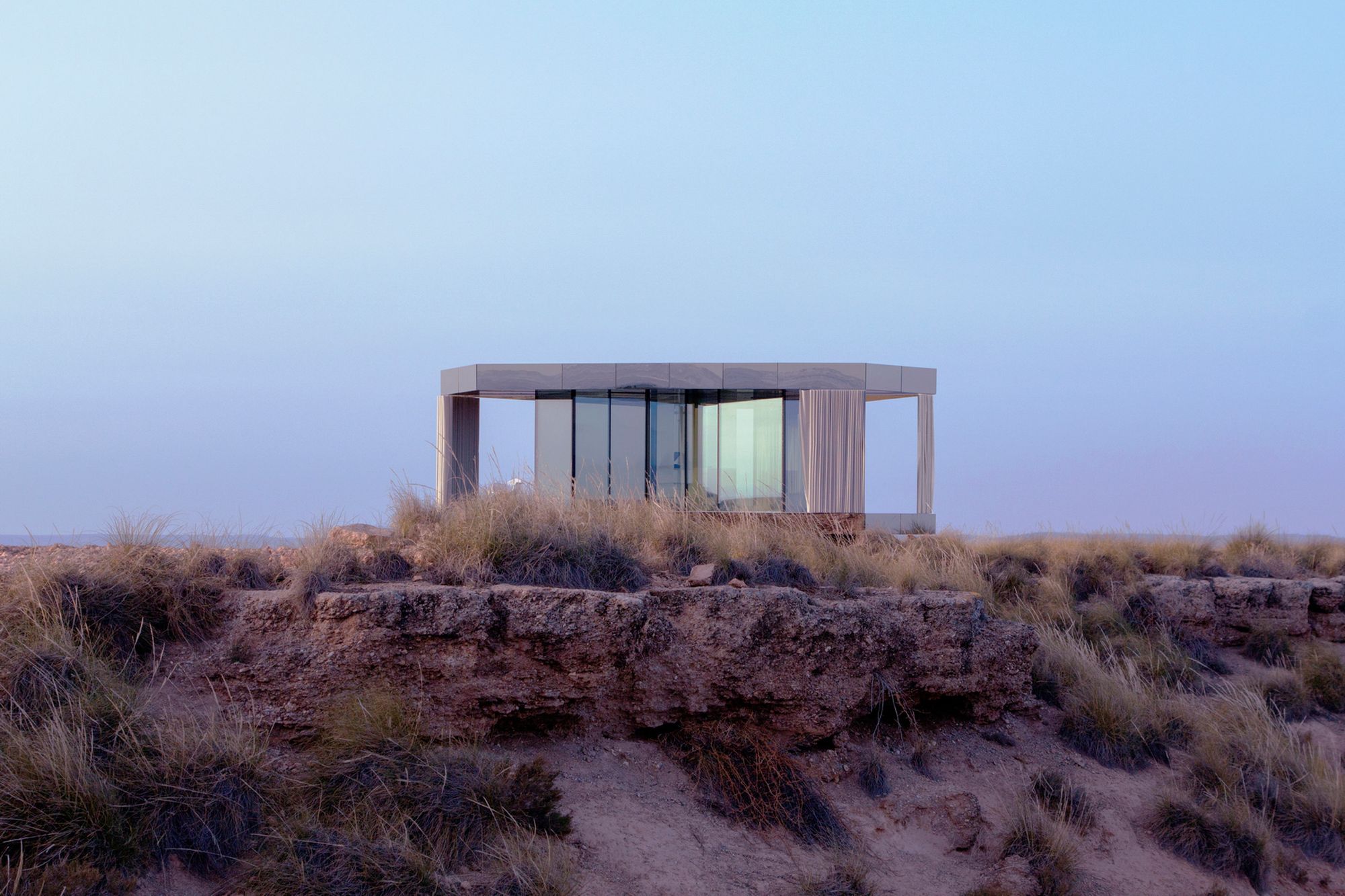
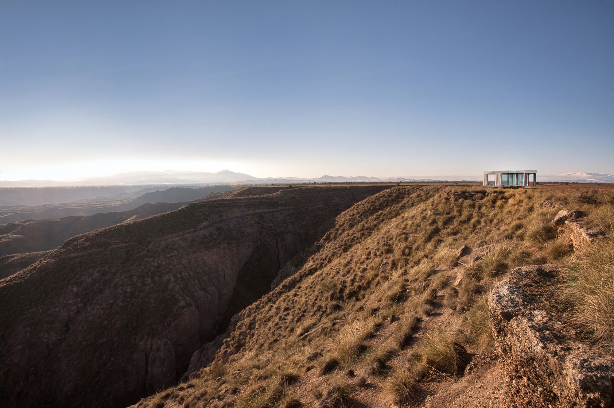
Is it possible to provide a safe haven in unfavorable landscapes such as a desert? The OFIS Arhitekti studio wanted to make this possible in one of the harshest natural environments in Europe, which is why this special building is located in the Gorafe Desert in Granada, southern Spain.

The mirrored glass pavilion offers not only a stunning panorama, but also safe protection. The studio has collaborated with the glass company Guardian Glass to develop the house to test the durability of the products, as temperatures in the desert rise above 40 degrees Celsius during the day and drop below freezing point at night, which can be dangerous with a weak glass wall.

The problem has been solved with SunGuard glass: this special thermal insulation glass covers the building, which also provides protection against the heat of the sun and strong winds, so you can safely enjoy the beauty of the wild landscape.
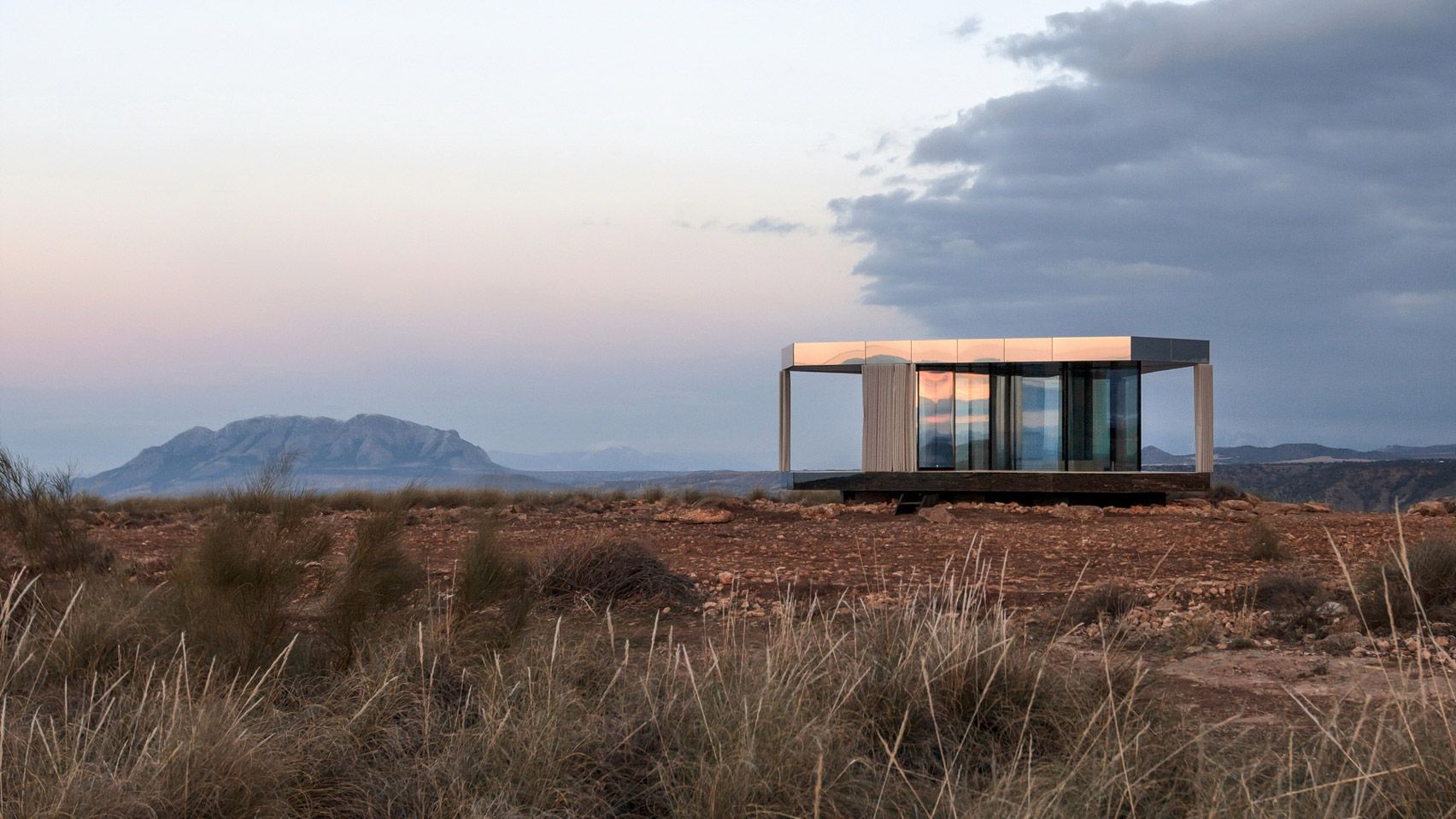
Photos: Gonzalo Botet and Jose Navarrete

OFIS Arhitekti | Web | Instagram

Source: Ignant
more to read
Industrial designer career paths are presented in the Forma Norma program series
workshop

Industrial designer career paths are presented in the Forma Norma program series

Those interested in industrial design can attend lectures on June 25 and workshops on June 26 June. Forma Norma’s program series aims to support the future employment of students in the creative industries through networking, presentation of inspiring career paths, various workshops, and self-introduction opportunities. During the lectures, former
Post-Covid optimism in a summer collection | Kamay Ko
other

Post-Covid optimism in a summer collection | Kamay Ko

The Budapest-based Kamay Ko brand has debuted their summer collection dubbed It’s Fine. Designs that pair well with each other, natural materials, soothing pastels and special collaborations were born in the spirit of livable sustainability. We talked to the founder of the brand at the collection’s Launch Party.
HIGHLIGHTS | Line and letter
design

HIGHLIGHTS | Line and letter

Ever since there was once a Bauhaus and Swiss graphic design, it’s no surprise to anyone that a business chooses total minimalism as its visual identity. However, touching the basics of our written language tools, the letters, and just a few lines can still make an impact with novelty