Several million New Yorkers met her colorful graphics on the cover of one of the most famous magazines of the world, yet we still know practically nothing about the Hungarian-born designer. Meet Ilonka Kárász and her cover designs!
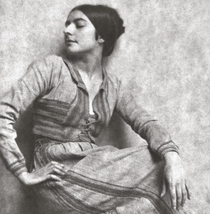
From time to time, the Hungarian media stops to marvel at the fact that Ilonka Kárász’s (1896-1981) name hardly rings any bells in Hungary, even though she has oeuvre exhibitions in the largest American museums, and her works are also featured in the collection of the Metropolitan Museum of Art. It is not a coincidence, as after she finished her studies on the Hungarian Royal College of Visual Arts, where she was admitted as first women student ever, she left the country. Not only was she a pioneer as a women at university: after travelling to the United States at the age of 18 and starting to work in the profession, she was also a trailblazer on a plethora of interior design exhibitions and professional selections featuring male designers almost only. Yes, Ilonka Kárász did not only excel in illustrations: she also designed textile, tapestries, furniture, and complete interiors, but more on that a bit later.
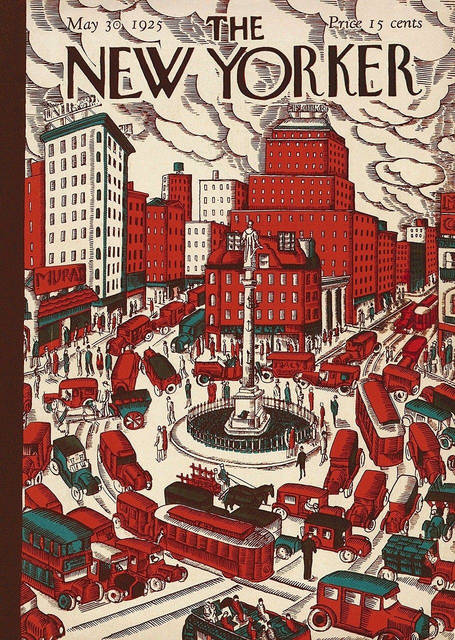
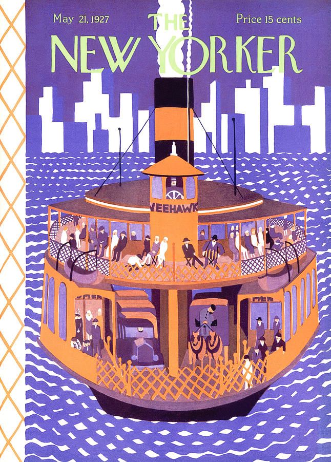
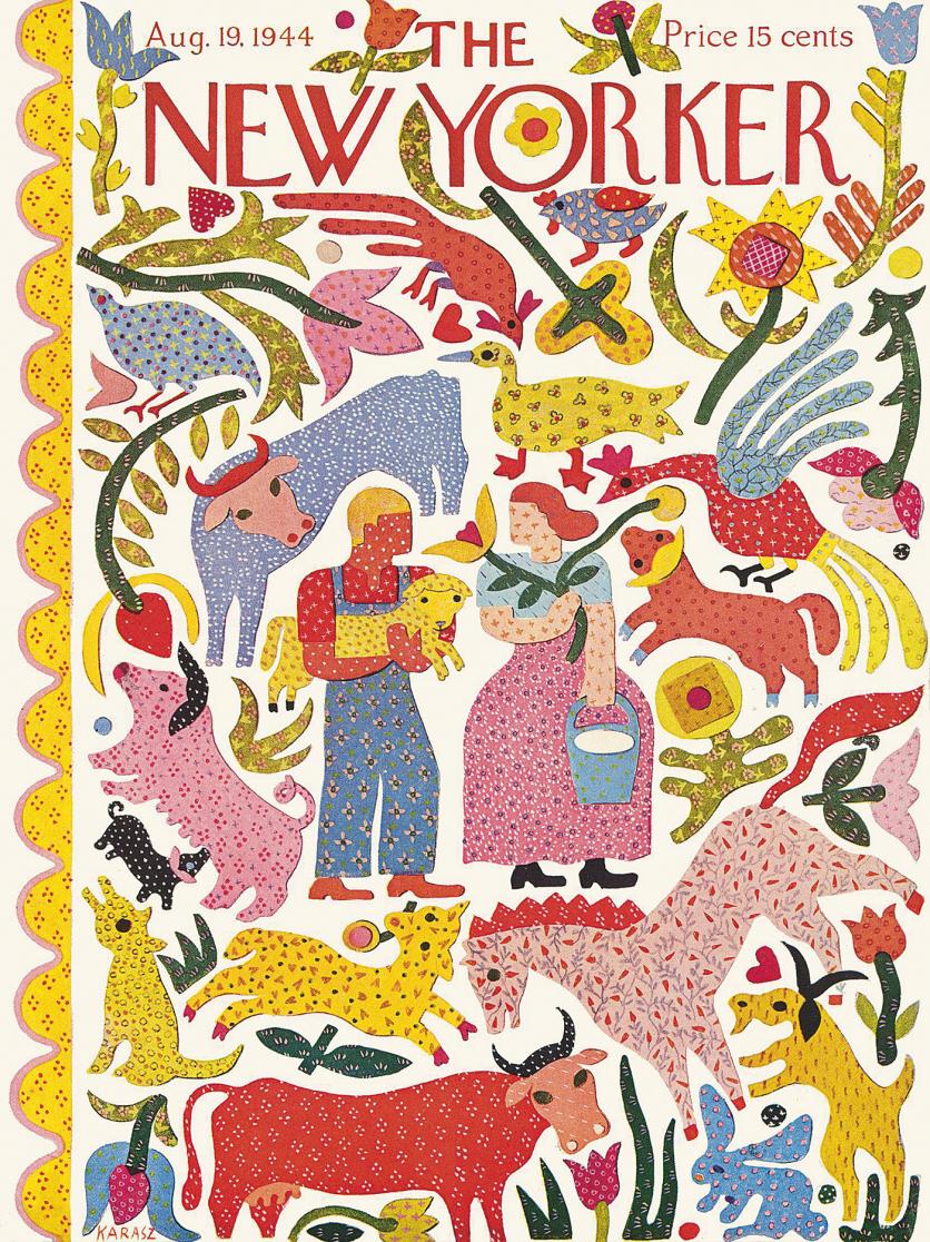
In the 1910s, when travelling between the two continents became difficult due to the world war, Kárász brought European Modernism to the USA with her graphics. She worked for several Avantgarde magazines before in 1925 she ended up at The New Yorker established at the time, where she designed magazine covers for almost 50 years.
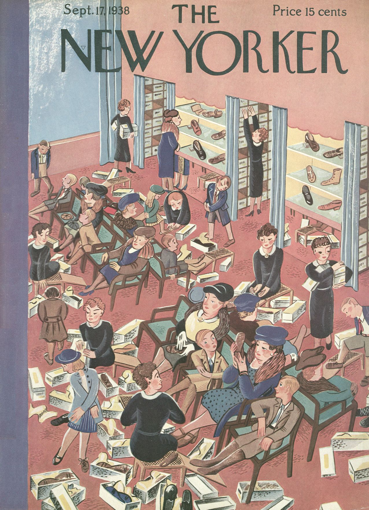
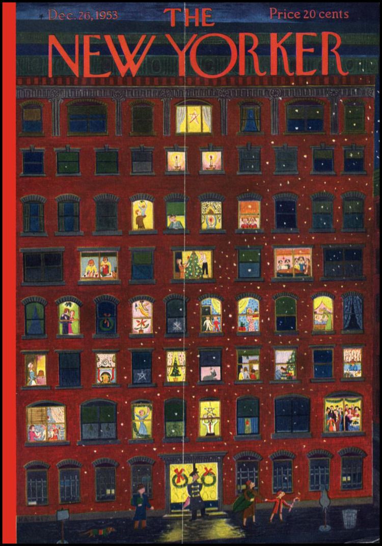
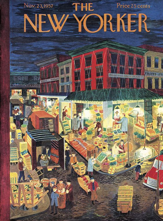

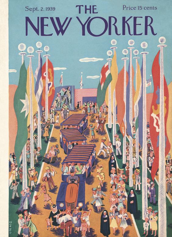

Kárász’s covers resonated with the content of the magazine focusing on daily news, politics and pop culture well: on the cover illustrations also documenting the era, she sometimes depicted New York’s iconic fire escapes and the silhouette of the city, or the completely everyday implications of capitalism – such as the counters overflowing with fresh goods and the shoe stores ransacked by customers –, and at other times the idyll of the countryside, but always in her unique, ever evolving style. The same as her early years inspired by Cubism were mainly about clean colors and black line drawings, her illustrations in the seventies became richly toned and finely chiseled images. She also captured political issues in a careful and graphic manner: on one of her covers made in 1943, for example, the events of the war form a floral pattern.

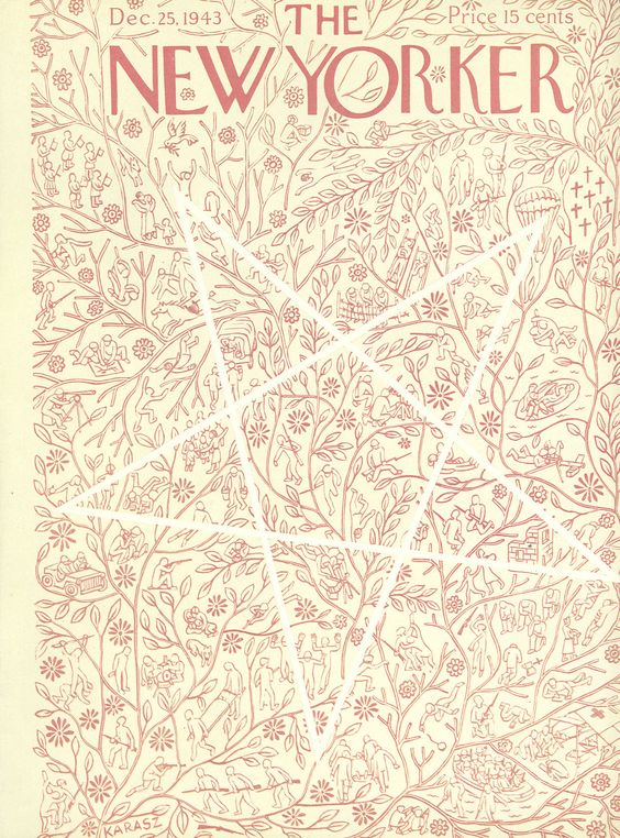

The combination of natural forms and geometric shapes dominated both her illustrations and textile works already from the early years. Around the age of 20-22, she successfully competed at several textile competitions, and her designs were produced by large manufactories. It was important for Kárász to design manufacturable things, which could become accessible in everyday life, as well. Even though she did not disregard the Modernist principle “form follows function”, she also attached a great importance to colors, as she believed it was colors that can bear the strongest influence on our mood.
“Today’s designer thinks about how you can lift something instead of what it can lift in you” – she stated in 1959.Brown, A. (2000-2001) Ilonka Karasz: Rediscovering a Modernist Pioneer. In: Studies in the Decorative Arts, Vol. 8, No. 1 (FALL-WINTER 2000-2001), pp. 89
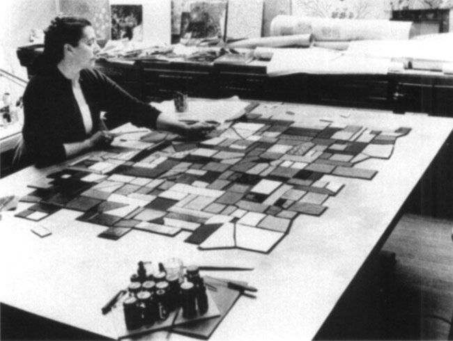
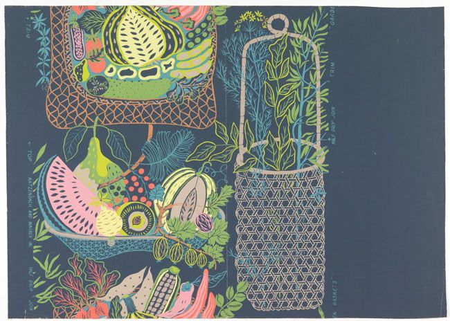
In addition to home textiles, she also debuted car and aircraft seat covers, but she also tried herself in tapestry, furniture and ceramics design. She redesigned homes, receptions, school interiors and the furnishing of kindergartens – she had particular interests for the latter. She firmly believed that designing for children holds additional responsibility, as the visuality of their environment may influence their development and vision to a larger extent. She believed that the geometric shapes applied in various sizes can help children perceive proportions and see that nature is built in a sort of similar manner, out of tiny elements.
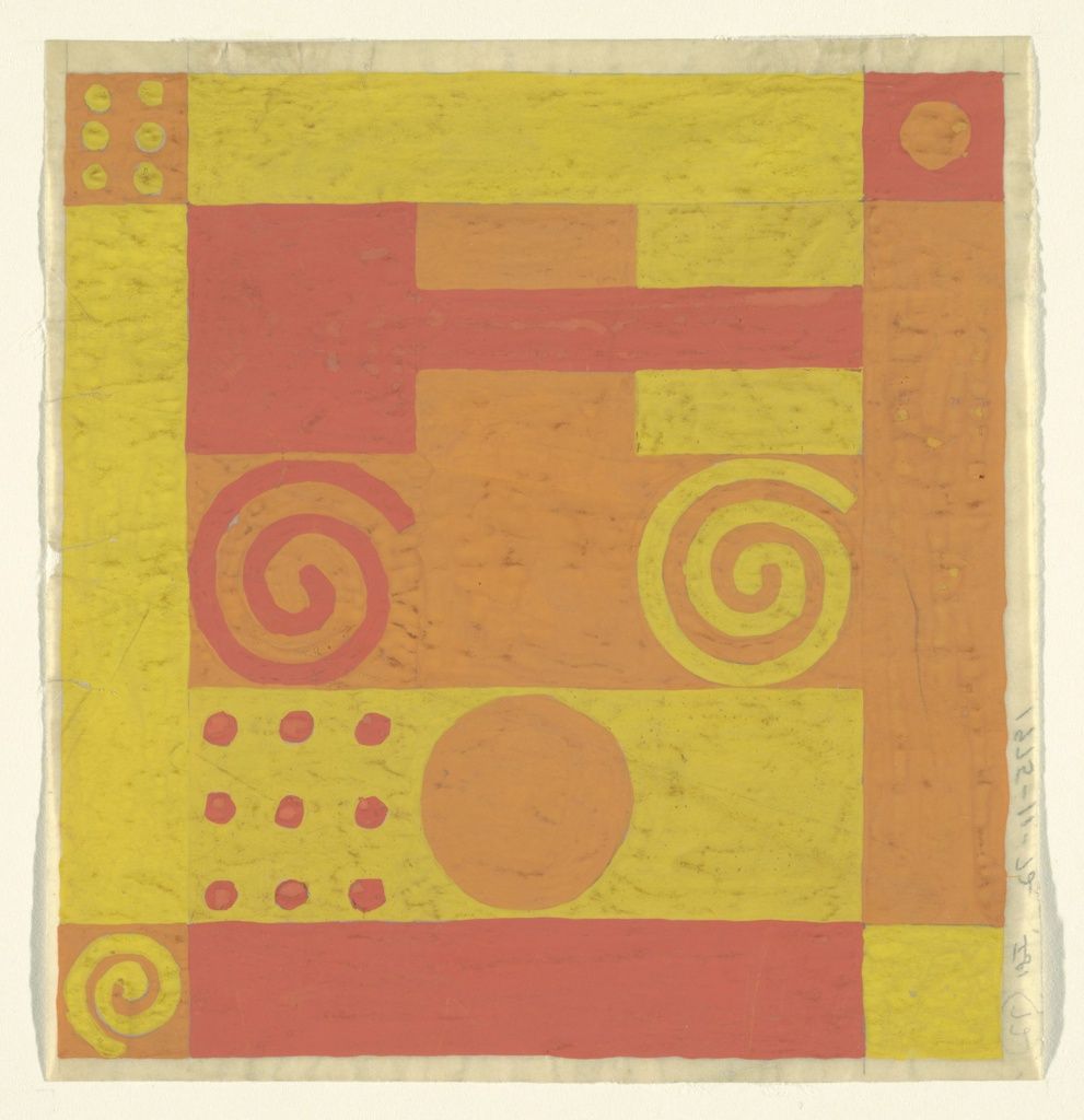
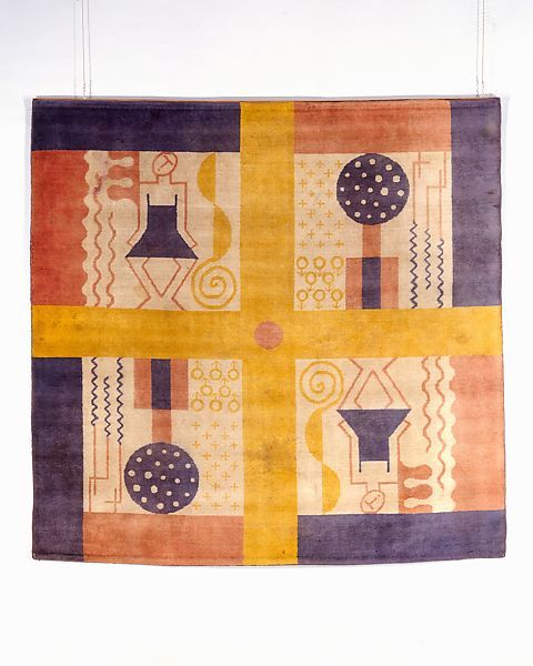
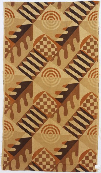
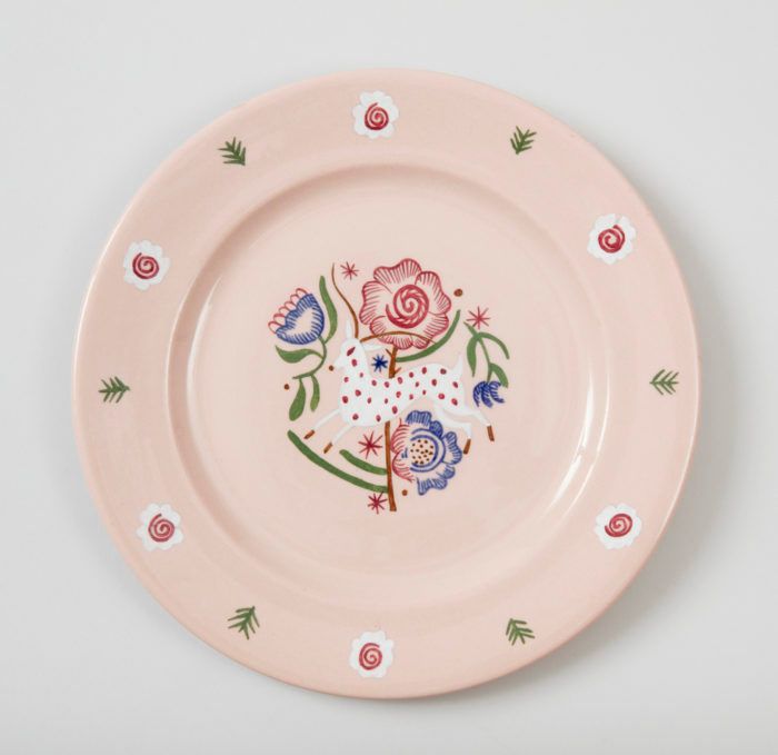
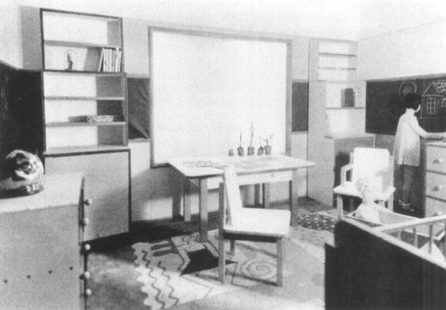
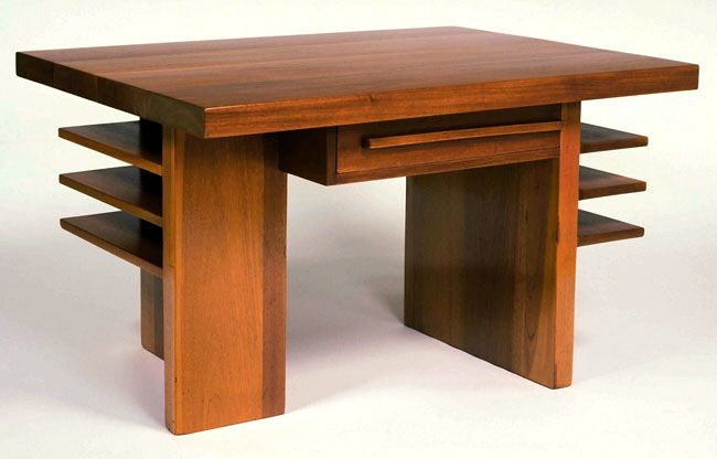
In spite of her rich oeuvre, she is not a recognized designer in Hungary, and even in the USA she deserved a greater fame. In the study titled Ilonka Karasz: Rediscovering a Modernist Pioneer, curator Ashley Brown claims that the reason why Kárász was left out of the canon was, on the one hand, that she created in multiple genres at the same time and thus no single, expressly iconic design remained after her passing. [1] On the other hand, as a woman in a profession dominated by male designers, and especially as a women who designed mainly for kids and households, she was pushed to the background.

Hurricane-proof floating villa

Harmony of concrete and wood | Archholiks


