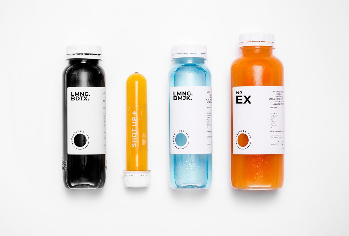
If we only saw the minimalist label of Superjuice (without the juice itself), we could easily think that there is some kind of medicine behind the image. The aim of designer Nóra Kaszanyi was exactly this: to give an appearance to the super-healthy fruit juices as if they were prescribed by the doctor, only not at the clinic, but in a high-tech laboratory.
Cold-pressed juices are very in right now, which is no surprise in light of the rise of healthy lifestyle today. For example, a vivid green juice is not only rich in vitamins, but also comes with serious psychology – one could say, we already feel healthier looking at it. Nóra Kaszanyi, the designer trusted by the Superjuice brand to design a complex image for the cold-pressed juices played upon this effect exactly.
Nóri, who works as a freelance graphic designer, first designed an image as part of a school task at Moholy-Nagy University of Art and Design – this was what caught the attention of Superjuice, too. The healthy, additive-free, cold-pressed juices inspired the designer to design a packaging that could have easily been prepared for a medicine. This is how the minimalist, almost sterile, yet spectacular visual world of Superjuice was born.
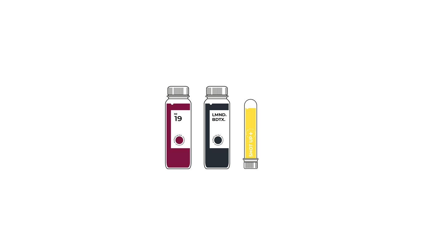

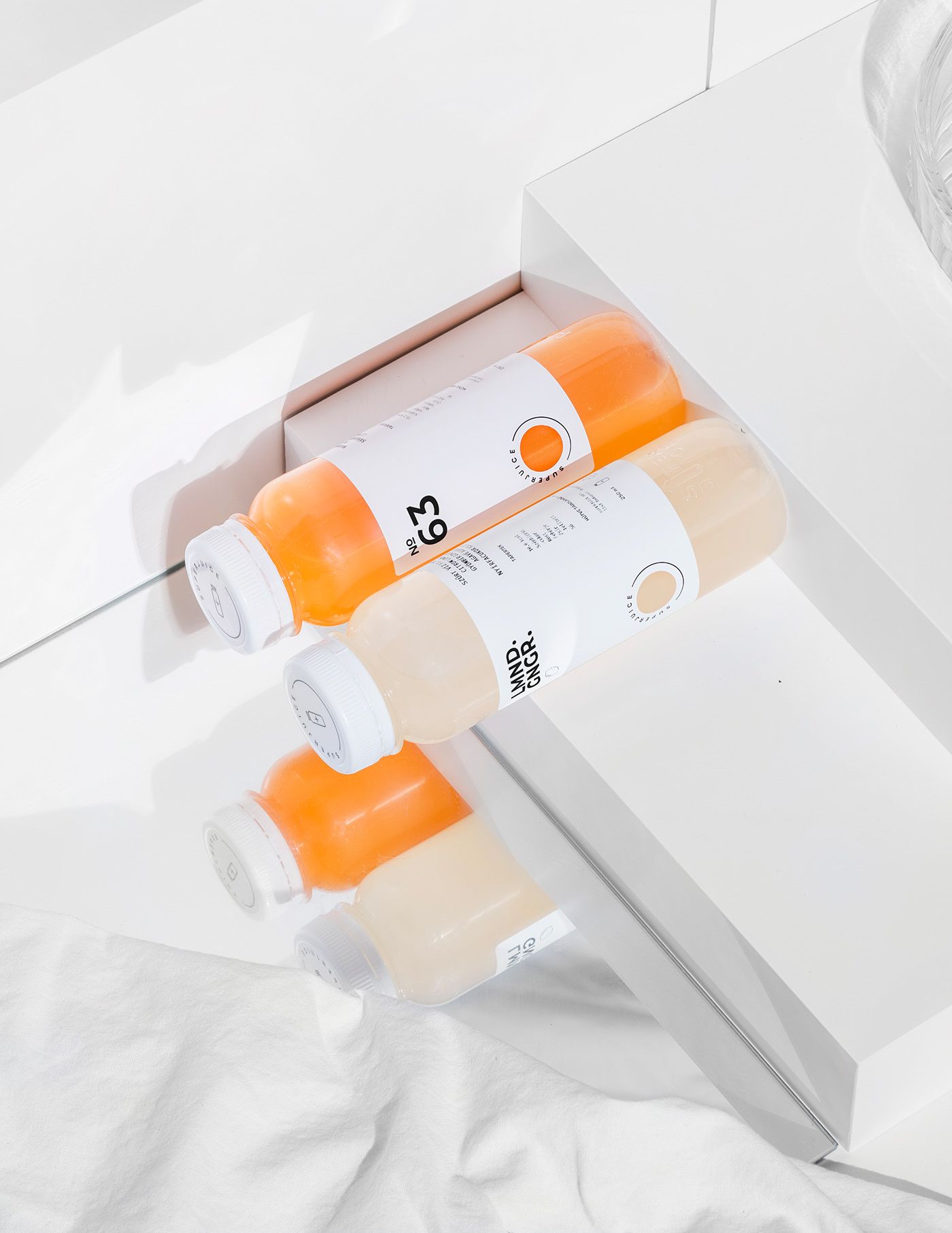
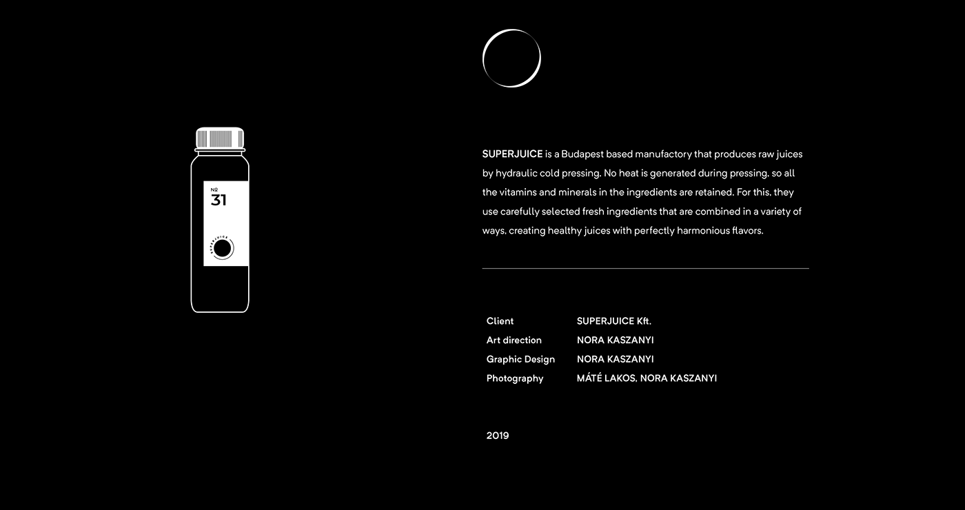
This also explains the fact that the labels put the emphasis on the numbers instead of the text. No colors were placed on the black and white base – however, the juice’s own color vibrates behind the circle cut out from the label, this way sneaking some playfulness into the minimalist design. By the way, minimalism is not only explained by symbolism: it was important that the image be flexible and dynamic, as it has to fit countless juices, and it also has to work on different events and promotional merchandise.
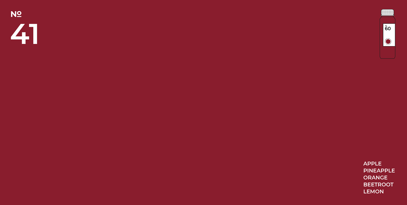
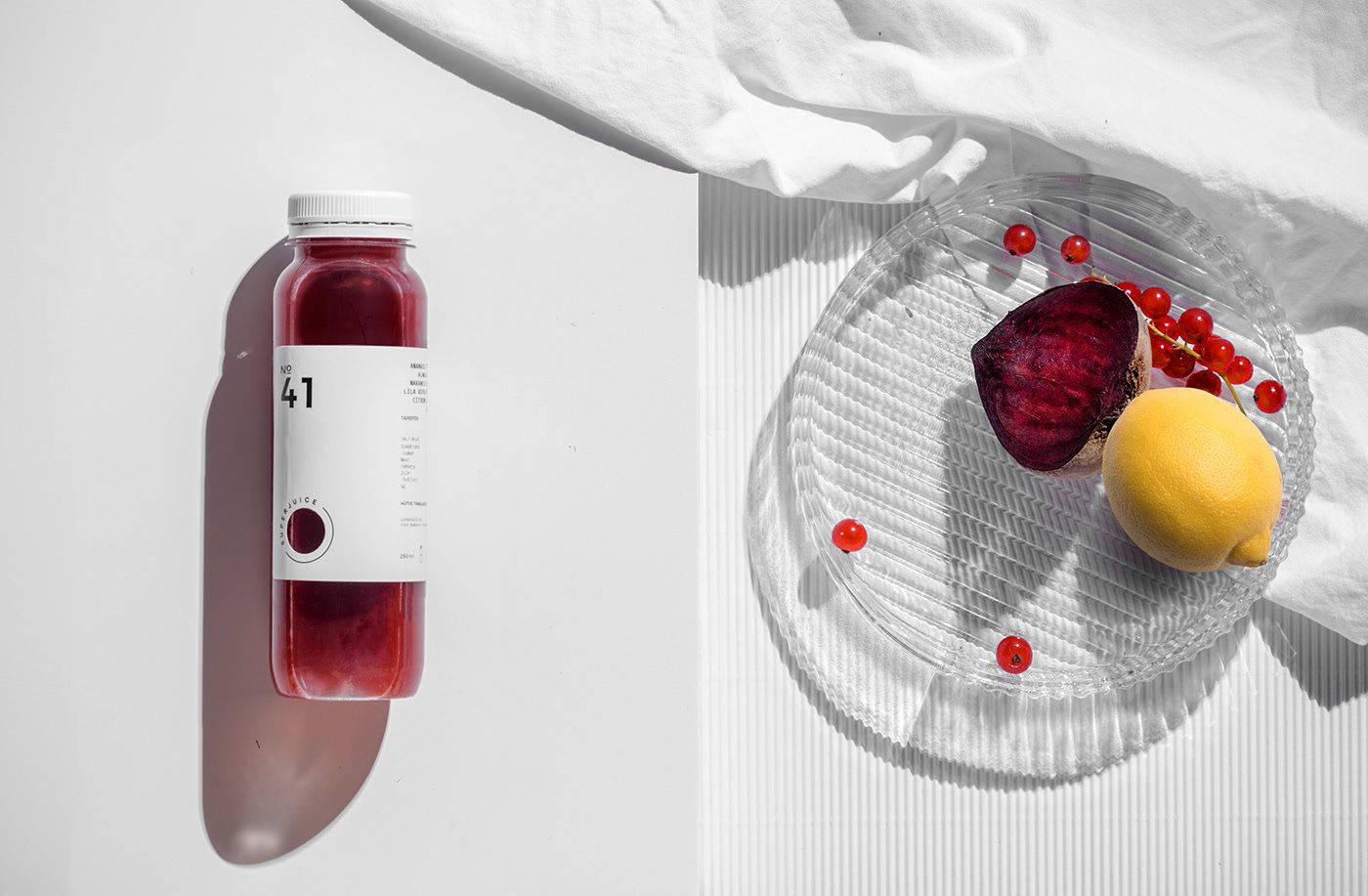
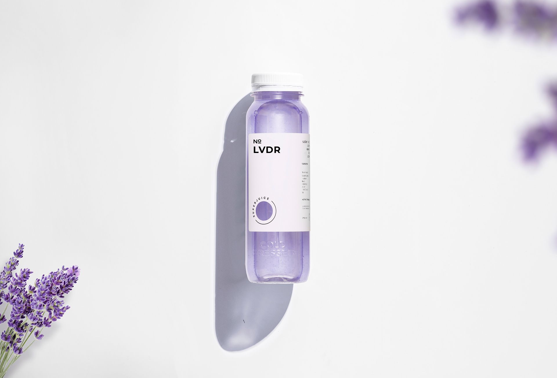
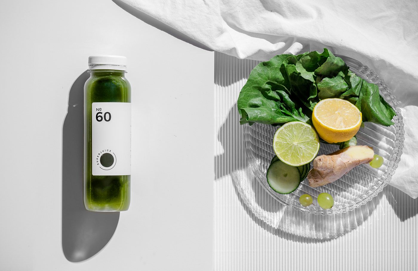
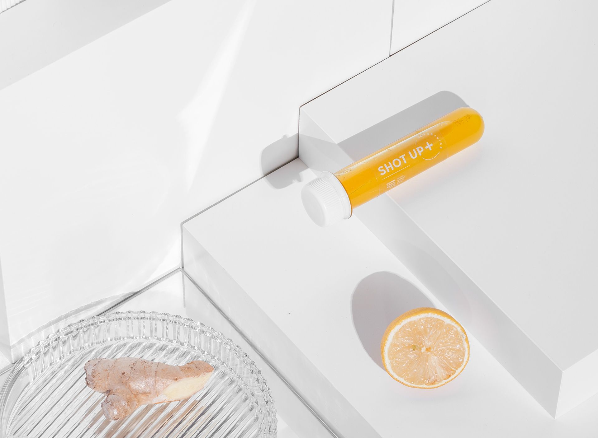
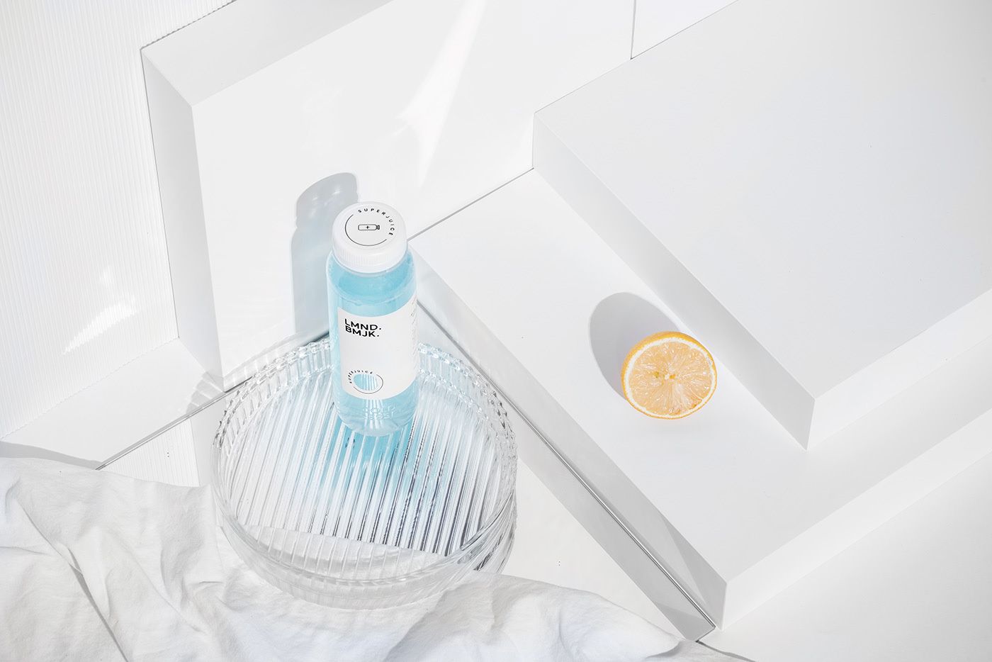
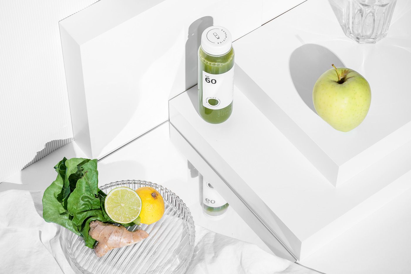
In addition to the graphical work, Nóri was also responsible for the entire art direction of the project. This way, the concept of the photo series made of the products is also her work (the photos were taken by Máté Lakos – the ed.). The clean and sterile world also appears here: the bottles are lit with direct and sharp lights, just like in a laboratory.
When we asked the Art Hungry award-winning Nóri what her dream job would be, we got some exciting answers: she would like to work more on the gastronomy line, but if its about beverages, she would love to design the image of an alcoholic one next time (gin, above all). She would also like to work on the design of contemporary exhibitions and books. Looking at her portfolio, we think we could expect works of outstanding quality from her on either of the fields.
Pastel symmetry, sensitized memories
HYPE | Weekly program guide
