The effortless combination of light, vista and white walls—this is how one can best describe the essence of the gallery interior designed by Czech architect Michal Motyčka. The simple, natural and sophisticated solutions envisage a new approach to the concept of the white cube.
The Miroslav Kubík Gallery is situated on the first floor of a bourgeois townhouse near Smetana Square, in Litomyšl. It was established by two siblings, Miroslava and Martin Kubík in 2011, who named the gallery after their father.
In the past, the townhouse burned down several times and during the last reconstruction in 1999 the layout of the first floor was rearranged to serve as an office. Since 2005, exhibitions regularly presented contemporary art here, which gave an impulse to reconstruct the place into a fully functioning gallery—this is how the Miroslav Kubík Gallery presenting 21st century contemporary visual art came into being.
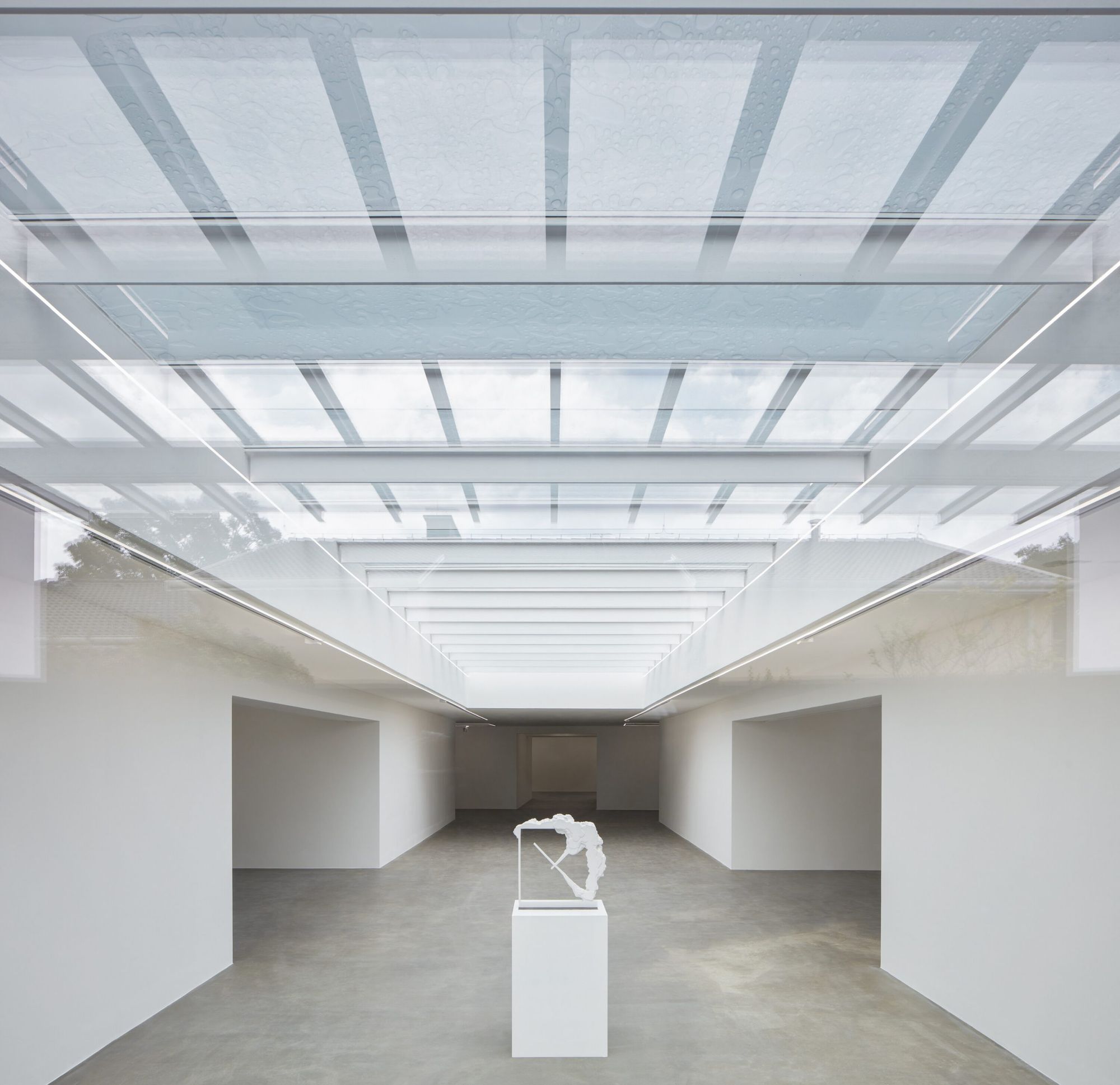
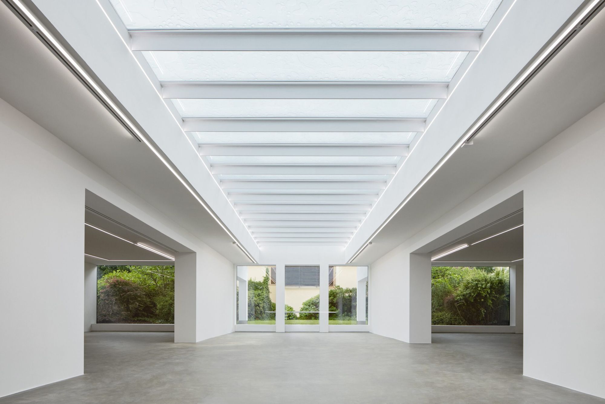
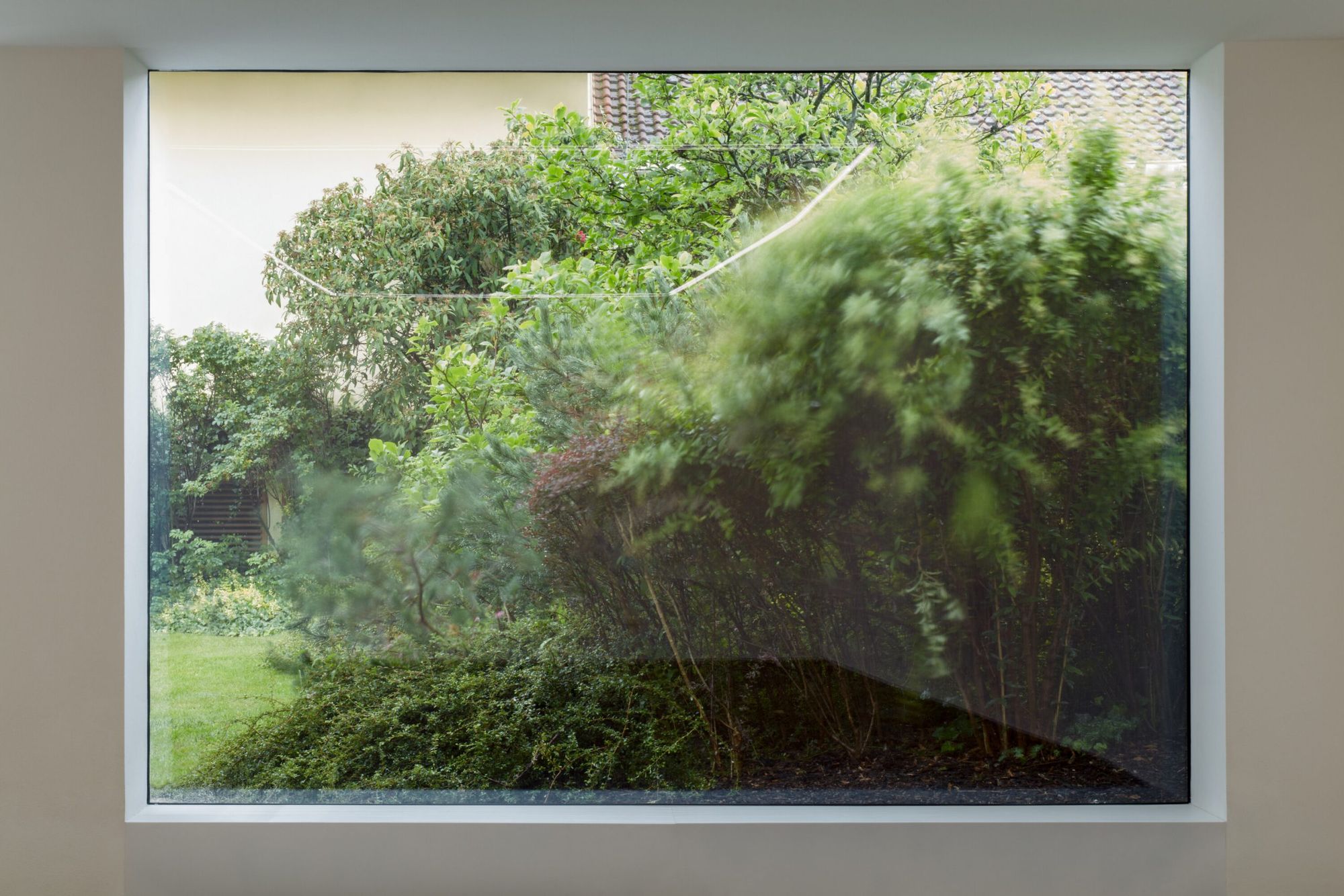
“The architect Michal Motyčka recreated the space of the Miroslav Kubík gallery into a civil, modest exhibition space where exhibited works—sculpture, photography, spatial installations, video installations and paintings—become part of a whole, means of encounter and dialogue with visitors. An aesthetically clean and seemingly traditional spatial solution could be experienced with basic delights, we perceive: light, sky and greenery, air and an element that—according to Le Corbusier is the most important for the architecture of an exhibition space: a certain feeling of freedom,” said visual artist and art theorist Jana Šindelová, the curator of the gallery.
The architect dreamt up a space that is open, boasts a simple layout, is in a direct connection with the garden and is full of natural light, sometimes complemented by solo spotlights in a very effortless way. The interior also puts an emphasis on respecting artworks: the gallery enables visitors to breathe and stay calm while they observe the artworks, without having any architectural solutions distracting them.
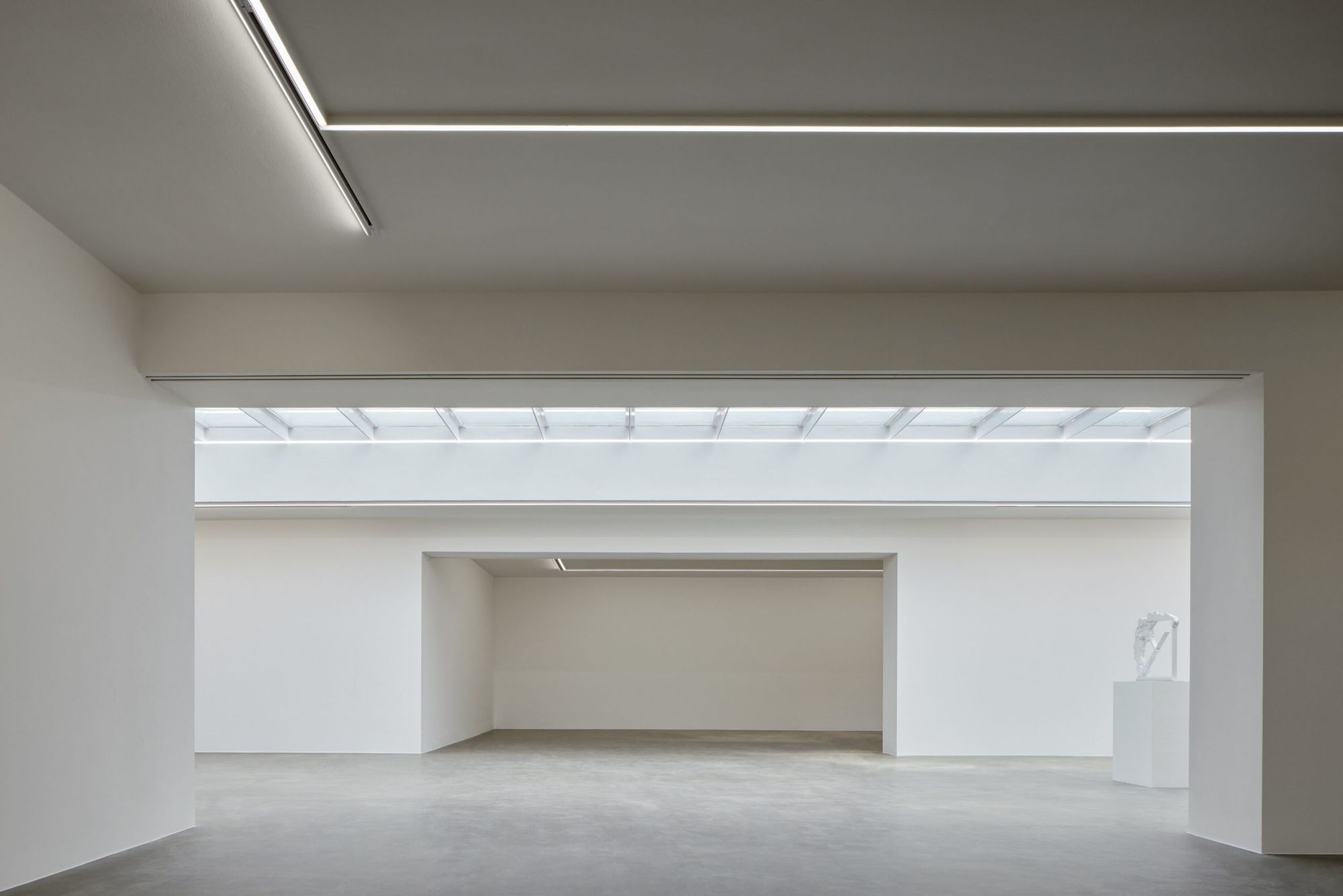
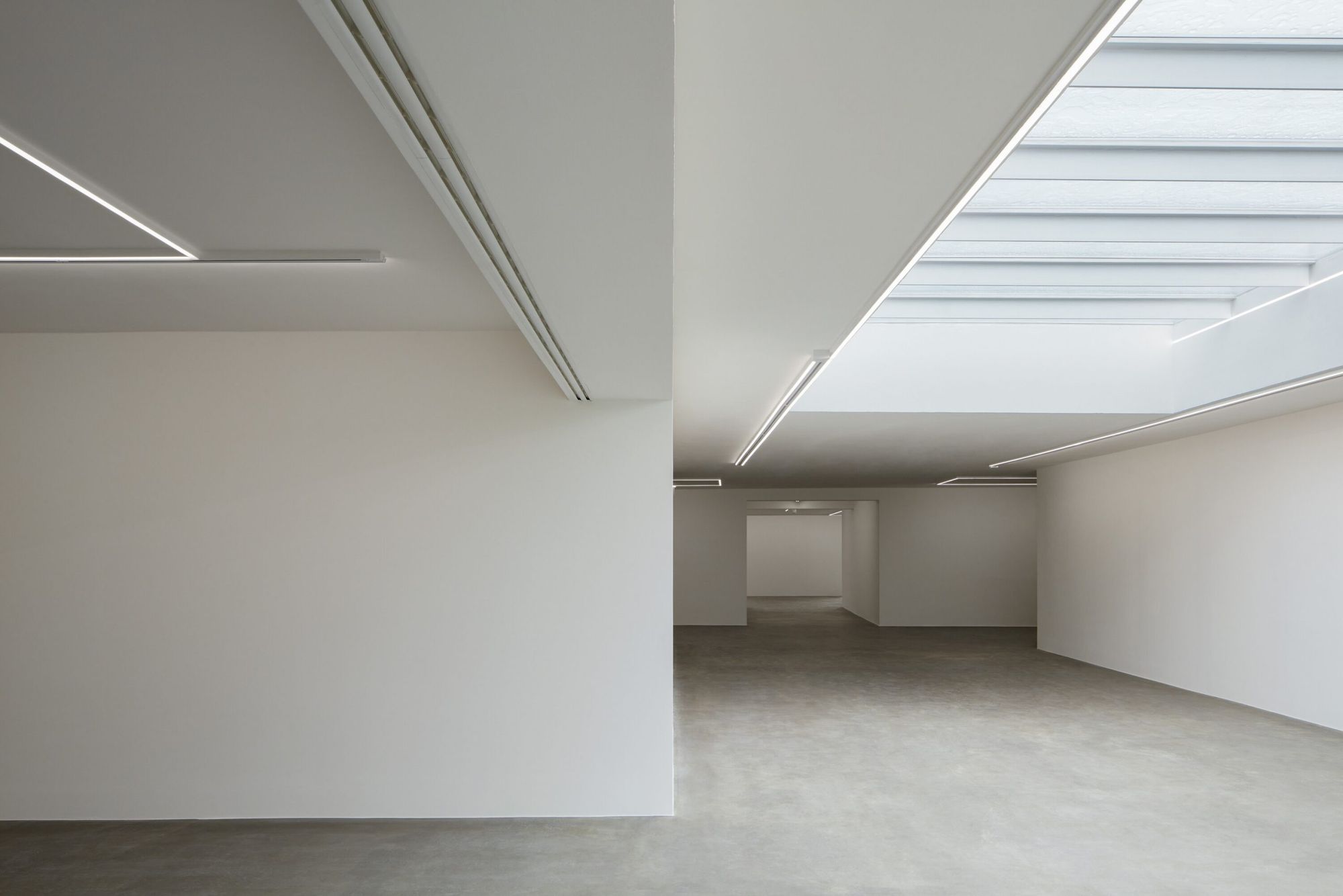
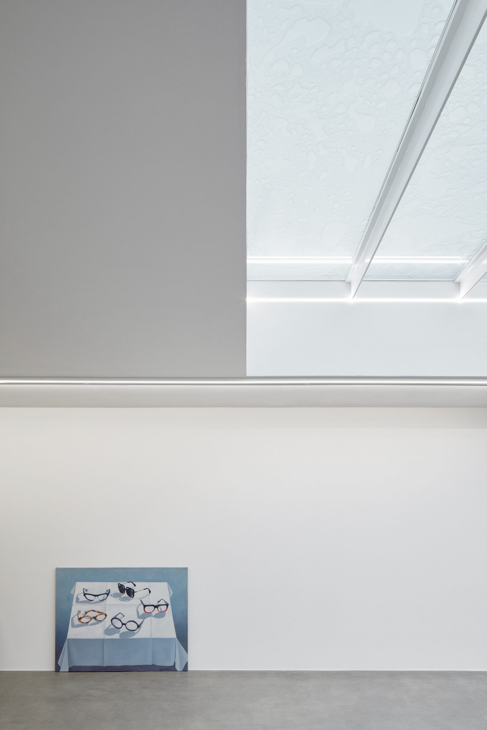
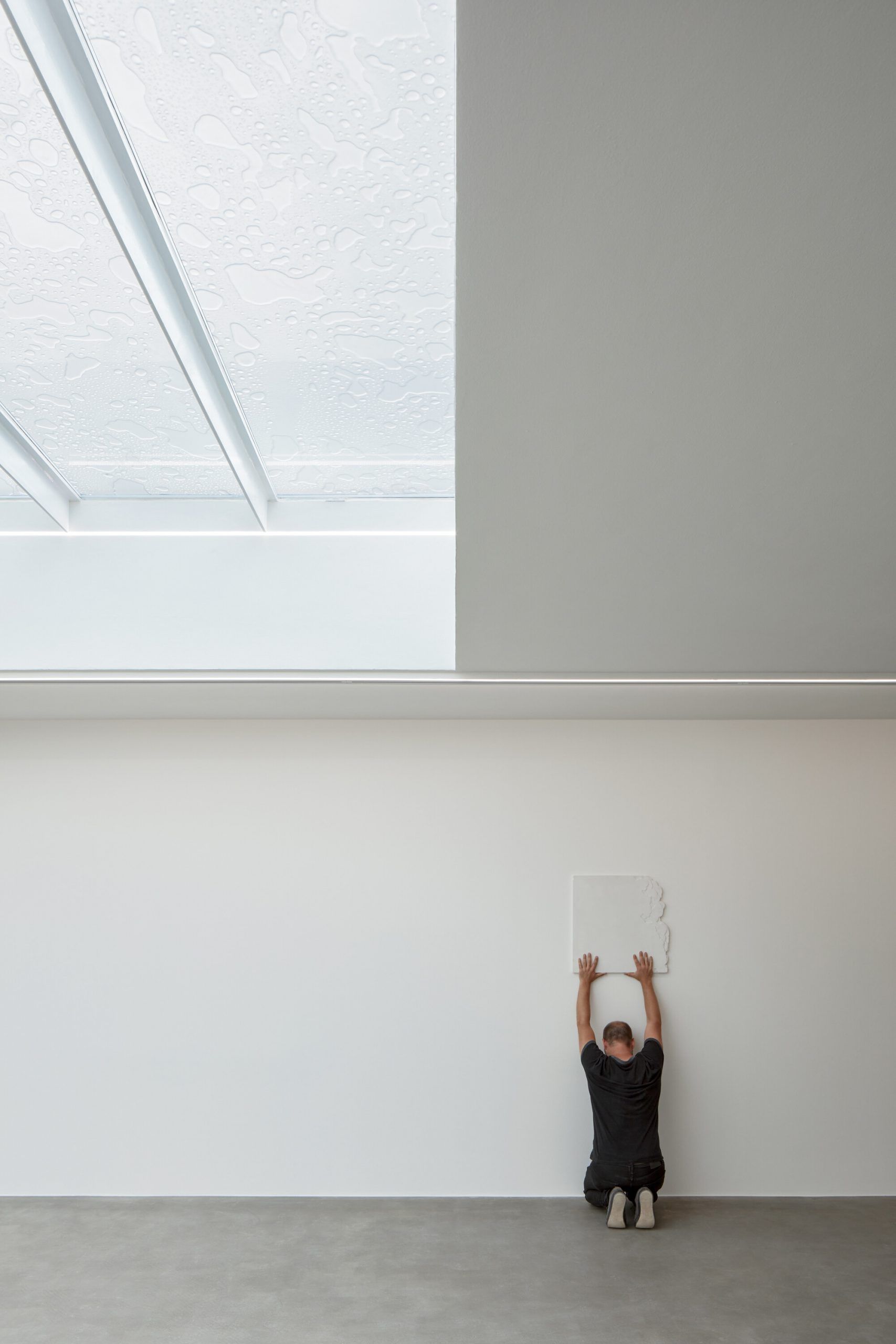
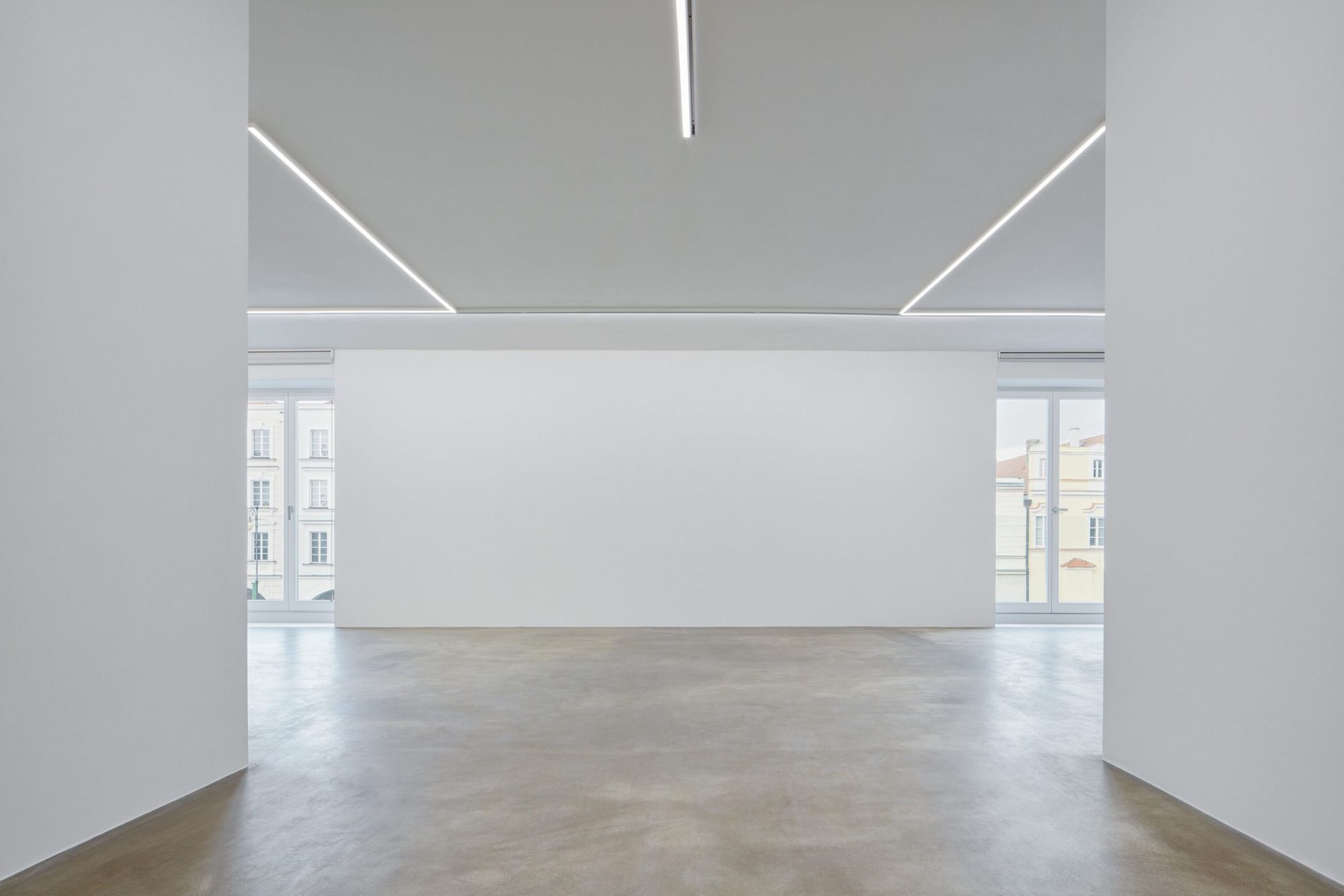
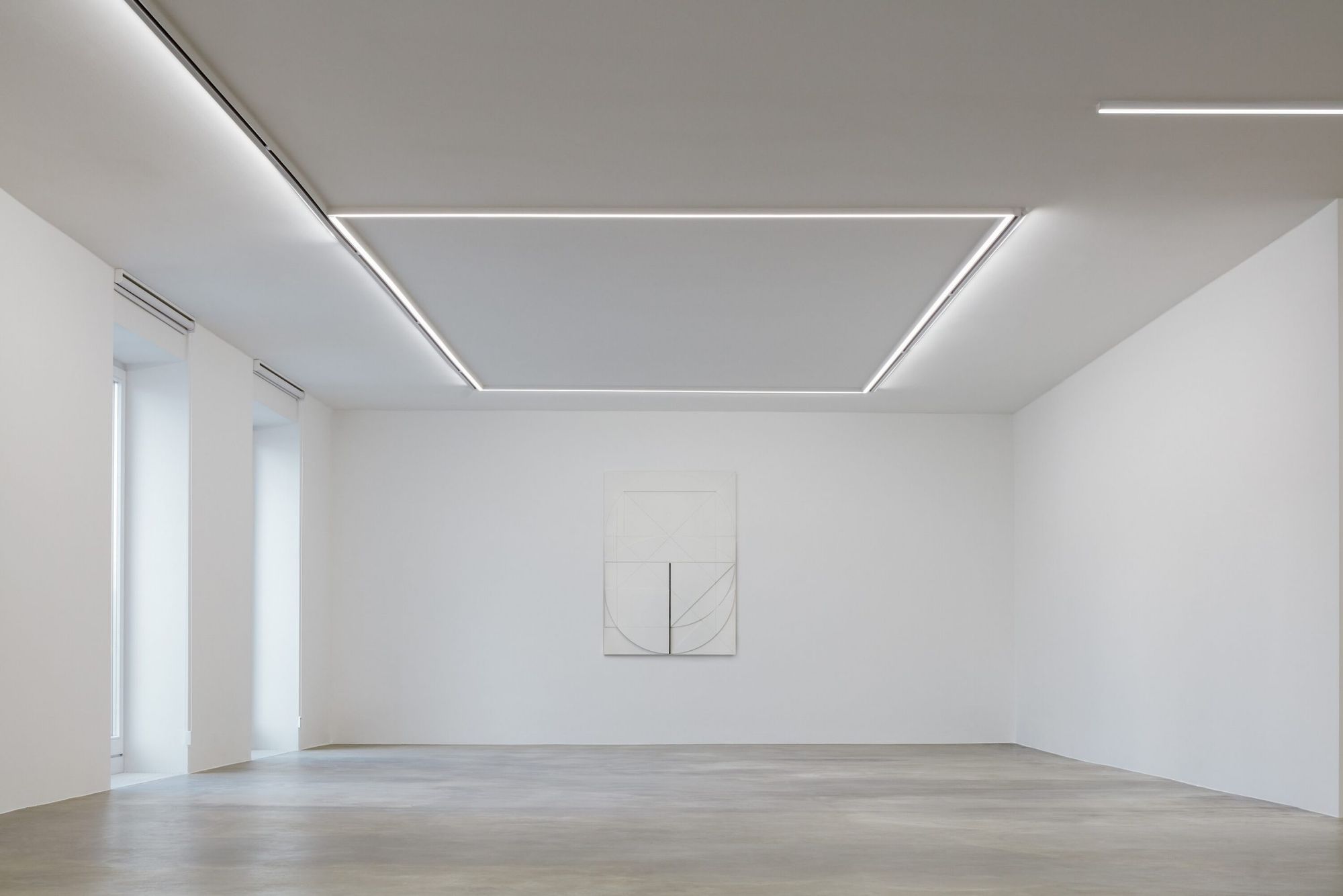
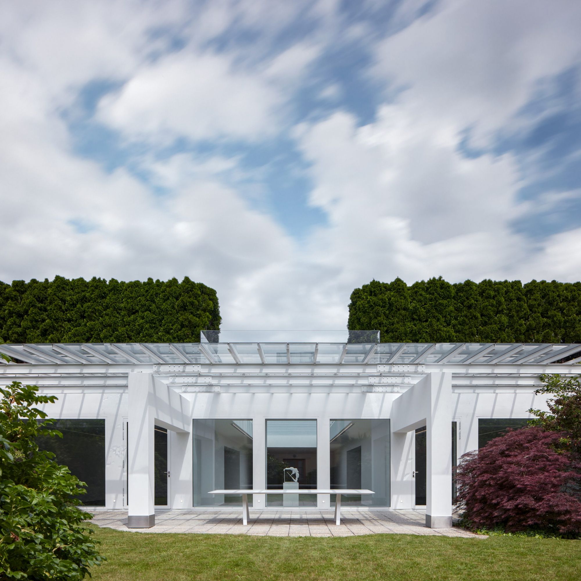
The new space of Miroslav Kubík Gallery is without doubt unique due to the remarkable light conditions, airy exhibition spaces, its level of comfort and its relationship to the natural environment. “The gallery space aims to encourage visitors to see, observe and contemplate, to indulge them in an experience. Miroslav Kubík Gallery is a lived space for art,” highlighted Michal Motyčka, the designer of the new space.
Photos: Boysplaynice
Michal Motyčka | Web
Miroslav Kubík Gallery | Web | Facebook | Instagram
Source: linka.news
HIGHLIGHTS | Living past

McDonald's products are spruced up by new, illustrative packaging


