Pinetime Clothing, the boardsports-inspired outerwear brand, is back for the autumn-winter season with a number of novelties. Responding to customer habits that have changed during the pandemic, they have launched an unconventional and user-friendly website that already uses elements of the brand’s renewed identity to convey the Pinetime message. So what are the main principles behind the new design, what are the biggest advantages of the unconventional webshop and what do you need to know about the newly debuted capsule collection? We asked Gergő Koczka and Péter Szalay.
Six months ago, you mentioned that Pinetime Clothing was being revamped and you were also working on a new website. The site debuted a week ago, refreshed in both content and visuals. Why and how has Pinetime’s identity changed?
Gergő: We thought that the rebirth of Pinetime should be supported by a visual facelift. As with all our products, it was important for the new identity to look good not only today, but also in years to come—that’s why we chose timeless, yet unique design elements, typeface and color.
Peter: We didn’t change the logotype and the logo. Our main brand identity color scheme is still black and white, but the complementary color has changed from orange to a kind of UV yellow/light green. For the headline, we were looking for a very distinctive font, which we found in Nikolai, designed by Franyiska Weitgruber. It’s a serif display typeface with more modern character traits—tiny fractures, lines reminiscent of a cut-tip pen make it exciting and modern, yet it has something classic, something evergreen and technical at the same time. This is complemented by the FF Good Headline font used in the body text and on the price labels, which is a sans-serif typeface similar to Trade Gothic, a well-known typeface among designers. It is basically, as the name suggests, optimized for headline writing, but in terms of its style, I think it works perfectly with Nikolai. Because of its condensed style, it takes up less space, so it works well on the web and in print, which was an important aspect for us.
How did you adapt all this to the website? How is the new site different from the old one?
Peter: Revamping the website was our main focus; this is where we started, so redesigning our online and offline identity went hand in hand. We were consciously looking for a solution that would be suitable on all platforms, but the majority of people come across our brand in the online space, whether it’s social platforms, ads on reseller sites or our own website, so the design was driven more by the online identity.
Gergő: Initially, we wanted to create a magazine in the online space, where people could also make a purchase if they wanted to. Today, this has changed completely. We realized that putting the products first is more important, as they are our main value and message carriers, so the clothes and the “shop“ part of the website should be emphasized. We like to work and think as a team. In the development of the new site, we asked for help from friends and professionals who are familiar with the world of UX design and web development, but also have known the brand for a long time and are close to the Pinetime spirit.
As a result of a six-month design and development process, the new website and webshop will offer a much better customer experience, which we hope everyone will enjoy. We’ve changed the structure of the website: we’ve simplified the menu system and moved pages that aren’t directly about products and collections to the background. The pandemic has created a new situation where many people have switched to online shopping, and we felt it was important to support their decision the best we can by providing them with as much useful information as possible. How would this garment look on the customer? What is the right size for her? What color options are available? What extra features make our products stand out? We wanted to answer these questions and present our products in the clearest and most accessible way possible, so the structure of the product page essentially became the backbone of the new website.
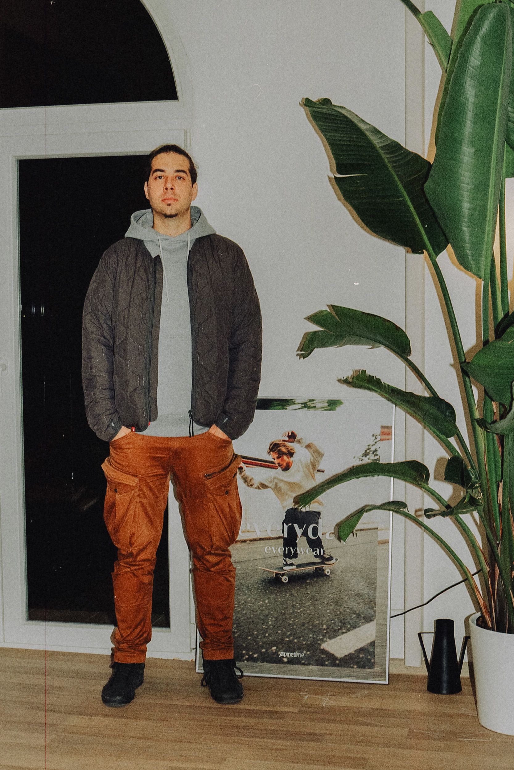
On the front page of the new website, the campaign photo of your latest collection appears. What inspired the Midnight Collection pieces?
Gergő: The newly released Midnight Collection is a capsule collection, which—uncharacteristically for us—does not include any technical products, but only streetwear pieces, which is somewhat understandable, as the collection is inspired by the city itself, the night lights. Furthermore, these pieces are 100% domestically made.
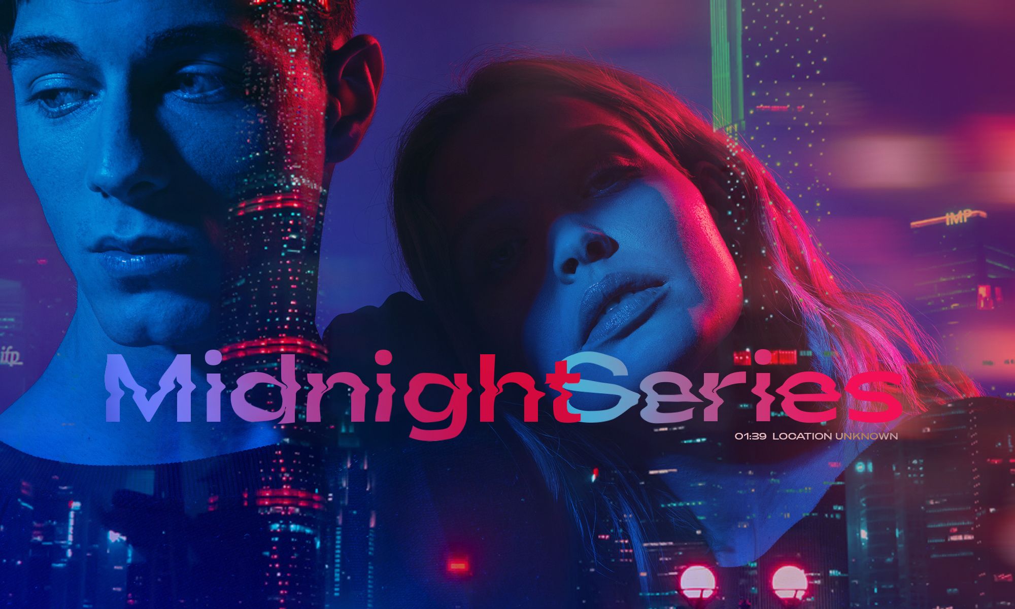
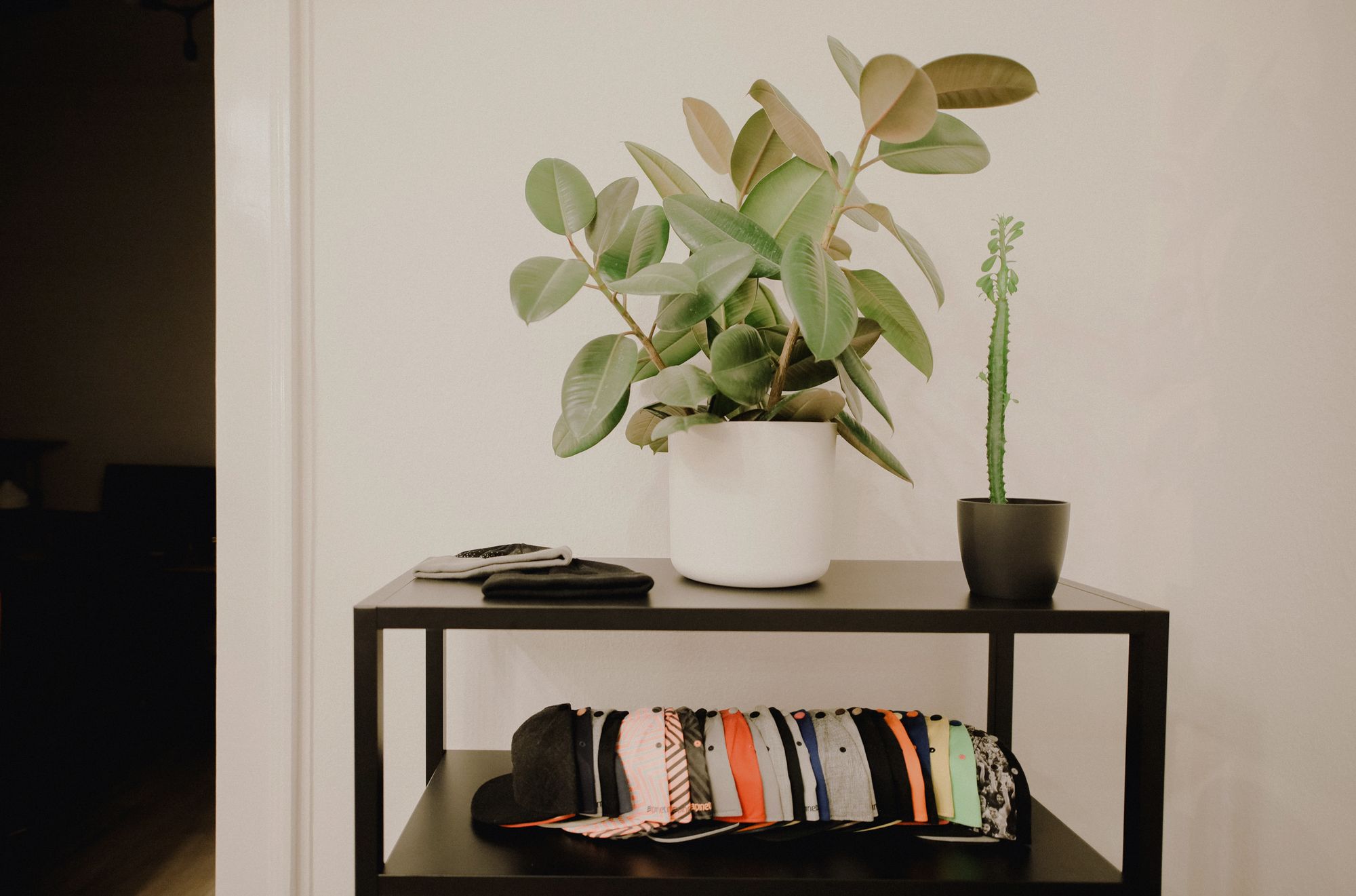
Peter: The main highlight of our new collection is the Midnight Crewneck, which may seem simple at first glance, but when you look closer there are many tiny details. The passé thumbholes, the colors of the decorative coating, the black metal emblem on the chest, and the RGB colors woven into the fabric used on LED walls and screens make this sweater rich in detail. The fabric itself provided the inspiration for the visuals of the collection and the campaign, namely, playing with the colors of blue, red and green lights. One of our evergreen products, the men’s and women’s Tunnel sweater, is also back with minor changes. We’ve replaced the lining and passé parts with a lighter, 100% organic cotton fabric to ease the weight and drape of the hoodie and to give the passé material that touches the hands a finer feel for more comfortable wear. Also included in the collection are a classic 5-panel baseball cap and 100% Organic cotton t-shirts.
Gergő: Our customers are mainly outdoor lovers, whose everyday life is inseparable from the city—with these pieces we are now reinforcing the latter experience. And as we approach winter, we’ll be back with a new collection and range that brings back both technical pieces and classic Pinetime products.
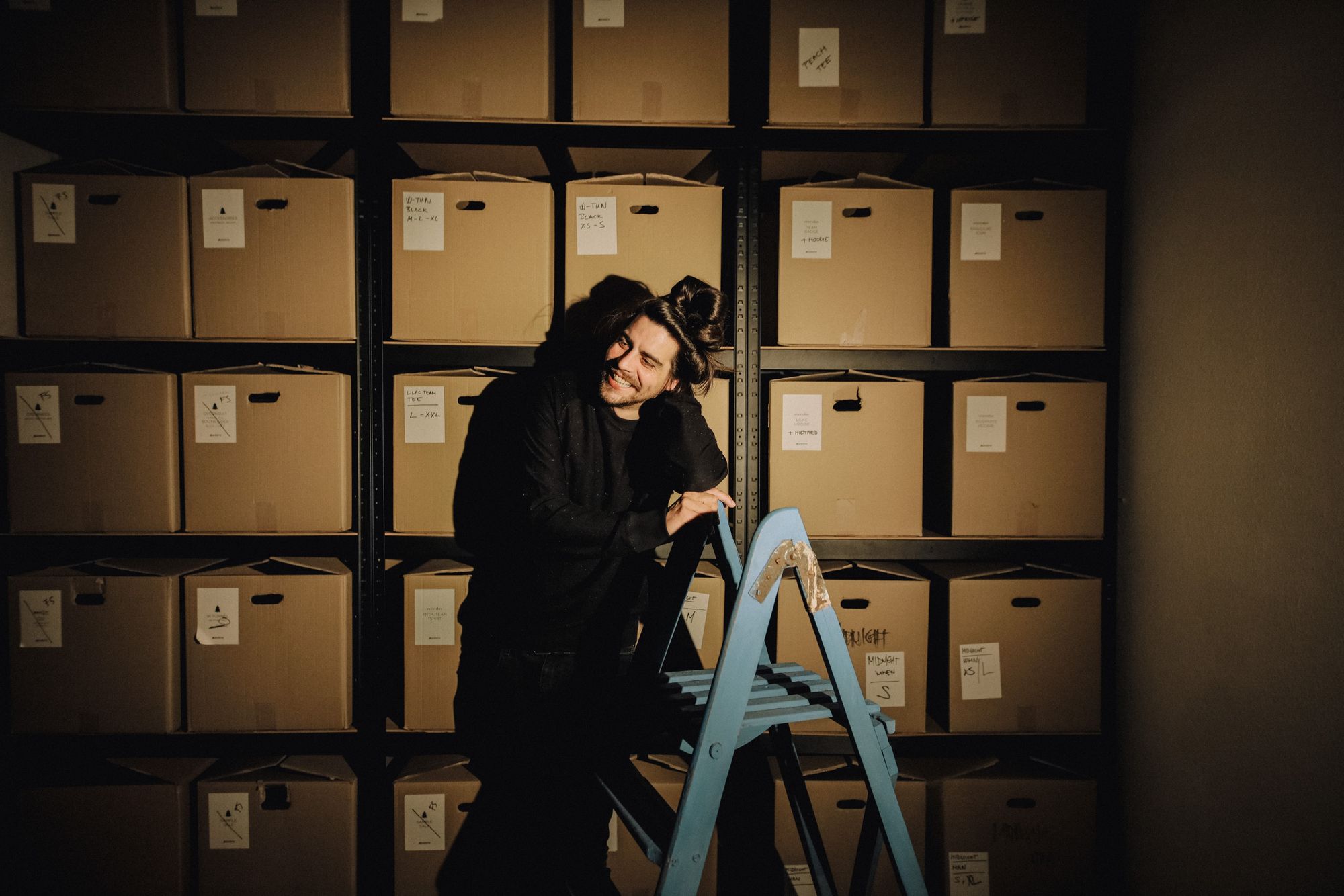
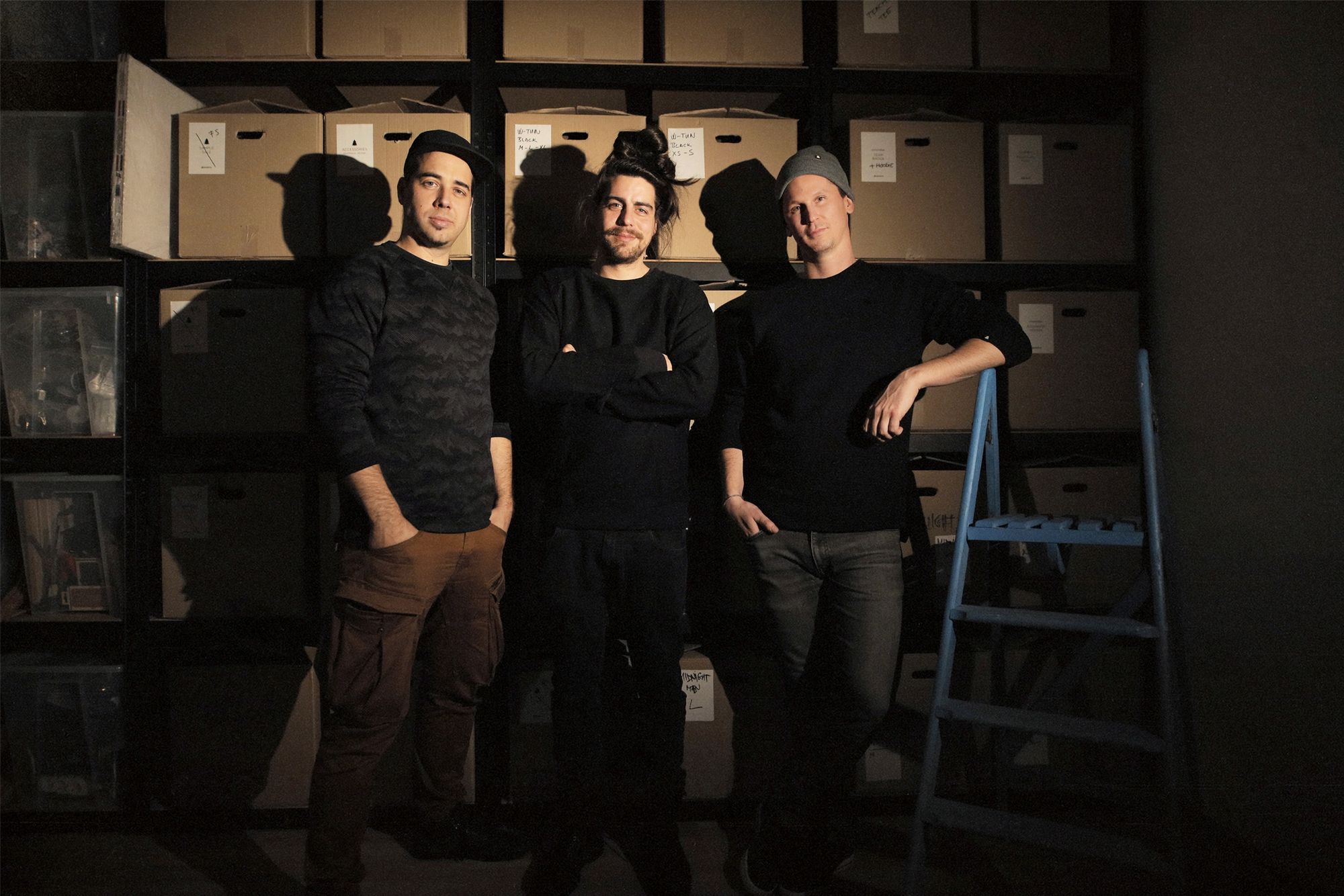
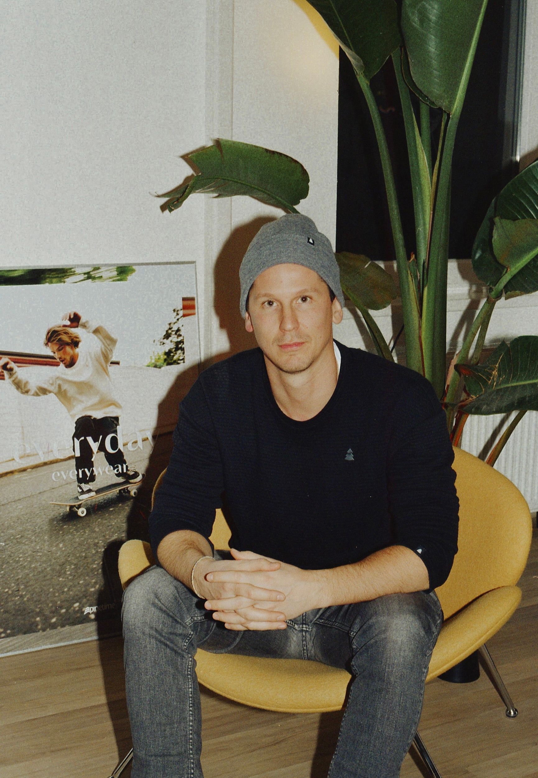
Portrait photos by: Dániel Gaál
Pinetime Clothing | Web | Facebook | Instagram
Award-winning confectionary brands in the region | TOP 5
Extraordinary home from the former Consulate of Serbia in Paraguay