The portfolio of studio NUR already gave away that they have a thing for Asian restaurants and culture; they created the visual identity of SÁO, Baobao and Khan restaurants in Budapest, and also that of SOЇ in Geneva. This time, they created an expressive visual appearance for An Nam restaurant in Stockholm.
The repertoire of An Nam offers authentic Vietnamese dishes for guests. Their operation is based on traditions and culture, as also suggested by the name: “An Nam” is one the historic names of Vietnam. Another peculiarity of the restaurant is that its owner, Michael Vu runs it together with his mother. Michael is in charge of finances, while his mother takes care of the attentively made Vietnamese dishes. The restaurant has a cozy and homey atmosphere, which also played a key role in designing their visual identity.
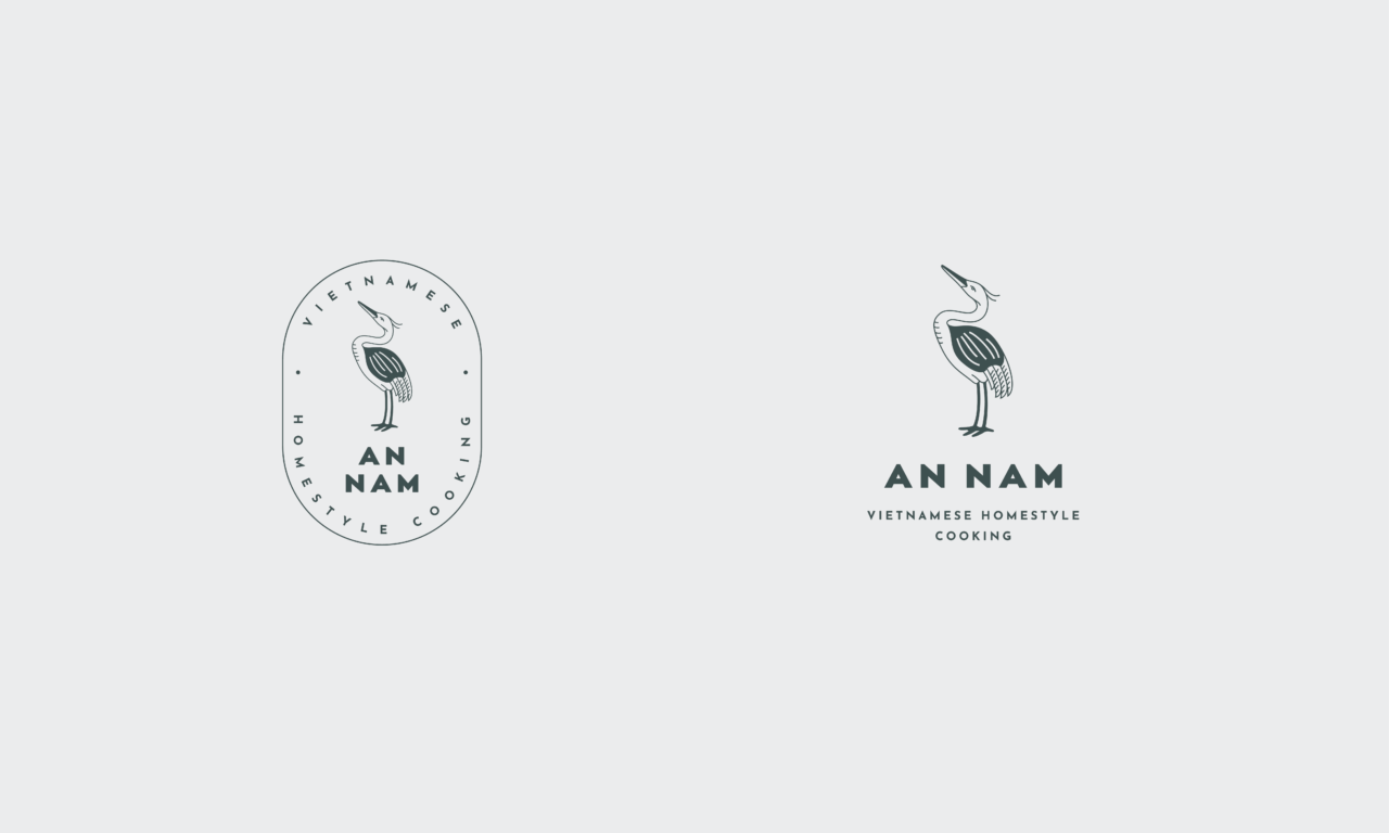
The logo designed by studio NUR was inspired by Vietnamese traditions, this way, the design process started with looking up symbols that play a dominant role in Vietnamese culture. These symbols include the Chim Lac bird, which is one of the most disputed legends of Vietnamese traditions, and was displayed on the ancient Dong Son bronze drums. Some people say the Chim Lac was a crane, thus the designers decided to make this majestic bird the central element of the visual identity of An Nam restaurant. The bird symbolizes family, reaching back to traditions, but instead of portraying it in an abstract form, the designers opted for a design that can be recognized by anyone.
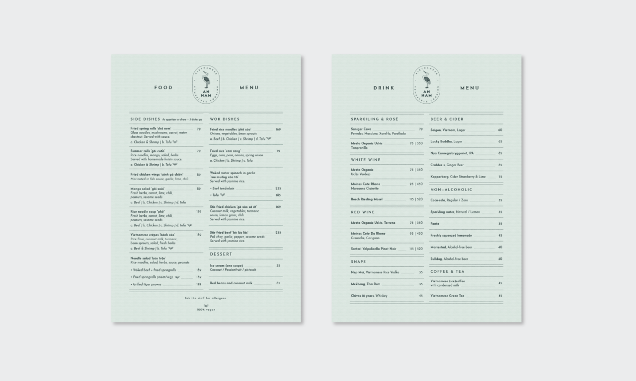
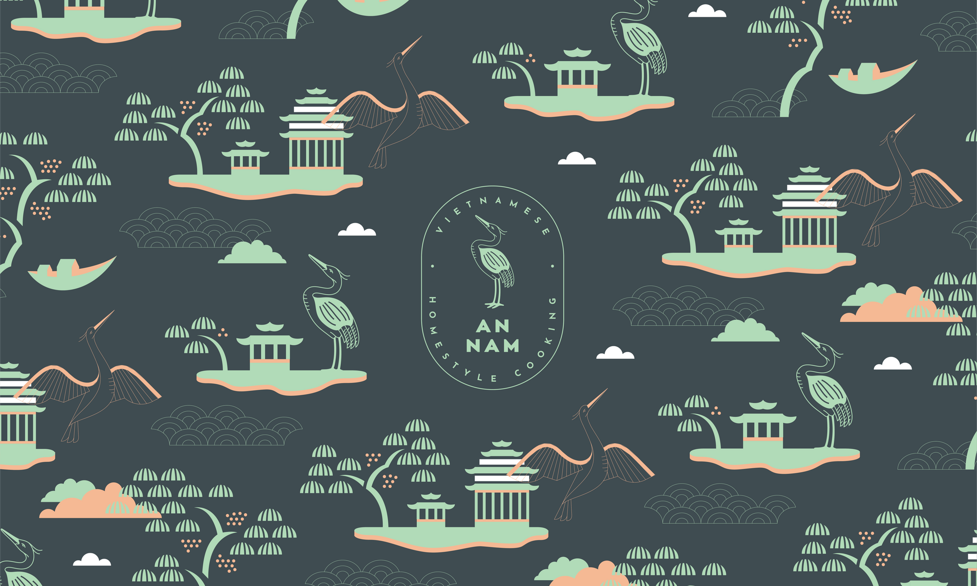
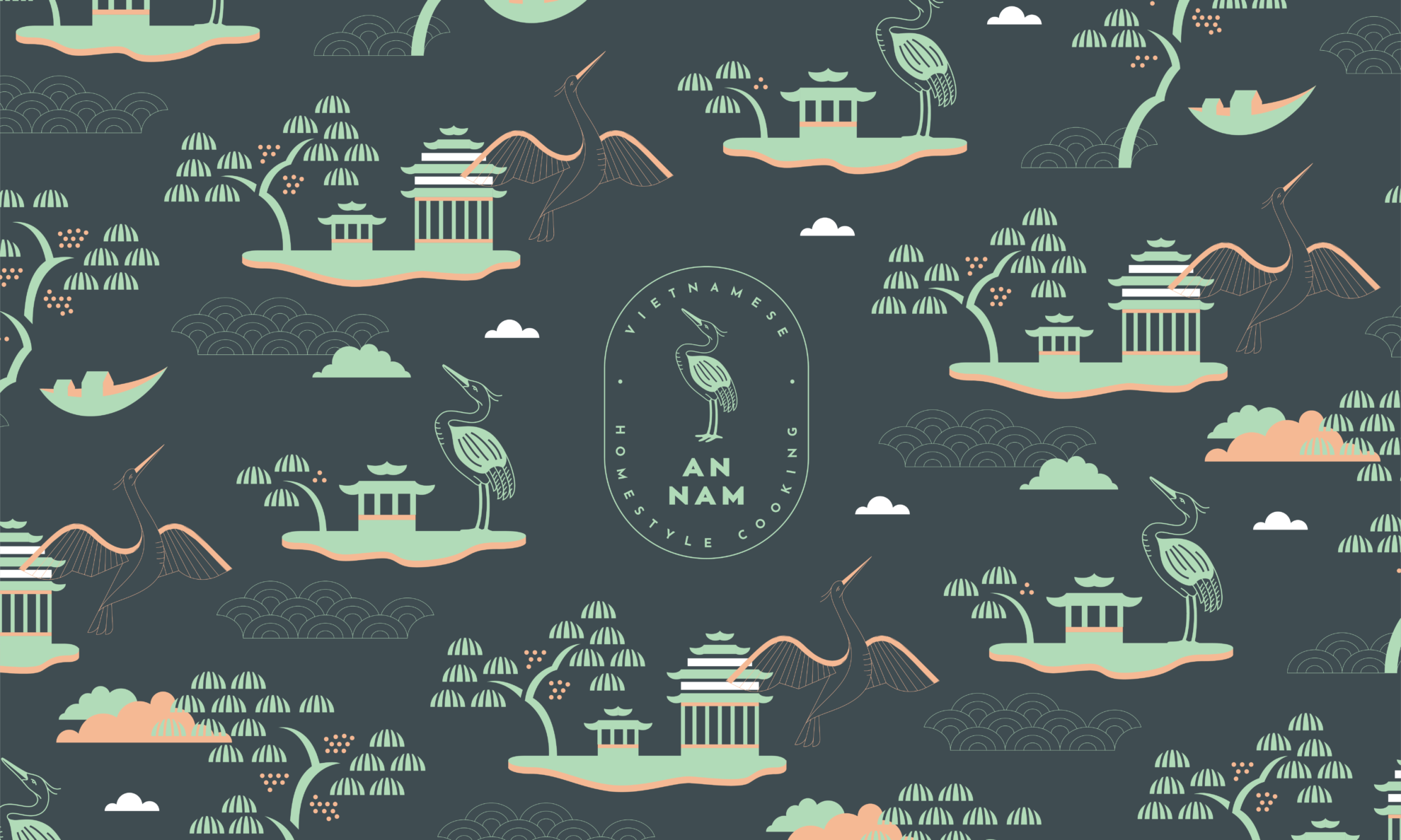
In addition to the symbol of the crane, the ornaments complementing the visual identity feature the motifs of classical Vietnamese folk paintings, in a contemporary and clean visual language. To further balance traditional elements, studio NUR chose an airy Art Deco font. The visual world created this way is a vivid manifestation of what An Nam is about: family, culture and tradition in a clean, sophisticated and modern environment.
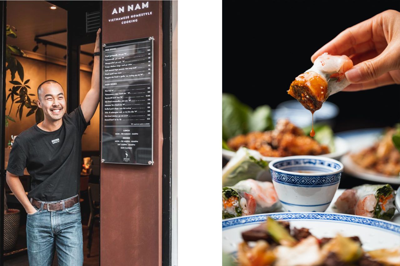

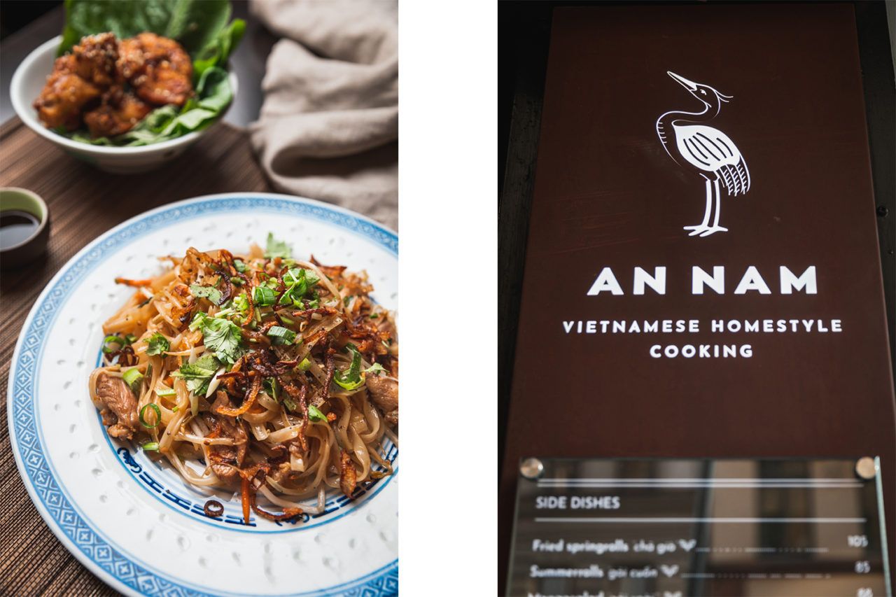
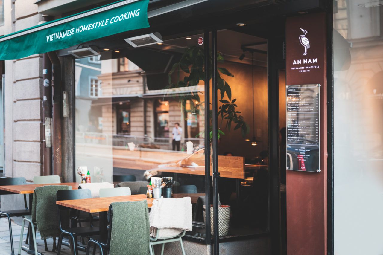
Photos: David Johansson
An Nam | Facebook
Studio NUR | Web | Facebook | Instagram
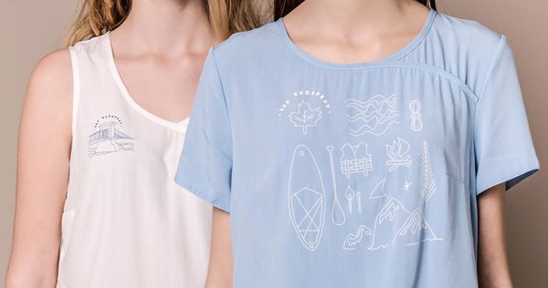
Back to nature, through the city | SUP Budapest x Alma Vetlényi
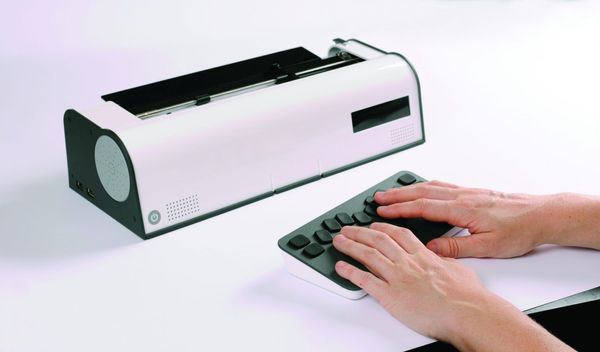
A Braille typewriter, with a modern a twist | Metaphor
