“Drink me!” – reads Alice on the small bottle in Wonderland. The naive little girl follows the command, and obeys: the flask runs empty, and so at times she shrinks, and other times she transforms into a giant. This mode of action also applies beyond Lewis Carrol’s fairy tale, as every potion bottled up wants the same: get out of the flask.
Over the decades, we’ve developed a plethora of methods as to what to say about the liquid genie sealed with a cork, lid or a ring pull, kept in captivity until the moment of consumption or use, and how to say it. The shape, size and material of the bottle, the markings of the label, the act of opening – so many ingredients striving for the same purpose: to make the product waiting on the shelf appealing without actually letting us get close to the liquid. The message of “drink me” can be conveyed in countless ways. This time, we collected the minimalist labels that reveal the least possible information, but what they do tell, they tell quite strikingly – from Moscow to Montréal.
Kitti Mayer
design theorist
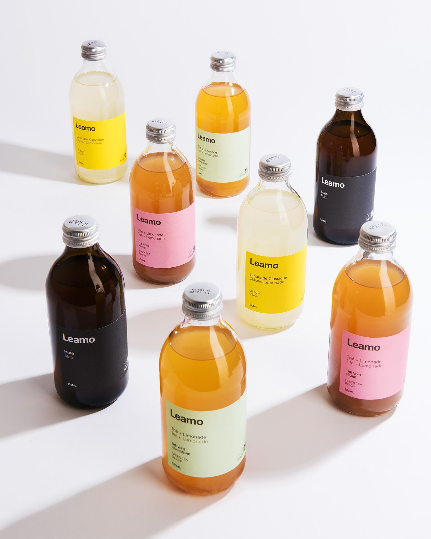
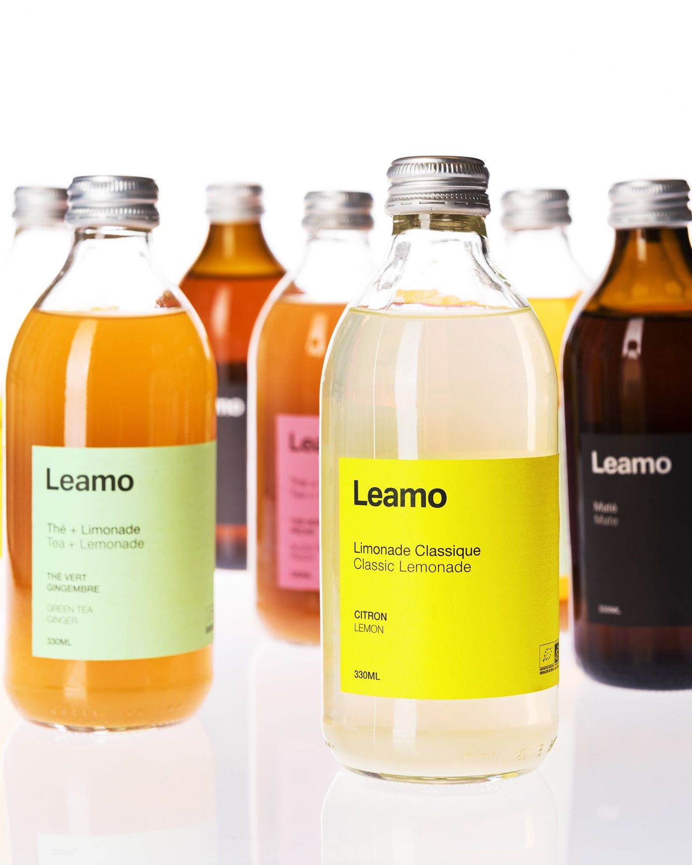
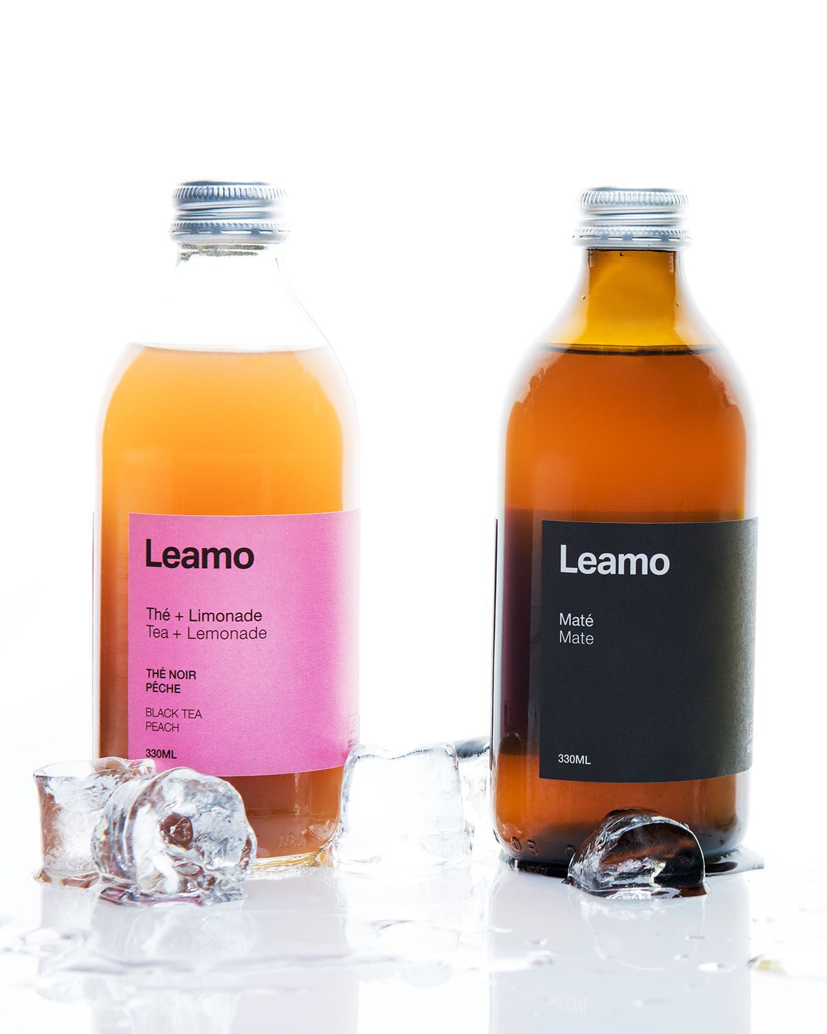
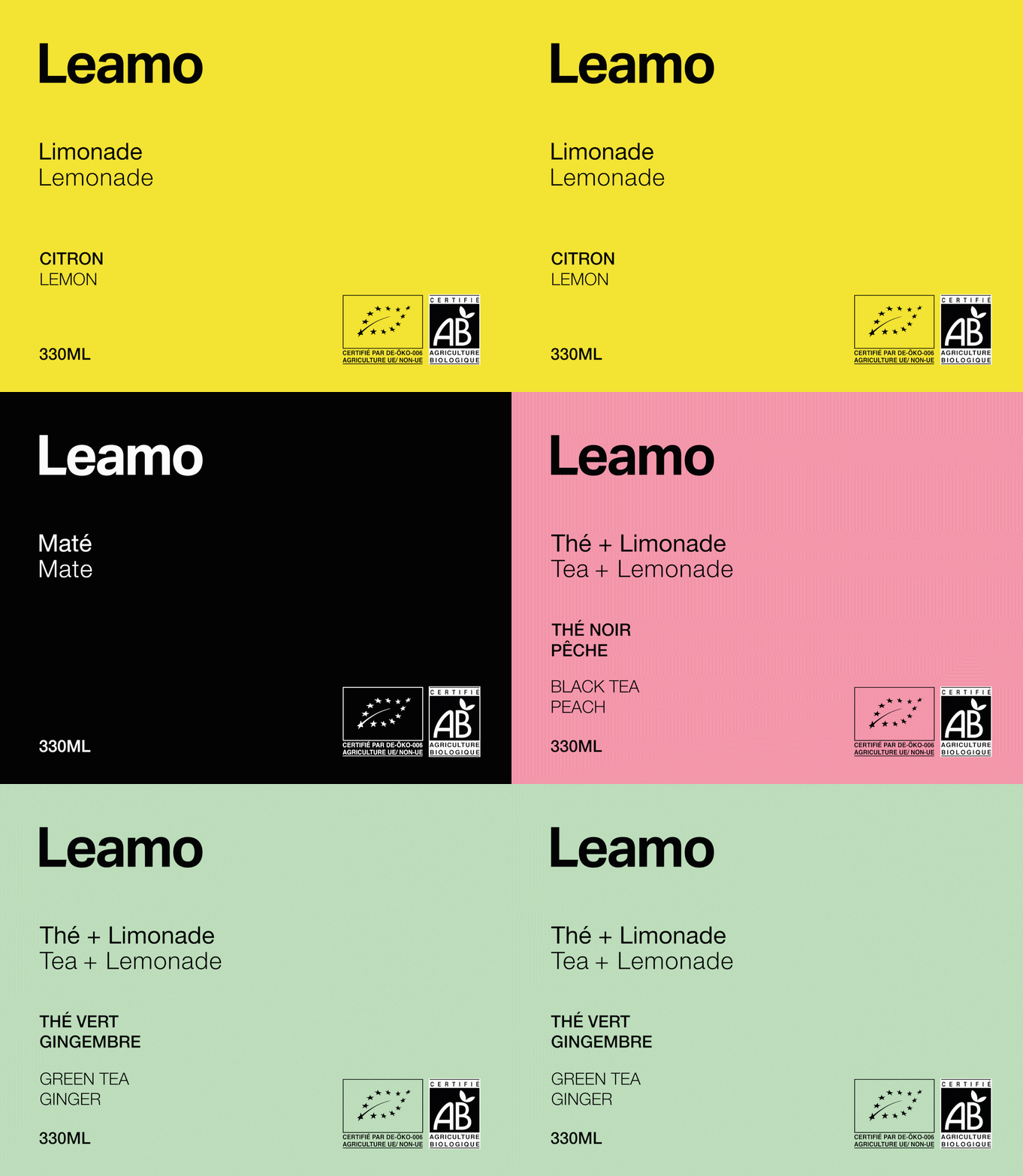
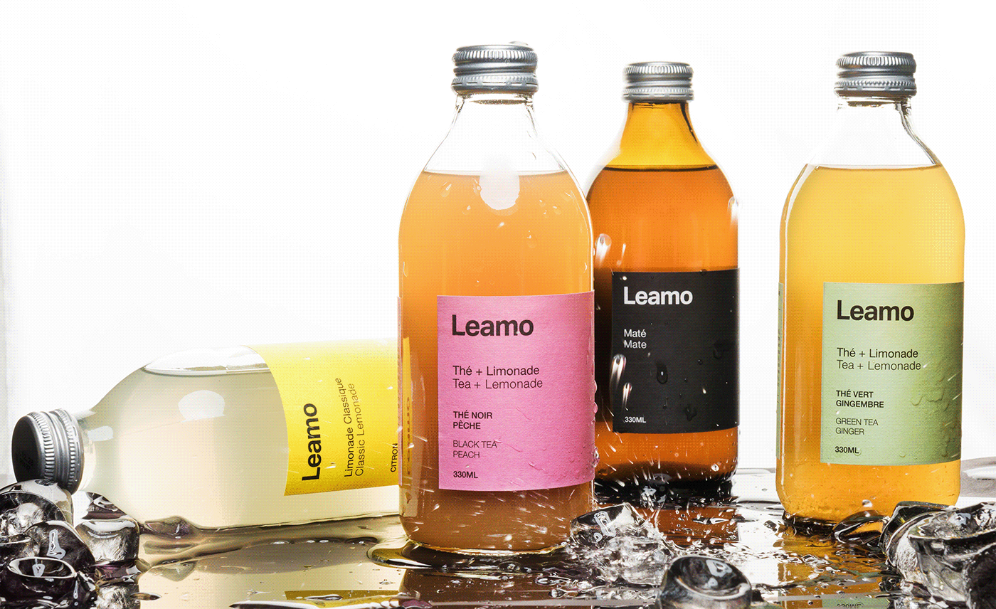
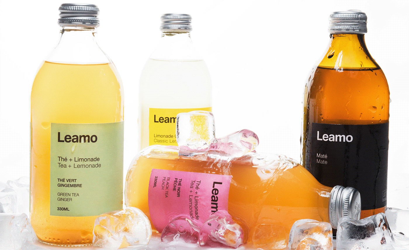
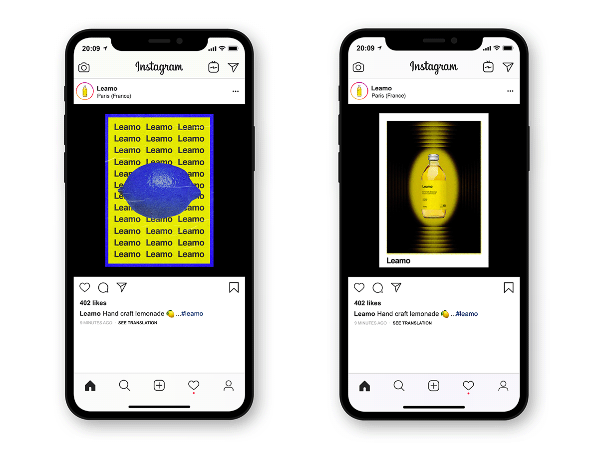
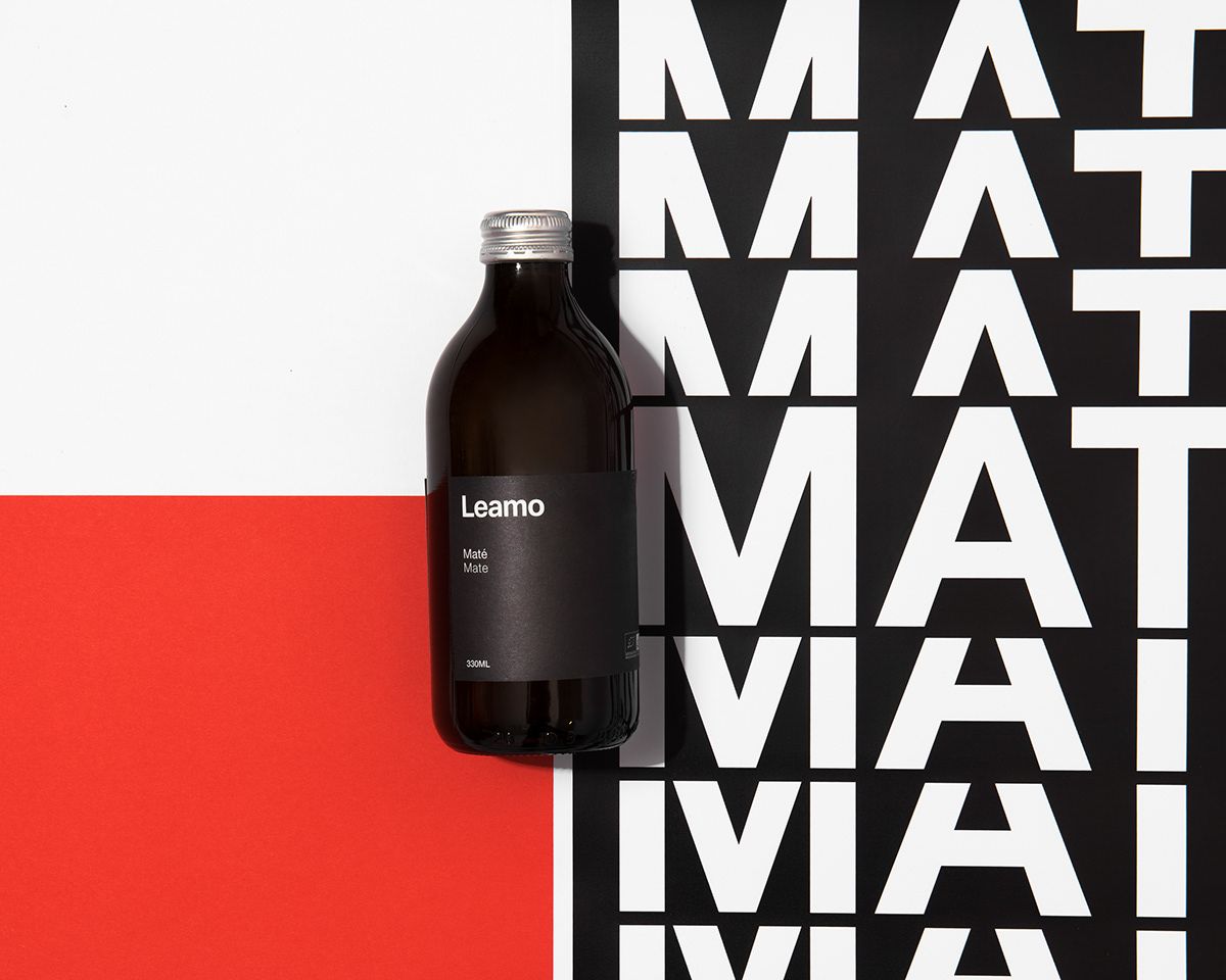
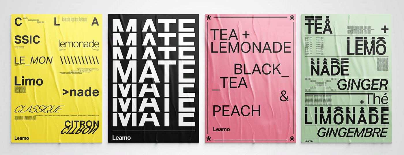
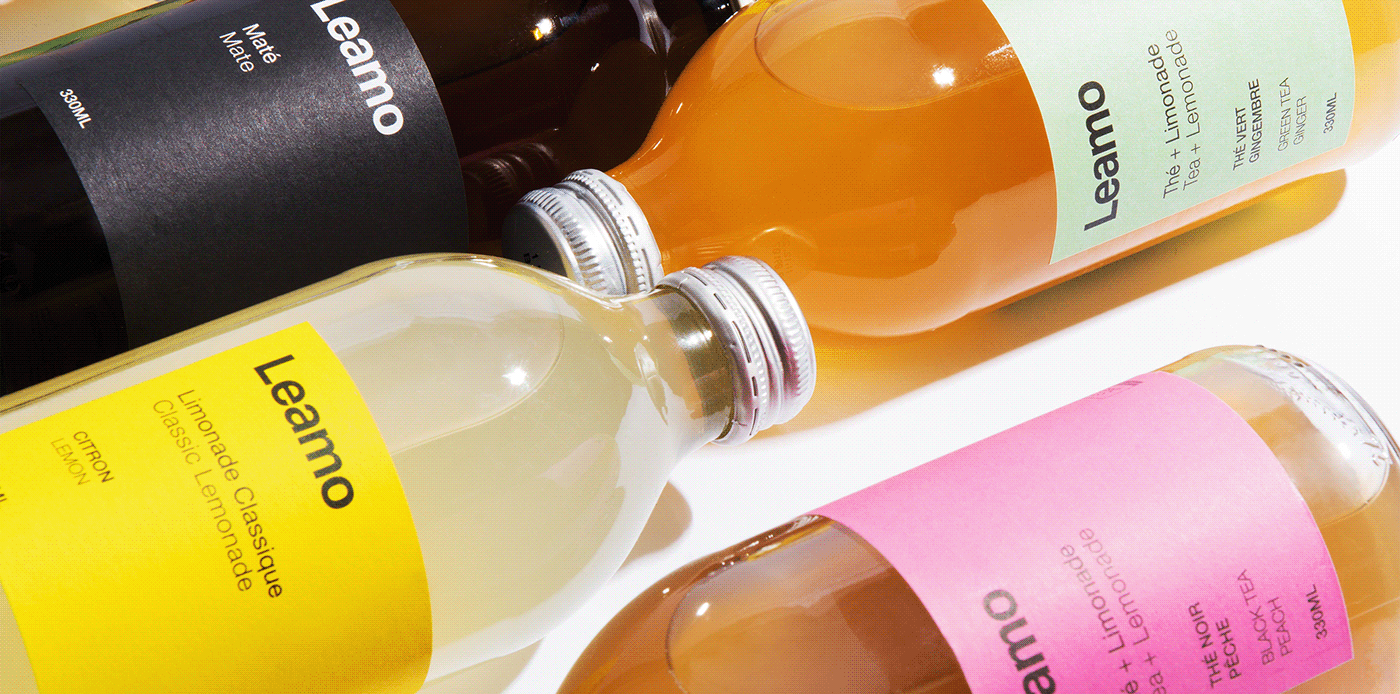
LEMONADE
LEAMO – BRANDING & PACKAGING | Paris, France
Pölar Studio
Thibault Savoyen


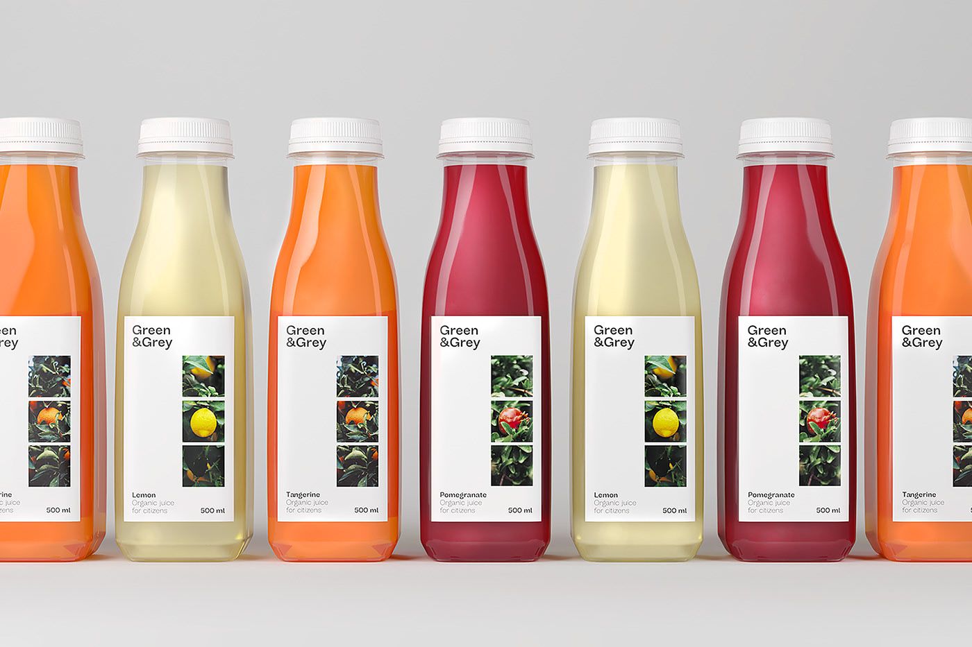
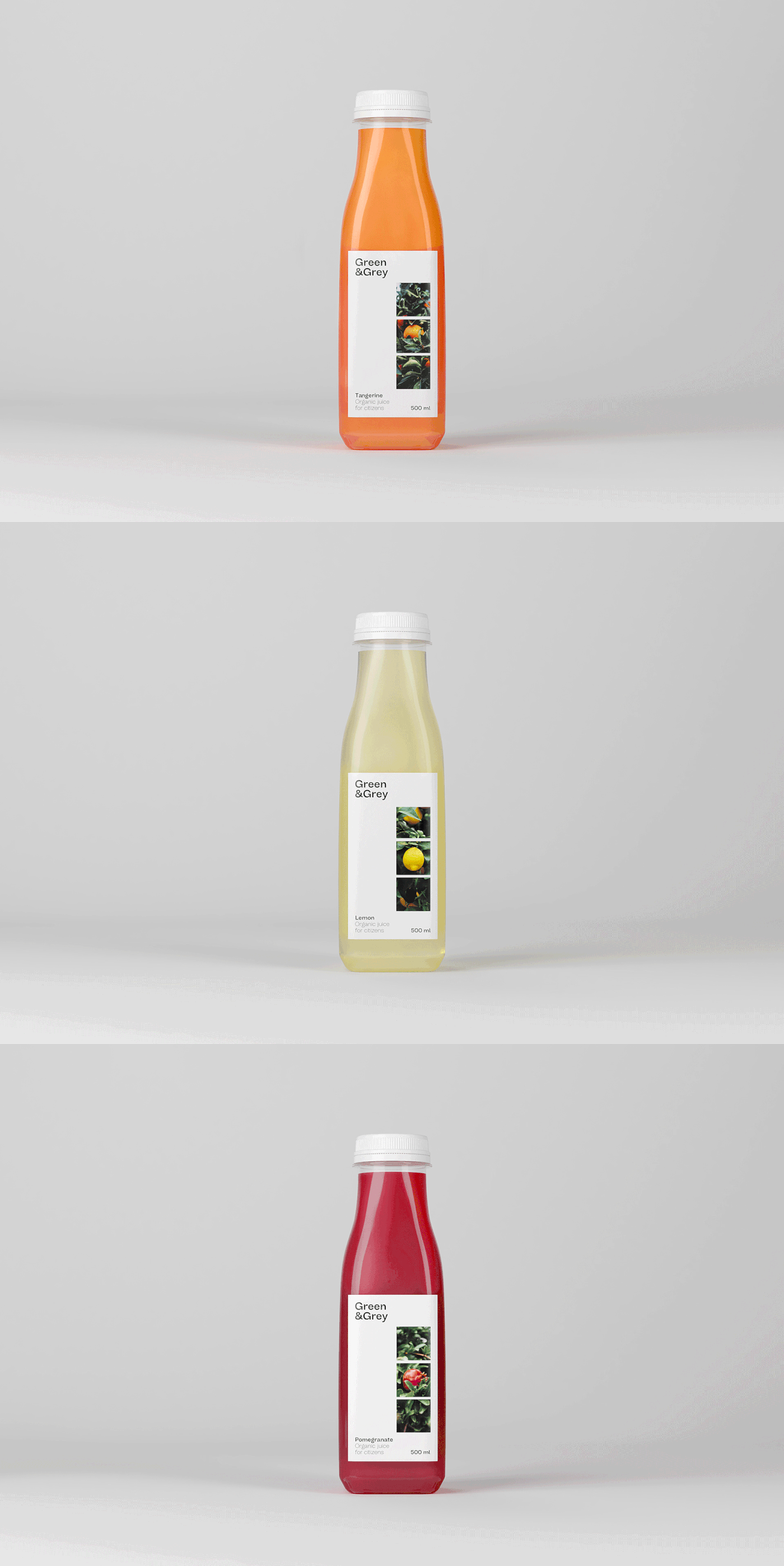
JUICE
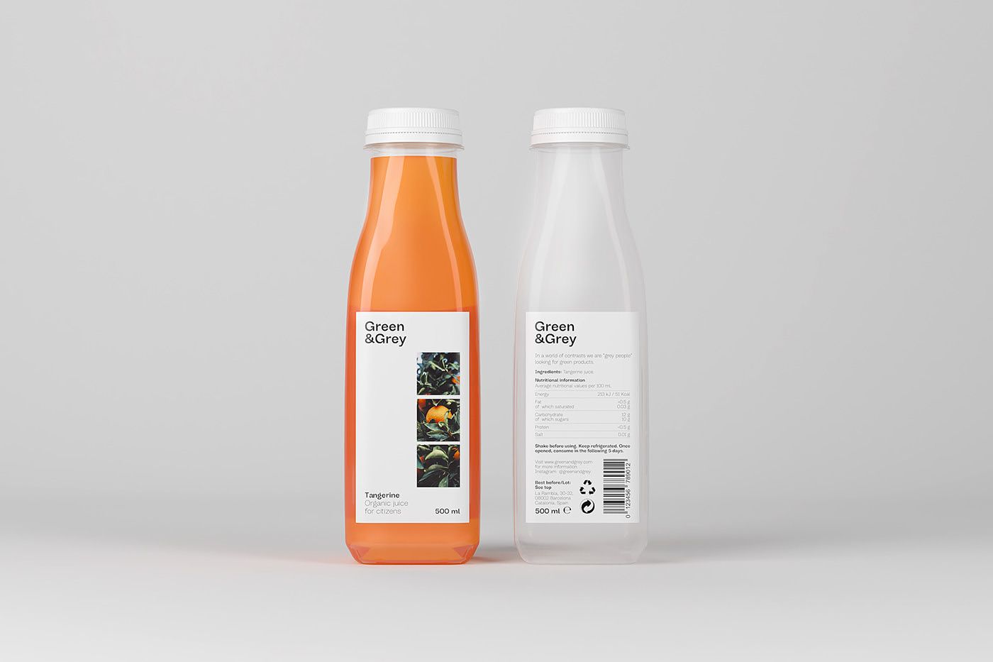
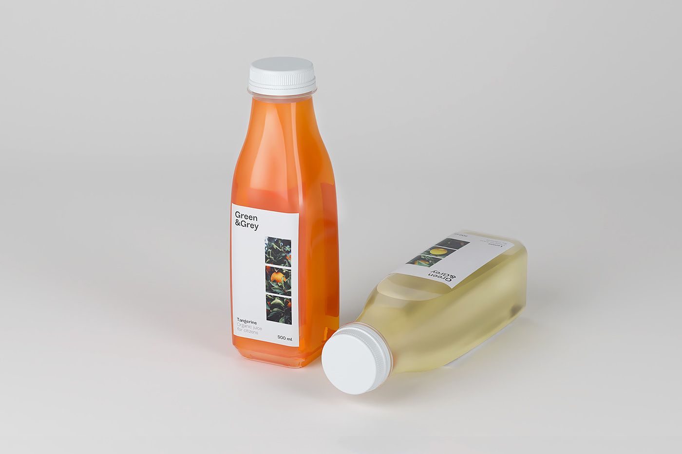
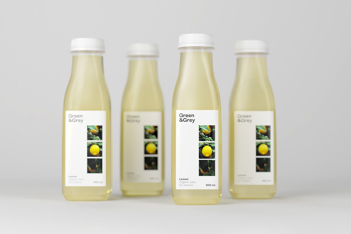
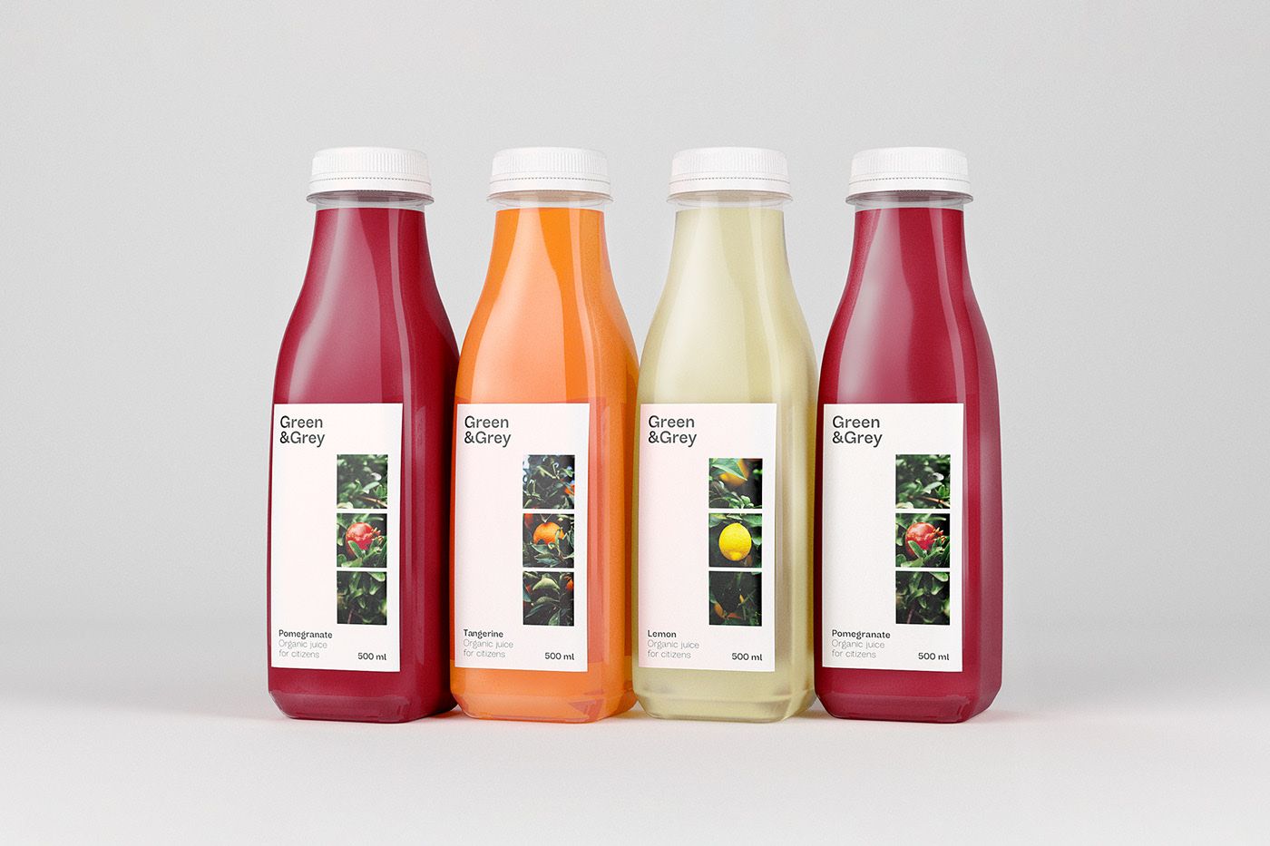
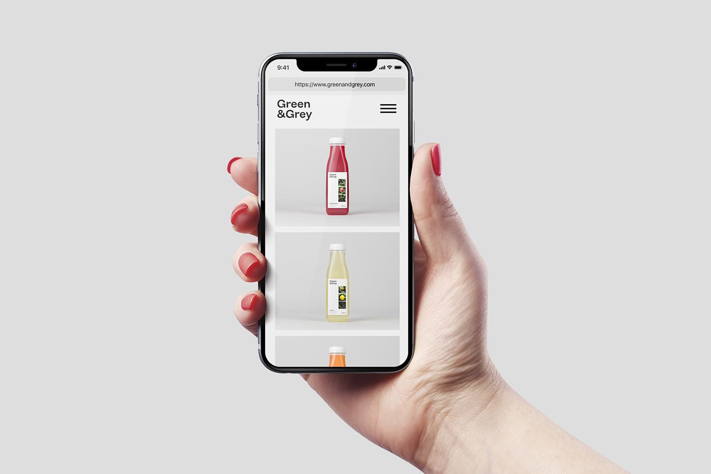
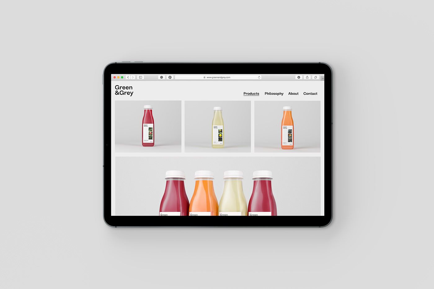
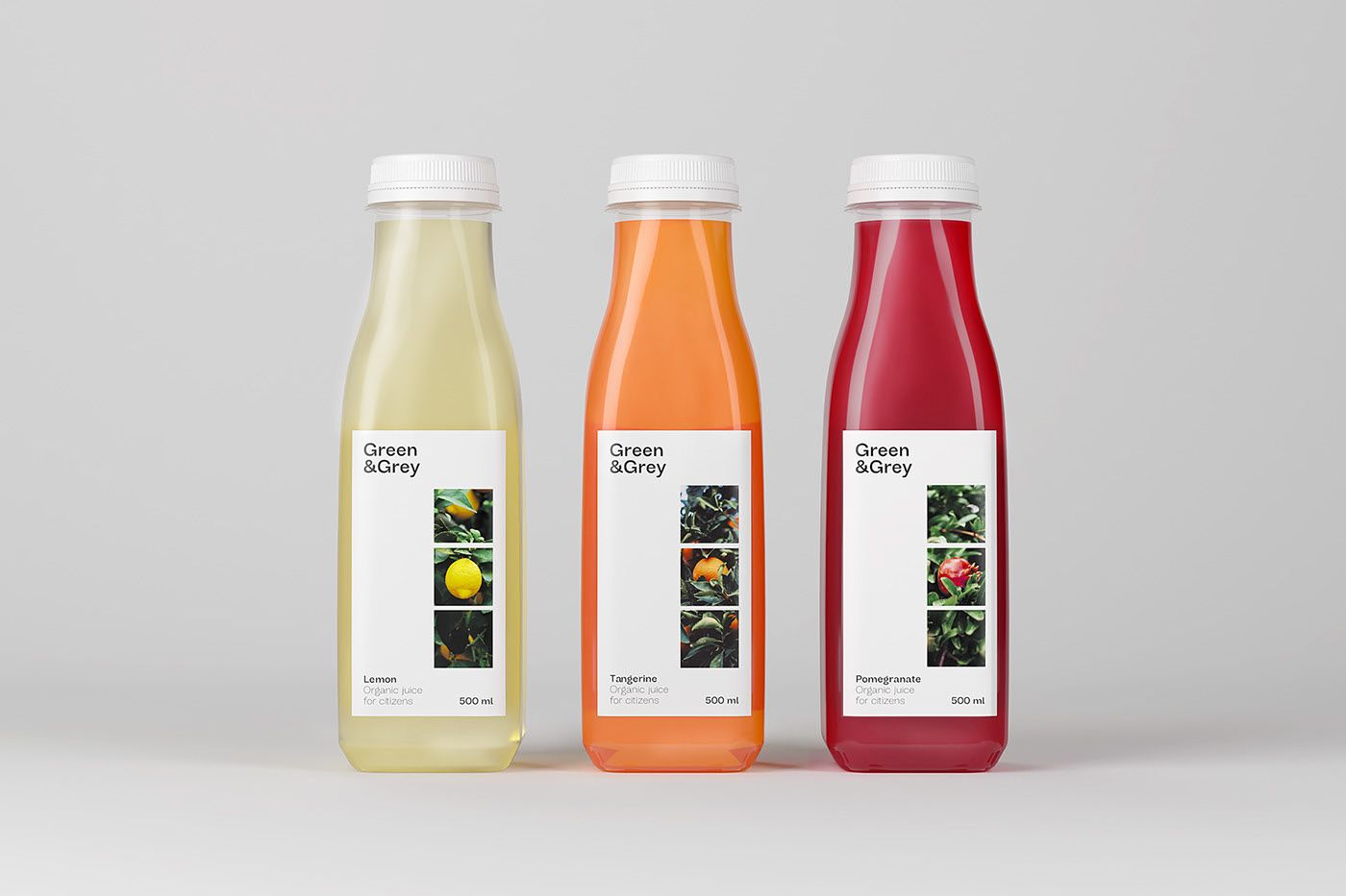
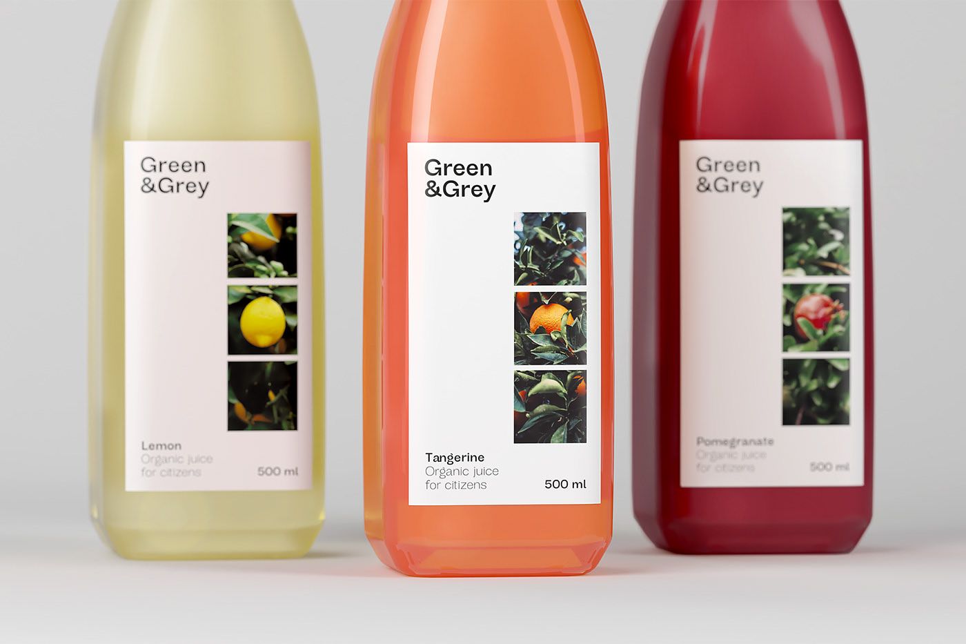
Green&Grey – Organic juices | Barcelona, Spain
Teresa Redón
Alba Morote
Miquel Nadal
ElisavaPack
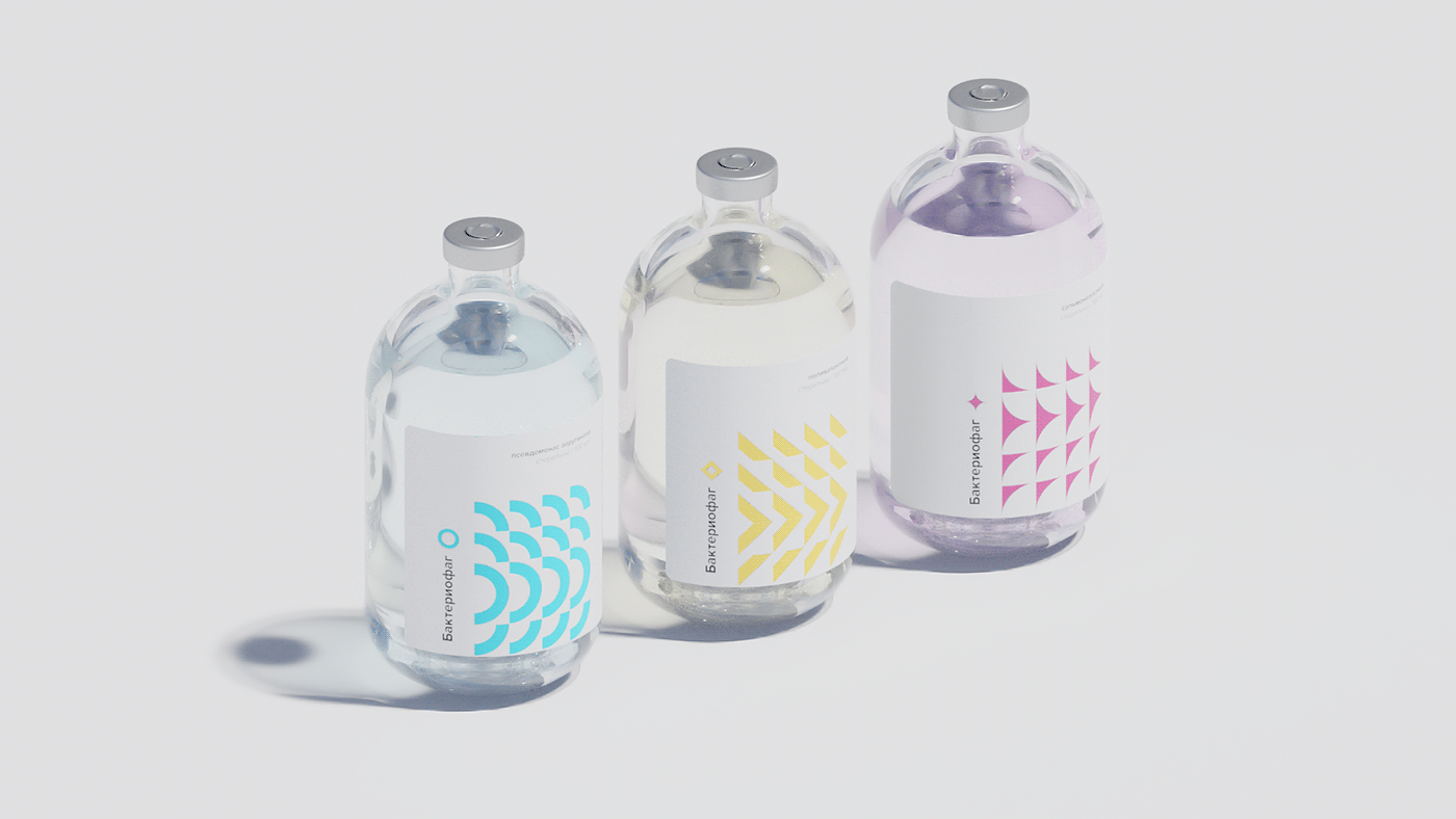
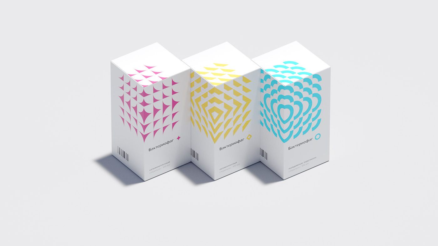
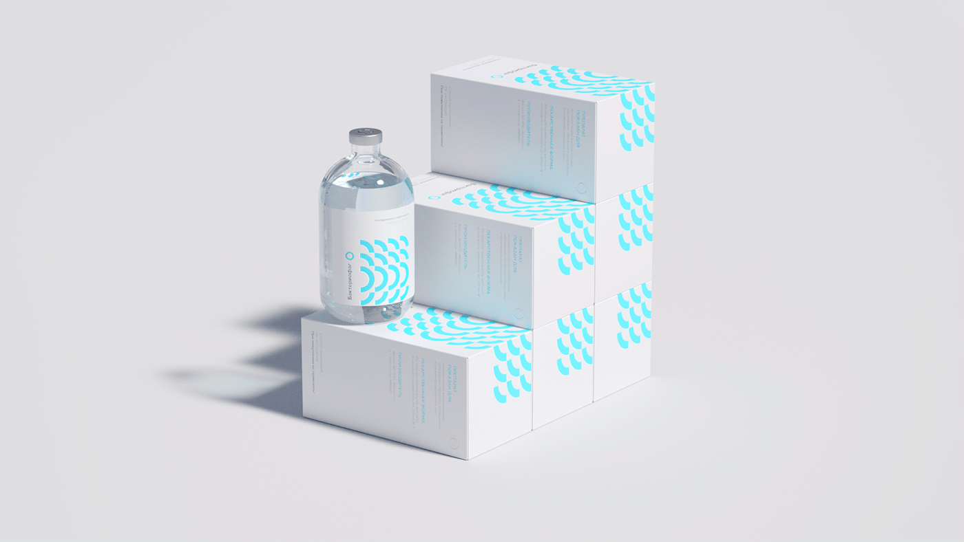
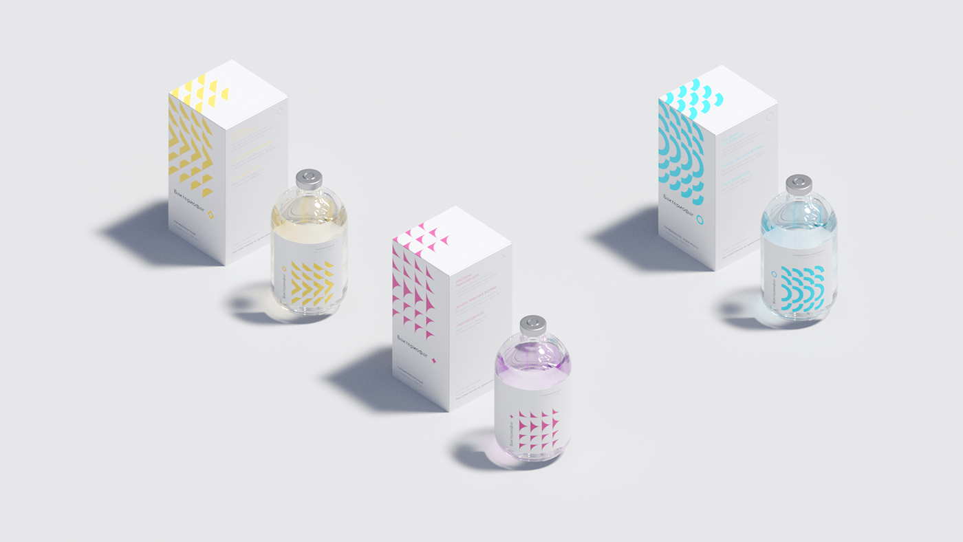
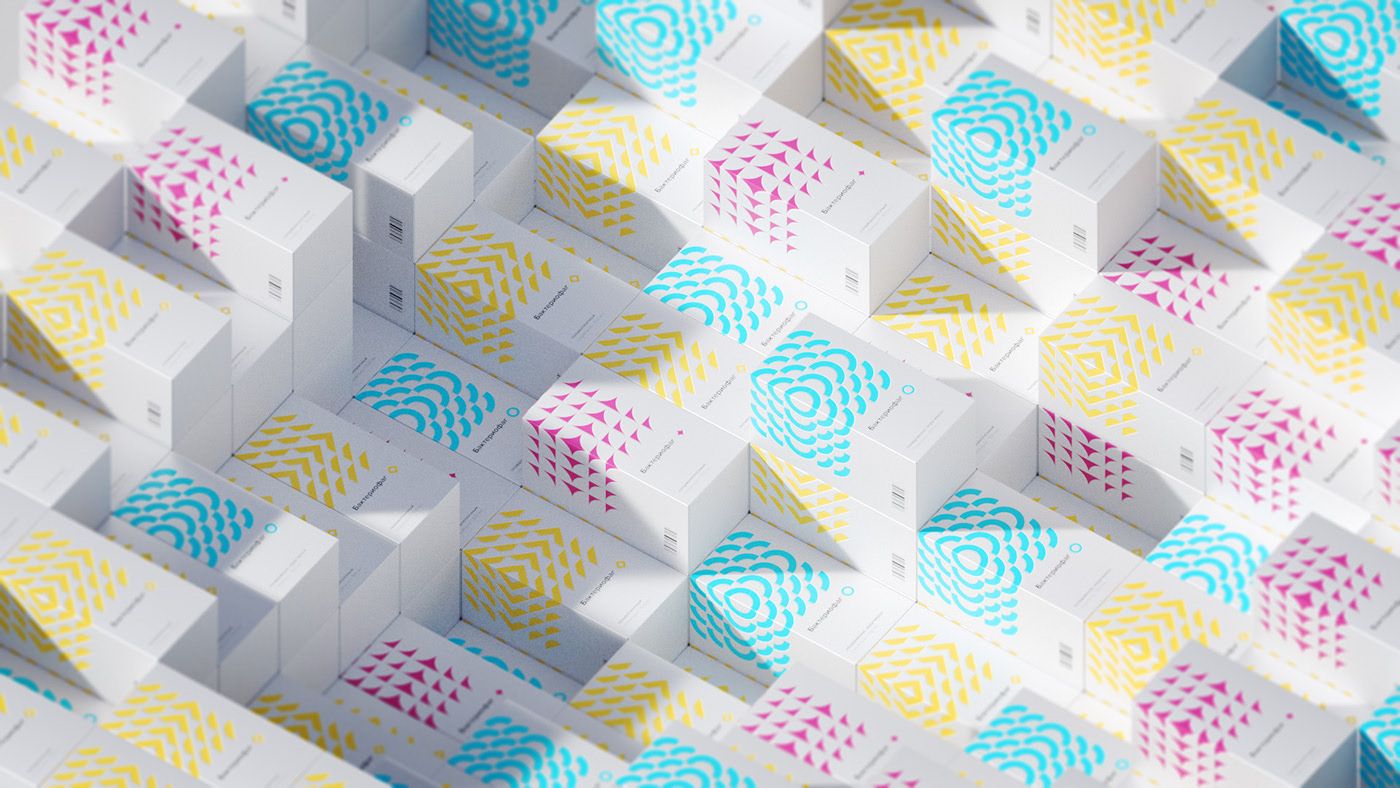
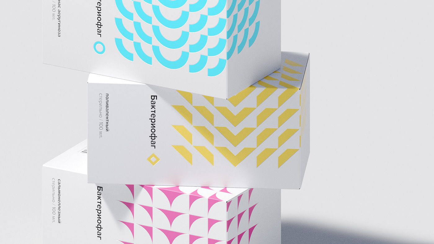
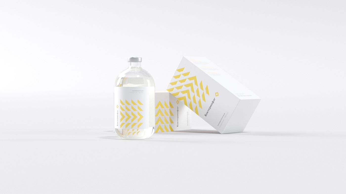
MEDICINE
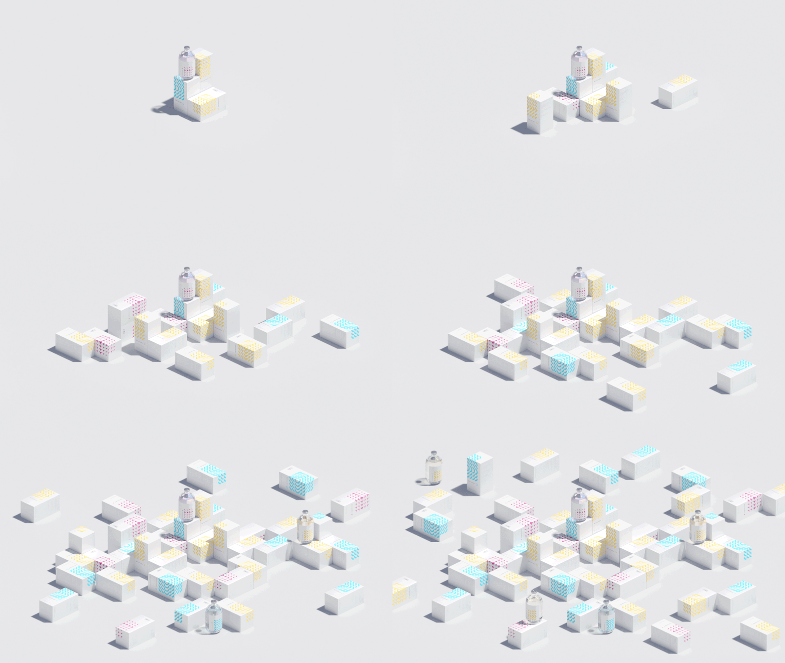
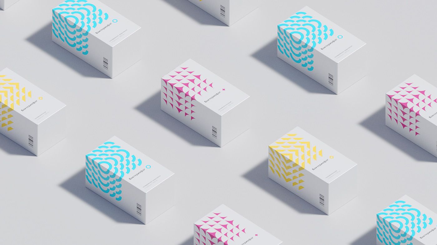
Bacteriophages. | Moscow, Russia
Kir Vitkovski
Sergey Shestakov
Design Band

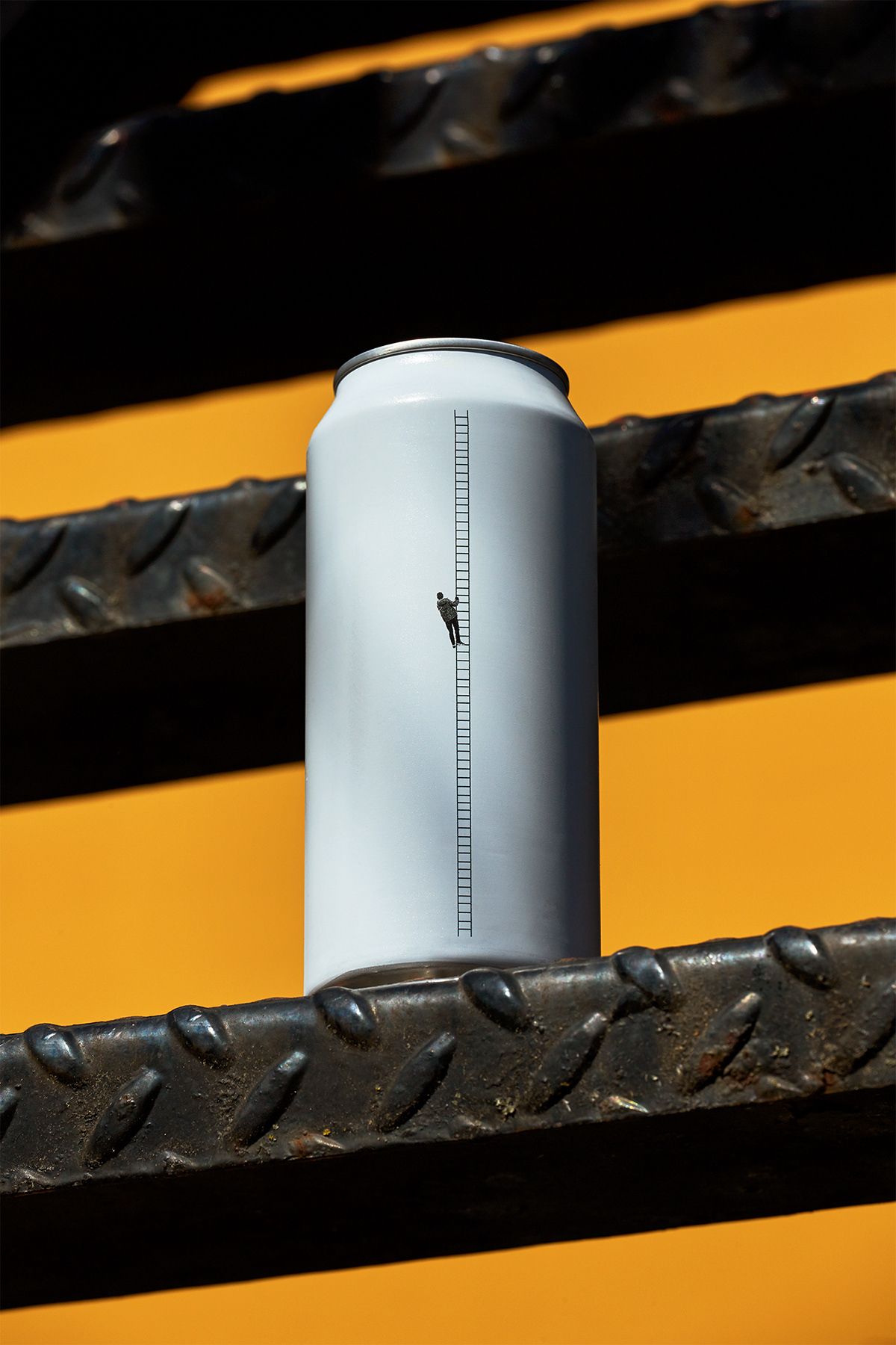
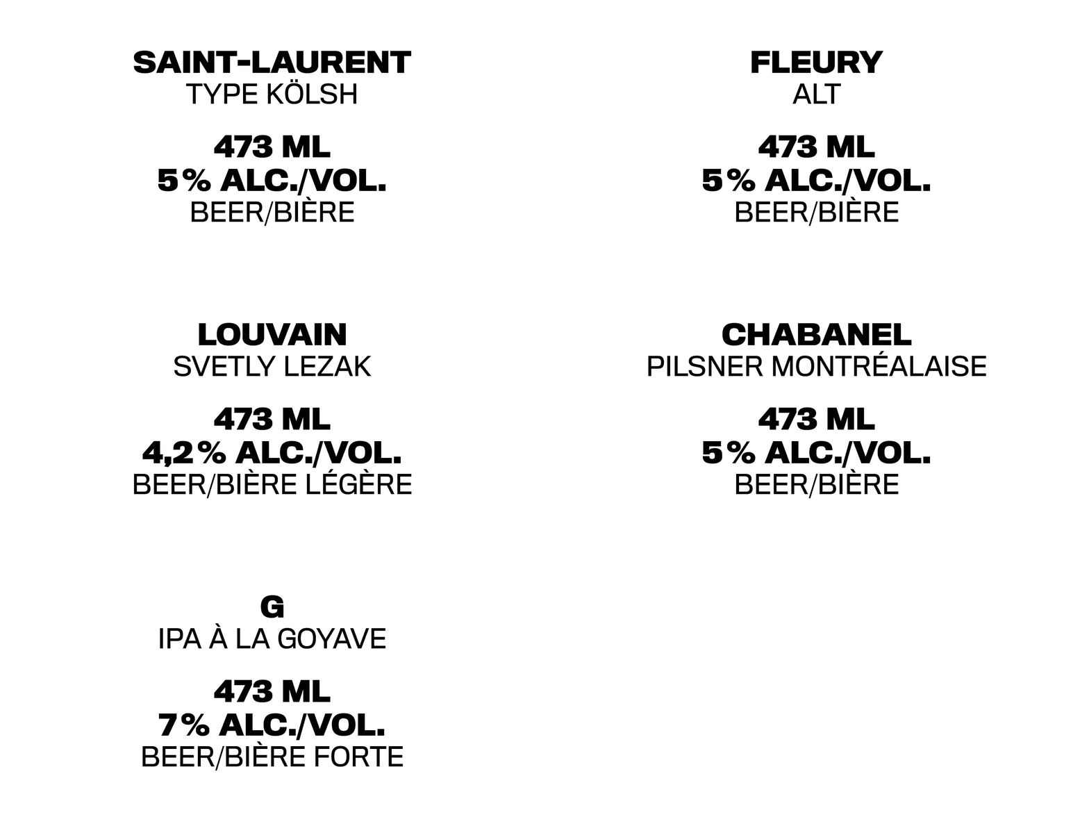
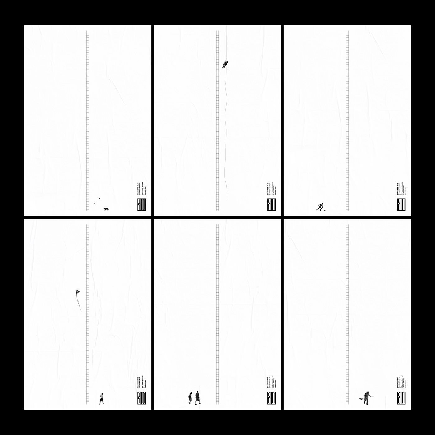
BEER
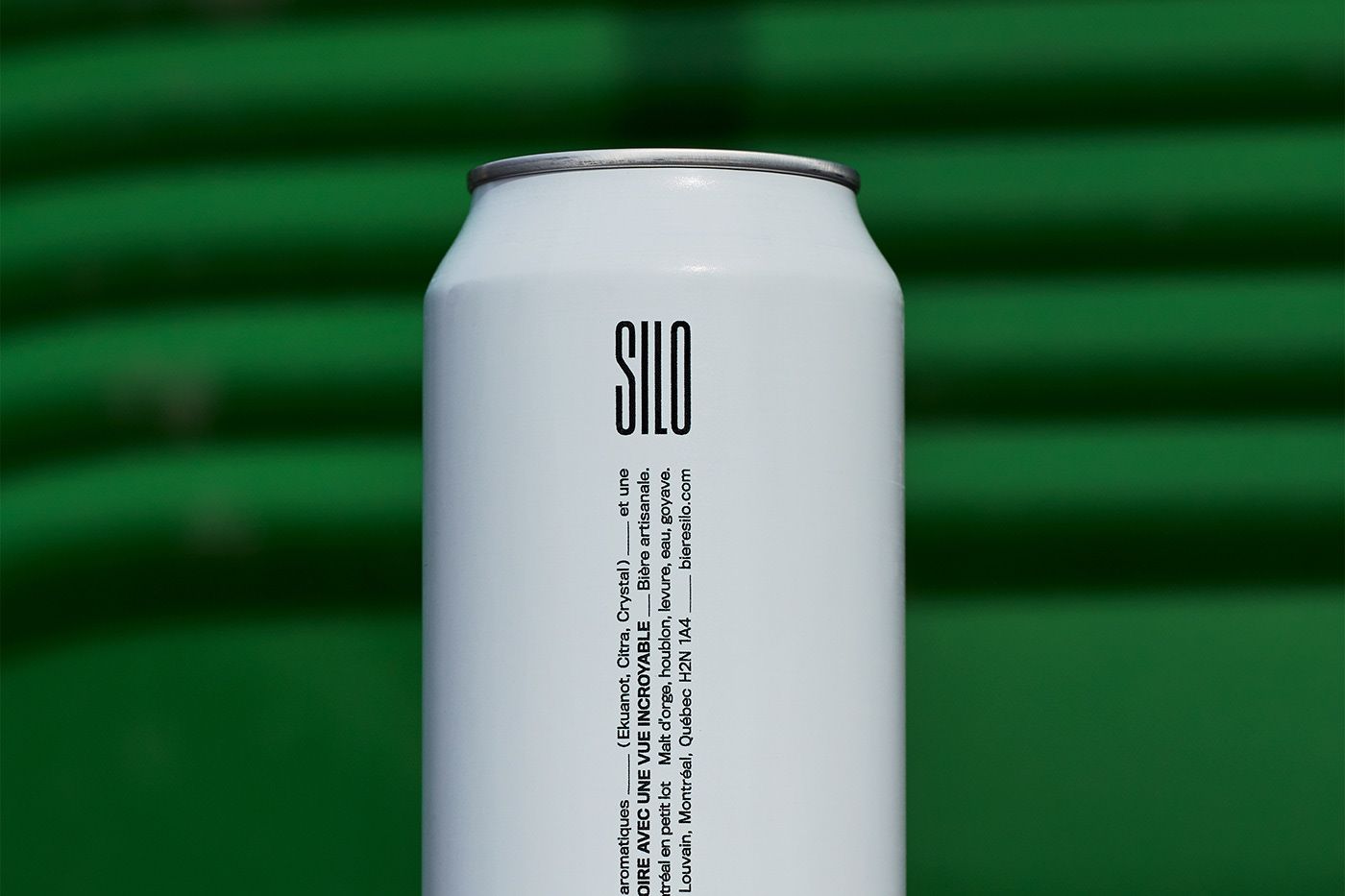
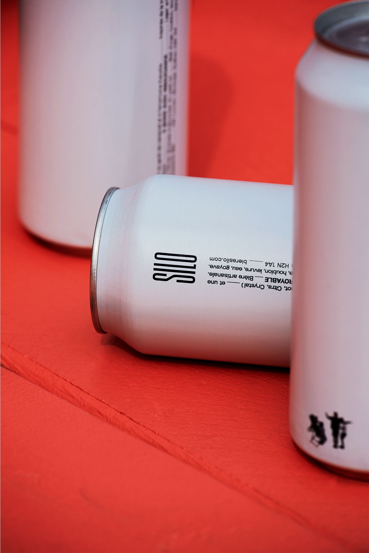
Silo | Montréal, Canada
Caserne .
Léo Breton-Allaire
Marianne Isabelle
Ugo Varin
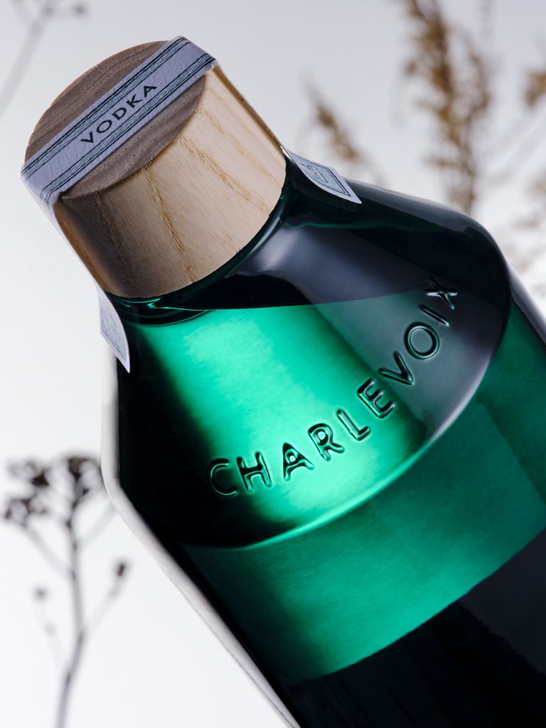
SPIRIT
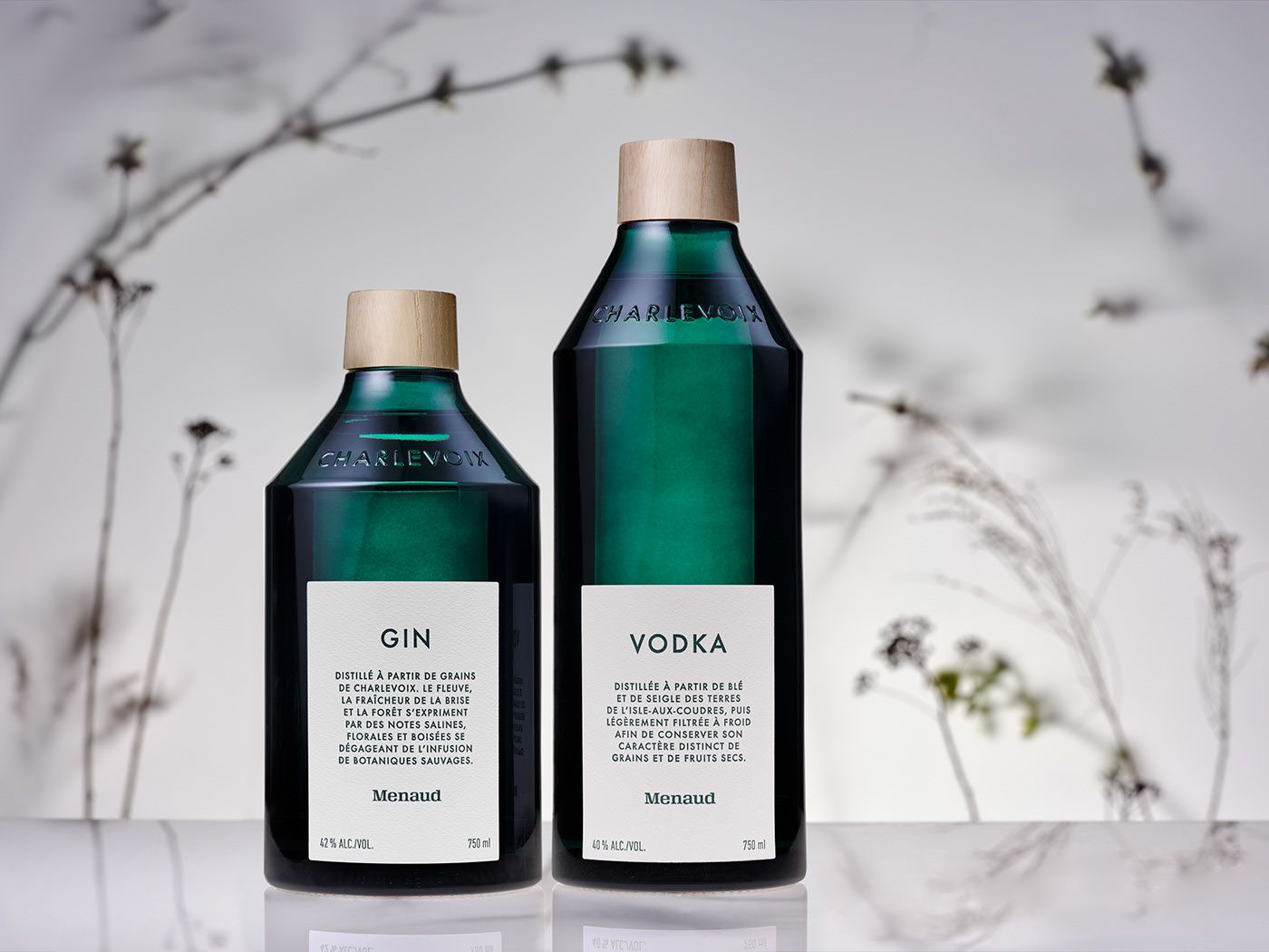
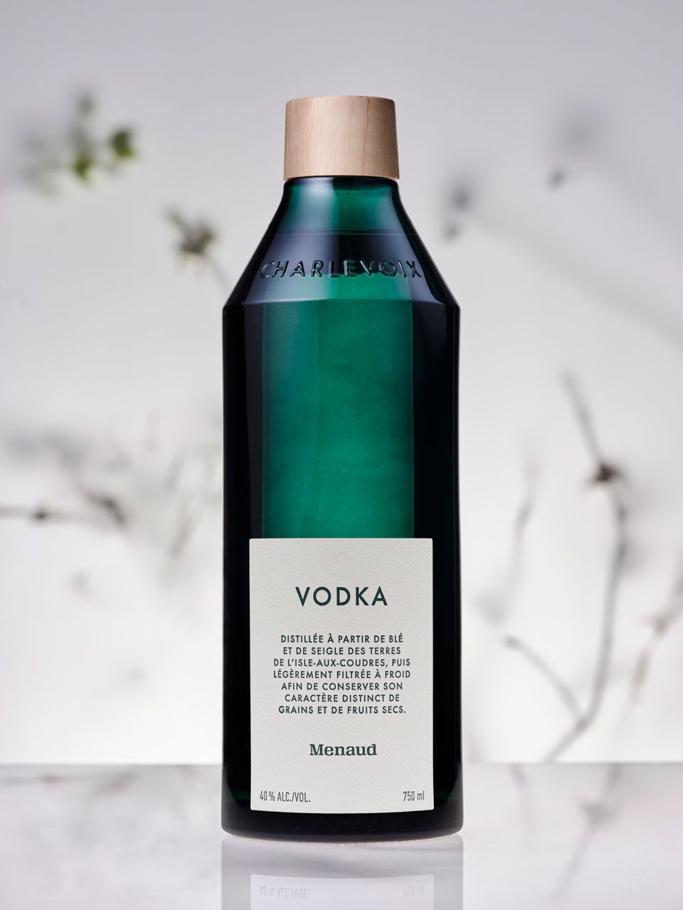
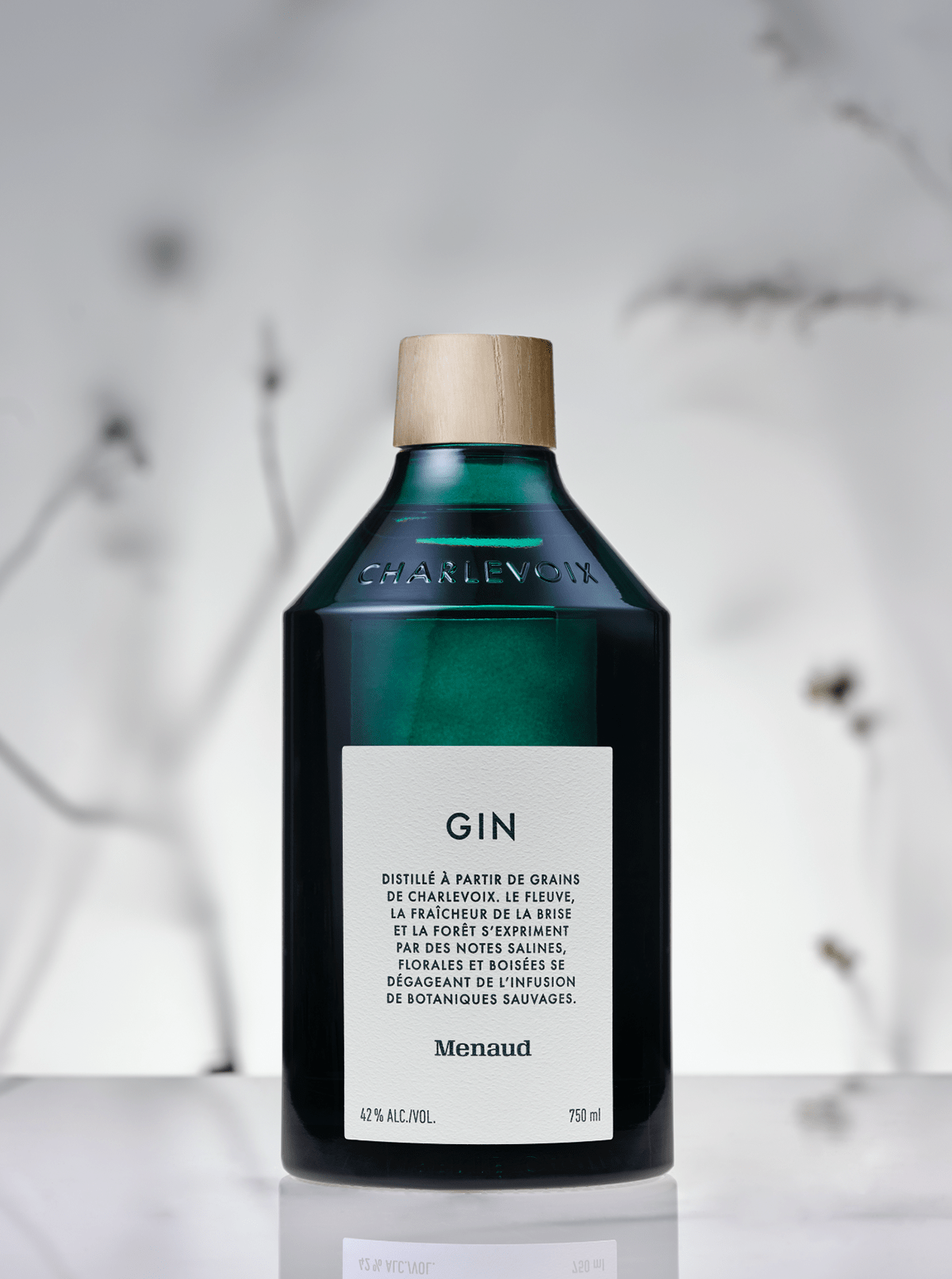
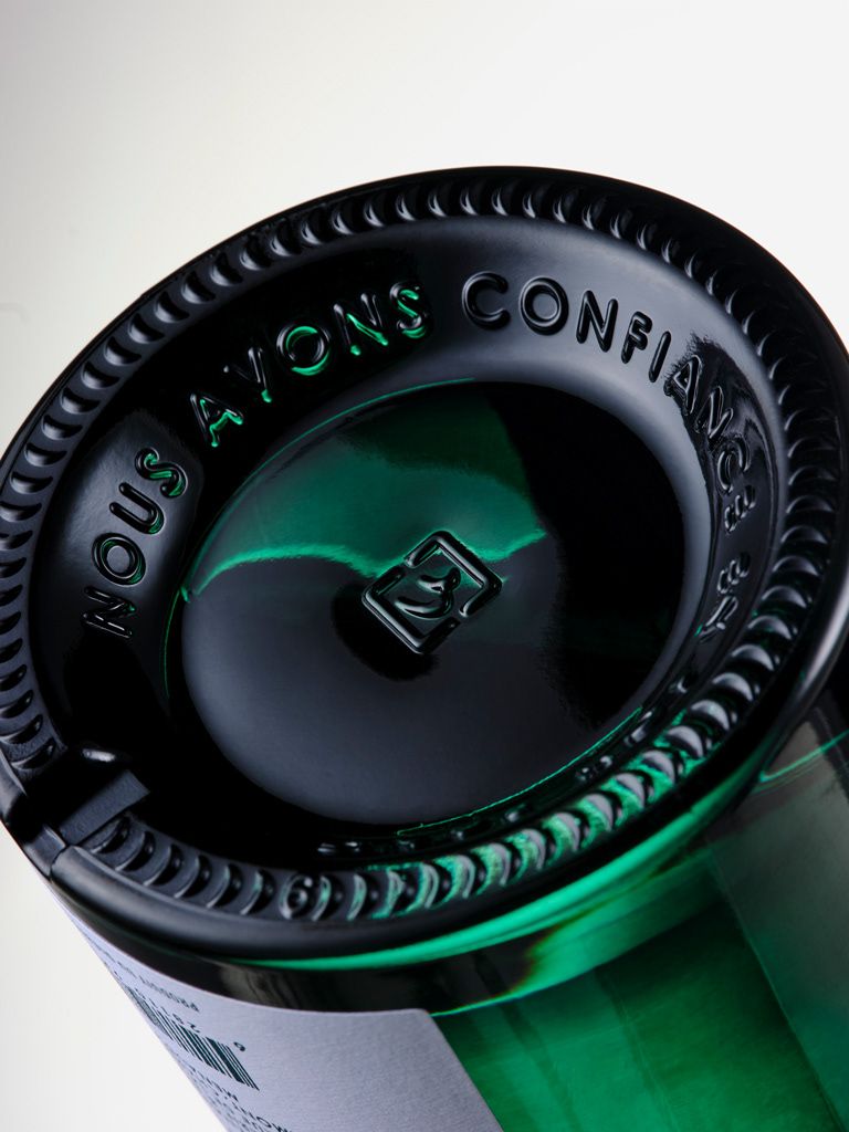
Menaud – Custom Bottle Design & Brand Identity | Montréal, Canada
Wedge Studio
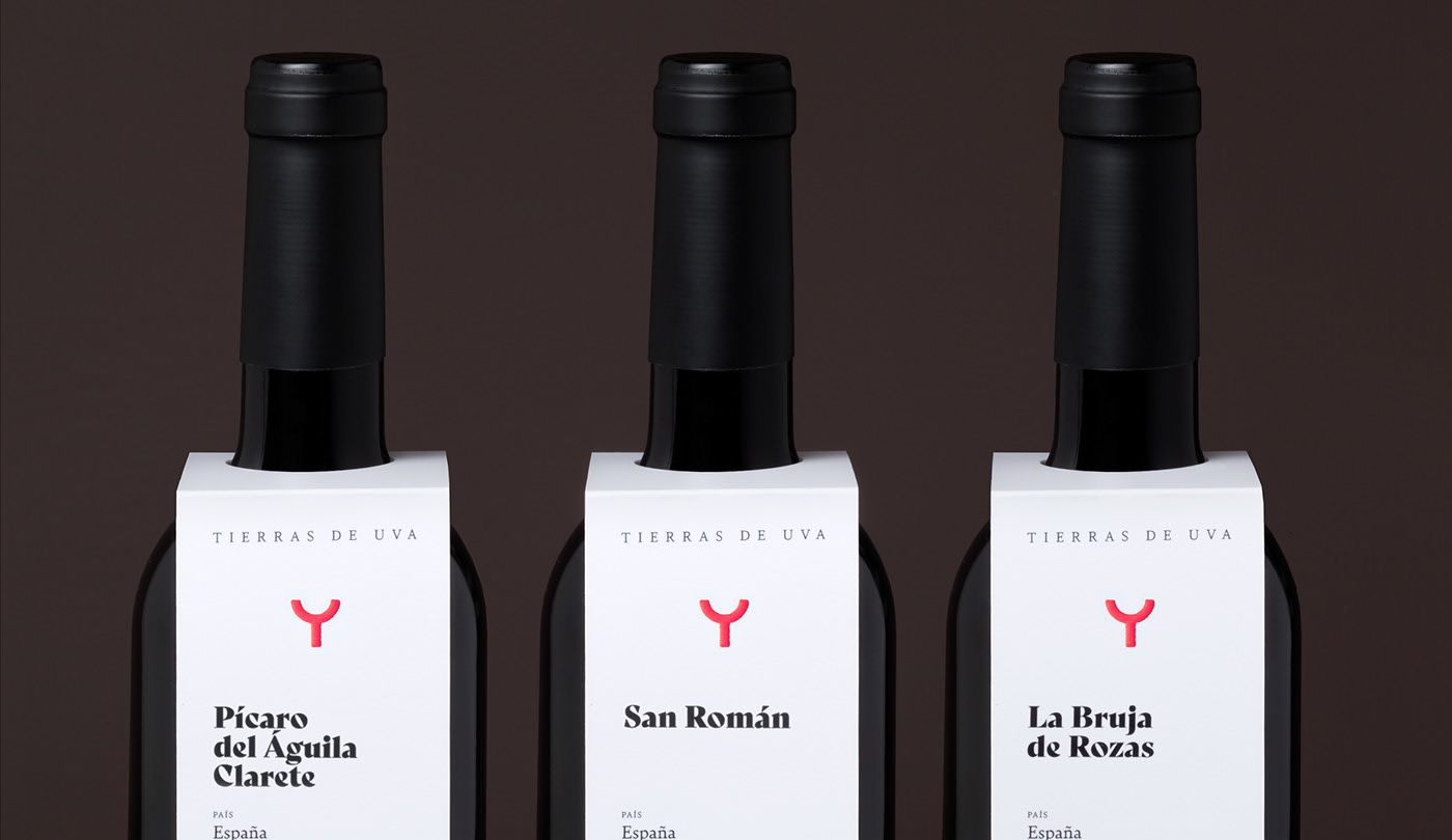
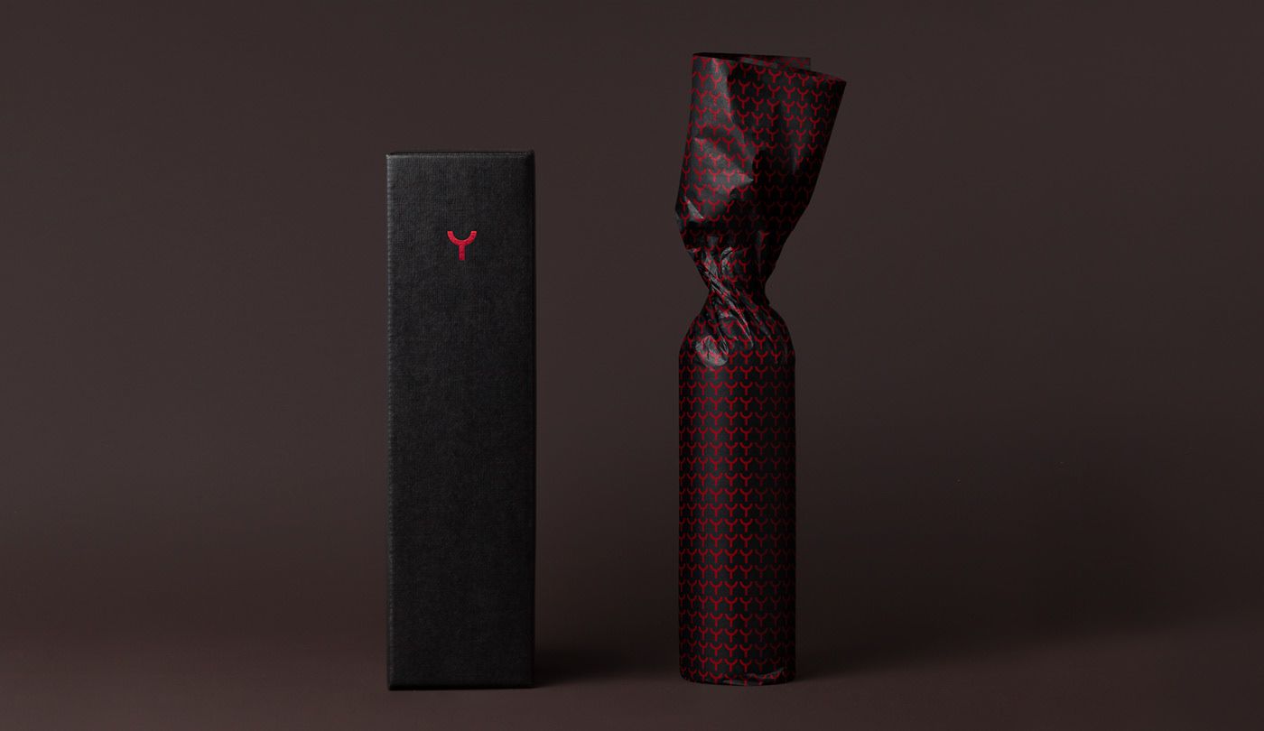
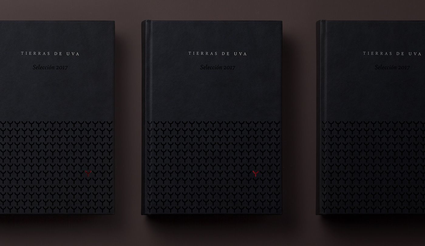
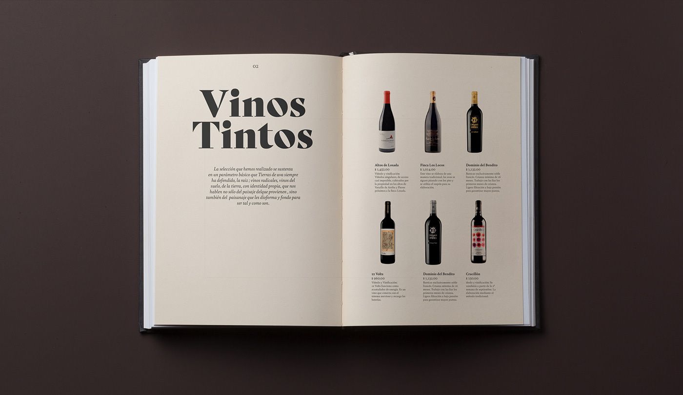
WINE
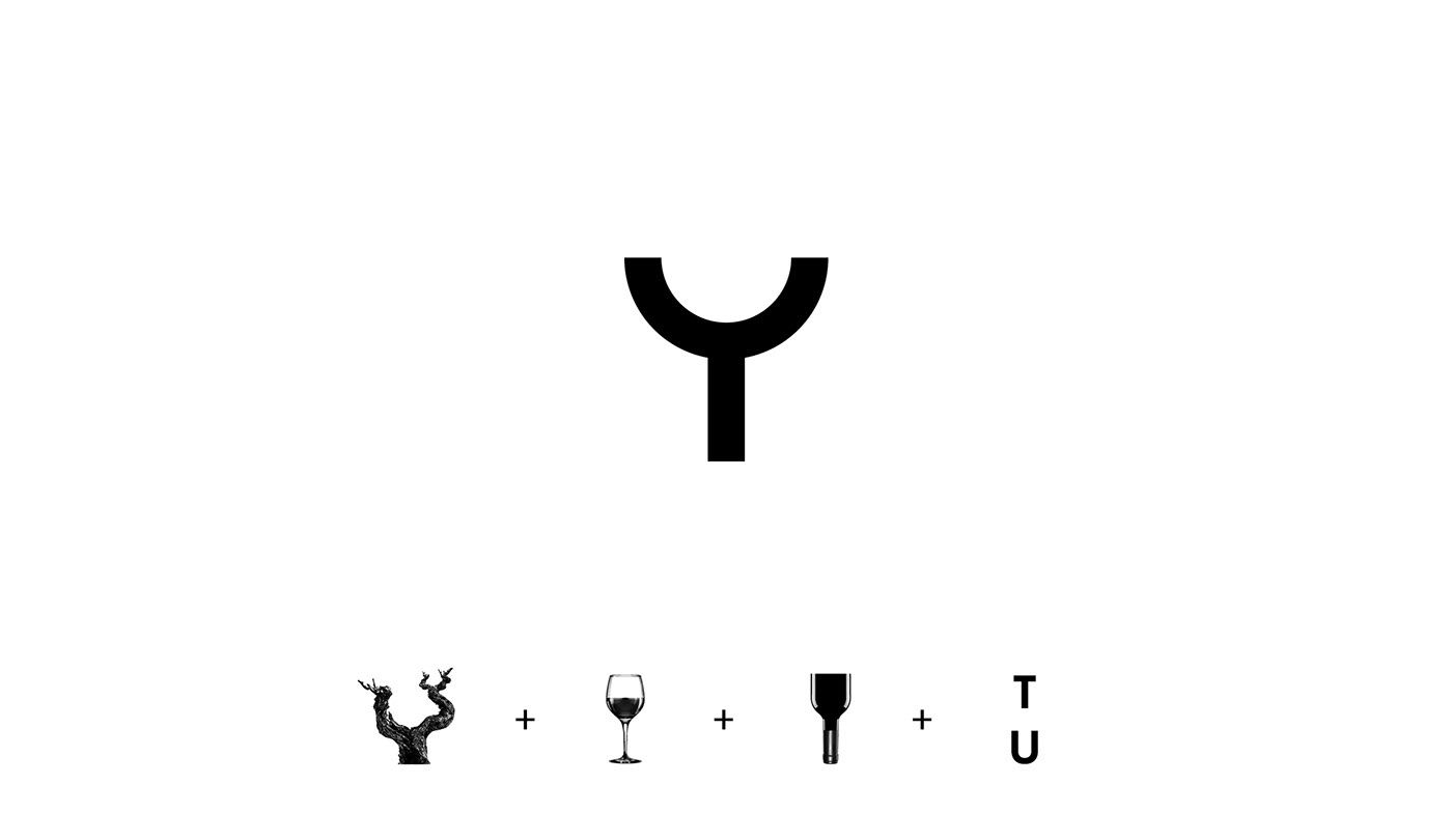
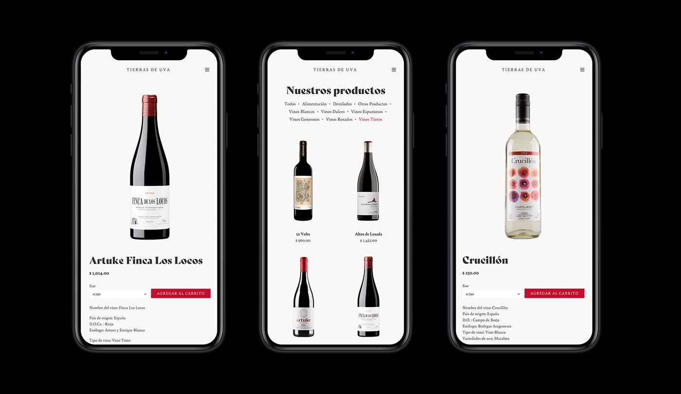
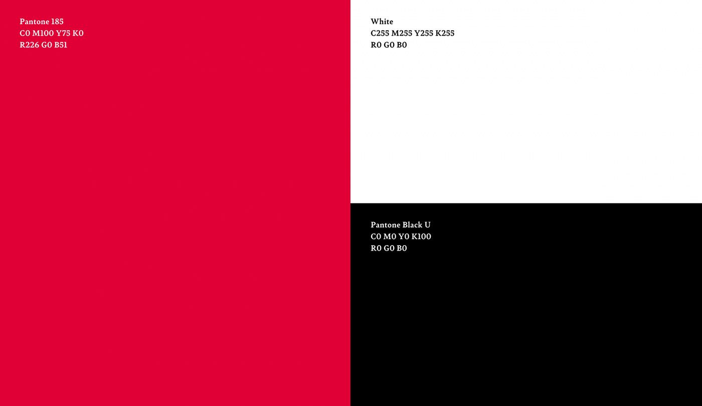
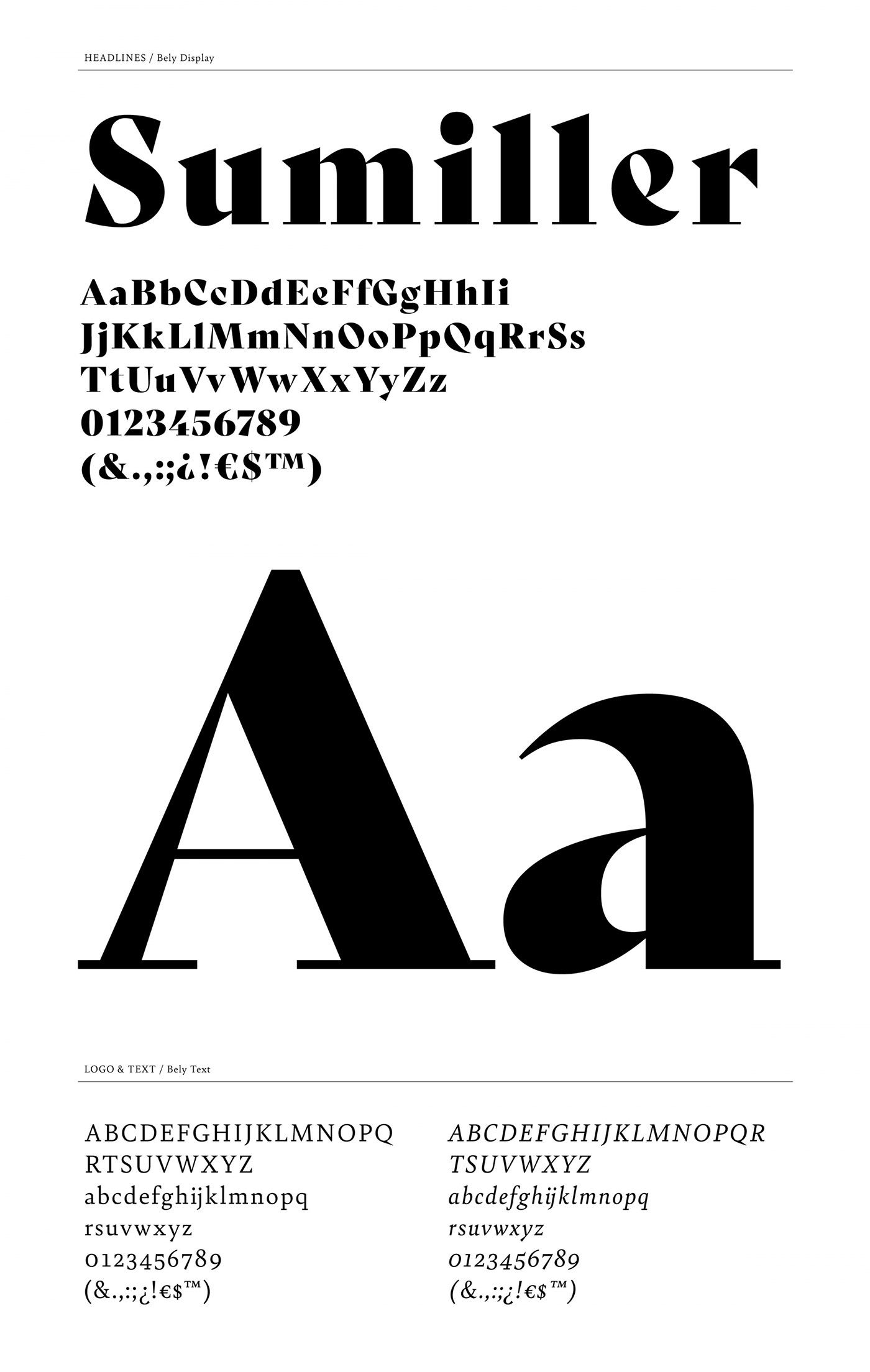
Tierras de Uva | Gijón, Xixón, Spain
atipo ®
Surfing at the Baltic Sea
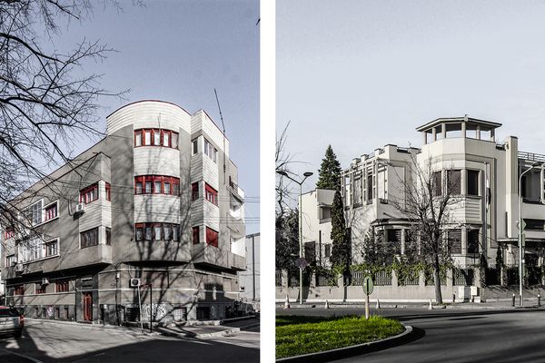
Art Deco Bucharest
