“Form follows function.“ “Less is more.“ The roots of these phrases repeated ad nauseum trace back to the Bauhaus movement, to the first half of the 20th century. The modern art movements had a prolific effect on graphic design, too: the “Swiss Style” developed around the 1950s has become a basis of reference, and we are still under its influence without ever realizing it. The grid system, that is the modular network typography design puts everything we detect with our eyes on the given surface in a transparent and clear framework. Structured, well-thought and logical, but not at all boring, on the contrary. In this selection, we present you exciting magazines and catalogues in the spirit of rational visuality, from Argentina to Poland!
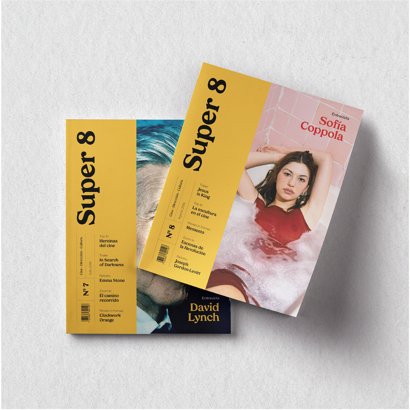
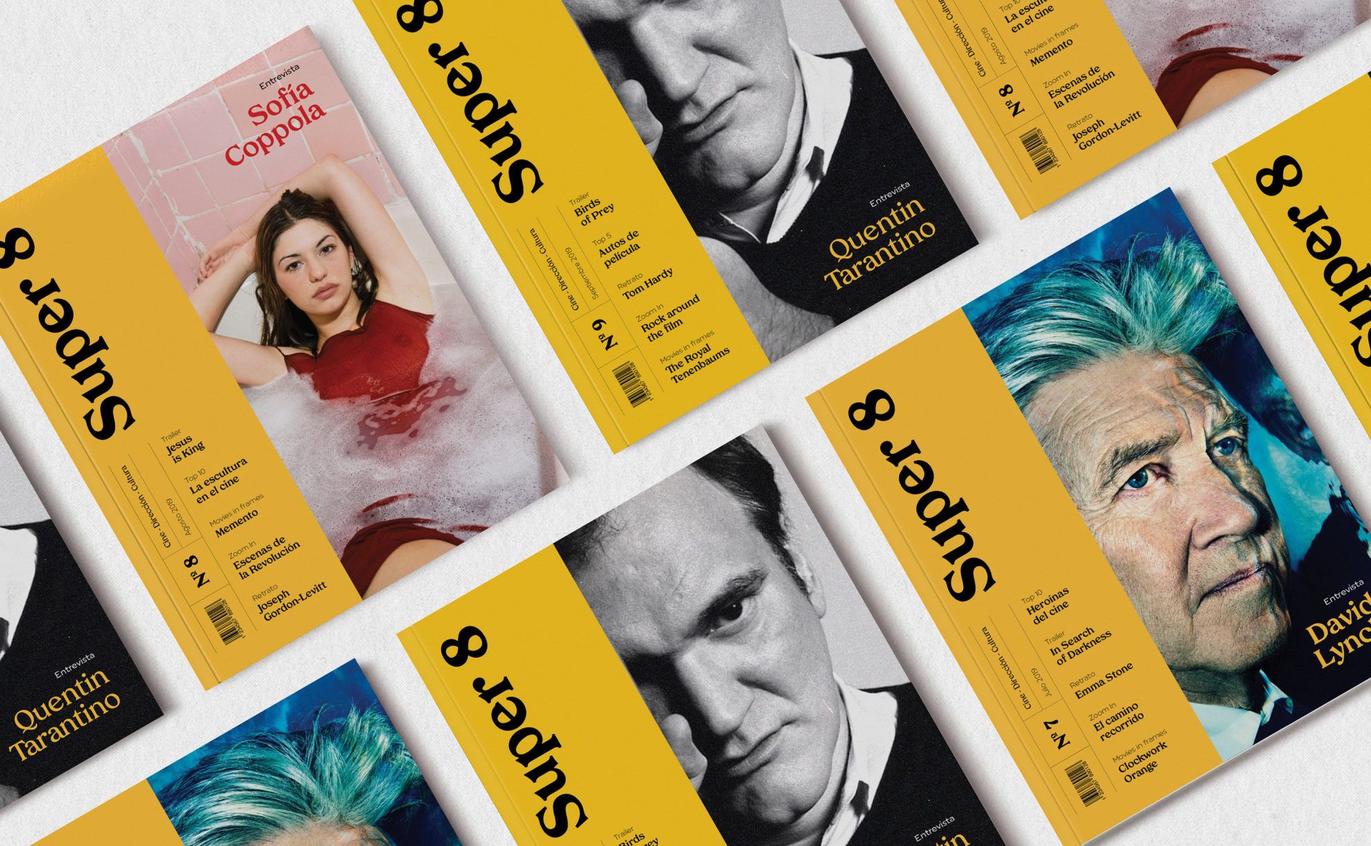
Super 8 | Cinema Magazine | Buenos Aires, Argentina
Agustina Claver

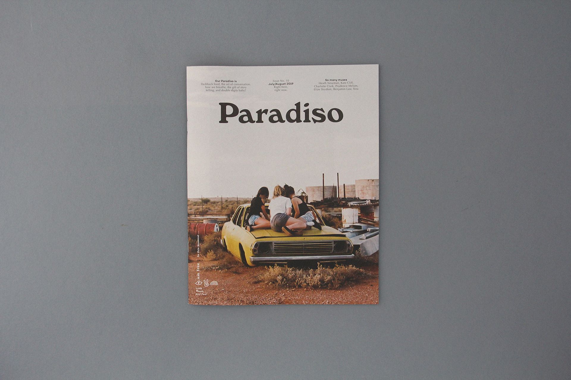
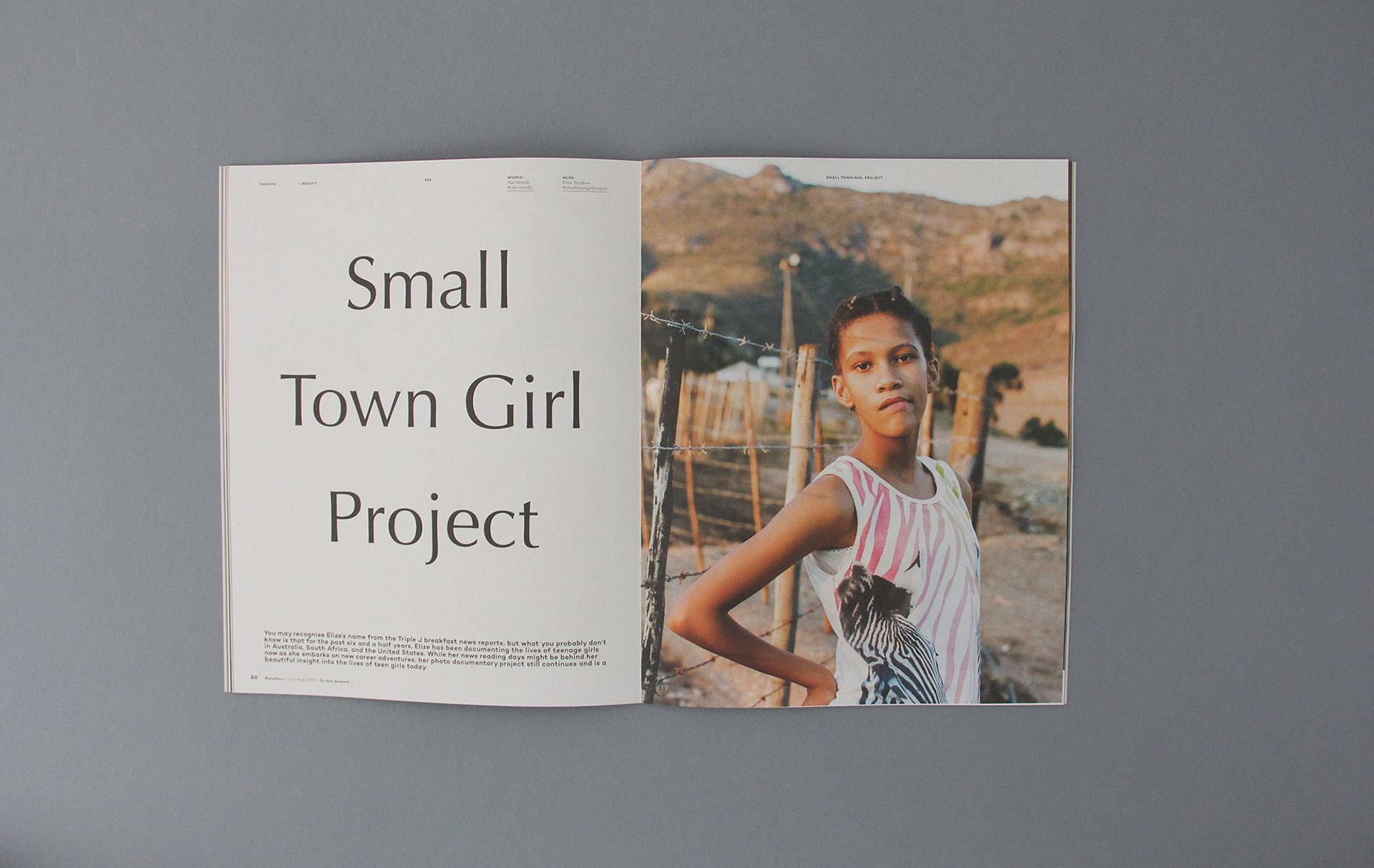
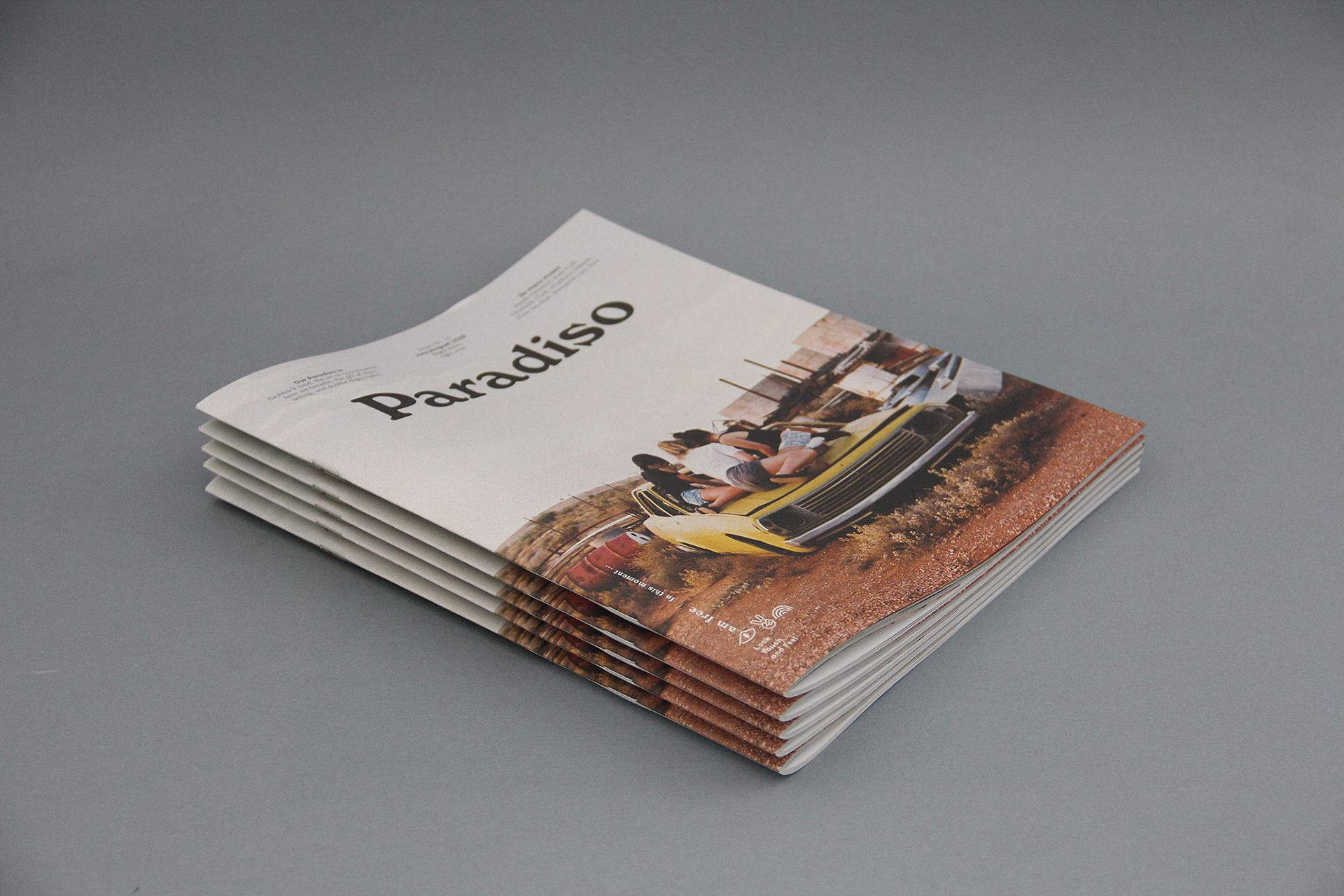
Paradiso Issue 10 | Byron Bay, Australia
Muse Muse
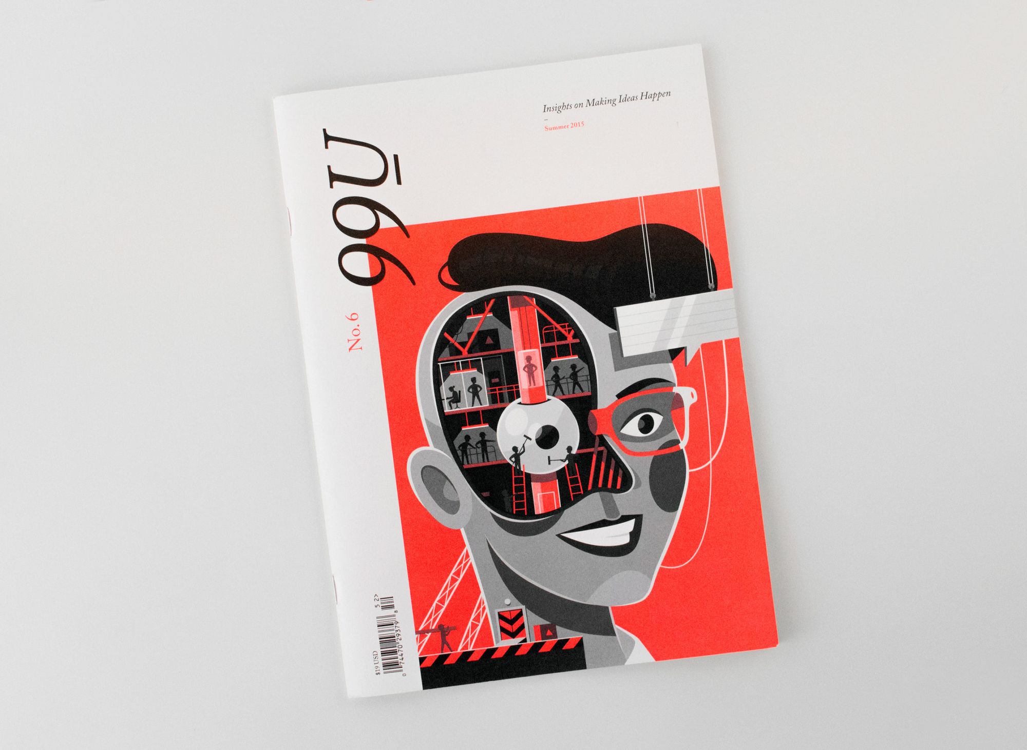
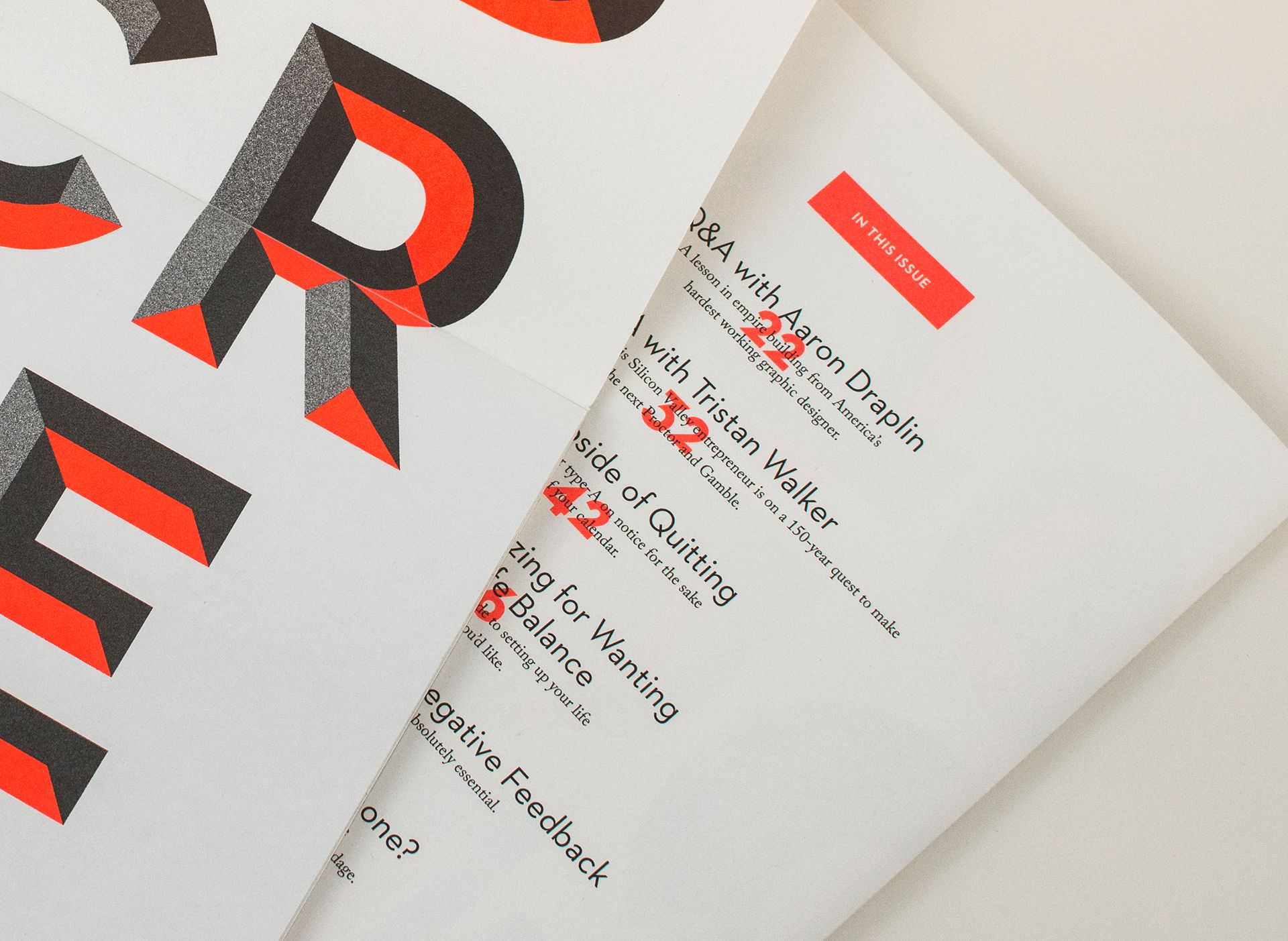
99U Quarterly — Issue 6 | New York, USA
Mark Brooks
Sean Blanda
Scott Belsky


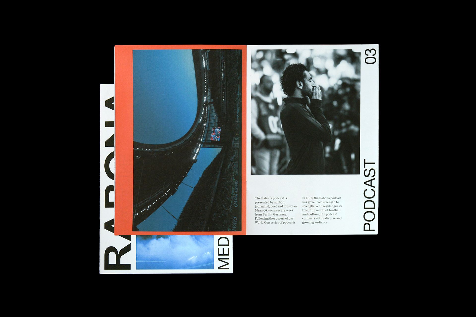
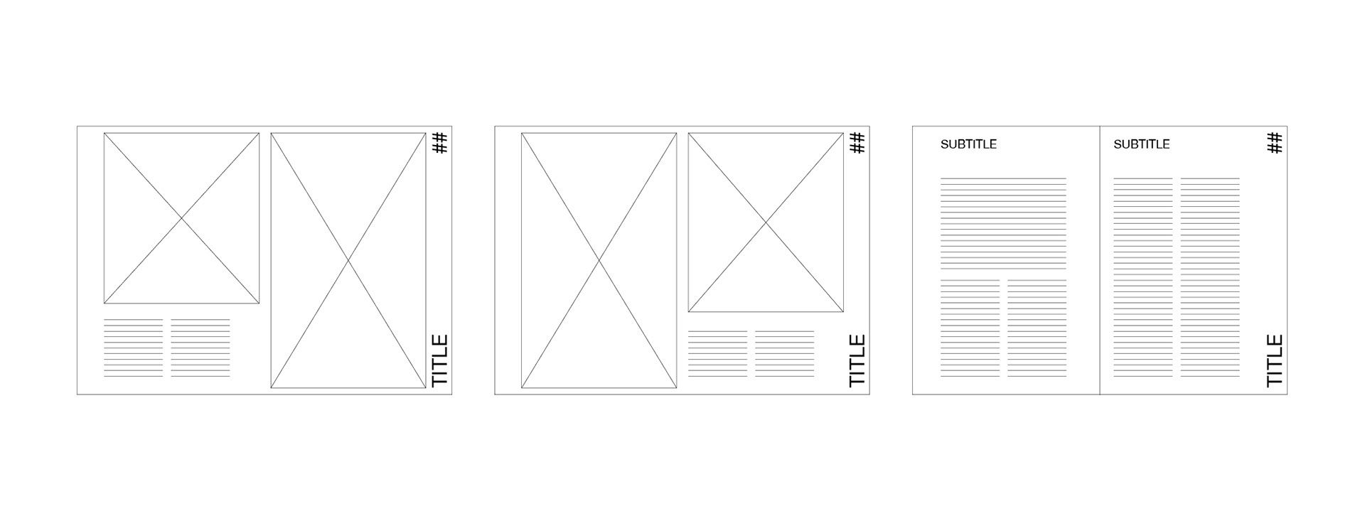
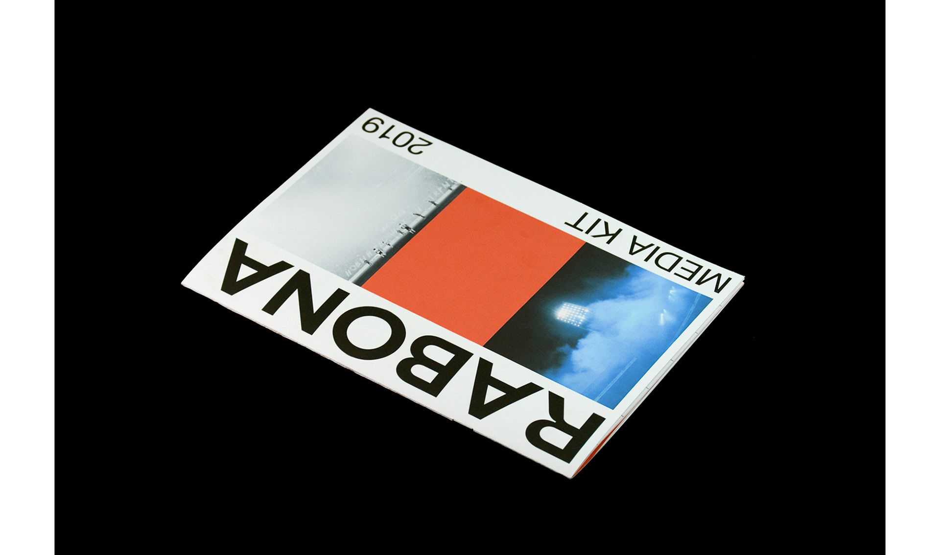
Rabona | Marseille, France
Studio Fréro
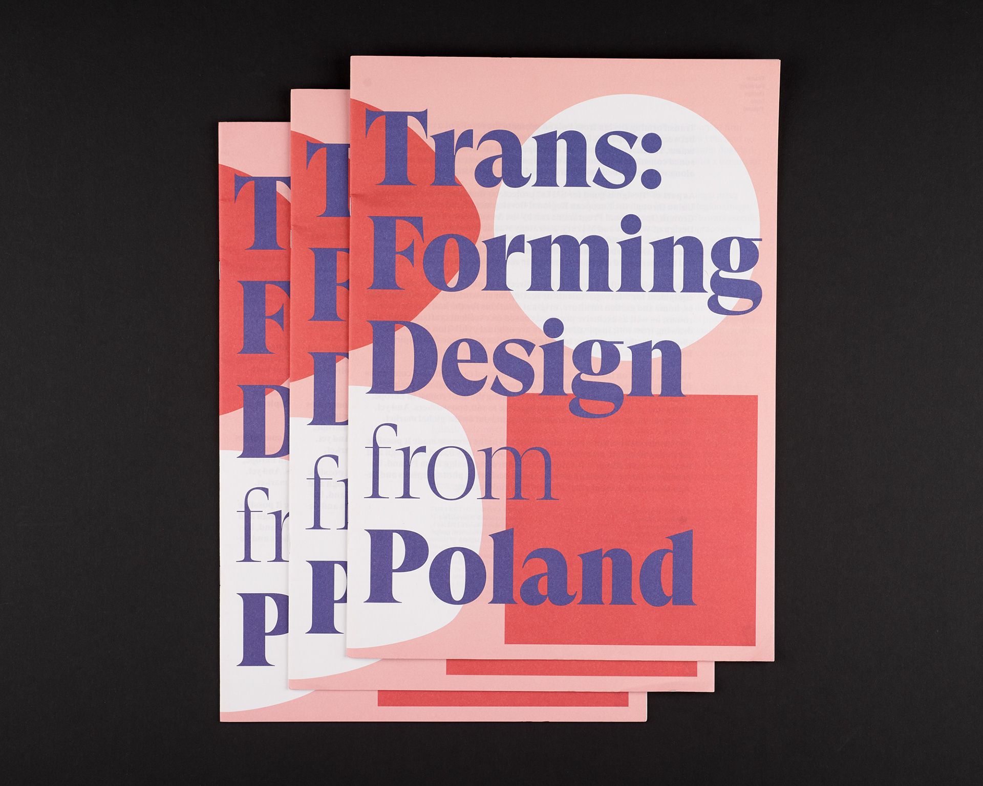
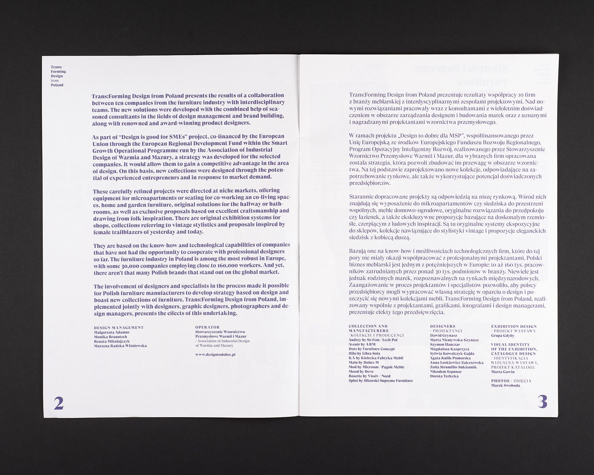
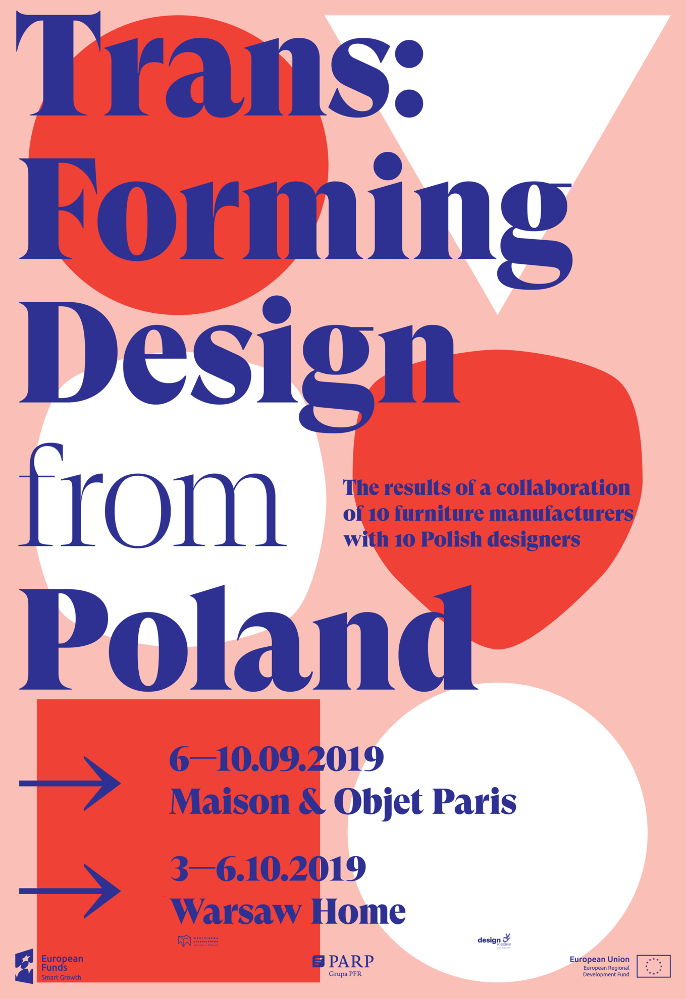
Trans:Forming Design from Poland | Katowice, Poland
Marta Gawin
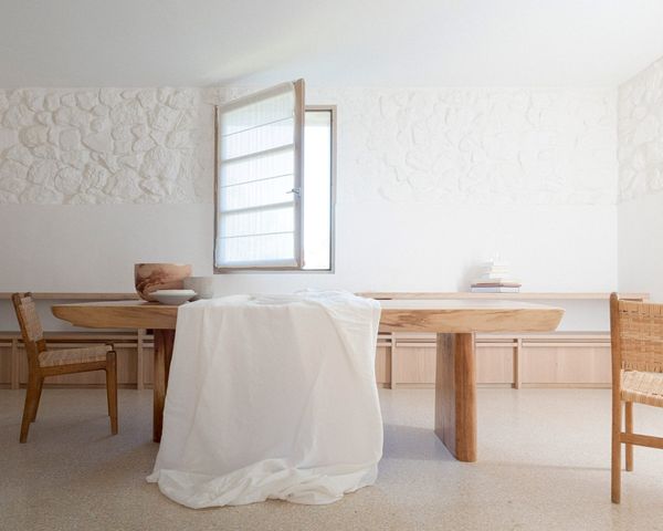
Favorite interiors of the week_06
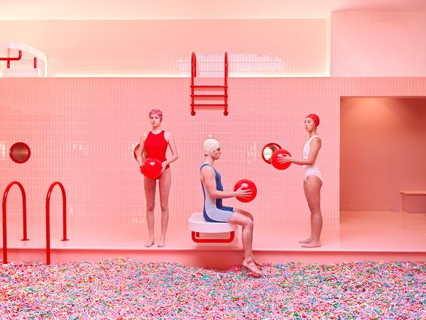
Pink bliss, from appropriate distance
