Through the latest project of the Budapest-based graphic design studio founded by Eszter Laki, we can get to know the identity of the Swiss cosmetic company FEHH. Let’s dive into a visual identity born in the spirit of sustainability, health and aesthetics.
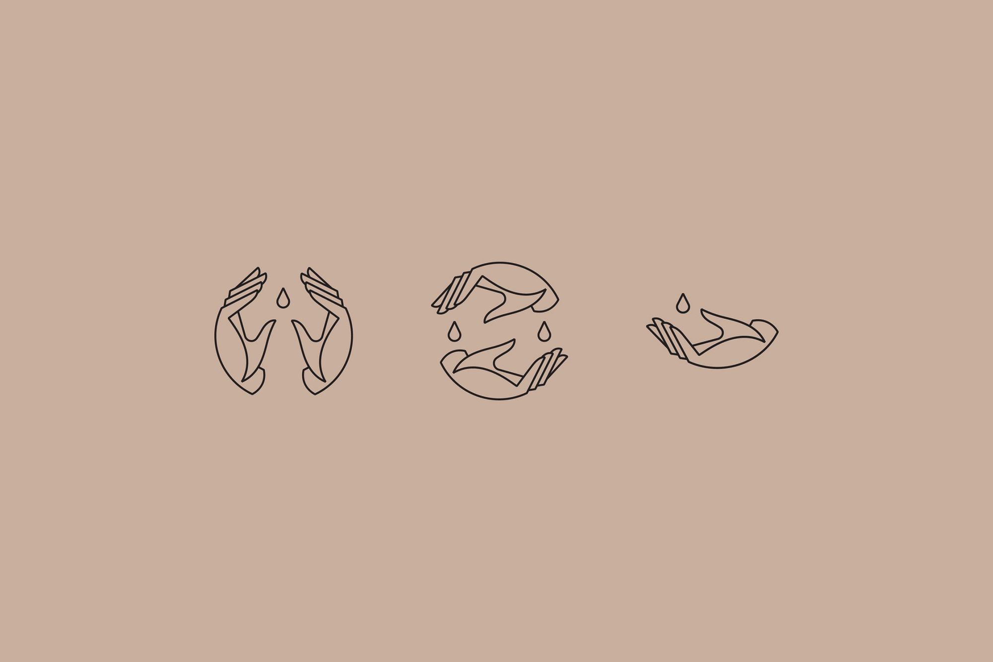
Studio NUR’s designs are characterized by clean typography and hand-drawn details. From the first design steps to the final touches, they manage the whole process. As conscientious designers, they dive into and work on a project with passion and enthusiasm, learning the personal stories and motivations of the brands. The fire and dedication they put into work are the biggest drivers of the represented brands and their clients; this is what links them together in national and international projects.


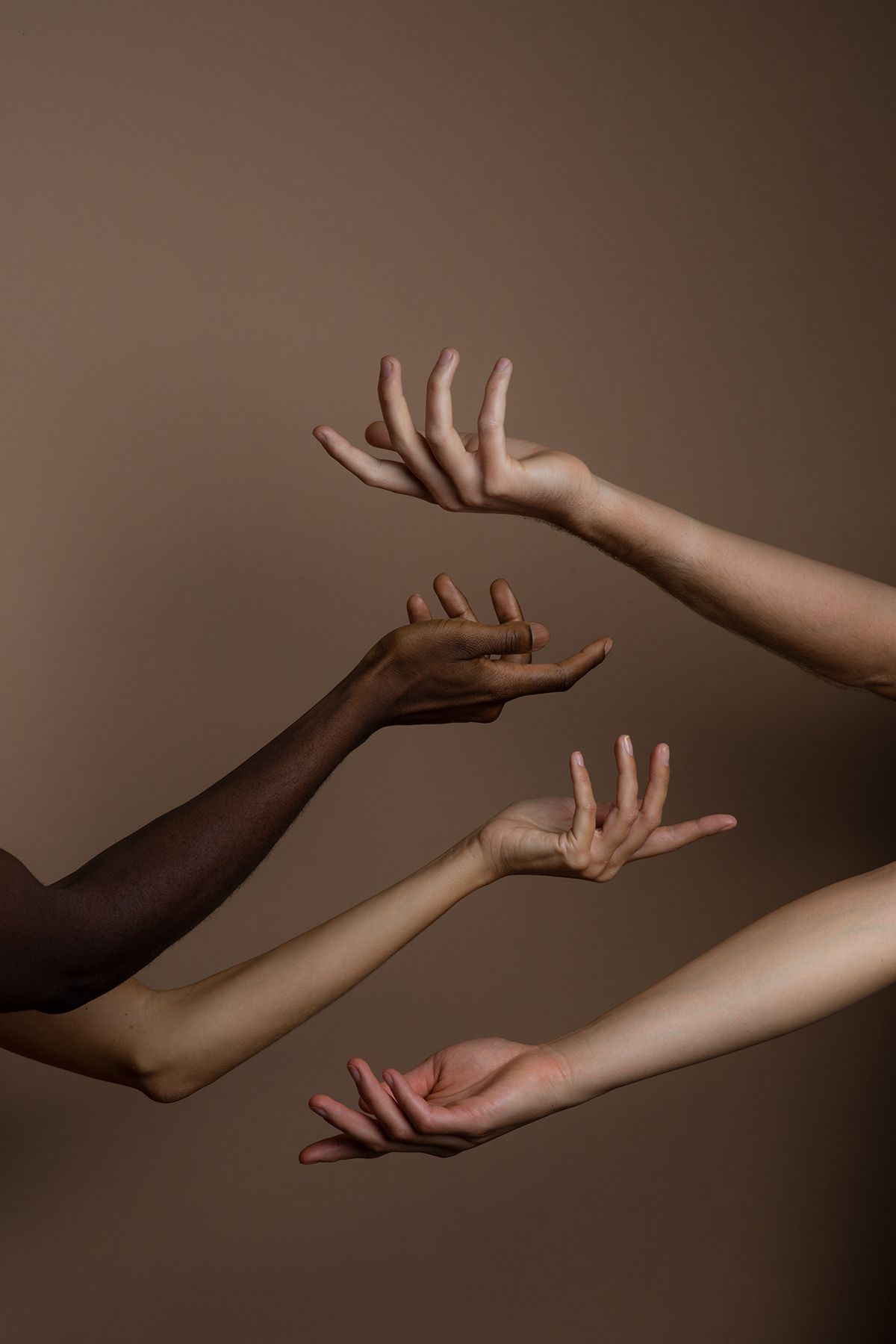
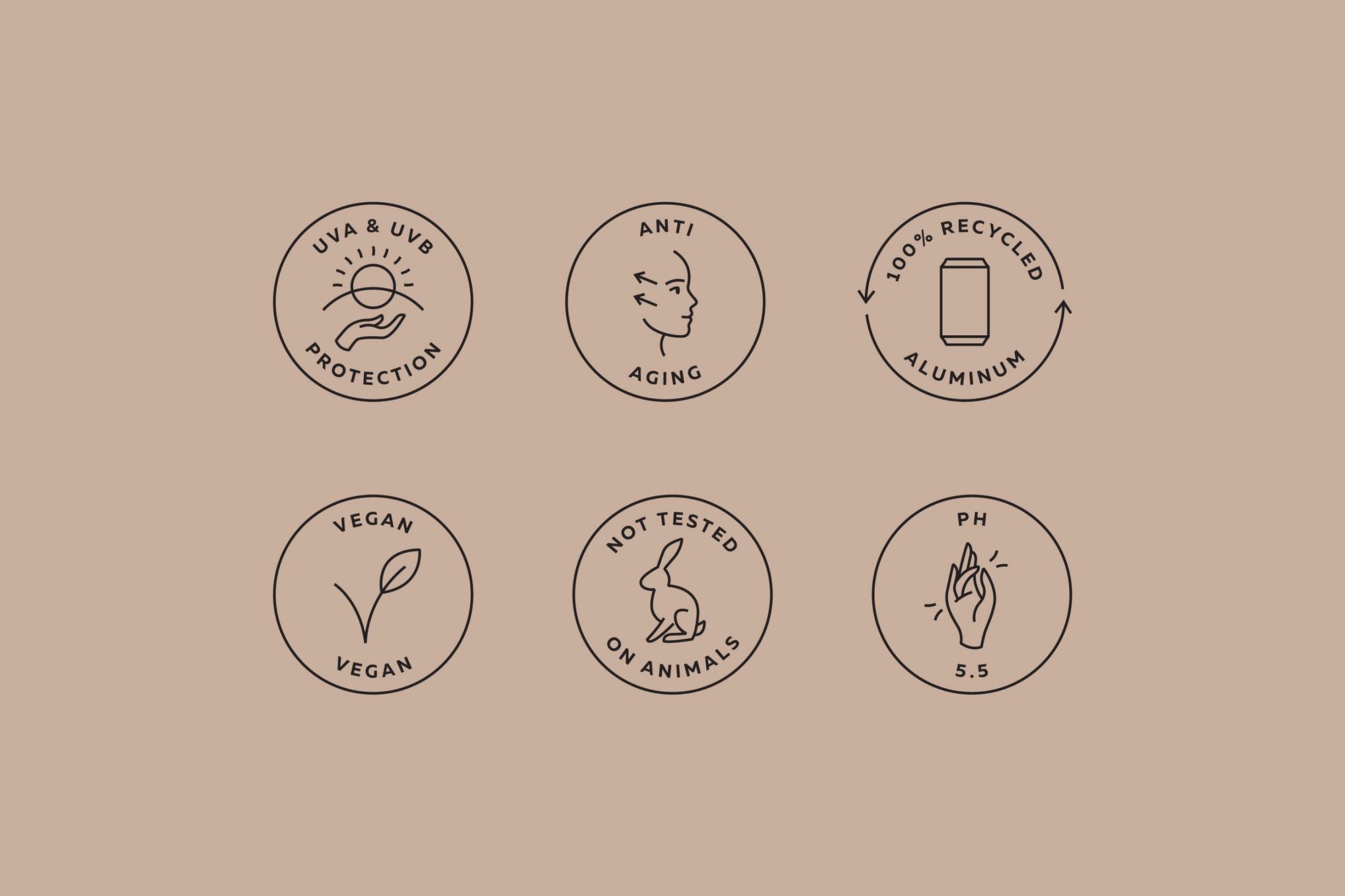
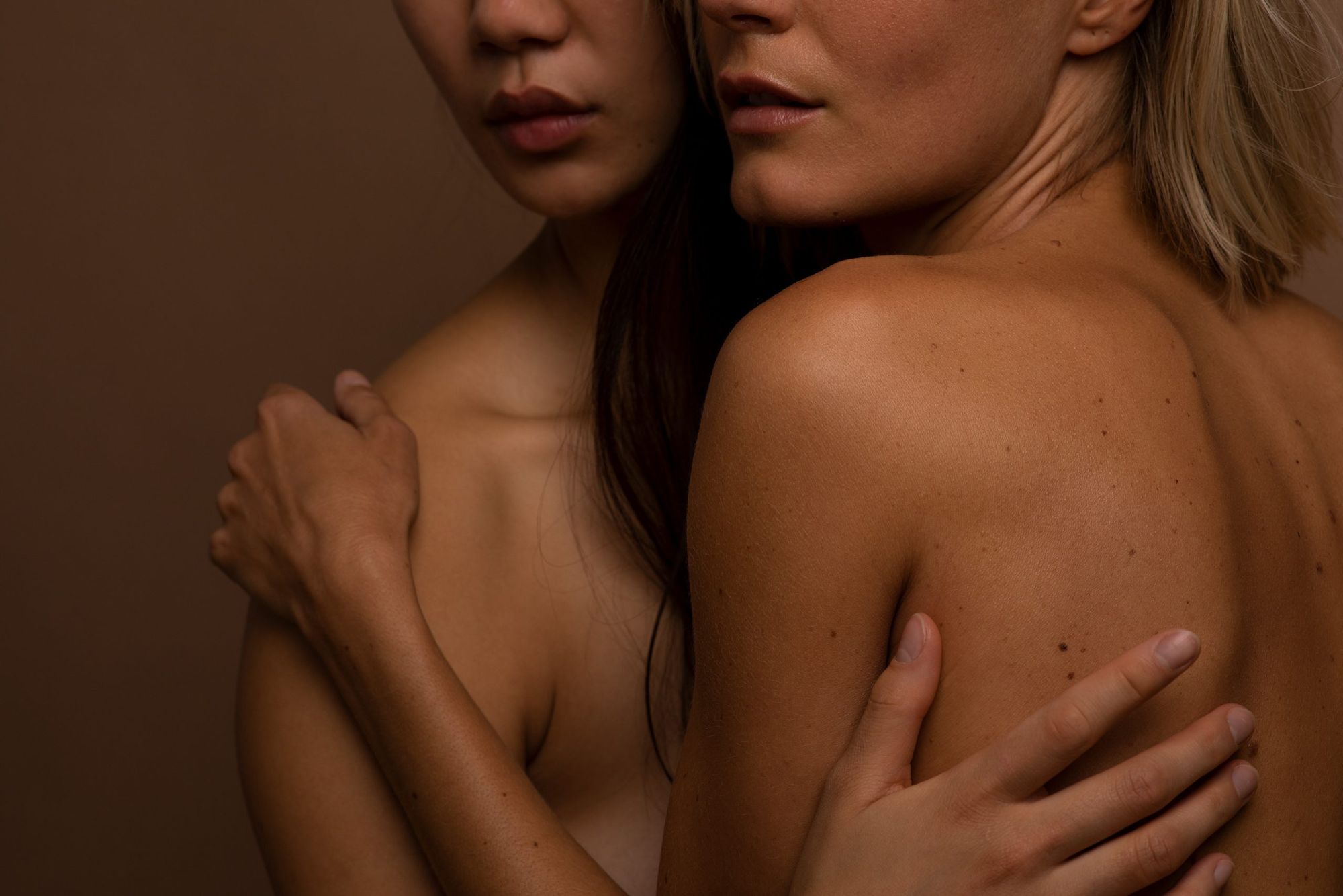
The founders of FEHH were brought together by their passion for sustainability, health and aesthetics. By creating their cosmetics, they speak to a broad spectrum of our senses, affecting not only our sense of touch and smell, but also our vision. The dreamers behind the brand, Cecilia Etterlin, Gian Grundböck and Florian Grundböck, felt that traditional beauty products lacked true natural purity. According to their professional belief, the use of a cosmetic product should be effective and healthy. They created their own brand with this focus, which spotlight pure beauty, minimalism and sustainability. Their product range includes cosmetic products that work inside and out and delights their users with the highest quality.
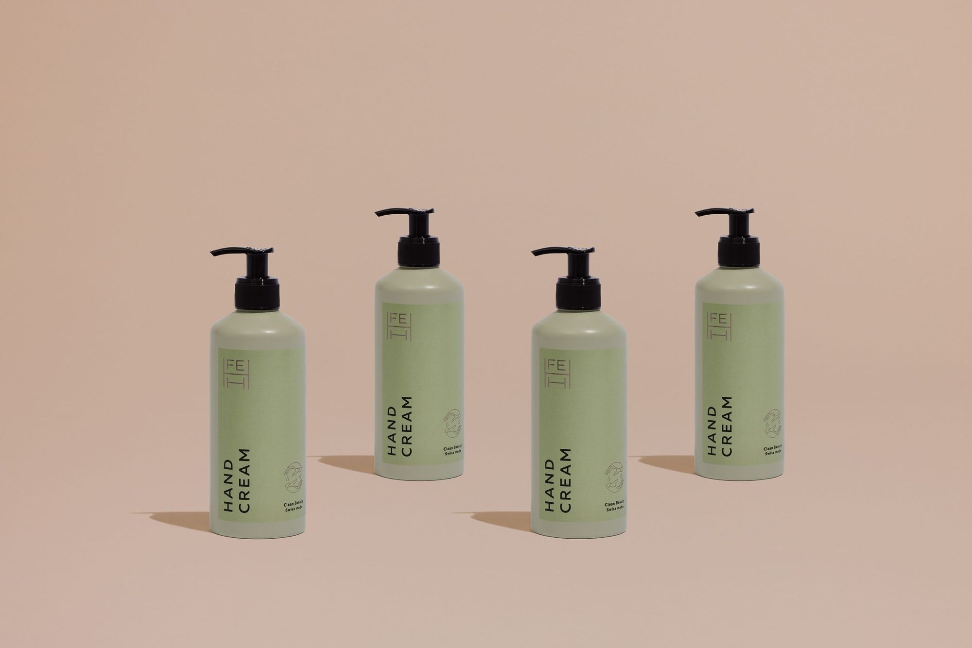
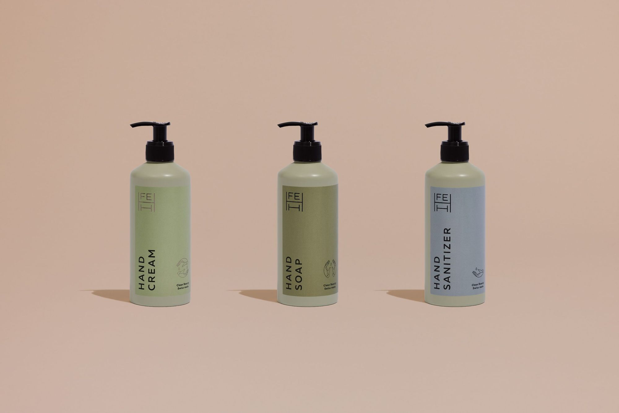
When the founders of the brand—the studio’s oldest Swiss clients—came up with the idea of producing cosmetics, there was no doubt that they would once again be working together on a joint project after previous collaborations (Deux Frères Gin, VRMTH). Both the packaging and the graphic identity reflect simplicity and clean lines. The designers, Eszter Laki and Réka Imre, have created a visual identity for the brand that faithfully reflects its core ethos.
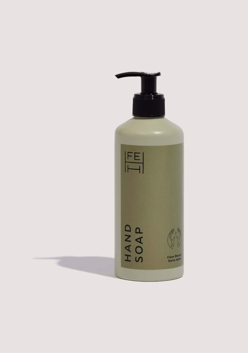
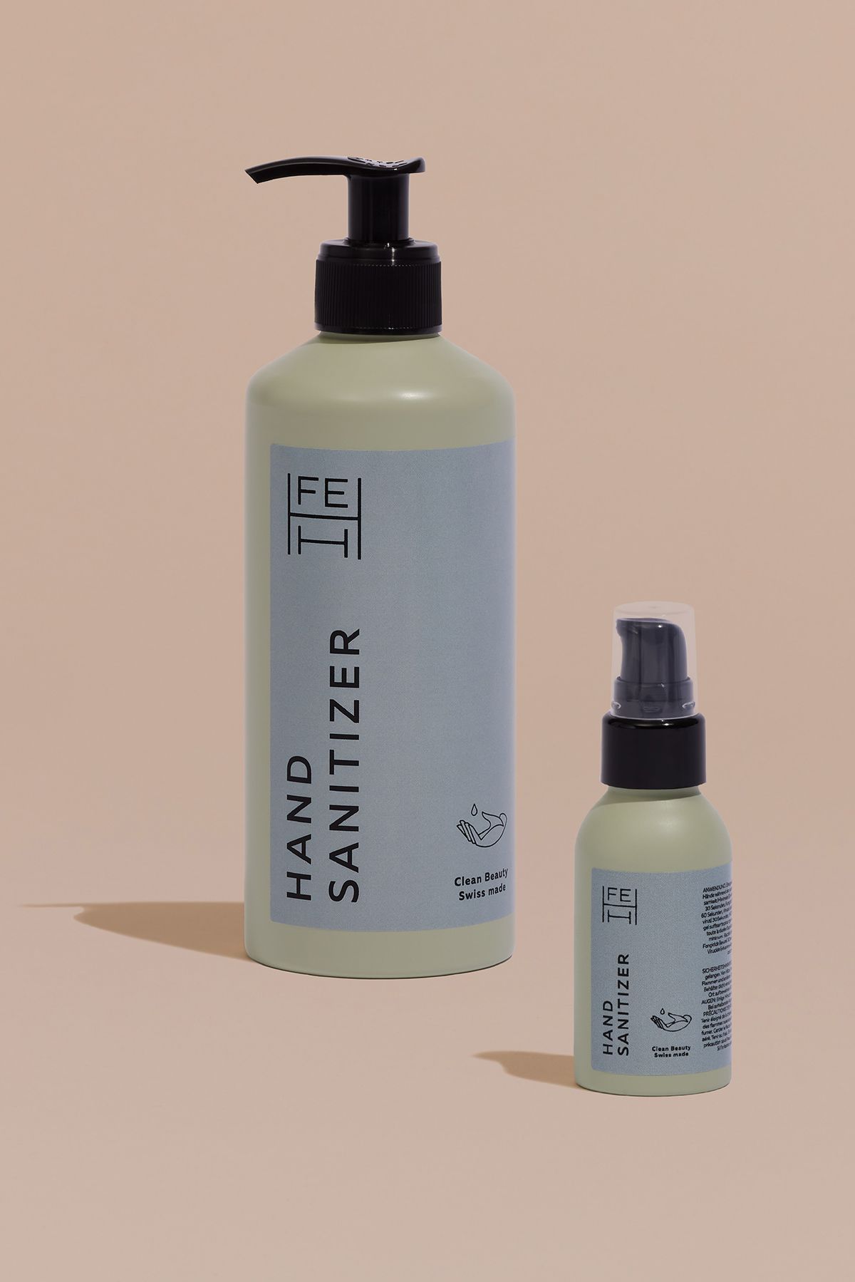
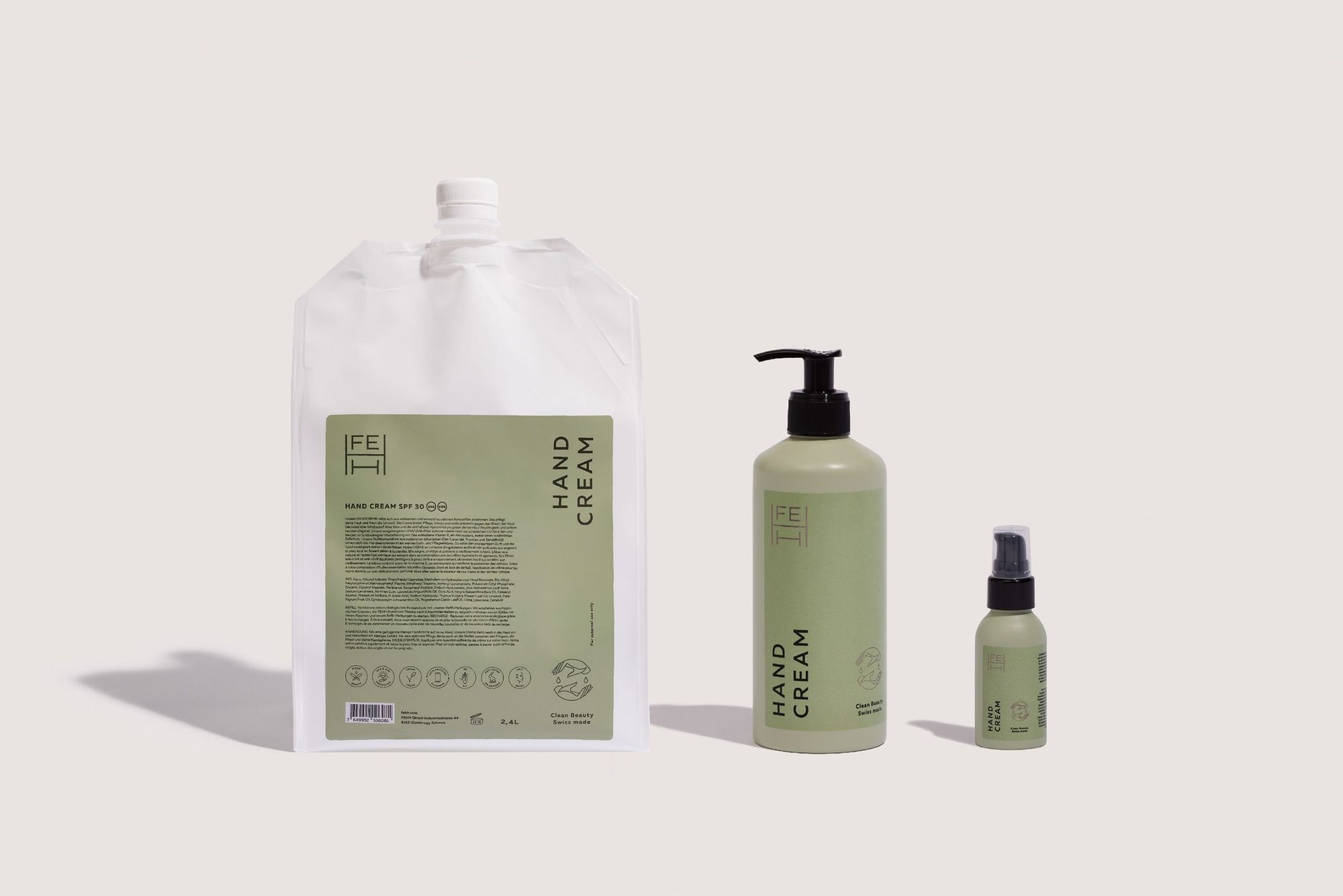
“The most important guidelines were a no-frills, honest minimalism and gender neutrality,”— said designer Eszter Laki about the project, “We spent a long time choosing the colors and we really like this lichen-green matt bottle.”
The brand’s name is an acronym, short for Femme Étoile Homme Humain, a beauty brand that speaks for everyone. The aim was, therefore, to create an elegant but unisex look. The design team aimed to visualize pure beauty in its purest form. Thanks to passionate designers, FEHH cosmetics were given a look that perfectly represents the brand’s values.

studio NUR | Web | Facebook | Instagram
FEHH | Web | Instagram
Anna Amélie debuted with the new HOME ceramic collection
Hospitality center built in the spirit of the new Russian style in Russia