

 Menü
Menü
Tag
brand identity
design
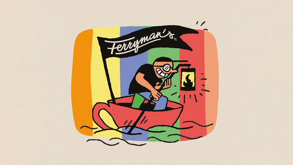
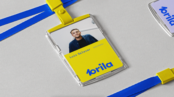
More than just a taste experience: Ferryman’s Coffee
A ferryman rowing in a cup, a fish bathing in a mug, or a scalded rooster in a modern style with a retro touch. Here is Ferryman’s new-wave coffee, made even more distinctive by the visual world of Péter Molnár’s identity design and the illustrations of Dániel Labrosse.
lifestyle
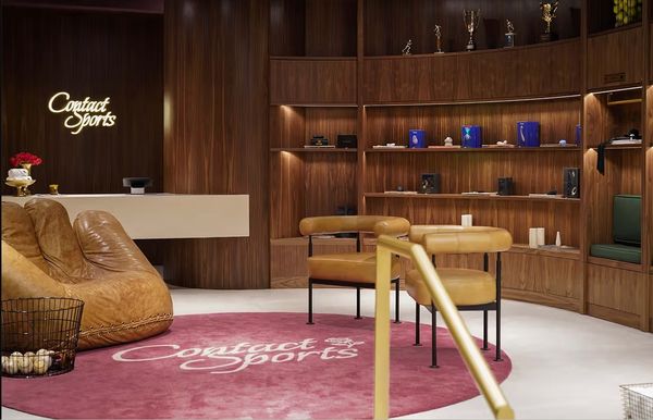
Why would a sex shop not be sexy? | Contact Sports
Neon lights, stained curtains, and faded posters, latex lingerie and accessories. That’s pretty much the image that comes to mind when you think of a sex shop. To sum it up, embarrassing is probably the adjective that best describes the most natural activity in the world that most people
design
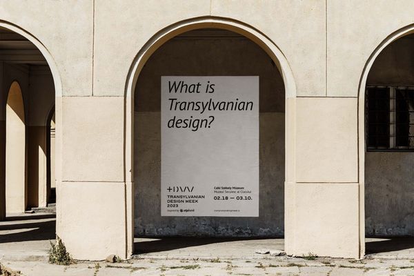
A fusion of thought fragments: how the identity of Transylvanian Design Week was born
What is Transylvanian design? This is the question addressed by the first event specifically showcasing Transylvanian creatives. Transylvanian Design Week (TWD), which takes place in Miercurea-Ciuc (Csíkszereda) between 18 February and 10 March, aims to capture a snapshot that will inspire the local creative community to think together. The visuals
design
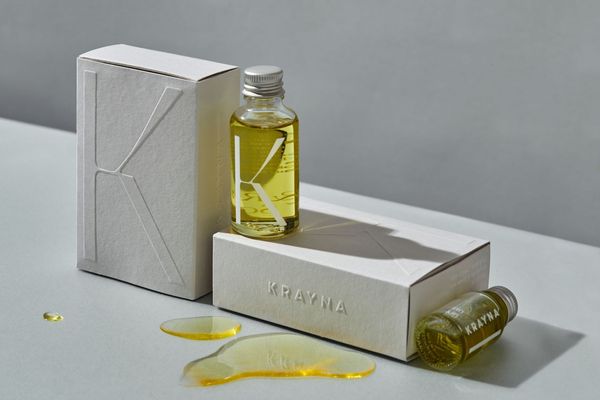
The flora of Krajna lives on in KRAYNA’s latest cosmetics
Out of a deep respect and admiration for nature, KRAYNA offers us vegan skincare cosmetics. Sustainable, cruelty-free, and 100% plant-based. Patrycja Hølm and Anna Nawara, who share the brand’s love for nature, have given the products a earnest yet powerful design.
Krajna is the land of gentle hills, lakes,
lifestyle
396 logos for sustainability by Westend in Budapest
An exhibition of the 40 best works from the logo design competition has opened in Westend Shopping Center.
We reported that in October, Westend launched a logo design competition in the spirit of sustainability. The creative challenge was linked to the shopping center’s autumn campaign, Live Consciously! (Élj tudatosan!
brand identity
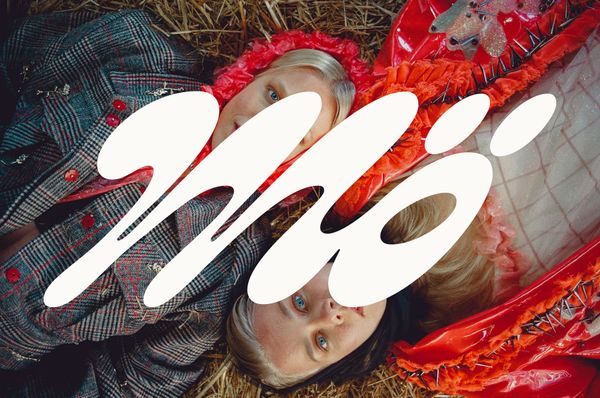
Vegan brand Mö has been revamped with a classic yet daring design
Nostalgic typography in classic blue and white, combined with striking visual elements—the taste of Finnish brand Mö’s vegan products competes even with traditional dairy products. The identity made in collaboration between the Werklig team and Lili Köves supports the brand’s move to the next level. Let’s

brand identity
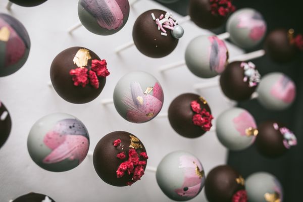
Where every cake has a story
The world of sweets today goes far beyond the colorful, syrupy, concentrated feeling of life, and instead, a softer and more creative approach returns in this area as well. Petra Sodja, the creator of Petra’s cakes, had one goal: to see her personality reflected in her creations so that
design
Magnificent regional hotels with outstanding identity | TOP 5
Little feels better than when, after all the planning and traveling, you finally arrive at your hotel and the relaxation begins. This experience is only enhanced when the details of the hotel are in sync with each other—when a harmonious and pleasant identity is presented!
Hotel Rum | Budapest, Hungary
design
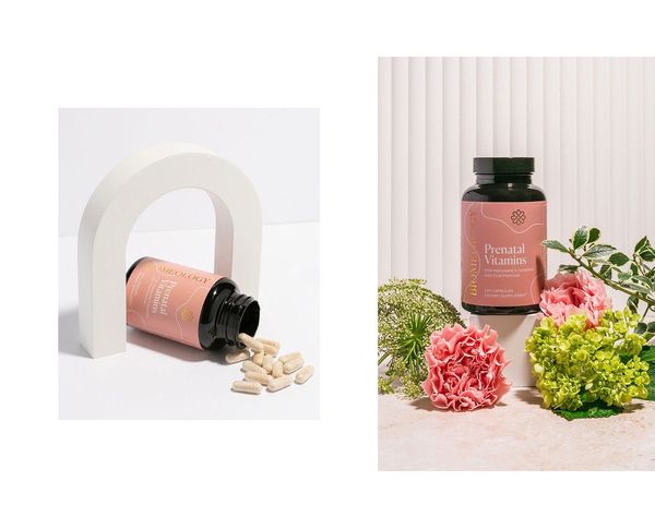
Vitamins with special identities | TOP 5
We’ve become used to vitamin packaging being anything but creative: there is too much text and it is easy to get lost in all the information. But nowadays, more and more companies are realizing that a spectacular identity can bring any brand, including vitamins, into the spotlight. Among our
brand identity
Dóra Zsigmond's menswear brand receives new name and identity
How can you design a modern and authentic identity for a clothing brand that draws its inspiration from traditional Hungarian rural life? Studio NUR and the Peltán-Brósz studio teamed up to reimagine the identity of Dóra Zsigmond’s menswear brand.
Dóra Zsigmond’s menswear brand, now known as ZSIGMOND, kicked
design
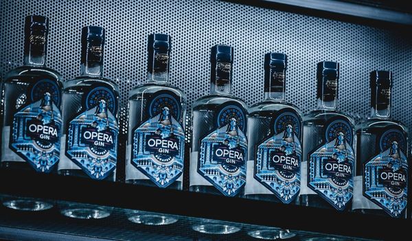
Stylish-looking alcoholic beverages from Eastern Europe | TOP 5
Most of us like to drink a glass of alcohol from time to time, be it a fine wine with dinner, an exotic cocktail in an elegant bar, or a glass of special champagne for a festive occasion. Choosing the right drink depends as much on our mood and taste
design
Stunning restaurant identities from Eastern Europe | TOP 5
When visiting a catering unit, we focus primarily on gastronomic experiences. The taste, appearance and serving of the food are undeniably important in creating the image of a restaurant, but we should not forget about the design of an interior that fits the theme and the matching brand identity. In

branding
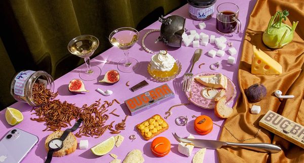
Ehető bogarak vibráló színekbe öltöztetve | BUGBAG
Az ehető bogarak étkezésünkbe való beépítését már évek óta javasolják a kutatók és a témában jártas szakemberek, ennek ellenére sokan a mai napig is viszolyognak fogyasztásuktól. A BUGBAG elnevezésű, ehető ízeltlábúak árusításával foglalkozó márka ötletes csomagolásaival azonban szeretné mindenki számára vonzóbbá tenni a nem hétköznapi étel megjelenését.
A vidám, feltűnő
art
Edible beetles in vibrant colors | BUGBAG
The inclusion of edible beetles in our diet has been recommended for years by researchers and experts in the field, yet many still resent their consumption. However, with the ingenious packaging of the brand BUGBAG, which sells edible arthropods, they want to make the appearance of non-ordinary food more attractive
design
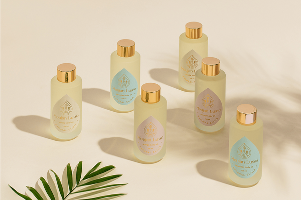
The Romanian brand Moujan Lusso conquers with a sophisticated identity | Alexandra Necula
The Moujan Lusso skincare brand specializes in body oils made from Tahitian botanicals. Their products are 100% vegan, cruelty-free, paraben-free and contain only natural ingredients to smooth, nourish and regenerate the skin. The sustainable identity of the Romanian brand was designed by the Alexandra Necula design studio.
The creative studio
design
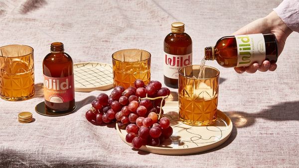
The Czech Marlon Studio used cultures of bacteria as a source of inspiration for the Wild. kombucha identity
Wild. aims to make a handcrafted kombucha that is 100% natural, contains no additional flavors or artificial carbon dioxide, and is even tasty by the way—freshly delivered to the consumer’s door based on a subscription model. The Czech Marlon Studio was asked to design the complete visual identity
east
The divisive era-changing identity of the Museum of Ethnography
In the spring of 2022, on the 150th anniversary of the founding of the institution, the Museum of Ethnography will open in a new location and building. The change of location is also the catalyst for the change of era. In this context, the museum wants to open up to
design
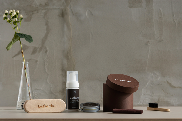
The Ukrainian Laskarda shoe brand got a brown-green identity | Dmytro Khrunevych
Dmytro Khrunevych, a graphic designer based in Kyiv, works on branding and packaging concepts, among other things—most recently he created the visual identity of the Ukrainian Laskarda leather shoe brand.
The designer typically conveys the concept improvements made in his projects with bold elements and stylish typography, without neglecting
design
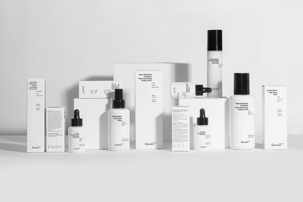
Natural cosmetics in a minimalist guise | IOSSI PRO
Conscious skin care means something different to every person. Some people like to use several types of products, others swear by a well-proven cream or cleanser. The Polish brand of cosmetics, IOSSI, wants its customers with special needs to find the formula that best suits their skin, so in addition
business
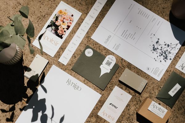
Commemoration, in style | ÁpoltSír x DARE STUDIO
In the absence of time or because of distance, there are those who visit the grave of their deceased relatives only once a year, around All Saints’ Day and All Souls’ Day. But what happens during the rest of the year: who takes care, keeps these resting places in order
branding
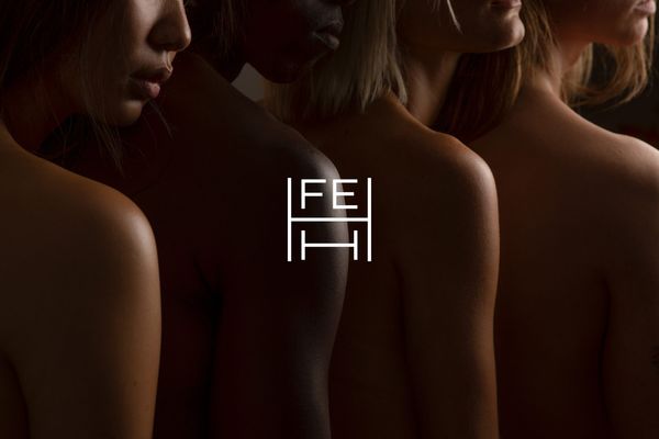
Svájci kozmetikai cég arculata a studio NUR-tól
A Laki Eszter alapította budapesti grafikai stúdió legújabb projektjén keresztül a svájci FEHH kozmetikai cég arculatát ismerhetjük meg. Merüljünk el egy a fenntarthatóság, az egészség és az esztétika jegyében született vizuális arculatban!
Tiszta tipográfia és kézzel rajzolt részletek fémjelzik a studio NUR tervezői munkáit. Az első tervezői lépésektől egészen a
brand identity
Swiss cosmetics company’s identity by studio NUR
Through the latest project of the Budapest-based graphic design studio founded by Eszter Laki, we can get to know the identity of the Swiss cosmetic company FEHH. Let’s dive into a visual identity born in the spirit of sustainability, health and aesthetics.
Studio NUR’s designs are characterized by
design
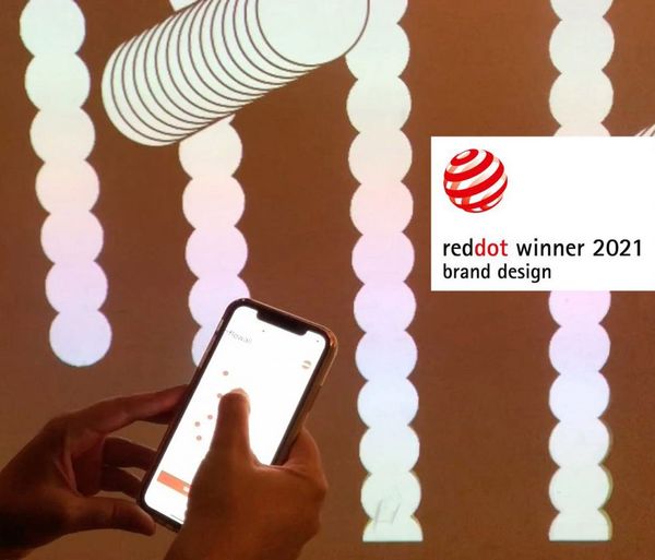
Hungarian success: a media designer won two Red Dot awards
Winners of the 2021 Red Dot Design Award, one of the most prestigious international awards in the international design scene, have been announced. Balázs Balogh, media designer and founder of the studio That’s it. excelled in two sections.
In the Brand & Communication Design category, the winning design was the
east
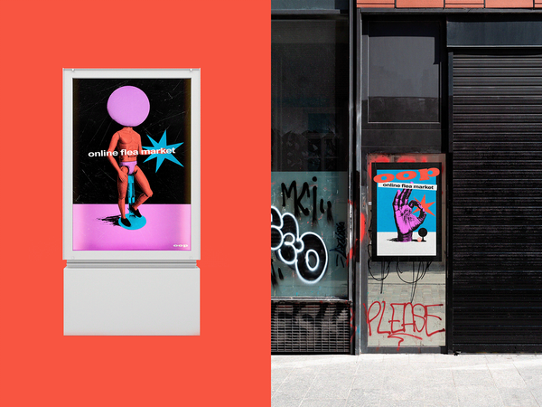
The eclectic atmosphere of flea markets in the online space
A flea market is a place of surprises and unexpected discoveries, a return to the nostalgic past with its strangeness and peculiarities. Probably this is why the success of flea markets is unbroken even today, as there is no more uplifting feeling than finding something interesting and unique among old
business
Where every cake has a story
The world of sweets today goes far beyond the colorful, syrupy, concentrated feeling of life, and instead, a softer and more creative approach returns in this area as well. Petra Sodja, the creator of Petra’s cakes, had one goal: to see her personality reflected in her creations so that
business
A crazy graphic universe of coffee specialties
In the 42 Coffee Roastery, coffee making is true alchemy, a crazy process of experimentation where the sky is the limit, whether it’s blends or graphic designs. Get to know the unearthly coffee universe of Máté Nezvál, which becomes complete and inimitable from the drawings of Aliz Buzás!
The
brand identity
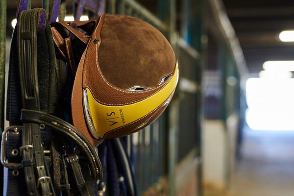
Studio NUR has created a timeless but not archaic brand identity
Elegant shapes, timeless yet not archaic, and memorable: this is the visual identity created for the world-class racehorse stable, the Scuderia Sonnevend, for which Studio NUR was responsible. Let’s see!
Alexandra Sonnevend and Ágoston Gubicza’s love for horses spans several generations. Because of family traditions, it was important
graphic design
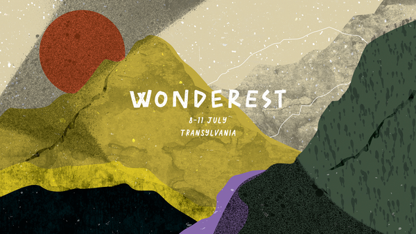
Defining the atmosphere of a festival visually | Hype X WONDEREST
In the heart of Transylvania, in the mountains, at an altitude of one thousand hundred meters, is the campsite that hosts the Wonderest festival, which is not only about total escapism, but also about environmental awareness. The basic idea of the event is also reflected in its visual identity: freedom,
design
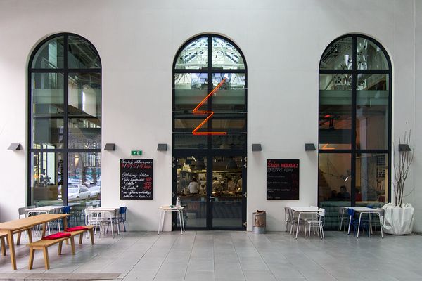
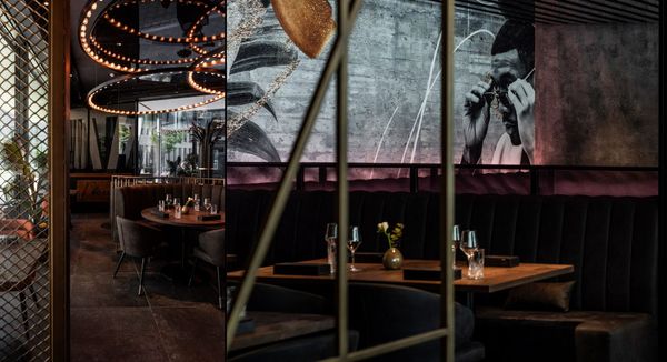
Atmospheric design in Vienna’s newest gastronomic citadel | Socially
How does a gastromarketing agency move toward holistic experience design? Eszter Csontos, the art director of Socially, told us about projects in which, in addition to the marketing strategy and the graphic visual identity, the interiors of the restaurants were also born based on their own ideas. In our article,
brand identity
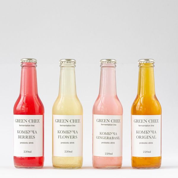
Healthy choice | Green Chef
Green Chef offers vegan, sugar- and lactose-free, as well as Ayurvedic, low-calorie foods and beverages too. Thus, the sweets featured by the brand: ice creams, cakes and sweets can be incorporated into all diets. In addition to stunning cake creations, you can also choose from smoothies, soft drinks, plant milks
brand identity
From church to pasta shop | Aliz Borsa X Buono!
Awarded the best in the world for olive oils, balsamic vinegars, various olives, capers in salt, real Italian coffee beans and many other classic Italian ingredients—this is Buono!, a tiny olive oil and pasta shop that brings a small slice of Italy to Teréz Boulevard. The visual identity of
design
HIGHLIGHTS | Letter+color
The visual identity of a company or organization is now an unavoidable factor. This has been the case for a long time, but over the years it has become more and more important and urgent to develop a visual language that is best optimized for the hectic life and intuitions
east
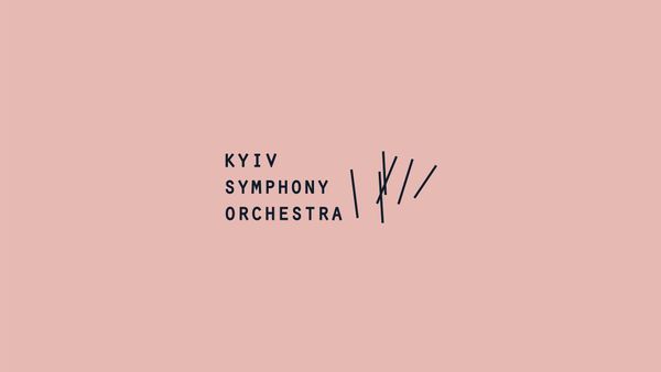
Music that connects us | KSO—Kyiv Symphony Orchestra
Designing brand identity is not an easy task. Such a challenge requires a high degree of creativity and sensitivity from the designer. The brand identity of KSO—Kyiv Symphony Orchestra was renewed in 2020 by the graphic design studio GRA Agency. The new visual appearance of the Kyiv Symphony Orchestra
fashion
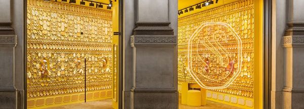
Swarovski debuts a new logo
In addition to the updated look of their swan logo, a new brand identity and business concept were created.
The change was orchestrated by Giovanna Engelbert, the first global creative director of the world’s largest crystal manufacturing company. A key element of the brand’s renewal is their new
brand identity
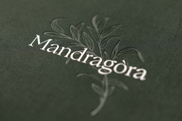
Hospitality with heart and soul | The revamped Mandragóra Restaurant
The history of Budapest’s Mandragóra Restaurant goes back more than a decade. Initially, it operated as a clubhouse-like café, then turned into a fine-dining bistro restaurant, while maintaining its laid-back, intimate and friendly atmosphere. But Mandragóra has recently arrived at a new chapter: in addition to the revamped interior
brand identity
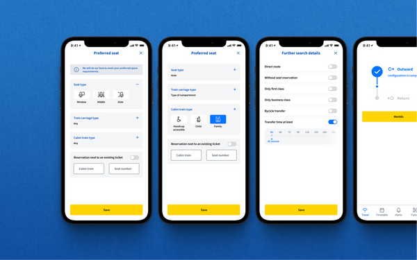
The Hungarian State Railways' online redesign | DOT Creative
The renewed online ticket selling platform of MÁV (Hungarian State Railways) is already available in its beta version, presenting a long-needed visual change compared to the previous version. The comprehensive redesign was created by the DOT Creative agency.
Anyone who frequently travels within Hungary by train knows exactly that MÁV’
design
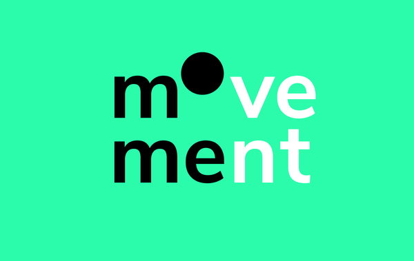
MOME students give a hand to NGOs | Movement
MOME Movement announced a contest and awaits the application of Hungarian non-profit organizations to help them in their visual communication. They primarily seek to give a hand to organizations pursuing public interest activities, which, for budgetary or other reasons, don’t have a visual brand identity yet.
Now for the

design
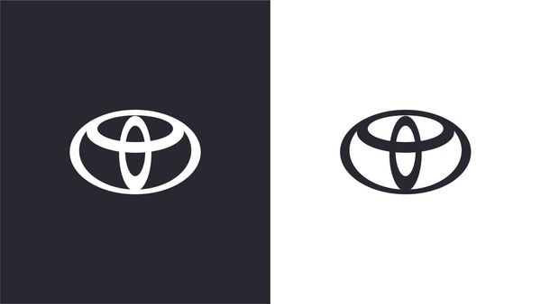
Toyota debuts a new logo
Following the lead of several other car manufacturers, including BMW and Nissan,
Toyota has now rebranded its logo and switched to a flat design.
Toyota breaks off with the previous 3D logo and debuts a much cleaner version.
In addition to the logo, the entire visual identity also underwent a
design
Megújult a Toyota logója
Követve számos más autómárka, mint például a BMW vagy a Nissan gyakorlatát, a
Toyota is újragondolta a logóját és flat designra váltott.
A Toyota szakít a korábbi három dimenziós, térhatású logóval, és egy
letisztultabb megjelenésű verzióval jelentkezik. A logóval összhangban a teljes
arculat is átalakul. Az új arculaton a The&
design
HIGHLIGHTS | Playful reduction
A form is never too simple, boring at best. Circle, triangle, square and the
rest of them – all friendly shapes: we keep running into and returning to them.
The common denominator, the least common multiple: a part of the visual language
we are all fluent in. A basis of reference
design
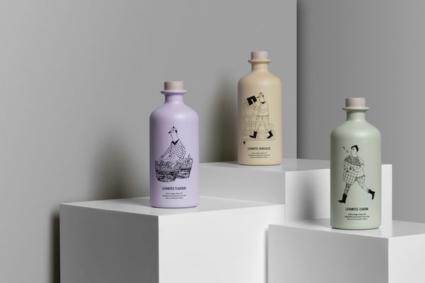
AG Design Agency | Levantes Family Farm
Pastel colors and lovely, story-telling characters. The Greek AG Design Agency
created a Red Dot award-winning visual identity for the Levantes Family Farm
family business. Let’s see the details.
AG Design Agency’s motto „Creating brands that are truthful, innovative and
beautiful” sums up the essence of the new
brand
Ginger Sprite
Even though they won’t make it to the East anytime soon, the major soft drinks
producers of the world keep experimenting with all kinds of versions, as in
addition to a continuous decrease in sugar content, consumers also want to try
out as many interesting flavors and special combinations
branding
Ginger Sprite
Még ha ezek Keletre nem is jutnak el hamar, a nagy üdítőital-gyártók időről
időre mindenféle változatokkal próbálkoznak, mert a fogyasztók bizony nem csak a
cukortartalom folyamatos csökkentését várják el, hanem mindemellett szeretnének
kipróbálni minél több érdekes ízt, különleges párosítást. Az amerikai fogyasztók
életébe így jött el a gyömbéres Sprite. „Kérek

design
HIGHLIGHTS | Visual Identities
A brand does not end at a well-designed logo. The expression “visual identity”
commonly used in English-speaking areas hints at the complexity of the
phenomenon: to the fact that an exigent brand has to work in a carefully
designed visual sign system. Colors, logos, fonts, icons and photos are all
design
HIGHLIGHTS | Visual Identities
Egy márka nemcsak egy jól megtervezett logóból áll. Az angol nyelvterületen
használatos „visual identity” kifejezés a jelenség komplexitására utal, vagyis
arra, hogy egy magára valamit is adó márkának jól átgondolt vizuális
jelrendszerben kell működnie. A szín, a logó, a betűtípus, az ikonok és a fotók
mind-mind annak a nyelvnek az

design
Leo Burnett I Ingredients
We have been looking at the attempts of McDonald’s at trying to prove that they
are green, edible, clean and beautiful. Most of the time, the attempts are
successful, and of course every adult can decide what he or she wants to
consume.
This time, the campaign created by
design
Leo Burnett I Hozzávalók
Hosszú évek óta figyeljük a McDonald’s kísérleteit arra vonatkozóan, ahogy
töretlenül próbálják bizonyítani: zöldek, ehetőek, tiszták és szépek. Ezek
többnyire sikeresek is, amúgy meg persze minden felnőtt ember maga dönti el, mit
fogyaszt és mit nem.
A Leo Burnett [https://leoburnett.com/] által kreált kampány most az
összetevőkre fókuszál,