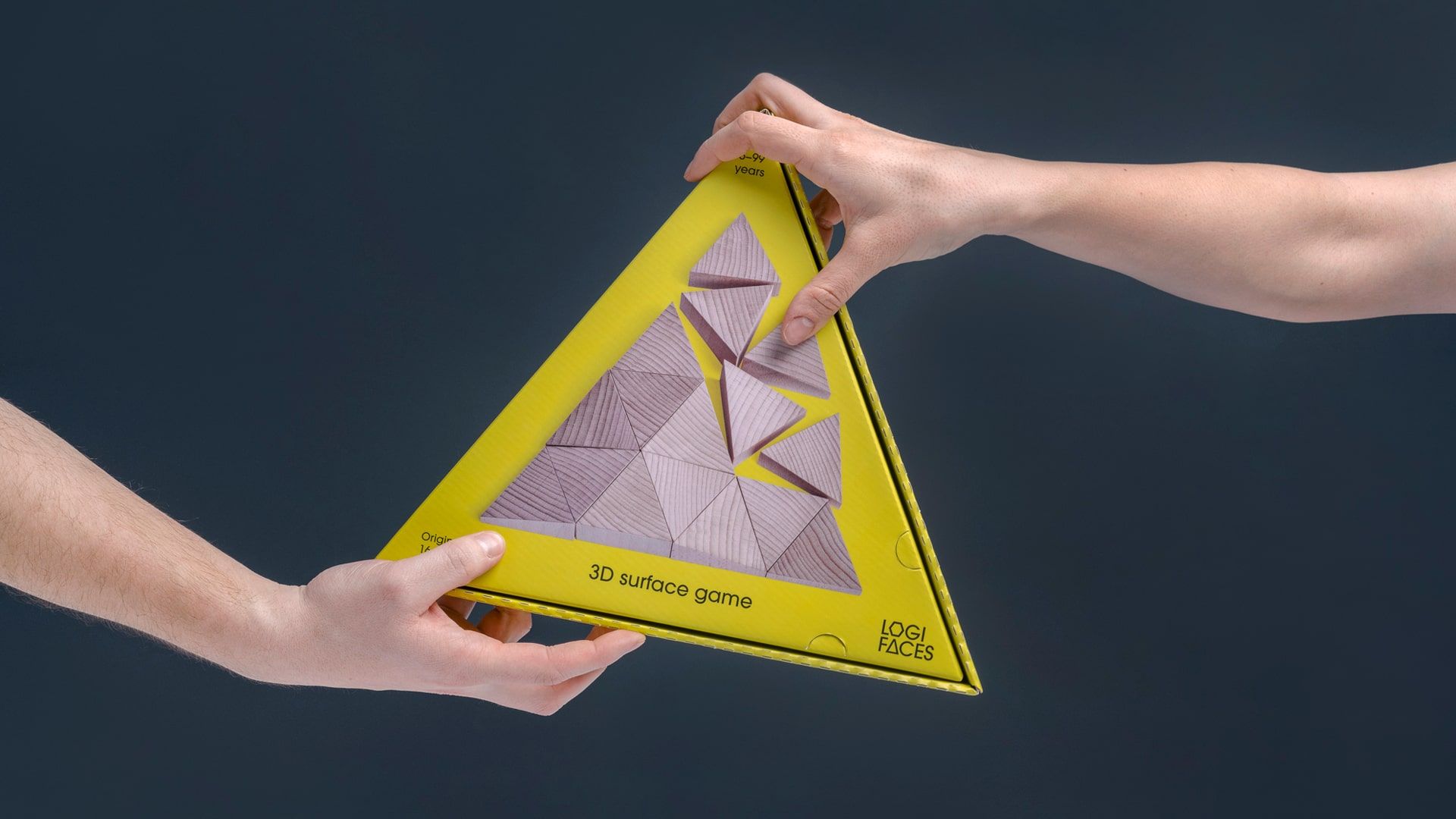
The story of Logifaces, dreamed up by architecture and design studio Planbureau, dates back to 2012. This logic toy is a real success story: it won the Hungarian Design Award, thousands of pieces were sold and many people refer to it as the Rubik’s Cube’s successor. The creators wanted to take its fruitfulness to a new level, so they commissioned the DE_FORM creative agency to create a new brand identity for the product. Let’s see the results!
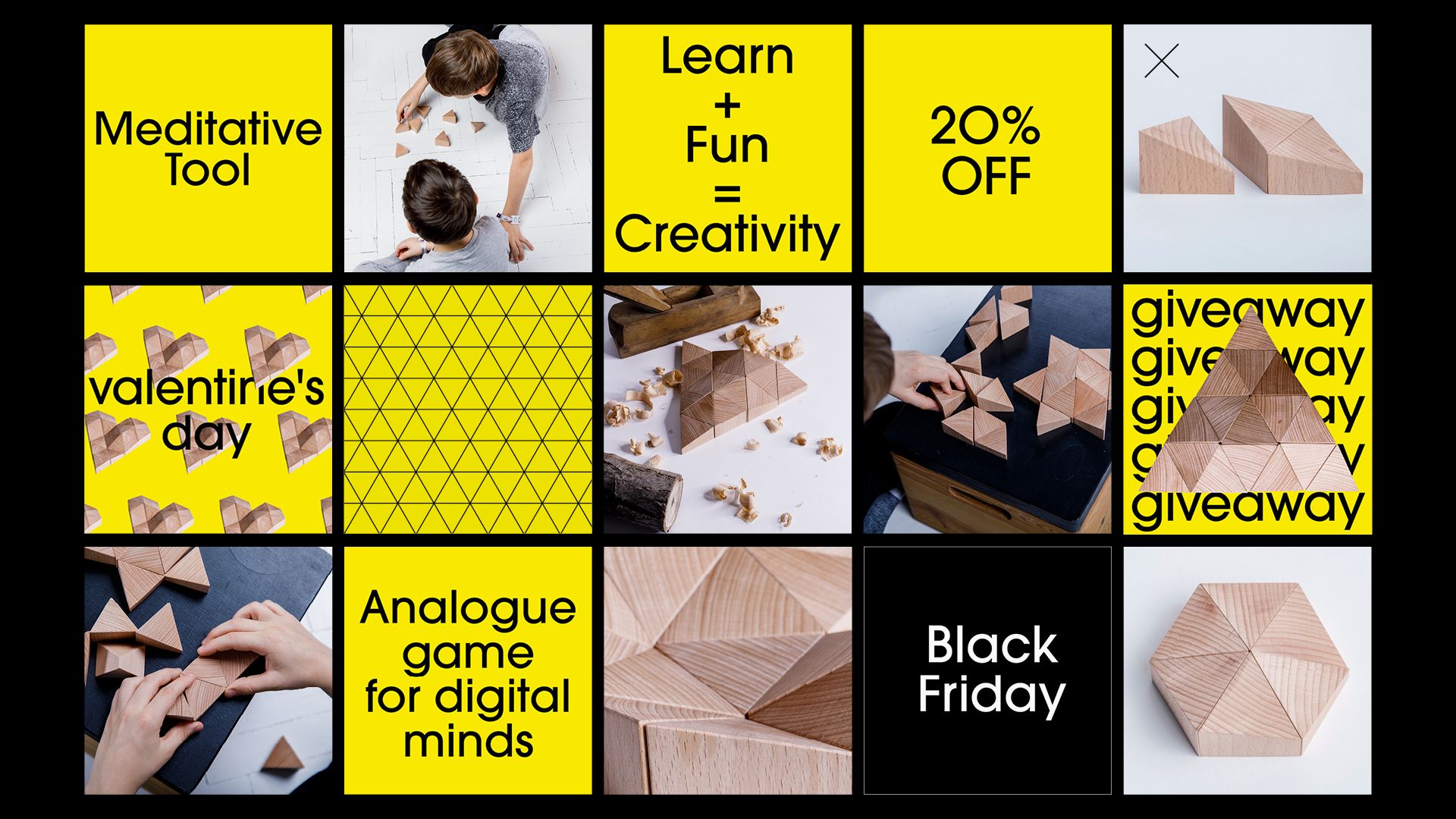
Inspired by features of CAD modeling, Logifaces was previously sold by designer stores in understated colors and made of concrete. The buyers were typically adults, who used it as a decorative design piece rather than a toy. Planbureau and DE_FORM wanted to change this by developing a concept that would make the product truly toy-like and attractive for a much wider target audience and age group.
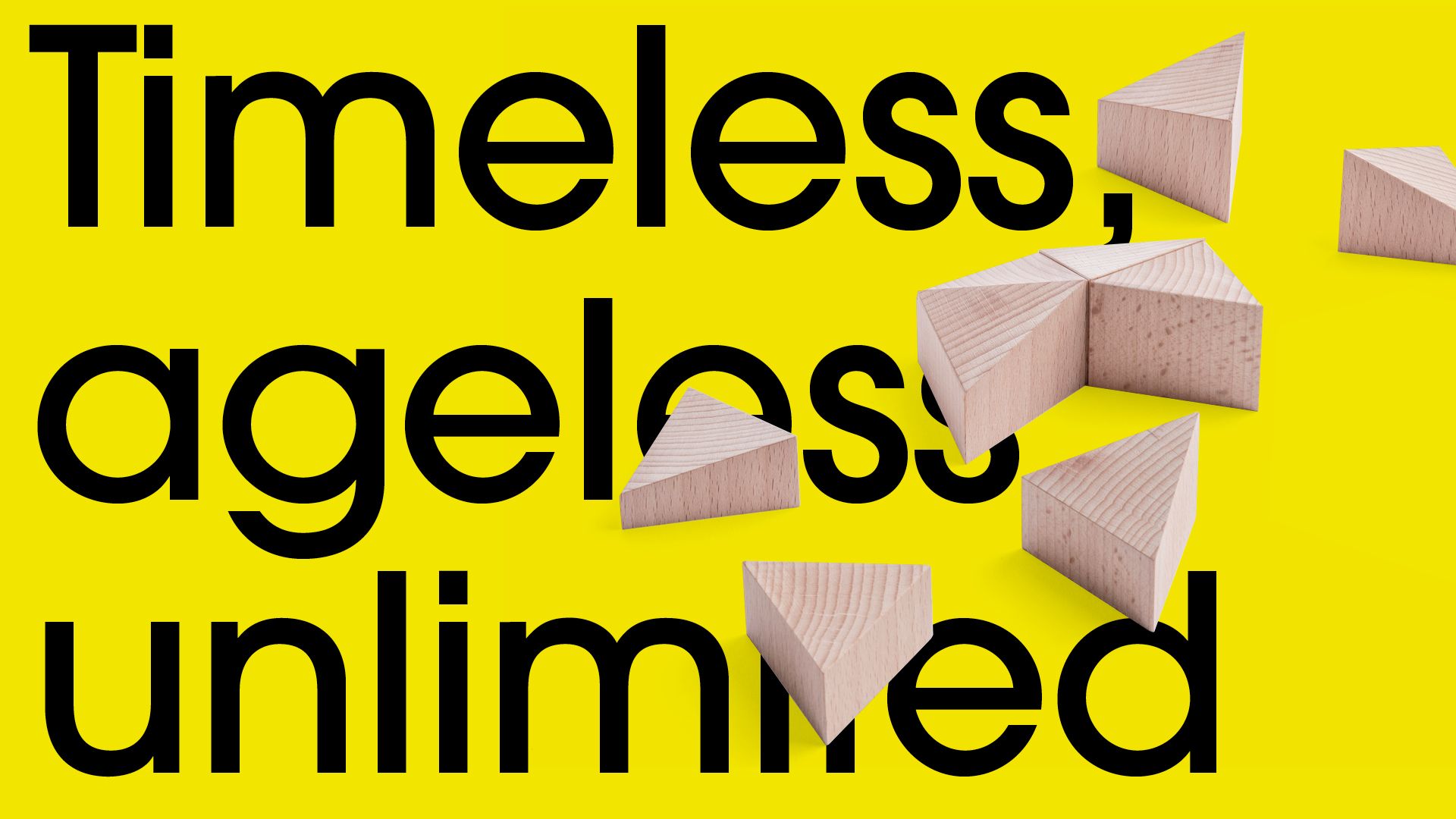
They replaced the material with durable wood, and made the brand’s identity more cheerful and youthful. The project included the complete redesign of the Logifaces website, logo, packaging, as well as the brand’s offline and online marketing activities, among others.
“Since the product will now be available not only in designer stores and museum gift shops, but our goal is to get it onto the shelves of toy stores as well, we have made every effort to attract attention both with colors and typography. We have left the former elegant, slightly luxurious vibe behind; we strived to create a visual identity that would be engaging for a wider audience. It is important to highlight that our main target group is now families and children,” said Nóra Demeczky and Enikő Déry, the designer duo of DE_FORM.
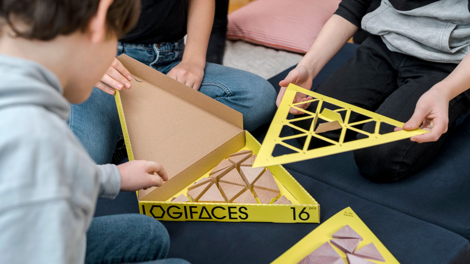
An important element of the identity is the triangular, bright yellow packaging, which showcases the basic solution of the game.
“The packaging was created from natural and durable materials, we definitely wanted to avoid having to use any kind of foil. Another important design consideration was that the toy should be easily repacked, so that the paper box doesn’t end up in the trash. However, we also wanted to show the product, so a scaled photo of it appears on the box,” said Nóra and Enikő.
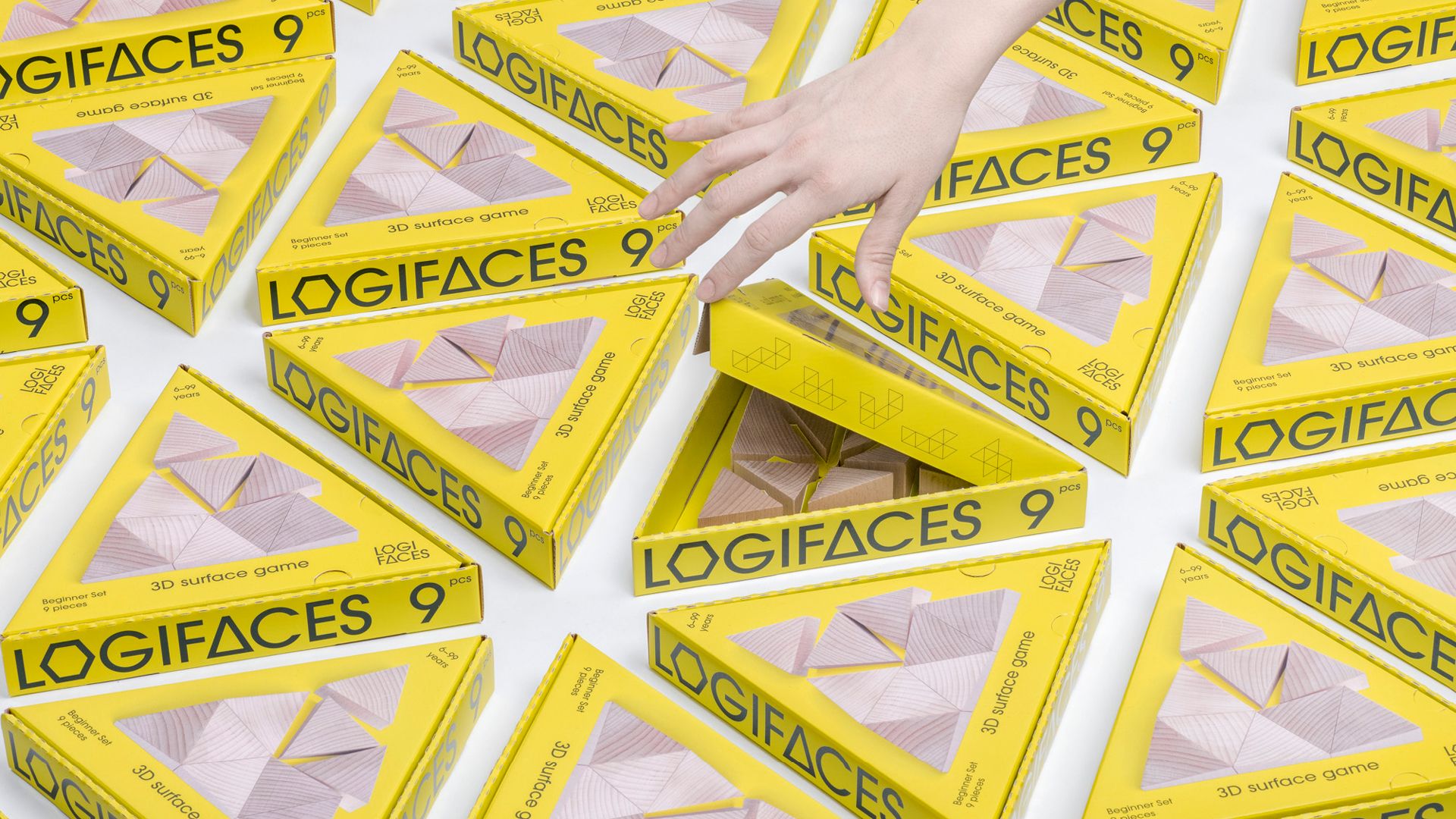
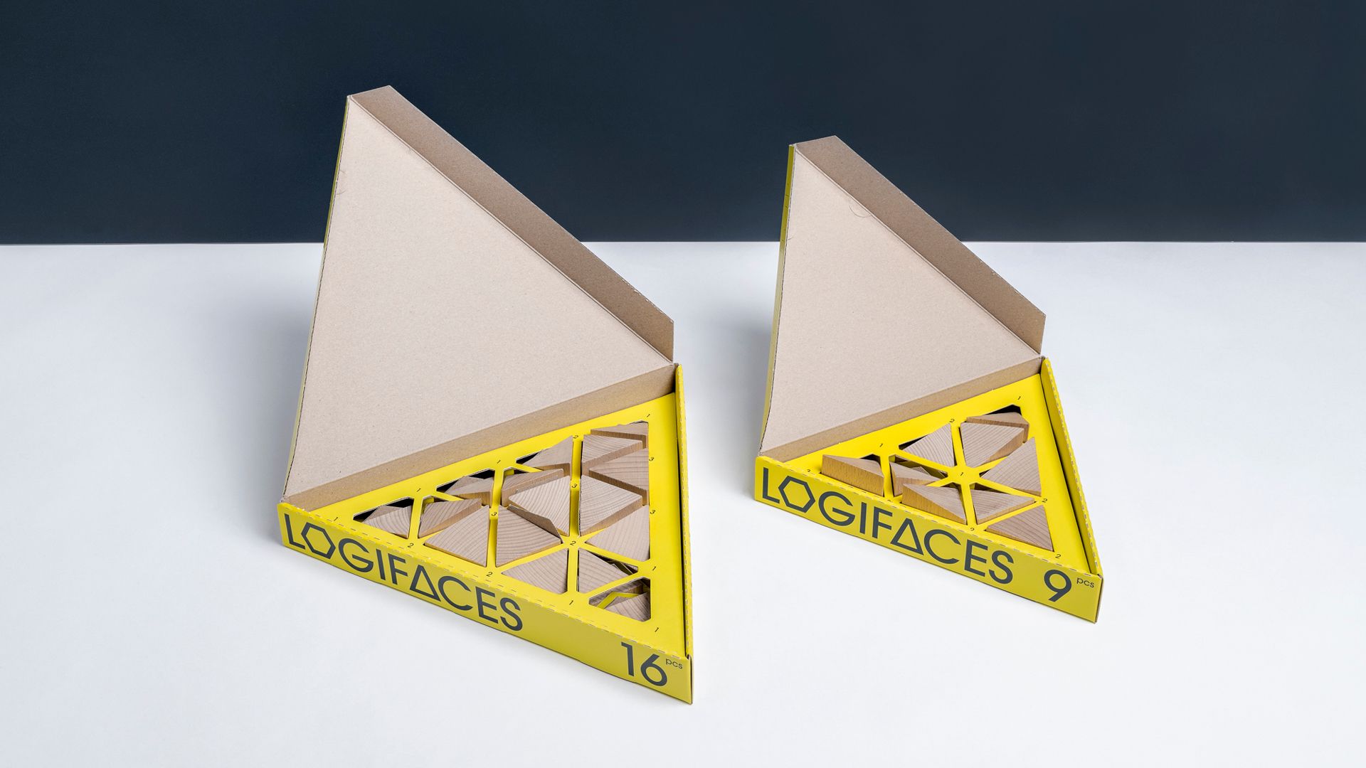
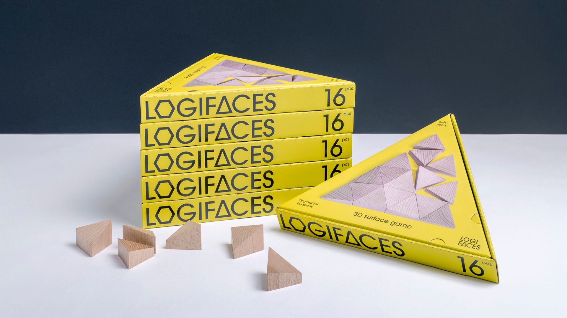
“Apart from the packaging, our personal favorite is the website: we endowed it with a lot of smart and playful gestures. Planbureau has also started to use the game for educational purposes and community building; more information on these will soon be available on the new website,” Nóra and Enikő told us.
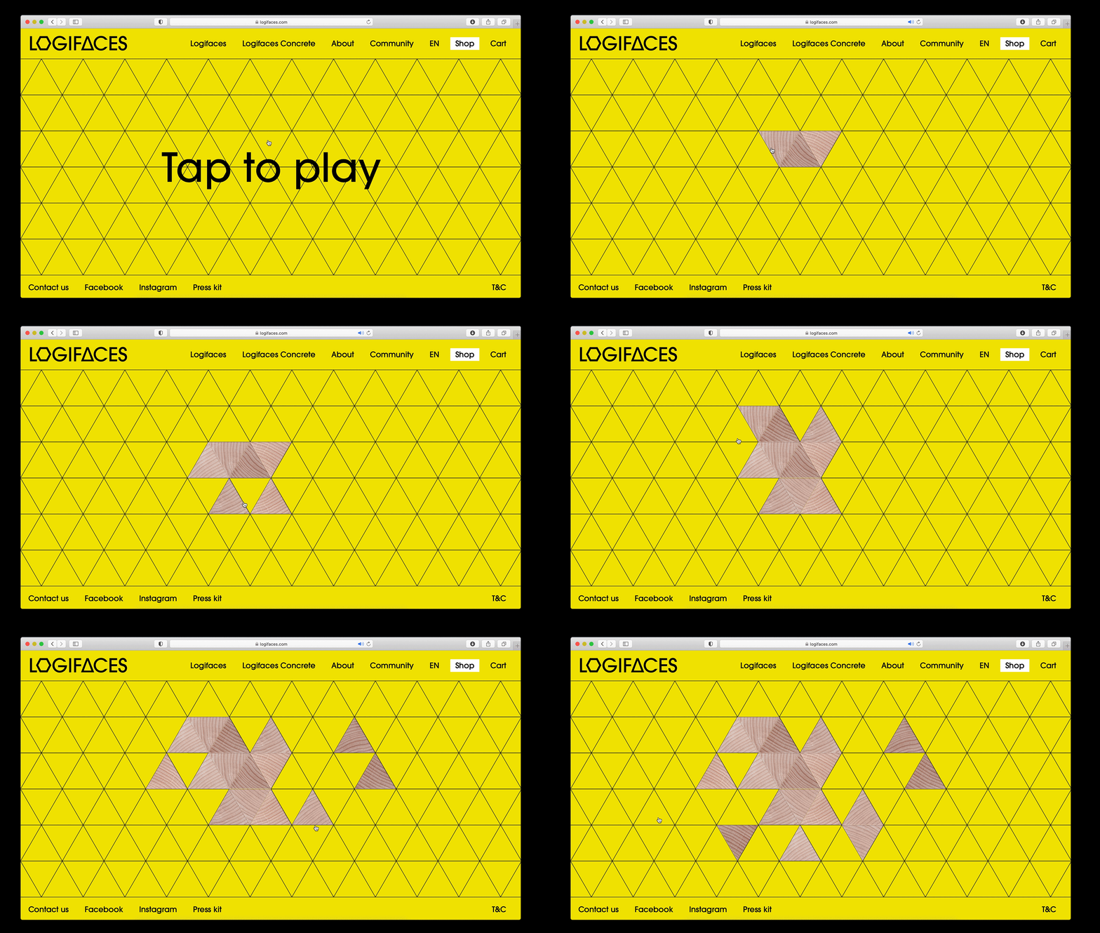
The next step will be branding the social media campaign, but the two creative companies are working together on multiple exciting projects simultaneously.
Photos: Máté Lakos
Website programming: Bálint Zalkai
“We reflect on social pressures” | Lazy Women
A meat packaging concept with Renaissance masterpieces
