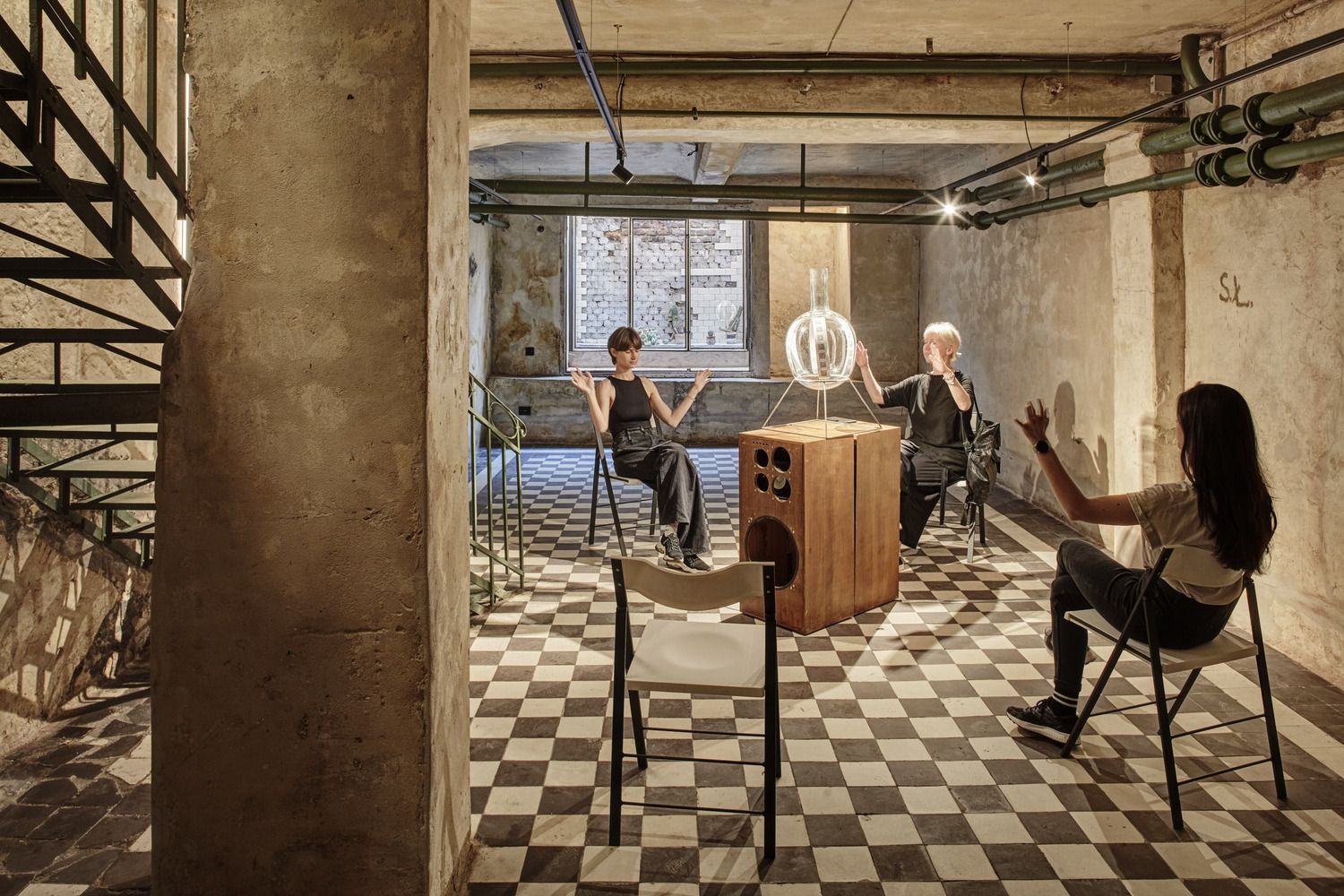
Tradition and innovation in Lviv’s newest interdisciplinary space: RadioGarage is a common playground for art, sound and technology. The Ukrainian design and architecture studio O.M. Shumelda created an exhibition space and cultural center in the historic building of Lviv Radio, on the site of a former garage. Let’s see!
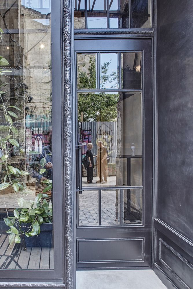
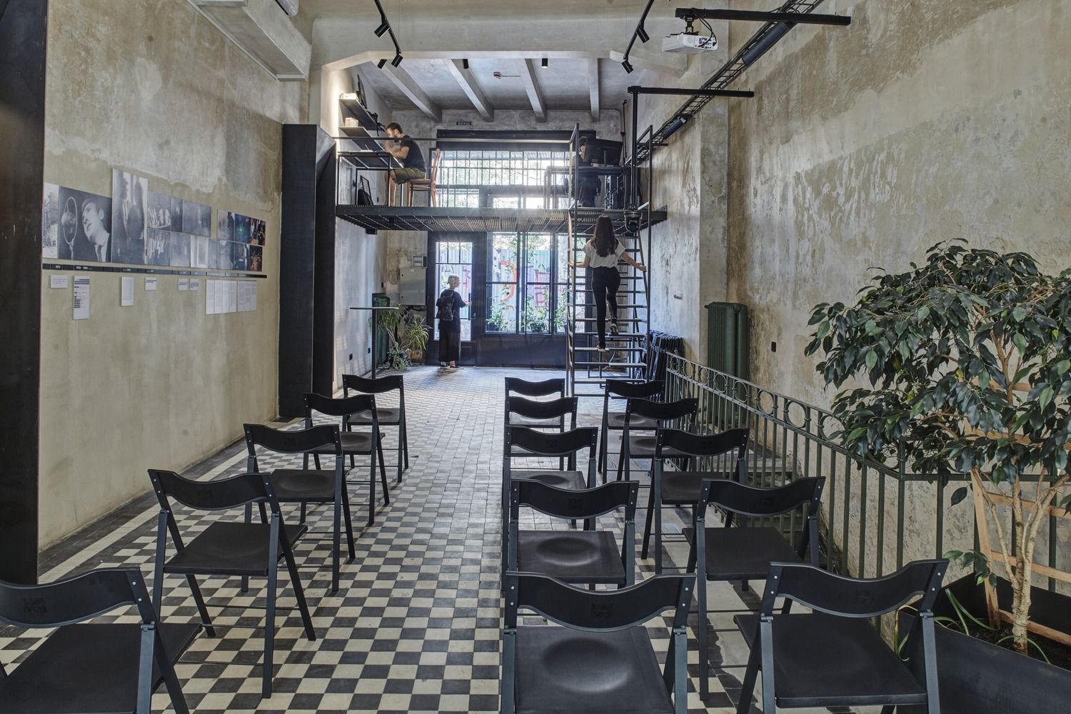
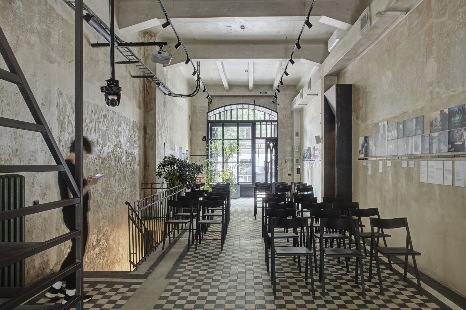
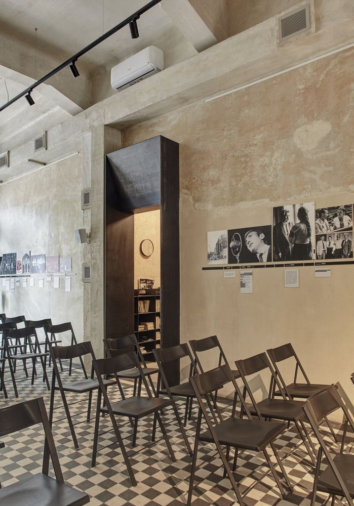
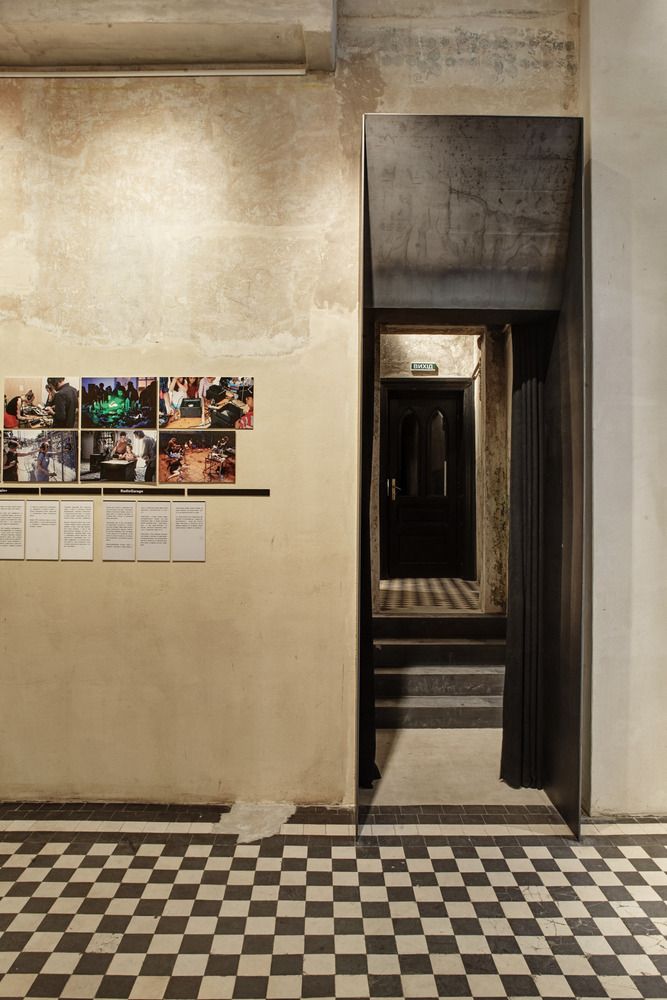
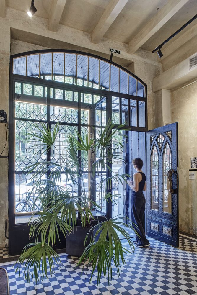
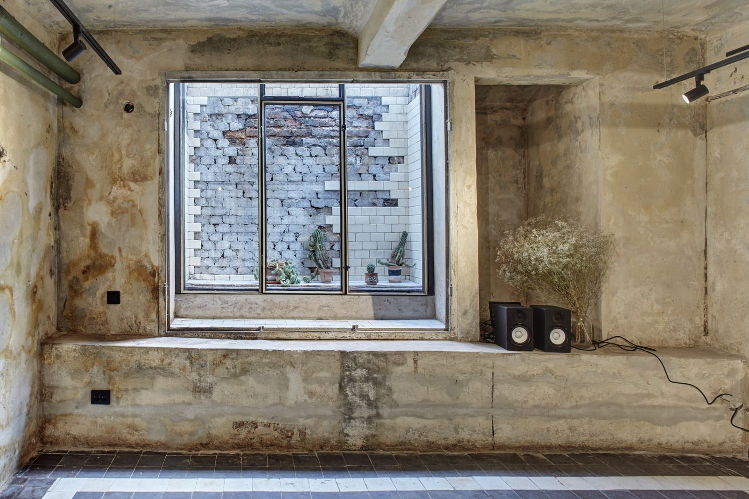
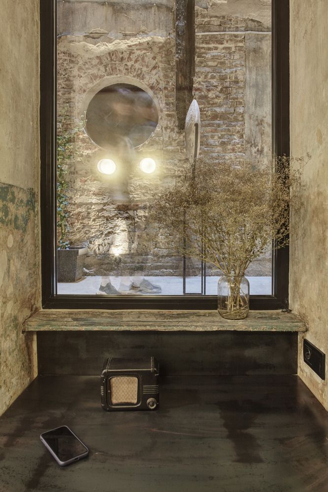
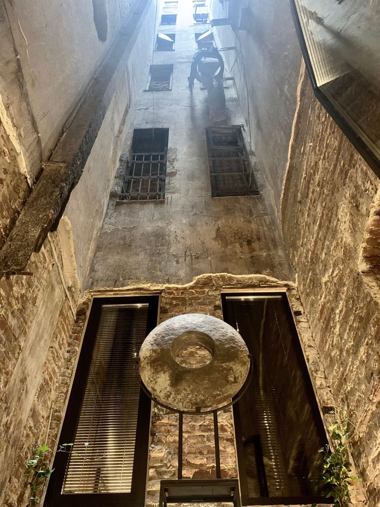
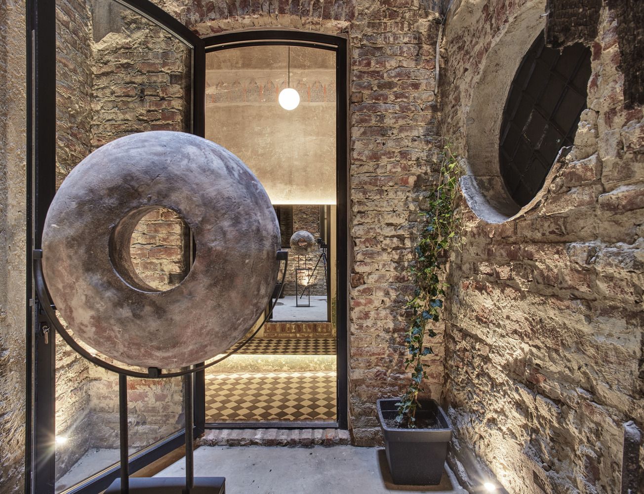
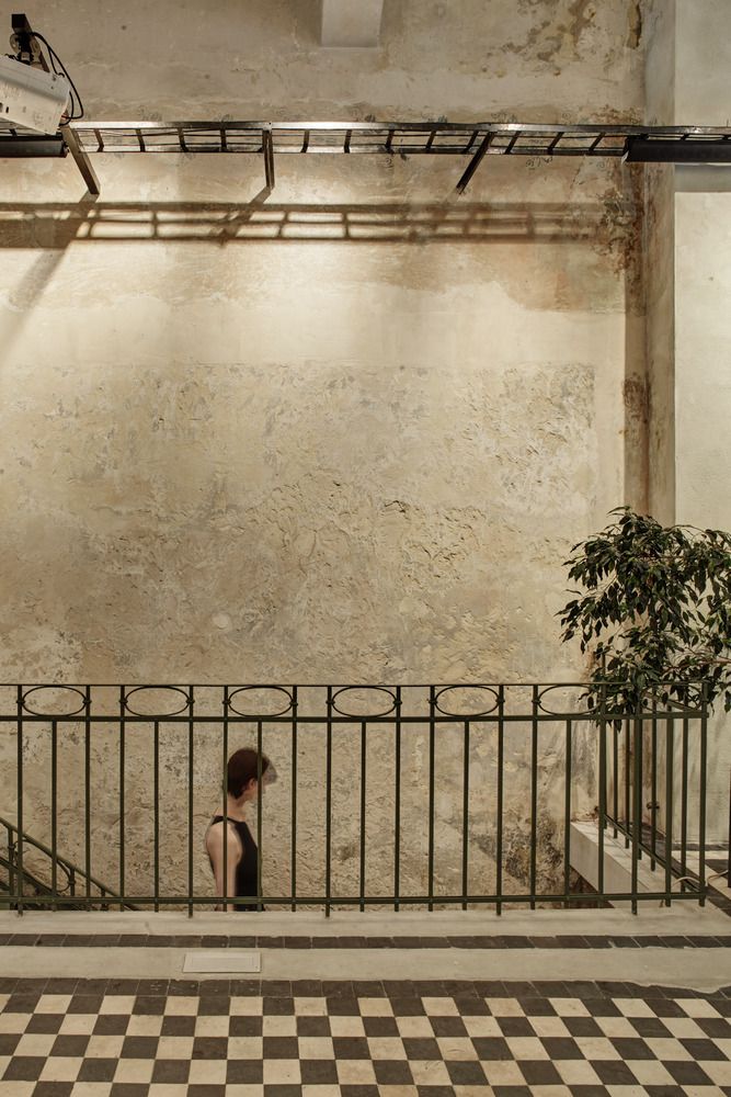
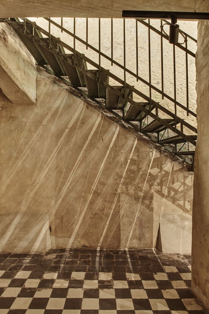
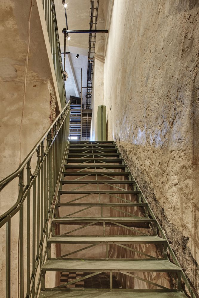
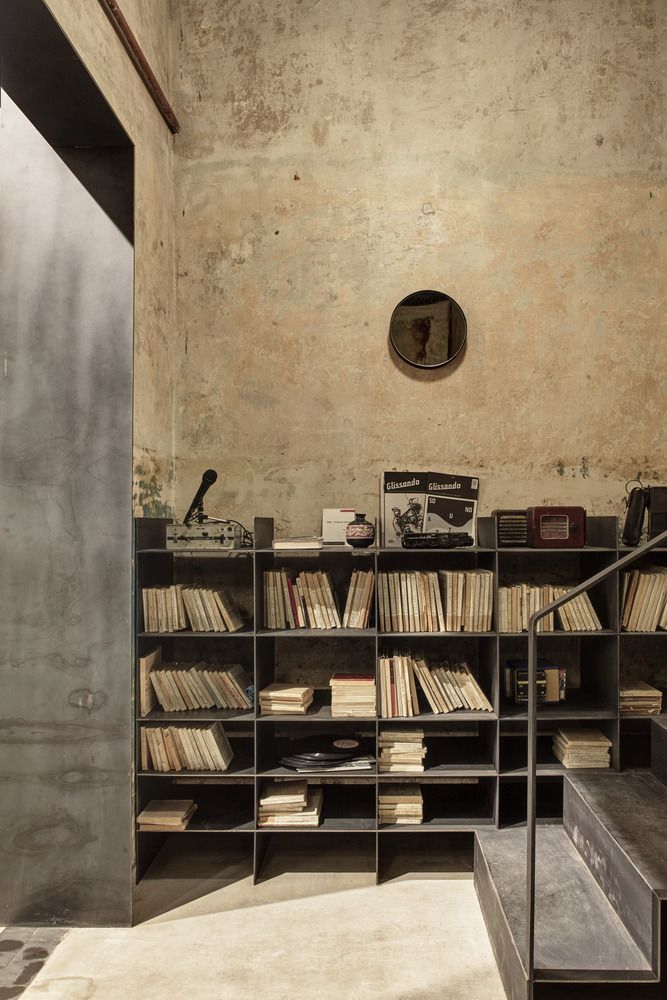
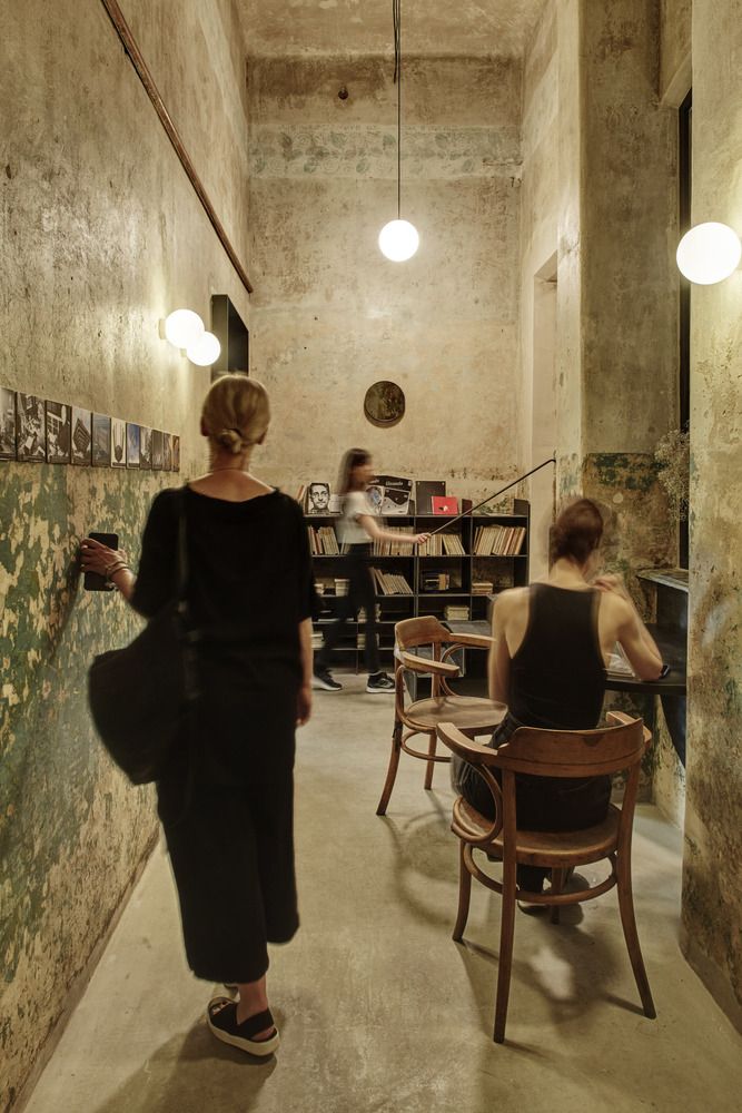
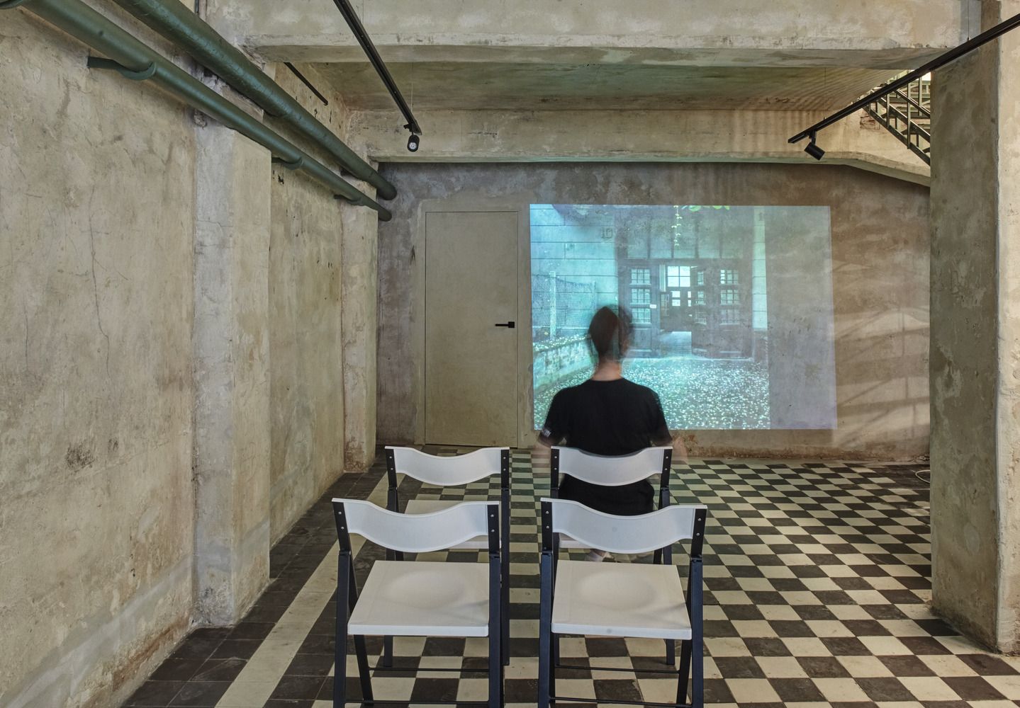
The Lviv Radio building was built in 1912-13 according to the plans of architect Adolf Piller in an early modernist style. It has been an apartment building, a bank and a garage throughout its history, but the various functions and eras have left a strong mark on the building, so it was extremely important for the architects to restore the building to its original glow during the renovation. In addition to restoring the floor and walls, three walled-up windows, as well as a downstairs back door have been restored, the latter leading to an atrium courtyard. On the ground floor, a community space was created for workshops, trainings, exhibitions and concerts, and a gallery was built for the workers, taking advantage of the ceiling height. An exhibition space has been set up in the basement for sound and radio art exhibitions, performances and video presentations.




Radio Garage | Web | Facebook | Instagram
O.M. Shumelda studio design & architecture | Web | Facebook | Instagram
Source: ArchDaily

Lace creations and other wonderful lingerie from Eastern Europe | TOP 5

The first collection from YKRA KIDS is here!
