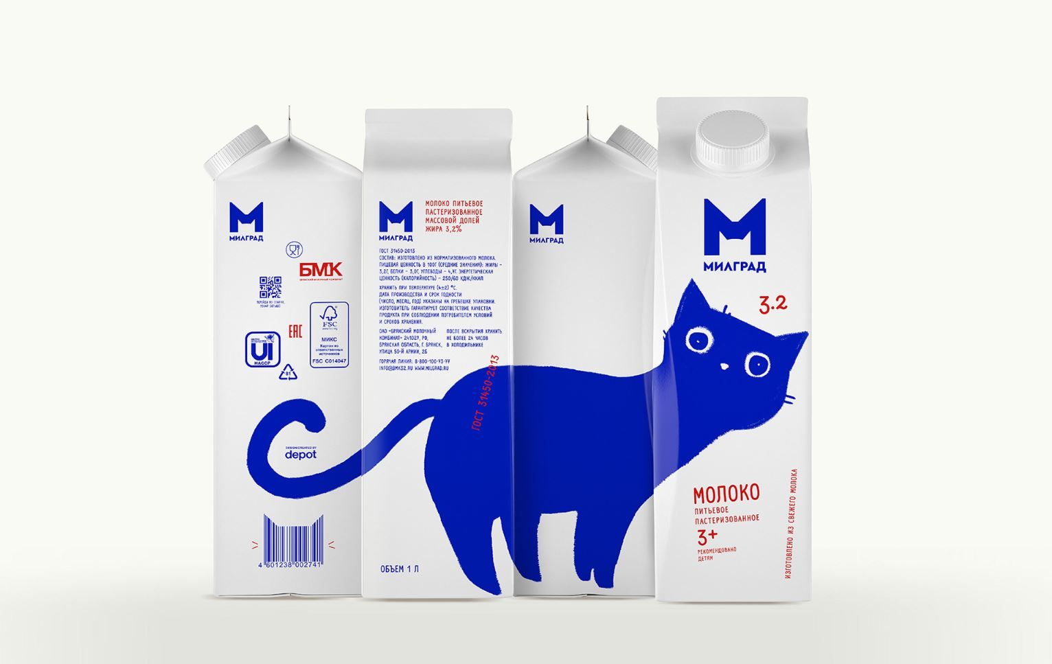
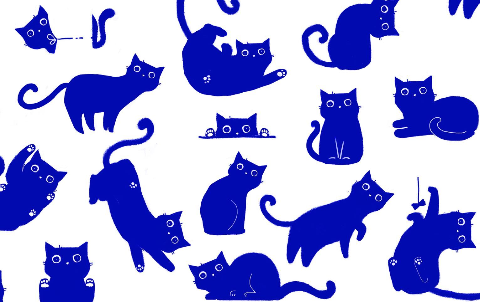
Every brand can choose the way leading to its goals. Some of them opt for strong, aggressive visual communication, urging the unwitting buyers to shop with their force. Depot Design Agency designed a less drastic, but all the more lovely and playful look for Russian dairy company Milgrad, while also keeping sales figures high.
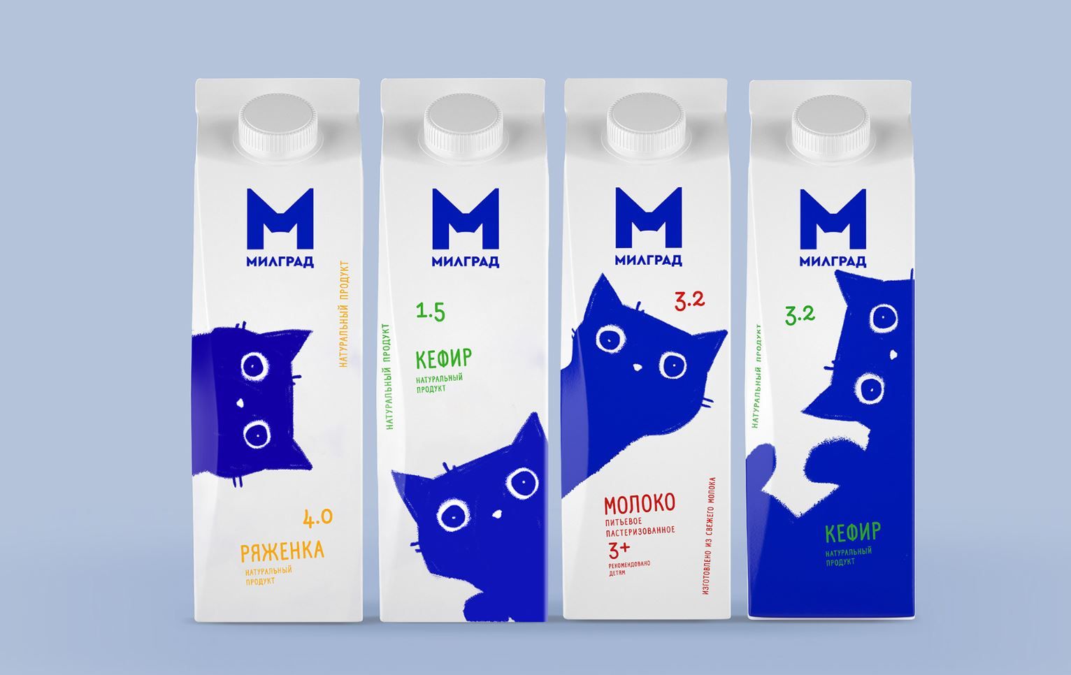
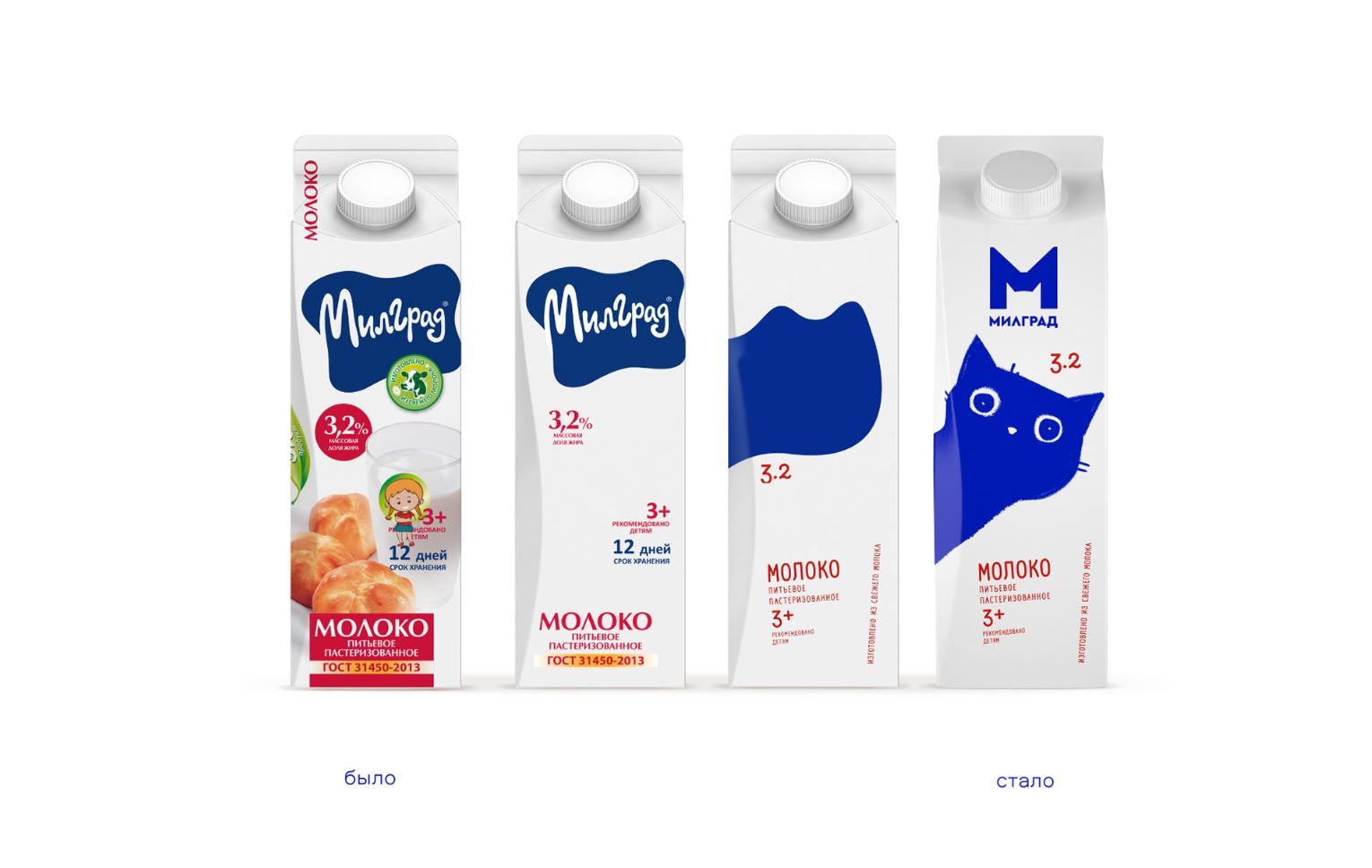
Building on the old packaging, they opted for a frisky look featuring a blue cat and clean typography, and spiced up the shelves of Russian stores while not only charming the clientele preferring tasteful design, but also winning the hearts of little ones, too.
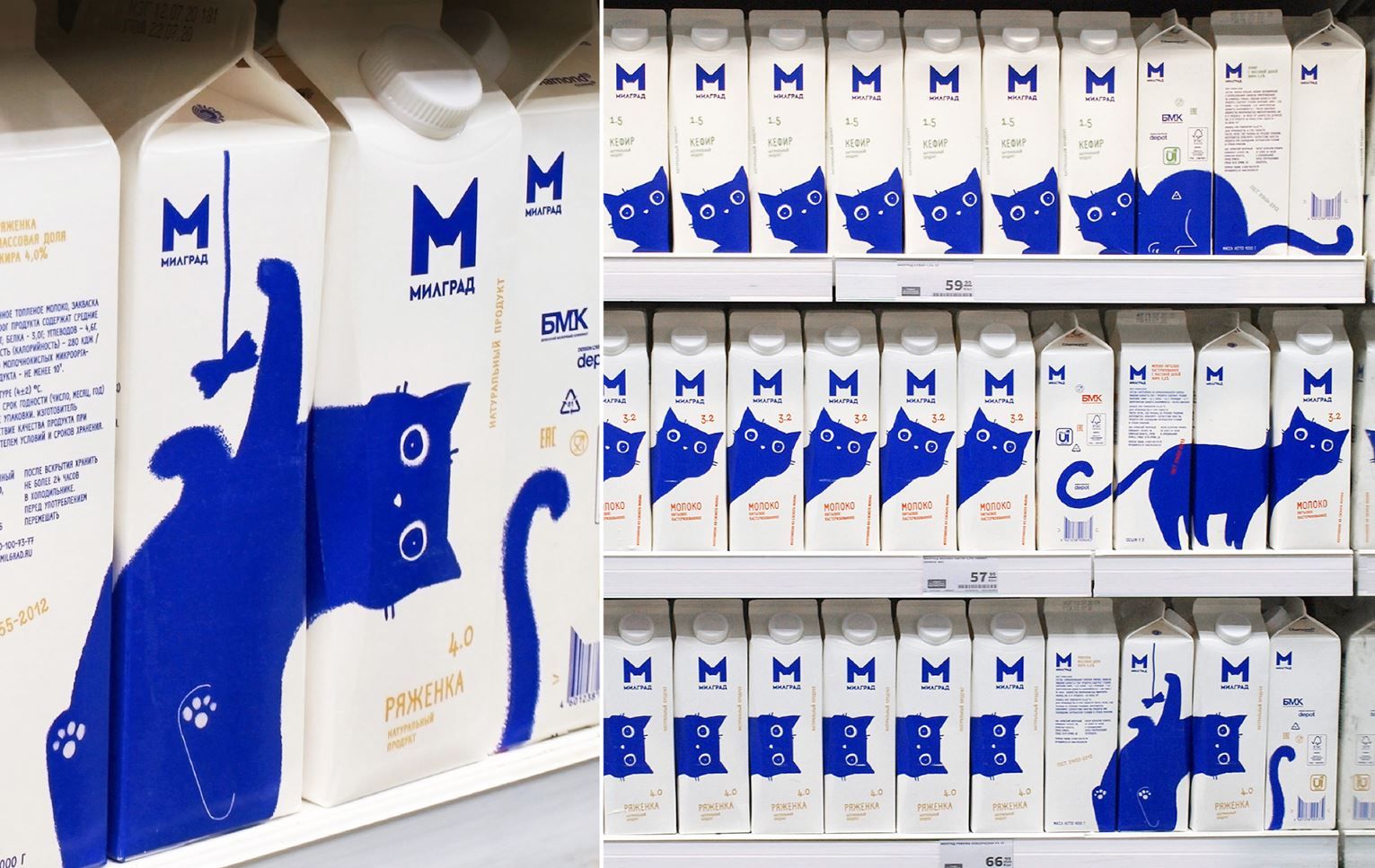

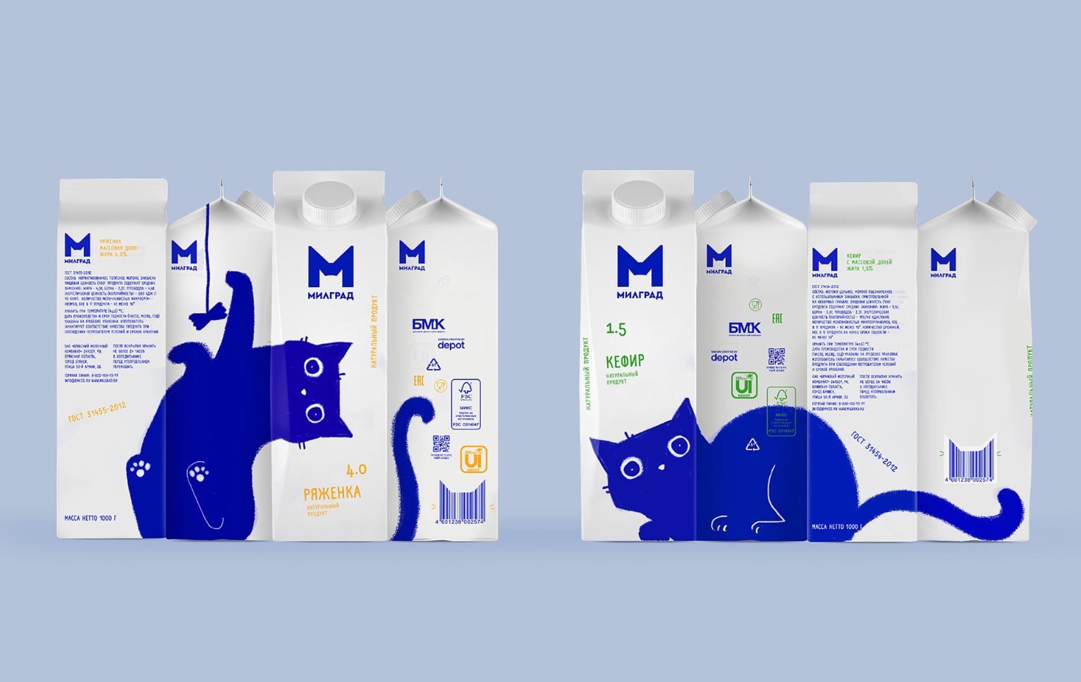
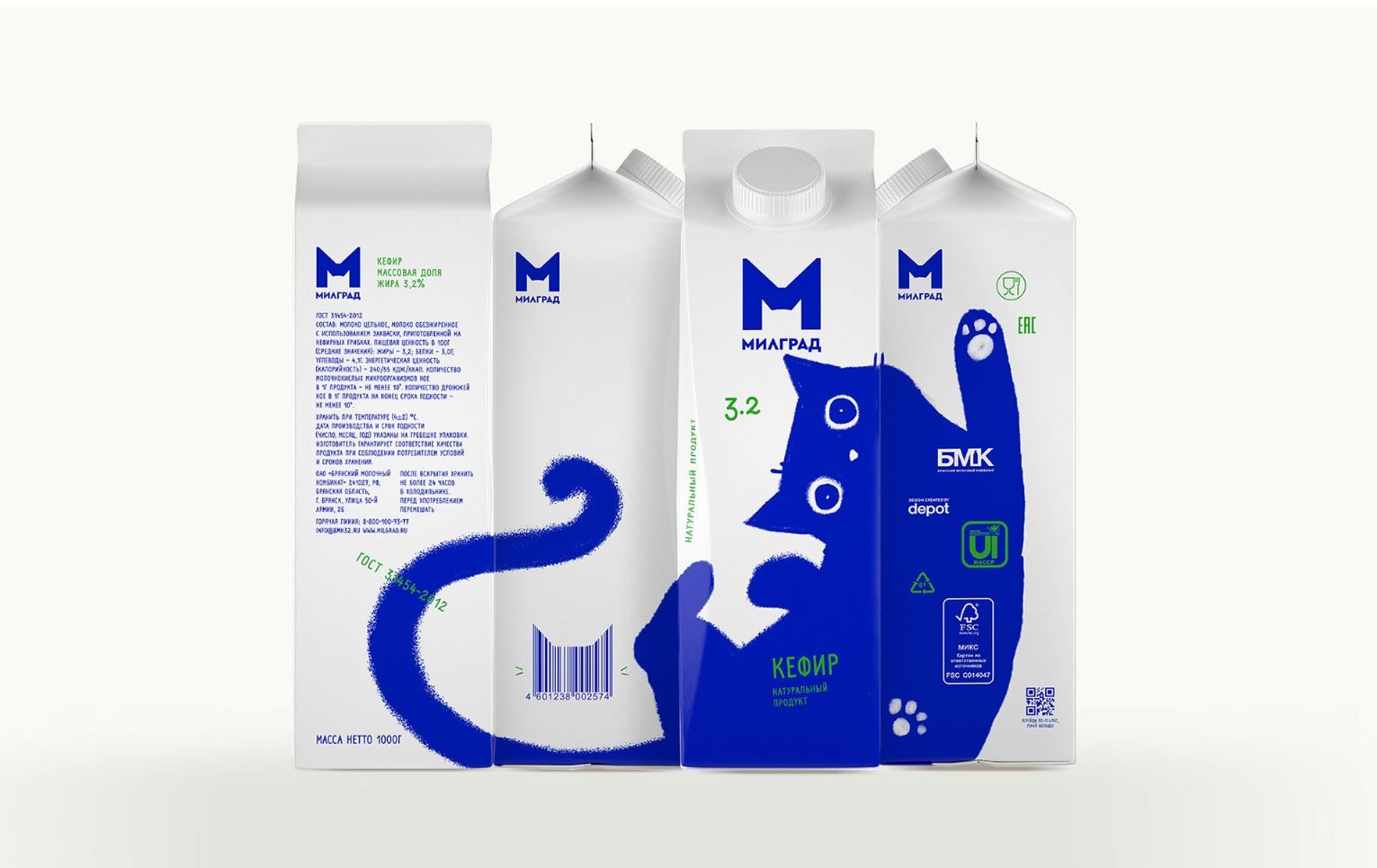
We can see this approach and quality adapted on the different surfaces on the other products of the brand, too.
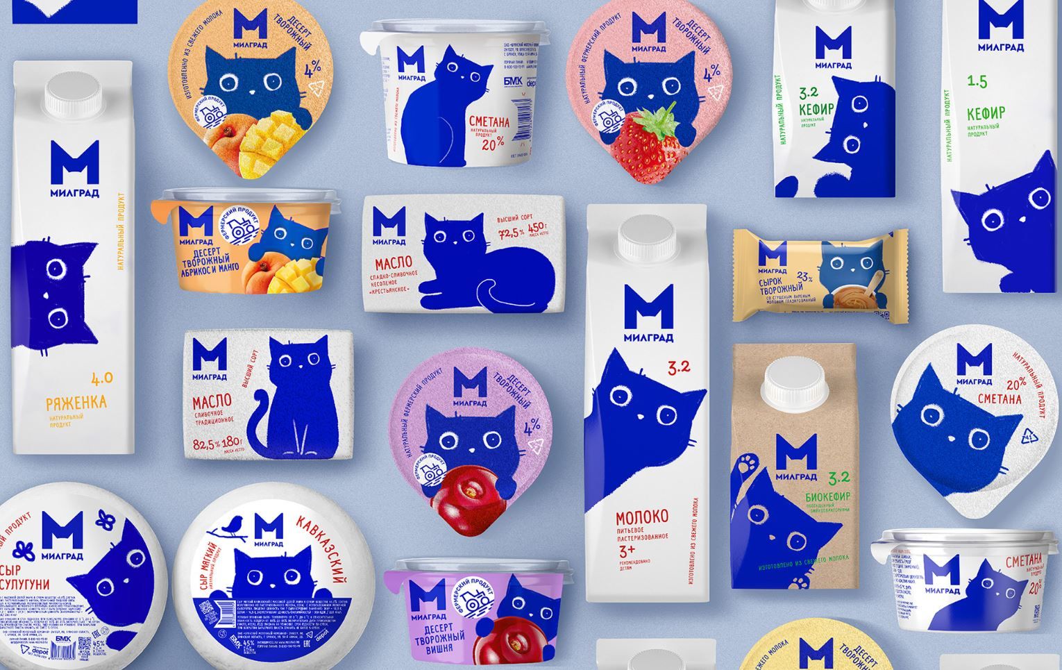
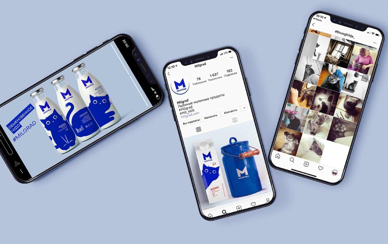
source: designboom
more to read

film
Concept to reality | Epic Creations
Looks like a hundred-ton body, yet it weighs almost nothing; it’s sharp but
couldn’t harm a fly; could be made for three months, but can only be seen for a
few seconds on screen. What are we talking about exactly? With the help of
Budapest-based Epic Creations, we
metro
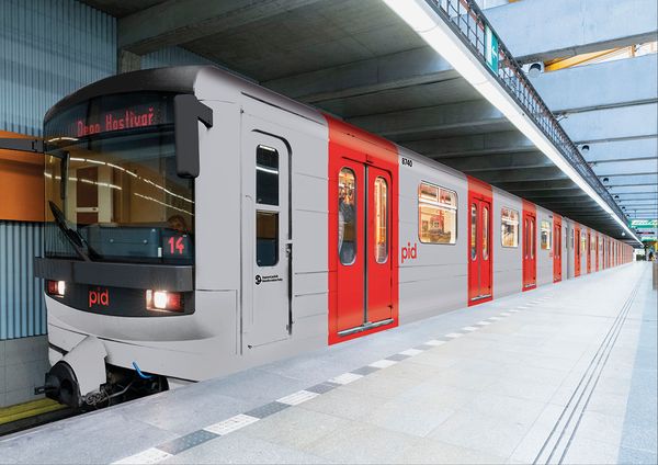
Prague’s public transport receives a new visual identity | superlative.works
Modern, clean, logically structured and comprehensible – we could describe the
new visual identity of Prague’s public transport with these words the best. In
their project, winning studio superlative.works proposed something that took our
breath away, too.
The public transport of the Czech capital and the central region of

architecture
Apple’s new store built on the water
The iconic logo is broken by waves on Apple’s third store in Singapore, built at
a quite unusual spot: on the water in a bay.
The store is not open to the public yet, but has already went viral: social
media is flooded by the images taken of the


