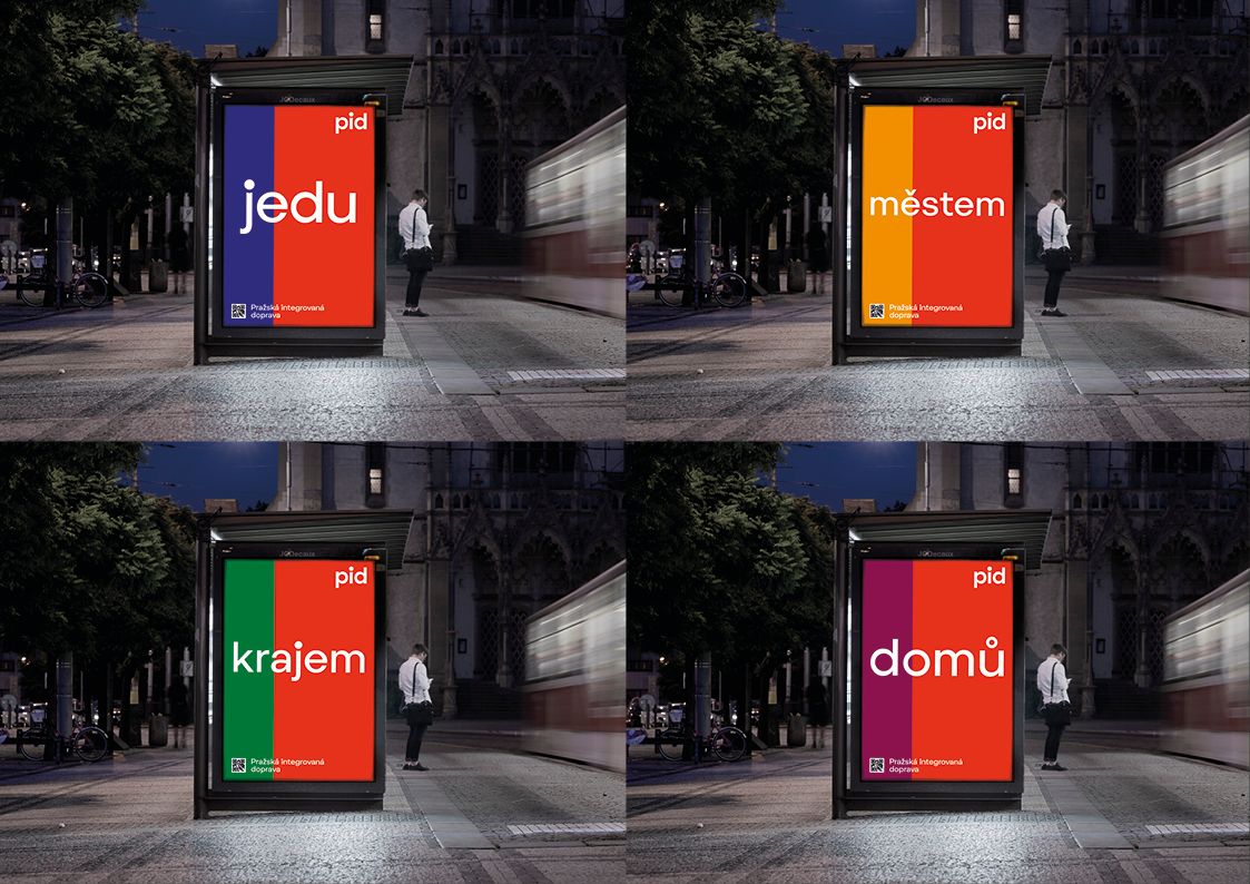
Modern, clean, logically structured and comprehensible – we could describe the new visual identity of Prague’s public transport with these words the best. In their project, winning studio superlative.works proposed something that took our breath away, too.
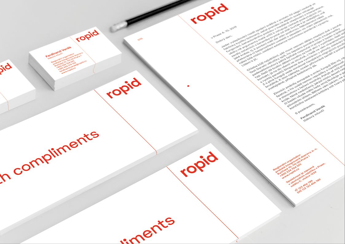
The public transport of the Czech capital and the central region of the Czech Republic will soon receive a refresh, at least in terms of visual communication. Instead of the previous logo using the national colors (blue-white-red), a much cleaner version will be used. In addition, the urban and suburban buses, trams and the metro will also receive a unified visual appearance. The client was the organization in charge of the regional control of the integrated transport in Prague, that is the ROPID (Regionální organizátor Pražské integrované dopravy), and the call itself took place with the cooperation of CZECHDESIGN.
Design studio superlative.works (designers: Petr Štěpán, Mikuláš Macháček, Bohumil Vašák) won the call, and it’s safe to say this wasn’t their first rodeo. In 2008, they designed a new visual identity for freight trains of the Czech railroad, between 2009 and 2014, they were in charge of the visual identity of the passenger trains and the new wayfinding system (they used the ČD Fedra font at the time), and we can also thank them for the brand identity of our favorite confectionary in Prague Cukrář Skála (which we have already covered in a previous article – the Ed.).
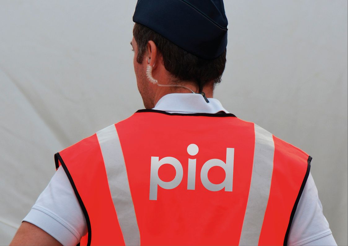
The logo of PID (Pražská integrovaná doprava, that is Integrated Transport in Prague) could seem boring at first glance, however, the difference is immediately visible if we compare it with its predecessor.
The emblem using blue-red-white colors and dynamic fonts could make us think of a sports brand, however, the new logo designed by superlative.works completely lacks the bit fuzzy, blue-red line drawing framing the sign, while it kept the red color and the three characters. The designers also designed a sans-serif font for the new logo named “Pid Grotesk”.
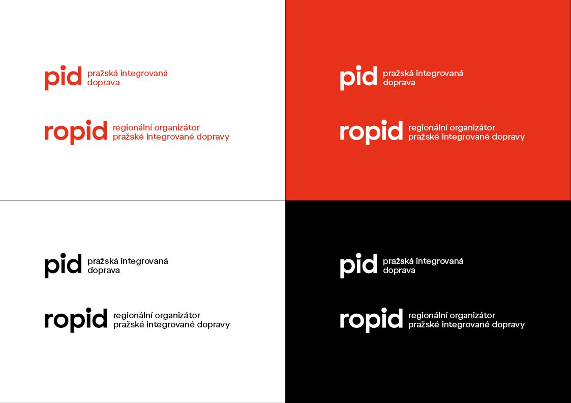
The letters “p” and “d” are inverted reflections of each other, while the dot on the letter “i” between them received more emphasis. Seeing this character, we immediately thought of the logo in the main theme of “The Incredibles” and the superhero costumes of the characters. The attention-seeking central character could make us think of the figure of a passenger and of course the final destination marked on a map, too. The top of the leg of the unusually bent letter “i” adjusts to the dot above it, thus presuming cohesion between the two elements.
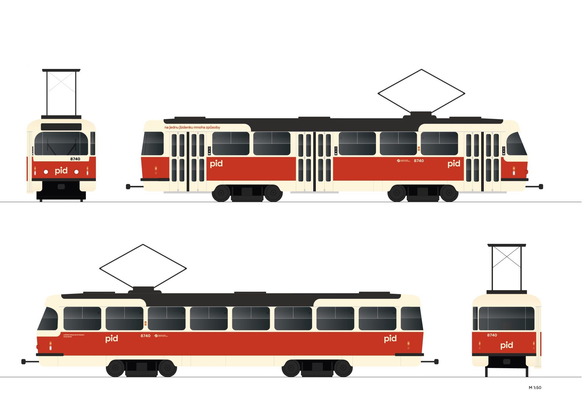
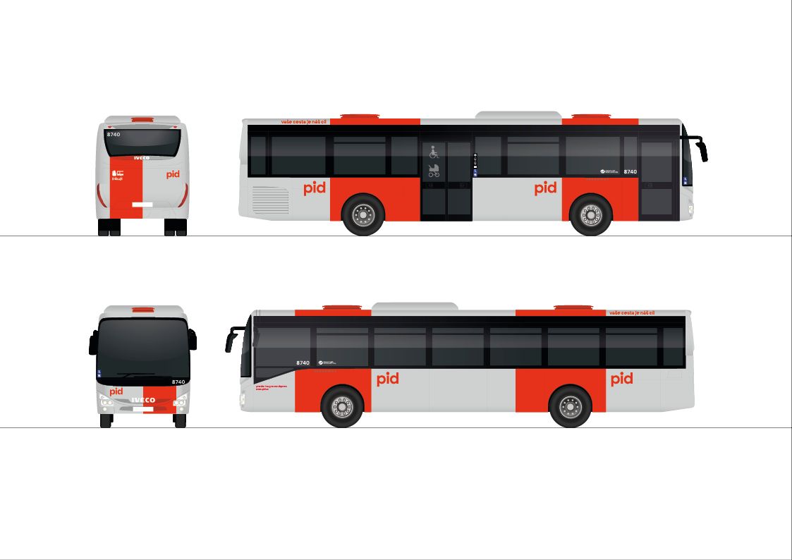

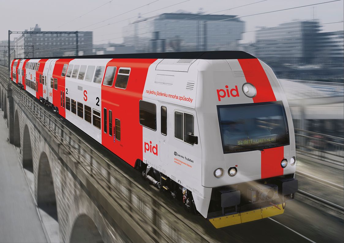
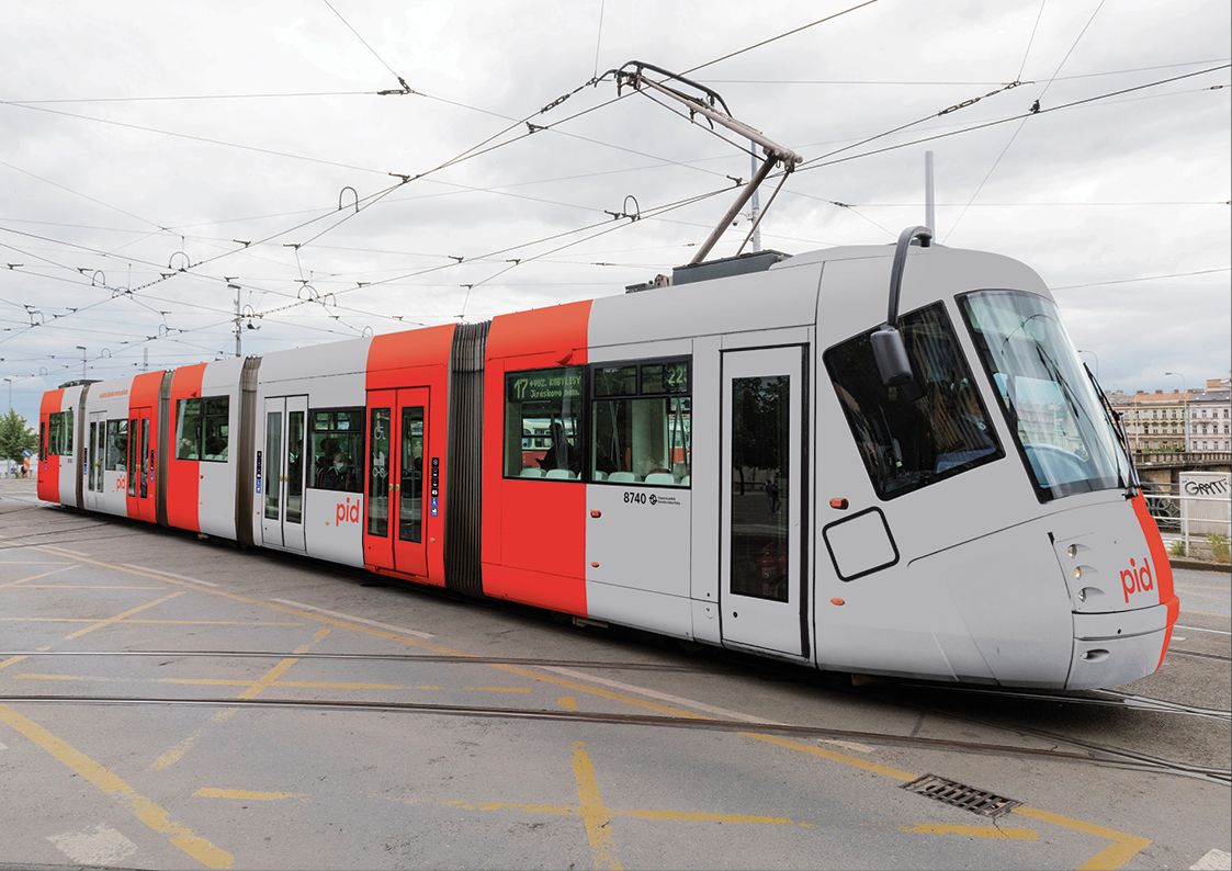
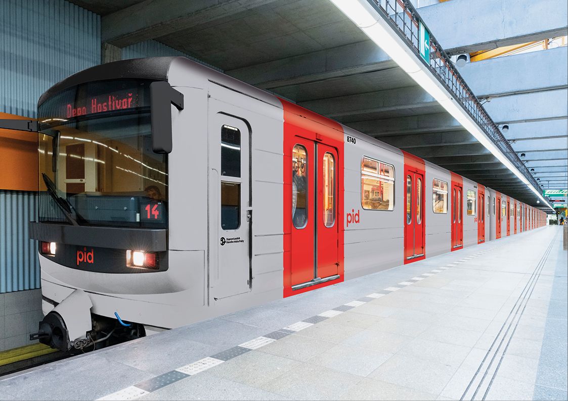
For the outer cover of the vehicles, the designers proposed a light grey color, and the red color appears rather vertically on the buses, metro and train cars, in a strict system: the prominent shade will also help passengers in orientation at the same time.
Source: czechdesign.cz

Heritage building turned into boutique hotel | The Modernist Thessaloniki

Zaha Hadid Architects to design Moscow’s new metro station