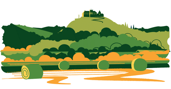
How can you design a modern and authentic identity for a clothing brand that draws its inspiration from traditional Hungarian rural life? Studio NUR and the Peltán-Brósz studio teamed up to reimagine the identity of Dóra Zsigmond’s menswear brand.
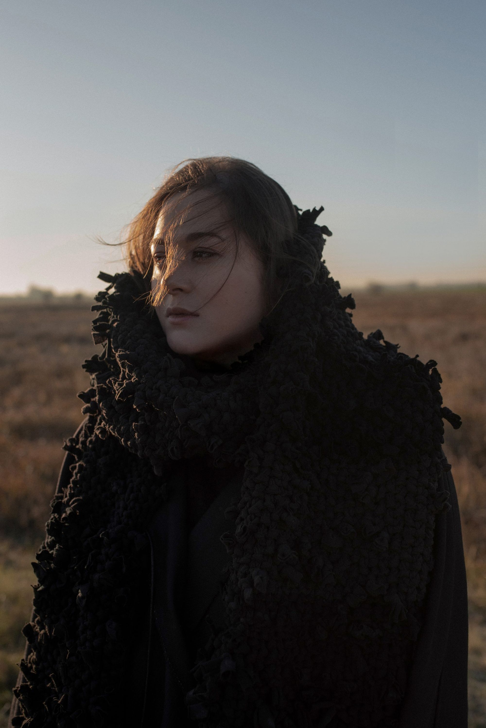
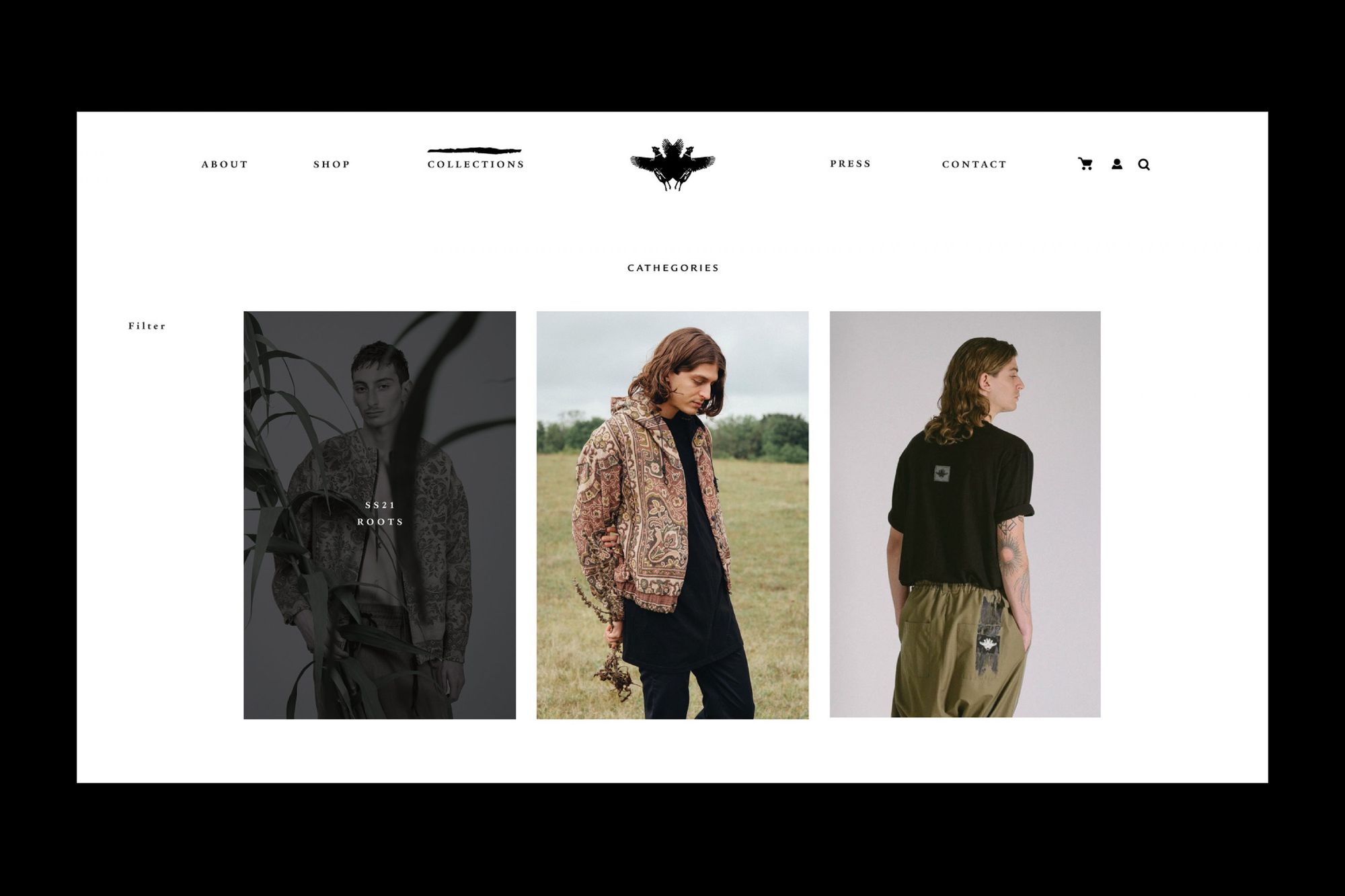
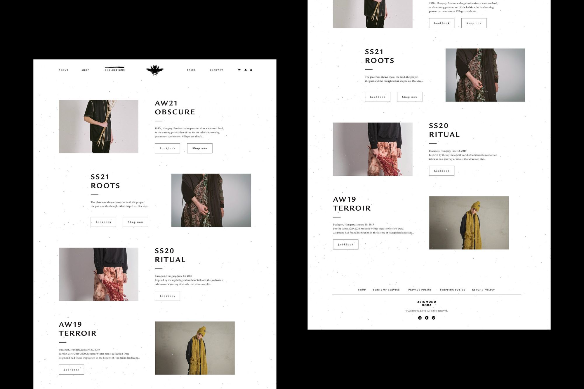
Dóra Zsigmond’s menswear brand, now known as ZSIGMOND, kicked off the year with a name change, a refreshed logo, a new identity and a new website. The Hungarian brand, which was launched in 2014, usually brings elements and moods of archaic peasant culture into a contemporary context with its collections, just as with its 2022 spring-summer collection, UNRIPE, which has recently been made available on the webshop. UNRIPE’s timeless pieces are inspired by period photographs of 19th-century Hungarian noble estates. ZSIGMOND’s creations are often patterned with unique textile manipulations and painted details, while REMADE pieces are made using period fabrics.
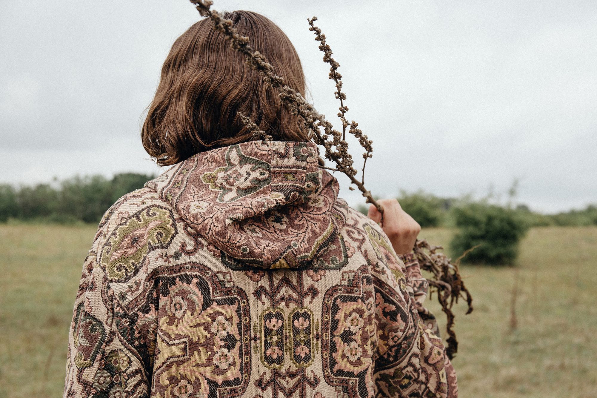
The two Budapest-based graphic design studios Peltán-Brósz and studio NUR, who designed ZSIGMOND’s new identity, saw the essence of the brand in its rawness and simplicity, which they evoked visually through the use of natural materials and handwritten, manual gestures.
“We were strongly influenced by Dora’s personality and her precise vision: she wanted an honest, no-frills, raw and timeless image, and she communicated this well. Her vision was a good starting point for the choice of materials and typography,” says Eszter Laki, designer at studio NUR.
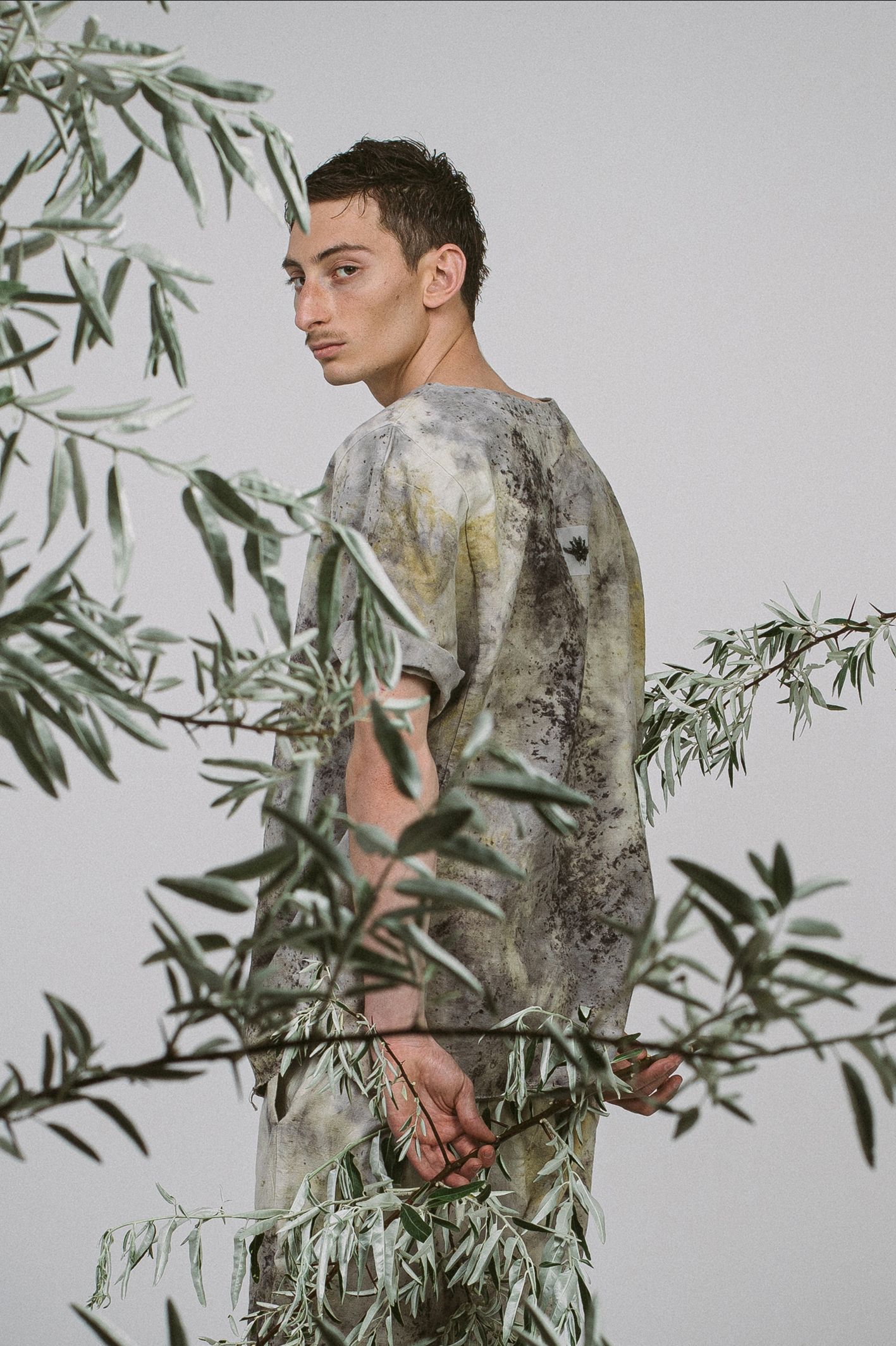
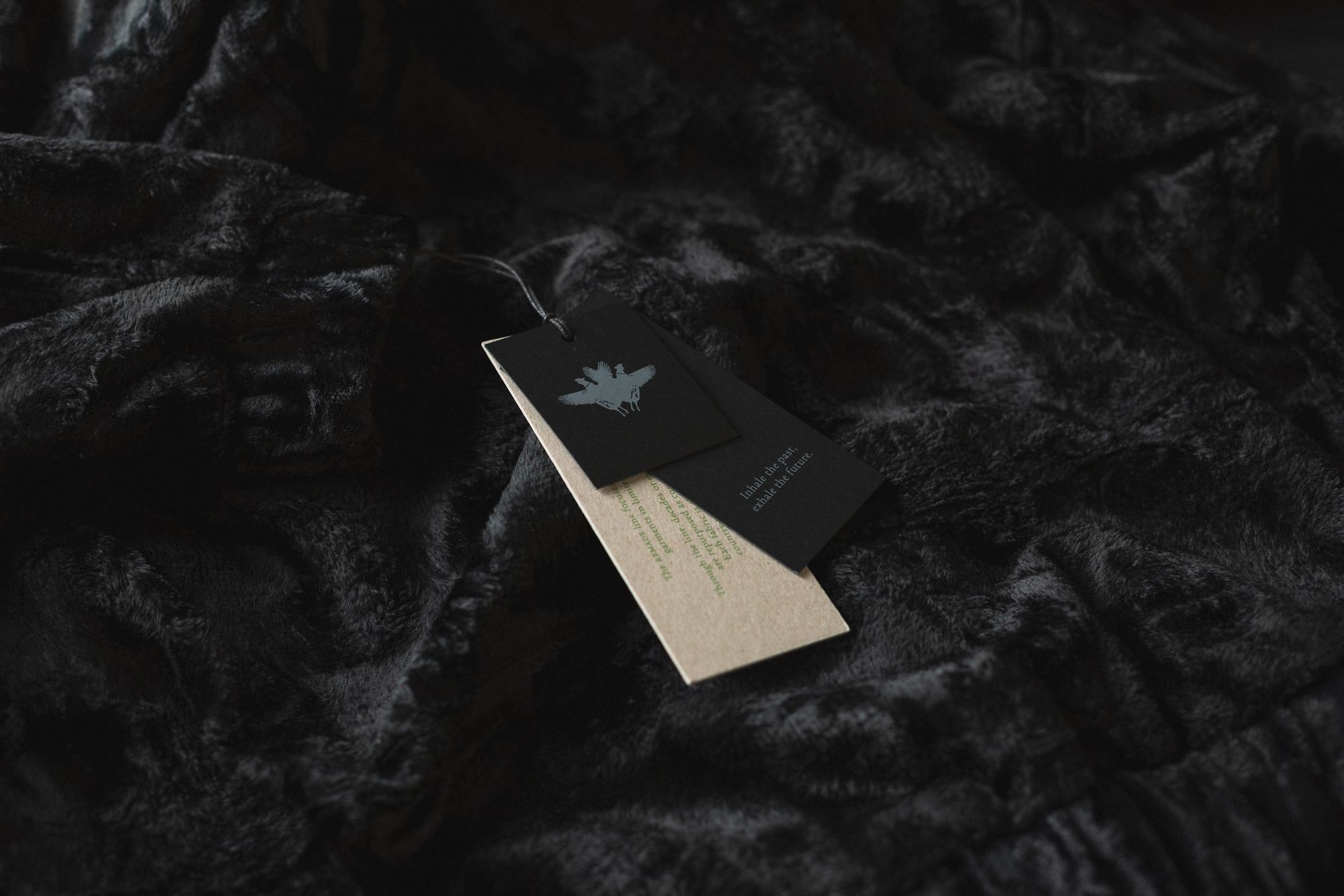
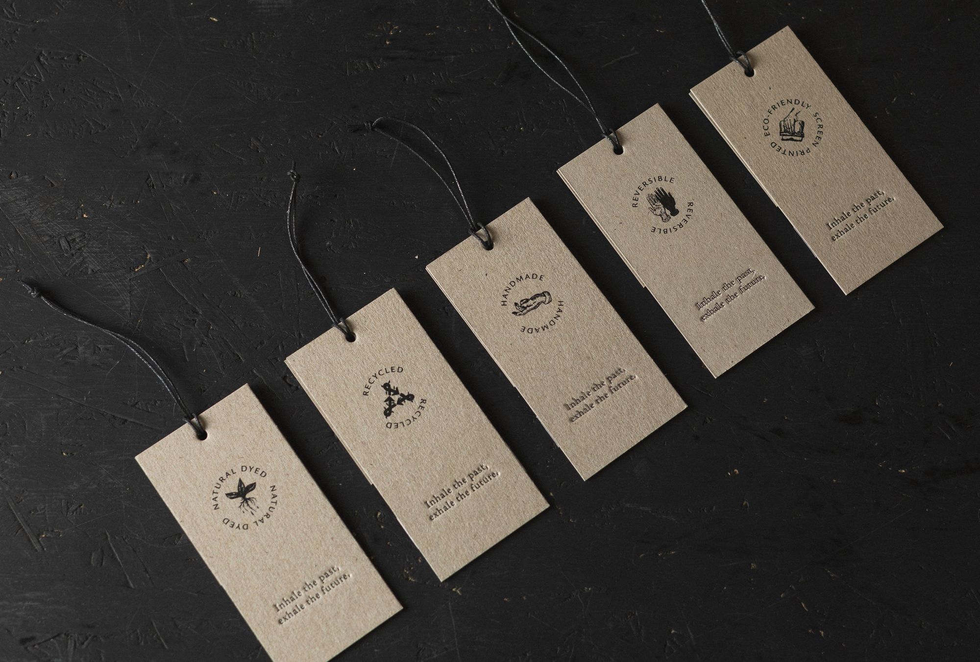
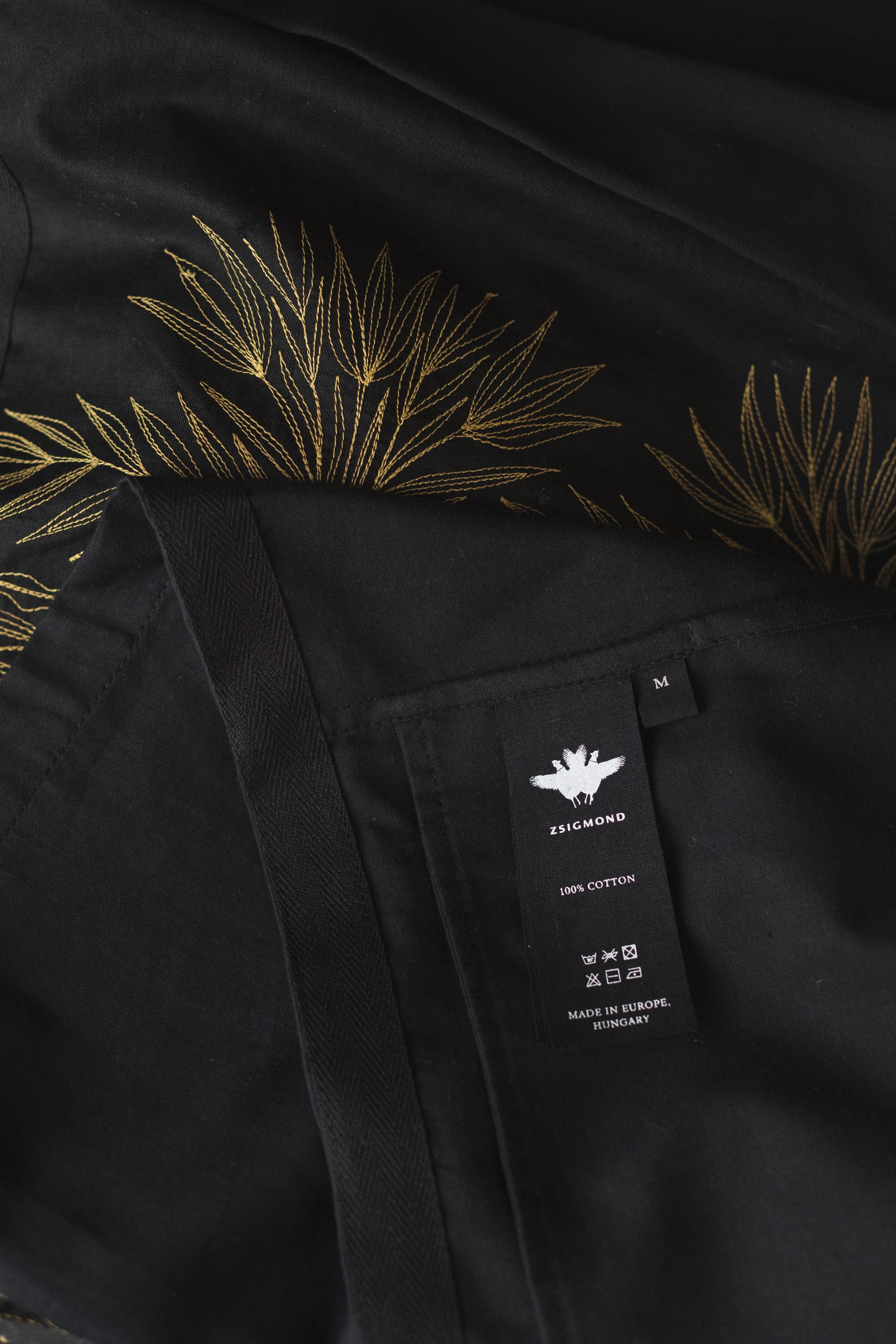
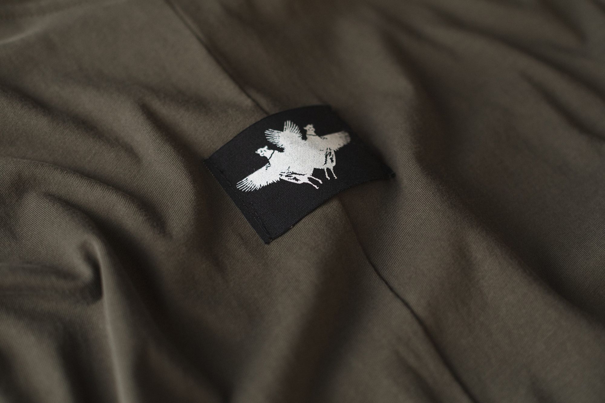
The original logo, featuring two pheasants, was kept, but streamlined and made easier to use. The birds can be seen on the clothing labels done with silver embroidery, but also printed on the packaging tape. Hand-drawn icons to match the style of the logo have been created to indicate the technical parameters on the labels of the garments: separate icons have been designed for recycled, naturally dyed, handmade, reversible and ecologically screen printed features. The labels are made of untreated and black recycled paper, letterpress printed and featuring the brand’s motto: “Inhale the past, exhale the future”.
A lookbook and a revamped website have also been created. According to studio NUR, the design process was not only inspired by the brand’s core values, but also by specific garments. For example, clicking on each menu item on the website reveals underlines reminiscent of paint strokes, inspired by the striped shirts and tops. These pieces are made using a technique similar to the way patterned walls in country houses are painted with the use of rollers. The graphic designers have also incorporated this striped graphic scheme in a non-intrusive way into the new identity.
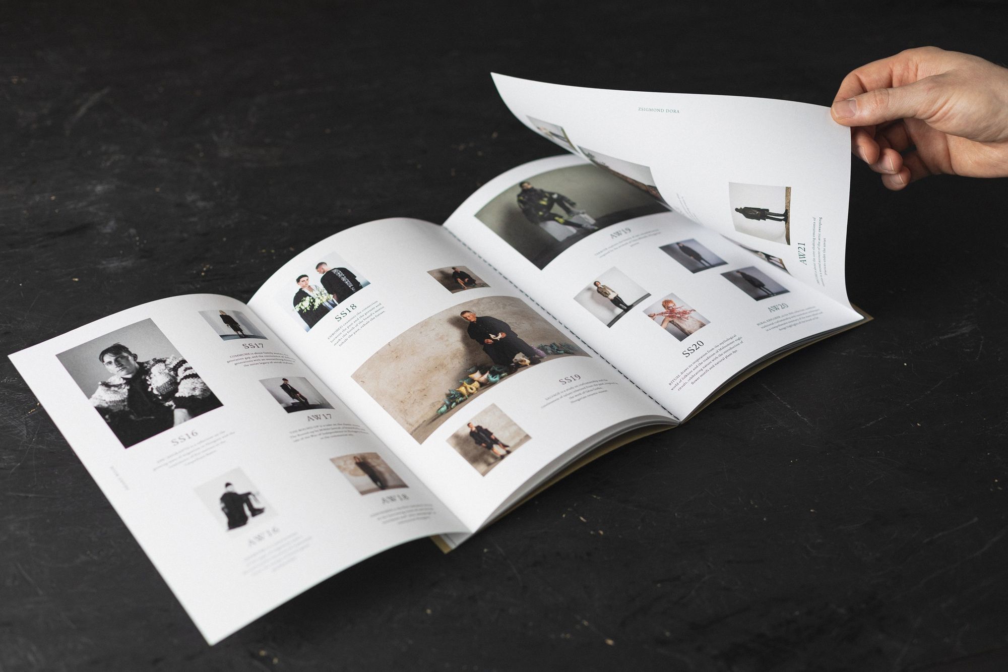
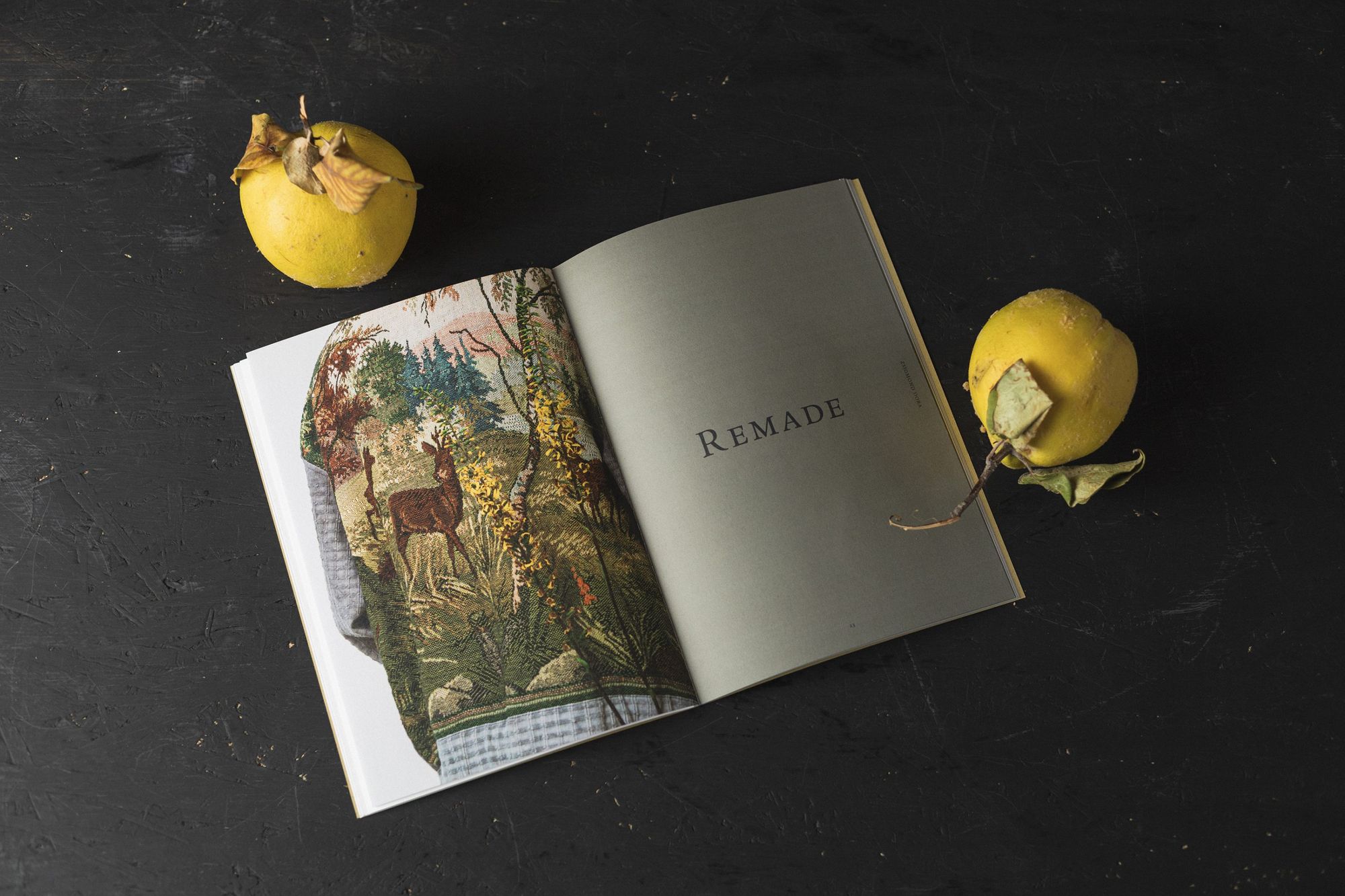
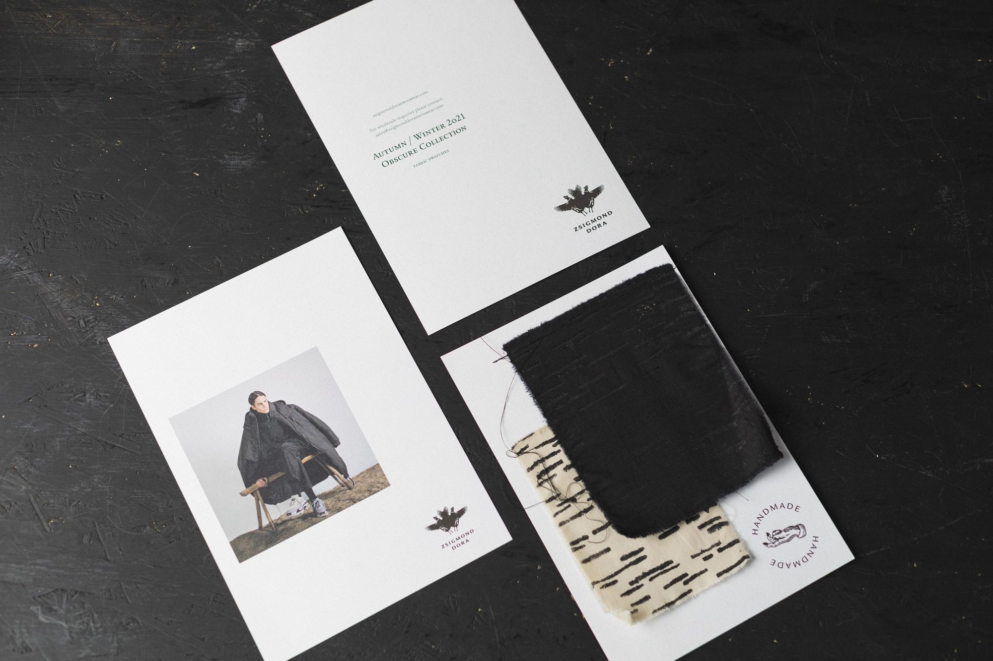

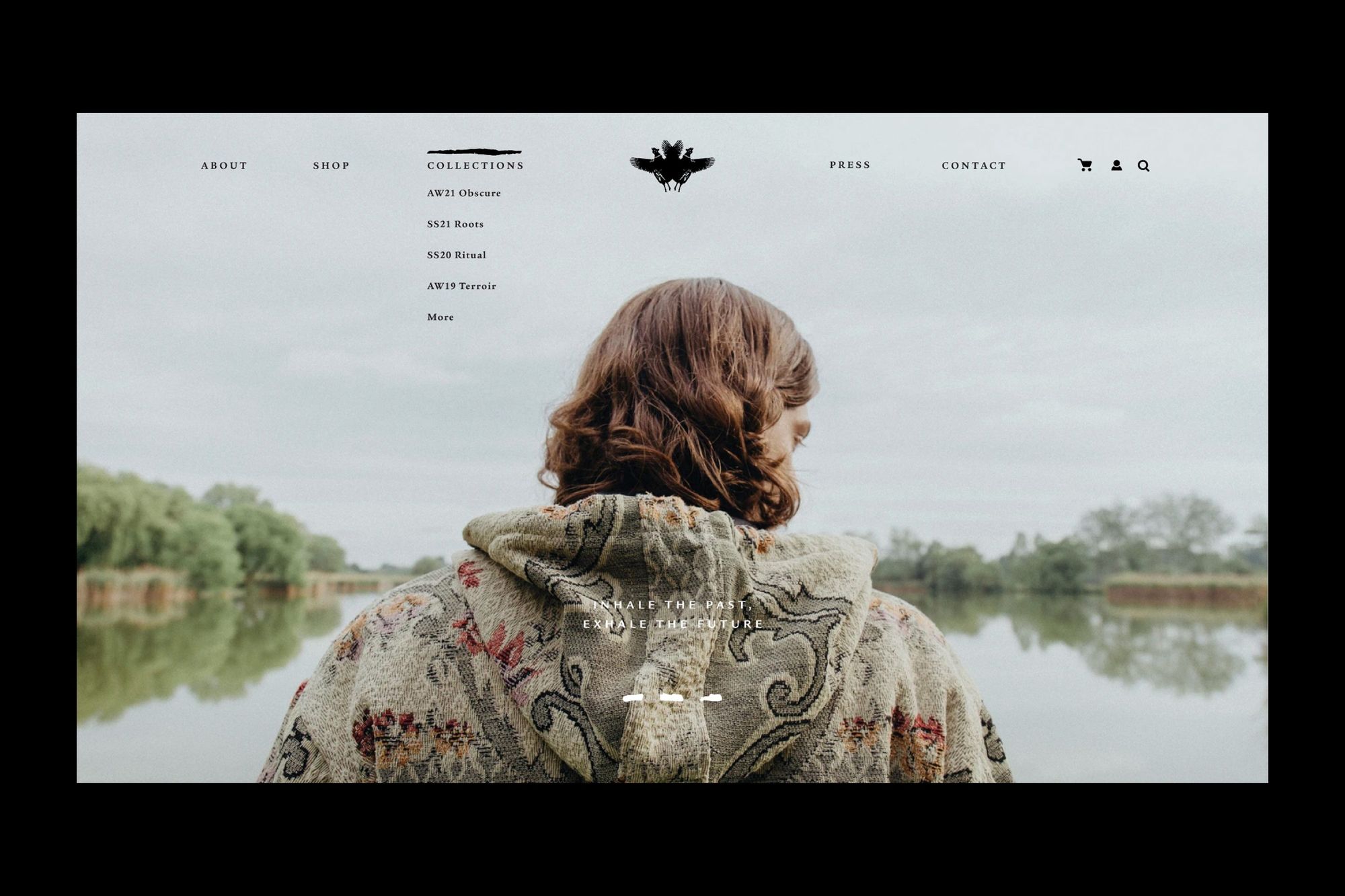
Photos are courtesy of ZSIGMOND
ZSIGMOND | Web | Facebook | Instagram
studio NUR | Web | Facebook | Instagram
Peltán-Brósz stúdió | Web | Instagram

Ukrainian designers we won't let out of sight I.
Why is there no such thing as a perfect world? - In pursuit of utopian cities
