The team of CZECHDESIGN has another successful city image tender to be proud of. The town of Kadaň in the northern regions of the Czech Republic is now the proud owner of a new visual identity created by studio Colmo, which can be described best as showing respect for traditions, with a modern twist.
Kadaň situated near the German border offers countless peculiarities to its visitors; there’s good reason it was chosen as the most beautiful city of the Czech Republic-Moravia in 2010. The sights of the town with medieval roots include the Franciscan monastery established in the 15th century with a spectacular garden, the royal castle built in 1260, and one can also find the narrowest alley of the Czech Republic here, Katova alley with a mere 66 centimeters width.
The new visual identity of the city located on the banks of the Ohře river with a total of 18,000 habitants was designed by studio Colmo. The restricted tender was once again organized by CZECHDESIGN. Six entrants submitted proposals on the competition: Kadaň-born Lukáš Kocelský, Věra Marešová, Jakub Vaněk studio(they designed, amongst others, the visual identity of Prague District III, which we have already covered in a previous article), Dipozitiv Studio, the duo of architect Kateřina Šedá and graphic designer Kristína Drinková, as well as studio Colmo finally chosen as the winner of the tender.
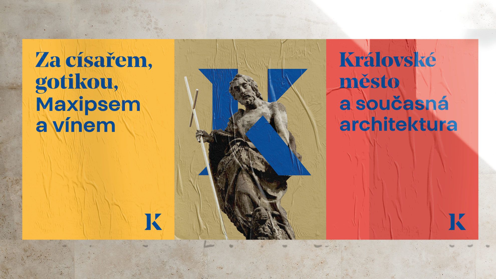
In their proposal, studio Colmo established in 2008 strived to create a harmonious balance between the ancient history and present of the town, in a visual form. The designers, Markéta Hanzalová and Miroslav Roubíček proposed a visual identity featuring traditional and modern fonts at the same time: serif and sans serif characters are placed next to each other, thus giving a unique touch to the various signs attributed to the town.
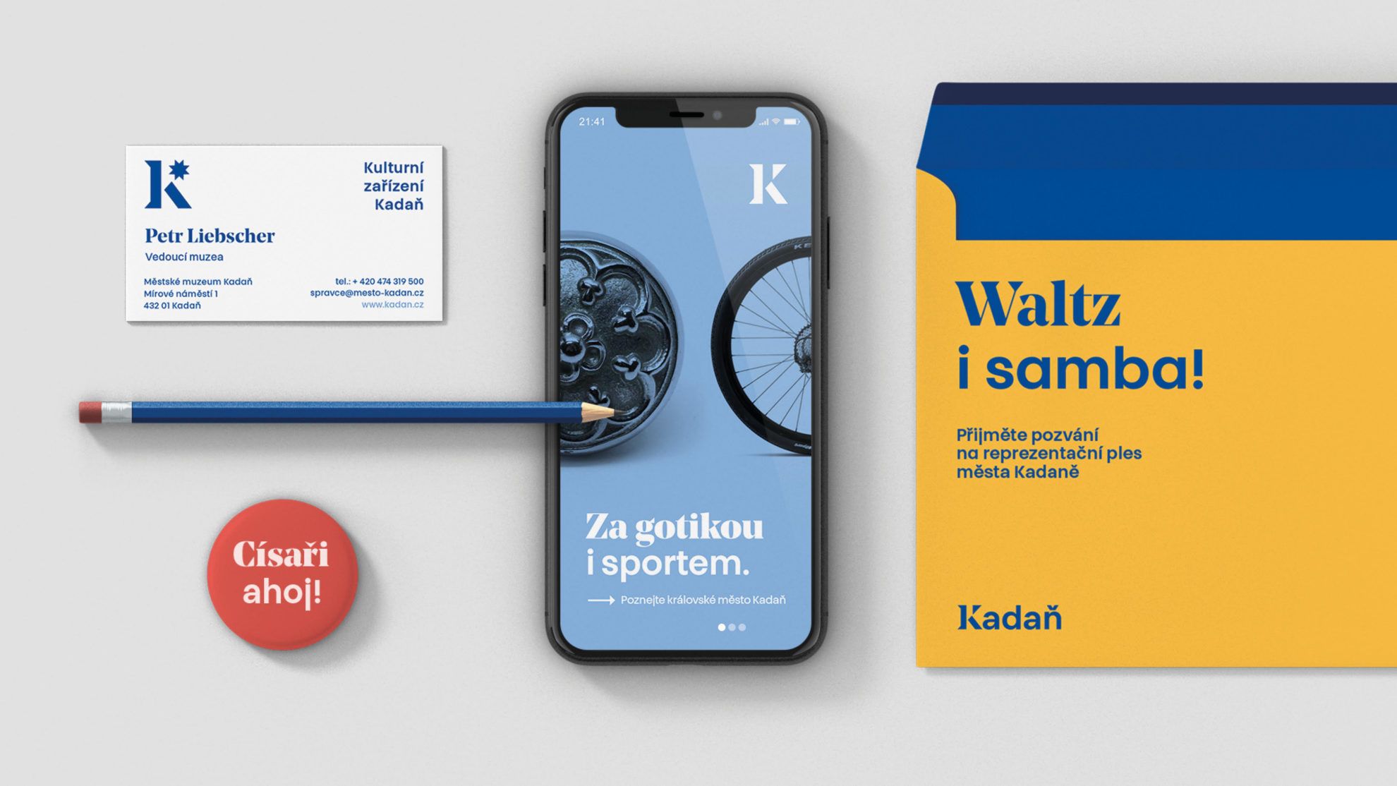
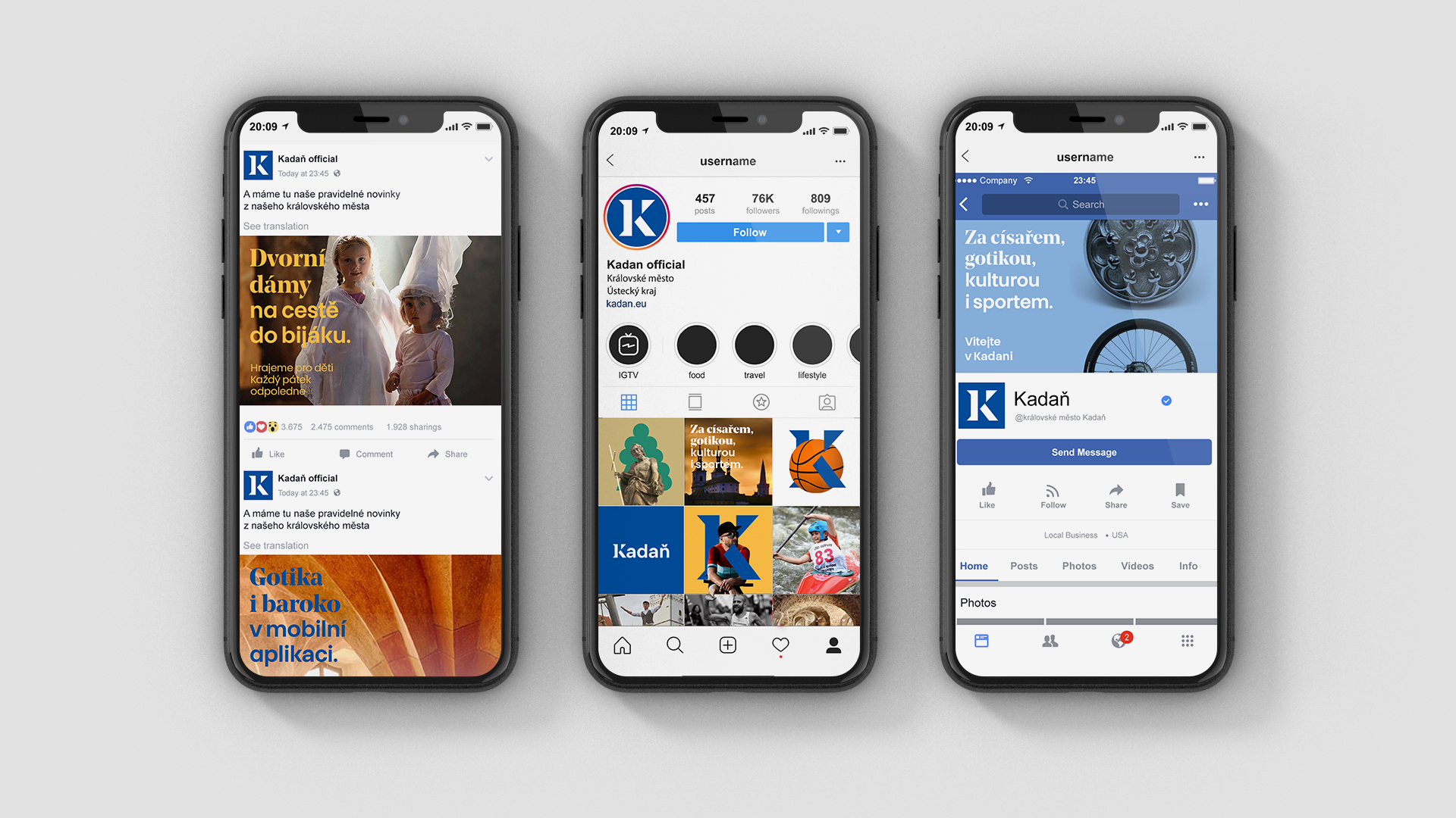
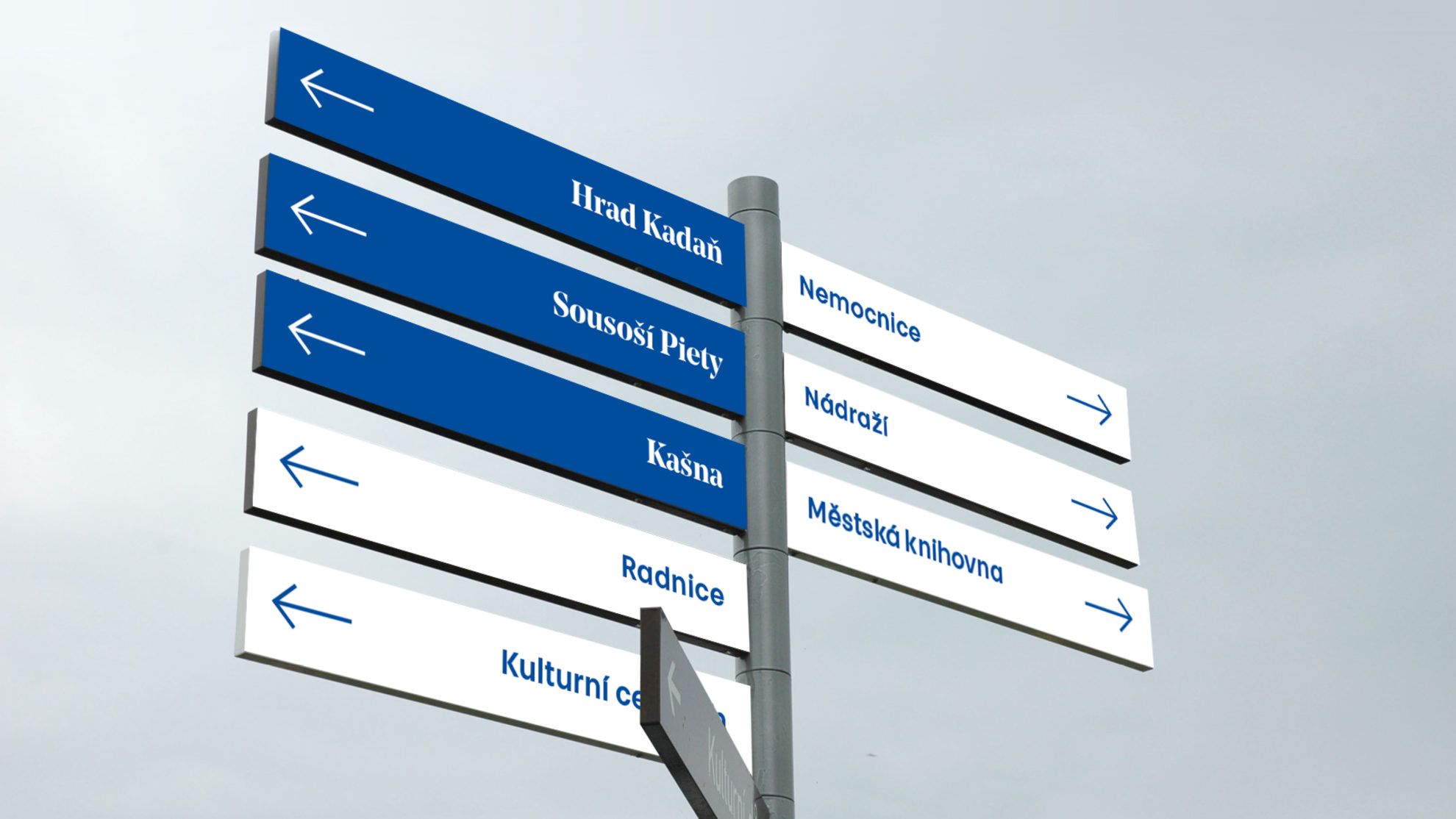
The most dominant element of the unique combination dreamt up by the designers is the initial of the name Kadaň, drawing on antique fonts. The fresh, playful and at the same time clean city image brought to life by studio Colmo is a great example of how the past and the present can be placed next to each other in a manner that instead of conflicting with one another, they point to the same direction by standing together, reinforcing each other.
Photos: CZECHDESIGN / Colmo
Source: czechdesign.cz

Microplastic menu | Sweet Sneak Studio
Czech design in the Costa Rican jungle_02 | Art Villa


