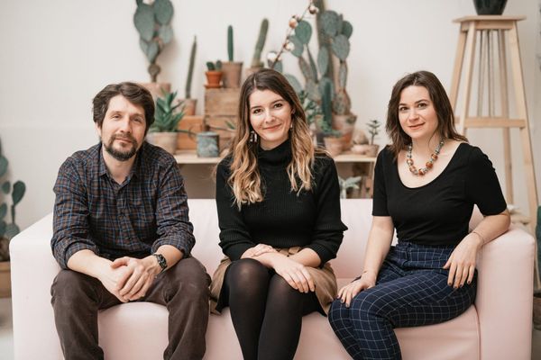
We have already reported several times on the metamorphosis of the Onyx Restaurant, the first two-Michelin-starred restaurant in Hungary and Central-Eastern Europe. Most recently, Bianka Geiger guided us through the complex gastro-evening of the newly opened Onyx Műhely (Workshop): writing about the restaurant’s new, democratic and experimental construction (the Creative Community), which breaks away from traditional fine dining and about the exquisite dishes themselves. Now, instead of flavors, we immerse ourselves into the depths of space. Márton Lengyel, head of the URBA studio, responsible for the interior design renovations and Marcell Fekete, strategic director of Onyx, gave us a tour.
Onyx’s organizational and gastronomic change intertwined with the need for a new interior from the very first moment. The neo-baroque, previous furnishing embodied the era that the Onyx team wanted to move on from. That’s why the interior design of the new space was a particularly cardinal issue, an important element of renewal, which was handled by the URBA studio (Márton Lengyel, Andrea Juhász, Liza Natasa Rakusz) in close consultation with the team.
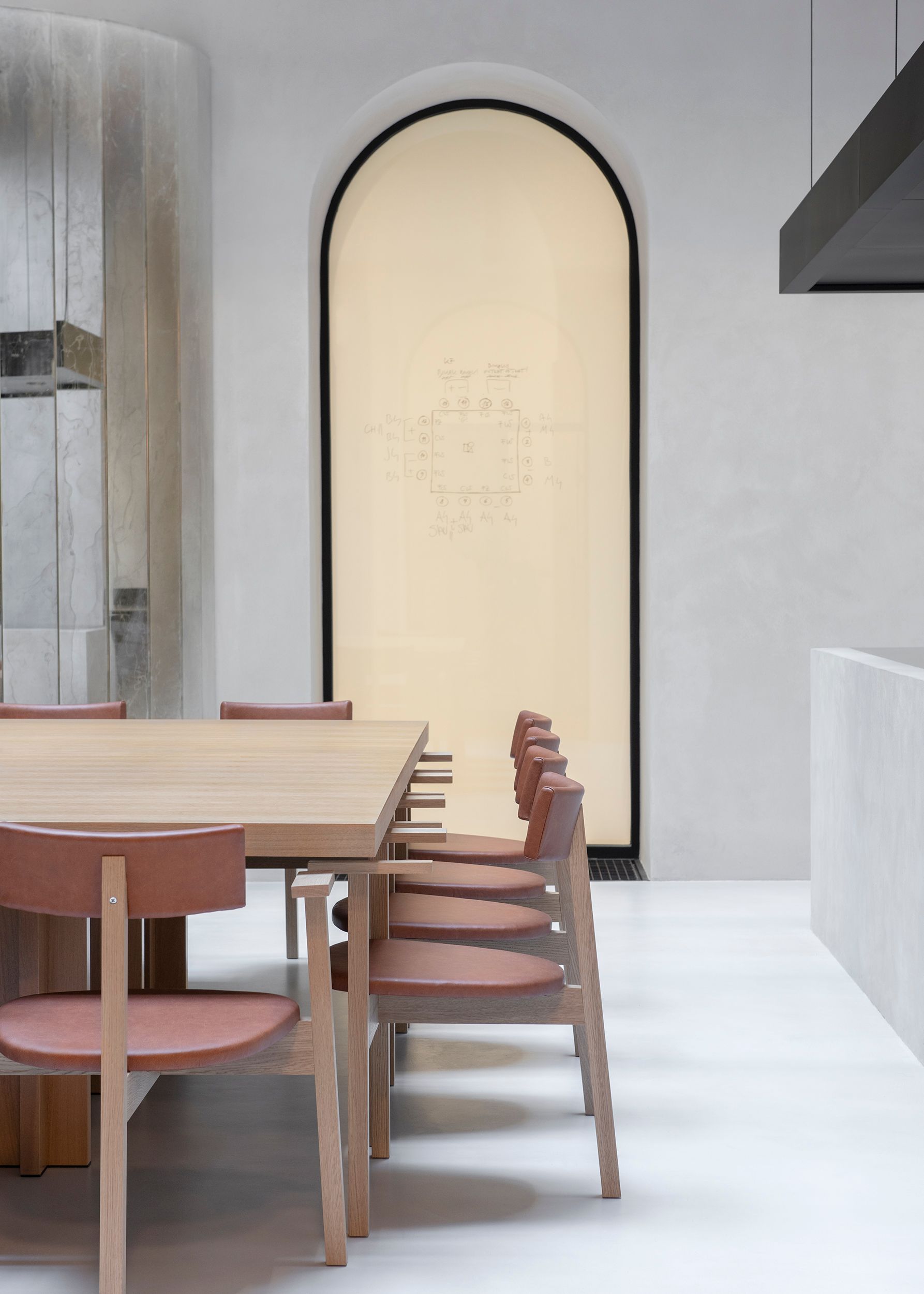
Renovations are not yet complete: at this stage, the street-facing restaurant section is in a temporary state, awaiting this year’s construction works. The ornate wallpaper has been removed from the walls and most of the furniture is gone. All that remains are the onyx stone fireplaces and chandeliers, and a pop-up exhibition about the restaurant’s past, present and future. However, the multifunctional Onyx Műhely has been completed and is now up and running in the place of the former atrium salon. “We had to squeeze a very complex design program in this relatively small space, where the team is now experimenting and working during the day, and where guests are invited for dinner in the evening. The open kitchen has many technological and engineering benefits, and we aimed not to overwhelm the simplicity and sophistication of the space. It was important that the honest gastro-concept of the Műhely and the Creative Community is reflected in the interior. This absolutely rhymes with URBA’s approach to interior design, which is functional, comfortable and simple, yet lovable and homely,” began Márton Lengyel of URBA and Marcell Fekete continued. “For more than a year, we have been working on getting the team ready before the space. For us, it was important to design a space for team dynamics and kitchen philosophy, not the other way around. A year ago we were standing in a demolished restaurant, but when we reopened, everything came together in perfect unity, and the team can move around freely and comfortably here. That’s really the whole concept, to reshape fine dining entirely without losing focus: that we want to deliver excellence,” says Marcell.
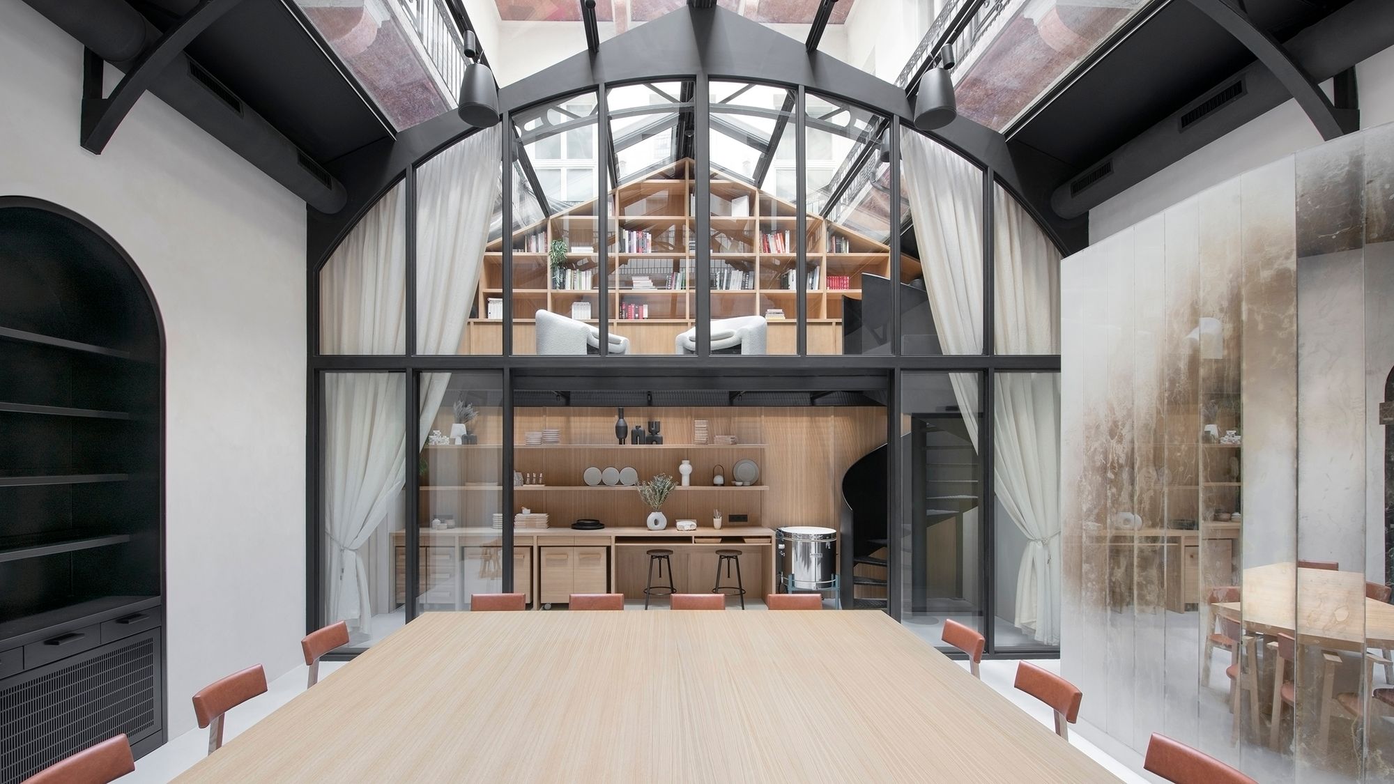
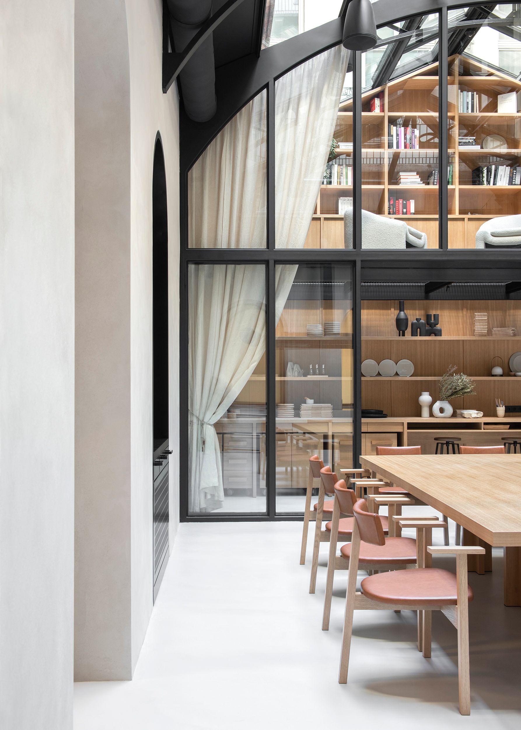
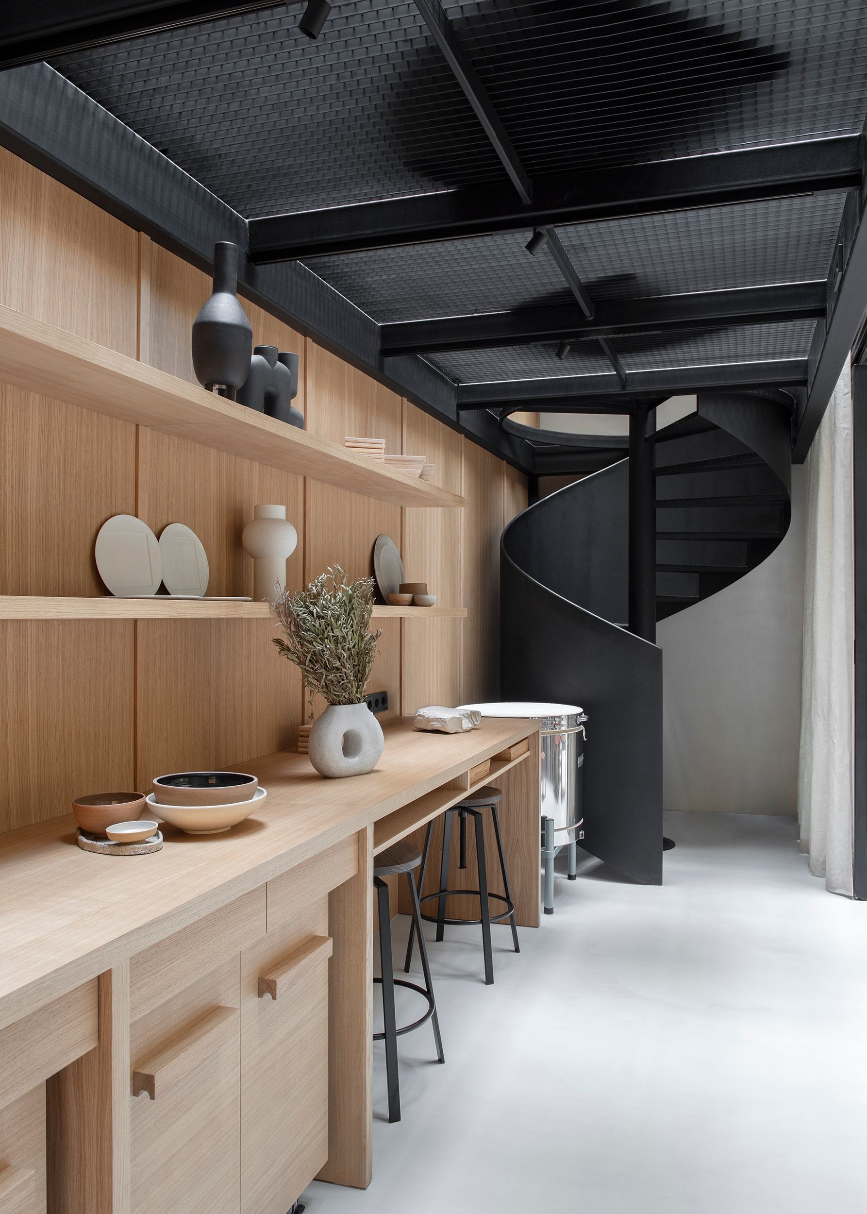
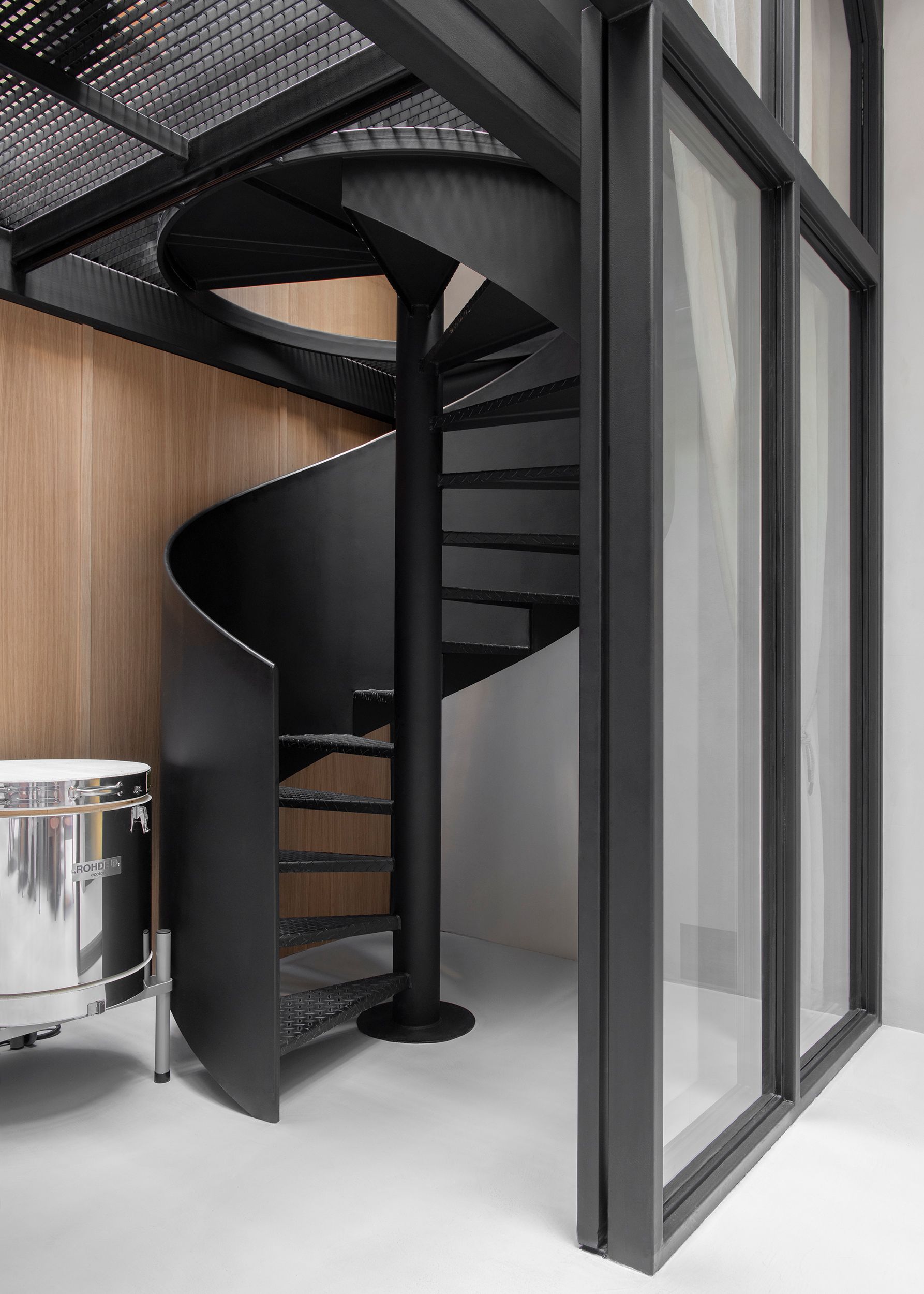
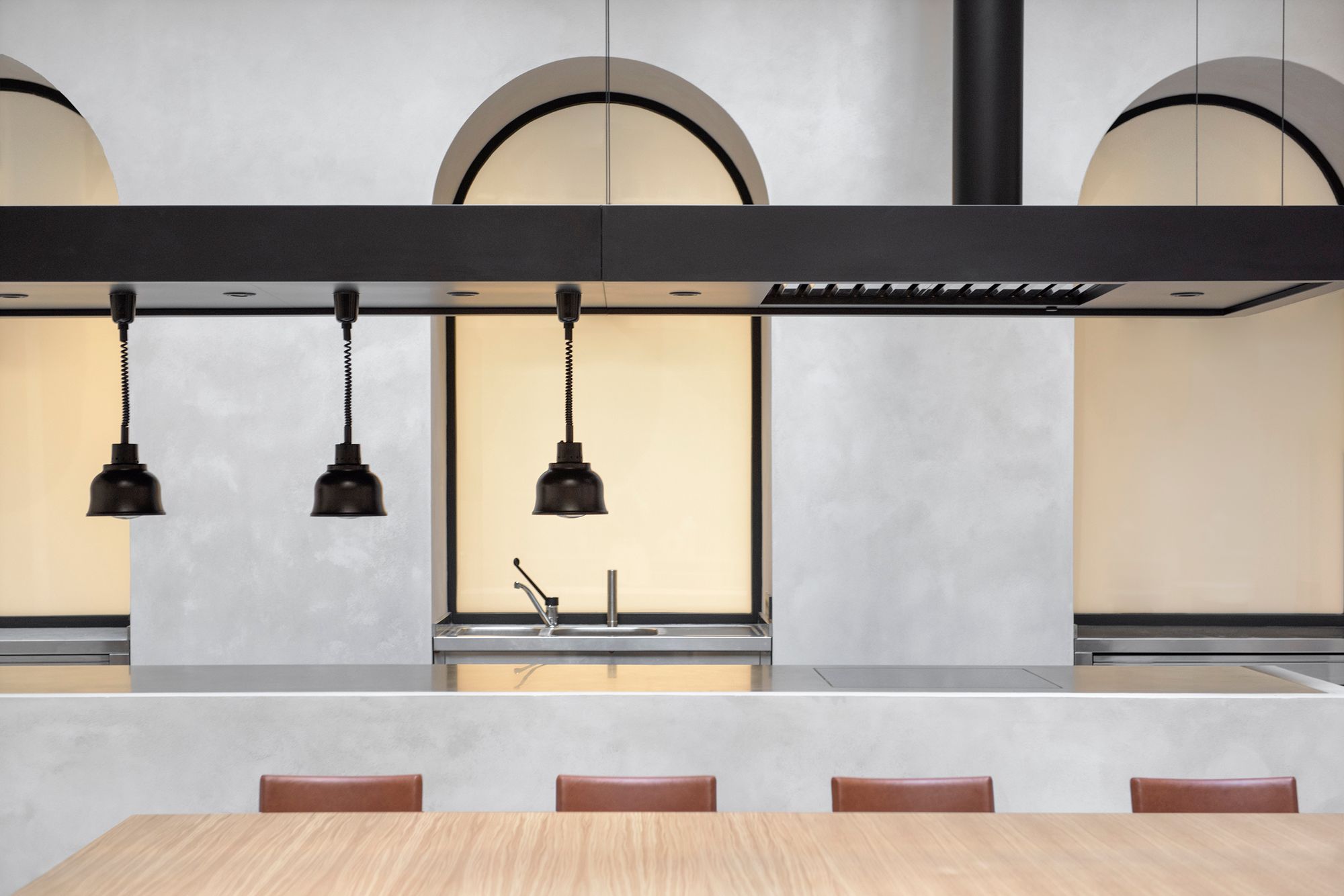
The Műhely, with its American living room atmosphere, is essentially a glass hut in the Gerbeaud House. Apart from the metal-framed structure, everything was dismantled from its previous state and the process started from scratch. The new space can be divided into three functional units: the guest room in the middle, the kitchen island on the right-hand side, and a detachable workshop area with a glass door on the left-hand side. Here, under the direction of Angéla Góg, art director, they make unique objects and utensils, for example, for serving. This has been complemented by an extra gallery space: in the library room, accessible by a black metal spiral staircase, a selection of gastro books and comfortable armchairs have been placed. Later on, they would like to open this up to a broader audience, including students studying hospitality. Through the lattice structure, you can look down into the workshop corner, and through the glass surfaces, you can see the whole interior, the hallway of the house and even the sky.
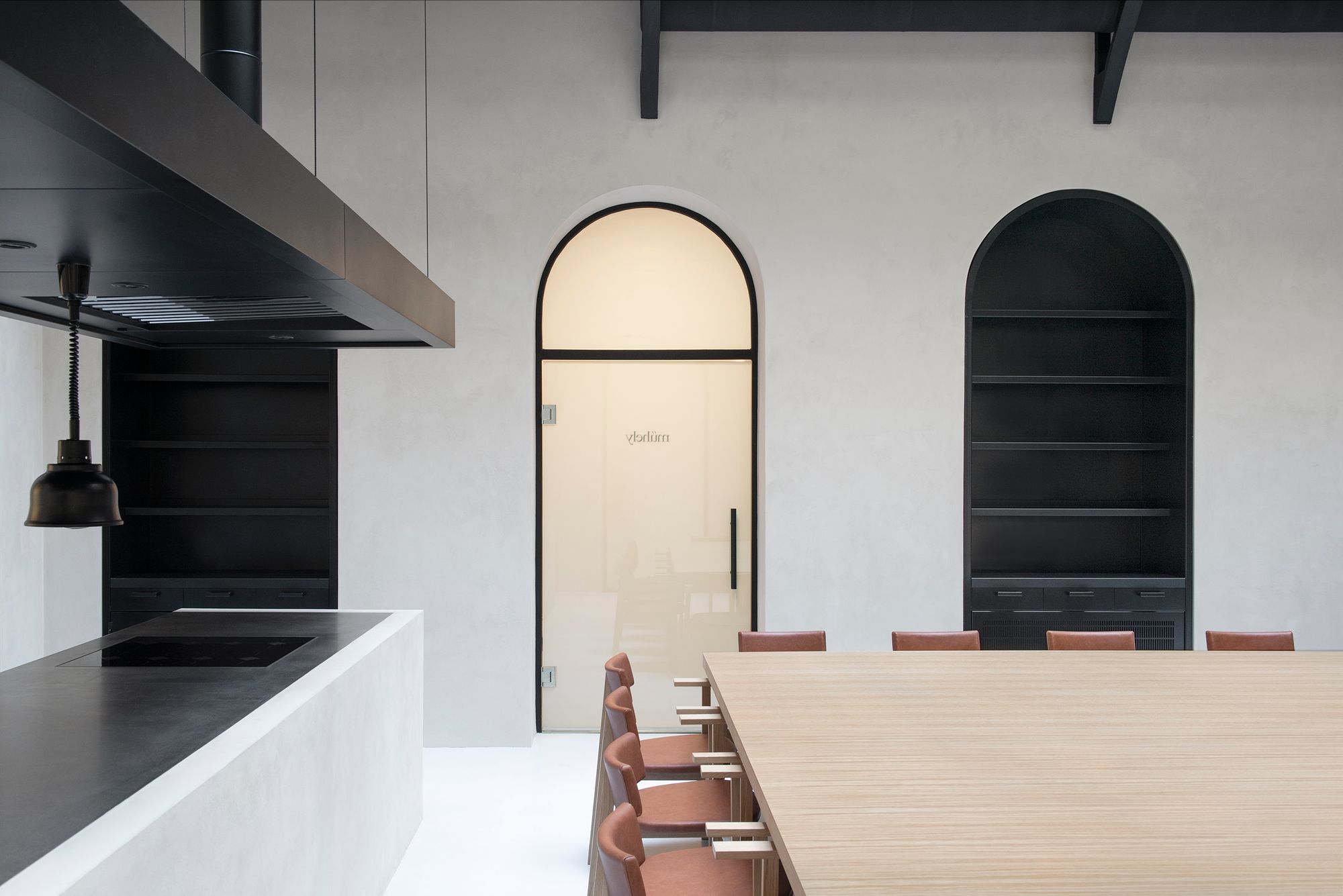
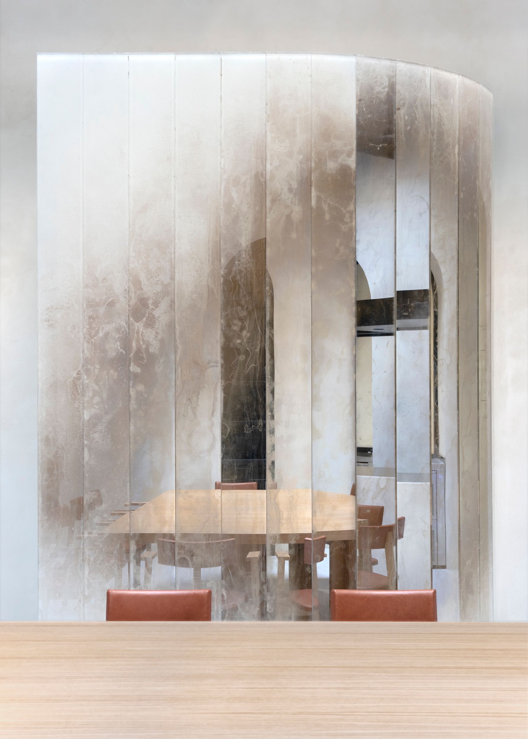
As in URBA’s showroom in Vienna, the heart of the space is a custom-designed, large communal table, surrounded by 16 chairs named ONYX, waiting for the guests, thanks to komok. URBA designed all the other furniture specifically here, most in the production of the KUNSÁG fenster. Coming back to the nine-legged table: it can be converted into nine two-person units on request, but so far, its community function has been so successful that this has not yet happened. Another characteristic feature of the space is the mirrored waiter station, reminiscent of the fine dining atmosphere. The transient pattern of the installation, called Dune, breaks up the sharpness of the mirror’s surface, while subtly reflecting the onyx stone and the fireplaces and countertops outside. Its designer, Boldizsár Szenteczki, was also part of the team as an interior designer.
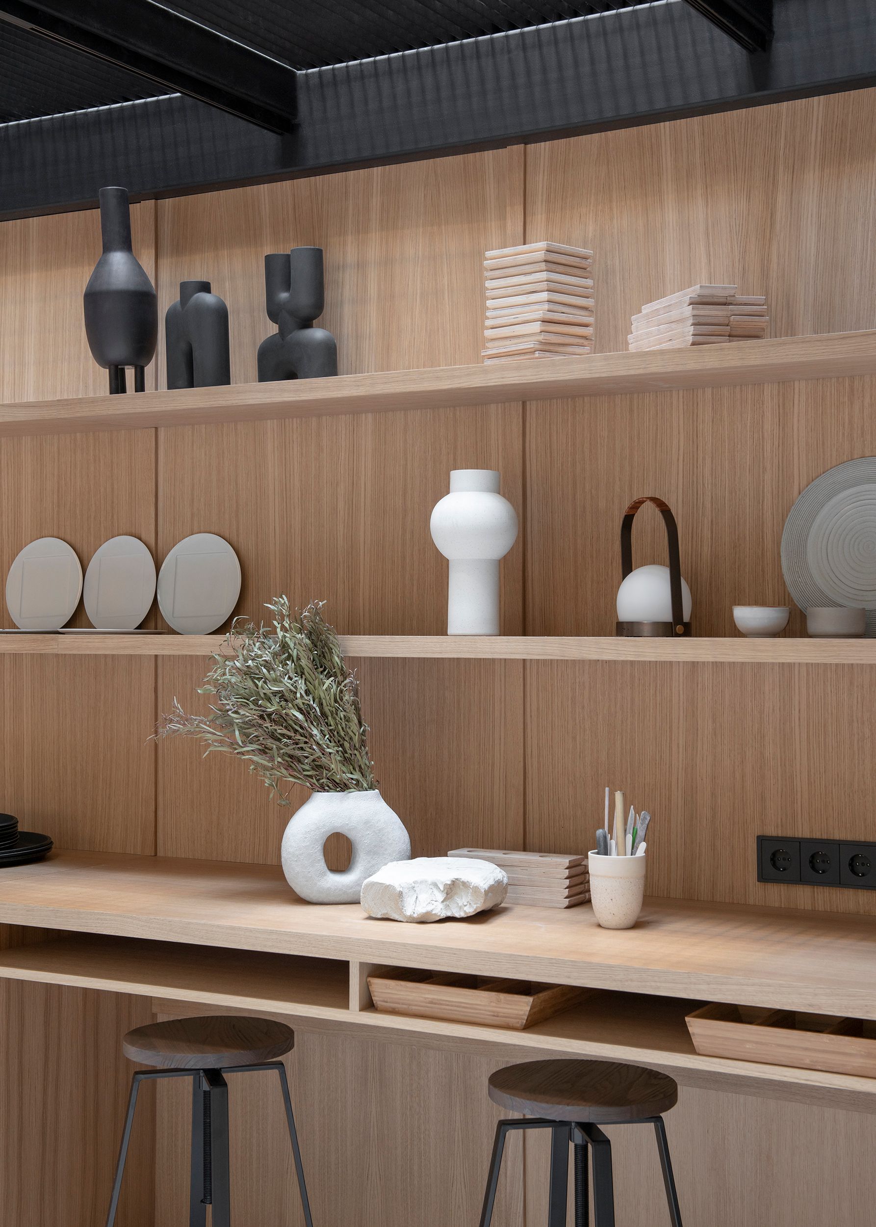
Almost every object has a function, a history and a meaning. For example, serving dishes are lined up on one shelf, made by MOME’s MSc ceramic students, explicitly designed for Műhely during a course. With the help of a Polaroid camera, a photo of each guest is taken, which they collect on a large whiteboard in the lobby. Essentially, all the elements of the space are designed and moved around and explored during the dinner to ensure that the guest is not just a passive consumer. According to Marcell, they often hardly want to come back to the table and it has also happened that they started dancing. The dynamics of the space stimulate a variety of senses: in addition to flavors and scents, there is a strong emphasis on visual and tactile stimulation. This is how everything comes together in a coherent and harmonious whole.
Their sustainability efforts are closely linked to this harmony. Although, of course, the environmental aspect is present in the space, the objects and the ingredients of the food, it is not the only thing that matters here. “Many restaurants do the sustainability on the food and interior design front and forget about the human side,” believes Márton. “Yes, and then all of a sudden, this unity is broken. And the guest can’t necessarily put it into words but feels that something is not right. It is a great challenge to deliver high quality every day of the year. The most important part of this is HR because, without it, all sorts of objects, tools and food will eventually become empty,” added Marcell. “We work in the field of architectural design, which is characterized by a high level of overtime, responsibility and stress at industry level. For me, too, it is an important objective that this does not affect people, that it is sustainable from a human point of view, and that we can do what we do for many years. That’s why I think the result is very authentic here, because, besides the food and the space, the human background also represents this attitude, both from the Onyx and URBA side,” Márton concluded.
URBA | Web | Facebook | Instagram
ONYX | Web | Facebook | Instagram
Photo: Matti Varga
Styling: Kinga Noszolyi

Clothes for (not only) extra tall people—interview with the founders of thisSIDE

DIALOG | Levente Trellay
