It’s undoubted: a product family should look like a product family. To that end, Google will redesign its last “black sheep” logo to fit into the product group.
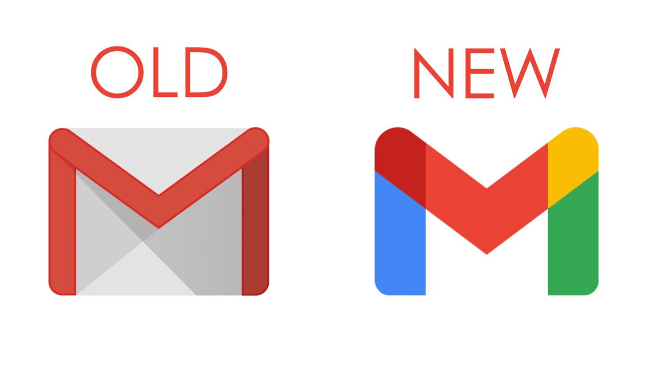
Leaving the old red-grey-white logo behind, Gmail, Google’s mail system will promote the variable and open attitude of the brand in blue, yellow and green colors – just like the rest of the company’s services.
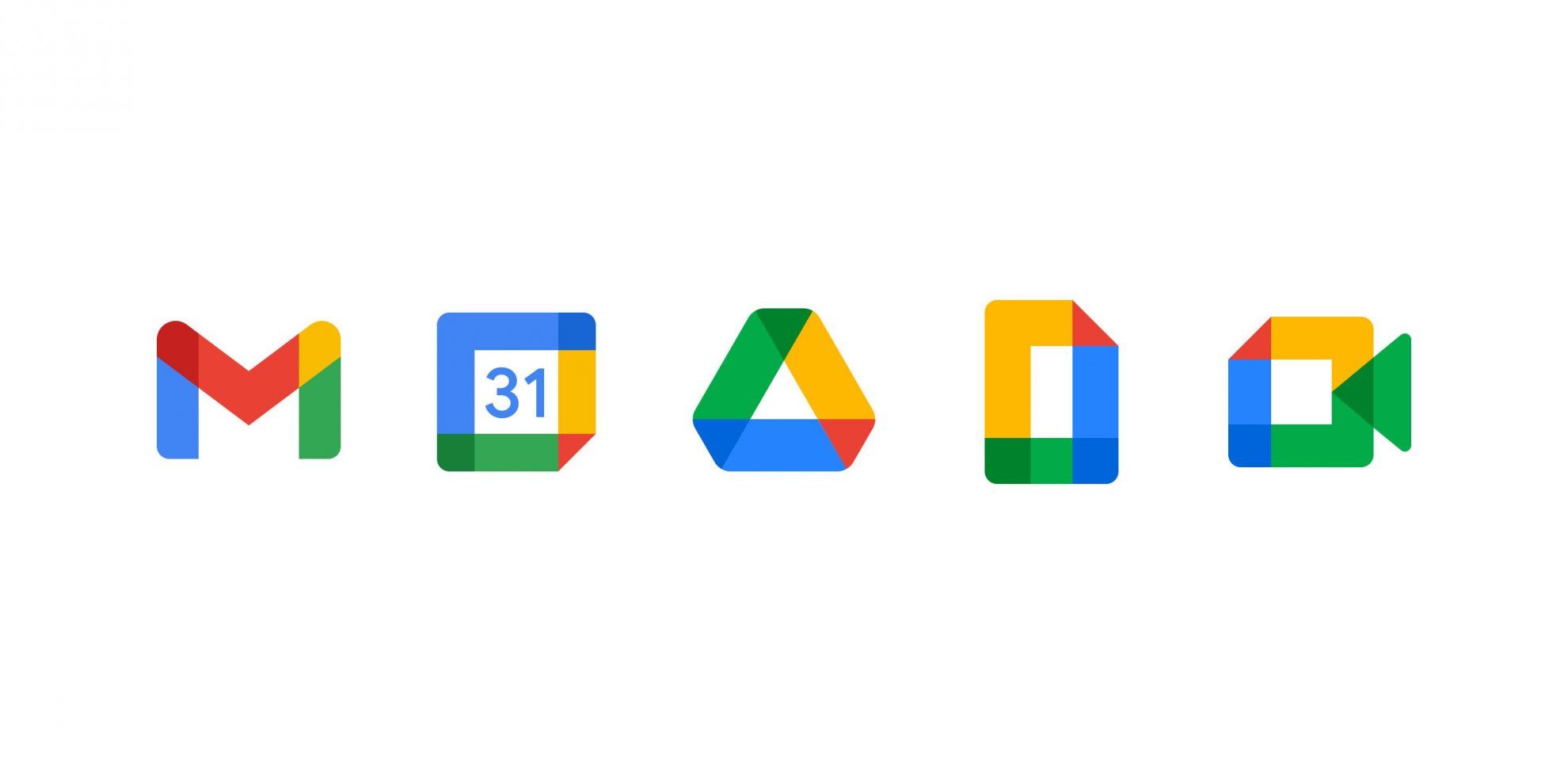
Google has been redesigning its product family built on the same visual language gradually in the past period – now with Gmail, the picture is finally complete.
source: ipon
more to read
architecture
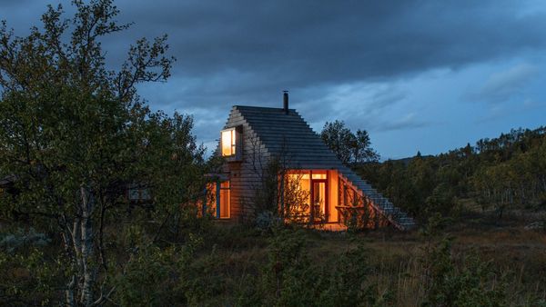
A cabin designed for nature | Gartnerfuglen Arkitekter
In addition to admiring the breathtaking Norwegian landscape, one can also sleigh or ski jump from the top of the latest cabin of the Oslo-based studio.
A playful answer to local conditions, modern look and reviving Norwegian architectural traditions – studio Gartnerfuglen Arkitekter‘s latest cabin titled Thunder Top offers all
design
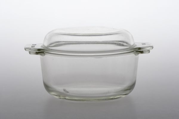
Object Fetish Part 5 | Termover heatproof dish set
The flame-resistant dishes frequently referred to as the dream of housewives once came from the GDR – this is where the name of these glass baking pots available in various shapes and sizes came from: “jénai” (Hungarian for denoting something originating from Jena, Germany – the translator’s note). One thing not
design
Tent and hammock in one | ARK
ARK could be one of the most versatile accessories of the fans of hiking: it can be used both as a tent on the ground and raised above the ground, like a hammock.
The multifunctional shelter is not only versatile, but also quite durable and easy to store. To further


