After twenty-three years, BMW has redesigned its logo: owing to the latest change, it became more modern and clean – something we could rightfully expect from the German car manufacturer.
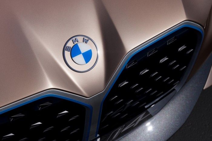
Of course, the white and blue color of the German brand – paying tribute to the motherland, Bavaria – has remained, but they got rid off the shades promoting the 3D effect when designing the letters in new logo version, for example. They achieved the most radical change by dismissing the black frame completely, which has been replaced by a contour circle and a transparent background.
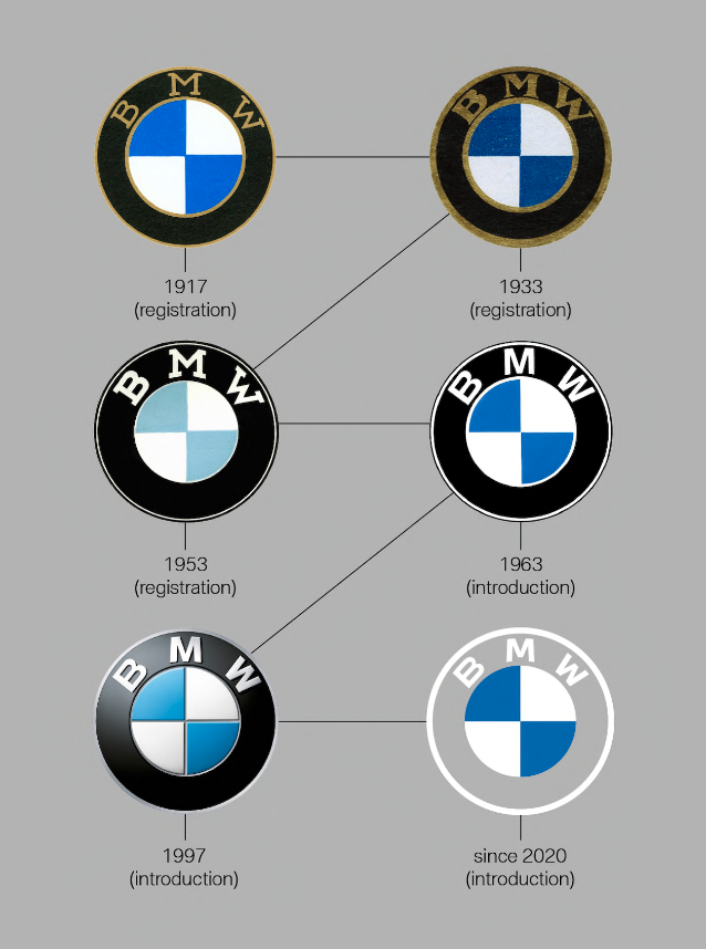
This is how BMW’s logo has changed over the years
This marks the fifth logo change in the history of the company. Compared to its antecedent (the version created in 1997), the new logo is flatter, one-dimensional and definitely more minimalistic.
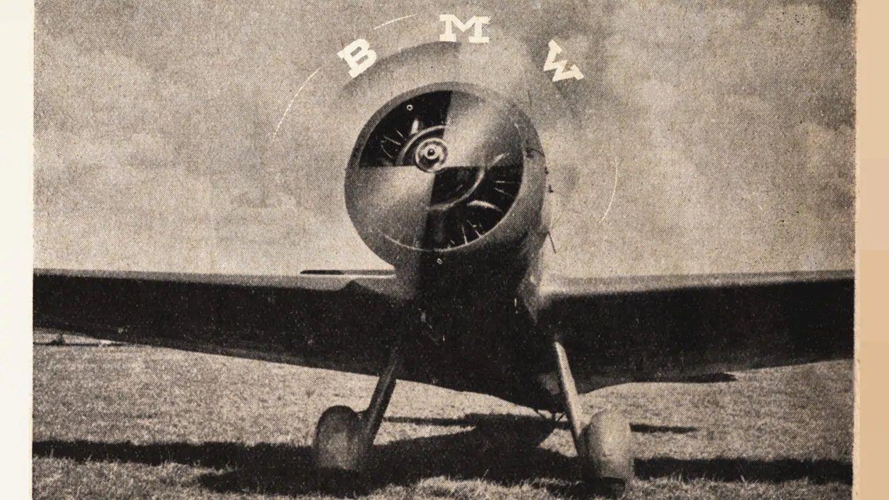
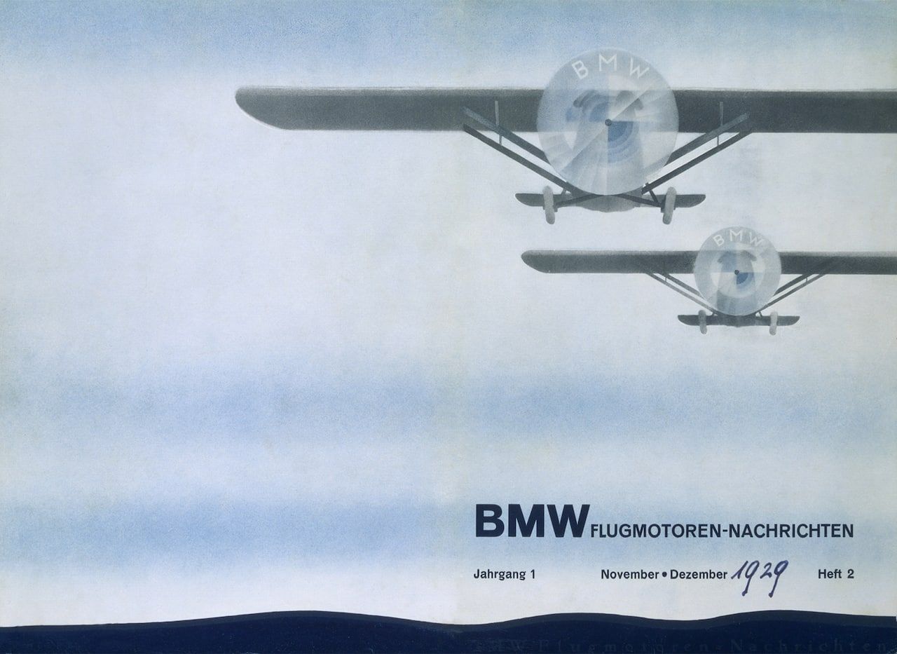
As also mentioned by bmw.com, many people think that the logo is a stylized propeller, but as Fred Jakobs has put it, “the truth is a little different.”
„Many people believe the BMW logo is a stylized propeller. But the truth is a little different.”Fred Jakobs (Archive Director, BMW Group Classic)
The history of BMW, i.e. Bayerische Motoren Werke or Bavarian Motor Works goes back to 1917. The company was established by renaming Rapp Motorenwerke aircraft engine factory in München. Initially, it worked with the same technical equipment and labor force as the factory, and when the company was registered in July 1917, it had no visual identity.
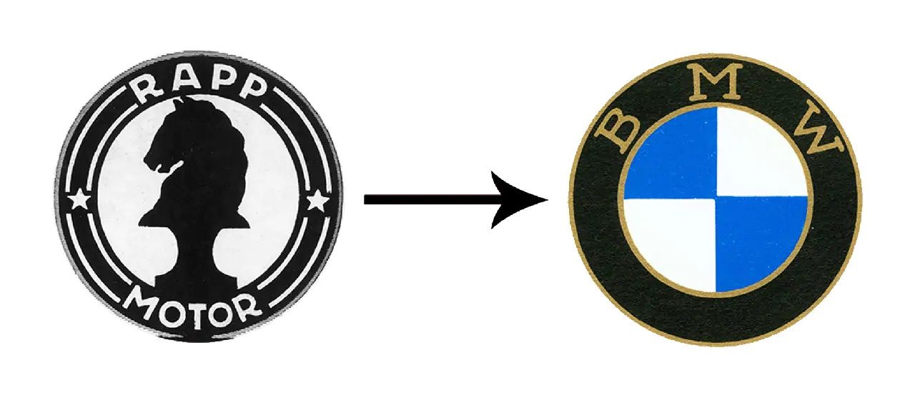
The young company finally received its emblem on October 5, 1917. This was the first BMW logo ever registered in theRegister of the German Imperial Patent Office. The resemblance between the logos of Rapp Motor and BMW is uncanny: in addition to the circle shape, they also kept the thick black frame (by getting rid of the lines and the stars).
They also wanted to display the colors of the company’s home state in the logo, this is how the blue and the white got in, but in an inverse order compared to the Bavarian flag. The reason for this was that the law on patents in effect back then prohibited the use of state coats of arms or other symbols of sovereignty in commercial emblems.
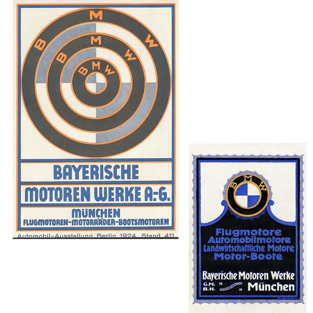
BMW has long been trying to disperse the myth (partially resulting from certain advertising billboards of the time) according to which the BMW emblem displays a propeller, as it is only the projection of the colors and pattern of the Bavarian flag.
The new logo of BMW
The new logo and layout of BMW symbolizes the”mobility of the future,” this is partly why it is not surprising that the new emblem was premiered at the same time as the new model of thei4 electronic car.
“BMW becomes a relationship brand. The new communication logo radiates openness and clarity,” explains Jens Thiemer, Senior Vice President Customer & Brand BMW. “With this new transparent variant, we want to invite our customers more than ever to become part of the BMW world. In addition, our new brand design is geared to the challenges and opportunities of Digitization for brands. With visual restraint and graphic We are equipping ourselves flexibly for the wide variety of contact points in communication at which BMW will show its presence online and offline in the future. The additional communication logo symbolizes the significance and relevance of the brand for mobility and driving pleasure in the future.”Jens Thiemer (Senior Vice President Customer & Brand BMW)
Source: bmw.com

Bogdan Anghel | Modernist Bucharest

Freely downloadable design magazines for the time of the quarantine