Whether it’s a street poster, a short film or packaging, we see vibrant colors on many surfaces around us. To the layperson, color use might seem like the easiest story of the world, but it is actually a much more complex tool than you might first think. In our weekly selection, we’ve gathered materials where the designer’s brave use of color benefits the carrier surface. Let’s see!
We have been using colors since our childhood. They are good for simple decoration, differentiation, highlighting, but perhaps we never ask the question: what makes us see colors? What is color? In our biology lessons, we probably encountered the thesis that colors appear because of the reflection of light from surfaces. But perhaps even more fascinating is the fact that light is actually visible to the human eye as a mixture of electromagnetic waves emitted in a frequency band similar to ultraviolet and radio waves.
No matter how attractive the scientific definition might be, what’s ultimately important for every human being is the aesthetic appearance. It makes a difference how much attention and effort goes into the works and graphic applications that color our everyday lives. Join us for the latest episode of our round-the-world project selection: let’s see our favorite colorful projects!
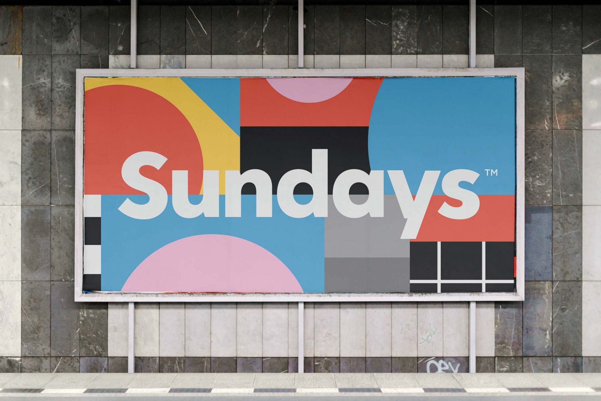
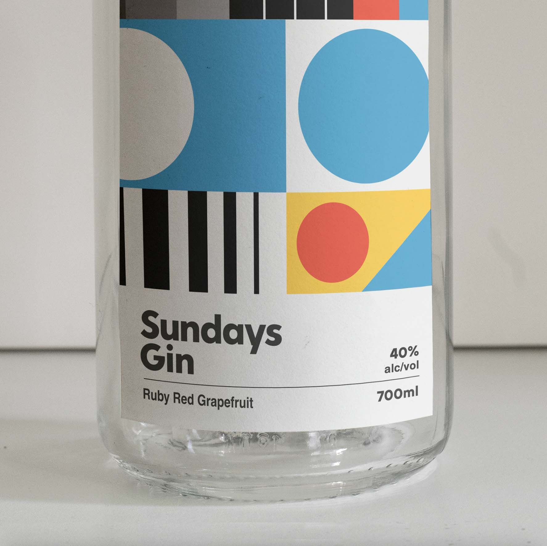
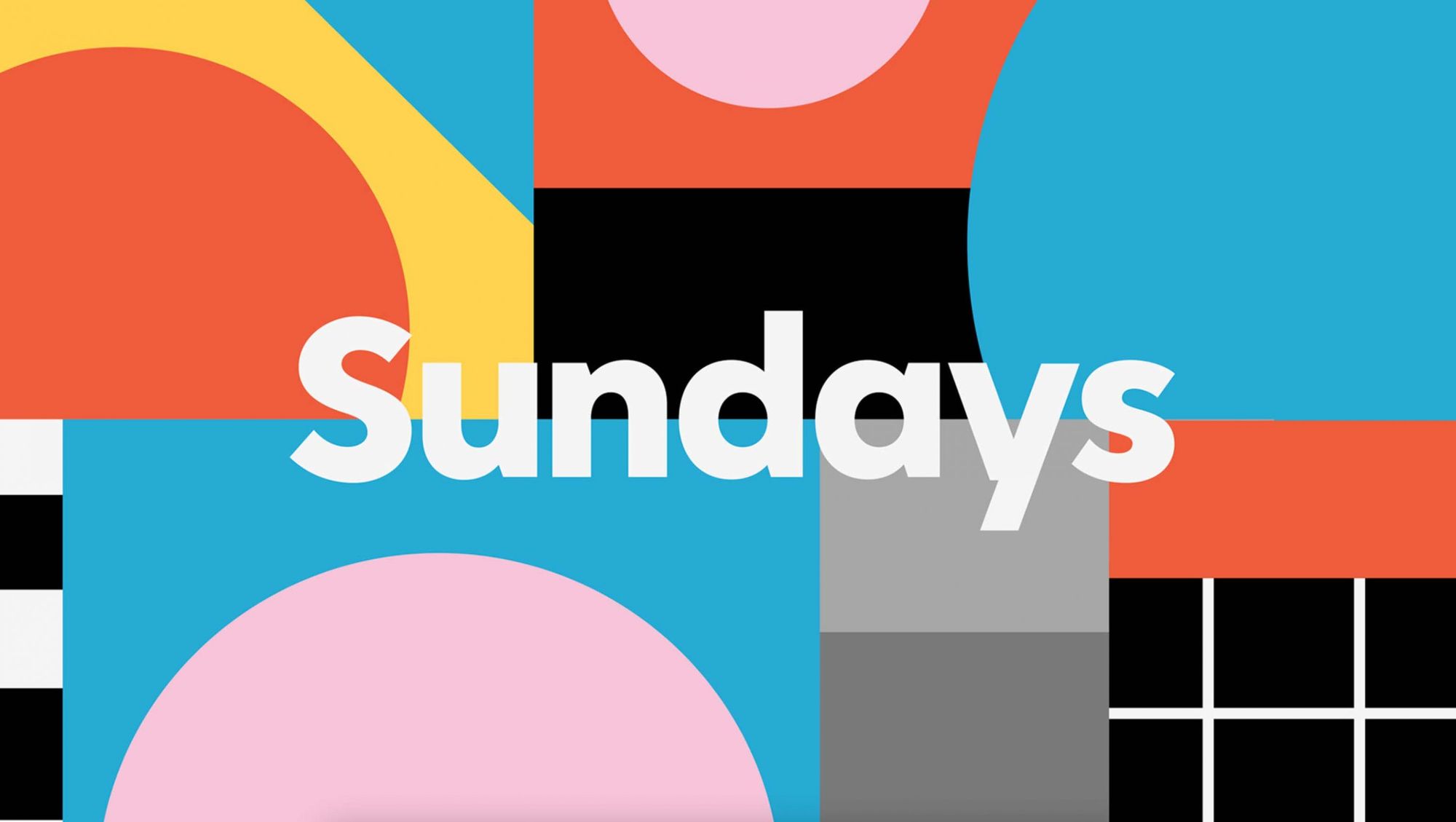
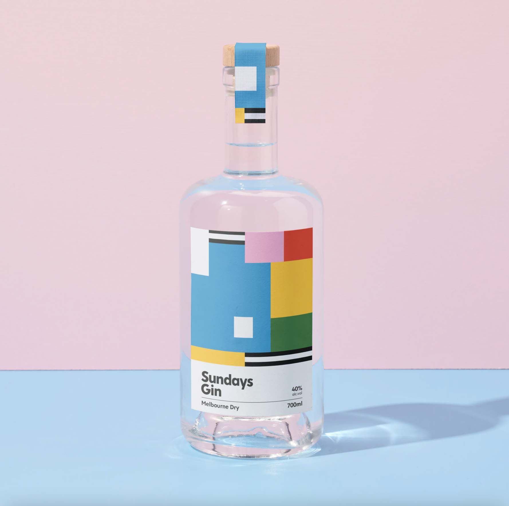
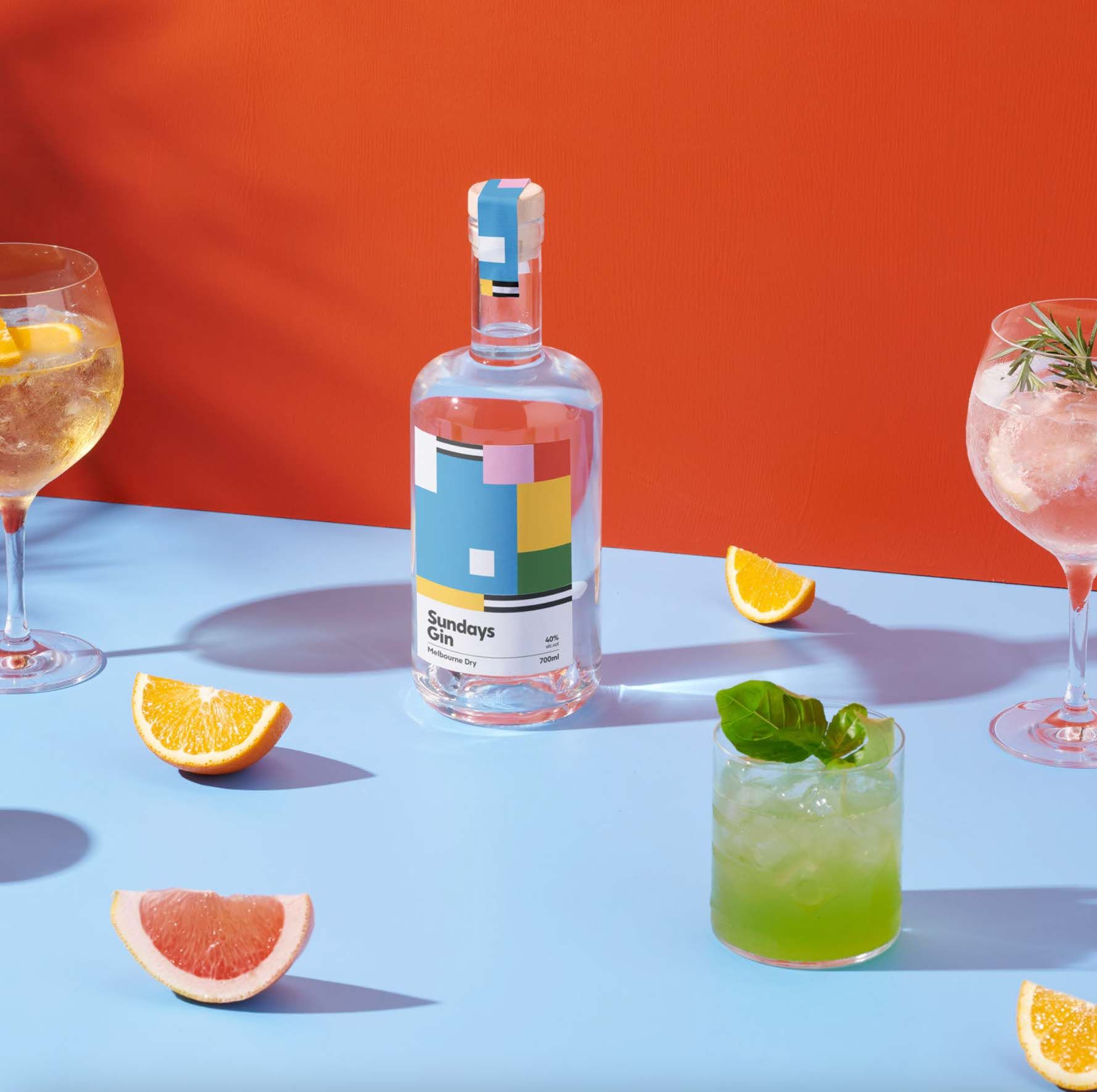
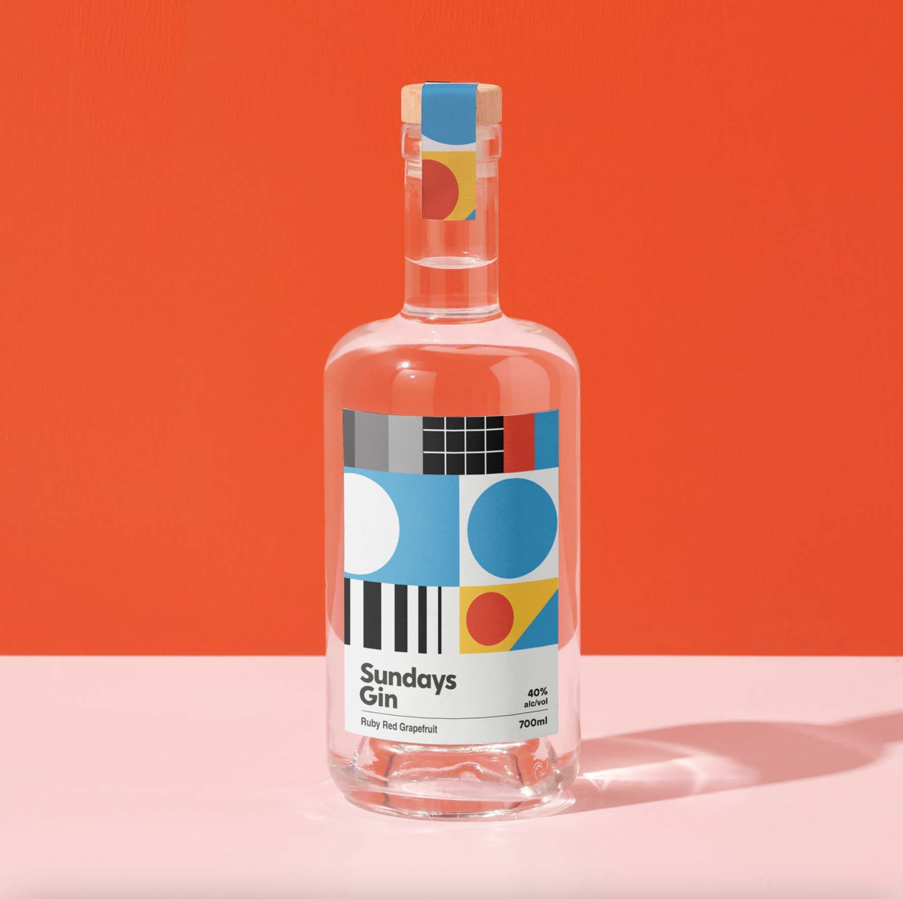
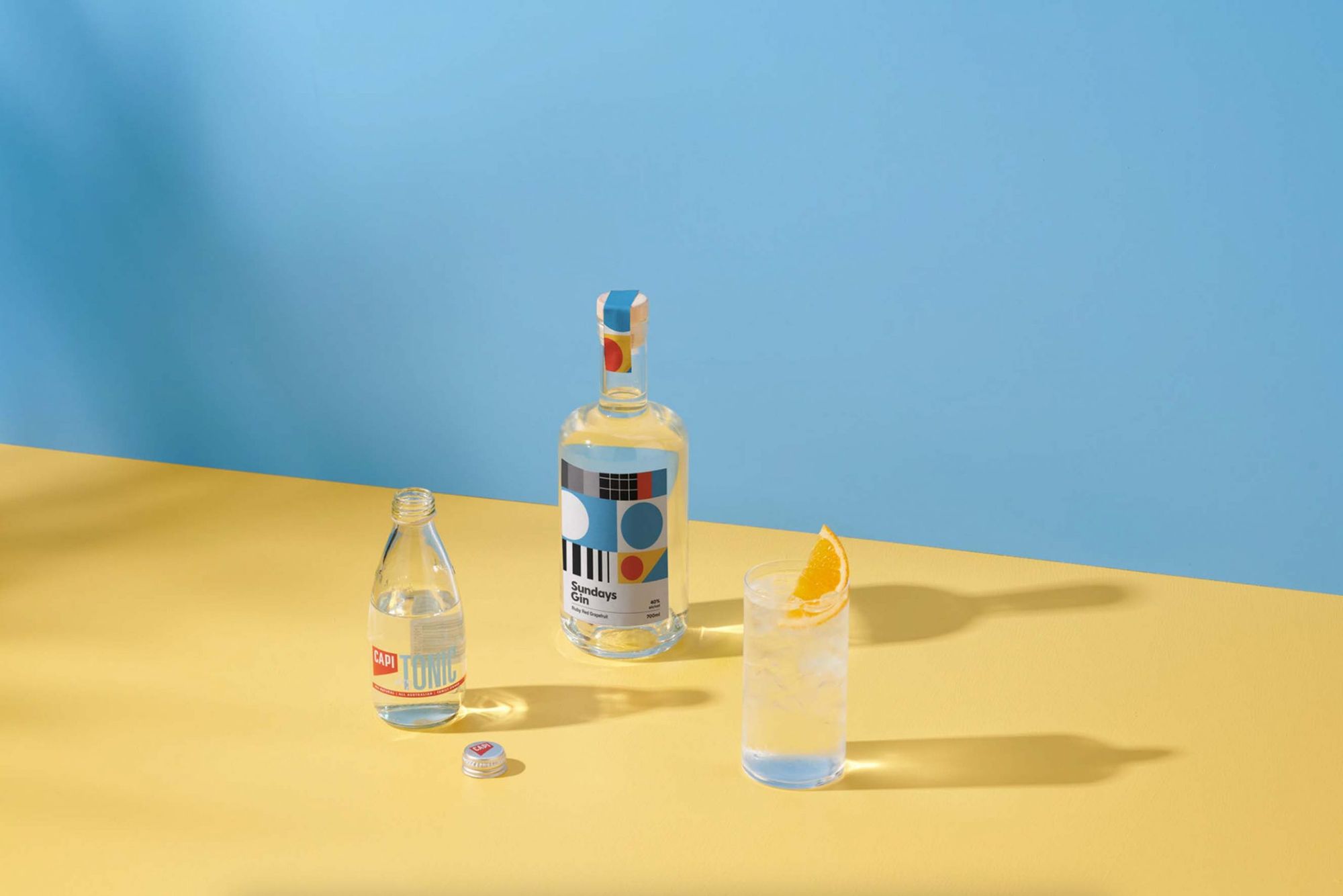
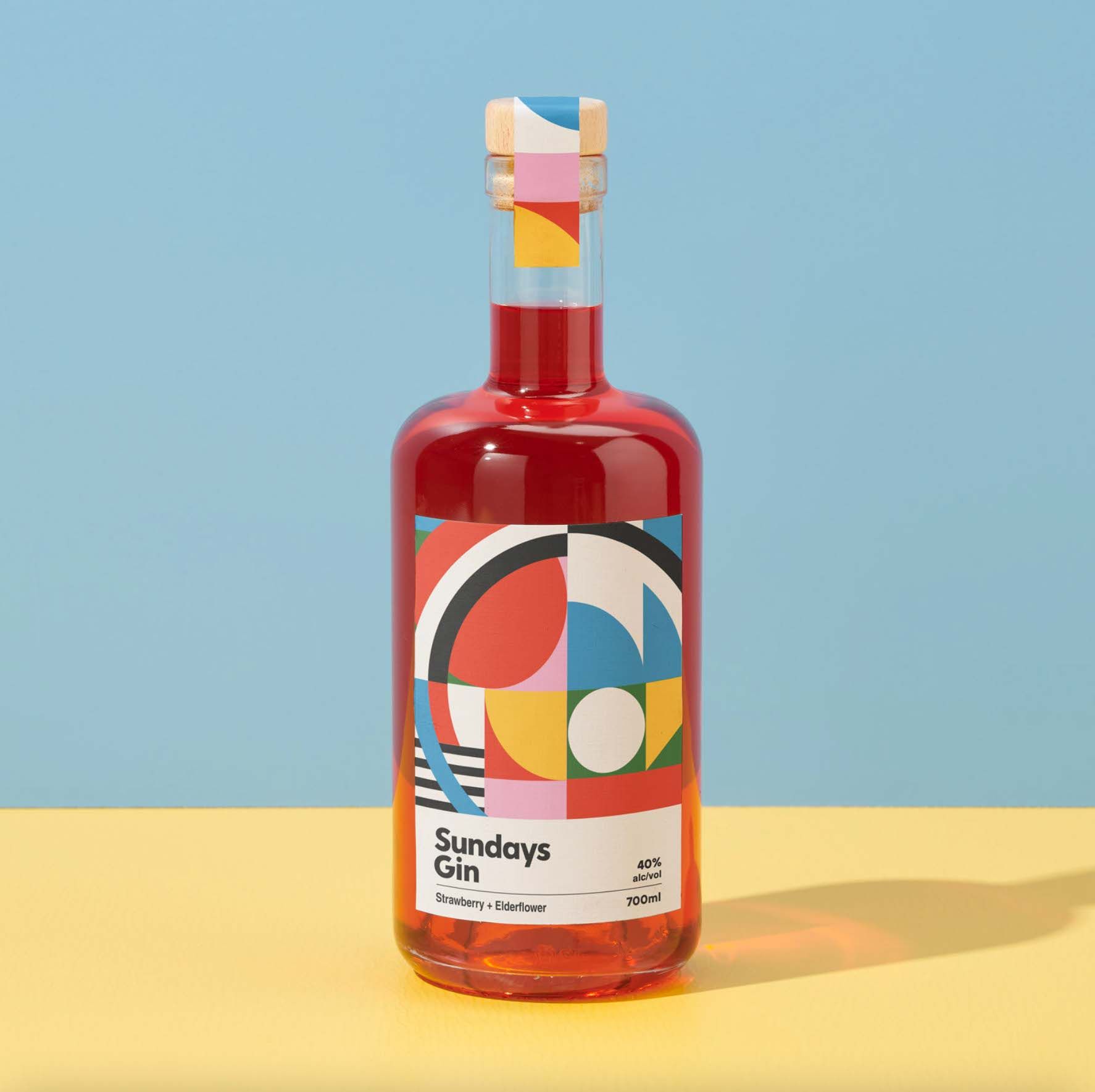
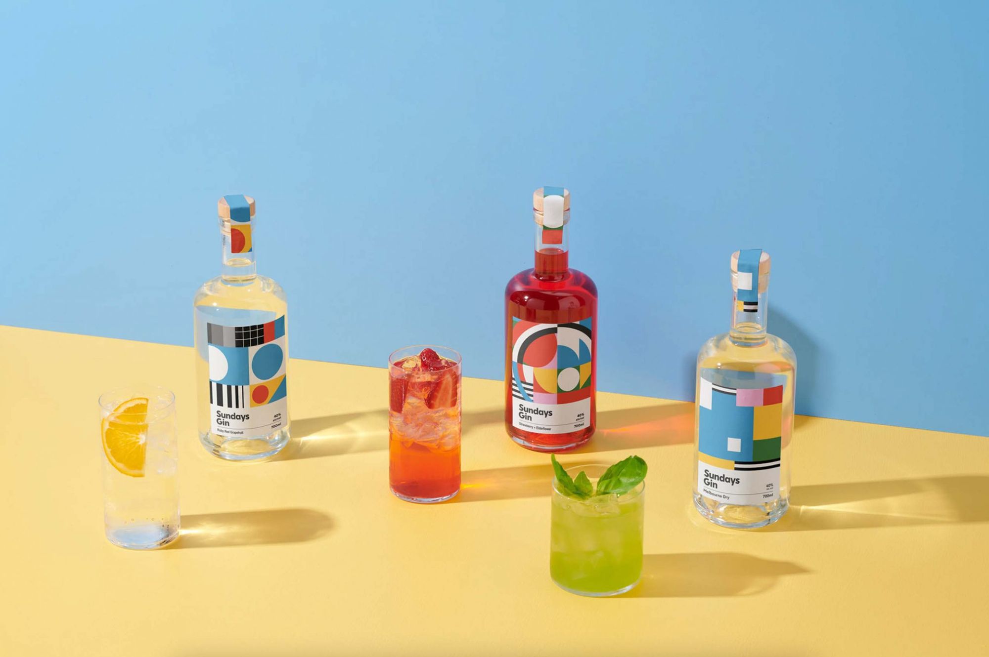
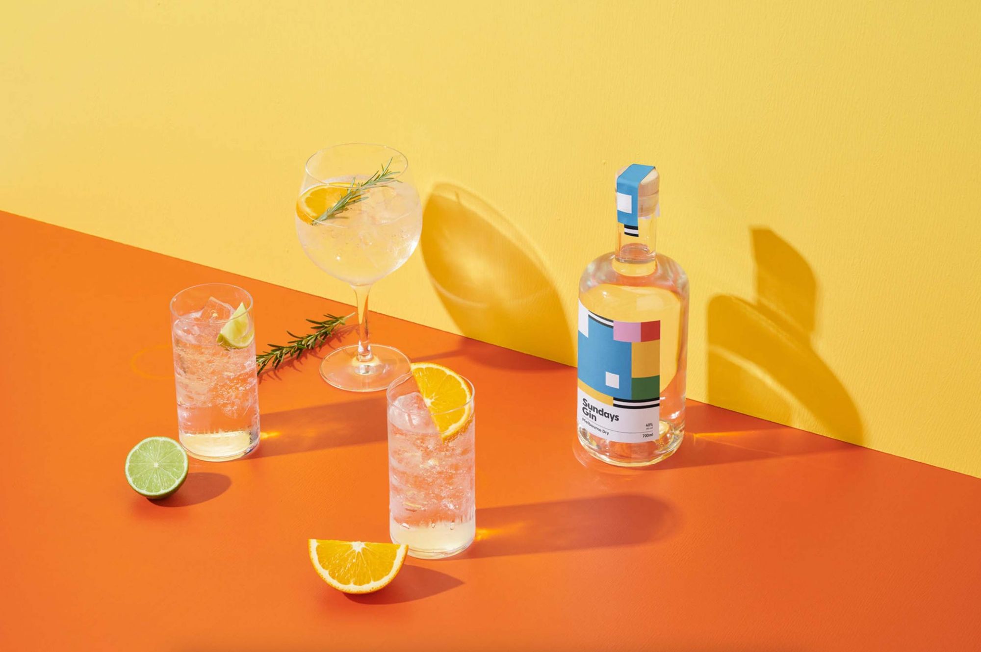
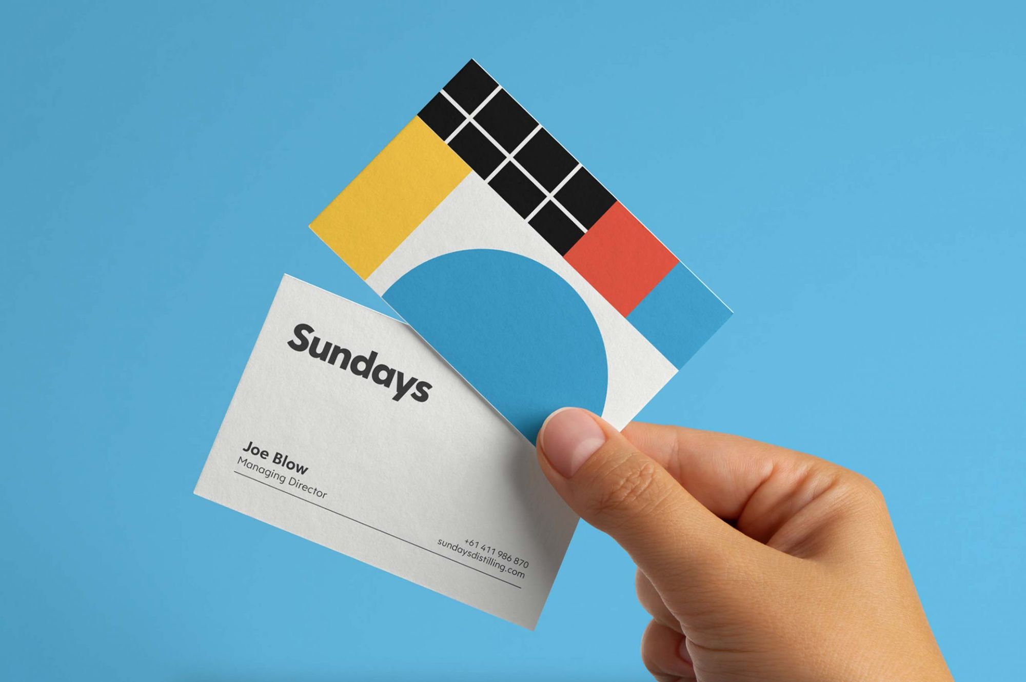
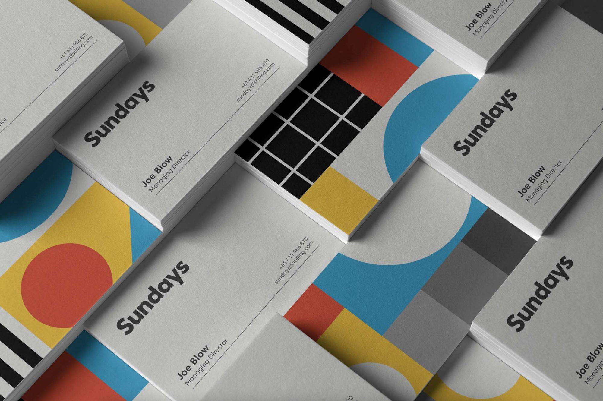
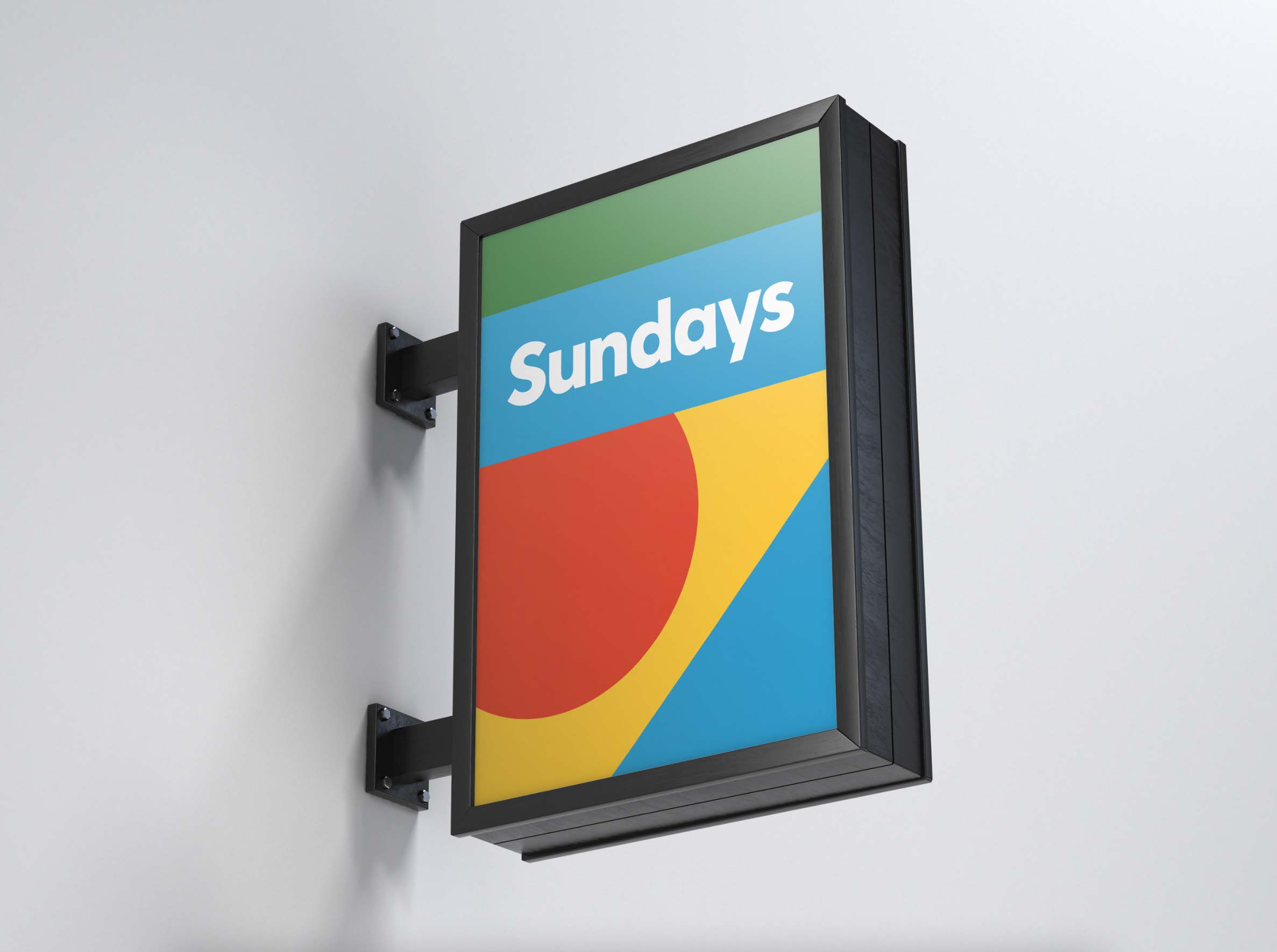
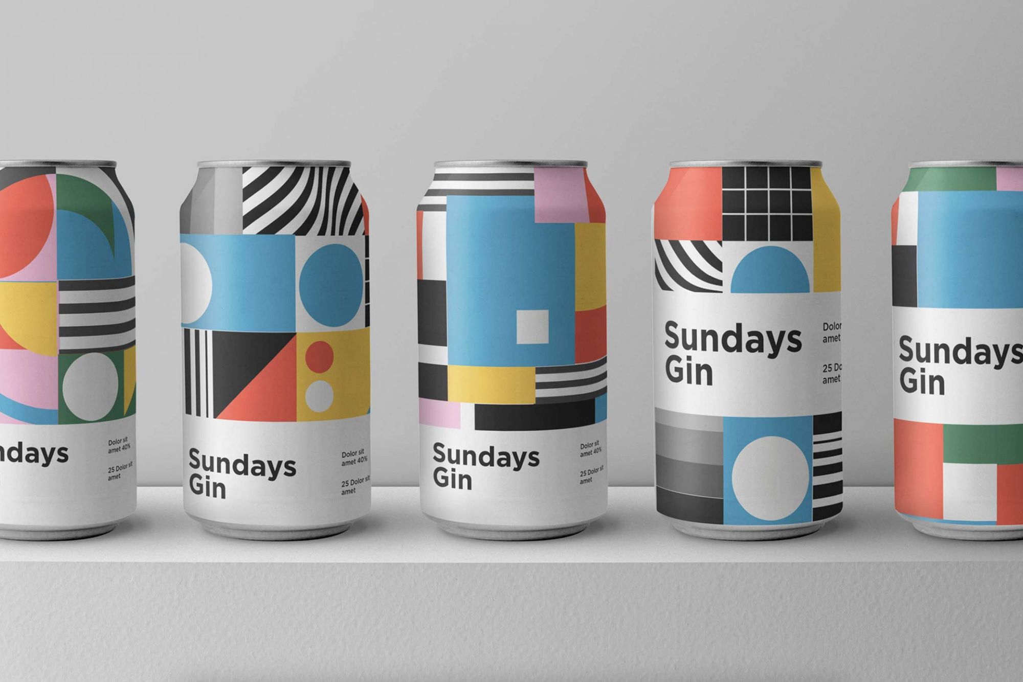
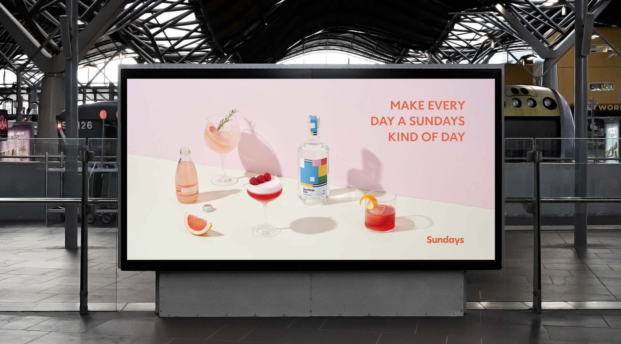
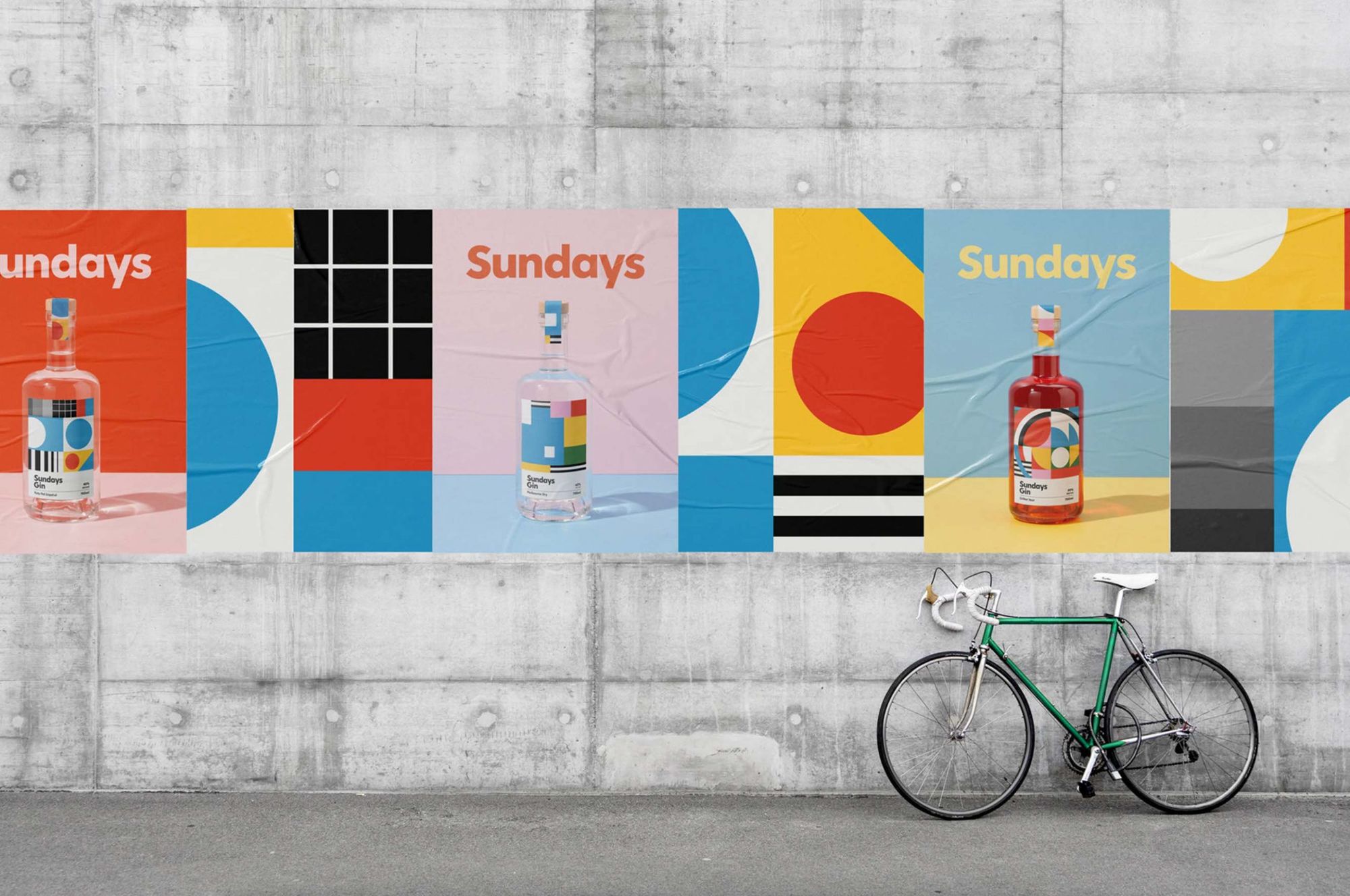
SUNDAYS GIN | Melbourne, Australia
Robert Wiltshire

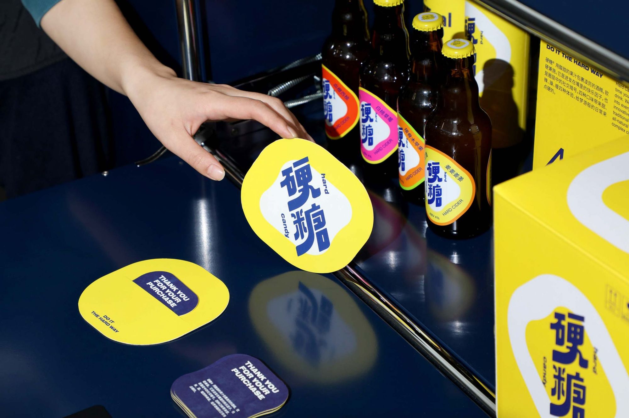
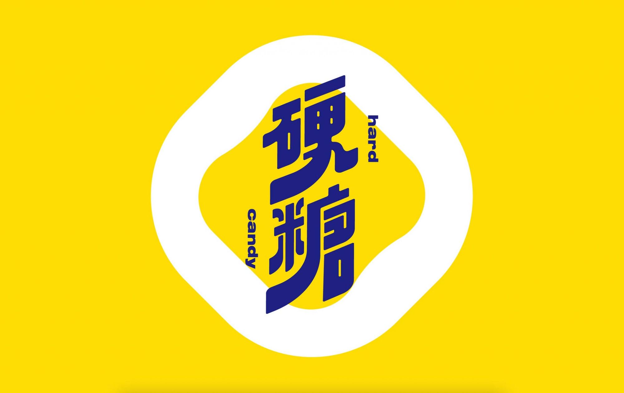
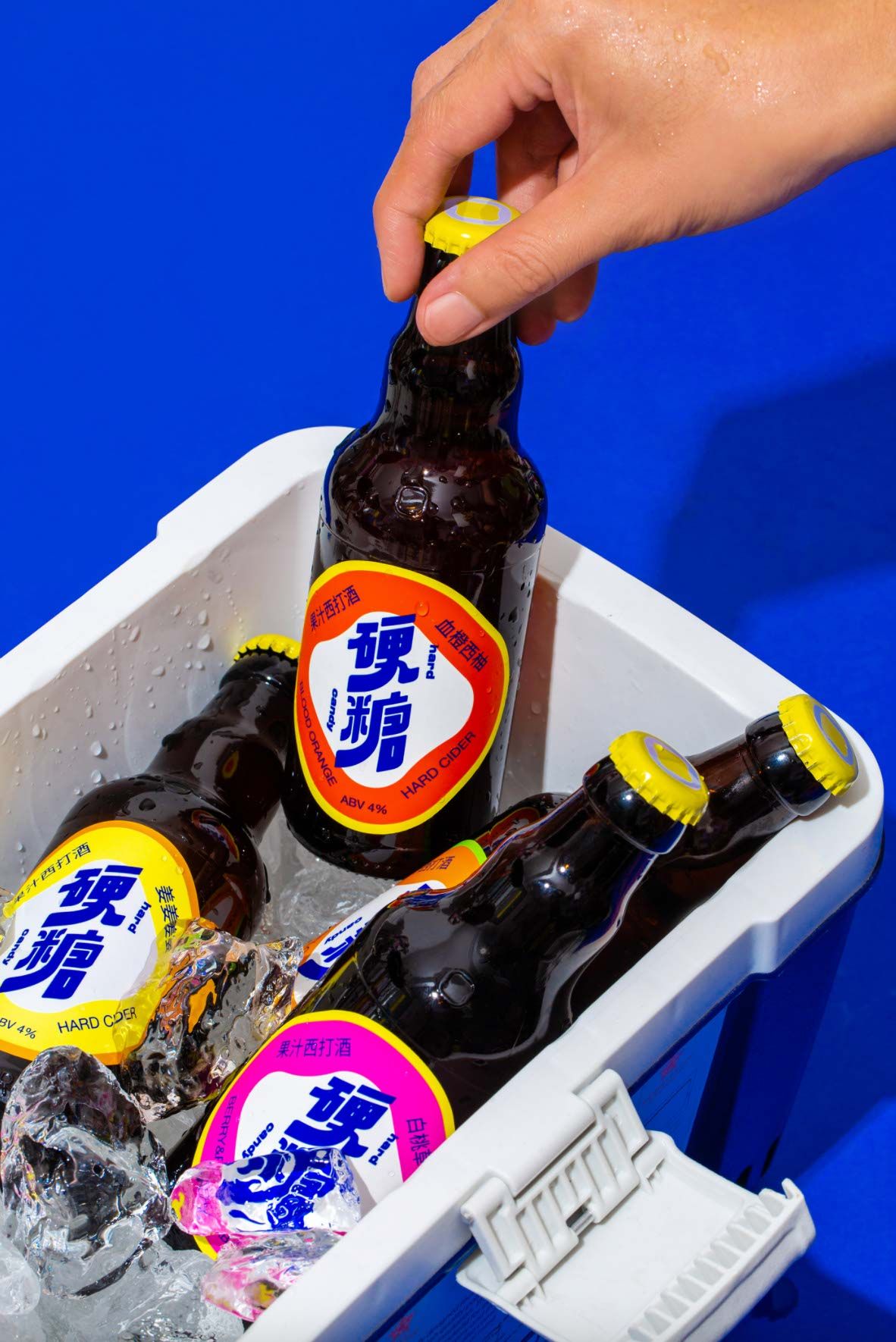
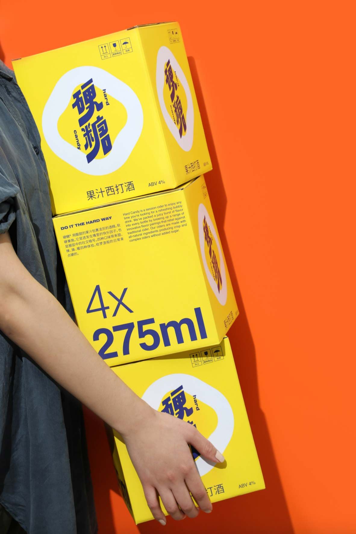
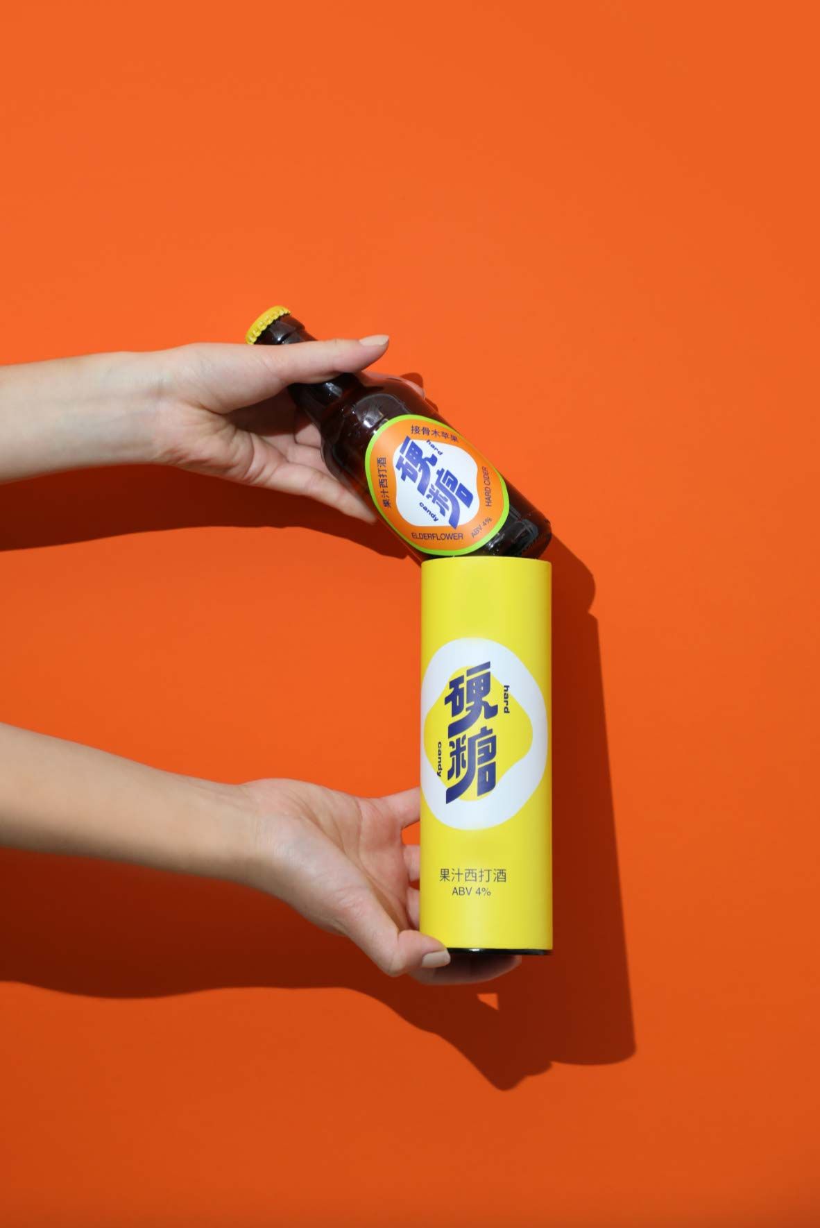
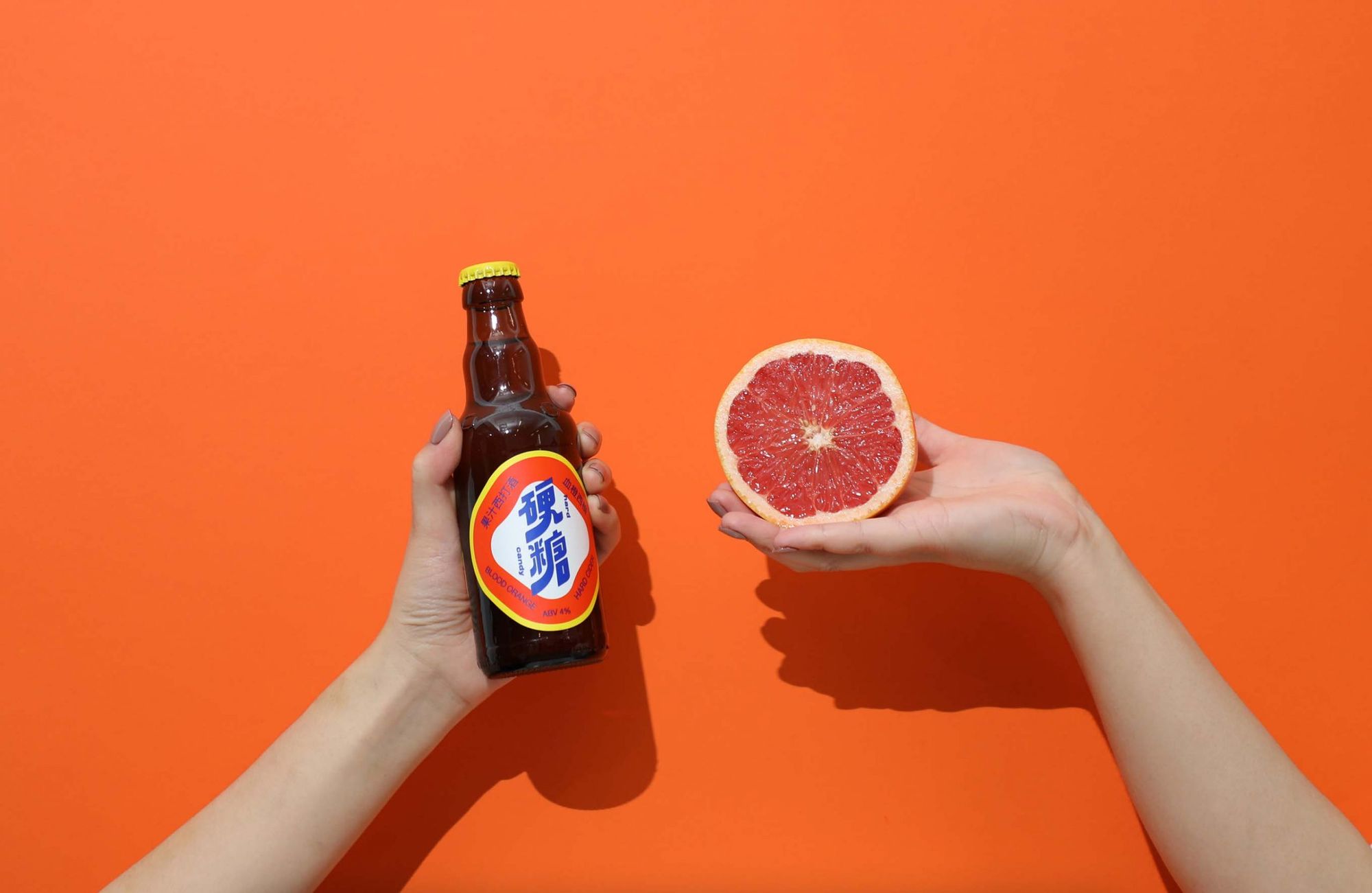
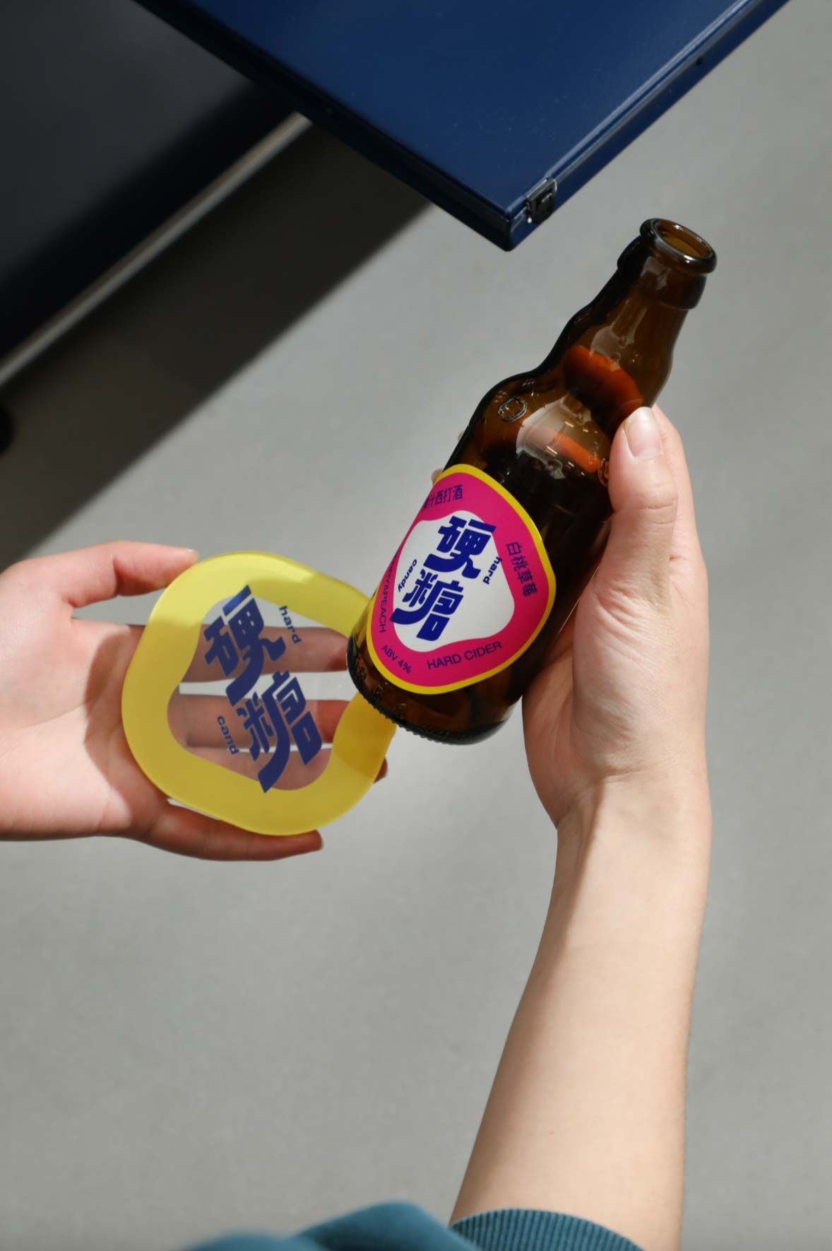
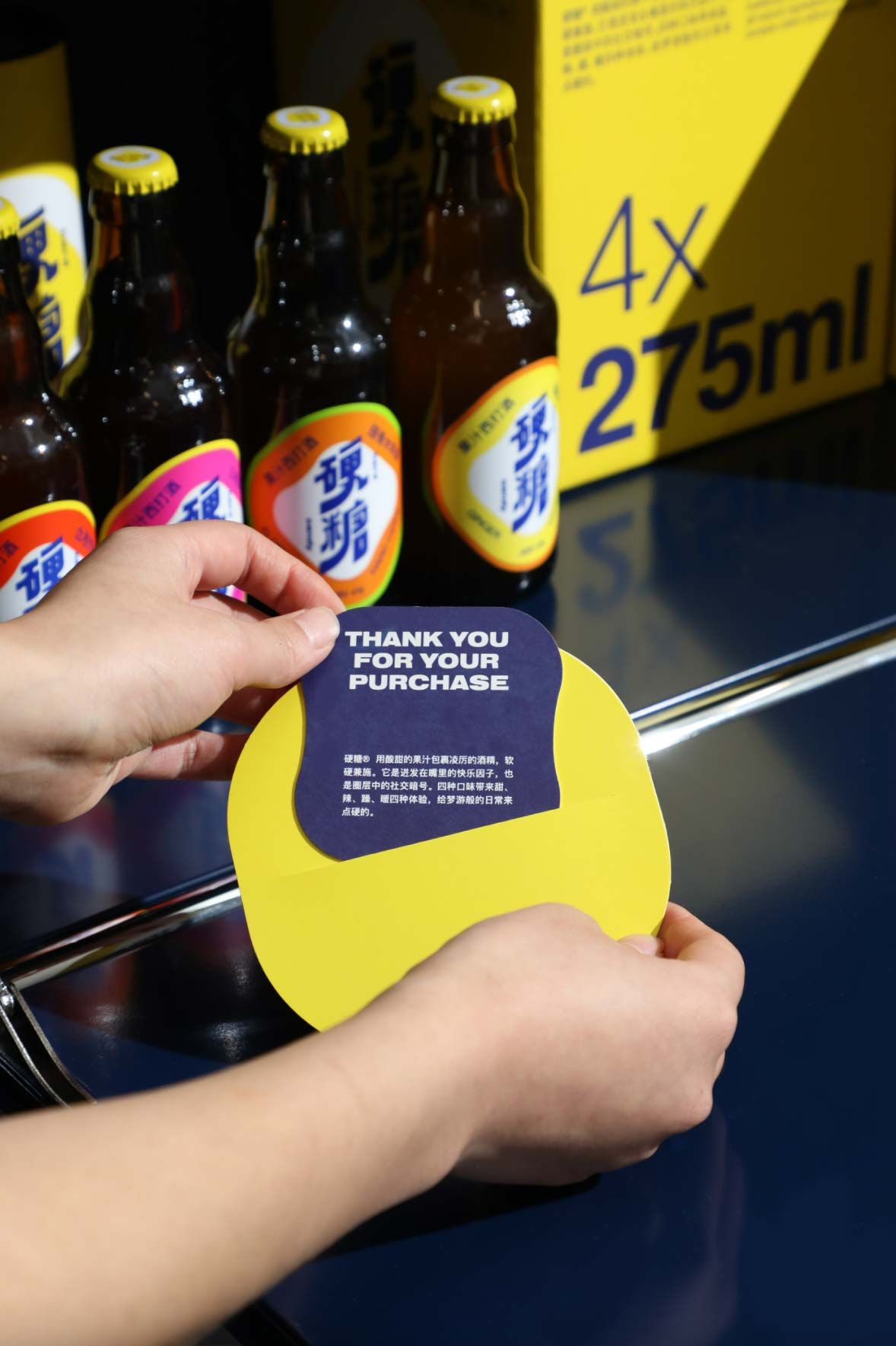
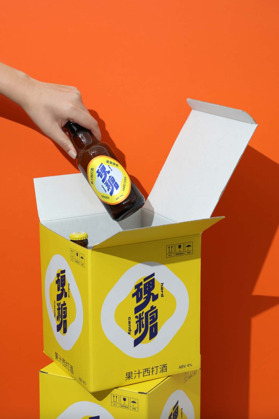
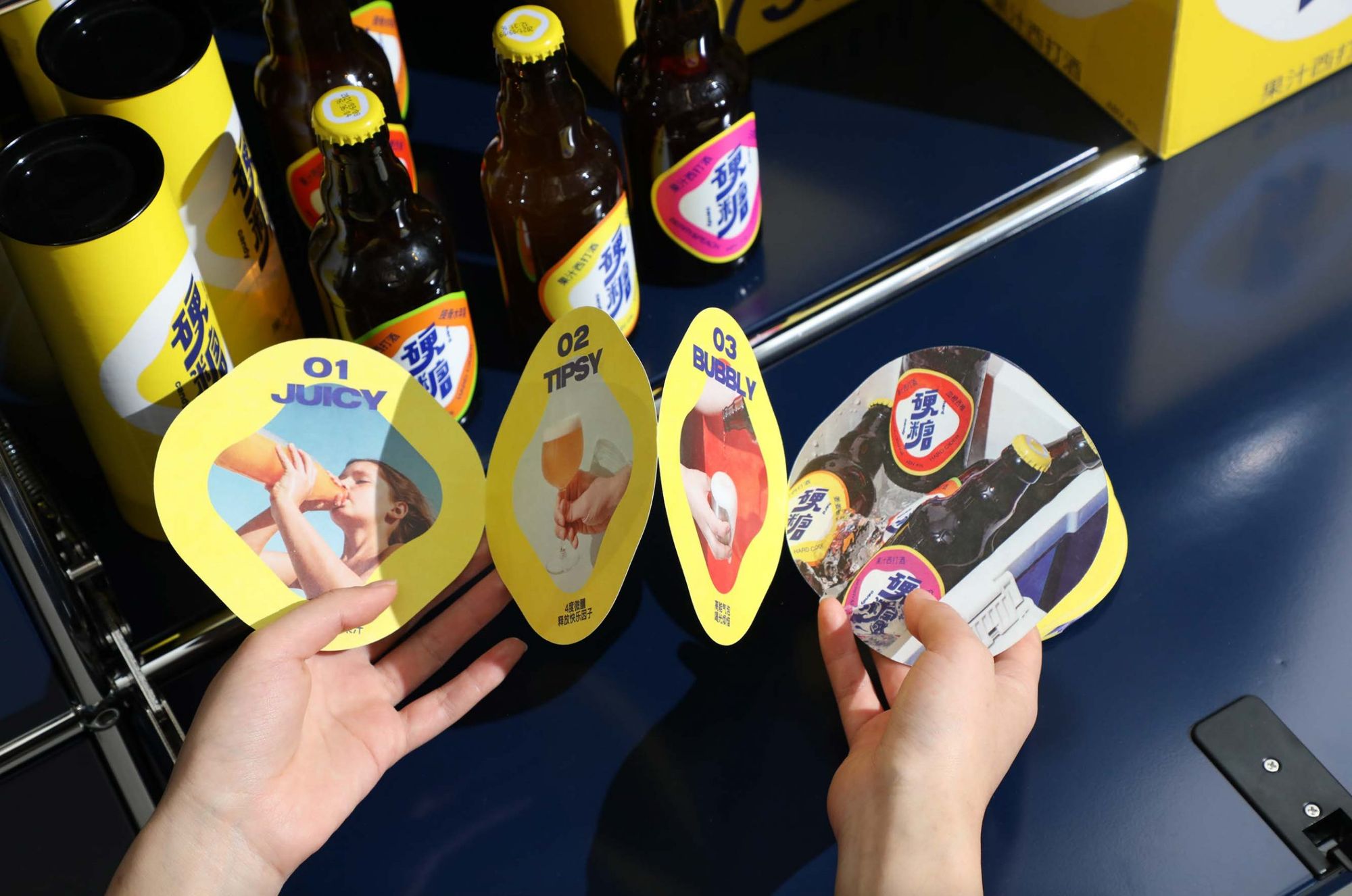
Hard Candy 硬糖 Visual Identity and Packaging | Shanghai, China
low key Design


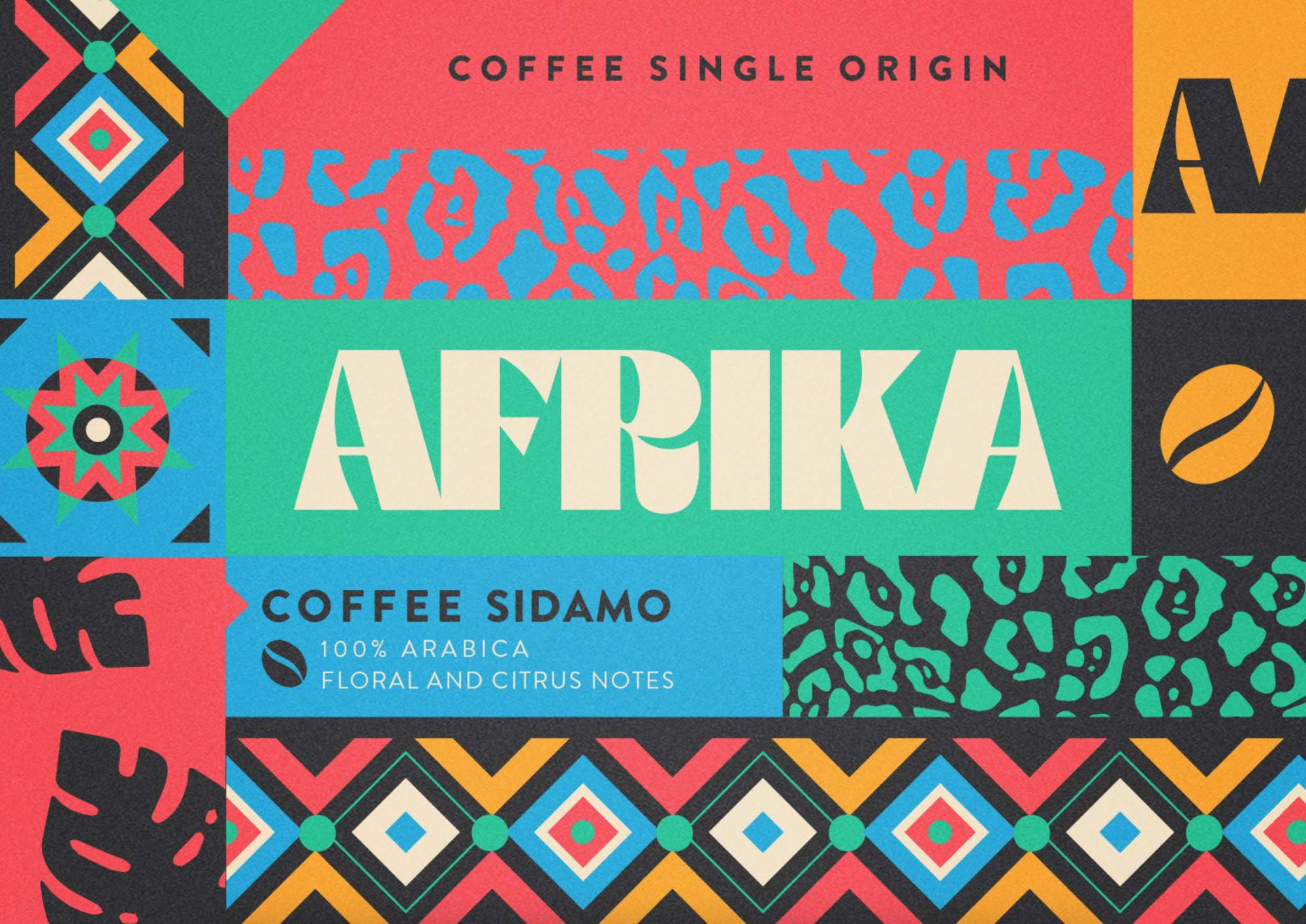
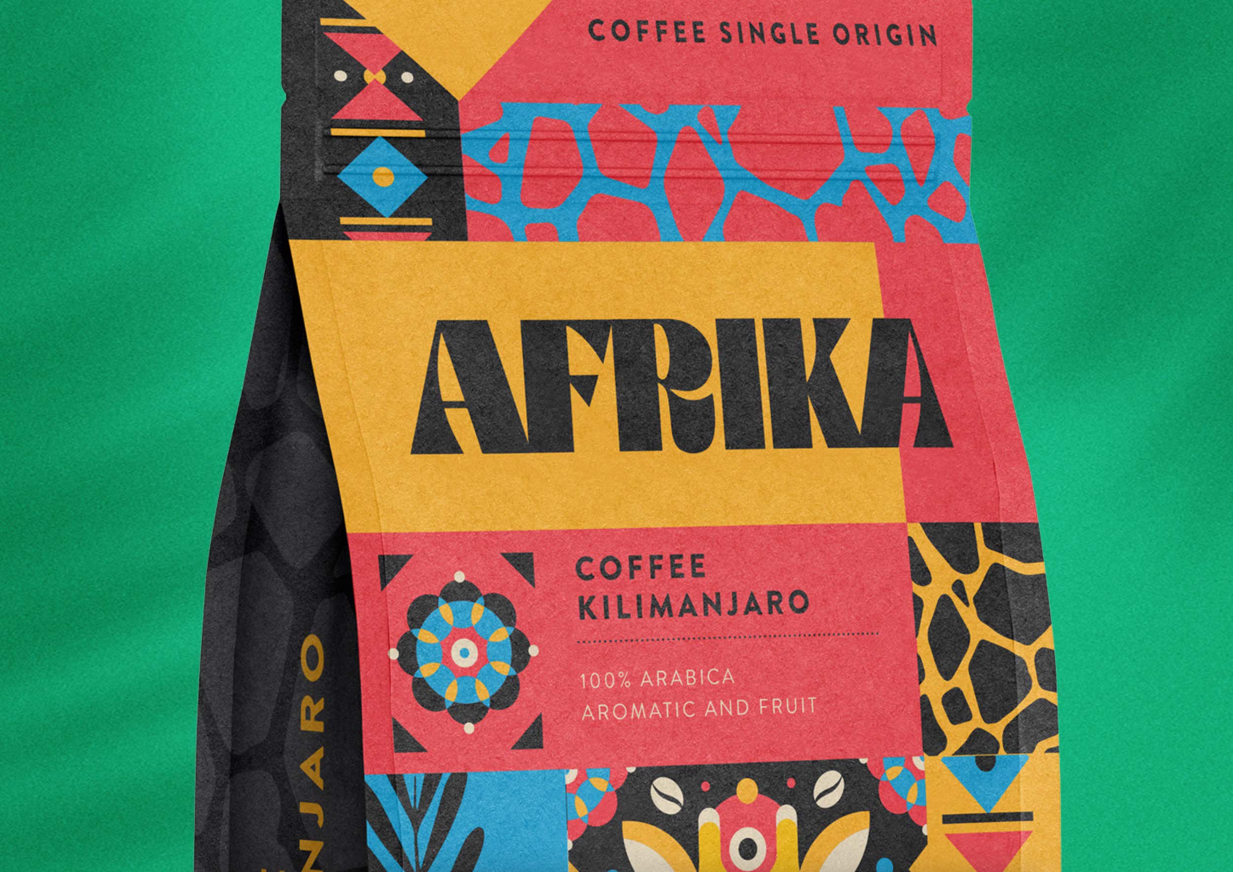
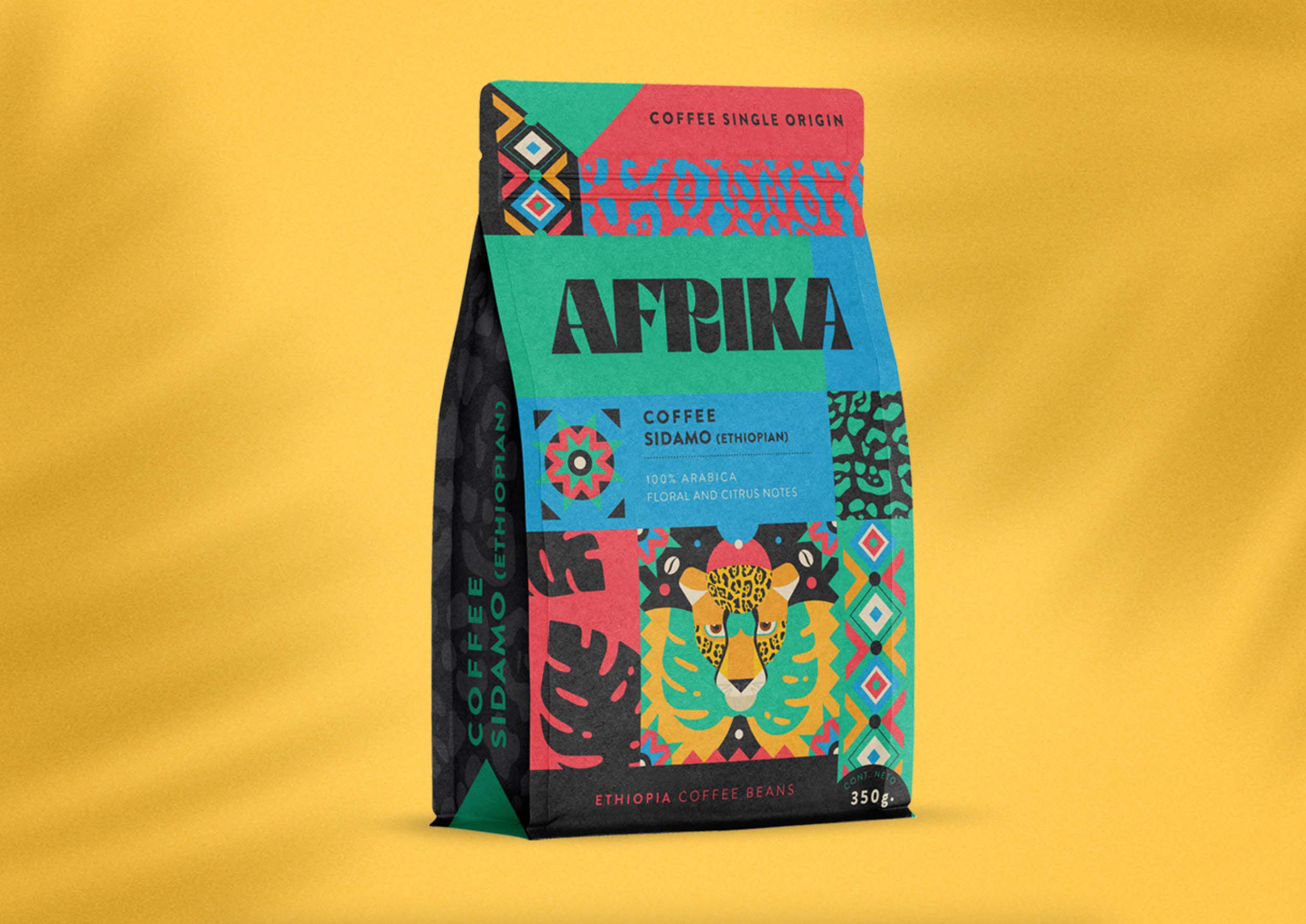
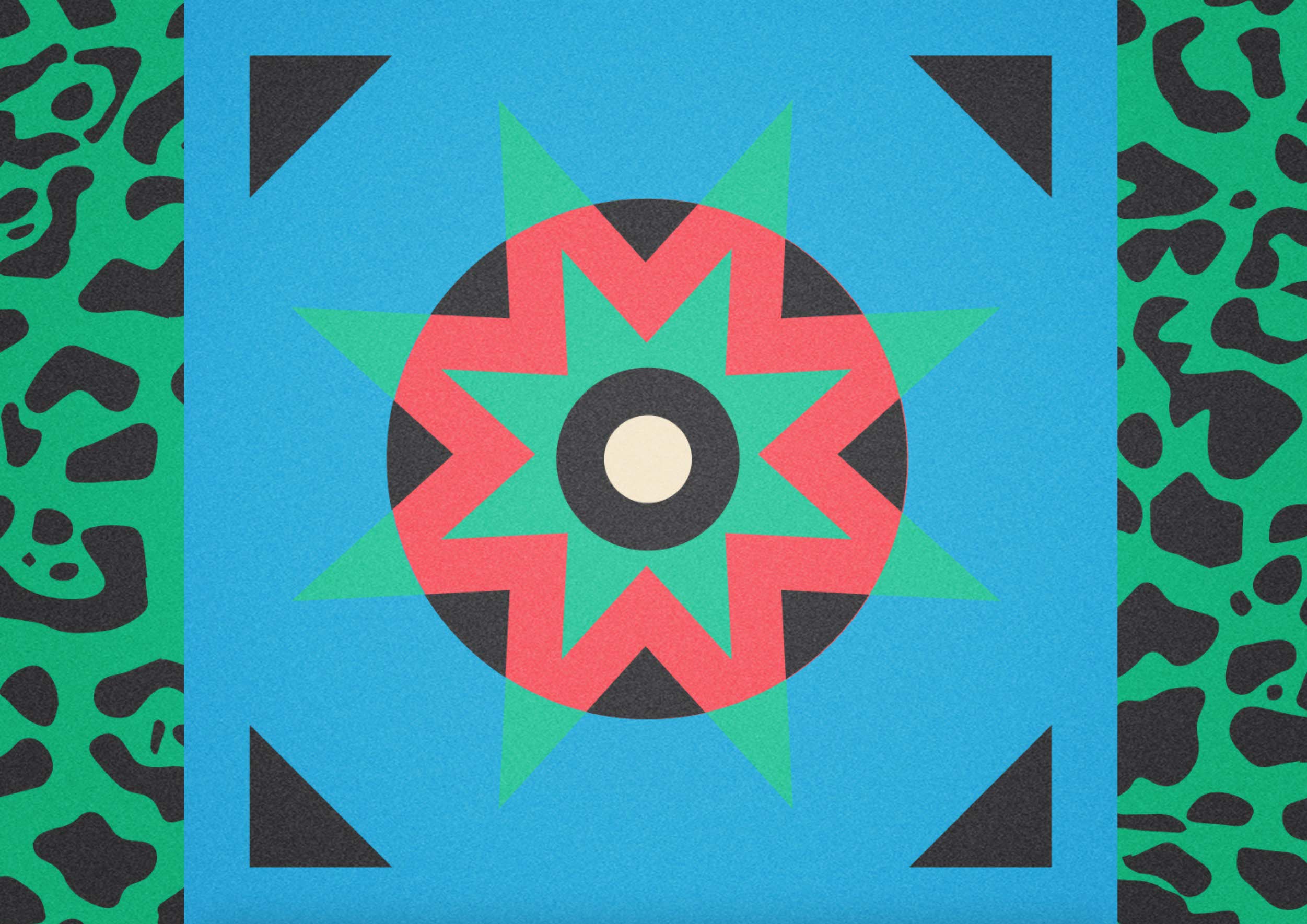
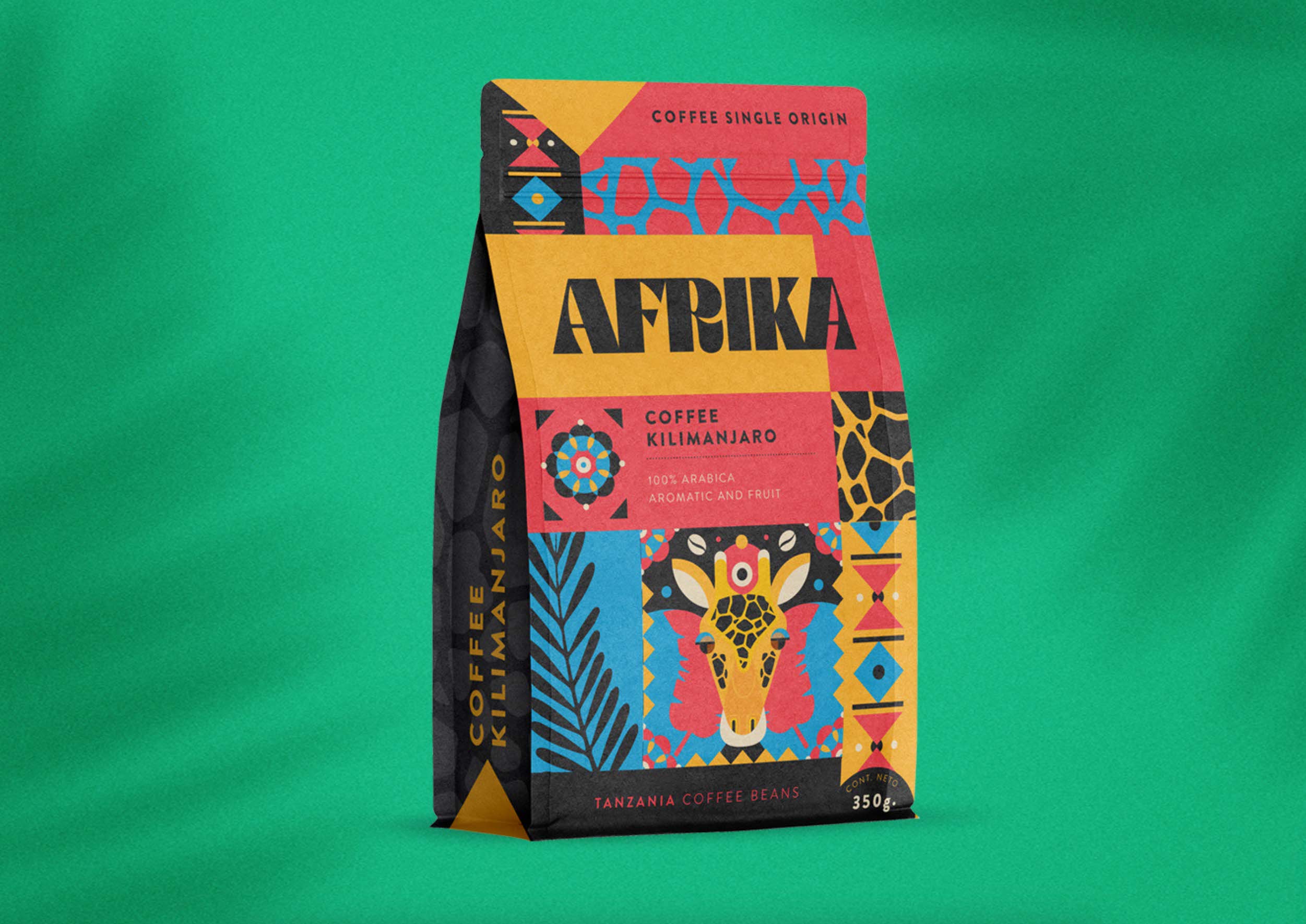
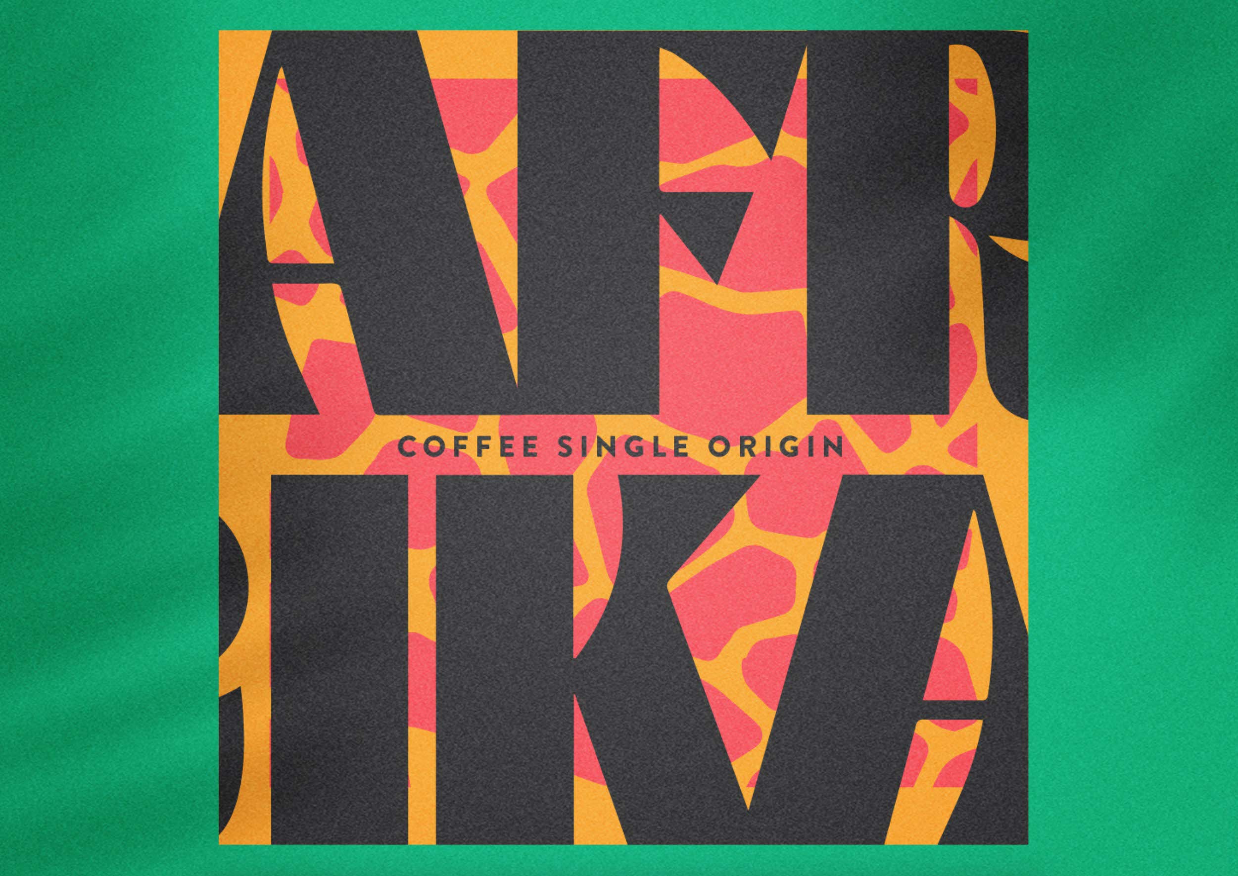
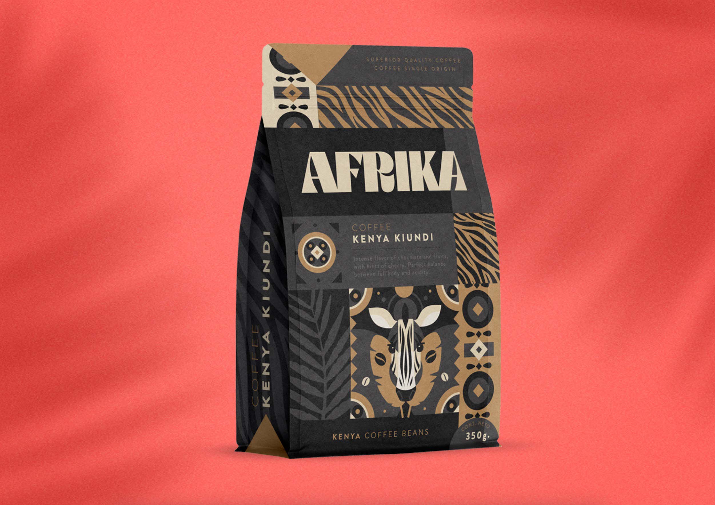
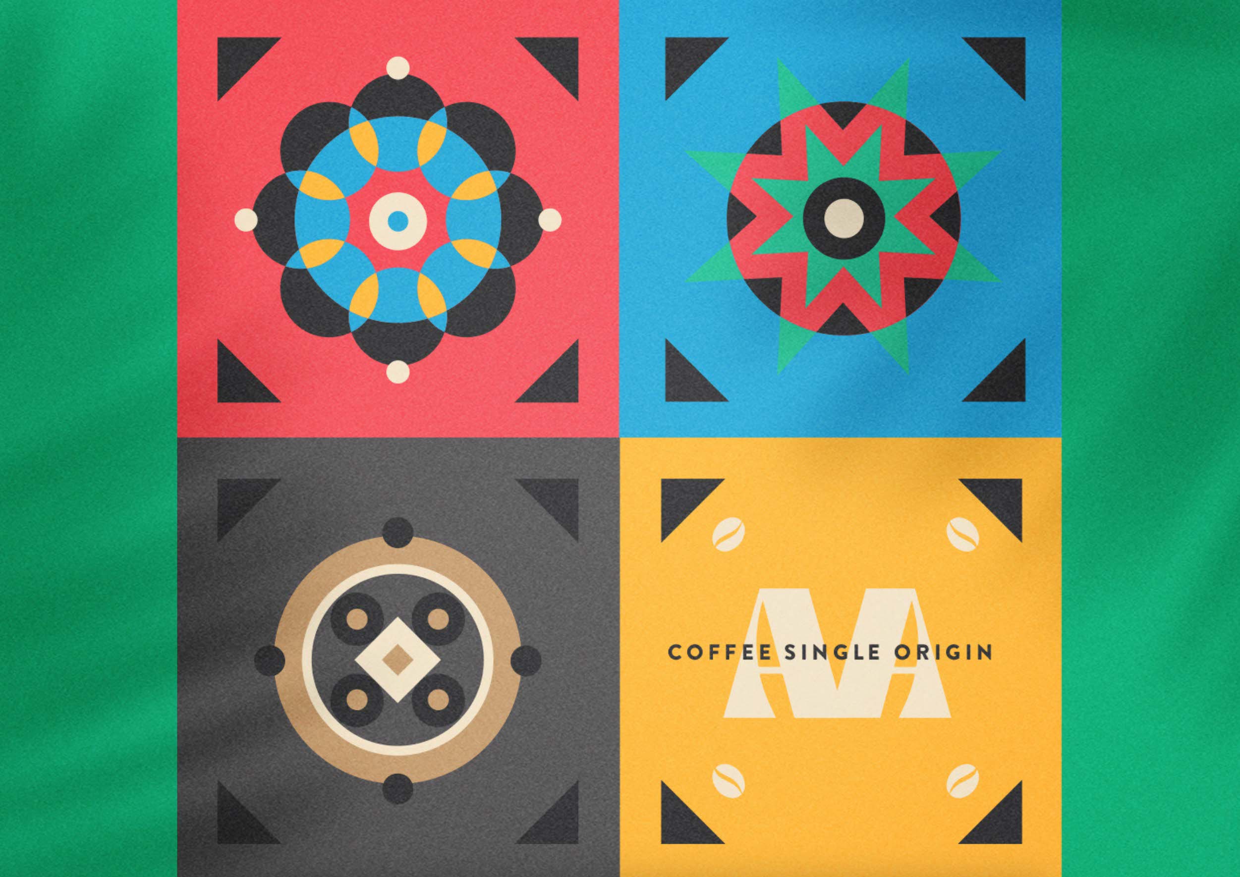
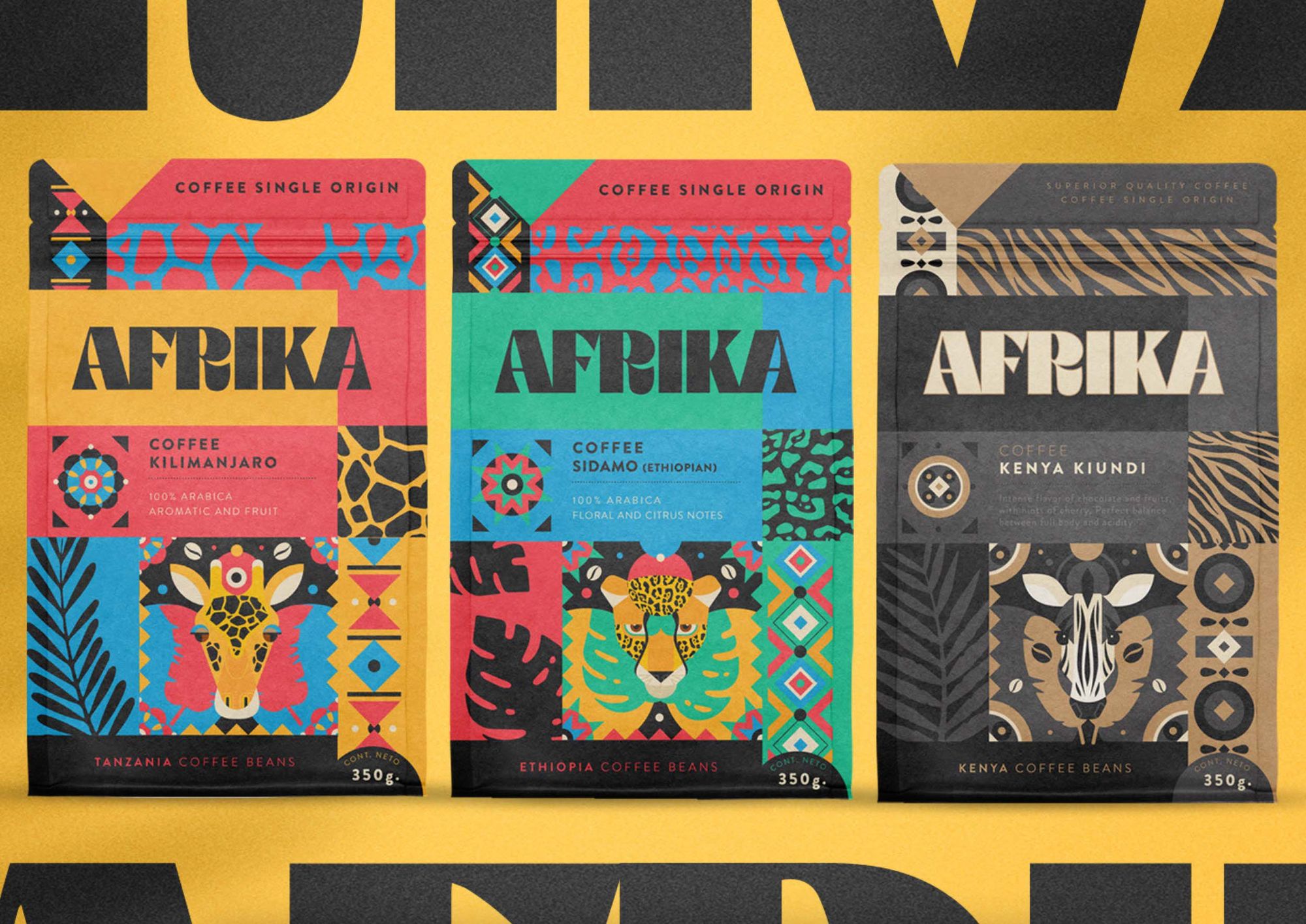
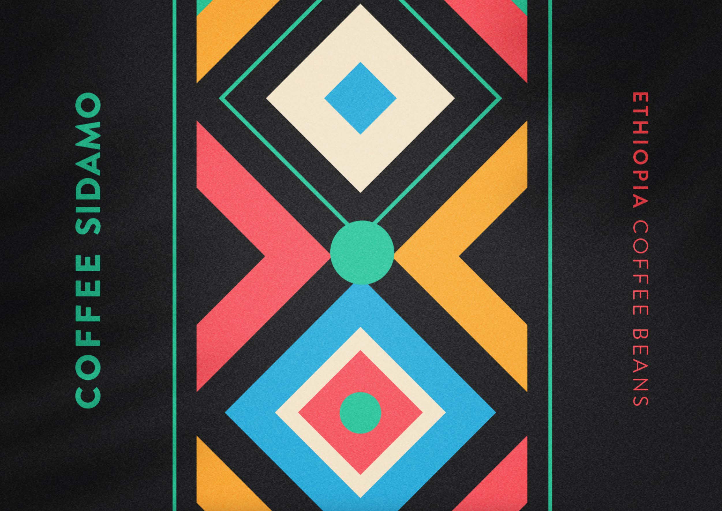
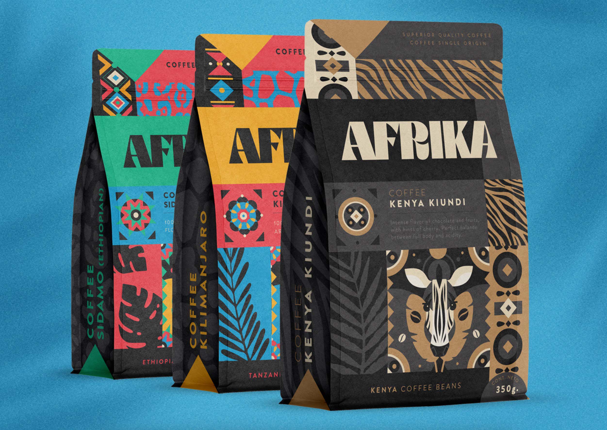
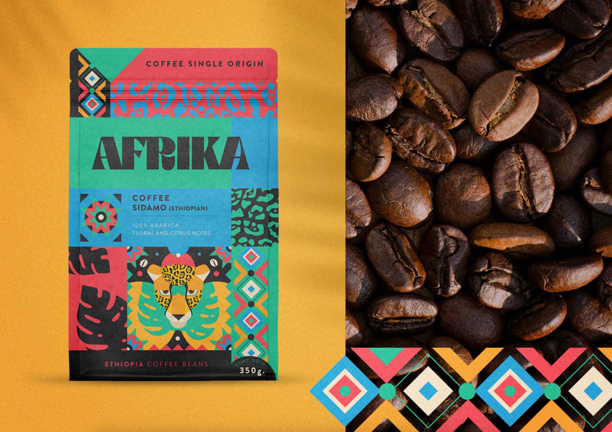
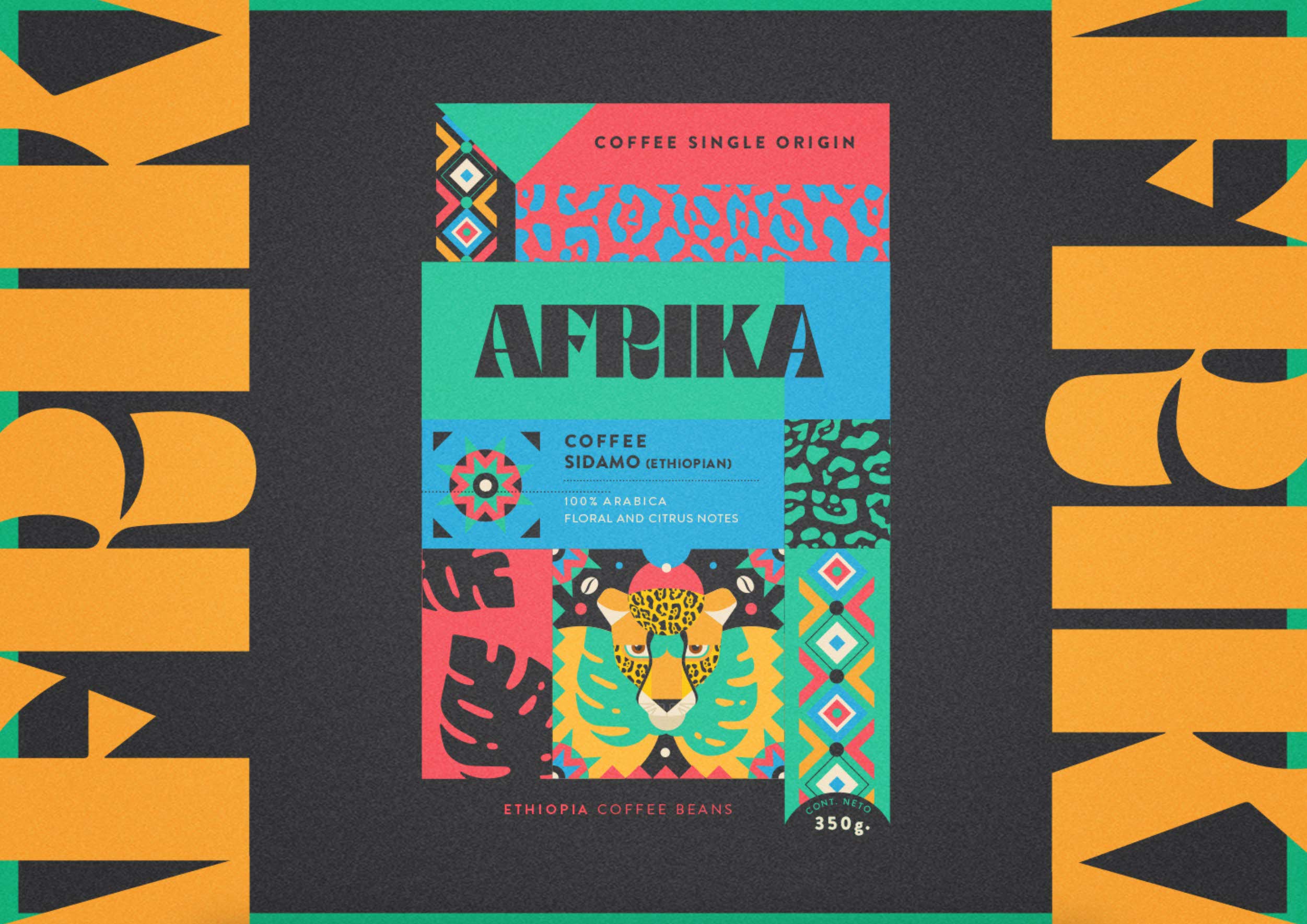
AFRIKA – Coffee single origin | Buenos Aires, Argentina
Emi Renzi

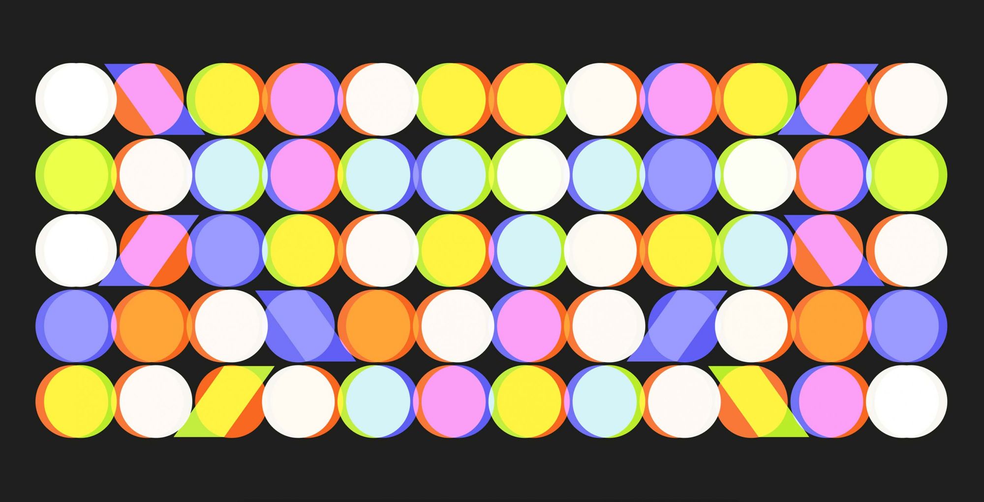
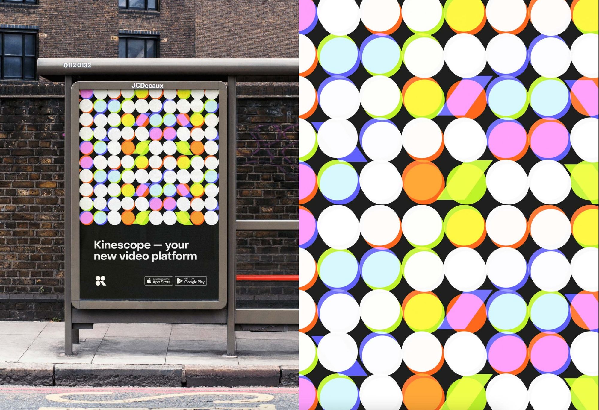
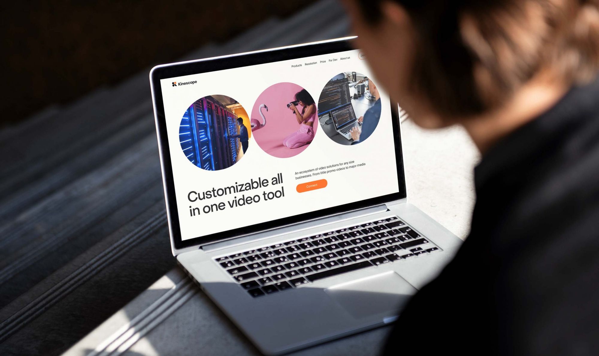
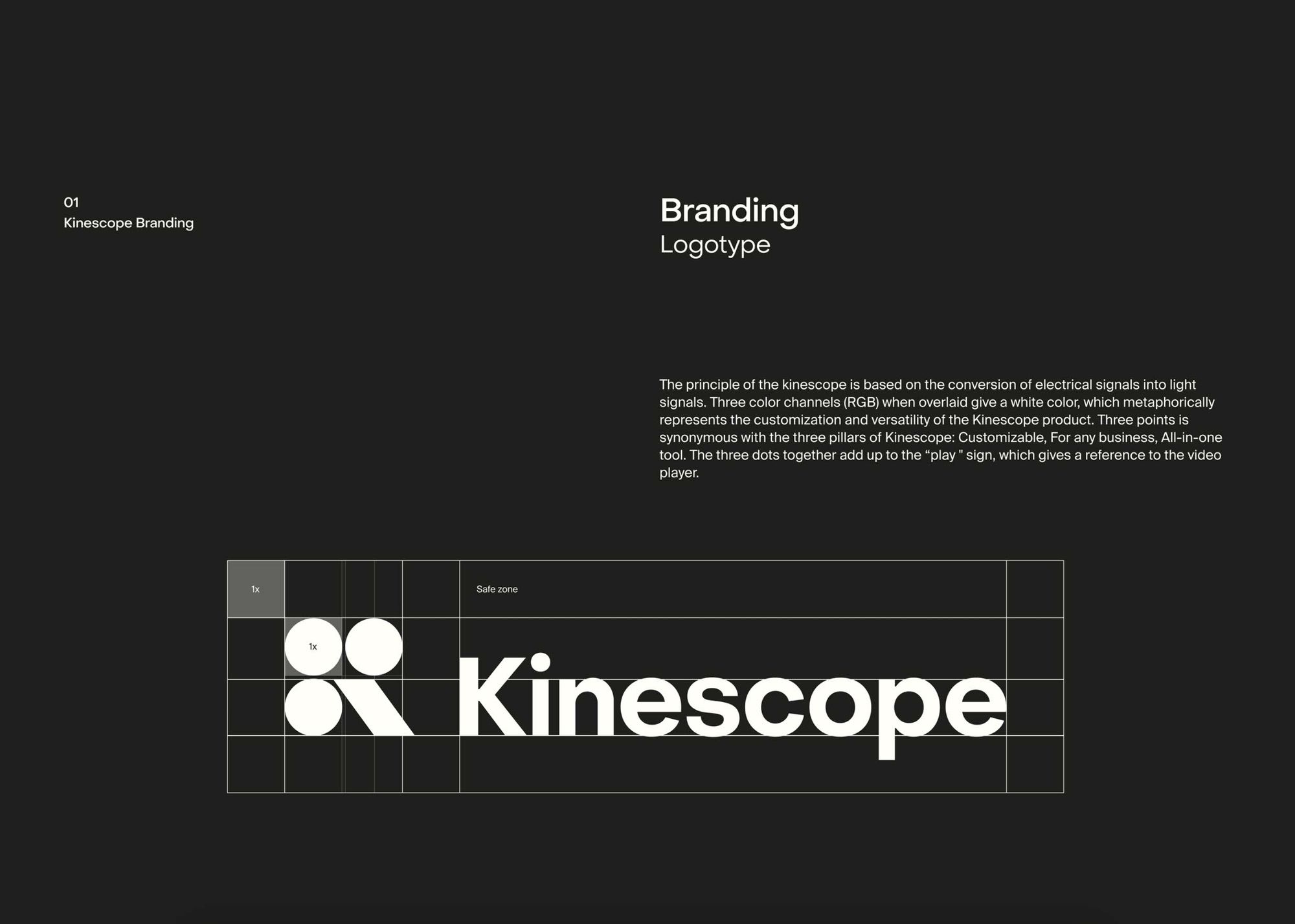
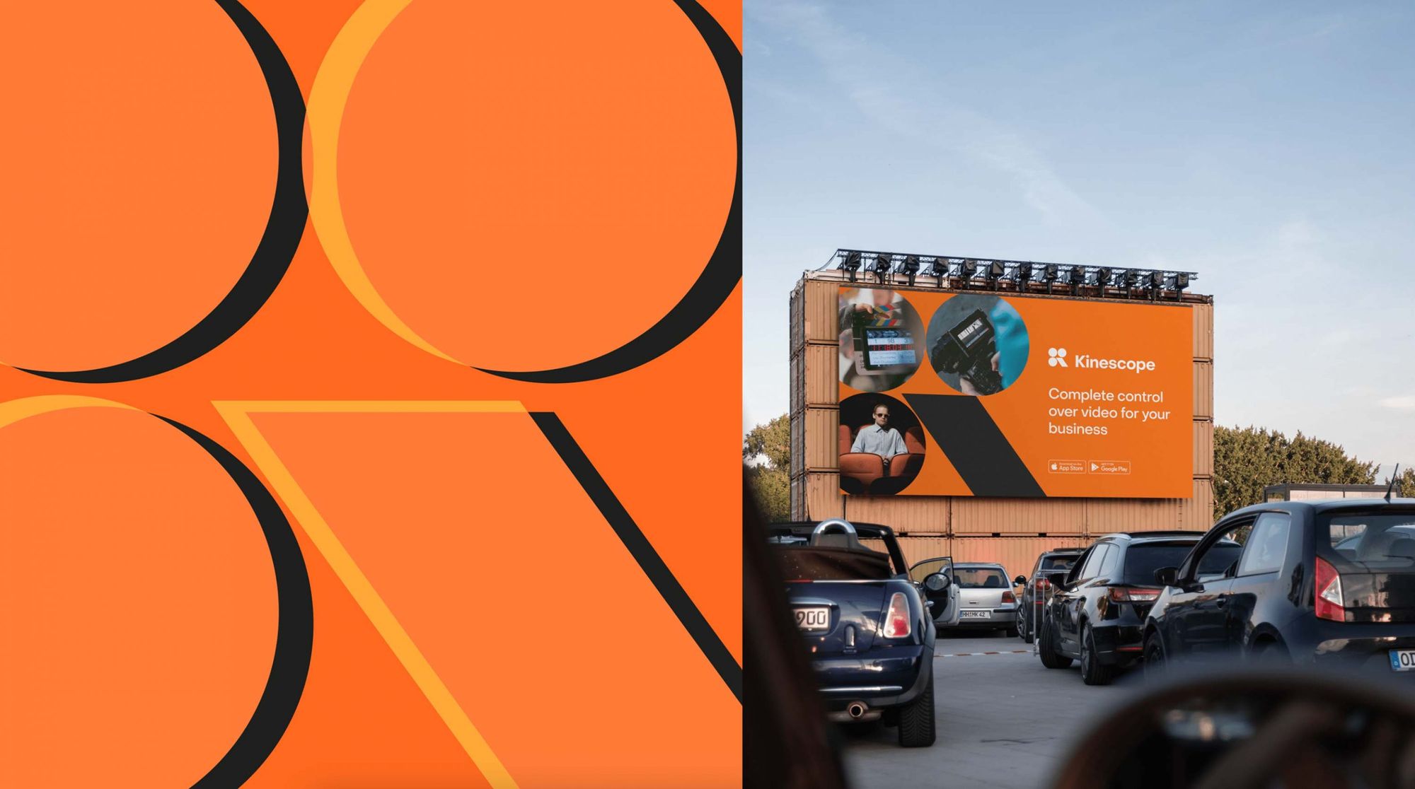
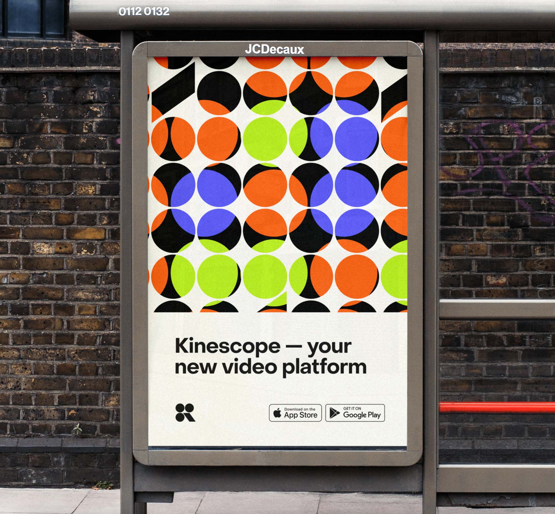
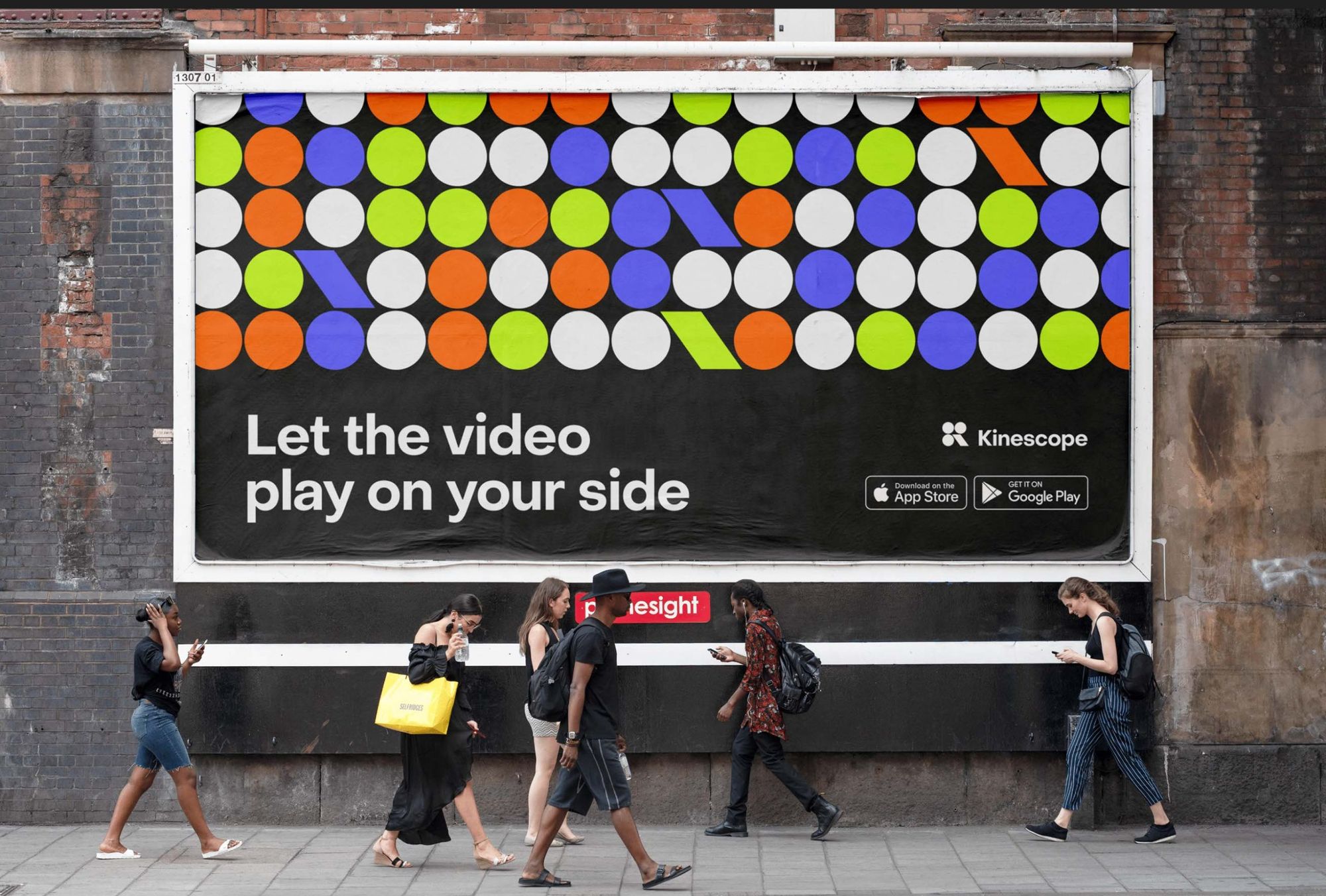
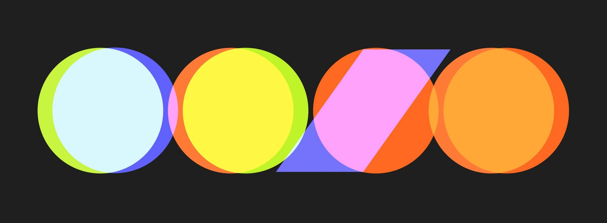
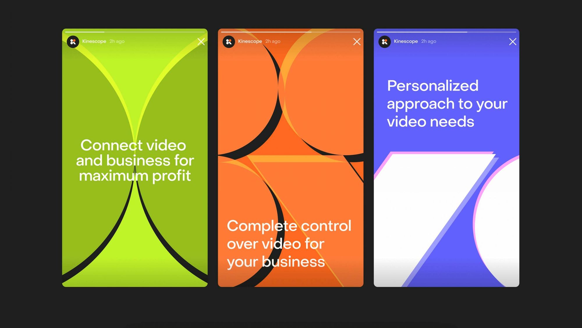
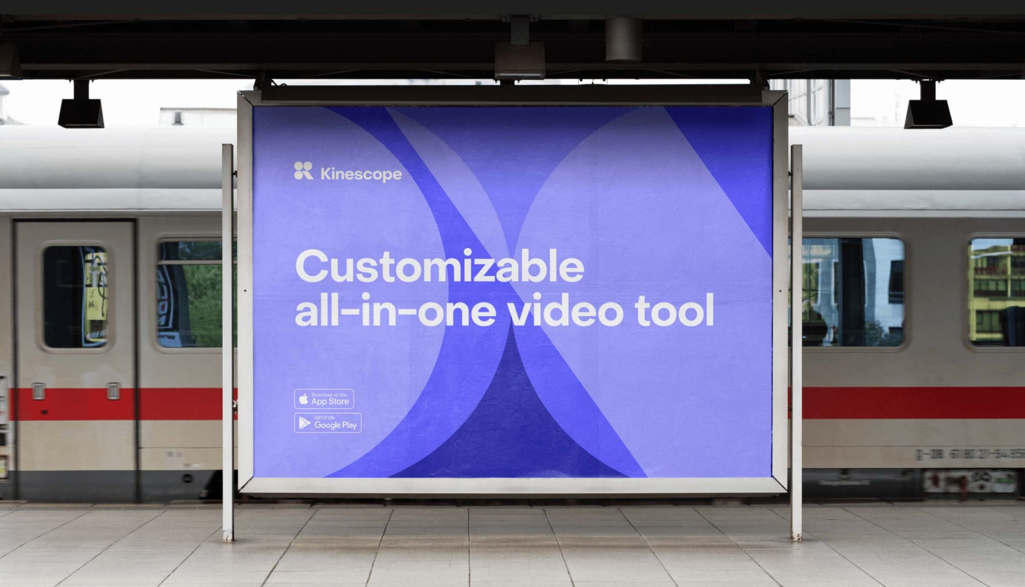
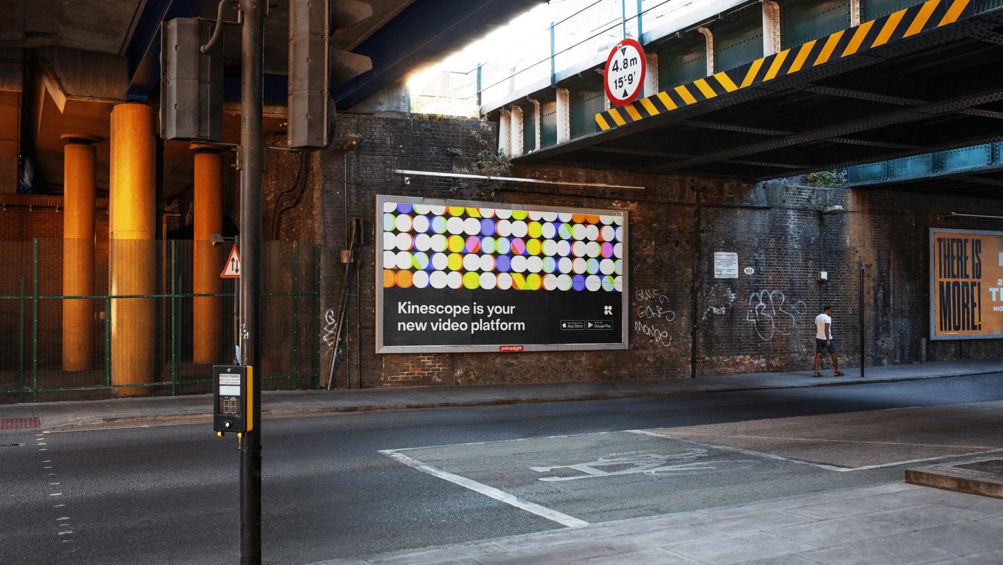
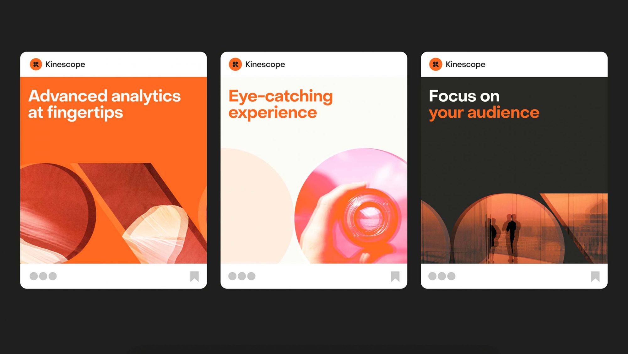
Kinescope: Brand Identity & Website | Moscow / St. Petersburg, Russia
Embacy Team


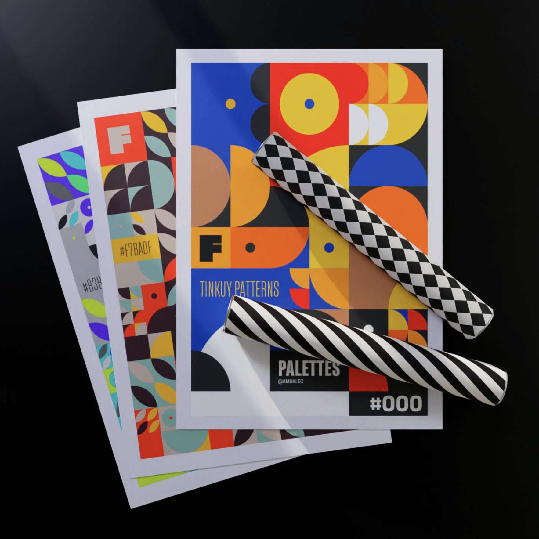
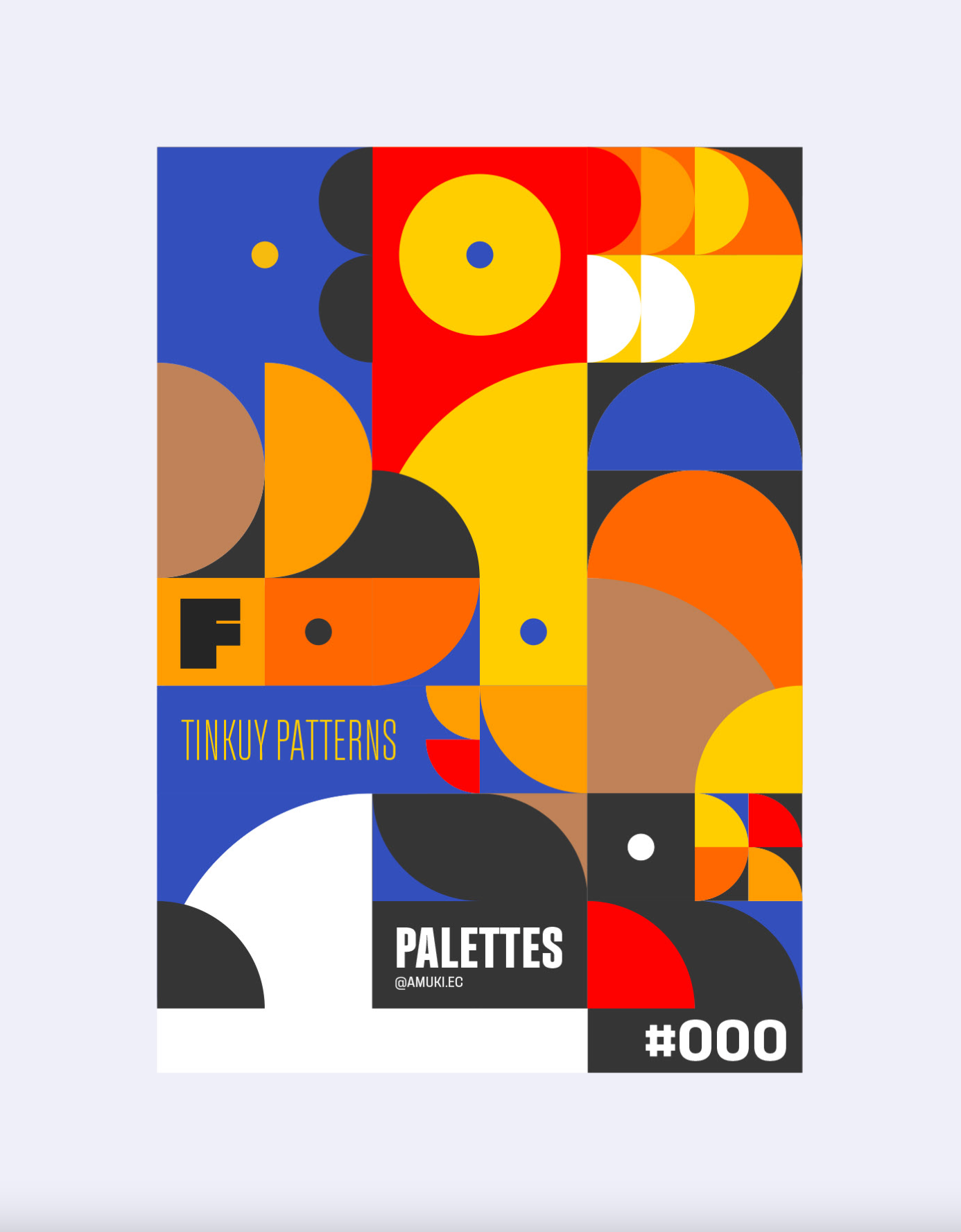
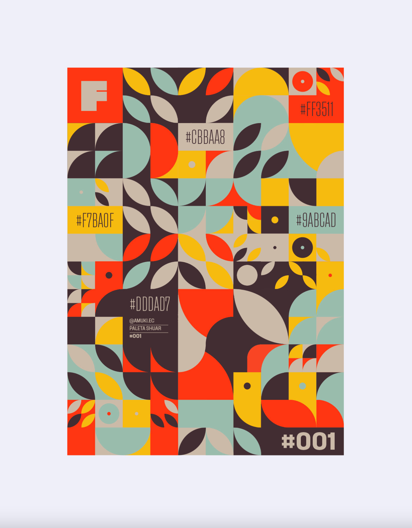
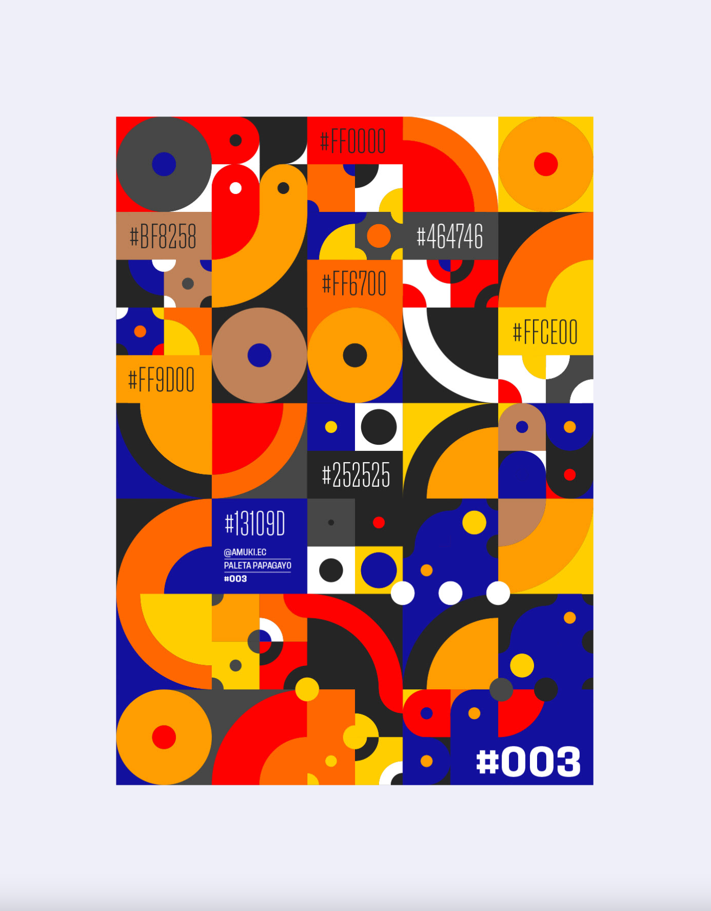
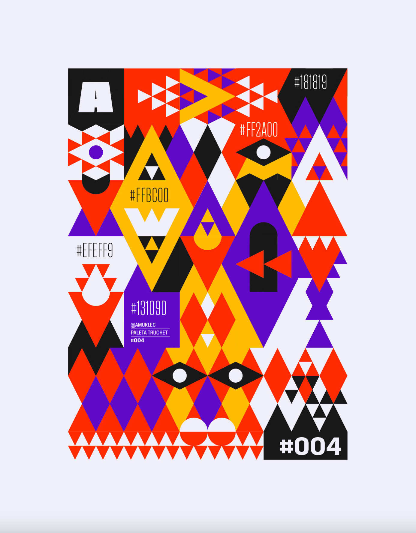
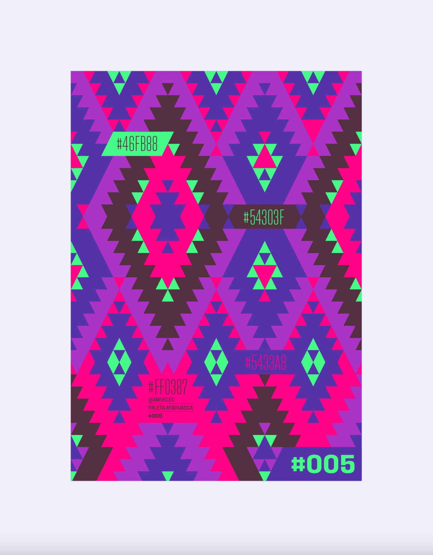
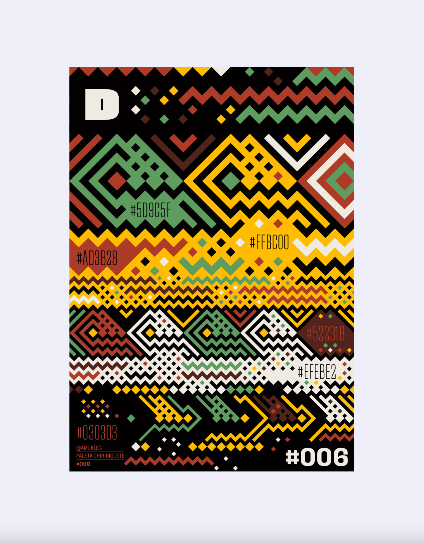
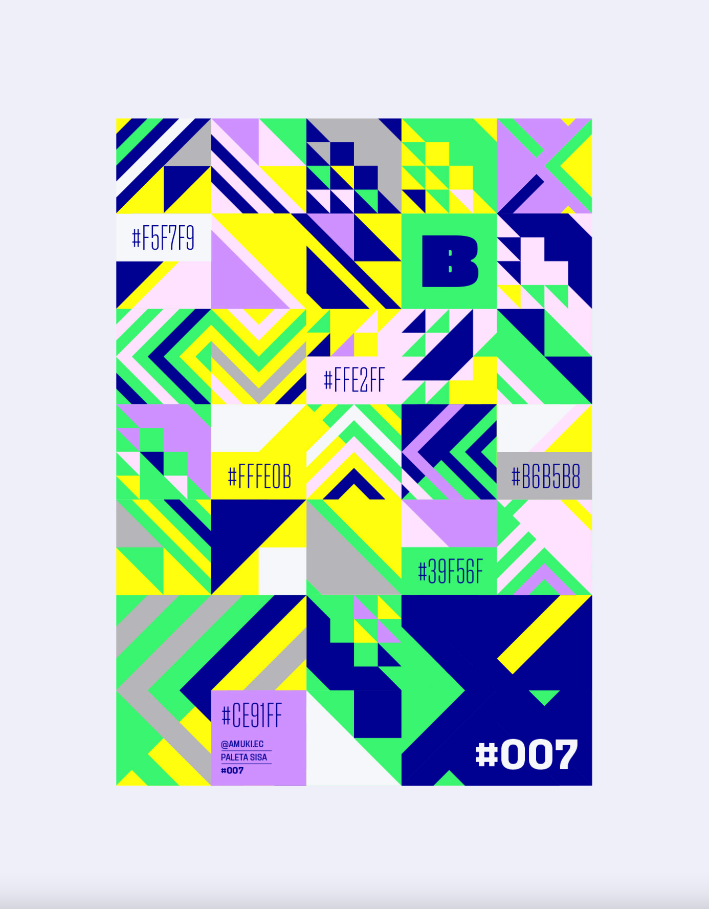
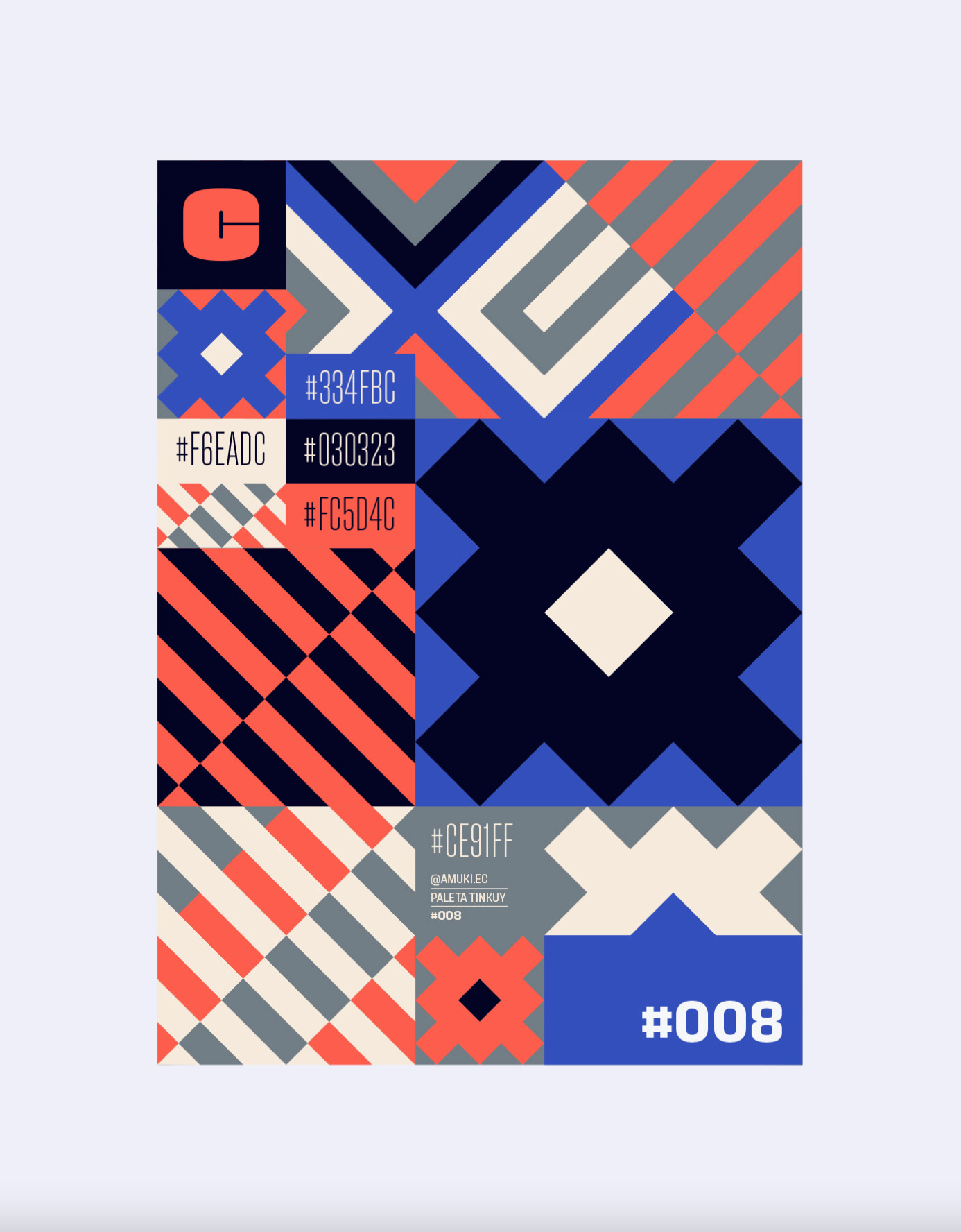
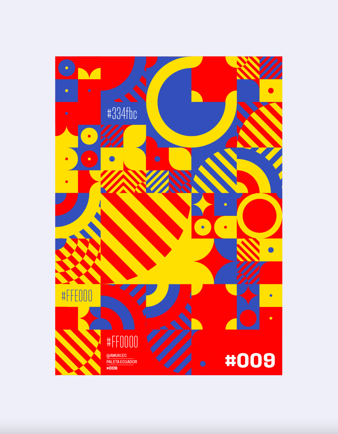
Tinkuy Patterns Posters. Vol.1. | Loja, Ecuador
Amuki Studio

A Christmas wish come true—One night at the house of ‘Home alone'

The NFT work to help understand the stakes of the climate crisis | NFT DEB