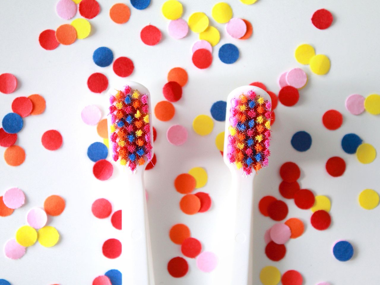
Brushing your teeth is usually no more than a monotonous daily routine that blends into the gray of everyday life. This everyday activity is made special by the collaboration of Curaprox Slovensko and Michaela Chmelíčková or Mikaela Lilhops as per her artist alias.
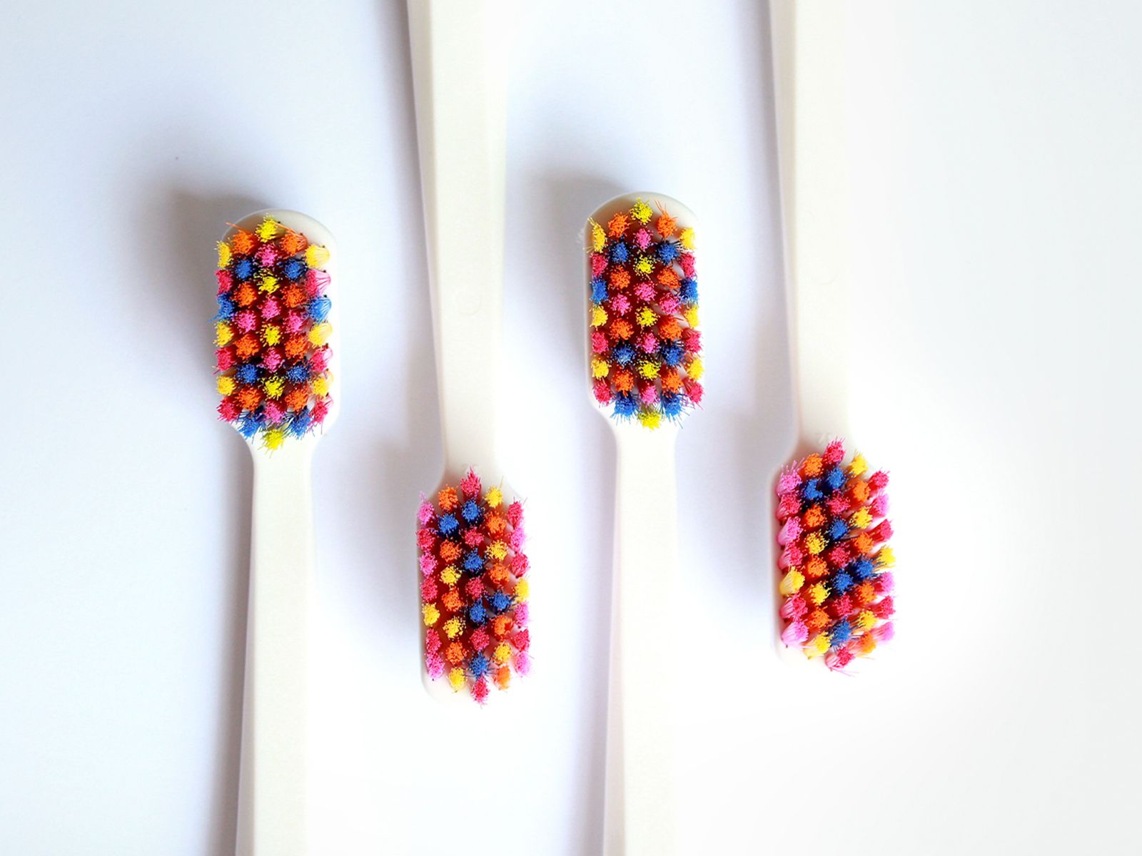
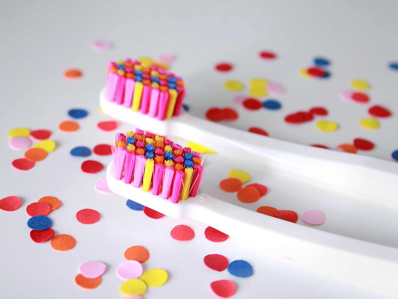
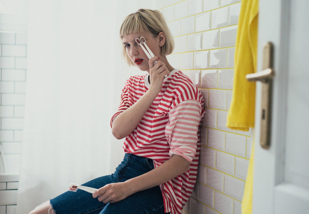
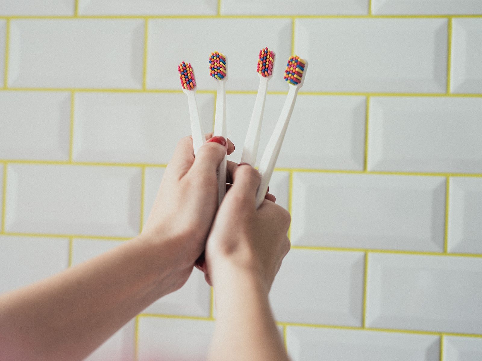
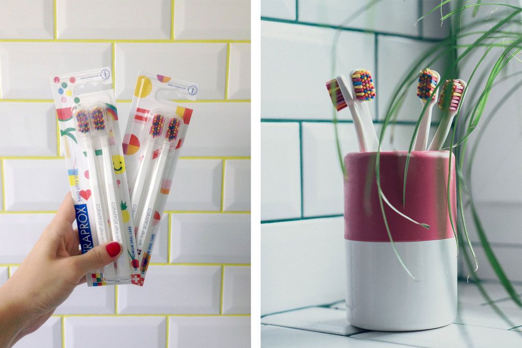
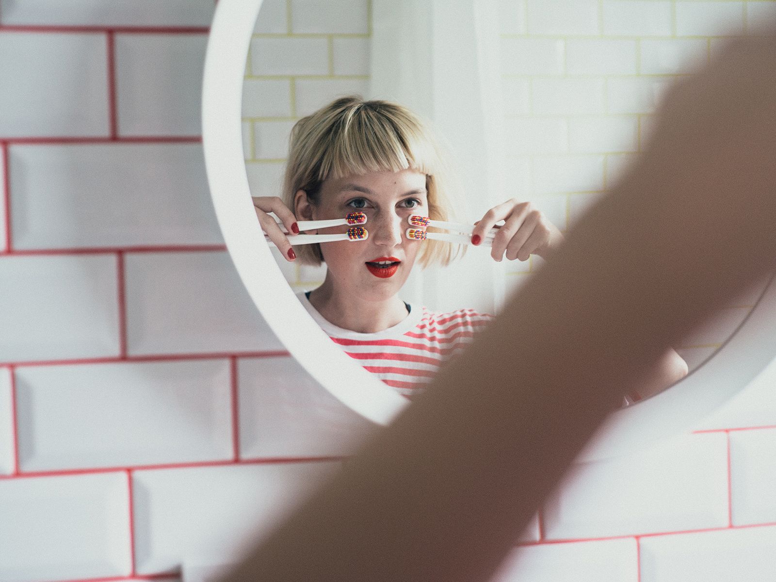
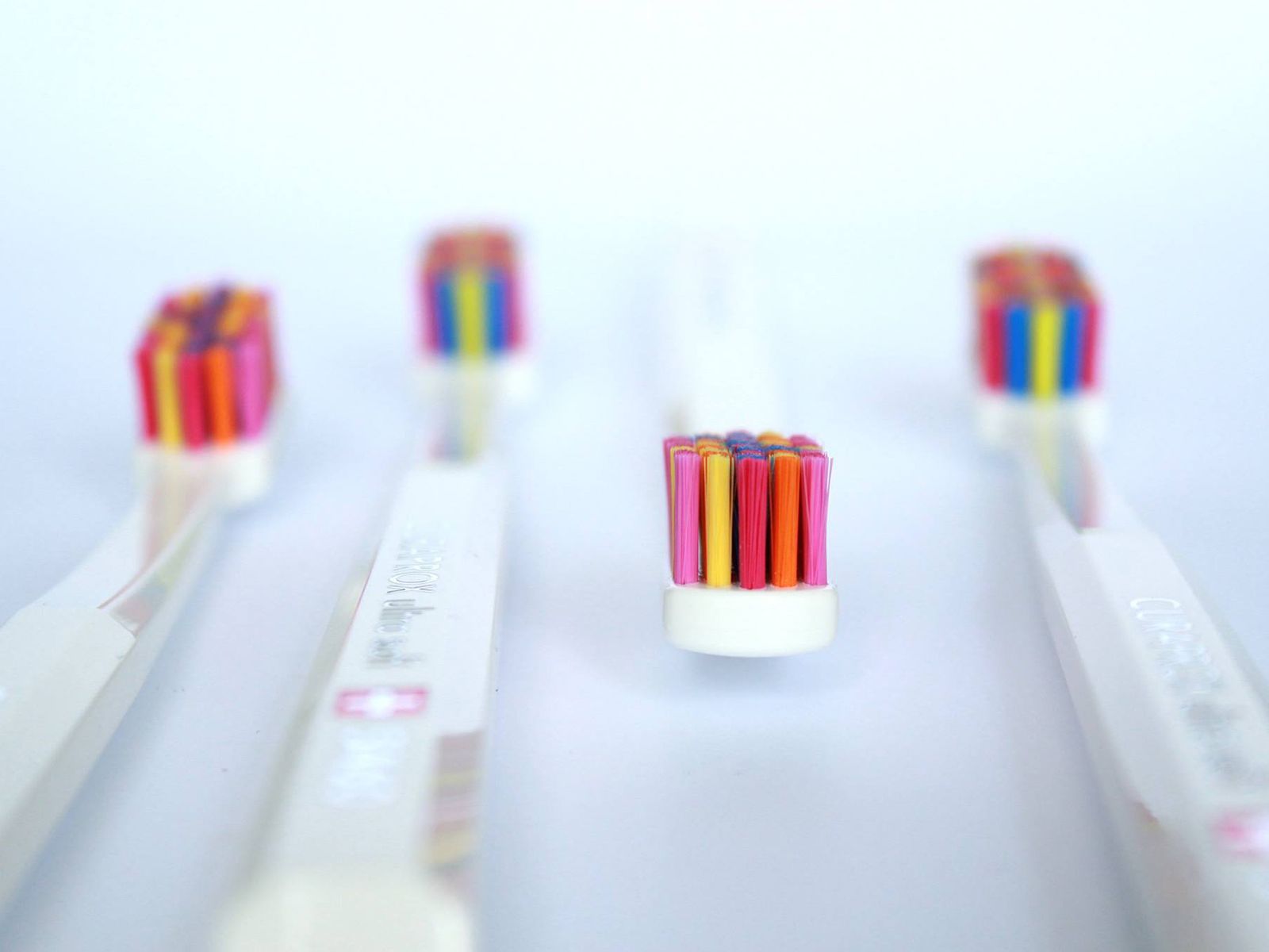
The Curaprox toothbrush brand launched its most cheerful collection in Slovakia a few years ago, with a central element of a smile. Slovak graphic designer Mikaela Lilhops gave the toothbrushes and their packaging colorful and playful elements: the color of the brightly colored bristles, reminiscent of candy, varies from strand to strand. Vibrant shades are complemented by a simple white color that highlights the colorful elements, resulting in a minimalist and compact object that is a pleasure to use.
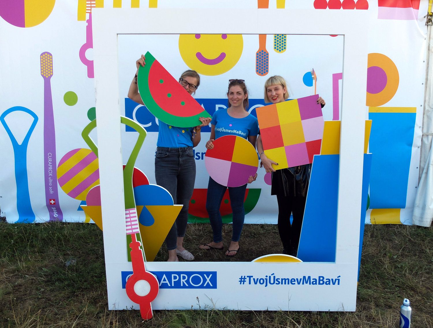
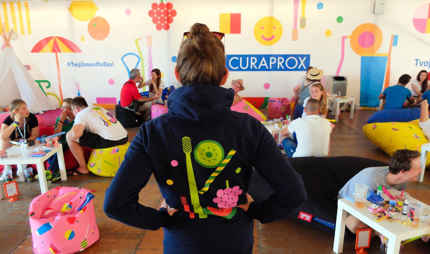
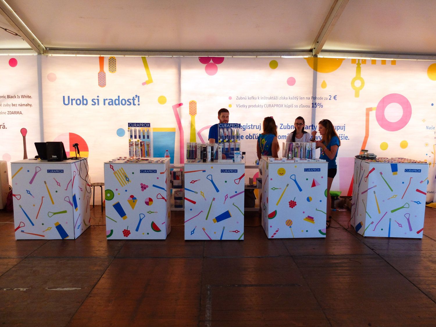
The Curaprox Slovensko Pop-Art edition has meanwhile received an international license, so the toothbrushes are now available not only in Slovakia but also in other countries. Curaprox’s other collections are similarly well-considered, the brand also collaborates with other artists, and as part of the Pop-Art collection’s campaign, it also draws attention to the importance of oral care among young people.

Curaprox | Web | Facebook | Instagram
Michaela Chmelíčková | Web

Modern churches | TOP 5

Metaurbanism in practice | The projects of Urbanum
