“Dare” means: “to venture”, “to pick up courage”, “to be brave enough.” Graphic designer Fanni Demecs and former chief archivist István Zámbó, true to their brand name, dared to dream big, and founded their own graphic design studio. Nomen est omen, there’s nothing else to say. We present you Studio DARE!
When and how did the story of Studio DARE begin?
Isti: Fanni and I started dating in 2011, then we moved together after one and a half years, and lived the regular life of university students. Fanni studied at the department of graphic design of MOME, and spent half year in Copenhagen on Erasmus at KADK (The Royal Danish Academy of Fine Arts – the Ed.), and then she worked in Stockholm for three months, at Bedow Studio
I completed my bachelor studies at the department of history of the Faculty of Humanities of ELTE University, and then completed the archivist MA course. Then I worked five and a half years at the Budapest Capital Archives, which I left as a deputy head of department chief archivist at the end of 2018. For me, this gives the brand name we chose a special symbolism: I dared to change and start something new from the public sector, from a completely different field, leaving a successful career behind. I needed to become my own employer and I needed to take control. A family business seemed practicable for both of us, as we saw many examples of this setup being successful. The past year with Fanni fully validates my decision completely.

Fanni: The idea of our own studio already conceived during my Erasmus program, and this is what I kept in mind when I applied for an internship. I learnt a lot from the founder of Bedow, Perniclas Bedow, not only about design, but about what it is like to work in a studio. After finishing university, I worked as a freelancer for a long time, and I worked in some film productions (“The Spy Who Dumped Me” – 2018; „Hanna” – 2019). At the beginning of 2018, Isti and I finally formulated the idea of doing a business together, but we had to wait almost a year for the stars to line up, until finally in January 2019 Studio DARE was established.
The studio consists of the two of you: Isti participates in building the brand as a project manager, with Fanni being the art director. How is the work divided between you two?
Isti: One of our main goals with creating our studio was to allow Fanni to concentrate primarily on design tasks, as may it be about sole entrepreneurship or a company encompassing a few people, organizing the work and administration take time. I mainly focus on organization, which includes any work that is not a graphical task in addition to daily administration duties. Moreover I continuously develop myself: lately I have been intrigued by creating websites, as we concluded from our enquiries that there is a demand for less complex websites functioning as an online “business card. We try to satisfy this need in the case when the studio creates the entire visual image of the client.
Fanni: We tried to organize our work processes in a manner allowing everyone to do what they are good at. I design and take care of visual tasks, and Isti manages all there is to manage: he replies to emails, takes care of our taxes, invoices and looks up anything I need. As we have put it on our website: „Fanni: art director.brave.creator of visuals. Isti: projectmanager.smart.the most detail oriented researcher.”
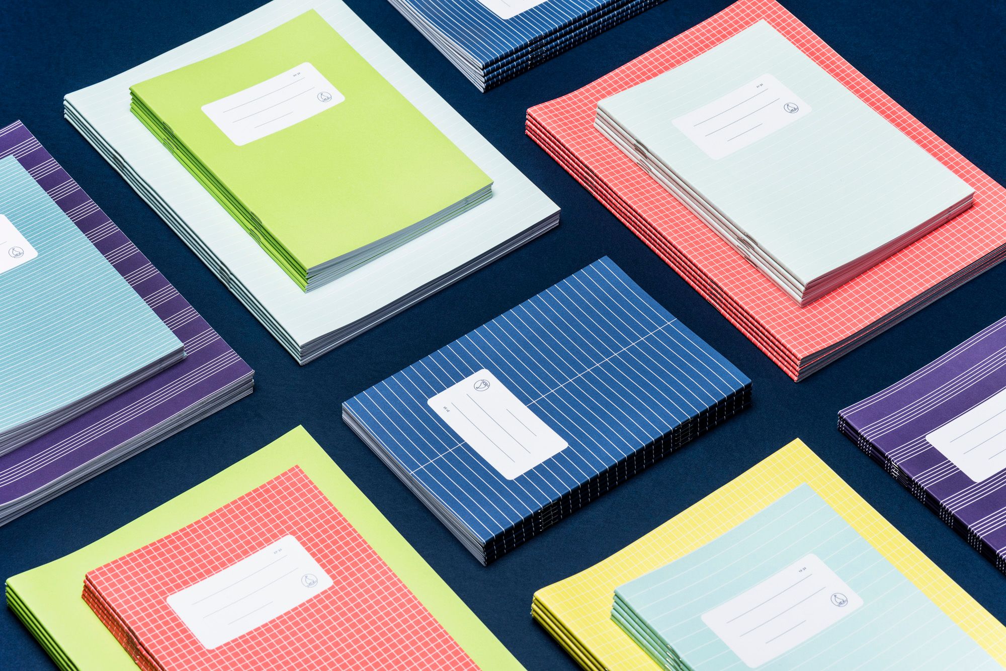
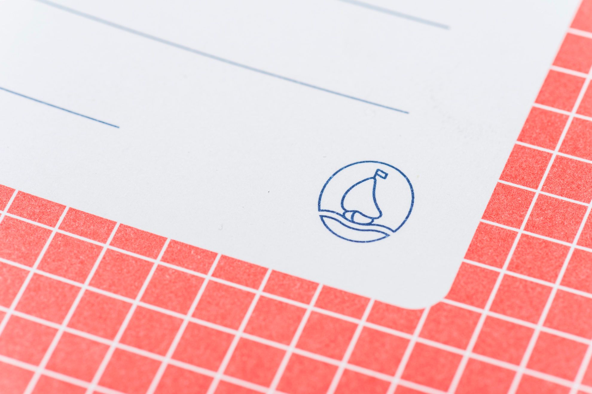
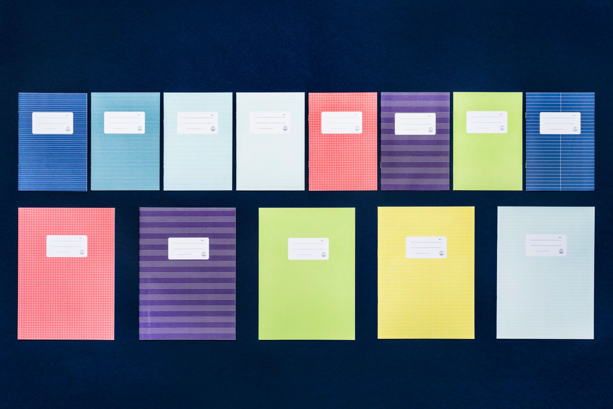
Everyone remembers the lined and squared exercise books from their elementary school days: generations studied from the notebooks produced by Fűzfői Paper Factory since the ‘70s. How did you get in contact with the paper factory, and why did such an iconic product need a redesign?
Fanni: It all started with me searching for a theme for my thesis while I was on Erasmus. The environment in Denmark was very inspiring and I observed how much they cherish, wear and buy their own products, that for them it’s the most natural thing to do. I wanted to do something with this phenomenon in Hungary. This is how I ended up looking at older Hungarian brands. The “small boat” notebook collection seemed like an ideal choice from several aspects: I saw potential in it, its history was researchable and as I am originally from Veszprém, a good amount of provincialism also played a role in my decision. In writing my thesis, I asked for help from Fűzfői Paper Factory regarding brand and factory history, and although it wasn’t a requirement in the thesis, I also designed the notebooks just for fun. They grew to like the new design so much that they contacted me after graduation saying they wanted to use it. On the one hand, I wouldn’t say redesign was necessary: this is one of the cheapest notebooks in the market, the target group that it addresses will buy it either way. On the other hand, I consider it extremely important that students also encounter visual culture outside of the “Disney-Marvel-kitten-racecar” line, and if someone cannot afford this, they should still have a good quality notebook in their hands.
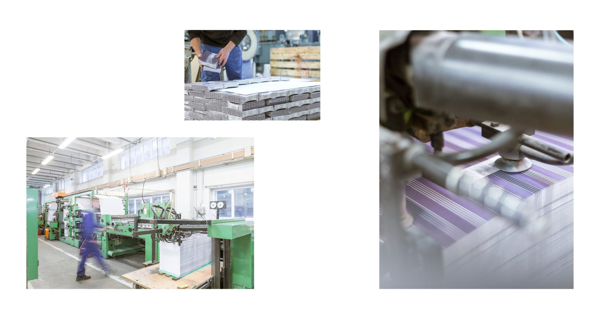
What I did in brief was assessing the qualities that make these notebooks recognizable and the qualities that can be changed. Clearly the colors, the vignette and the lining also visible from the outside had to stay. I harmonized the colors to each other, the difference between lined notebooks for elementary school students is more emphatic, thus helping mothers in orientation. There were two lines on the vignette from the very beginning, yet every child writes three things on their notebooks: name, subject, class – therefore, the new notebooks have three lines. I also removed the red frame, with which we saved a printing plate, this way almost every notebook is two-color printed, and the dark blue is only one-color printed.

We also changed the quality of the paper and the color of the inside page, but the average users will not realize this, and that’s alright. These aren’t big changes, yet the notebook gives a more high quality experience to the user. The best example for this is my grandmother. When on Sunday I brought the first new notebooks freshly taken from the printing house and handed them to her together with the old ones, she didn’t know what to say, and finally she only said: “But this is all the same!” Yes, only a bit more modern, a bit more cost-effective and a bit better to hold in our hands! This is what I wanted to achieve. Since then, I have worked with the company on several occasions, and last year they sponsored the drawing competition of the studio, which we announced to first graders and second graders in Veszprém county.
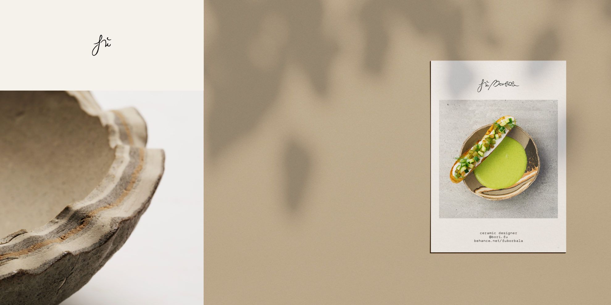
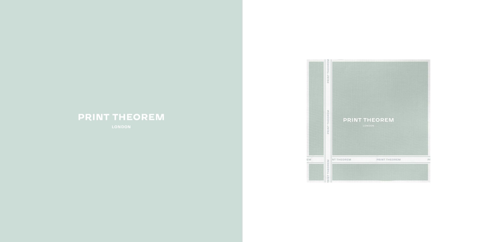
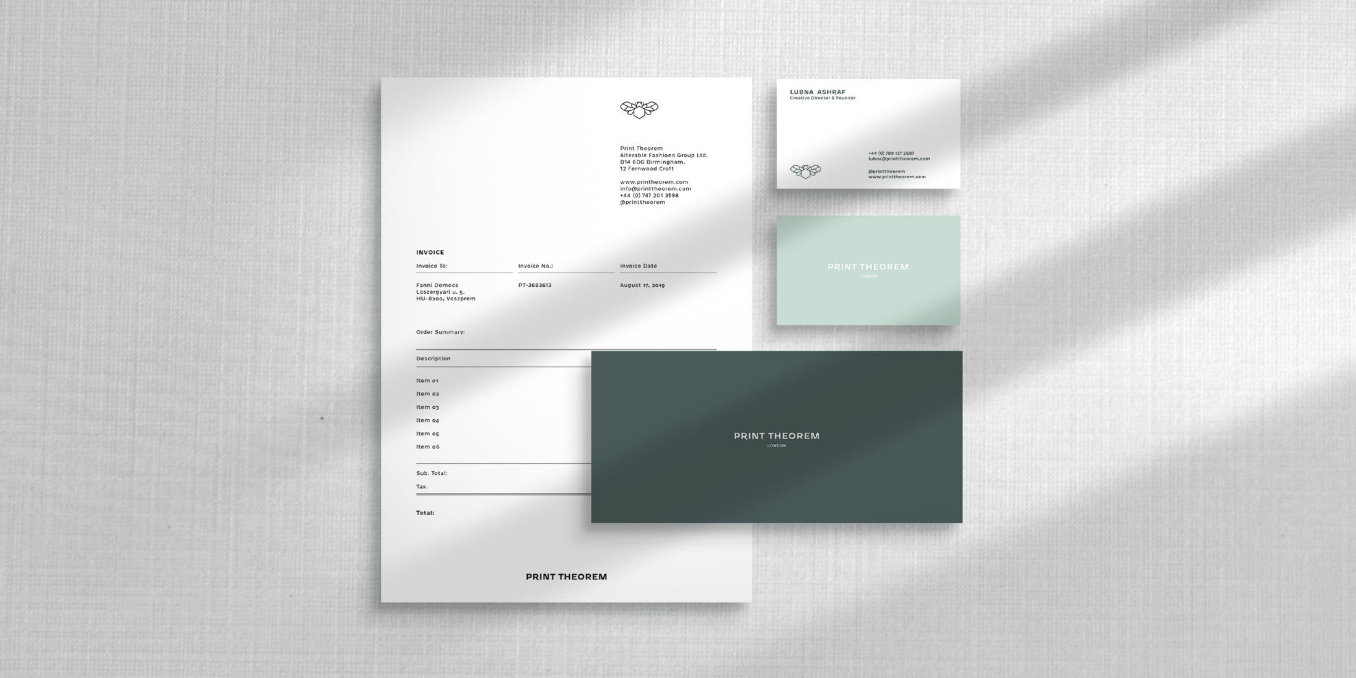
Ceramics designer Borbála Fű and London-based fashion company Print Theorem are also included in your clientele. One of them is a Hungarian single-person brand, while the other is a foreign luxury brand. Could you tell us a bit more about these partnerships? What experiences did you gain through them?
Fanni: With Bori (Borbála Fű , the founder and designer of the brand Fű Borbála ceramic design – the Ed.) we sat next to each other in high school, and have been close friends ever since. She is a professional in her job and it was natural for us that we would design her logo. A single-person brand, especially if it is a friend’s, is the easiest scenario: I know the style, the person and the jobs, so this project is quite easy-going and it is continuously expanded depending on what the brand needs.
We started working with the Print Theorem brand in 2016. Lubna Ashraf, the founder of the brand found me on Behance, and asked me to design a look book. The sample collections are always built on a given narrative, usually they respond to some kind of relevant social problem, which we can also support from the bottom of our heart, and we are happy to design for them. We develop the brand by joining our forces, and at the end of 2019, we also started updating their complete image.
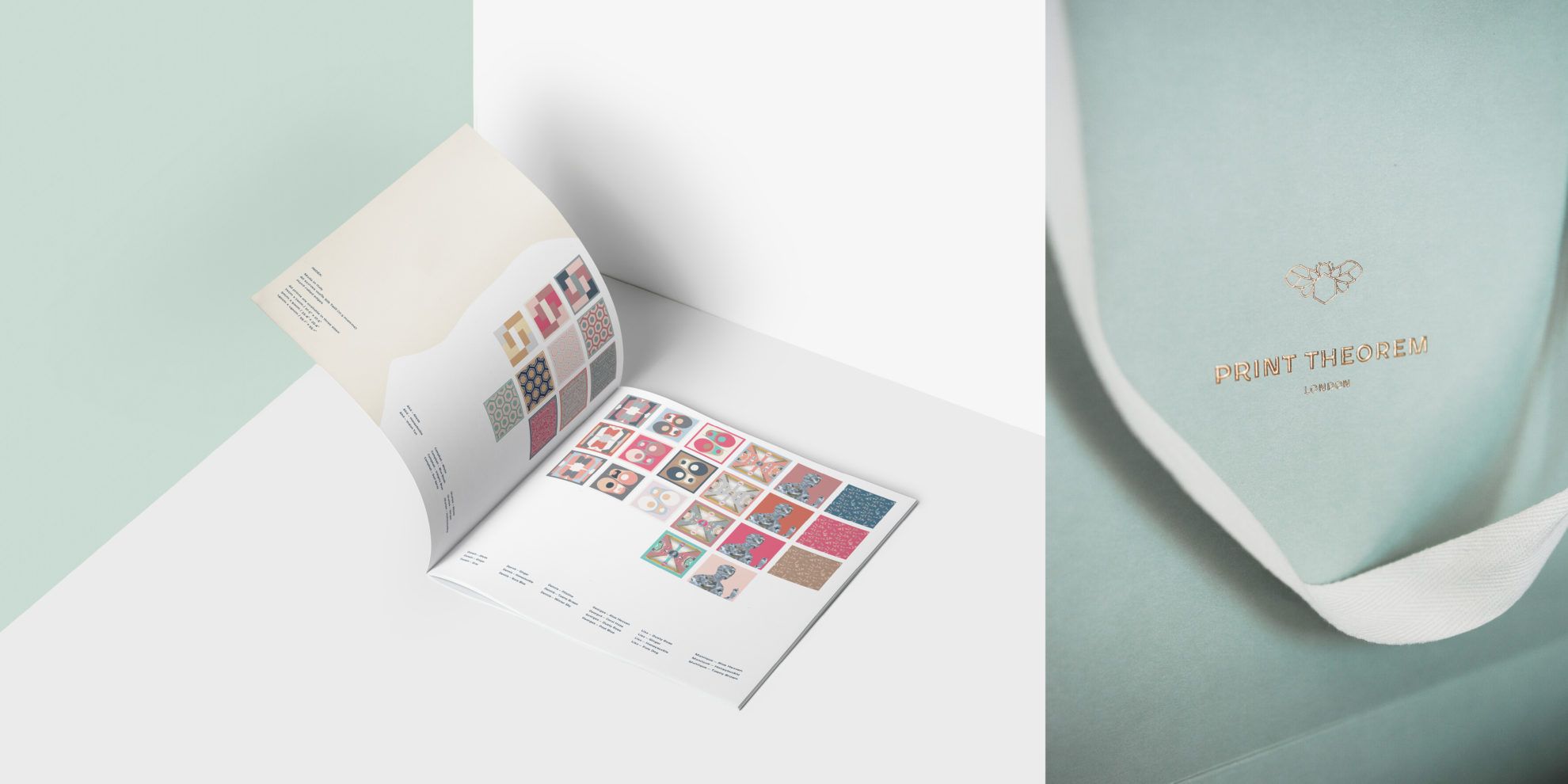
Many times, the clients themselves inspire us greatly: their attitude towards work, their creativity and vision. We gathered a lot of experience about work organization as to how good and viable remote working is if both parties see the project realistically and communicate with the other. A large part of our work consists of organization, intelligent thinking and communication – we try to do these better in each of our projects. We love establishing partnerships with other creatives and companies, because the spark that brings great success is there in their eyes, too.
What projects do you work on at the moment? How do you spend your days?
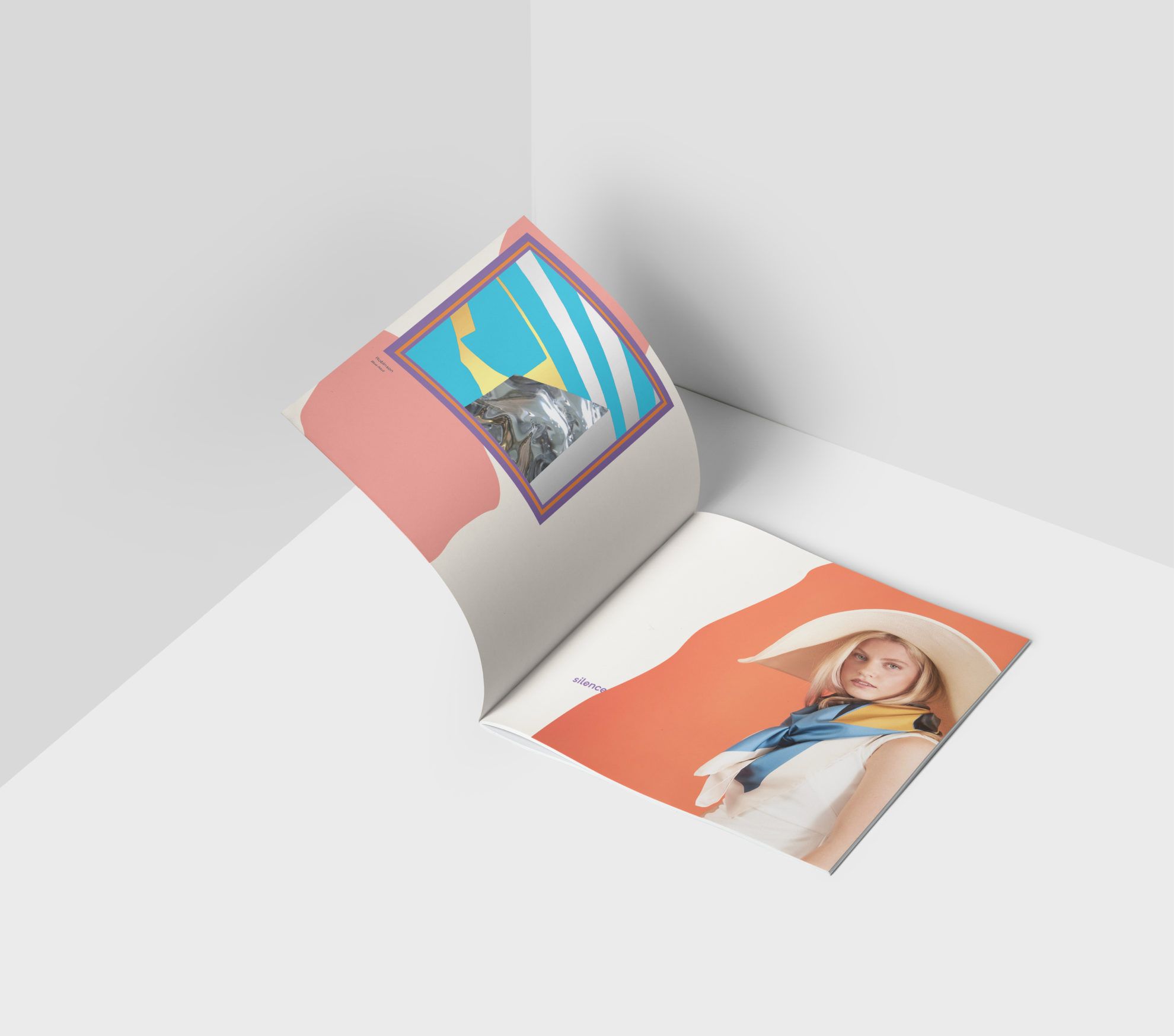
Fanni és Isti: We have been working in home office ever since we became a company, and we had been thinking about moving from Budapest for some time now. After a quite intensive film project, we relaxed for a few weeks in Canada, and then moved to Veszprém in February, we established our lives and the studio here. Of course we go to Budapest regularly, to personal meetings or press starts, but we control the processes from here on the whole. Now we work on some smaller images, our days go by with typesetting and designing covers. In the meantime, designing the packagings of Print Theorem and another Hungarian skincare product is also in progress.
Our lives have not changed much, there are more e-mails and Facetime calls during the current situation, but we keep on working the same as before. Veszprém will be the European Capital of Culture in 2023, this also inspires us to come up with new ideas, and whenever we have some time, we try to dedicate it to our personal projects.

Stay Sane – Stay Safe | Posters to find strength in
Object fetish warm-up! – In pursuit of the coronavirus set