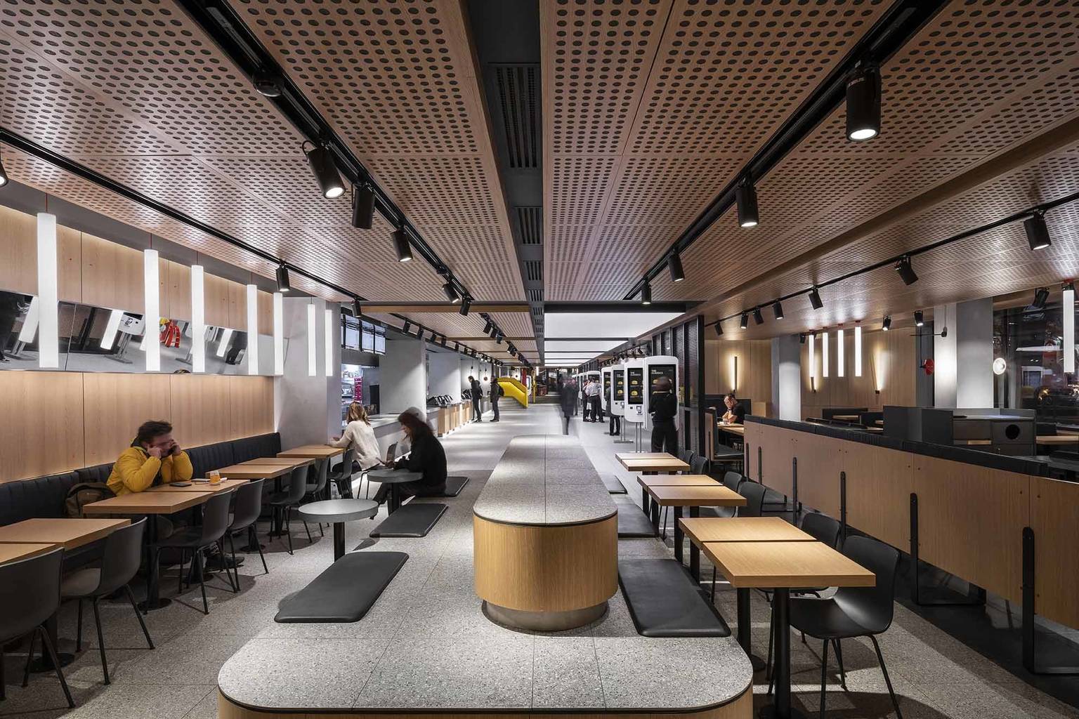
For the 30th anniversary of its opening, Moscow’s first McDonald’s restaurant went through a major transformation. The unit located at the buzzing Pushkin square is one of the busiest McDonald’s restaurants in the world, however, the basic concept of its renovation was to allow everyone entering the restaurant slow down a little.
The line in front of the McDonald’s in Régiposta utca in 1988 is of a memorable length for many – but it’s nothing compared to the one at the opening of the first McDonald’s in Moscow. It’s true, however, that the restaurant operating at Pushkin square opened almost two years after ours, so the people in Moscow must have been even more eager to taste the famous hamburger: On January 31, 1990, according to estimates, 38,000 people waited for hours to get their hands on the first Big Mac of their lives. The experience proved to be cathartic, indeed: “it felt as if I was taking a bite of America” – said one of the people waiting in the line, currently 53-year-old Andrej in the anniversary article in Voice of America.
This way, it makes complete sense that when the renovation of the unit in Pushkin square came up, only monumental ideas were considered (as the restaurant is quite monumental itself, with its 1087 square meter floorspace and three stories). Surprisingly, a quite humble proposal won: the project was assigned to Australian Landini Associates group, who tried to take a backseat with the interior by following the principle of non-design, and support the meals, service and guests from there.
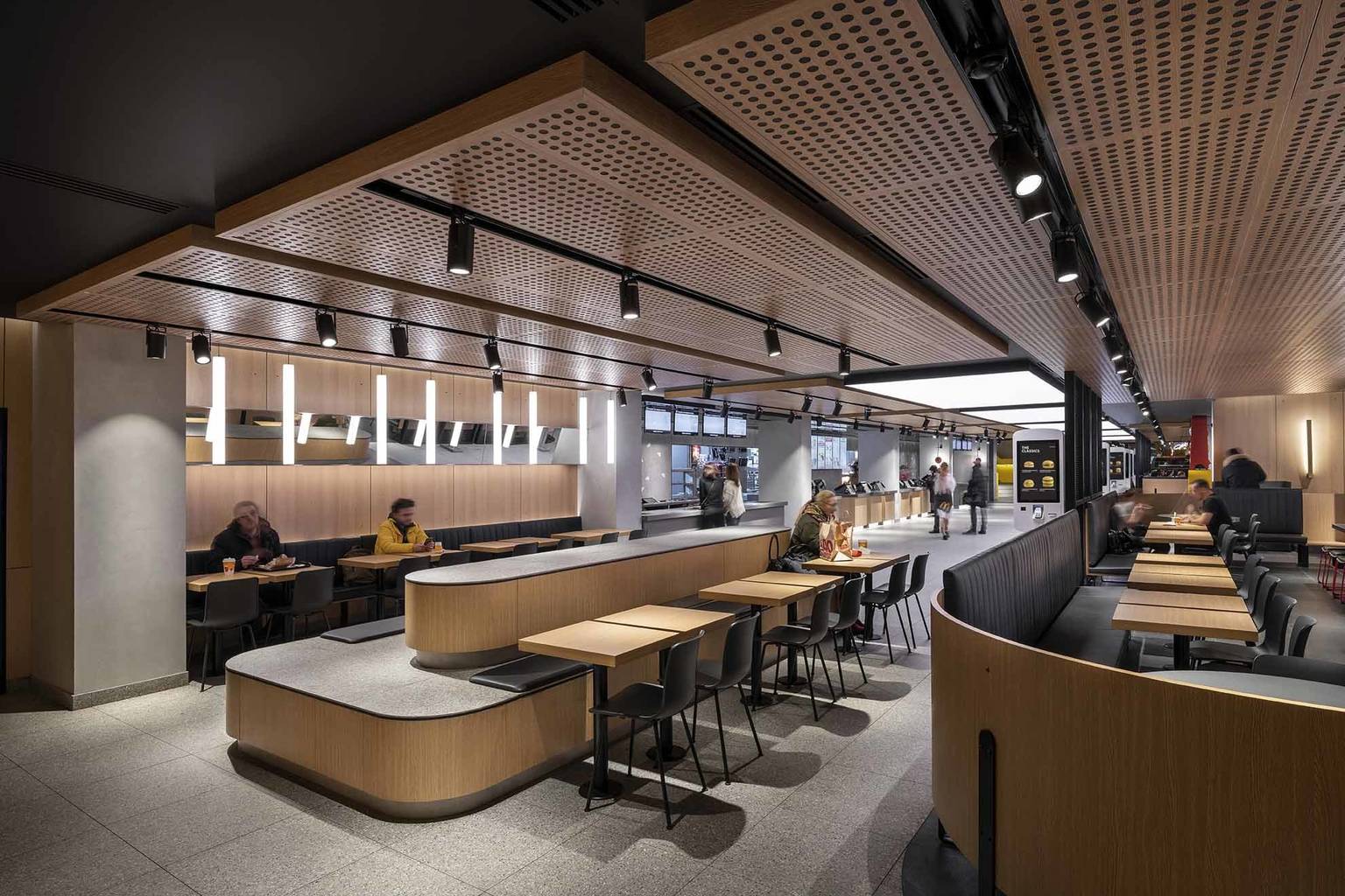
A modern and simple and at the same time recognizable interior was formed this way, where guests meet natural and modest colors and timeless materials as opposed to many other McDonald’s restaurants where loud graphical elements and vivid colors dominate the interiors. Concrete, stainless steel, oak and glass alternate in the space, and the lighting also gives the atmosphere of a bar rather than a fast food restaurant.
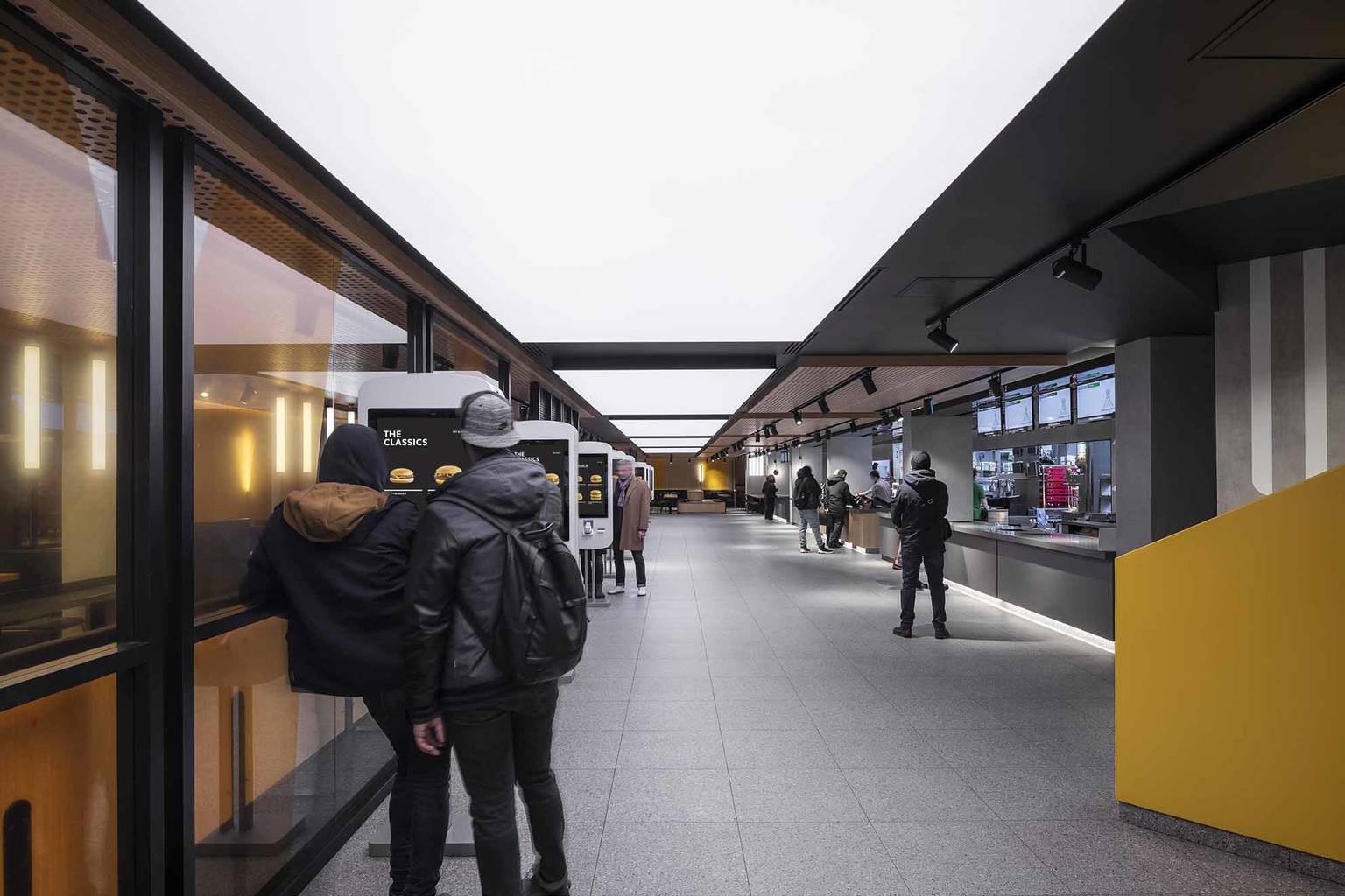
With its flagship restaurant in Moscow, McDonald’s wants to represent something utterly different than before – it wants to distance itself completely from disposability, rushing and poor quality. The words of Landini’s lead designer Wayne Cheng are quite interesting; if we didn’t know, we would never guess in a thousand years that they are about a McDonald’s.
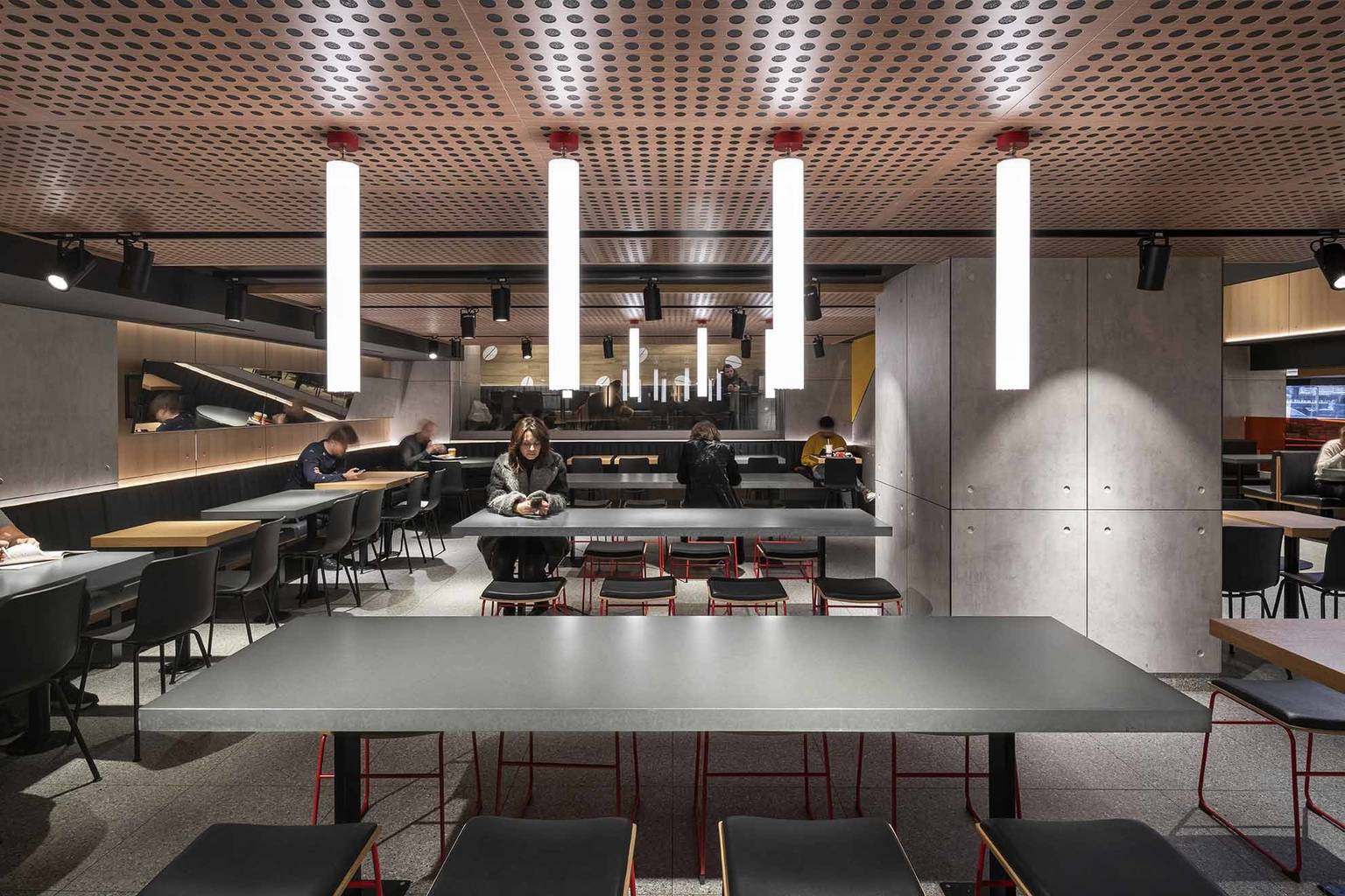
We live in a constantly changing world. There are fewer constants than ever before. Food however is and can be one of these. Eating is a fundamental human interaction. A place of commune where we behave as we have for millennia. We need a visually quiet place to do this in so we can hear each other talk, laugh, argue and cry.
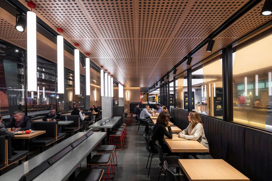
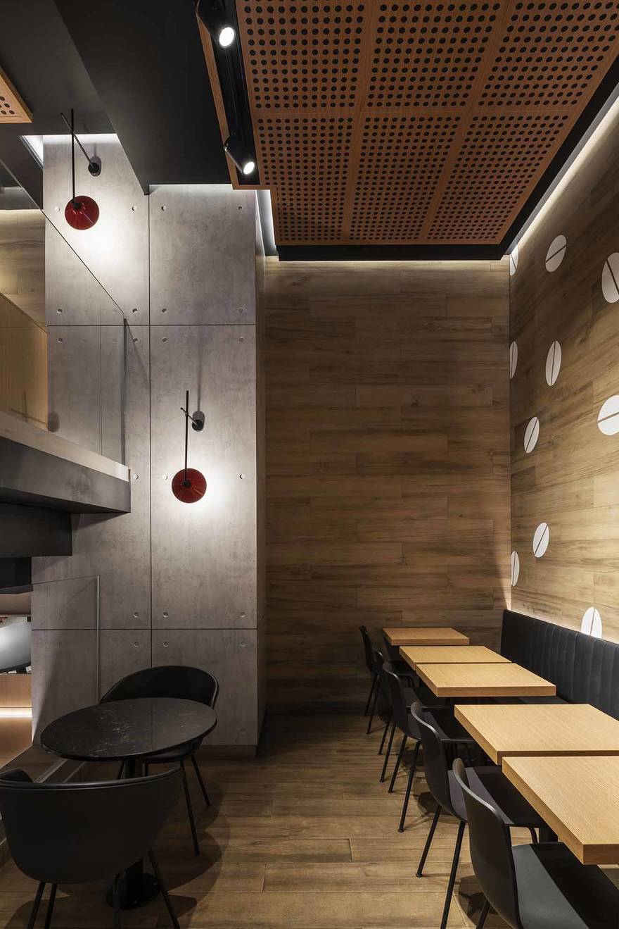
Creating simple places and spaces is much harder than creating loud and fashionable ones, creating memorable simple spaces is harder still. This project overcomes the challenge of creating a quiet, neutral, classic space that is memorable too.
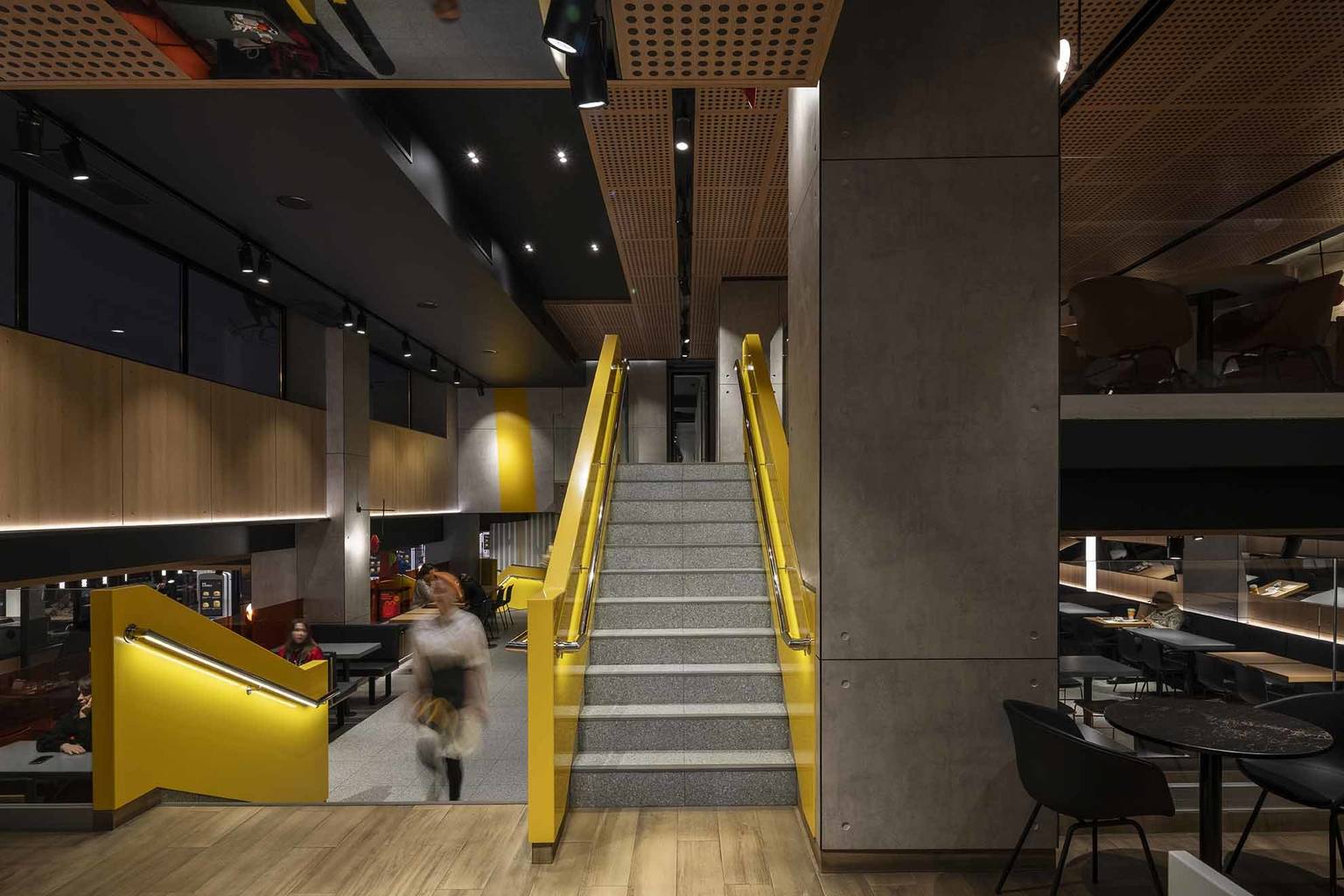
Photos: Landini Associates

Sneaker sculptures built of Lego bricks | Tom Yoo
Adél Zsigmond | Conceptual clothing
