Who doesn’t remember the story of Vuk, Bogáncs, Kele or Tutajos? For many, the first encounter with István Fekete’s youth novels was a defining youthful experience, which we often took in our hands for the first time under school or parental pressure. István Fekete’s animal stories opened the door to the world of imagination for several generations and made children love reading.
The novels The Testament of Aga Koppanyi (1937), Kele (1955), Thorn Castle (1957), Bogáncs (1957), Winter Grove (1959) and Vuk (1965) were published by the Móra Publishing House, with illustrations by Viki Hitka, in a completely new guise. (The novel Lutra is currently being prepared.)

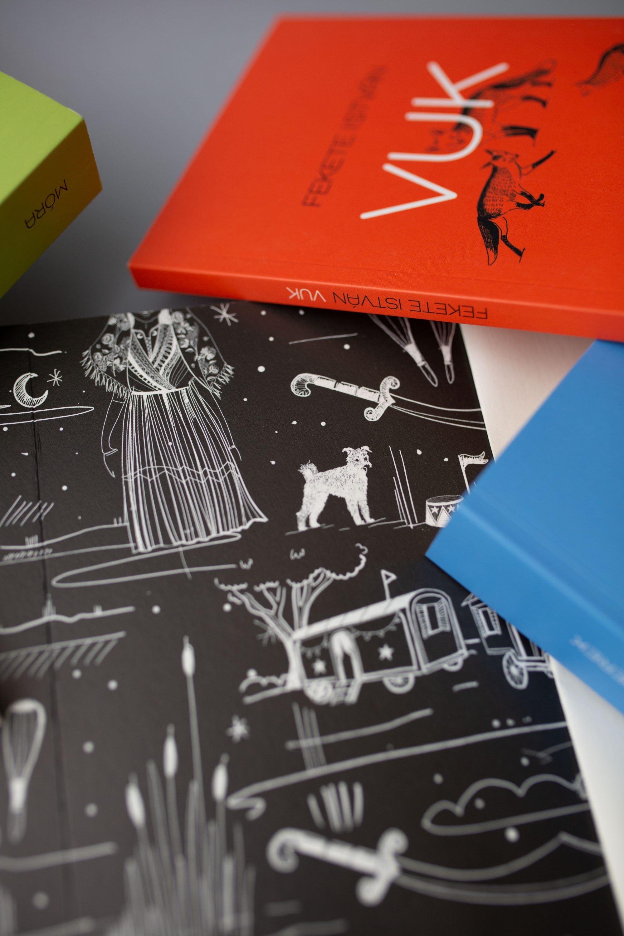
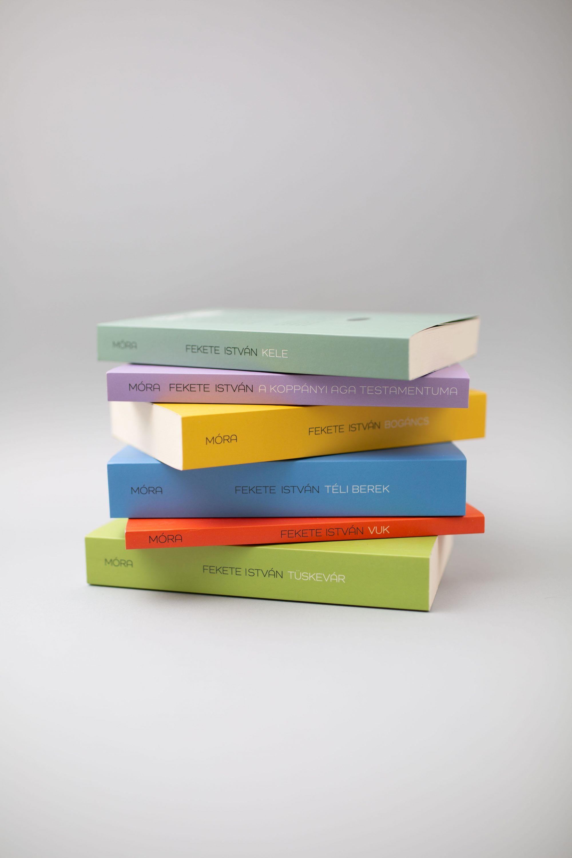
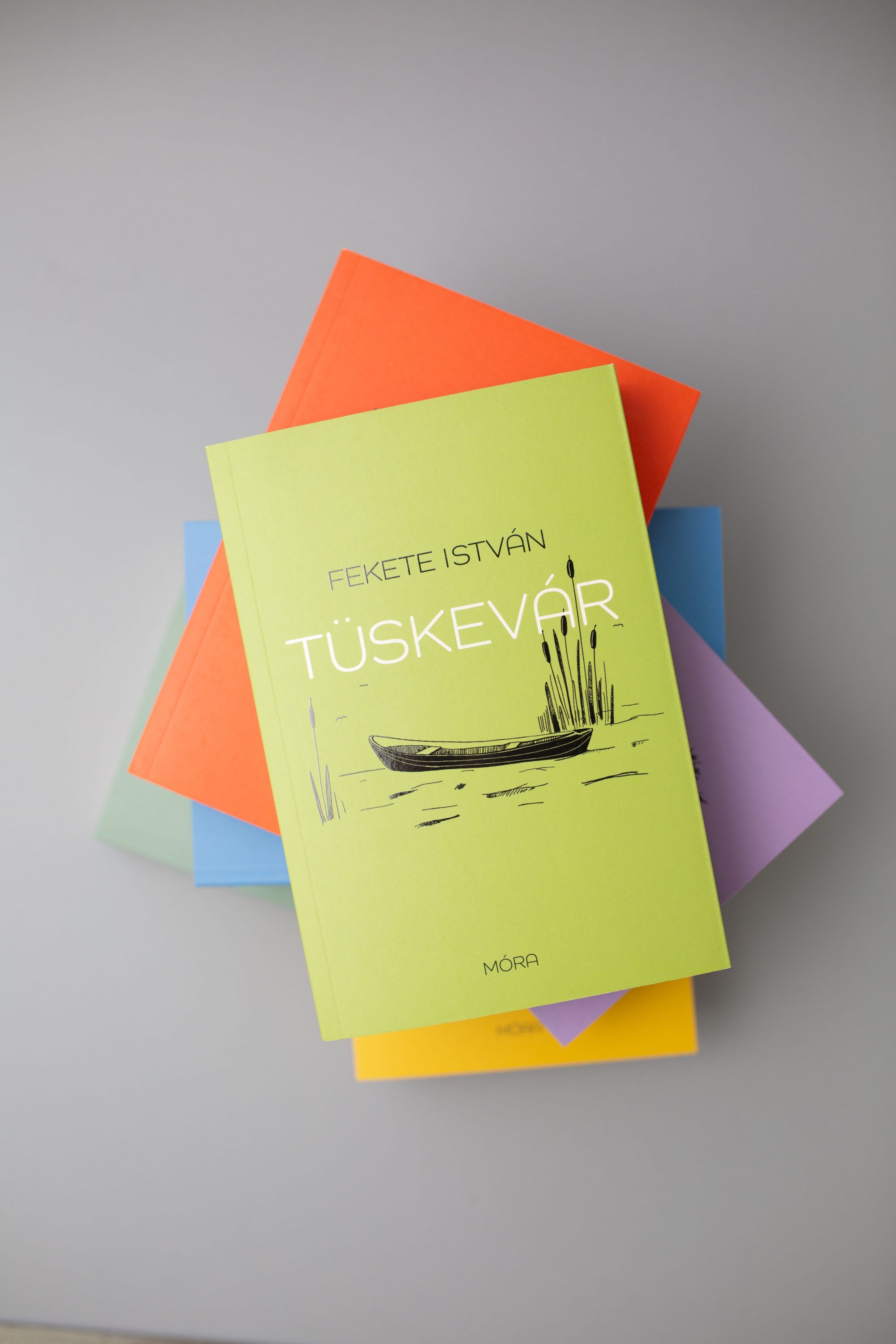
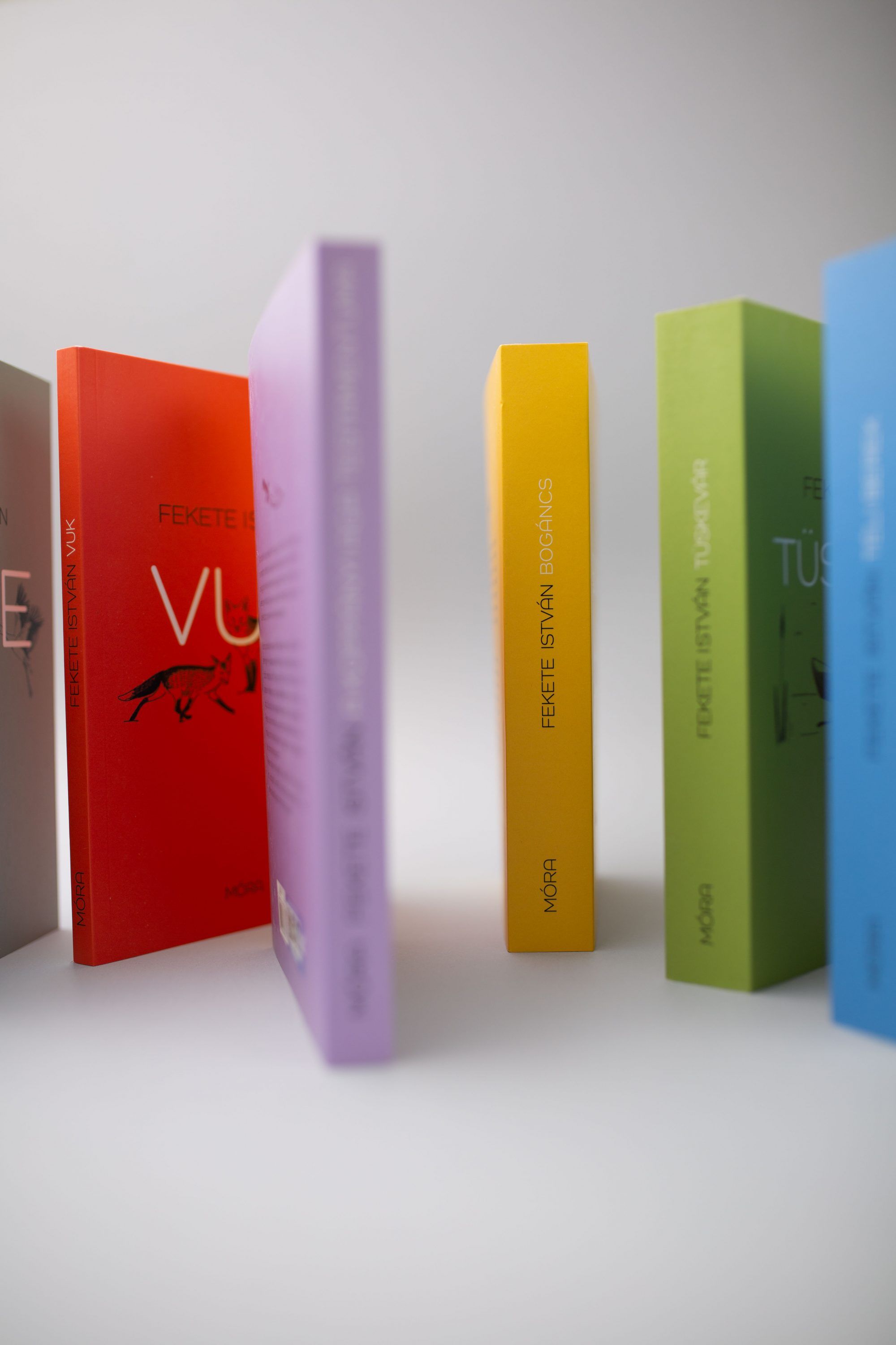
I wanted to have a lot of “silence” on the volumes visually as well, because István Fekete’s detailed landscape descriptions bring me a lot of quietness. That is, the noises of nature, which are very different from what surrounds us in our everyday lives today.
The covers of the volumes (with drawings by Tamás Szecskó, Károly Reich, Piroska Bakai, etc.) have been updated several times in recent years and decades. Now, however, there have been quite recent publications that still respect the original illustrations, and when we see them with adult eyes, we can get in the mood to read the stories.
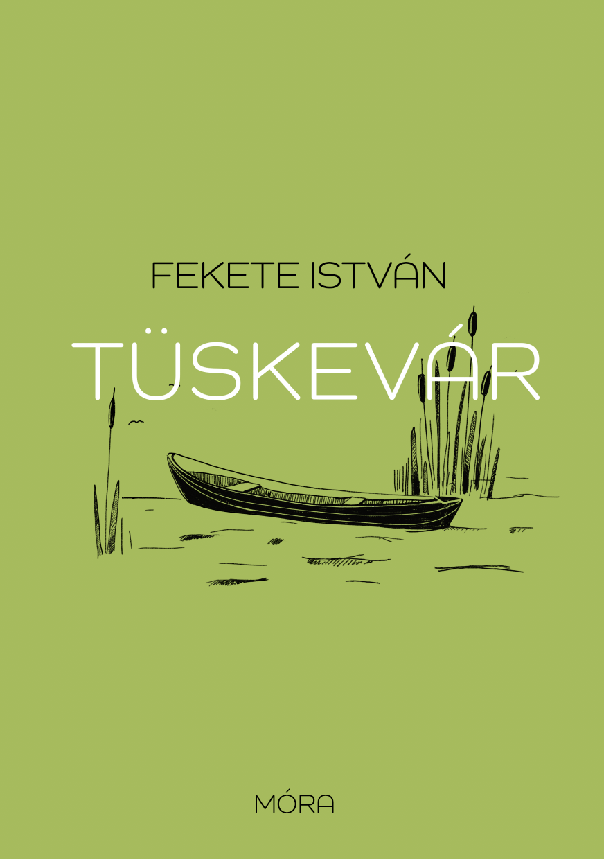
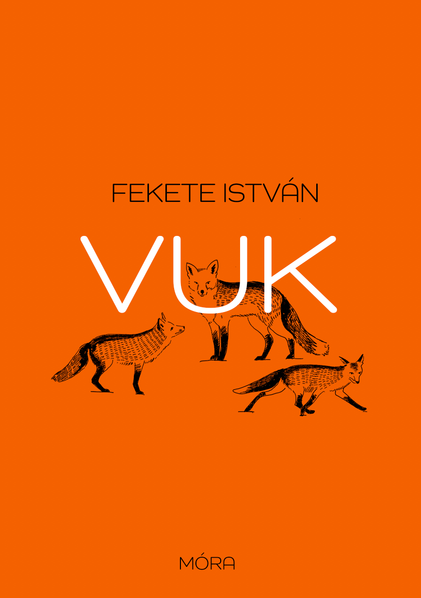
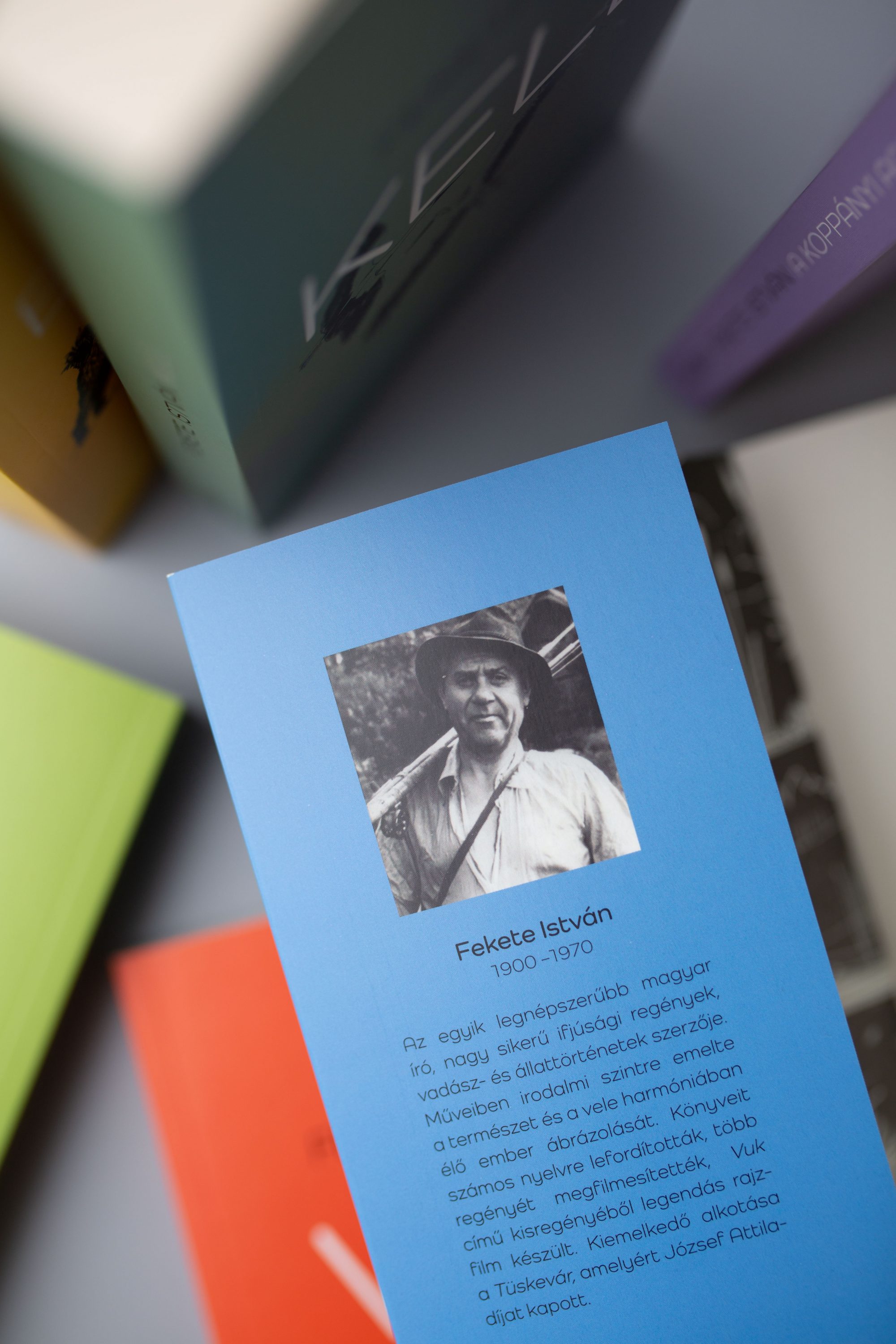
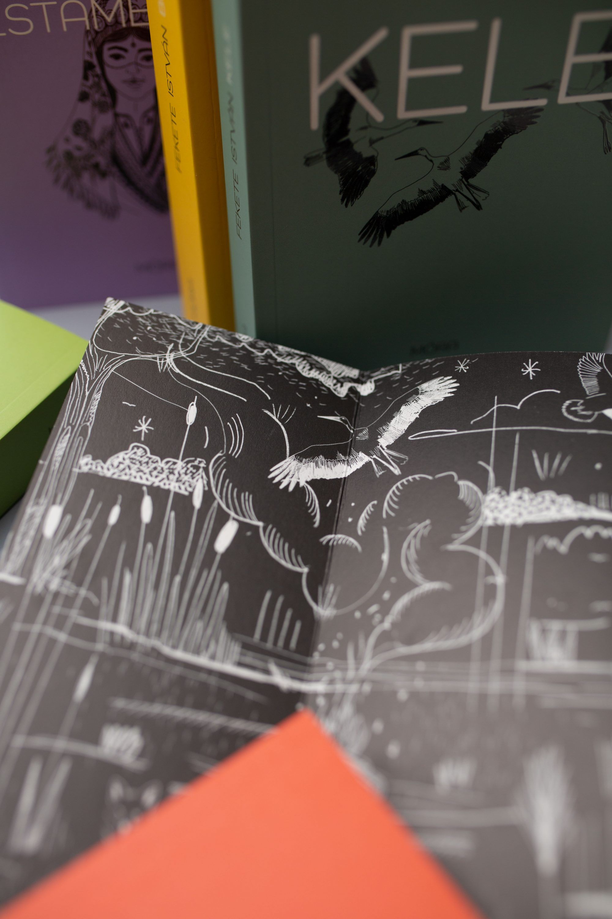
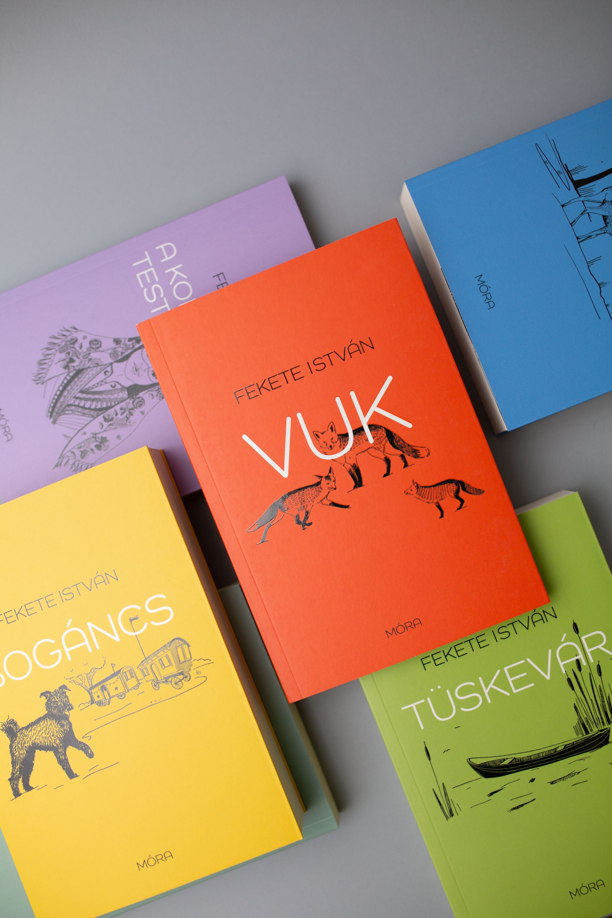
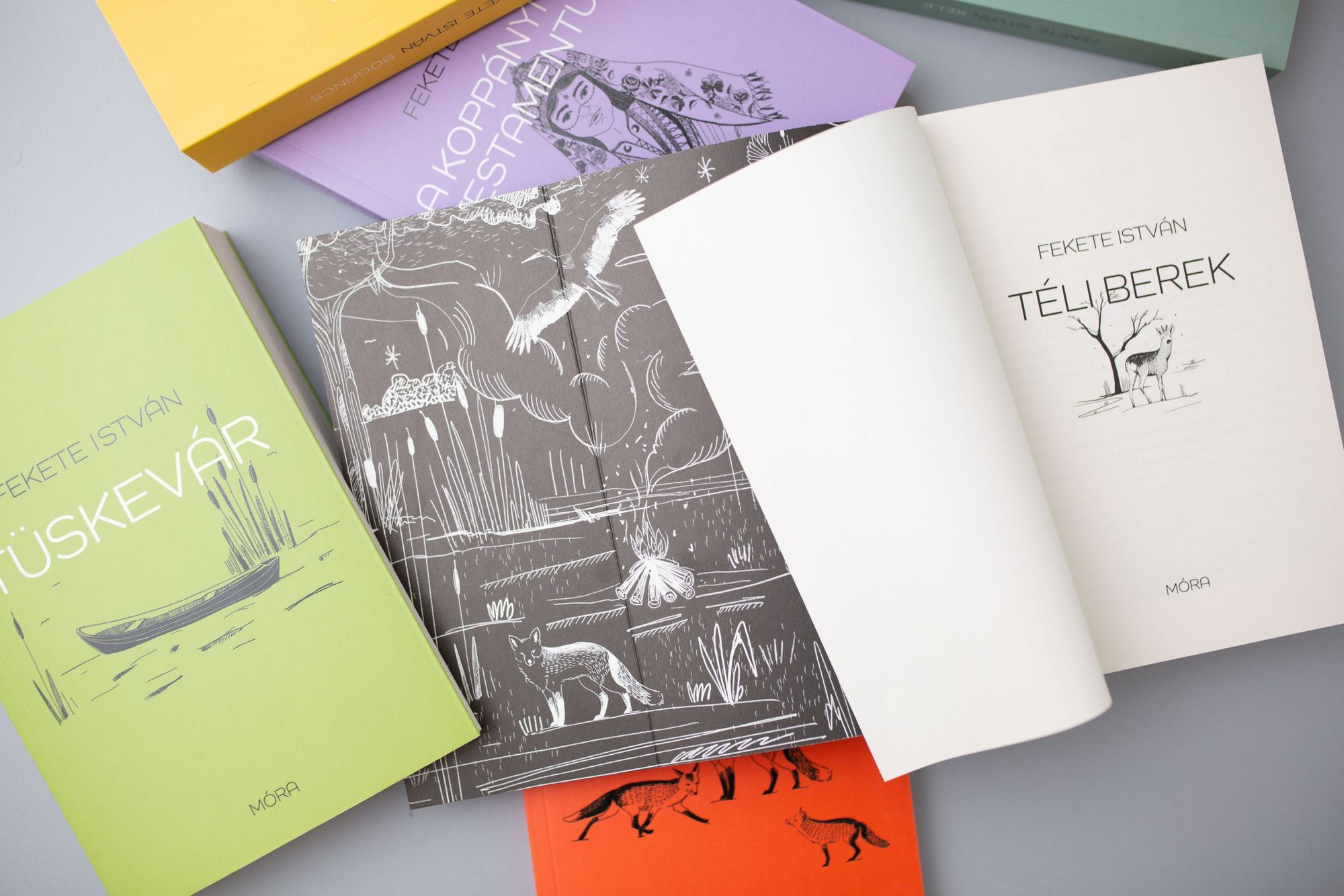
It is no small challenge to redesign the covers of novels that are known by everyone. Yet the versatile creator approached the task from a sensitive and contemporary perspective. The cover of each book was given a different beautiful hue. The colors red, yellow, blue, purple, bright- and gray-green also catch our eye easily, yet powerfully from a bookshelf. In addition to the different colors, graphic design also played a prominent role. On the outer cover, under the headline in a cheerful, bottomless font, the illustrated figures and images of the protagonists and the stories appear with elegant simplicity, which also appear in white on the black endsheet. In the books that got brand new looks on the outside, we can discover the original drawings. The cover designs make the volumes inviting to today’s youth as well, as they evoke the visual world of the original editions in a fresh, modern way. We are also excited about the future volumes of the series!
The inner sheet of the book varies every three volumes, the characters and details most characteristic of the given three volumes always appear in the drawing. This is one of my favorite parts about drawing and finished books as well.
Photos: Viki Hitka—Andris Zombori
Viki Hitka | Facebook | Instagram
Móra Publishing House | Web | Facebook | Instagram

Tropical ecosystem in a Polish office

An electric moon-rover motorcycle designed for NASA


