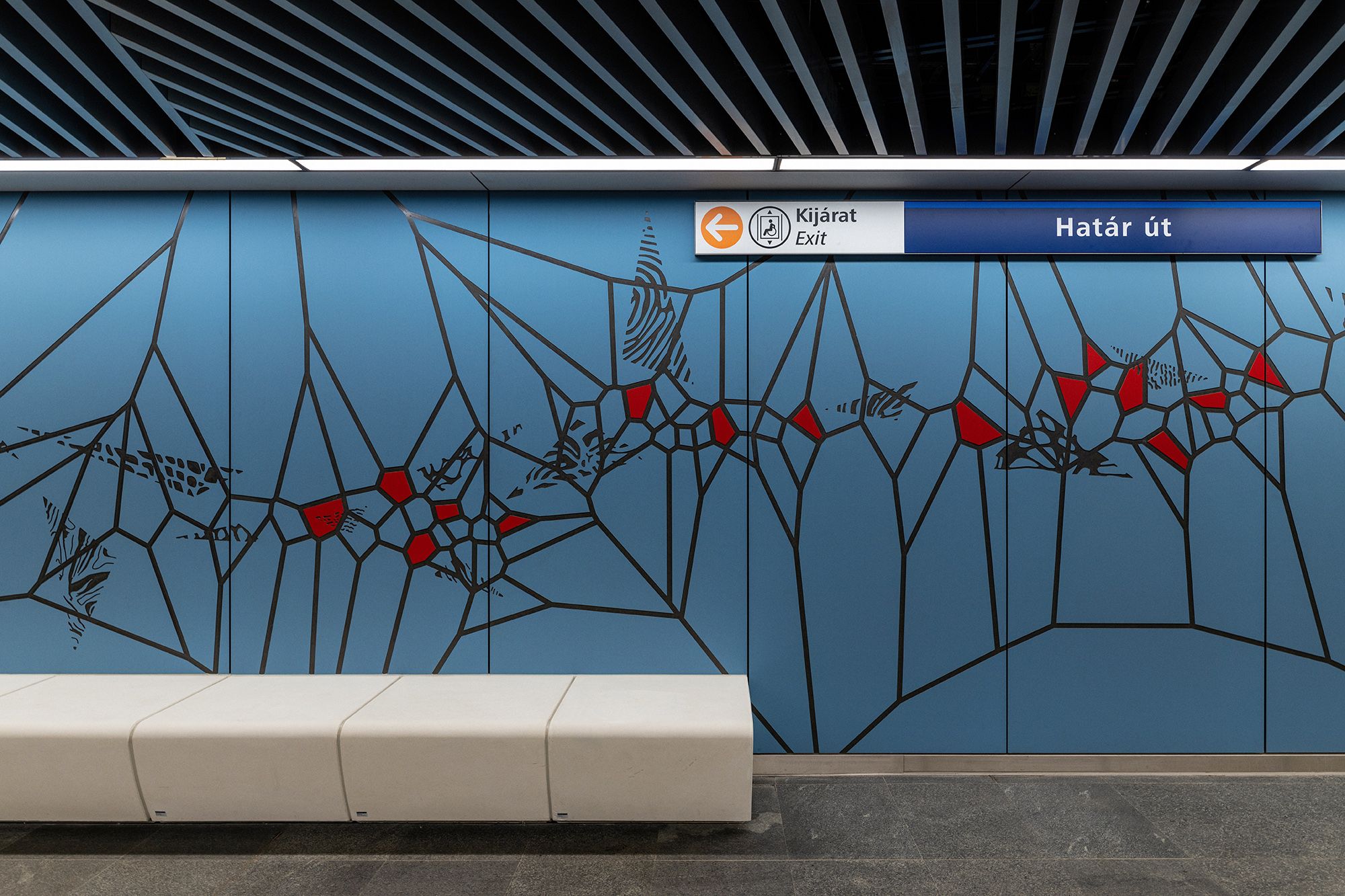
Not at all intrusive yet spectacular, nostalgic yet modern – the freshly renovated Határ út metro station received a graphic system inspired by nature, in the designing of which it was even weighed where passengers would spend more time while waiting for the metro. We interviewed the designers Dóra Novotny and Fanni Sall, as well as Máté Antal, the architect of Bright Field Studios in charge of architectural design about the design process.
The southern, renovated section of metro line M3 has been handed over for some time now, and what gives the specialty of the Határ út station is the large, new graphic element that has been added to it. Máté, how would you describe the space where Dóra and Fanni’s graphic was placed?
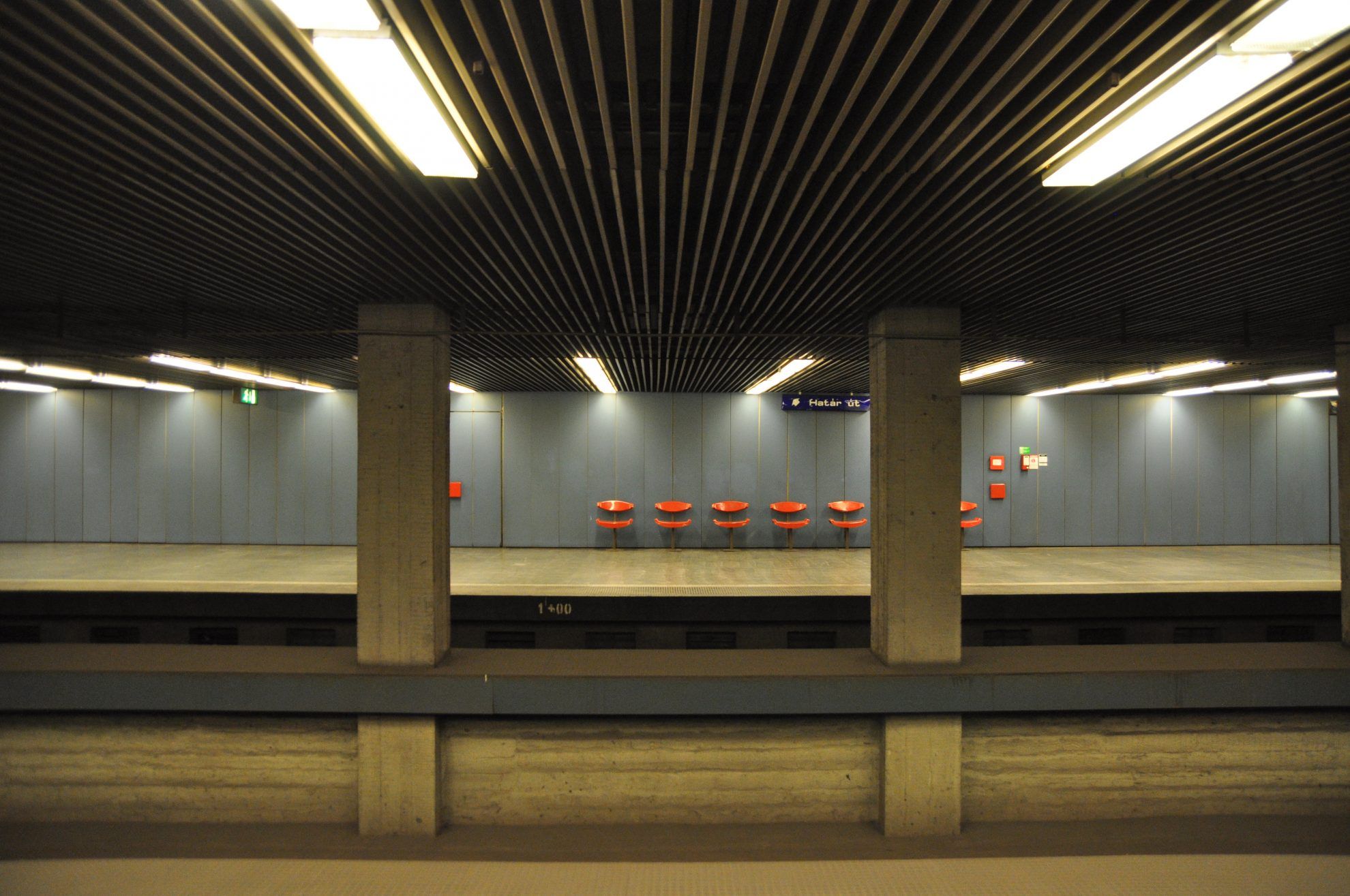
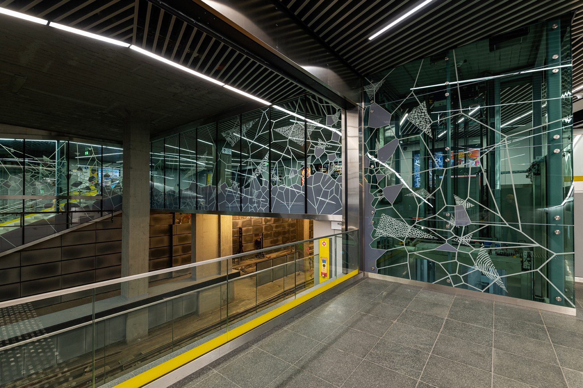
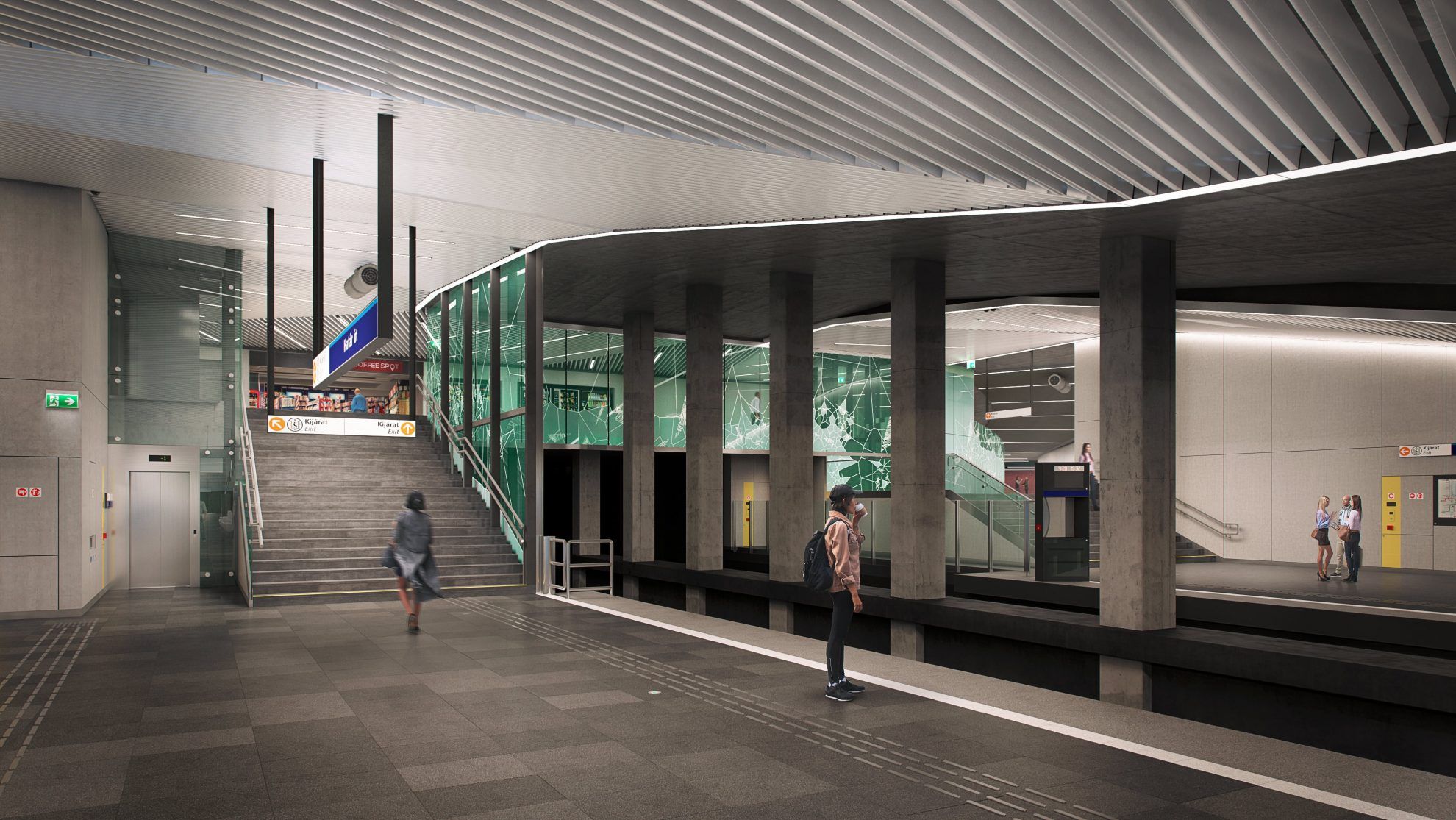
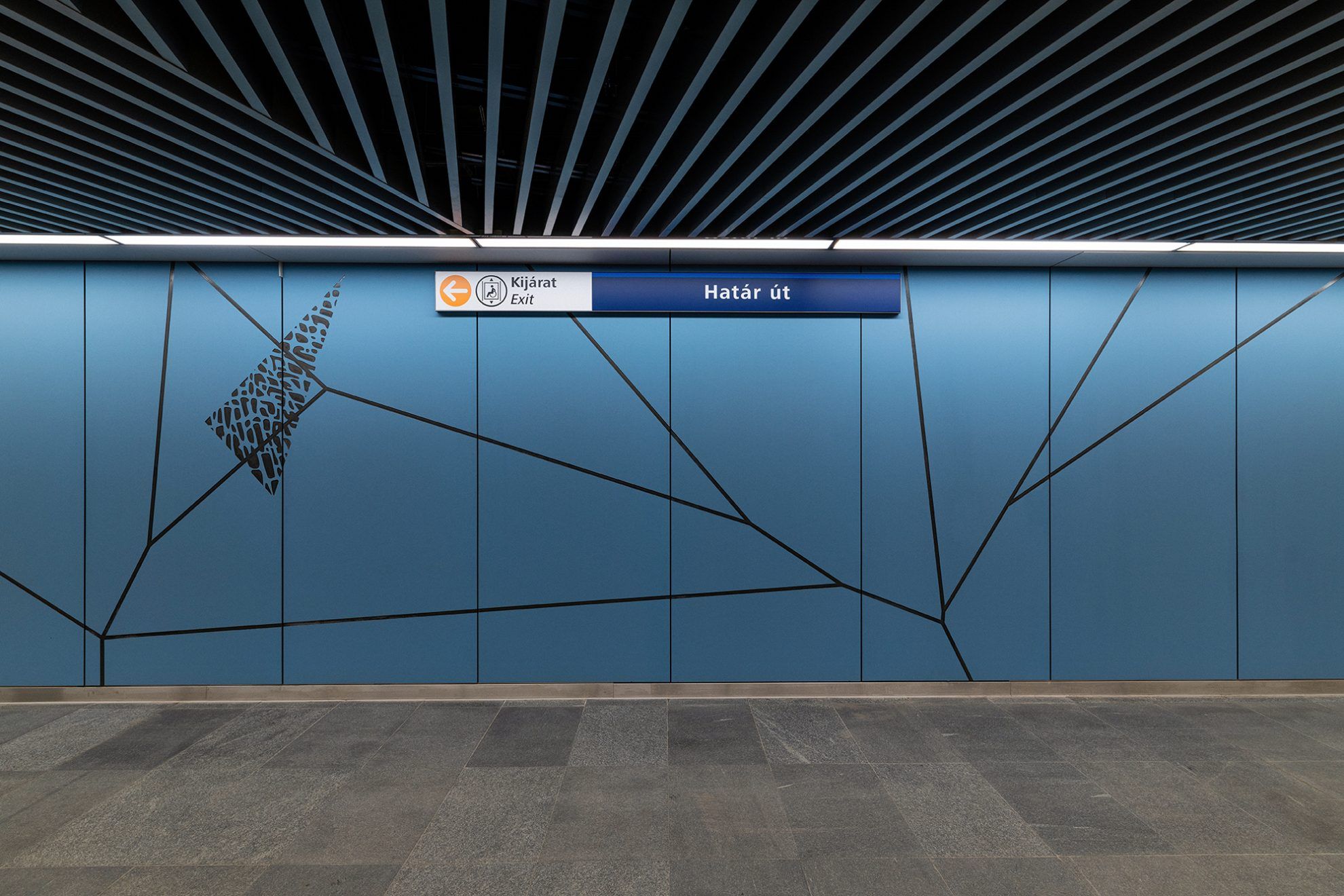
Máté Antal: The stations of metro line M3 are basically very simple, box-like spaces: there is always a dominant floor – typically the original one –, a long wall which is always a gesture – a color, a relief or a graphic –, and there’s always a suspended ceiling with aluminum lamellae. These are then complemented by the necessary furniture, making the metro station a metro station. Each space varies this simple formula, but the Határ út station is a bit more complex than that. People arriving on foot pass over the leaving metro at the entrance, and the space itself can only be mapped in details. The transparency provided by the high glass surfaces facilitates this complicated spatial situation, but so that the different spaces of the entrance zone and the platform get visually connected, a linking element is needed. This is how the idea of using graphics as a tool on the blue fiber cement cladding and the glass surface accompanying the entrance zone came up, and we were looking for creators to join us for this task.
Why did you want to engage representatives of related arts?
M.A.: I worked on metro line M4 for approximately years, followed by this line, which is a result of 6 years of work. It was already an important aspiration of ours to work with representatives of related arts in the course of building metro line M4. This approach has an important antecedent in the case of metro line M3: many professors of the Budapest University of Technology and Economics created ceramic-based images integrated into the walls during the original design process. We thought that in addition to preserving these, we would also create a new, added value. We started working on the working drawings of the station in the third or fourth year of planning, this is a very detailed step of the design process. We invited Fanni and Dóri at the beginning of this phase, whose works we had been familiar with from earlier. We told them what was important to us in this space, and then we started looking for ideas based on it.

What were the cornerstones that you as architects considered to be important?
M.A.: Working on such a place and on such a scale is a very responsible and strong gesture, and so we have to be very careful about what we put there. According to our experience, the non-trendy, non-fashionable, non-illustrative solutions that doesn’t convey a concrete message are what work here, because a metro station is not a museum. Those who travel on this line will look at this surface every morning and every night, on up to 700 occasions a year.
The same amount of people travel on metro line M3 in one day that travel on the entire national railway network of Hungary. This means a lot of occasions on which passengers get to connect with the graphic. Thus we were looking for something that gives just as much room for individual interpretation and exploration to make it familiar in a good sense, without the feeling of forcing something on the viewer.
On the one hand we were looking for the fine line between spectacular and subdued, and we also wanted to evoke the old station in one way or another. We mainly achieved this with the blue and red color combination and its ratios. We also considered the materiality of things important, because we like to show the very strict system designed by man in a more intuitive and natural way. We were looking for a solution without the feeling of all millimeters planned meticulously by a designer, but with a sort of spontaneous ease.
Dóri and Fanni, how could you adapt to these as graphic designers during the design process?
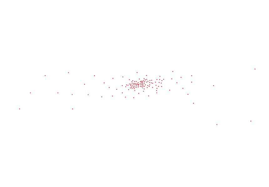
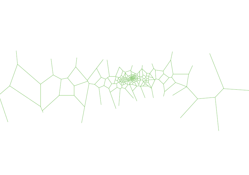
Dóri Novotny: The points of reference were useful and we were in continuous dialogue with Máté and his team. Fanni and I used to take a different approach to our previous jobs: previously usually we had an idea and we elaborated it, but this time we had to think much more globally, and we had to approach the solution starting from the whole. We wanted to connect the lamella ceiling with the granite floor visually, with a motif inspired by nature. Fanni’s partner is a biologist, and he showed us how certain patterns in nature can be described mathematically as so-called Voronoi cells. This a mathematizable spatial partitioning system, which can be found in nature from microscopic scale through the wings of insects to the territory of predators and to the patterns of the spreading of certain plant species. We also found a software to generate this pattern, and thus we designed an organic pattern with the help of a computer program in a manner that we defined the key points, and we condensed them at places where we knew people would stop – at a bench, for example.
Fanni Sall: The program’s peculiarity lied in the fact that we could continuously change the designs, we always rendered the current condition and then we modified it when we needed to. In the background of the Voronoi pattern, another frame-like drawing is also made in a system, parts of which appear in the network in the form of triangle shapes. We designed nature-inspired motifs into these.
If I’m correct, this was your first job when you had to work on such a monumental scale. What did this entail and what do you think about the final result?
F.S.: Yes, this was the first time we worked in such a large size. Dóri and I have been friends since high school, we were in the same class in the Secondary School of Visual Arts. We already had joint projects at the time, we mainly helped each other in our school projects. She studied graphics, while I studied book binding and book design. We were classmates at the University of Fine Arts, too: both of us studied at the graphics department, only Dóri specialized in graphic design and I specialized in graphic arts. This was a completely different type of job than our previous ones, but thinking together went just as smoothly.
D.N.: When we were standing in the completed station and were looking at the final result, I thought this was reaching way beyond graphics. The drawing was graphic only while were sitting in front of the computer and designing it. Somehow it all rather turned into sculpture art, it was fantastic to see it “work” in the space.
M.A.: A strange situation arising from the size of the graphic is that this is not only a surface that looks nice and is entertaining, but a surface with various functions and angles. It starts to behave like a building: some places you can sit next to it, in other places it connects elements in the space, and in some places you stop and look at it from a distance. The Voronoi pattern with the triangles was a good idea for this diverse behavior, because in addition to providing a unified look, it can also be utterly varied, rich in details, static and dynamic at the same time. I found it very exciting to look at a graphic in a spatial dimension, and to see how it relates to people in the space. Working on such a scale also requires incredible team effort. One and a half years of close cooperation and dialogue was needed between the designers, contractors and field-specific contractors to finally achieve that when the passenger arrives and looks at the wall, for them it is completely natural that the pattern runs on the wall in a straight line.
For how long do you think the graphic will form an integral part of Budapest? How long can we expect this metro station to last?
M.A.: On the one hand, a metro station has an aesthetic life, by which I mean whether its visuality will become obsolete, but in this case I’m not afraid of this. On the other hand, it has a renovation life: stations need a bigger face lift in every 30-50 years, but a good visualization could even survive a renovation. Thirdly, one must also weigh in normal wear and tear and vandalism. BKV (the company in charge of public transport in Budapest), as the operator of stations, can do a lot for preserving them. We used outdoor façade cladding materials, which are quite durable if we take care of them.
D.N.: In terms of visuality, we strived to create something universal instead of something trendy, and so we hope the pattern will prove to be future-proof.
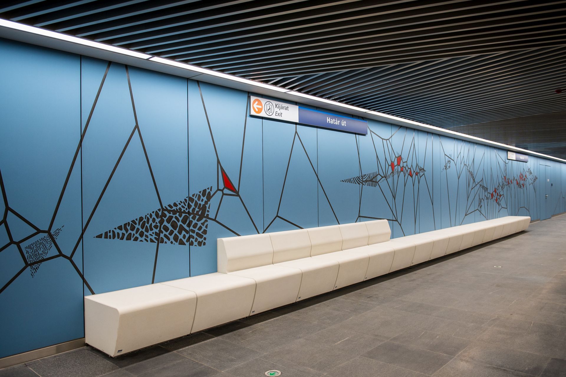
Graphic design: Graphic designers Dóra Novotny and Sall Fanni, architects Antal Máté and Soma Hajnal
Architectural design: Bright Field Studios Ltd.
General architecture: Paragram Stúdió Kft.
General designer: Főmterv Zrt.
Client: BKV Zrt.
Contractor: Strabag Zrt.
Dóra Novotny | Behance
Fanni Sall | Behance
Bright Field Studios | Web | Instagram

Concentrated sunshine, in jars | Konyha x Sáfárkert
Advent calendar full of art
