Even though the restrictions imposed due to the coronavirus don’t allow us to go on a trip around the world (or to travel to a destination outside of our borders), we shouldn’t give up on foreign trips completely. We may not be able to pack our flipflops or ski overalls into suitcases at the moment, but thanks to the Instagram page ‘Hotel Graphics’, we can still experience some traveling.
Jens Müller and Katharina Sussek, themembers of Düsseldorf-based design company Studio Vista launched their Instagram account Hotel Graphics during the first wave of the coronavirus epidemic. The designers of the German design studio focusing on design communication invite us to various hotels around the world, in a quite extraordinary manner. Those expecting a classic travel blog will be either relieved or disappointed, yet the fans of architecture, interior design, design and graphic design will for sure find something to their liking on this Instagram feed, featuring not only hotels from Palm Springs, but Körszálló and the Vörös Csillag Szálló in Budapest, too. We interviewed Jens Müller, the creative director of the studio.
How did the name ’Hotel Graphics’ come to your mind? If I know it correctly, you have a design studio called Studio Vista in Düsseldorf, Germany.
We like to travel and actually from almost every trip we bring back historical printed matter from the respective country. This has developed into a neat collection of old leaflets from all over the world. In February, for example, we were in Paris and found a whole range of brochures and maps in some small bookstores. During the first Coronavirus lockdown, when many hotels had to close and international travel became almost impossible, the idea of Hotel Graphics was born. The project is a small break from our studio work at Vista. Here we work on brand and editorial design projects for clients from a wide range of industries – interestingly we haven’t worked for a hotel yet.
Could you please tell us a little bit more about your connection to hotel graphics and the visual culture of hotels?
Graphic design for hotels combines very different aspects: architecture, interior design, typography, logo design or infographics. Then there is the location-specific component, which is particularly interesting for us. Here you can observe how local characteristics are reflected in the design. And the zeitgeist plays a huge role. Within the collection, certain typologies appear again and again, of course. The printed matter for winter sports hotels from the 1920s, for example, looks quite similar. But there are also always surprising and very unique solutions. We are still fascinated by how a historical hotel brochure makes it possible to discover a hotel that no longer exists on the other side of the world.
On your Instagram page, we can find several hotel graphics (prints, postcards, illustrations, brochures, etc.) from Palm Springs to Stockholm. This content is collected and curated by two of you, Katharina and Jens. What method do you follow here?
We find the objects on flea markets and also in online stores. There are so many hotels worldwide that a complete collection is of course illusory. In order for us to decide to buy a postcard or a brochure, it must have a certain graphic quality and appeal to us visually. The collection should be as diverse as possible and in some way it should surprise us over and over again. For the Instagram account, we search together for interesting motifs in our collection. This happens, so to speak, in a random way, in order to enable subscribers to make surprising discoveries.
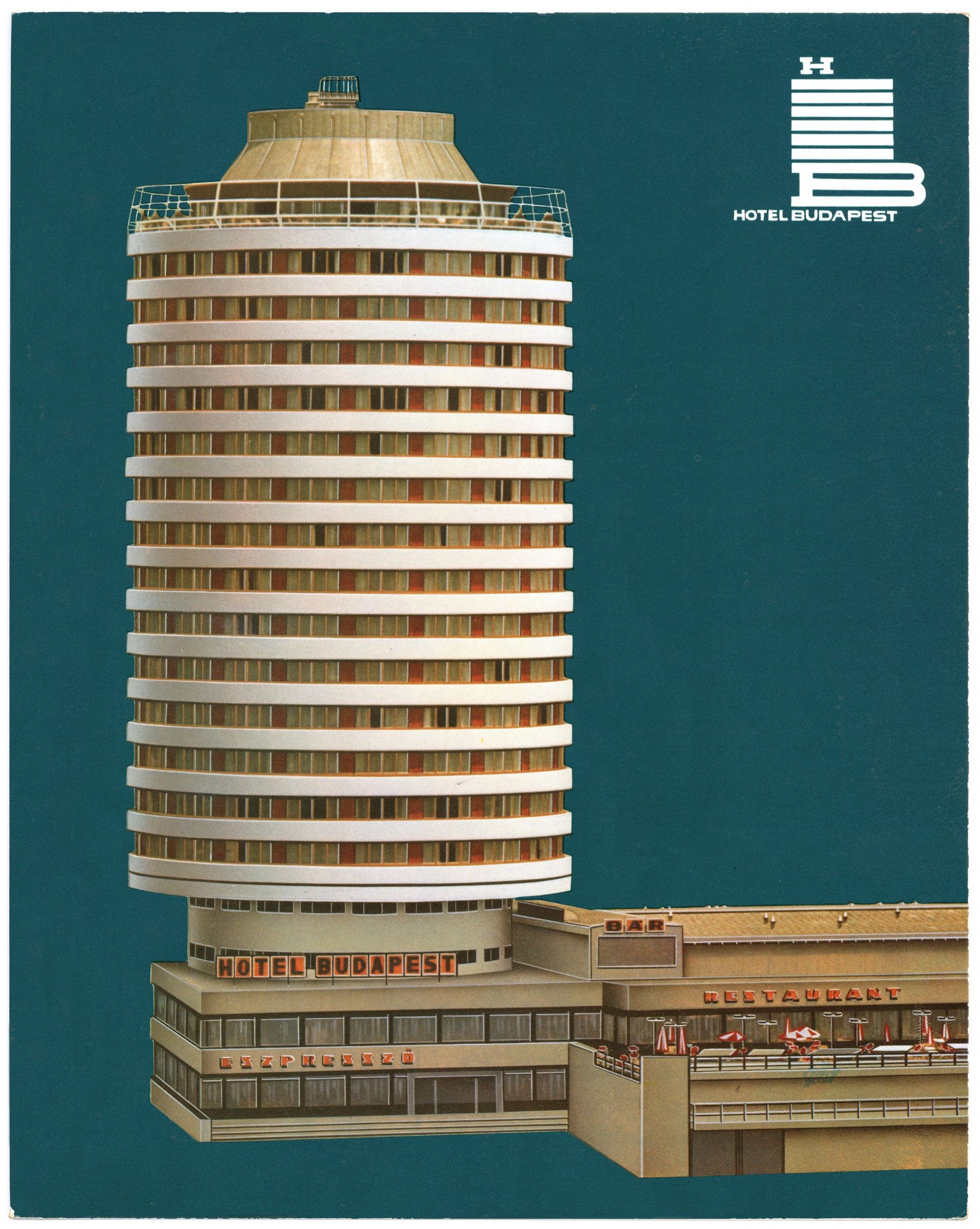
I also discovered some Hungarian content on your feed. For example, the Hotel Budapest, the illustration of a motel in Siófok, or a detail from the Vörös Csillag Szálló brochure. Do you have any extra interest in the Central Eastern European region?
Objects from Hungary, Poland or the Czech Republic, which were created during the communist era, are of a special fascination to us. Much of the graphic design created at the time was extraordinarily modern and used clear forms and strong colors. Even tiny objects like luggage labels reveal that they were developed and produced with the highest quality craftsmanship – even though the technical conditions were probably not as good as in the USA or Western Europe.
Which is your favorite hotel graphic item and why?
It is too difficult to name a single object, there are too many great pieces in the collection. But illustrated brochures for California or Hawaiian beach hotels from the 1950s and 1960s exert a special fascination on us. The drawings immediately trigger the desire to pack the suitcase and take off. Hopefully this will soon be possible again.

The final days of Adjarian nomads

Tesla launches new product inspired by April Fools’ Day joke


