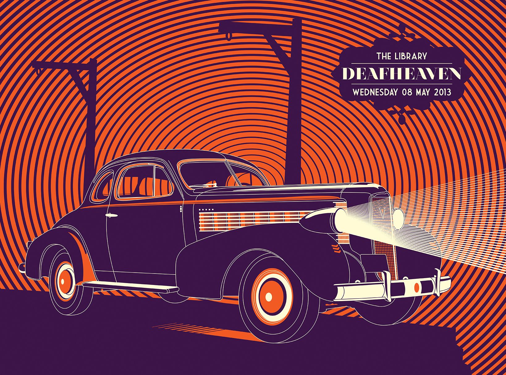
László Nagy has published more than a hundred screen-printed posters he has created over the past eleven years, which were exhibited this year in the visual communication category of the Hungarian Design Award. We talked to the artist about the book and the gig posters movement. Interview!
László Nagy graduated in graphic design at the predecessor institution of MOME and started early to work in the field of illustration and cultural graphics. Currently, he teaches graphic design at MOME, works on applied graphic commissions, and his autonomous creative work focuses on screen-printed posters.
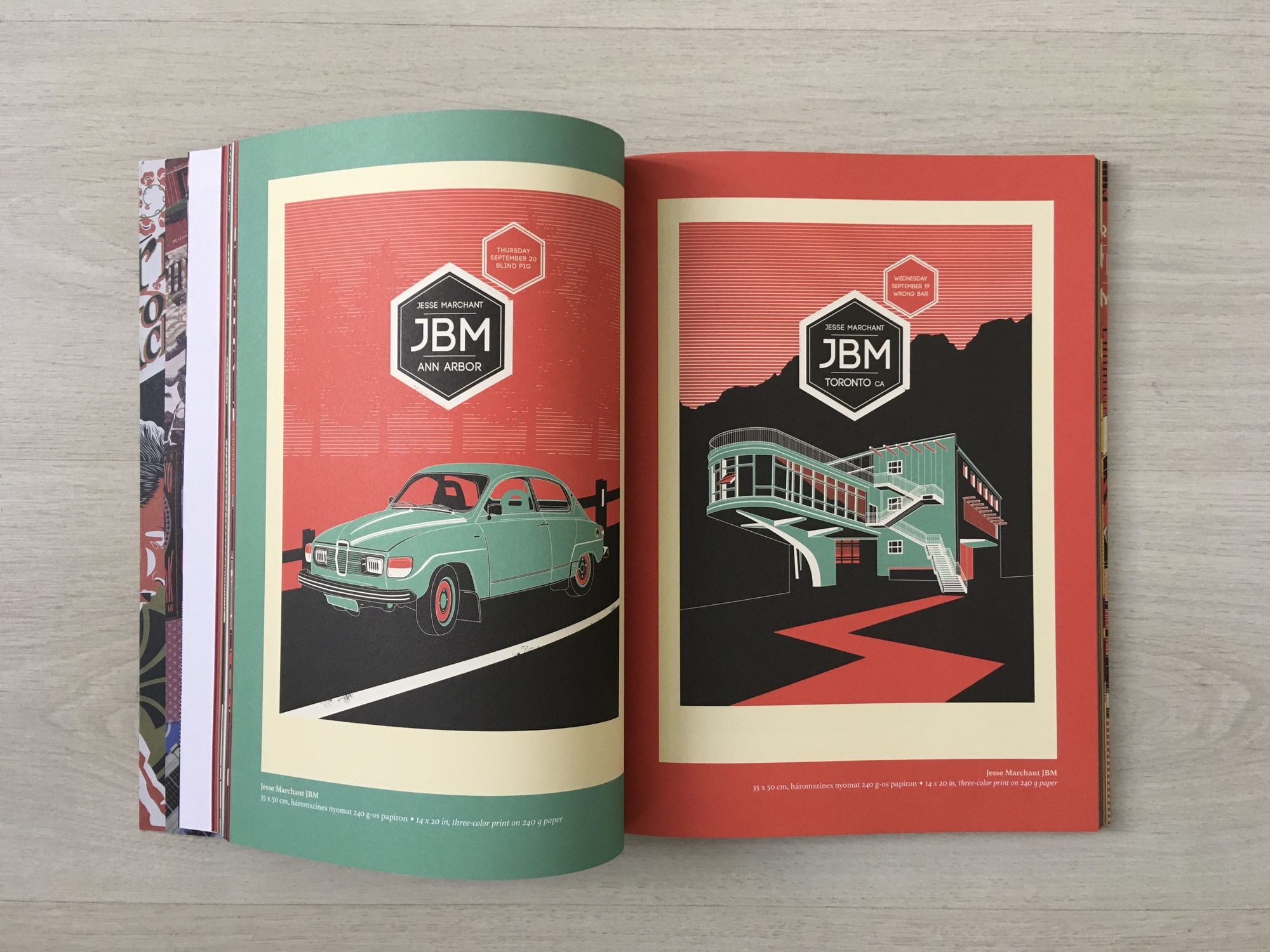
Your creative career and the present publication (Screen Printed Posters 2010-2021) also focus on gig posters, which are less known in Hungary. What is the short history of this genre?
The gig posters movement started in the US in the late 90s when the internet shook up the traditional music industry. Music was available for download, so fewer and fewer people bought CDs and vinyl records. This affected not only the major but also the small independent publishers. They started to organize festivals and sell T-shirts and posters in addition to tickets. The gig posters are made by screen-printing, a reproduction graphic process, somewhere between graphic design and fine art. This genre is not made for the street, collectors and fans buy the numbered works: either because of the band, or the graphics, or the event itself. The gig posters then find their way into the art trade and, from 2010, into museums as well. In the meantime, their reputation and value are constantly growing thanks to their canonization.
How would you define the graphic aesthetics of gig posters?
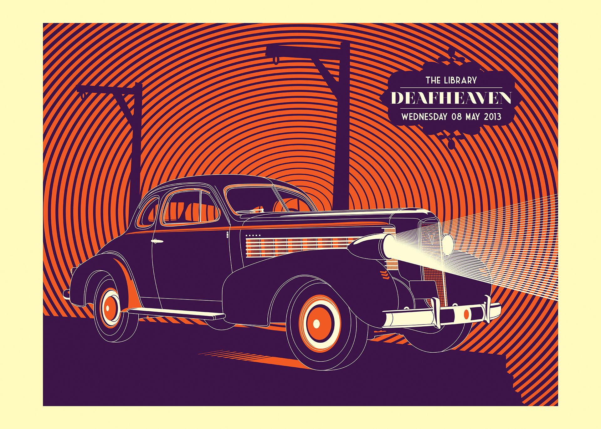
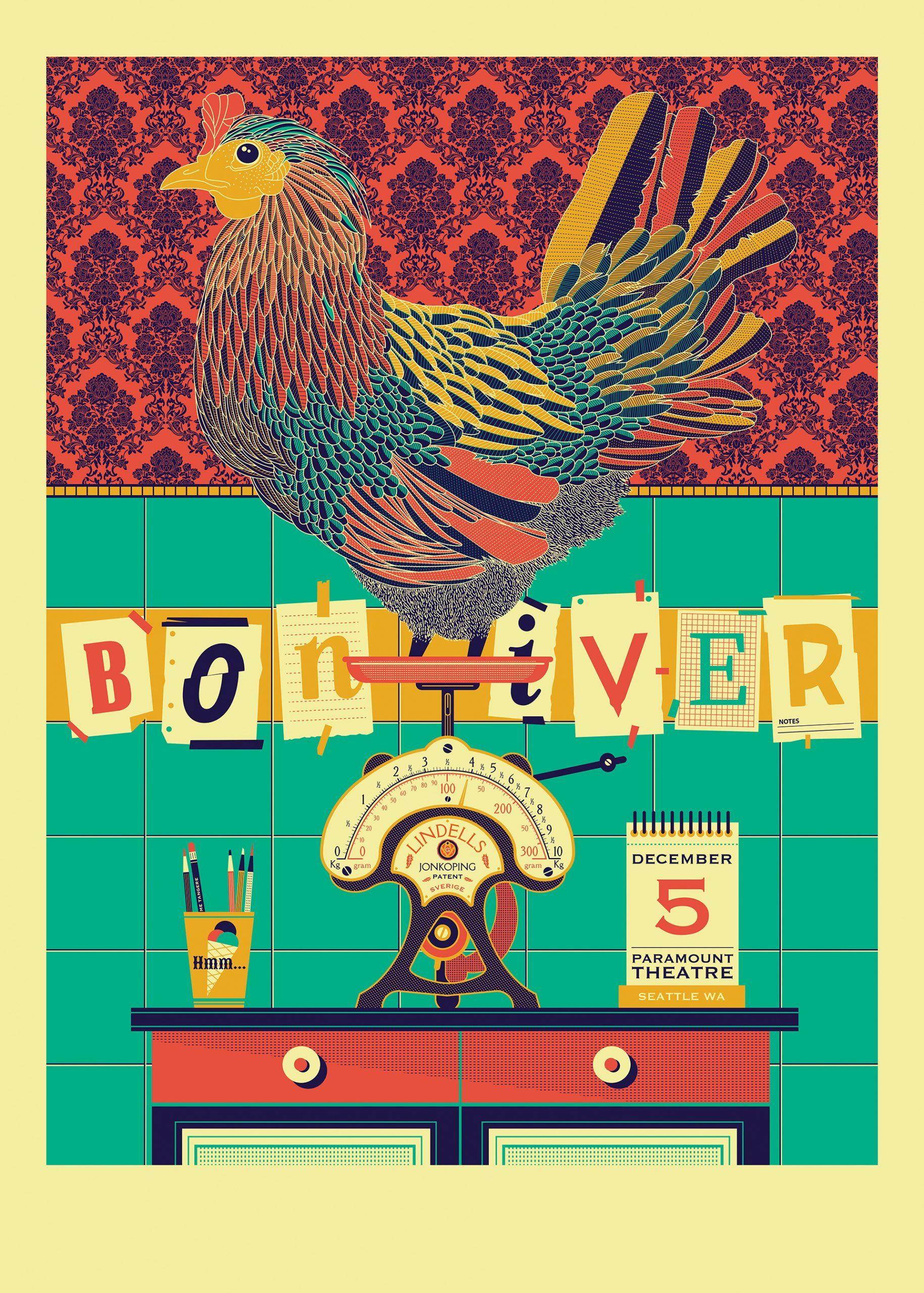
Stylistically they are very diverse. Because of the tight budget, sometimes they are made by a member of the band, which gives them a kind of naive outsider aesthetic. There are also professional artists in the movement, so the quality can vary a lot. There are three or four groups: one is the vintage movement that goes back to the fifties and sixties, that is the one I relate to the most. Hot Road, the American flame-blowing car guy, draws from the Elvis period. In the hyperreal, they screen-print things drawn with a very high technical skill, even on a photo-realistic level, and there’s also a kind of trend for trash. What is particularly exciting is that visually these posters are not necessarily linked to the music, but are based on subjective reception. For example, for avant-garde, noise-like music, they might just be making a nice, inclusive design, emphasizing the contrasts.
How did you get involved with this movement?
In 2008, I came across the movement on the internet, on Clay Hayes’ website. I had been doing cultural posters before, but I started learning screen-printing around this and became more and more immersed in it. I set up a workshop, started getting commissions in 2010, and the book is about the ten-plus years I spent making over a hundred posters. I made one every month, which I continue to do even now, just like a gymnastic exercise. I went to the US, met all these companies and people, and it all became the reality of the everyday. Over the years I’ve been able to organize exhibitions and I’ve also written a Ph.D. thesis on gig posters and the history of screen-printing as a cultural technique. This became my artistic credo, which then became stylistically aligned with my graphic design work, and also with my teaching. I have a full-time job at MOME in graphic design, where they are currently planning an illustration specialization and later an illustration course, which I intend to participate in, and where all this can be channeled in.
How do you decide which concerts to illustrate?
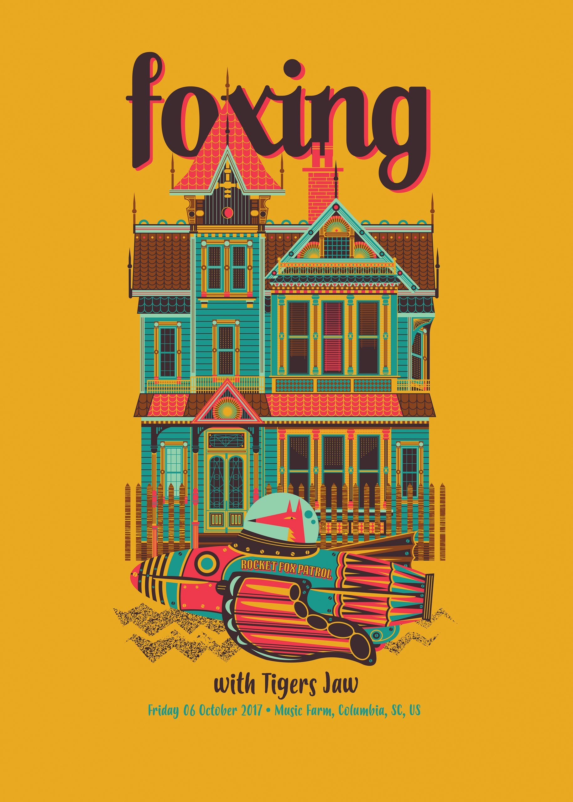
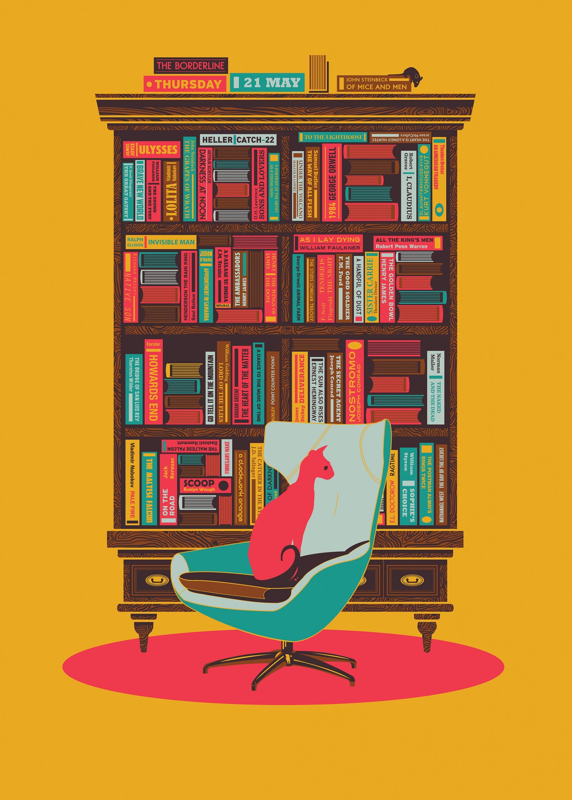
The posters are usually an imprint of my musical taste over the years. It’s a relatively narrow segment, usually indie bands, but there are also metal, jazz and post-rock bands. My work is always related to real events, usually concerts I attended. But the commission is not always real, sometimes I make them just for my own pleasure. The visual part is completely intuitive. Some of my posters were made for some very serious music, but they were bought specifically for children’s rooms for decoration purposes. I do a lot of traveling while taking many photos and actively observing. I’m fascinated by spaces, the built environment, object culture, old art deco cars, but sometimes I’m inspired by the name of the concert venue.
Can you highlight some personal background stories about the posters?
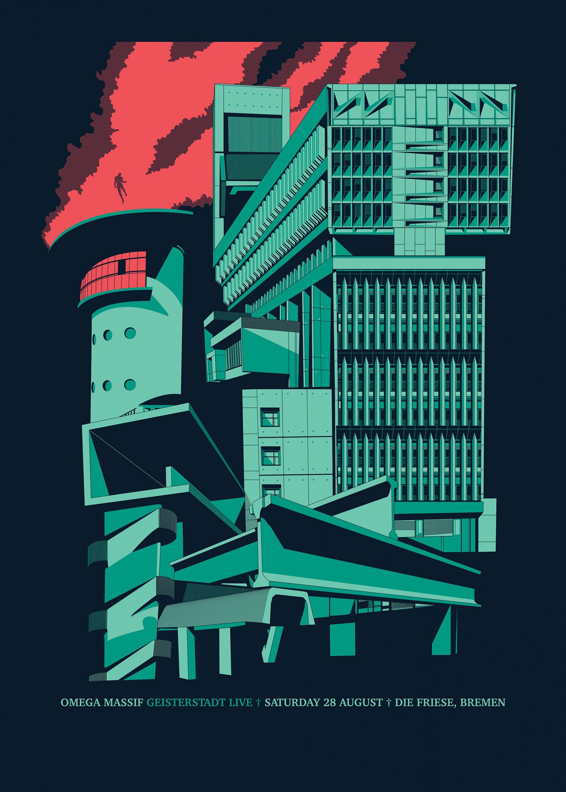
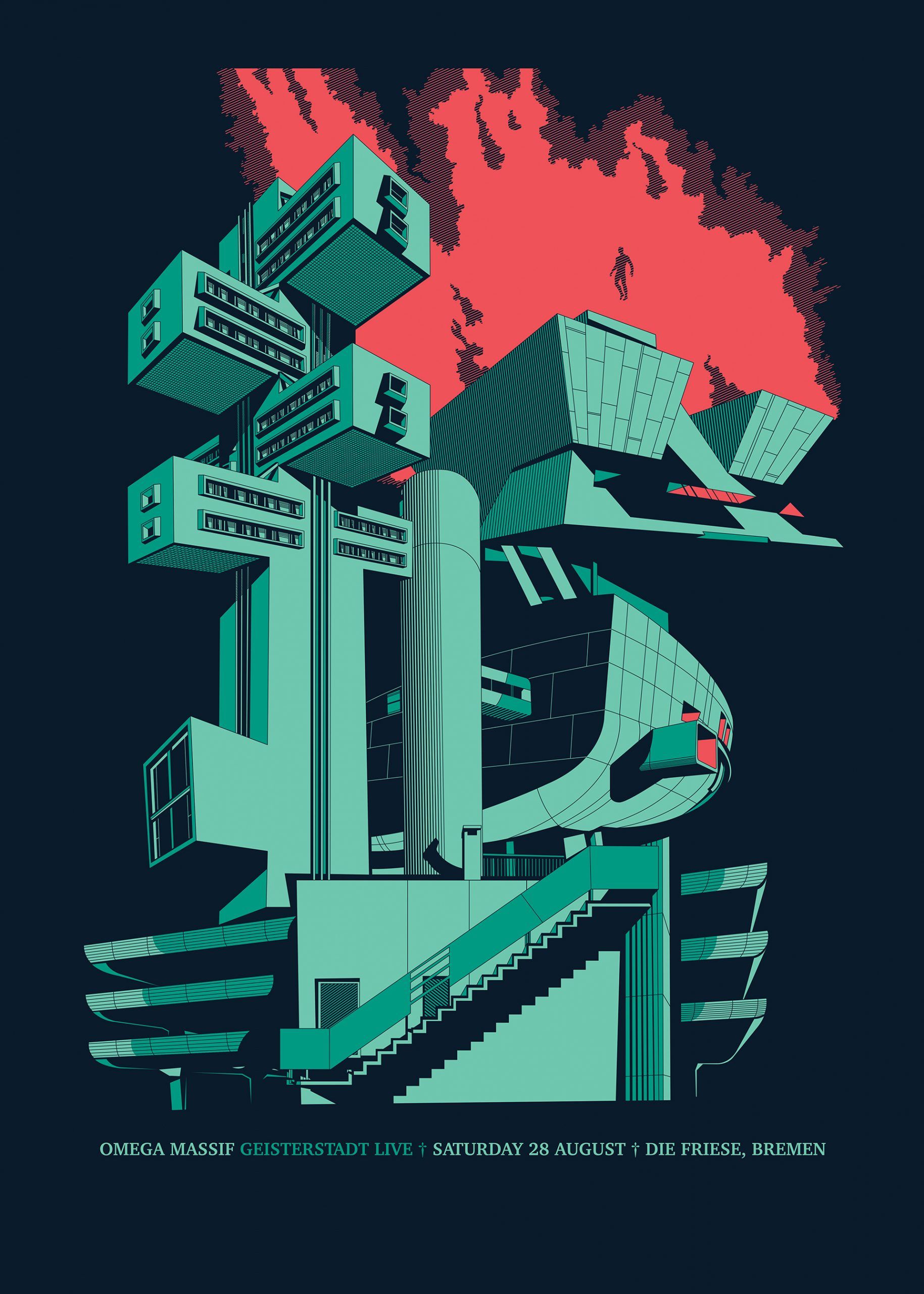
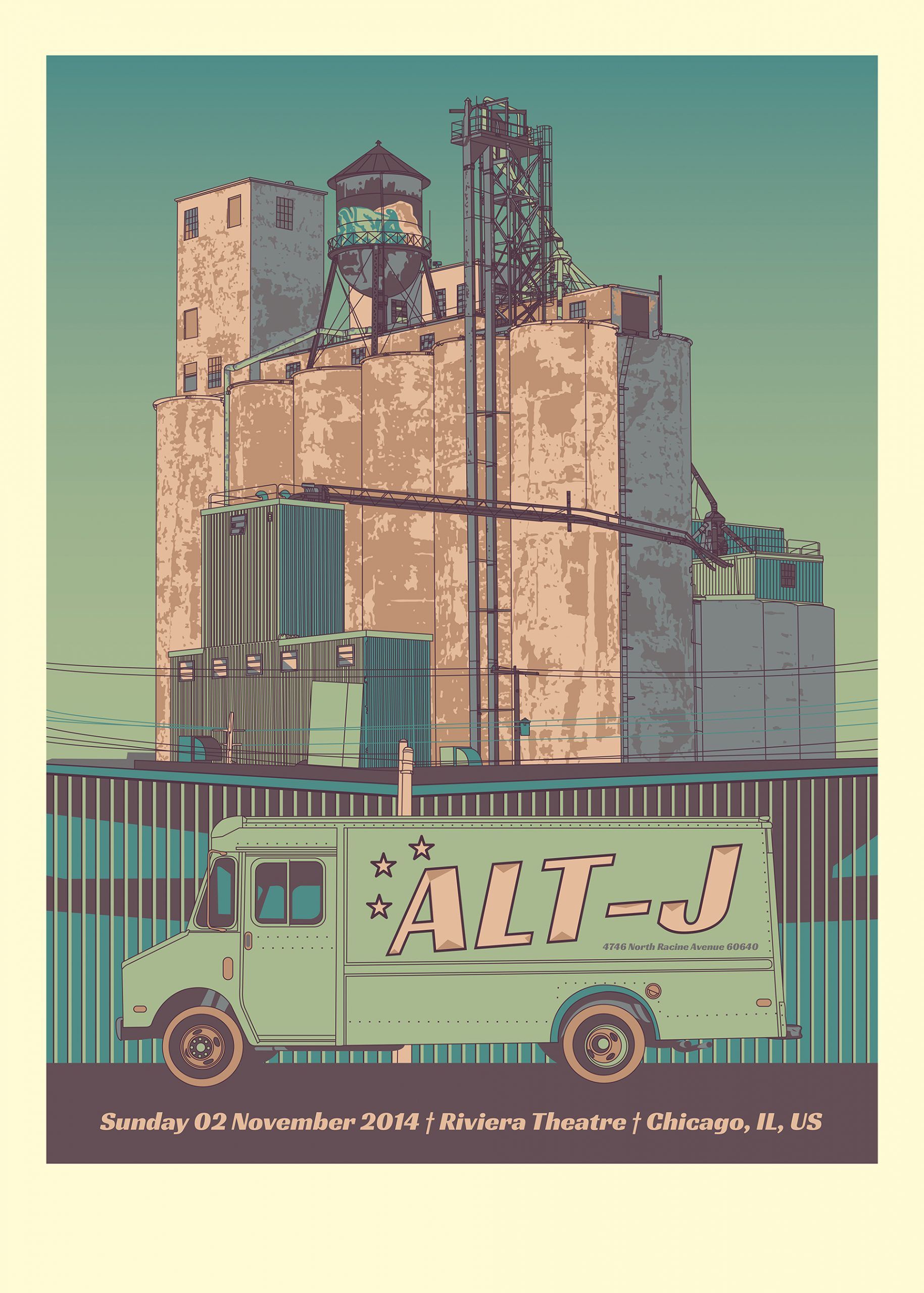
For example, I was at a concert of an industrial German band, and I was inspired by the nearby factories and the title of the concert (Geisterstadt, Ghost Town), so I made a collage of iconic brutalist buildings from around the world. In the US, when I was near the Pitchfork Festival, I was inspired by an iconic factory there and used it for my Alt J poster. Then it turned out that three or four of us had drawn the same building, hated by the locals, into our gig posters that year.
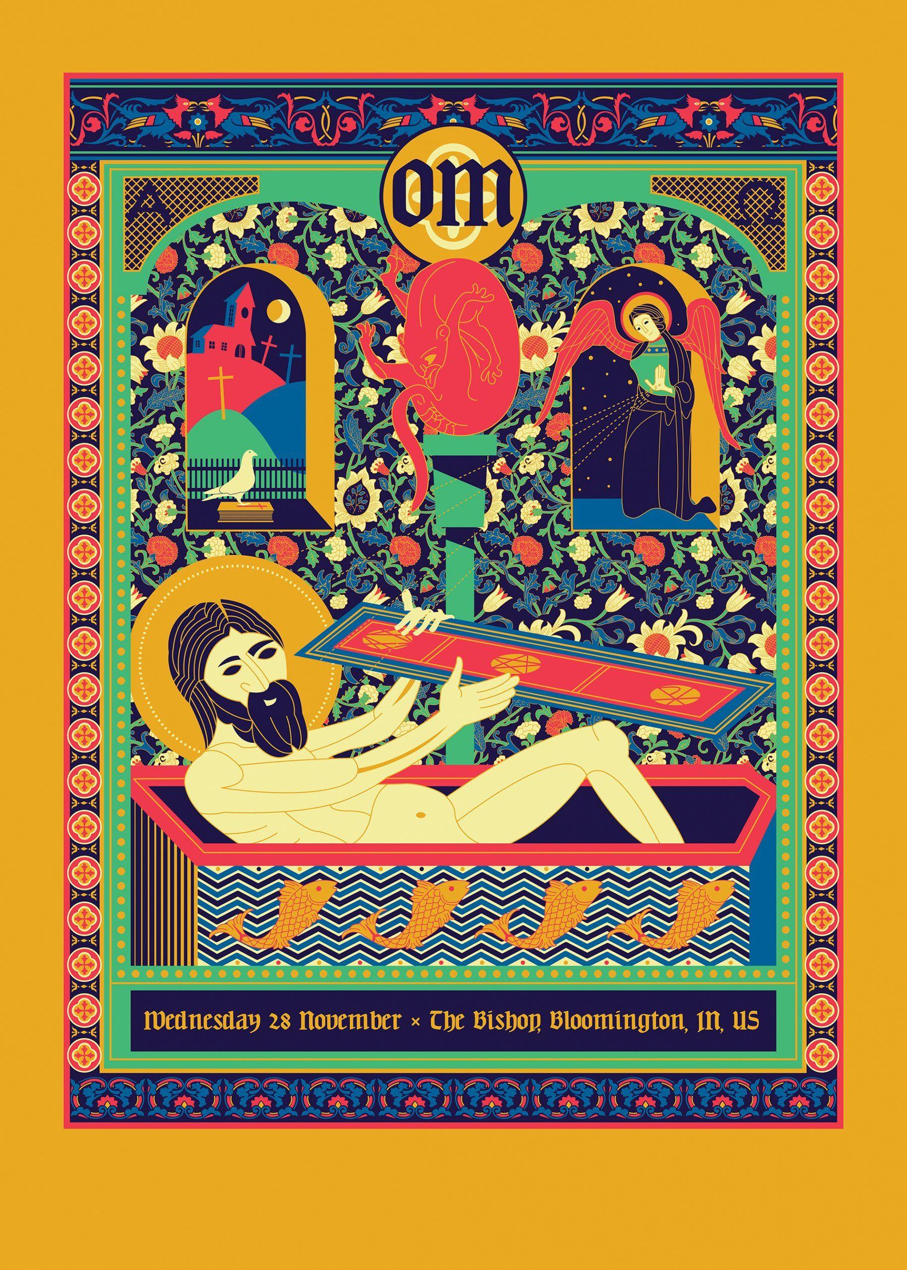
The band Om plays a very slow, somewhat medieval style of so-called doom with spiritual lyrics. I saw an enamel in the Vatican Museum earlier which I found very funny and profane, so I organized the visuals of the poster around that.
How have posters changed over the last eleven years? Do you see any trend for development?
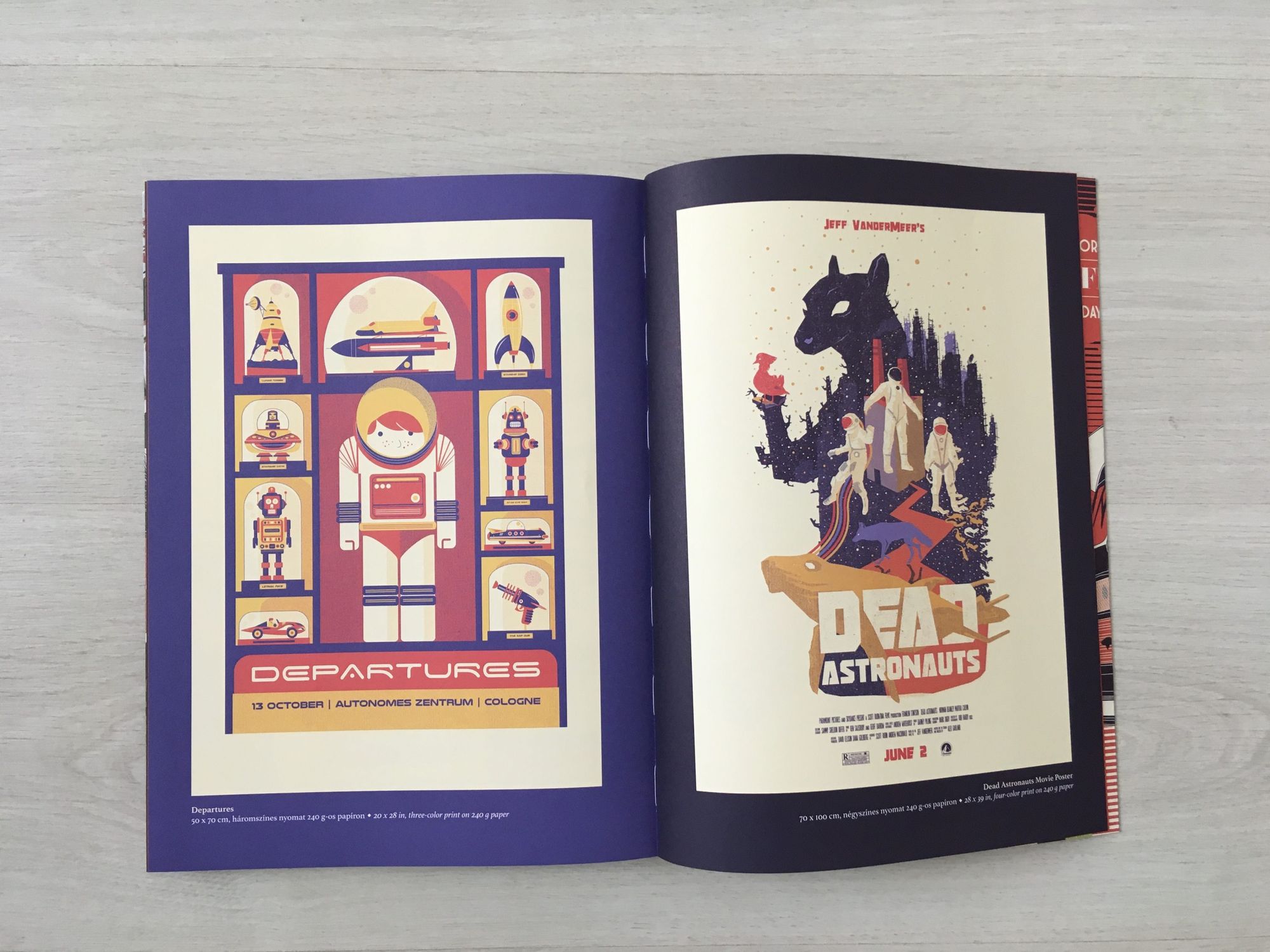
Technically, I’ve become more confident in screen printing, and I dare to take on larger sizes and technically more complex projects. And in recent years, I’ve also started doing film posters as well as music posters. It’s an existing trend: people who used to do concert posters are now starting to redefine cult films. There are some examples of this at the end of the book.
Objective | Károly Szalóky’s favorite objects
Favorite interiors of the week_82


