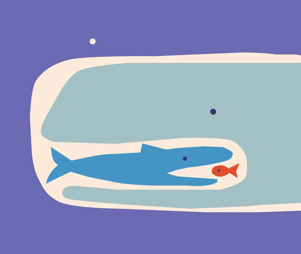
During the Hype&Hyper DIALOG thematic month, we spend a whole month searching for parallels and contrasts between the analog and digital worlds. Beyond exploring the current state of the fashion and art market, we have written about the world of analog fragrances. Now it’s time for illustrations!
The history of graphic design is inseparably linked with books. In the 15th century, book printing fundamentally changed the world. As a knowledge sharing and dissemination platform, the printed book and the Gutenberg galaxy brought significant changes to the world of art. At the time of their invention, book printing and the various printing and reproduction processes for graphic arts were undergoing enormous technical development. Like the cultural and social developments of the past centuries, the contrast between the printed and the digital book could be discussed at length, but that is not my aim here. Yet, it may be worth pondering over the question: do we prefer print or digital reading material? We can make arguments for and against both. While the smell of an ebook reader is nowhere near that of a freshly bought book with paper and ink or the slightly musty smell of an old volume from an antique book shop, it can even outshine its classic rival in size and function.
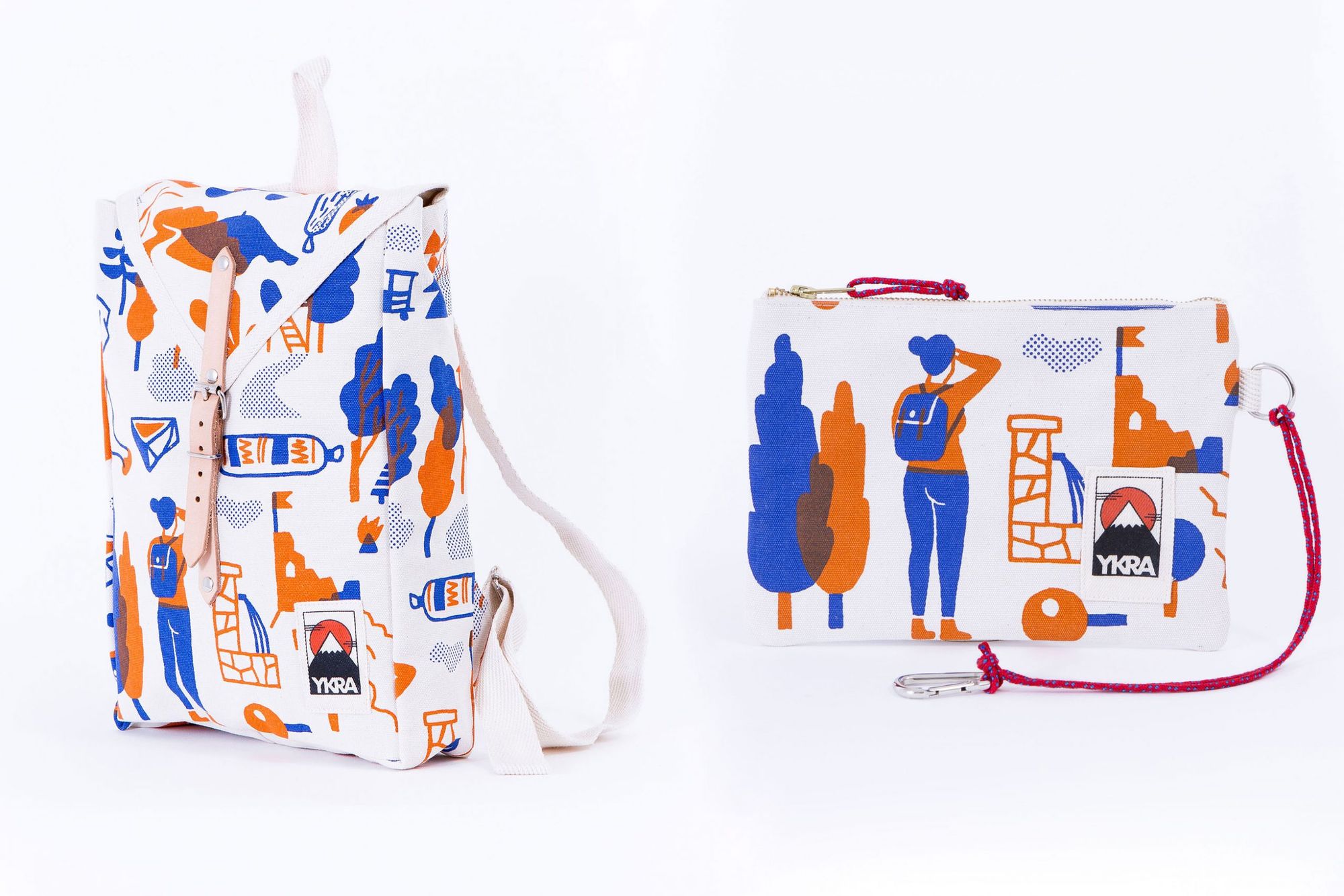
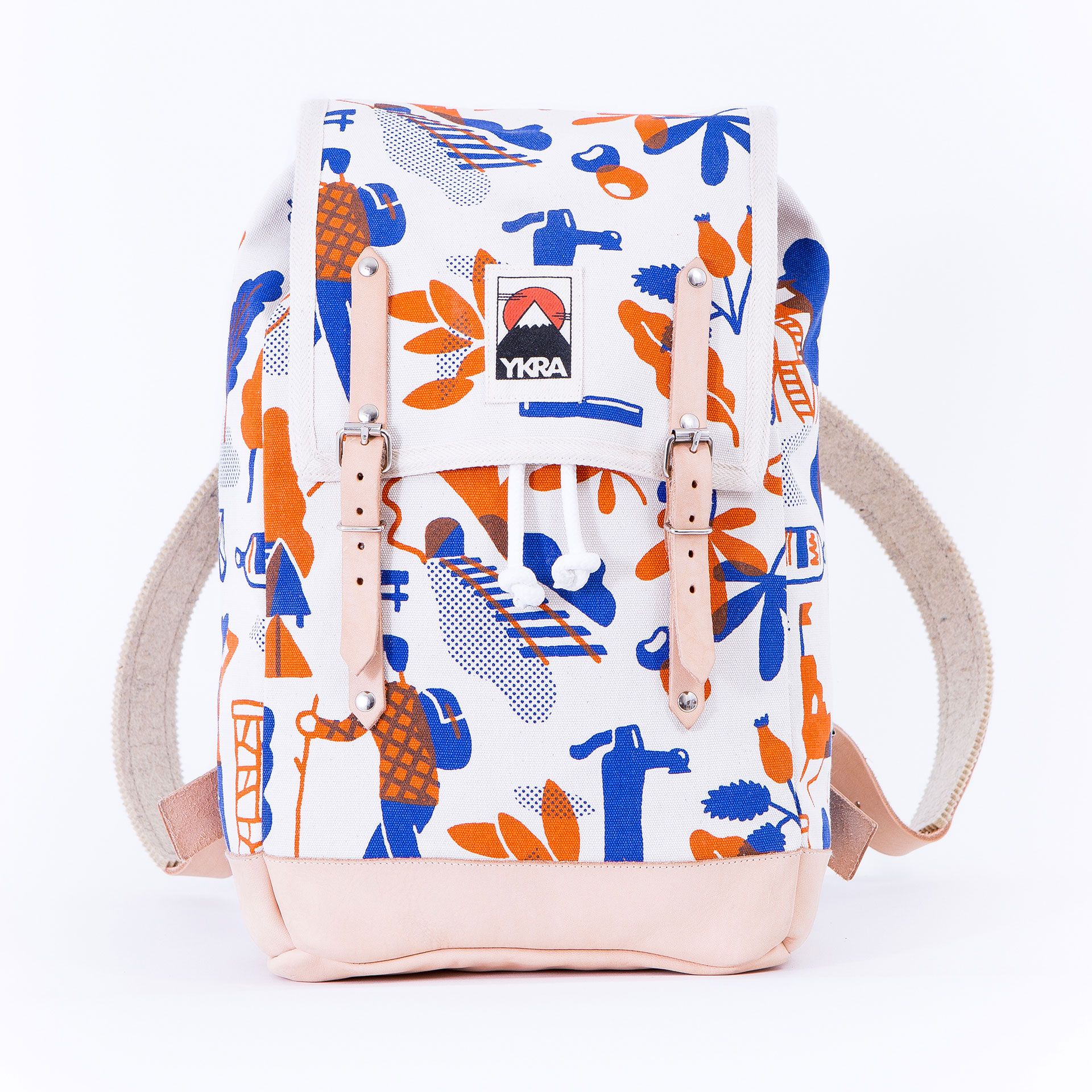
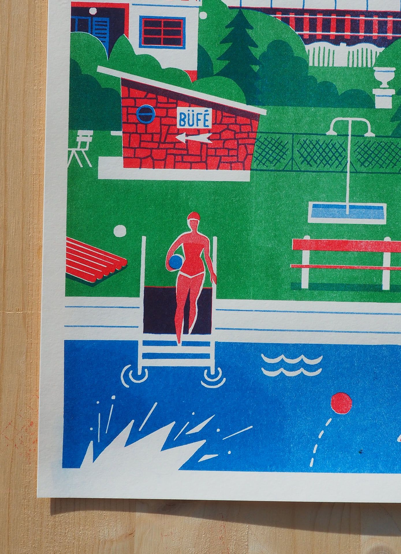
You might rightly ask, what does this have to do with illustrations? There are many approaches and many ways to get there. Manual reproduction techniques have become increasingly valued with digitization, and hand-drawn illustrations can have nostalgic connotations beyond their visual value. Therefore, it is a popular illustrative theme to recreate the pleasant, almost synergistic memories of bygone eras in the language of images. This trend can be noticed in the work of many national and foreign artists. Among others, the illustrator Levente Csordás comes to mind. Together with Orsolya Boncsér, they published the children’s book “Fogd rá a jetire” (Blame the Yeti—free translation; written by Orsolya Boncsér, illustrated by Levente Csordás), whose imagery can take you back to “Kisvakond” (The Mole; original title in Czech: Krtek). But it’s not just visual products designed for children that are driven by a sense of ‘retro’. We can also travel back in time with his designs for the collection of the Ykra brand and his posters available at Levente Hurrikan Press.
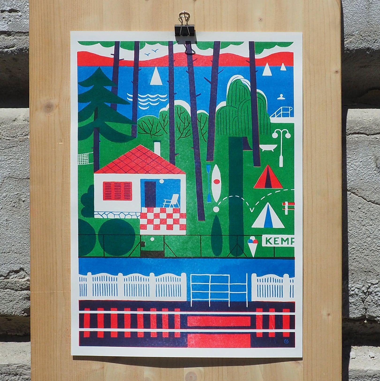
Levente Csordás
This direction also comes to mind when we think of the works of Anna Kövecses, an illustrator of Hungarian origin who lived and worked abroad for many years. The first publication associated with her name is the 2011 children’s book“Erik és Csipesz nyomoz” (Eric and Tweezers investigate—free translation). The picture book reflects that Anna Kövecses is extremely conscious of how she constructs her publications—both the colors and the forms result from well-thought-out decisions. The conscious style choice faithfully reflects the Eastern European illustration traditions of the sixties and seventies, which served as her main source of inspiration. She deliberately reaches back to the visual world before the change of regime (cartoons, filmstrip, TV commercials). In this regard, the designer pointed out that while in our country, these illustration traditions seem to have been washed away by the political changes of the early nineties, elsewhere they survived and can still be seen today. Drawing inspiration from her childhood memories and stimuli, it is mainly the postcards and maps of those years that have left a deep visual imprint on her, something she encountered during the summers spent with her grandparents by Lake Balaton. Her paintings and illustrations are infused with the atmosphere of naive art. Her simple, organic, childlike forms reflect the child’s state of consciousness when there is no room for doubt. The vivid colors and minimalist tools she uses to create her work translate into a simple but not self-evident, illustrative language. Through her work, she wants to tell as much as possible with as few tools and forms as possible.


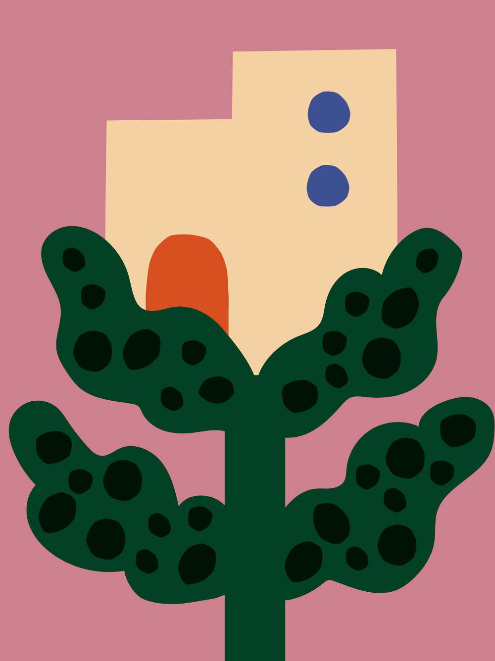

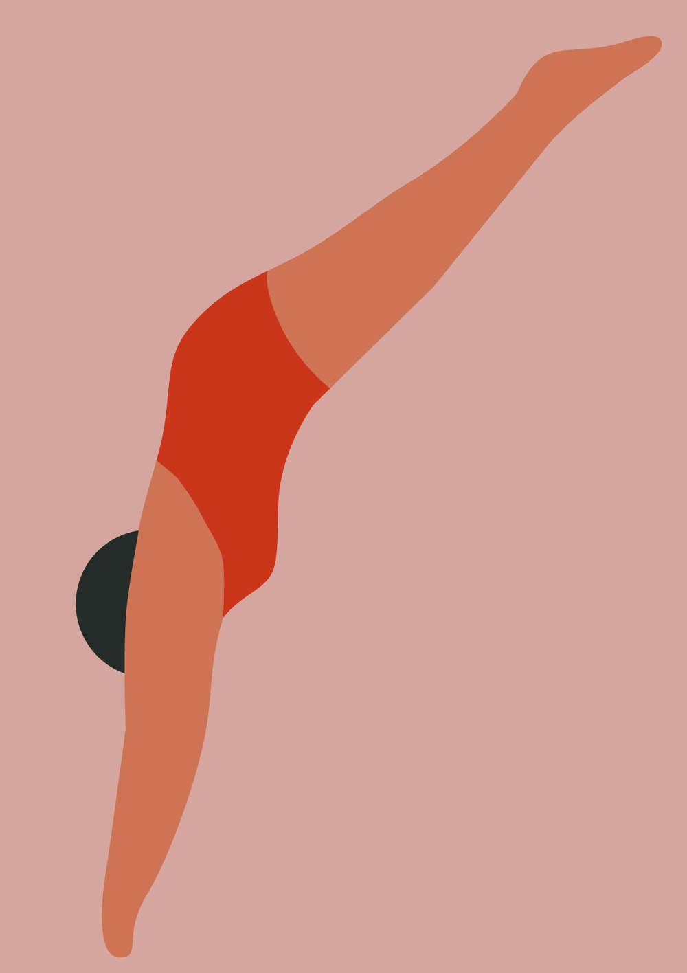
Anna Kövecses
Last year, in addition to animation, 3D and minimalist illustration, the most prominent digital illustration trends also included abstract geometric shapes, known as line art, playing with shapeless forms and the tangled, complicated lettering, the so-called calligraphy. As we go on, we will discuss these trends and the role of the analog-digital concept pair in graphic design. The term ‘digital art’ can be misleading, and we might think of artworks that are conceptualized by machines or computers. However, digital art is also rooted in an artist’s or designer’s individual thoughts and story, like any great work of art. And the extremely sensitive and ever-changing world of graphic design and illustration is no exception.
We can already guess what trends will dominate in 2022. In recent years, it has become an almost standard practice to anticipate changes in the new year by taking stock of the past year. Such speculation is likely to be correct, but we must remember that surprises are always waiting around the corner. One thing is for sure, whatever the new developments in technology and trends bring, we are eager to see them!
We could talk about the genre of visual design in a broader sense, but bearing in mind the article’s subject, I would like to focus on illustration. Many of last year’s trends will be with us again this year, and alongside them, fresh fashion trends are already taking root.
With no spatial elements, the flat illustration has brought a breath of fresh air to visual platforms, replacing boring stock photography. The trend, which has enjoyed uninterrupted success for more than 5 years, has changed a lot over the years. This trend will be about unique shapes, textures and details in a more personalized and artistic approach.
Traditional art has always been and will remain popular because of its timelessness, just like freehand illustration. The latter is worth a longer discussion since it has become an increasingly attractive genre with the digitalization boom. As the technical background of graphic design developed, many doors have opened. The personal tone is one of the greatest added values of illustrations, whether hand-drawn or digitally created to evoke the classic visual style or made traditionally.
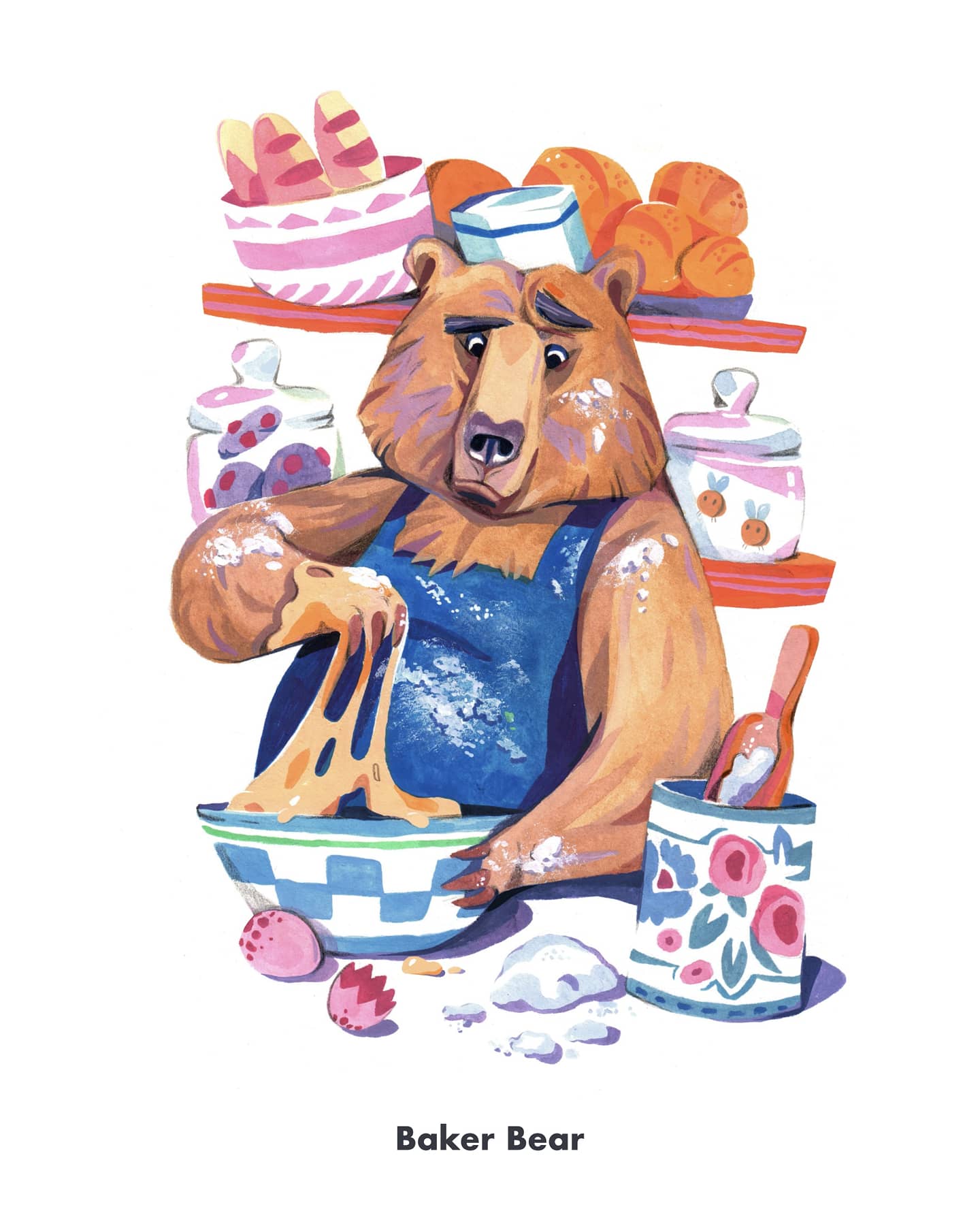
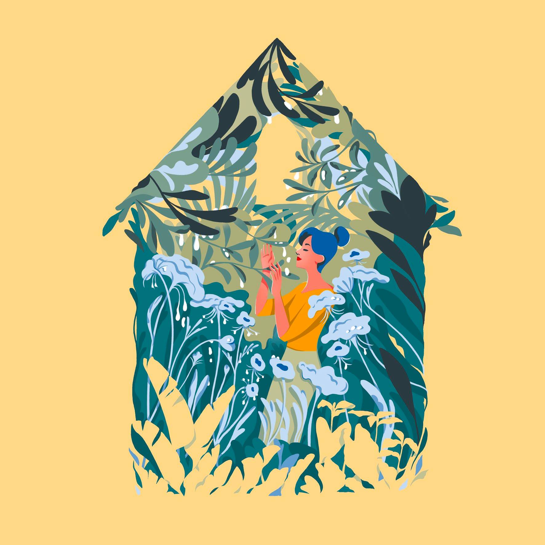
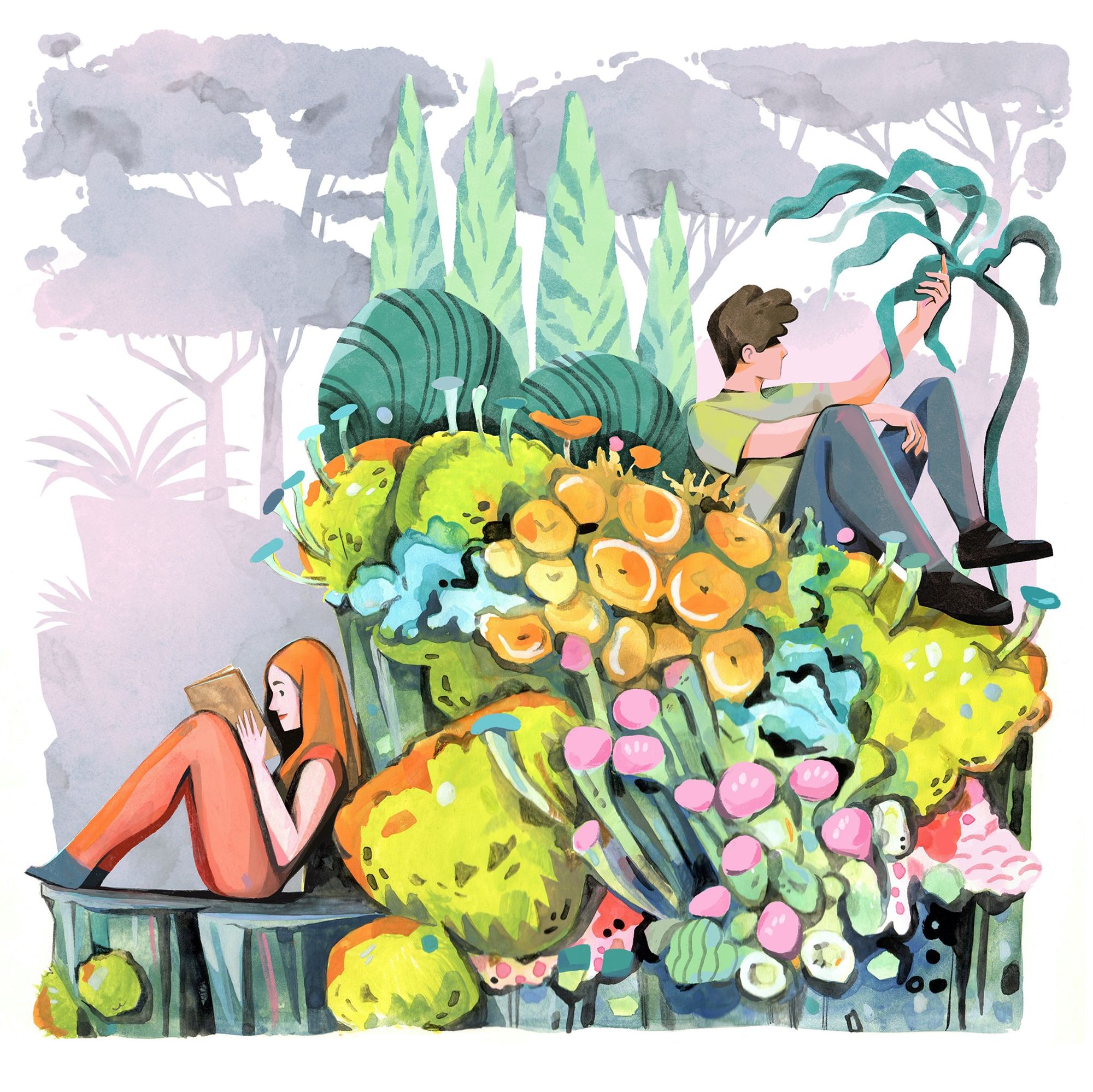
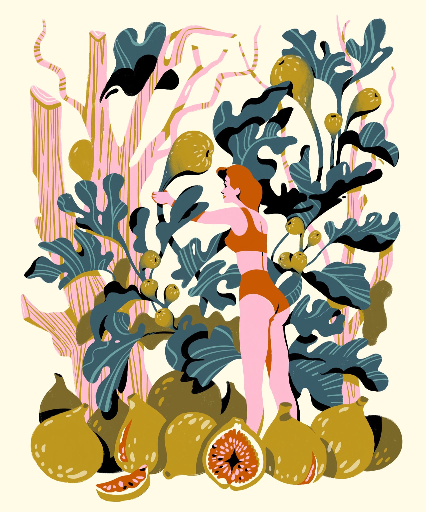
Aliz Buzás
Using geometric shapes is also not a new trend. It stretches way back to the Bauhaus. And in addition to its fun, light and playful nature, its unbroken success is also due to its ease of implementation. The abstract shapes, lines, and angles themselves can be used as a backdrop to an illustration or even a stand-alone composition.
It was not so long ago that 3D solutions appeared on the horizon of illustration. The style, associated initially with video games and character design, has in recent years become an emerging trend in other creative fields outside the virtual gaming space. And we wouldn’t be surprised if funky characters continued to be a popular element of the leading brands’ campaigns this year.
Animation has been the hottest trend in recent years. Moving illustrations are everywhere, on social media, in advertising and on websites. Unlike static images, dynamic moving animations can capture and hold our attention much more easily. They also make storytelling and story building a breeze. Animation is both an opportunity and, to some extent, a limitation. Some styles are much easier to animate than others. A complex, detailed drawing loses its power when animated. In contrast, a basic sketch with simple shapes, combined with exciting textures and a touch of playfulness can be easily converted into a personal and remarkable animation.
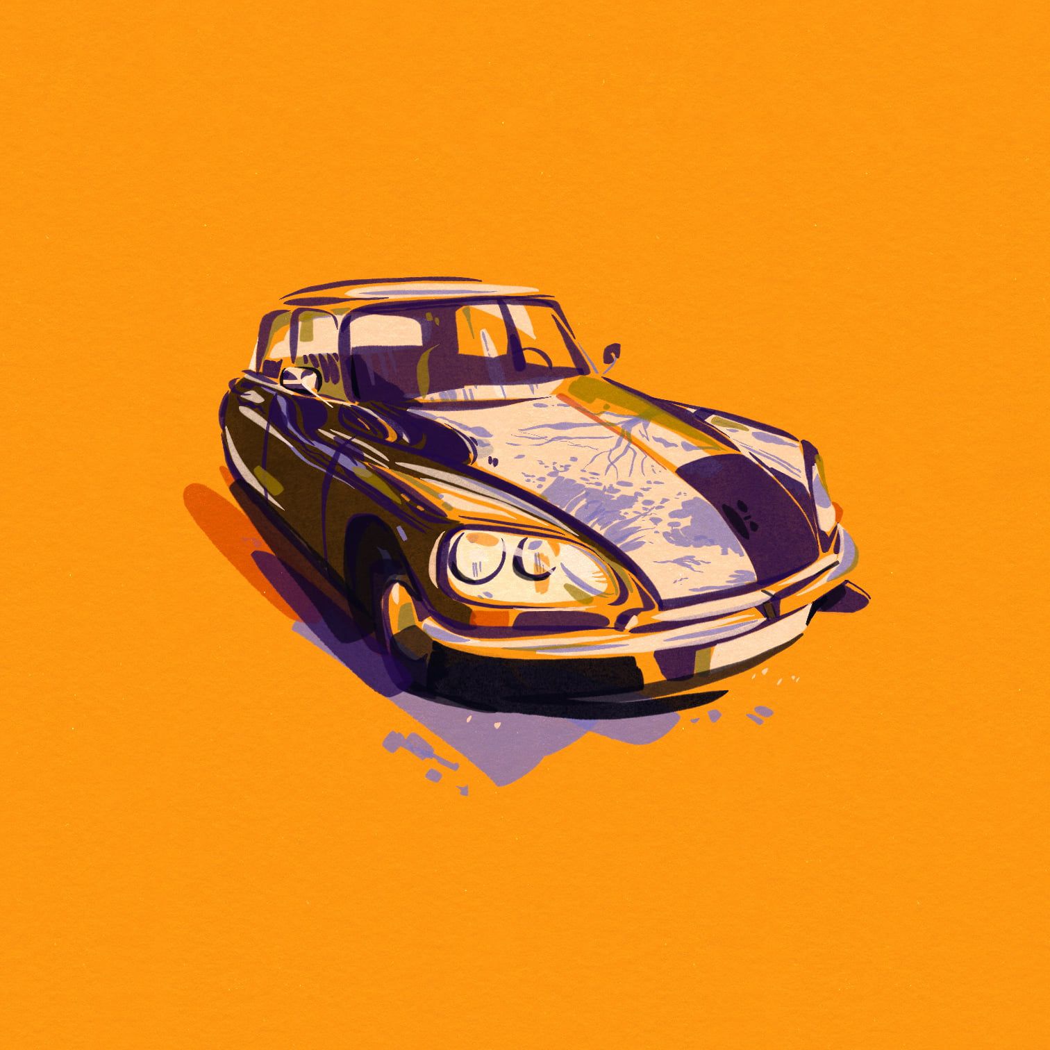
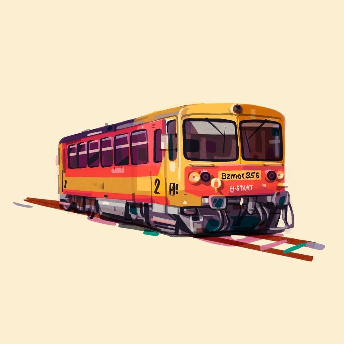
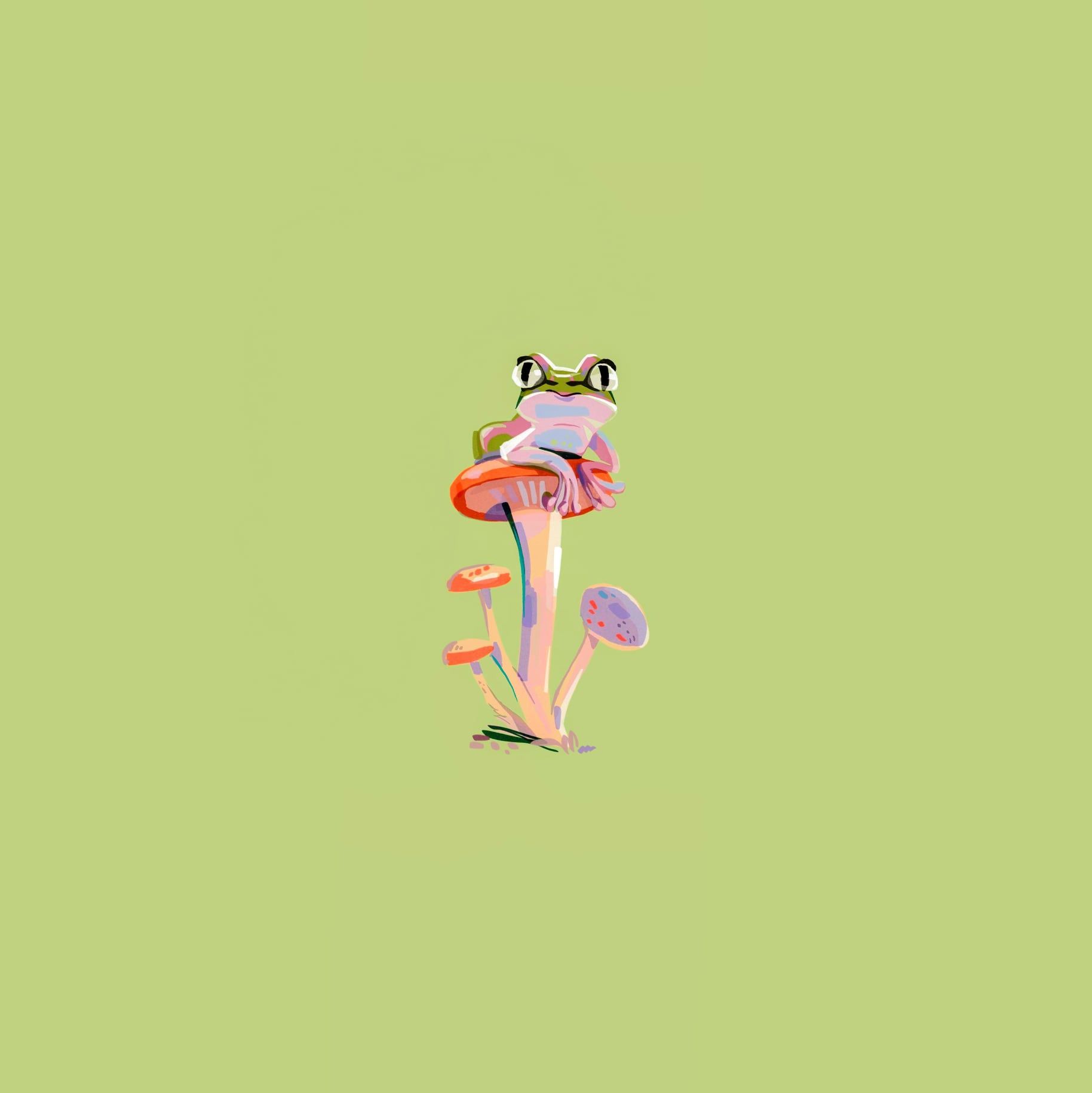
Aliz Buzás
A simple but powerful trend has also made its way along with the previously mentioned illustration styles with complex structures and complicated design mechanisms. And this is nothing other than line art, built from simple lines and clean shapes. In the age of constant information overload, rather than losing its power, this style has recently become even more popular in the graphic design scene.
The popularity of hand-drawn lettering lies in its versatile use. Beyond the classic usage (logos, publications, advertising), they can work well either mixed with illustrations or even more boldly, as stand-alone compositions. Miklós Kiss balances his work on the border between fine art and design. His refined, thoughtful logo and illustrations, which don’t lack calligraphic features, are all part of the Hype&Hyper identity.
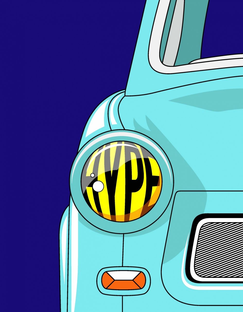
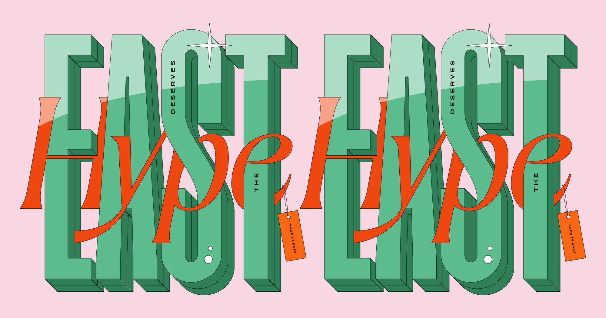
Miklós Kiss
Trends in digital illustration and web graphics are excellent indicators of the changes brought by the winds of digitalization. Graphic designers and illustrators monitor the shifts of technology and taste in their environment like sensitive seismographs. Beyond the changes and nuances of graphic trends from year to year, their subjects reflect the interconnection points between the analog and digital worlds. Modern digital illustrations are also an imprint of social movements, moods and trends. The pictures use the language of visuality to present even the most difficult topics easily and understandably, which is why they also depict social diversity and encourage us to make environmentally friendly choices. At the same time, the current situation caused by the coronavirus is a theme that anyone can easily relate to. Looking at Aliz Buzás’s drawings, we can almost smell the unpleasant odor of alcohol-based hand sanitizer, and our noses can start to itch under the mask.
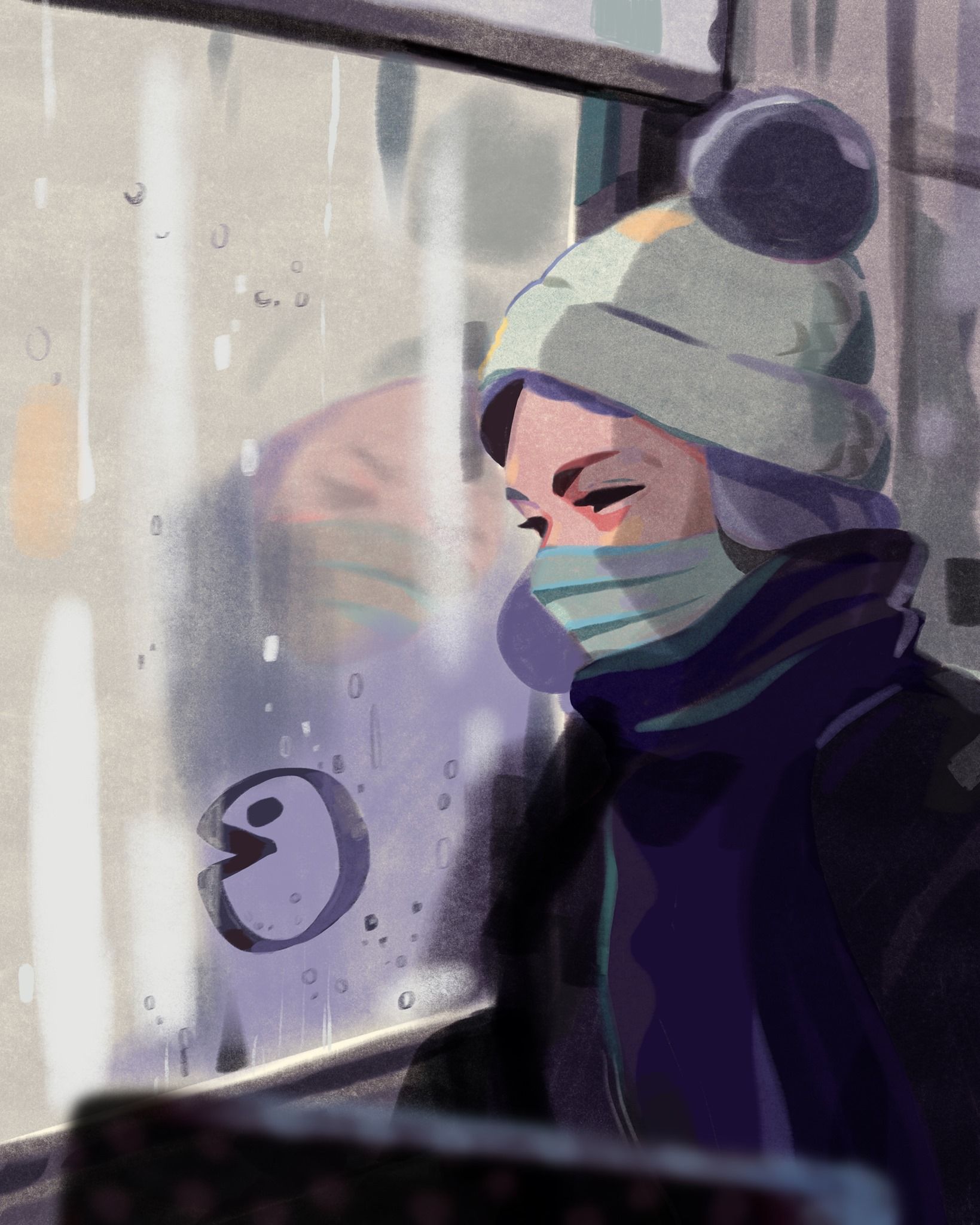
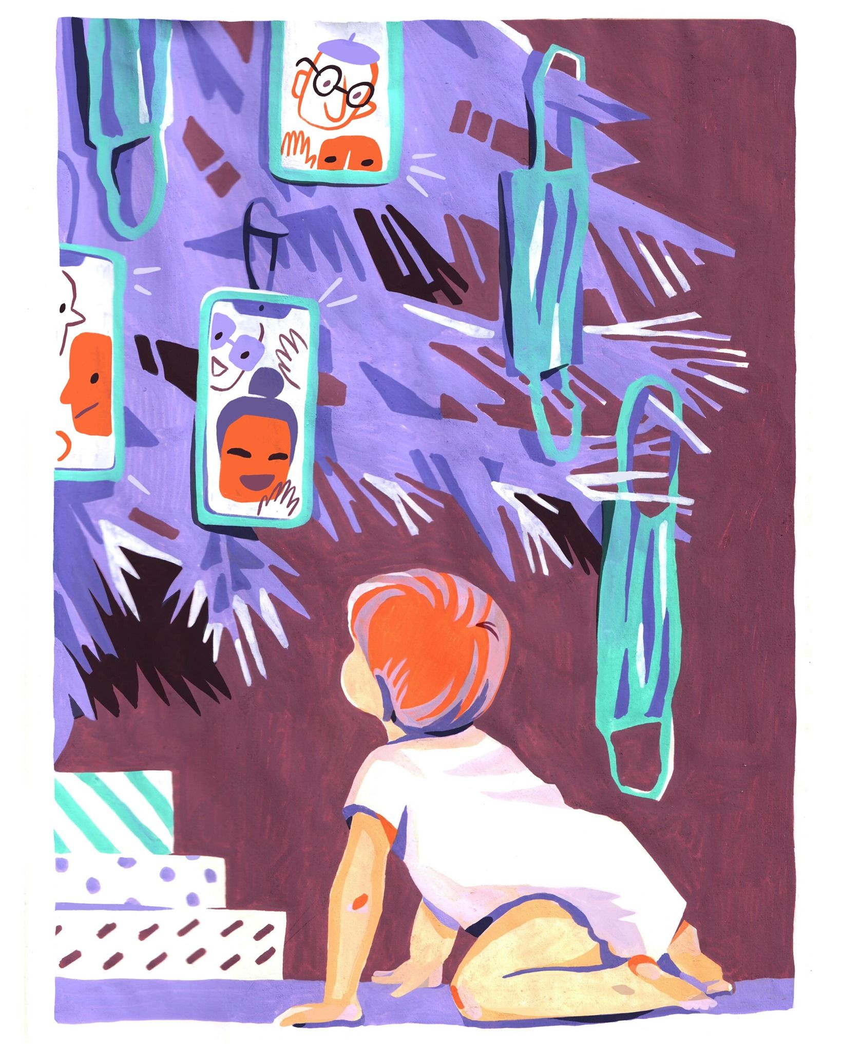
Aliz Buzás
Whether we are talking about hand-drawn illustrations made with traditional graphic techniques or the latest computer-generated designs, they are an integral part of our lives. If we pause for even just a moment in front of a drawing or picture with a visually pleasing or thought-provoking subject, I think it has already achieved its purpose—it speaks to us!
Photos: Aliz Buzás, Miklós Kiss—Hype&Hyper, Anna Kövecses—Facebook, Urbanplayer, Hurrikan Press
Source: Behance, Designstripe

Modern self-sufficiency on the island of tranquility | Mandrova house
Polar bears have moved into abandoned Russian houses


