Application to this year’s first ArtHungry call titled TypoHungry—Typography in Hungary in the XXI century has opened today, with the aim of finding the best Hungarian typographic works of the past twenty years. The projects selected by the professional jury will be published in a comprehensive album, which will be the first part of an artwork publication series. We interviewed José Tábori-Simon, the founder of ArtHungry.
What gave you the idea of this exclusive book series?
I have always considered it important to also work on my own publications in addition to my made-to-order graphic design projects, and so I have co-founded several publishing companies in the past twenty years, with which we mainly designed and published fashion and pop culture magazines. It has been an old dream of mine to also offer an opportunity for the high-quality projects uploaded to the ArtHungry platform to be featured in print because I firmly believe that, in today’s overloaded digital world, beautifully designed and crafted publications that may look just as good on the shelves as it feels to hold them in our hands still have a right to exist.
Our publisher was a given, and on top of it all, a lot of supercool projects have been uploaded to ArtHungry over the years. The art of design is, inexplicably, quite underrepresented in today’s Hungarian book market, this is why the idea of launching a series of calls and publications was born in the beginning of 2020, in which we would collect the best and most prestigious Hungarian graphic design projects of the 2000s that are also outstanding on an international level.
The first three parts of the art publication series will focus on typography, logo design and icon design. What made you choose typography to be the focus of the first album?
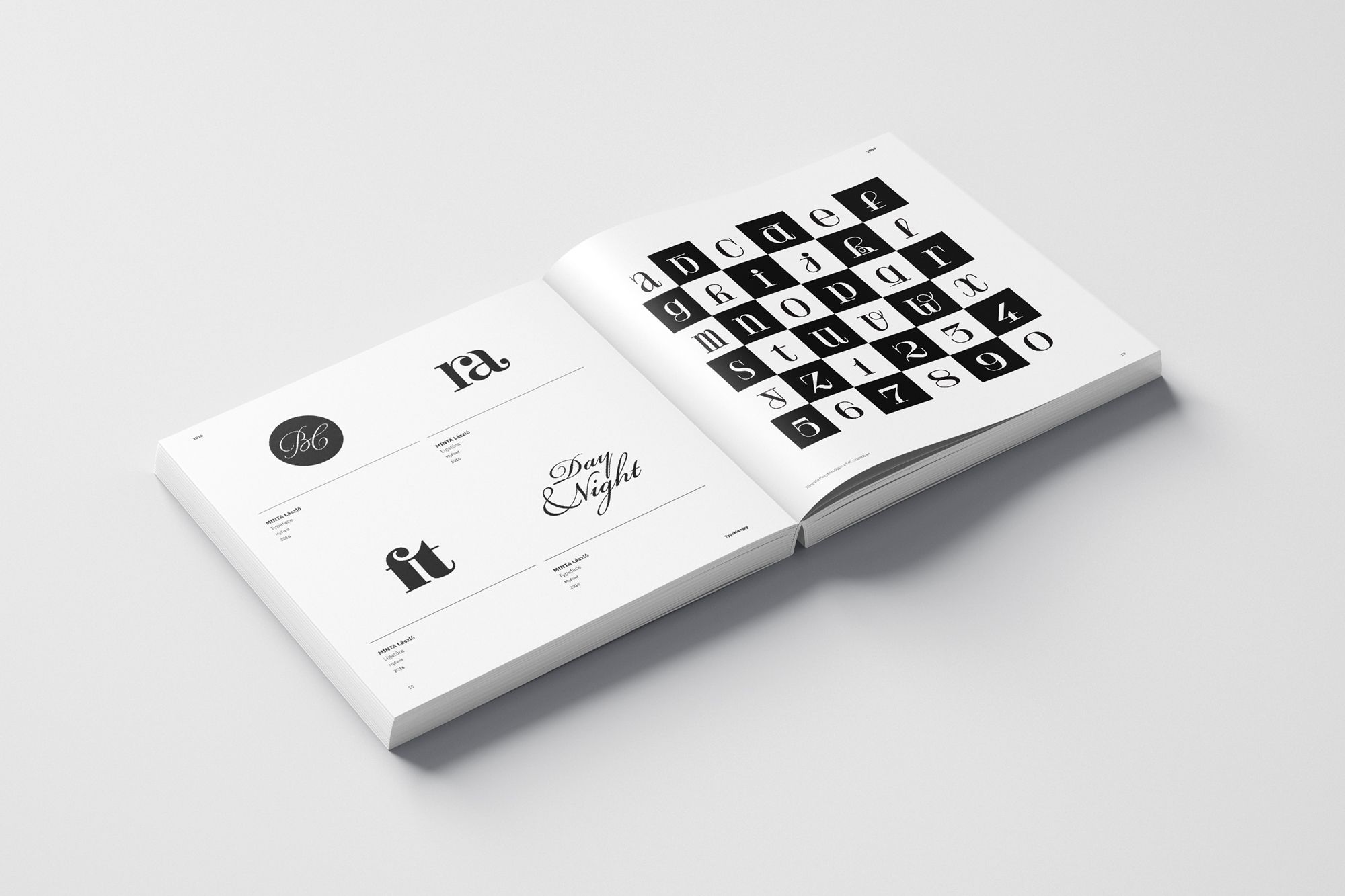
I think the booming digitalization and the supersonic development in the art of design of the past two decades are the most apparent in the field of typography. The increasingly user-friendly operation of computers and the appearance of the various graphic software opened new dimensions in the nineties also to font designers. Experimental typography having a renaissance was truly flourishing in the late 1990s and the early 2000s. The availability of mobile devices and platforms brought new trends once again—after the appearance of neo-classic typefaces, young designers are now rediscovering the psychedelic fonts of the seventies. All this is not only happening on an international scale: owing to the internet and the quick flow of information, this process can also be observed here, in Hungary. A quite exciting selection can be expected in the field of typefaces, but all font-based projects are welcome, including various typographic signs, ligatures, monograms, calligraphies as well as experimental typographic projects and graffitis, too.
In the future, we would like to dedicate a separate call to the Hungarian publications and magazines made in the 2000s, and we also plan to publish albums collecting UI/UX and game design projects.
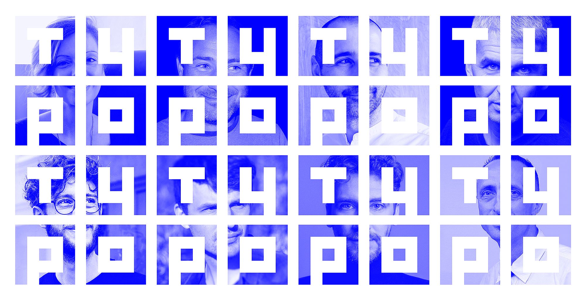
The same as in the case of all planned publications, the works published in the first volume will also be selected by a professional jury of nine. Who will be in the jury of the call focusing on typography?
It was very important that the experts invited for curator tasks feel confident in the given category and are acknowledged professionally both in Hungary and abroad. The publications will also feature the works of the jury members—making sure to include Hungarian graphic designers and typographers who could not be left out of such a publication by any means was another important aspect we considered when selecting the members. In the case of the TypoHungry volume, Dóra Balla, the associate professor of MOME’s Graphic Design Department, represents the experimental trend in the jury. Oszkár Boskovitz and Amondó Szegi, the founders of the Hungarian Font Society are teaching font design in several institutions, and their typefaces are used internationally. Zoltán Halasi’s works have been acknowledged by several professional awards, and he teaches typography at several Hungarian universities. As a member of Halisten Studio, János Körös is mainly known for his hand-drawn fonts and calligraphies. Miklós Kiss needs no introduction either: he is an internationally acknowledged visual artist, his characteristic ligatures are known by practically everyone. Béla Frank and Ádám Katyi are the most well-known Hungarian new generation font designers, both of them have their own digital “type foundries.”
In addition to the curators invited, many Hungarian art schools, institutions and professional organizations also decided to support the project. Our sponsors include MOME’s Graphic Design Department, the Hungarian University of Fine Arts, METU, the Visual Arts Institution of Eszterházy Károly University in Eger, the Faculty of Art of the University of Pécs, the Association of Hungarian Fine and Applied Artists, Graphifest and the Golden Drawing Pin Society.
You have been in the profession for more than twenty years. In addition to your magazine, album and record cover jobs, as well as awesome and informative icons, you have also designed fonts for the Design Week Budapest event series. What’s your take on the development of typography in Hungary in the past years?
As an artist, I experienced the technological and digital revolution of the turn of the millennium on my own skin. I am part of the generation that hand-painted fonts at college: we used Letraset templates in addition to ink and tubular pens. At the appearance of computers, we did typesetting in QuarkExpress, we designed fonts in Freehand, and then we localized and generated typefaces in Fontographer. We started online communication with dial-up modems and we spent hours in image setting studios examining the films and the cromalins before print production.
With all these behind my back, my perception is that the development of Hungarian typography really caught up with the international trends by the 2000s. In spite of the economic crises, even in the midst of the current pandemic, our devices and tools keep renewing and updating, the software we use for designing fonts are more and more simple to use, education improves, and, as a result, typography is flourishing not only abroad, but also in Hungary.
Do you see a difference between the styles of Hungarian and foreign font designers working ten or twenty years ago?
I would not separate Hungarian and foreign typographers, because as I have already mentioned it earlier, in the 2000s, it was easier to be up-to-date in Hungary, too, especially thanks to the internet. If we look at typographic and graphic design trends as a whole, after the experimental trash typography dumping around the turn of the millennium, I remember a long trend with re-editing the classic fonts in the focus. While in past years, what I see on the various professional social platforms is that the general pop cultural retro trend, that is, rediscovering the seventies and the eighties, is still quite prevalent among young font designers.
You, too, will be one of the jury members: what aspects will you consider when selecting the projects?
In the case of the calls related to ArtHungry, I am one of the curators for practical reasons: based on the experience of past years, it’s good to have someone coordinating the jury members, who can be convincing enough and can decide disputes, should there be any difference of opinions.
In addition to the obvious aesthetic requirements, I’ll also consider the complexity of the projects as well as their presentation on the site. What I mean by this is that for me, uploading a few images depicting fonts will not be enough: I appreciate “elaborate” presentations more. For example, I like to see how the designer got from the initial sketch to the final version. They should present the project during use, on mock-ups, for example, but it’s best if they illustrate it with their own photos and renders. It’s also great to see the compositions in motion, animated. In addition to jazzing up the presentation, these extra features also help convince the curators, for sure.
How many projects are expected to be featured in a single album?
It’s hard to say how many projects the jury will find suitable for inclusion in the book, but I think approximately six hundred projects could represent this 20-year period well.
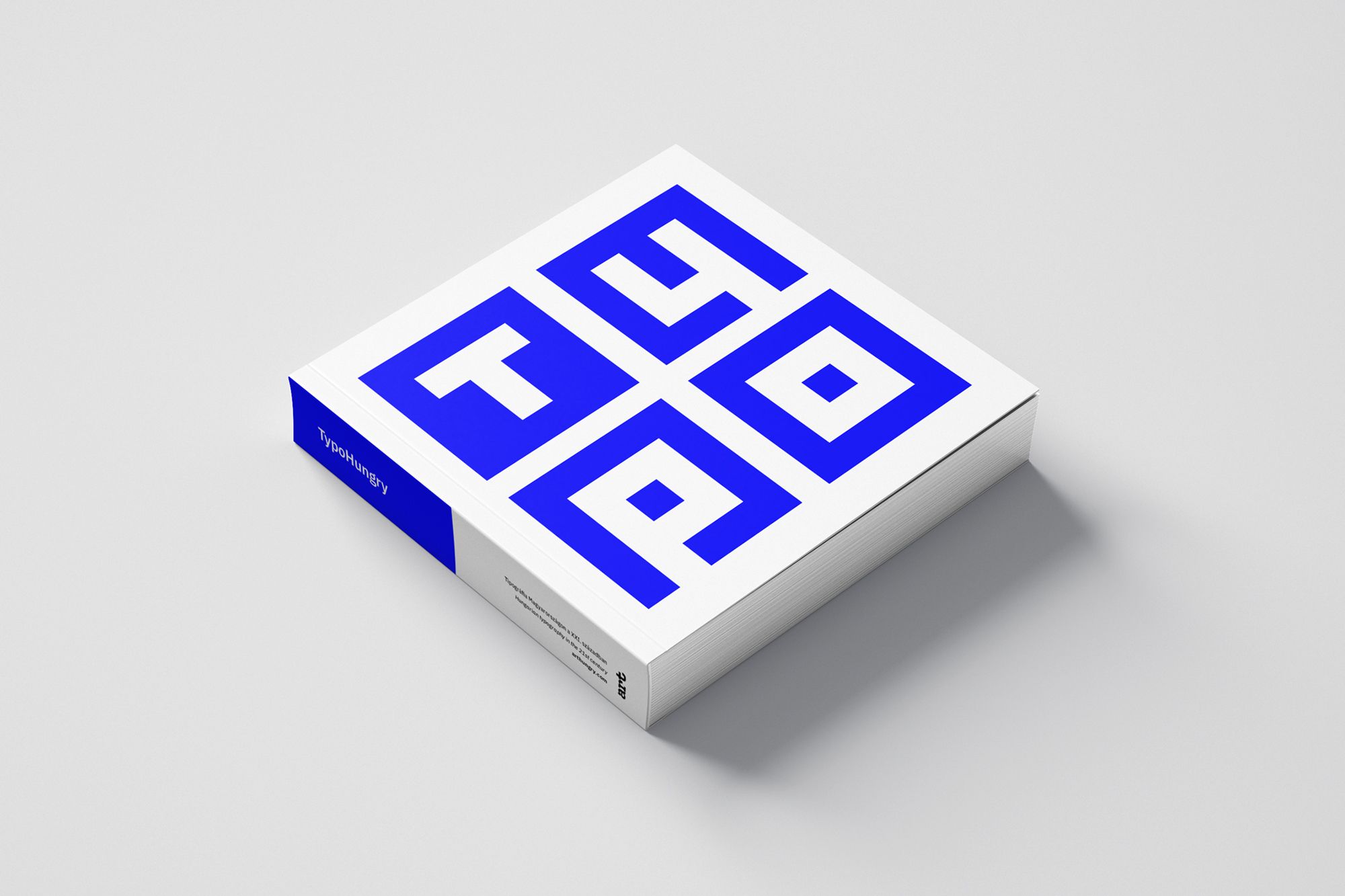
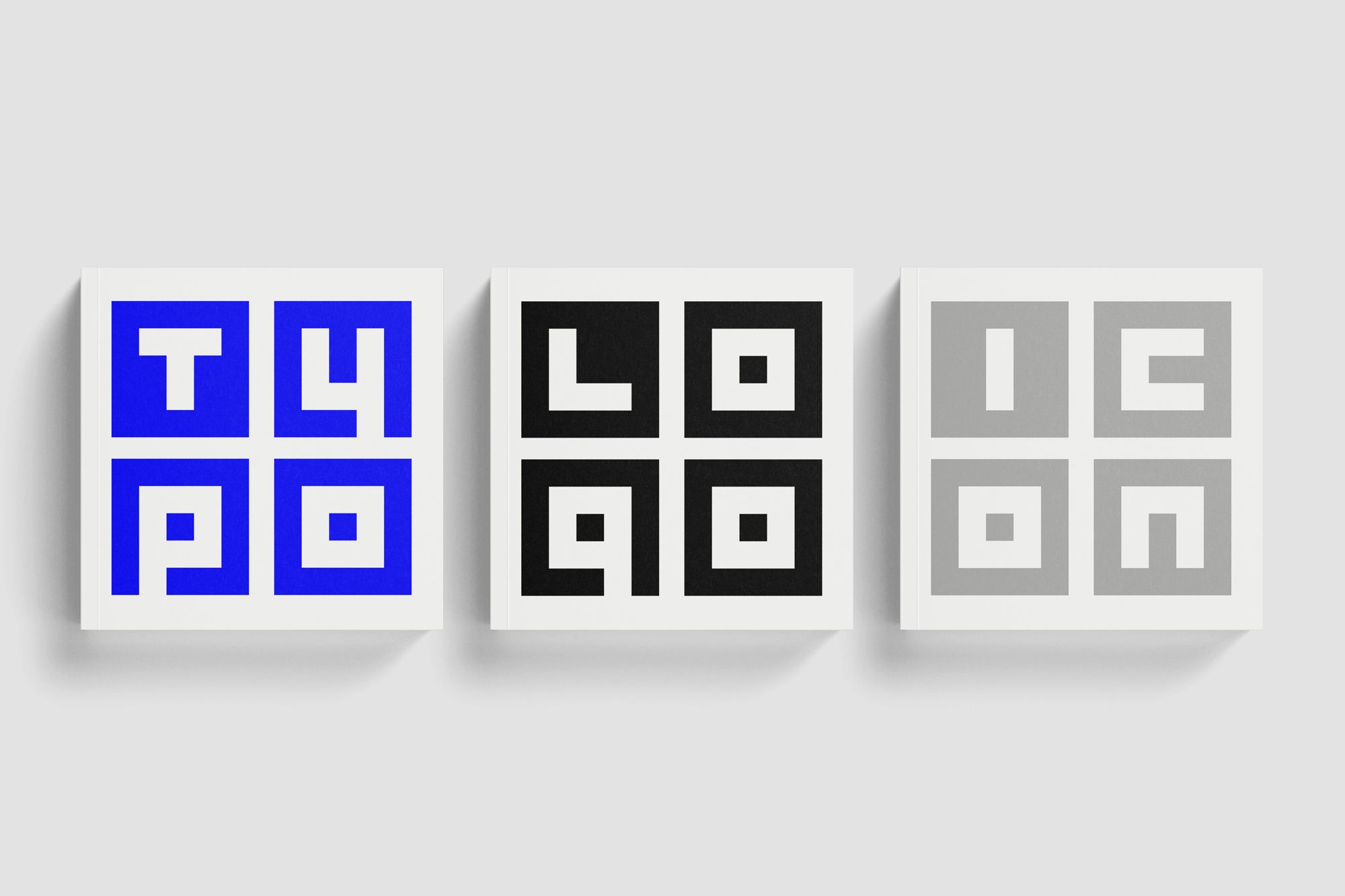
The impressive layout and cover of the publication are both your designs.
Yes, in the case of projects like this, I like to utilize the fact that I, too, work as a graphic designer and that in these cases I get to design without compromising on anything. In addition to the layout, I also designed a custom monospace typeface for the series, and now it looks like this four-font logotype-like visual concept evoking QR codes will accompany the publication series with various direct colors.

Application for the call is now open. When can we expect the volume of the selected projects to be published and what’s the schedule for the coming publications?
We open the application period today, which will last until April 11. Until March 17, there is a ten-day early bird period with a significant discount, so it’ll be worth acting quickly. As usual, we’ll offer a great discount to students, and before the jury process, we’ll also announce an “Audience Award” winner, whose project will automatically make it into the album, and who will also get Bang&Olufsen premium headphones in addition to their acknowledgment. We plan to release the final book around May, in the framework of a grand launch event. The creators of the projects included in the publication will receive their commemorative copies at this event. The album and the upcoming books of the series will be available on the Arthungry.com website, in the publisher’s own online store.
Check the call and the related guide for more information!
ArtHungry | Web | Facebook | Instagram

In the intersection of the cosmos and photography | Łukasz Żak
Retro Trabants, world-famous people and fairy-tale shacks | Drvengrad