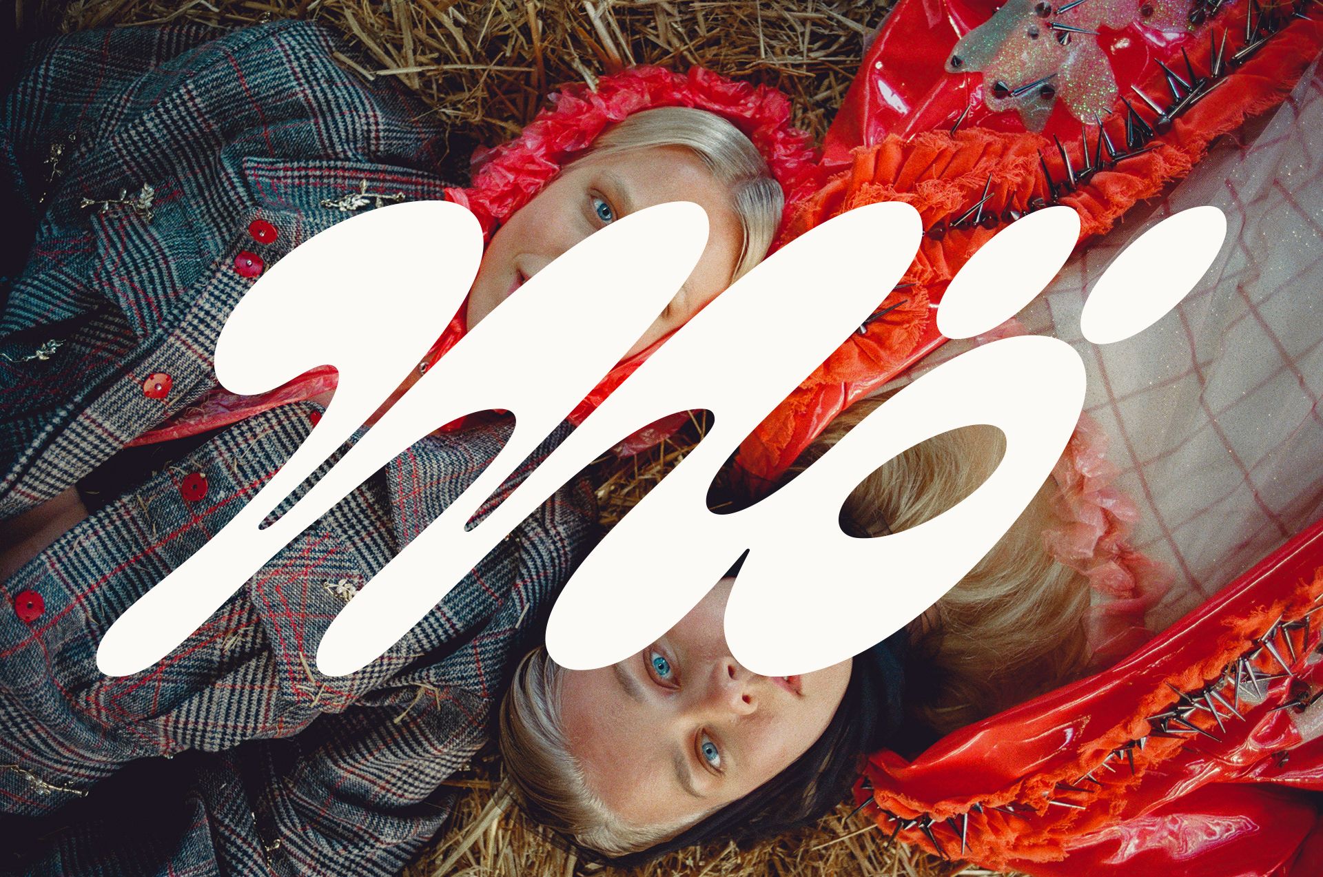
Nostalgic typography in classic blue and white, combined with striking visual elements—the taste of Finnish brand Mö’s vegan products competes even with traditional dairy products. The identity made in collaboration between the Werklig team and Lili Köves supports the brand’s move to the next level. Let’s see!
Lili Köves lives and works in Helsinki, partly at a Finnish agency and partly as a member of Classmate Studio. As a graphic designer, she admits, she is inspired by projects where clients dare to break away from the norms of their industry, such as the Mö oat milk brand, whose new identity was created in collaboration with Finnish studio Werklig.
Mö was created by two sisters from a rural community in Lohtaja, on the western coast of Finland. They aim to offer 100% vegan and climate-friendly delicacies that do not compromise on taste. ”The founding sisters grew up on a farm, as children of cattle farmers, so they have a close knowledge of the industry. Years ago, when they realized the consequences of dairy and meat production, they felt they wanted to offer an alternative to those who want to abandon traditional dairy products. But thanks to their family background, they knew that nothing is black or white, so they didn’t want to ban, to incite, or to ‘convert’: they approach their mission diplomatically and seek to convince with delicious flavors,“ reveals Lili.
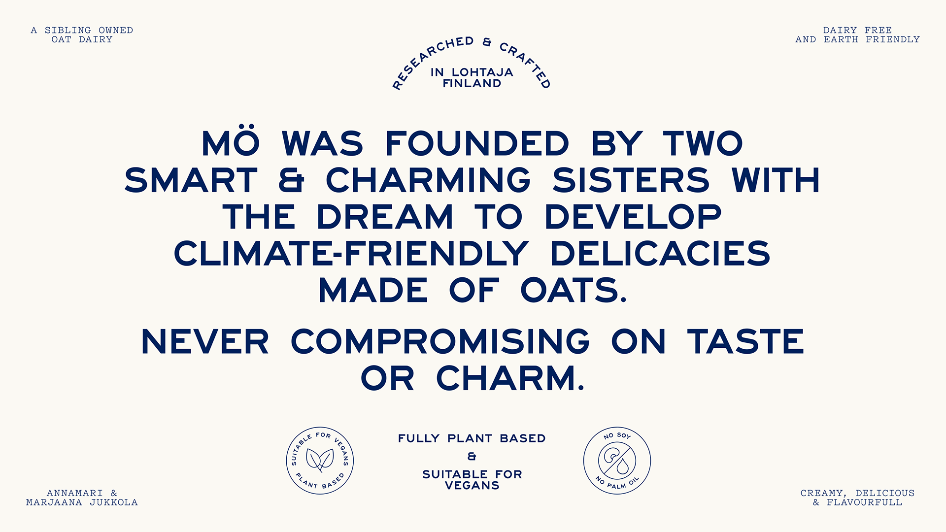
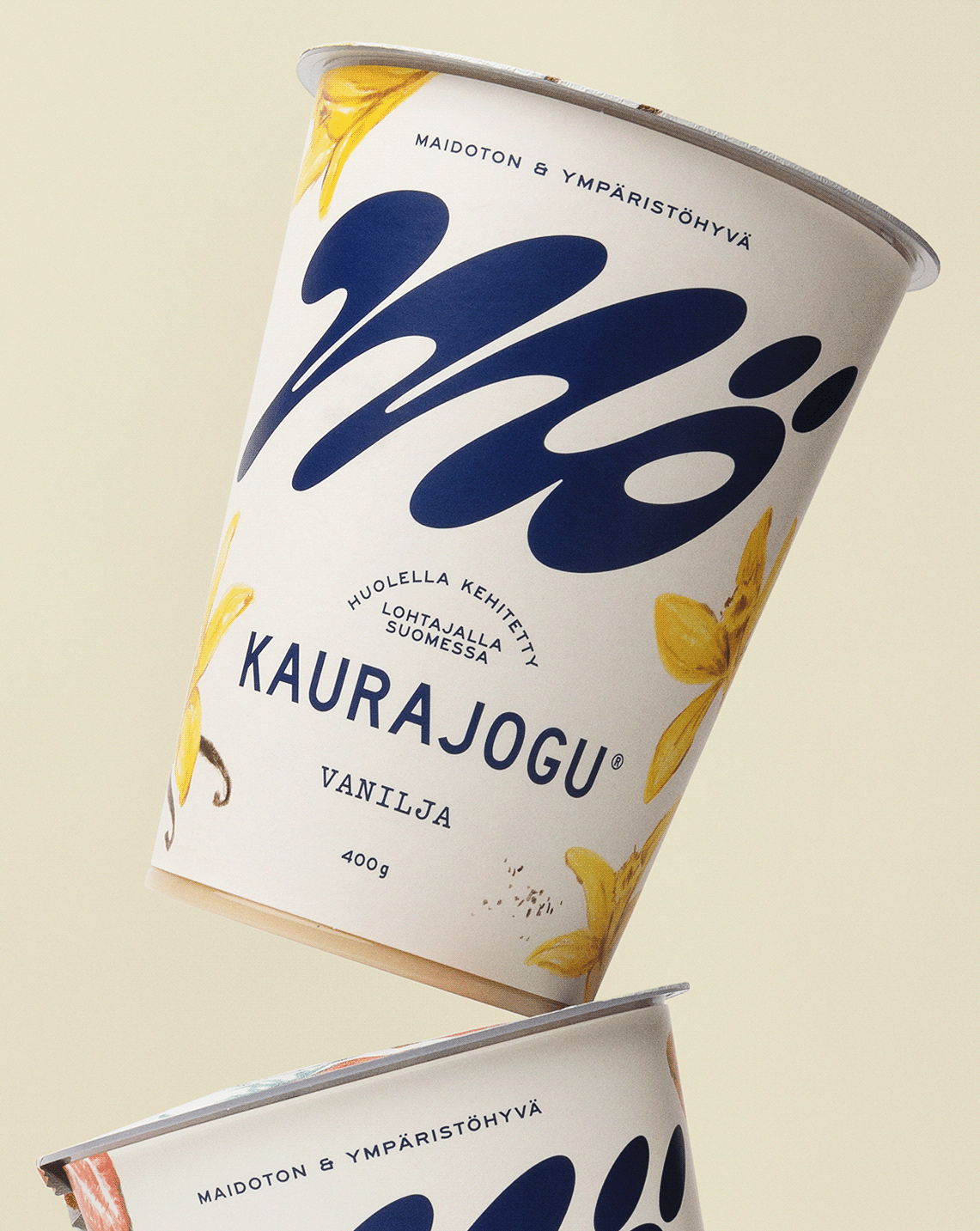
As Mö has reached a point of growth that allows them to expand its product portfolio, the founding duo’s goal is to make their delicacies available beyond the borders of Finland. ”It was our job to create a brand strategy and creative identity that would help Mö distinguish itself and take the company to the next level,“ adds Lili.
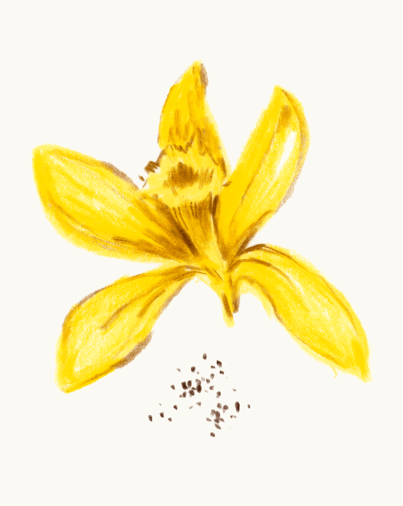
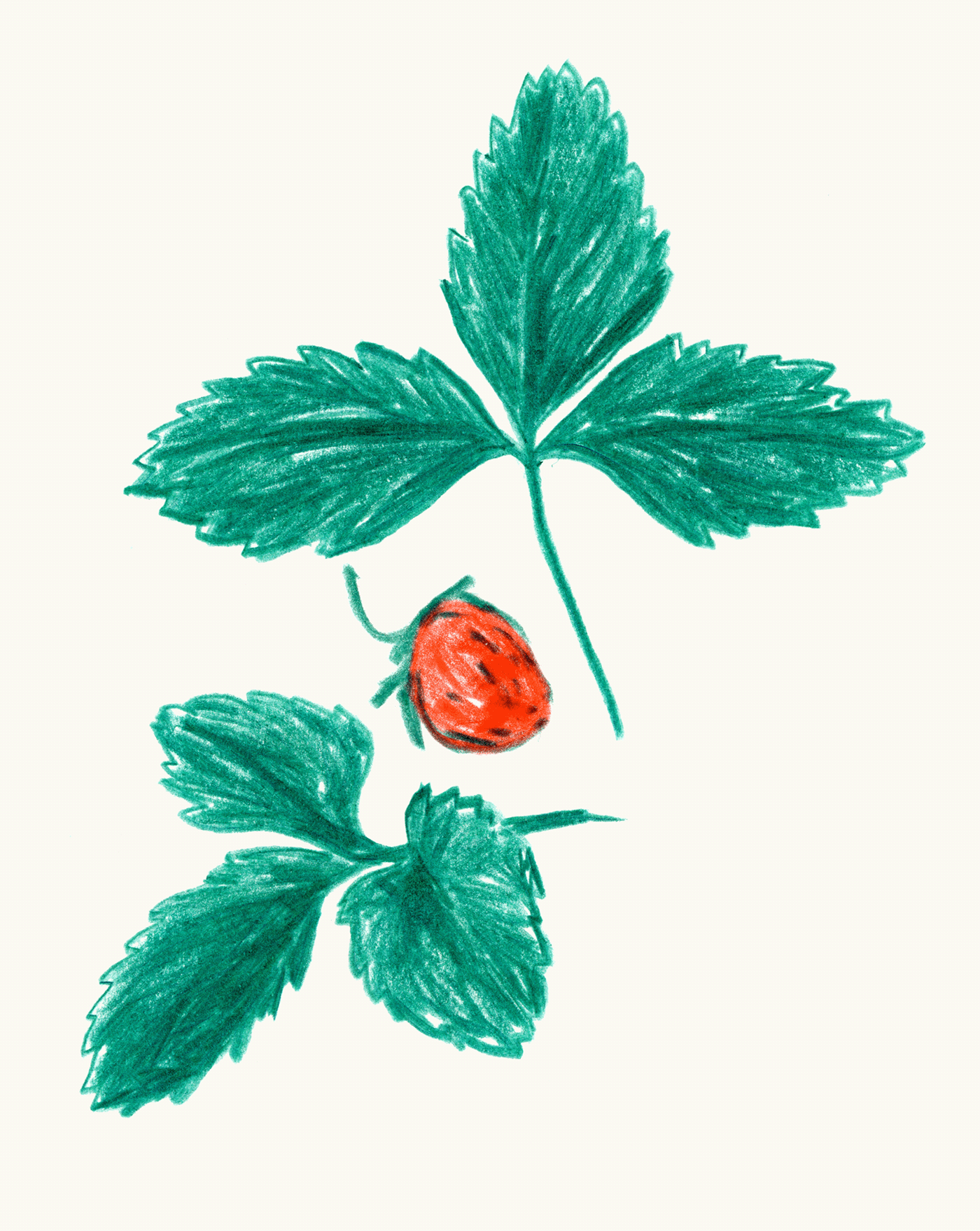
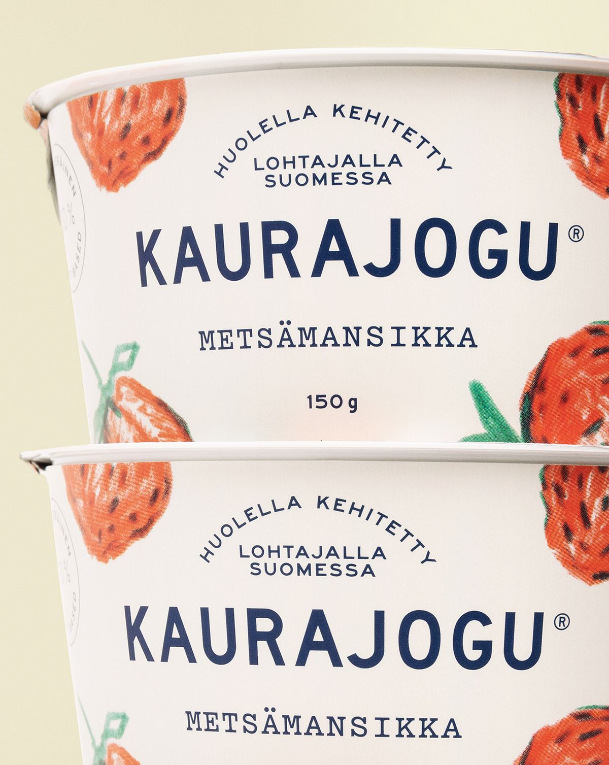
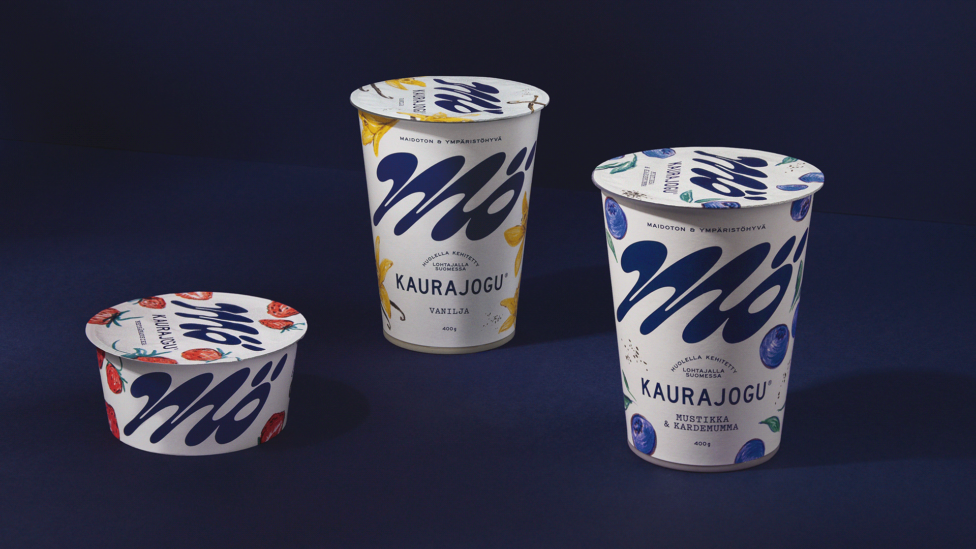
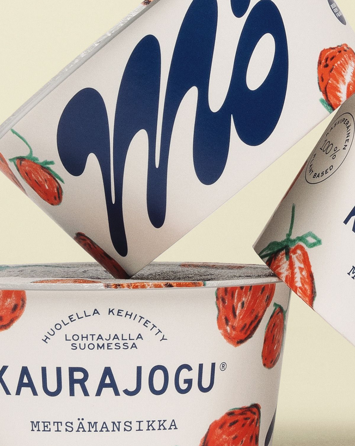
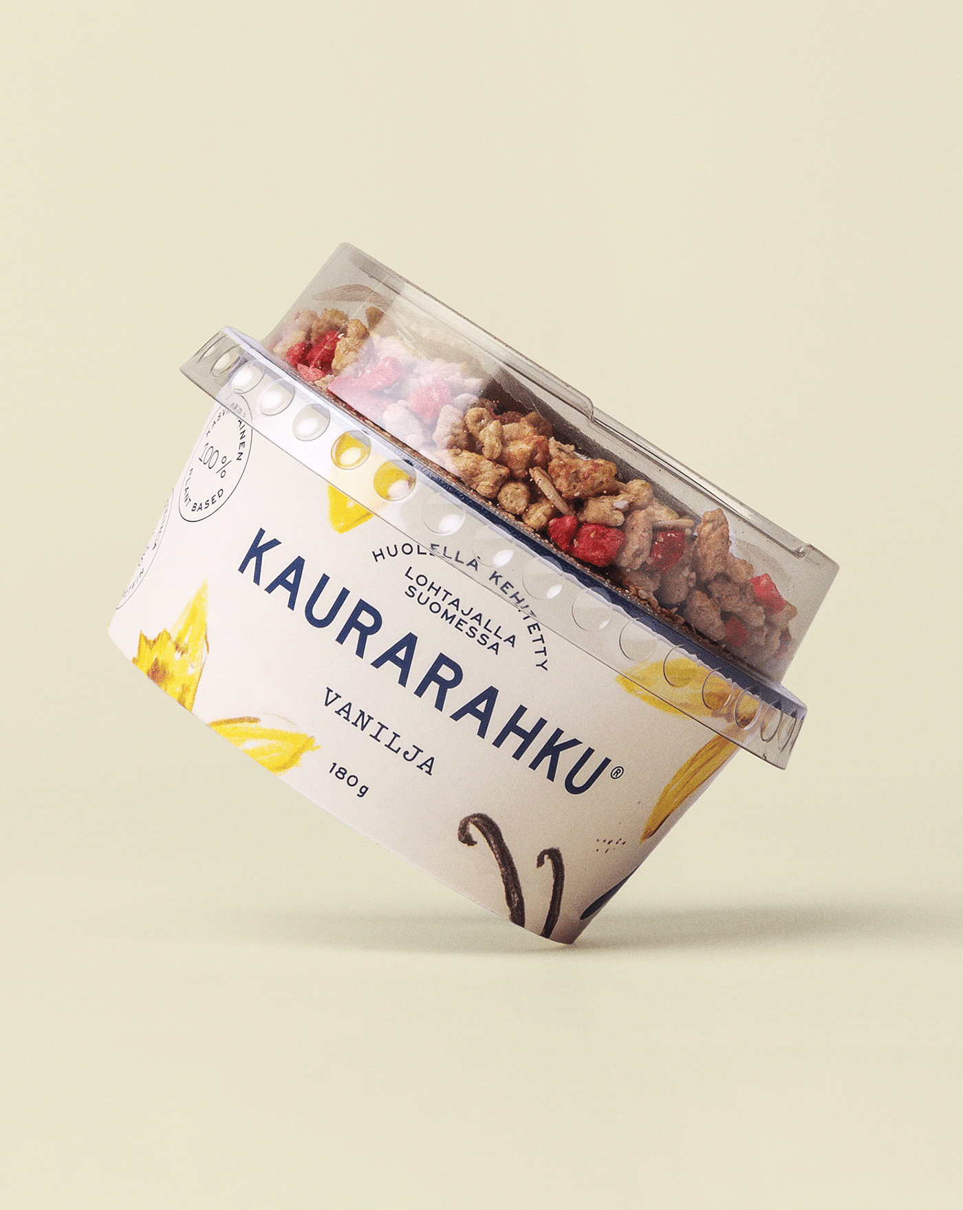
The new brand identity is characterized by a deliberate play on visual clichés typical of the dairy industry: charming typography, hand-drawn illustrations, and a blue and white color palette evoke the world of Finnish dairy co-ops in the countryside. ”The unusually large size of the Mö logo on the packaging or in advertisements emphasizes the bold and youthful nature of the founders,“ Lili notes.
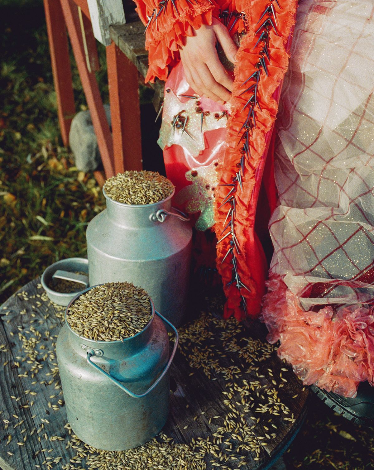
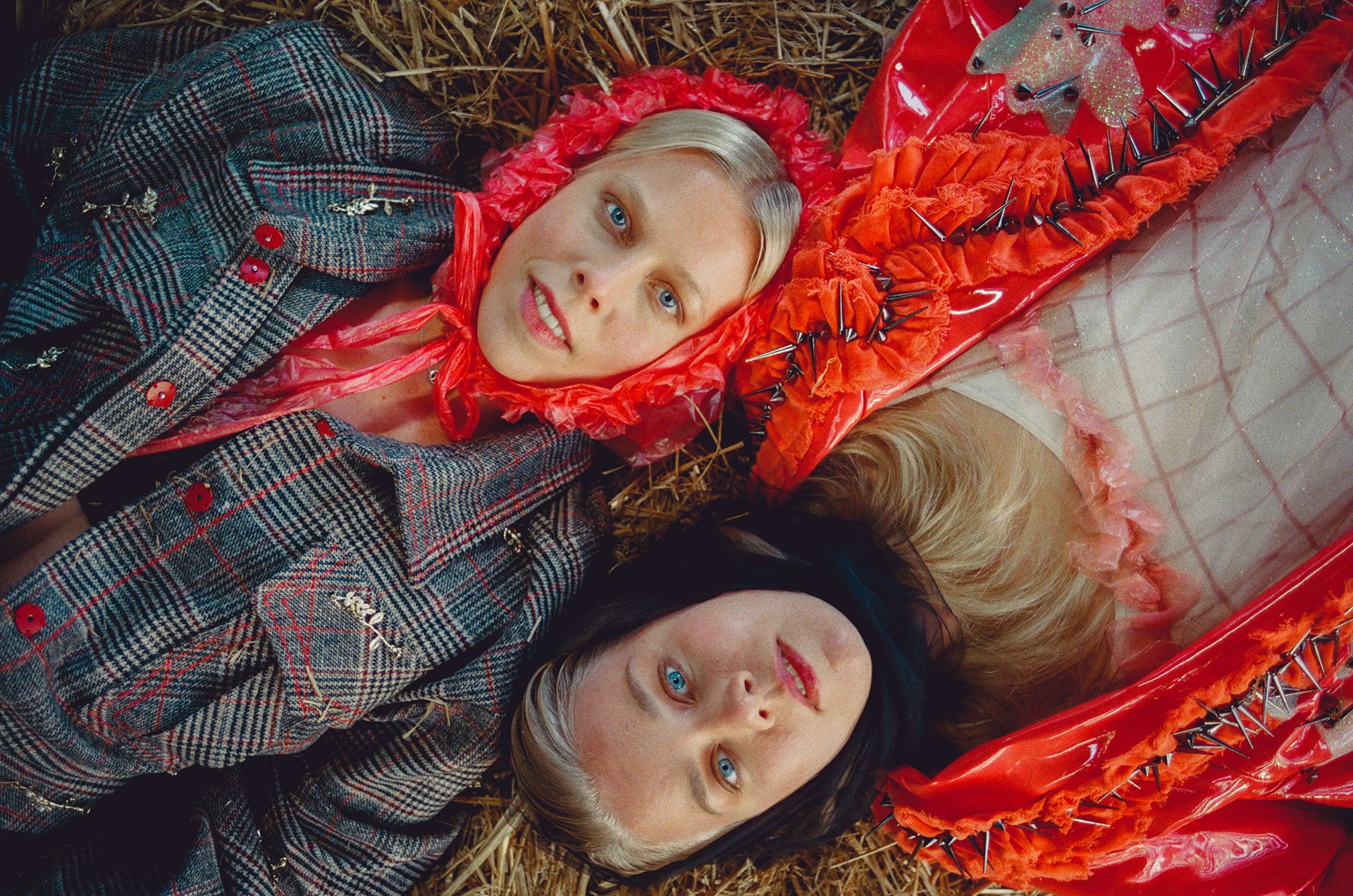
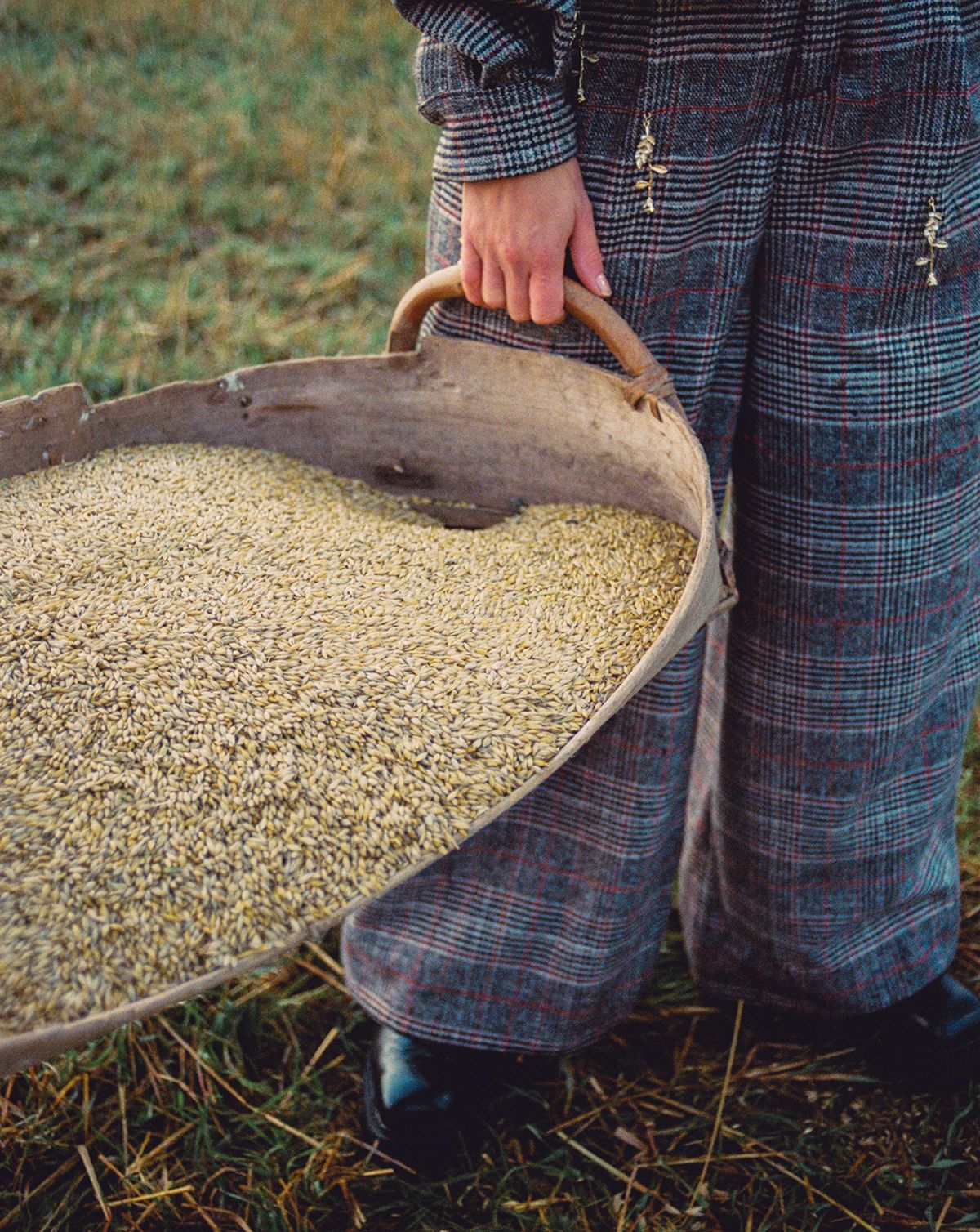
Image photos and a brand film inspired by the founding sisters’ rural roots, highlighting their rebellious spirit, are also important elements of the redesign. The brand video is unique in that it presents Mö’s mission and story in the form of a visualized poem rather than classic storytelling, setting the mood with a mix of nostalgic imagery and contemporary fashion inspirations.
Werklig | Web | Instagram
Lili Köves | Instagram
Mö | Instagram

Crafty mini-home in the wild | Leaving the city Part 3—Dávid Pataki, Tahi
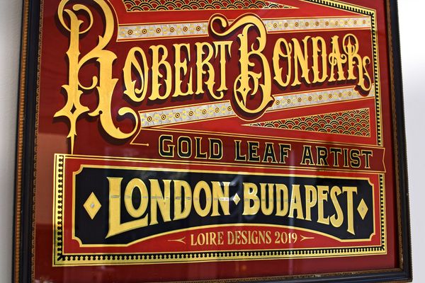
Turn-of-the-century glamour | Róbert Bondár, gold leaf artist & signwriter
