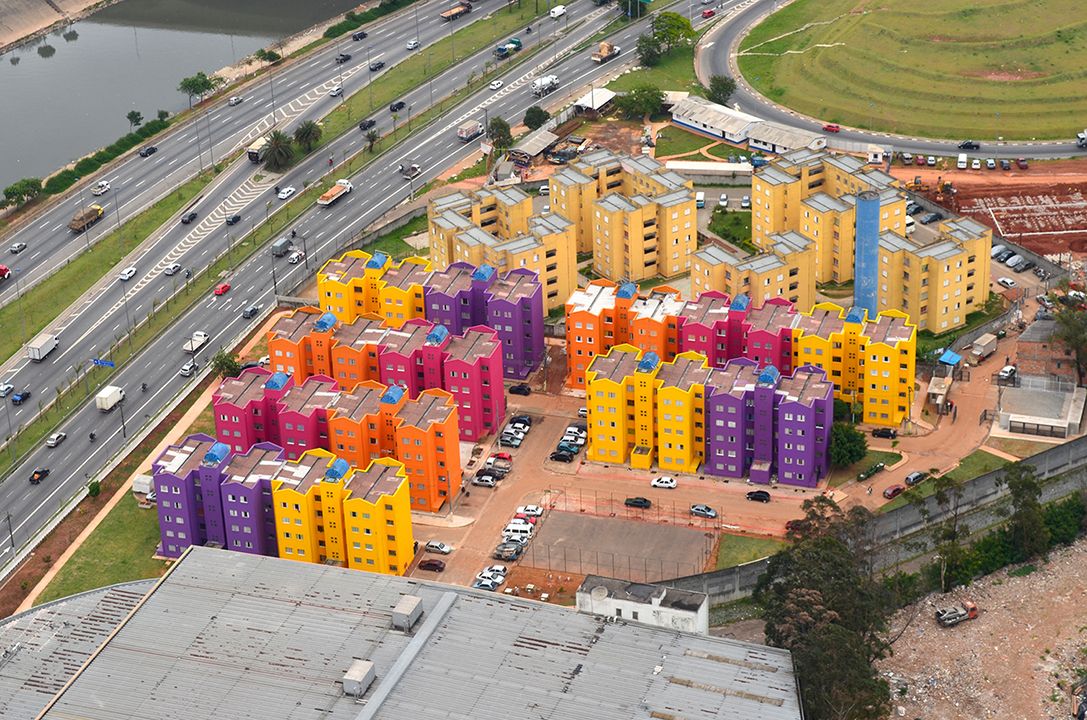
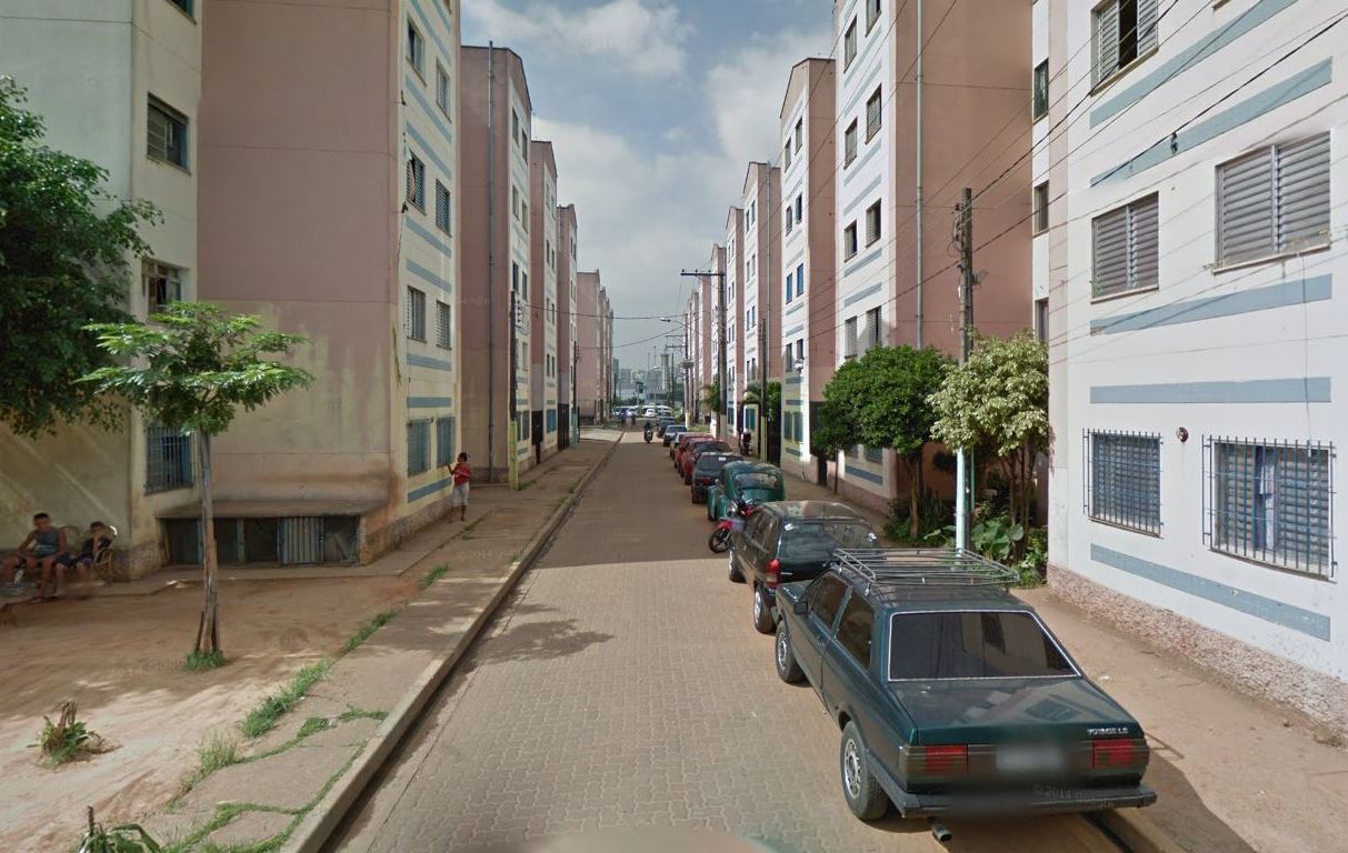
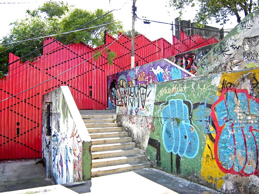
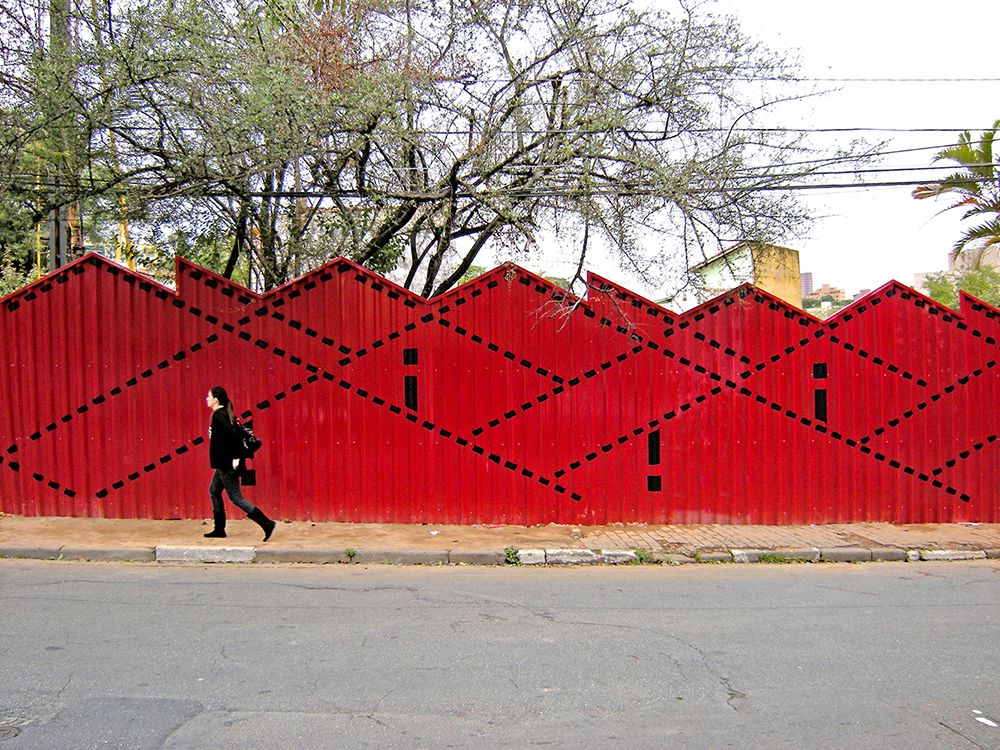
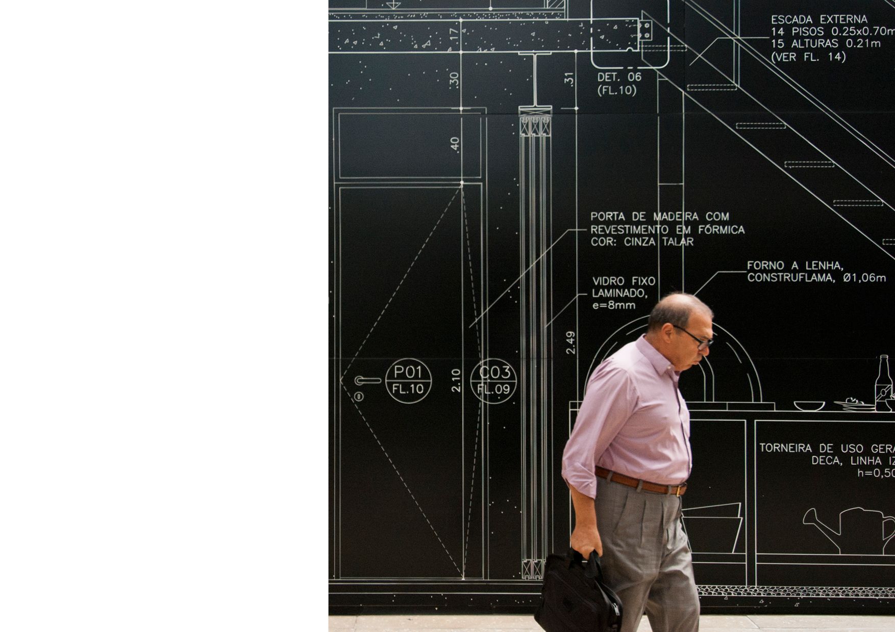
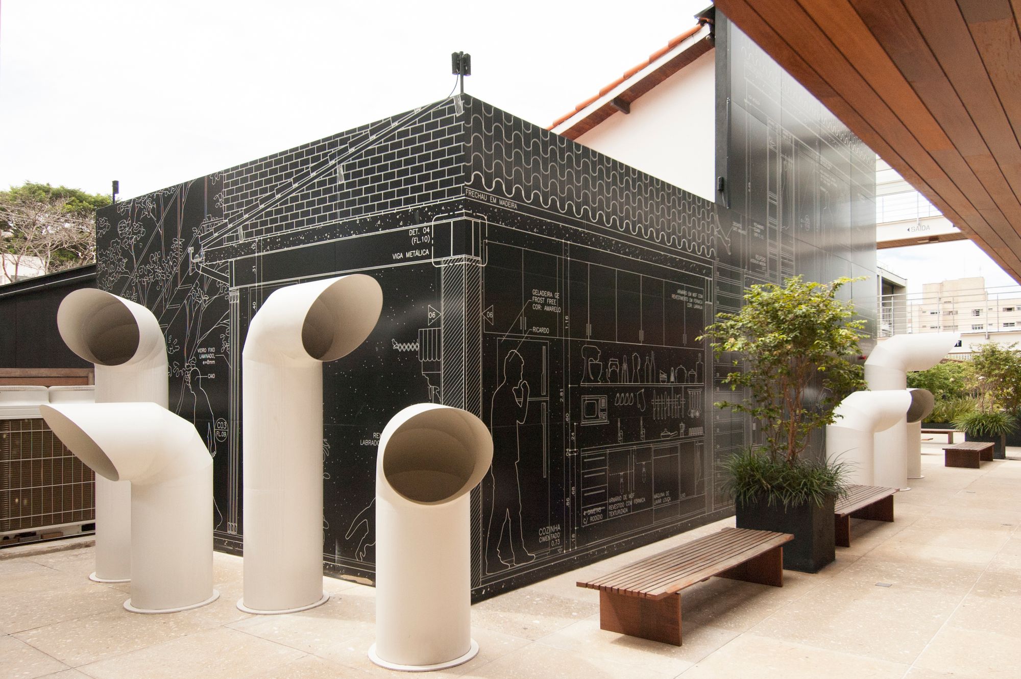
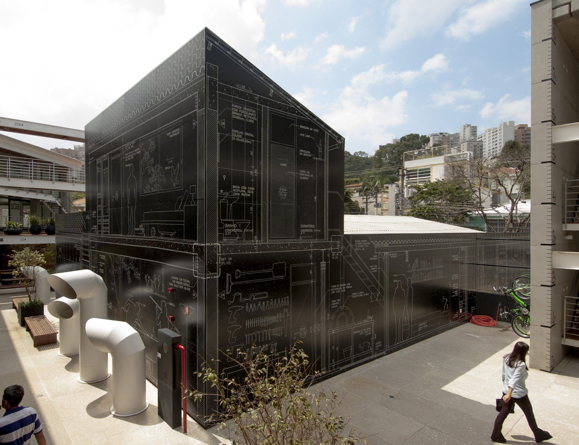
Murals can appear in cities in the most diverse ways: as advertising spaces, imprints of local history or as works of art, and sometimes they catch our eyes with their organic connection to the specificities of the given building. Now we’ll show you some examples of the fruitful encounter of architecture and graphic design through the projects of Brazilian architect studio Nitsche Arquitetos.
A lot depends on the visual language along which the architects and designers choose to establish a street scenery, the same as on the type of mural that gets on the firewall. An artwork of the kind could influence the appearance of the area as well as the mood and habits of passersby for years, as a fine piece of art could not only be a jewel of the city, but a popular meeting point, too.
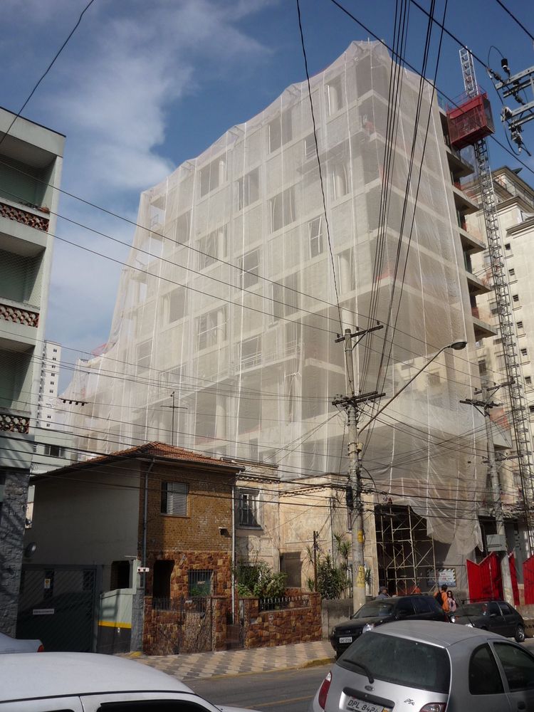
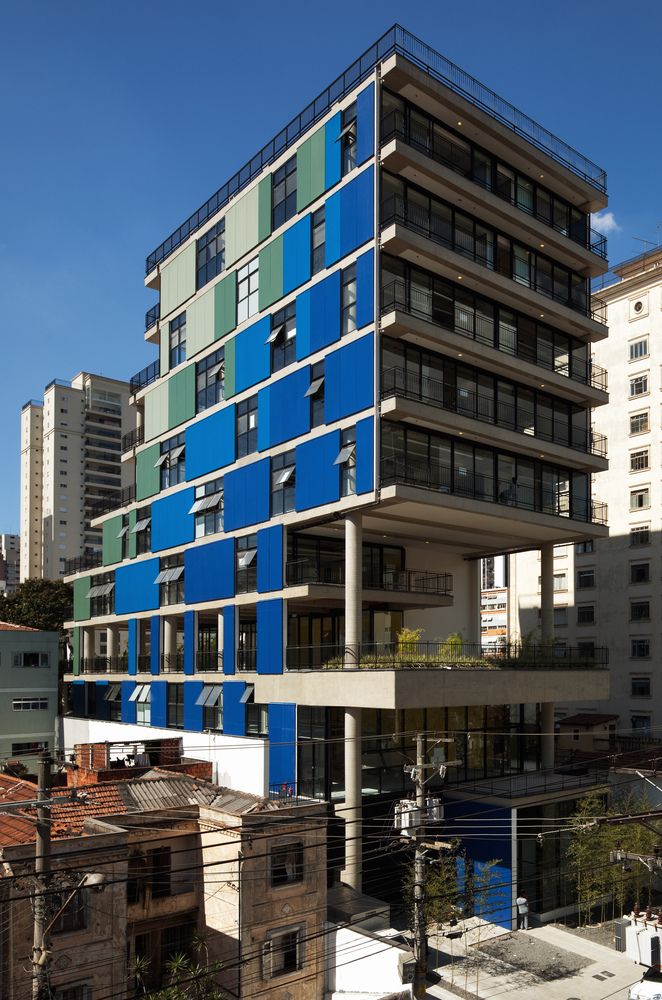
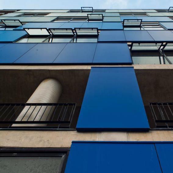
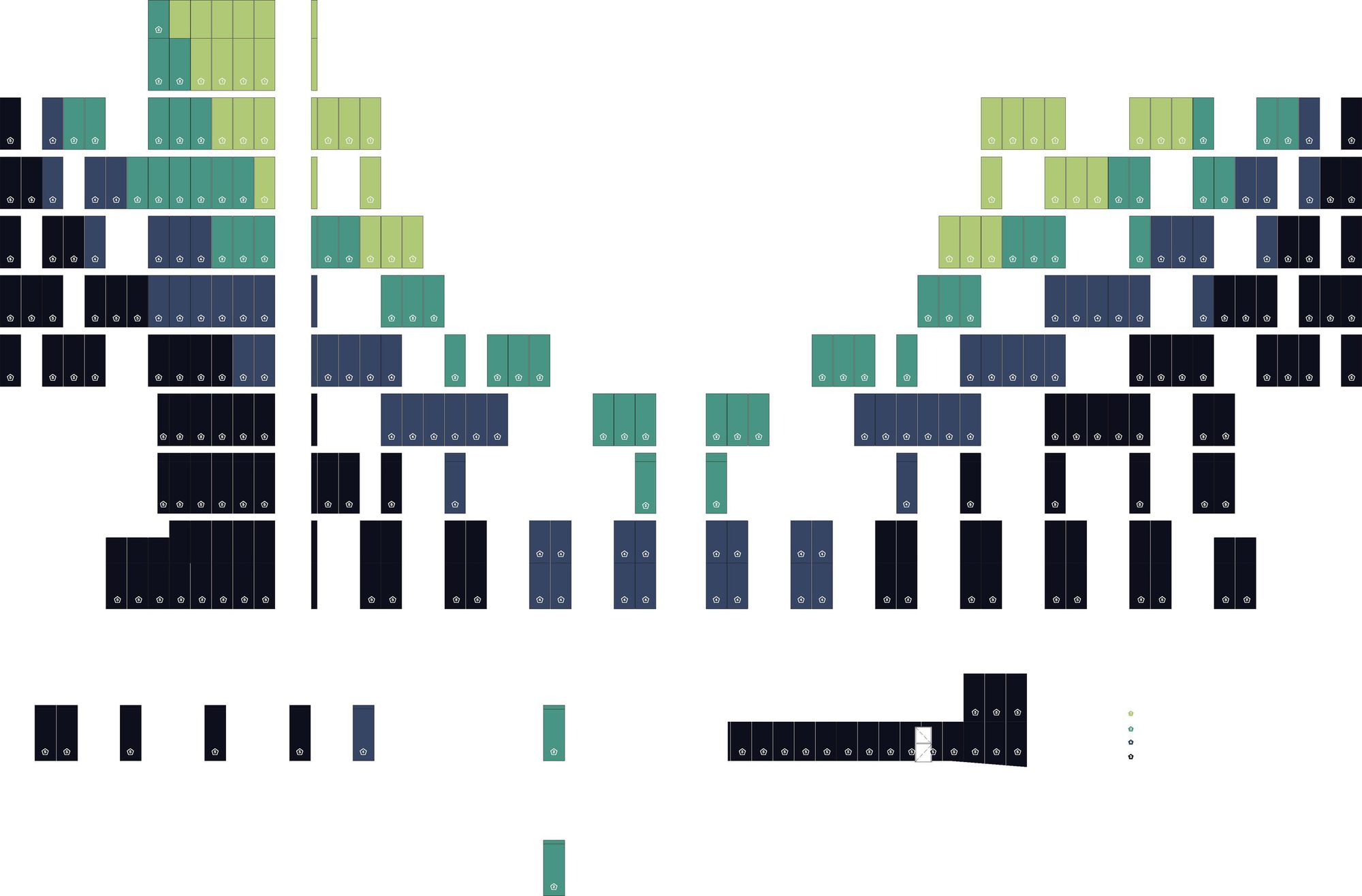
The designers of Nitsche Arquitetos realized the power of exciting visual solutions, and instead of giving a spectacular cover to the buildings, they rather look for opportunities where graphic design and architecture can truly reinforce each other. The studio also carries out graphic design tasks frequently and is not afraid of art projects, either, on the contrary: they regard some of the works presented here as artistic interventions, too.
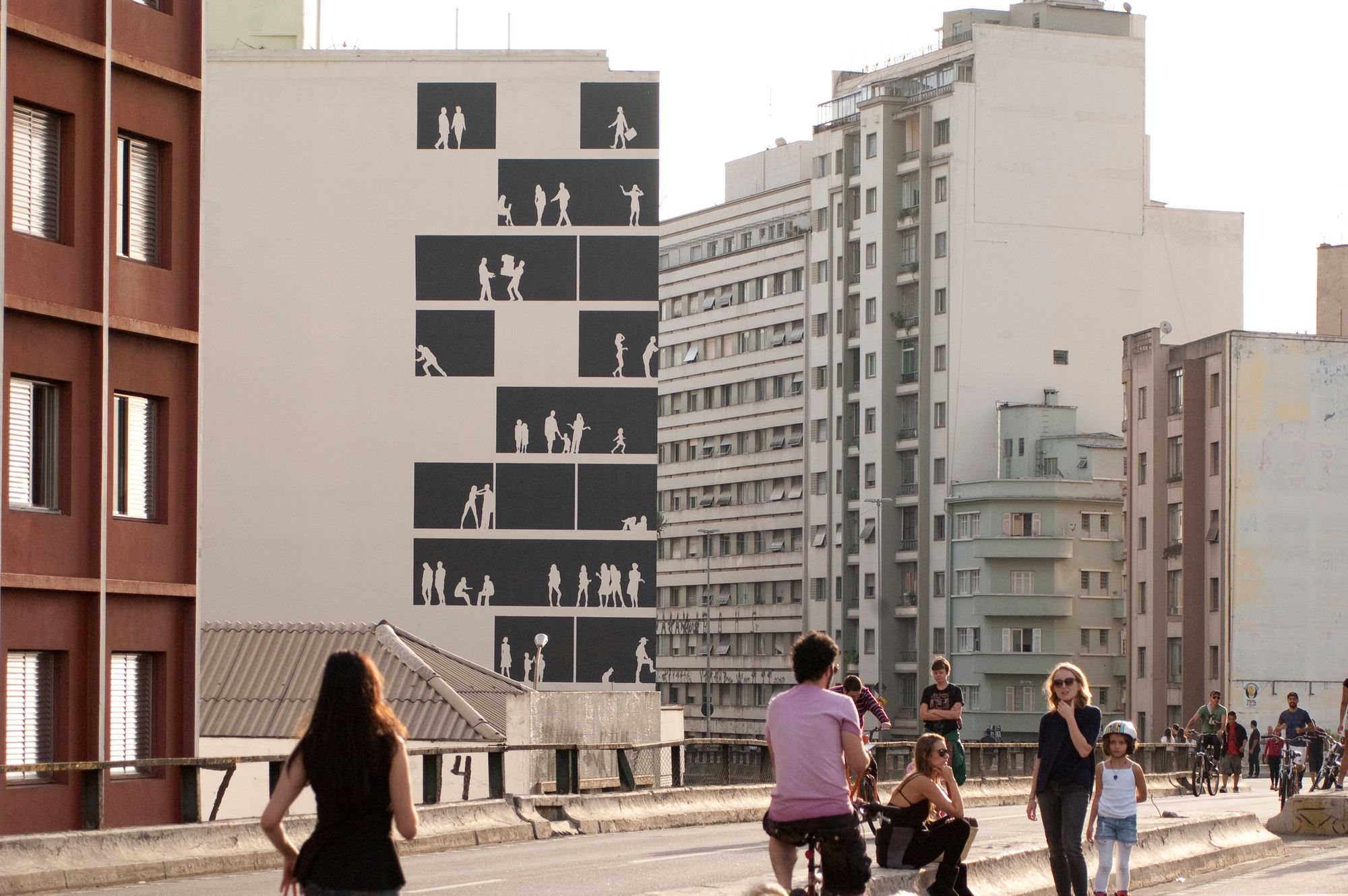
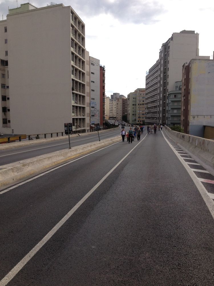
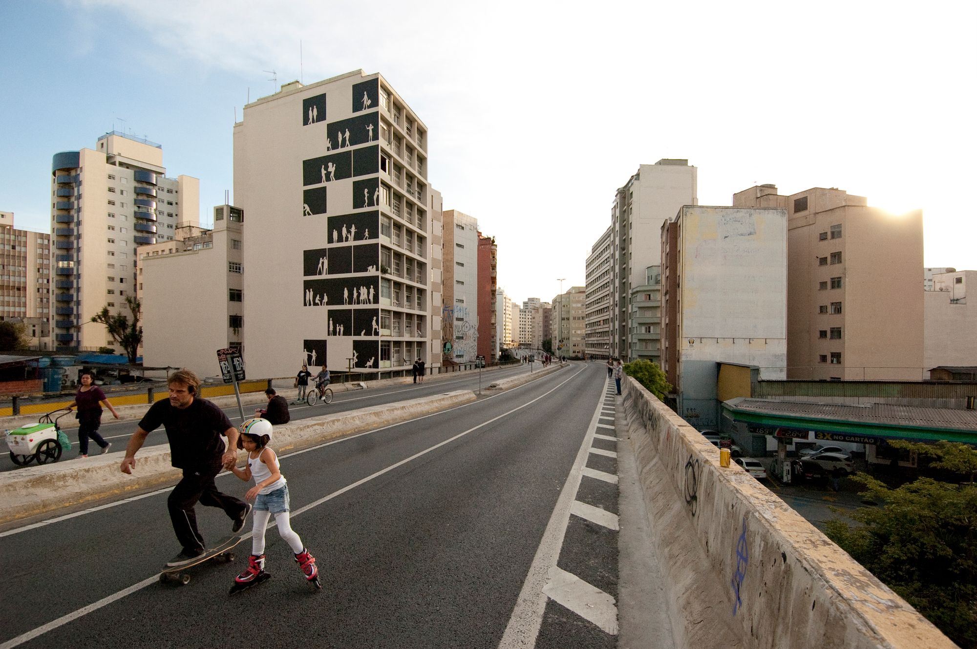
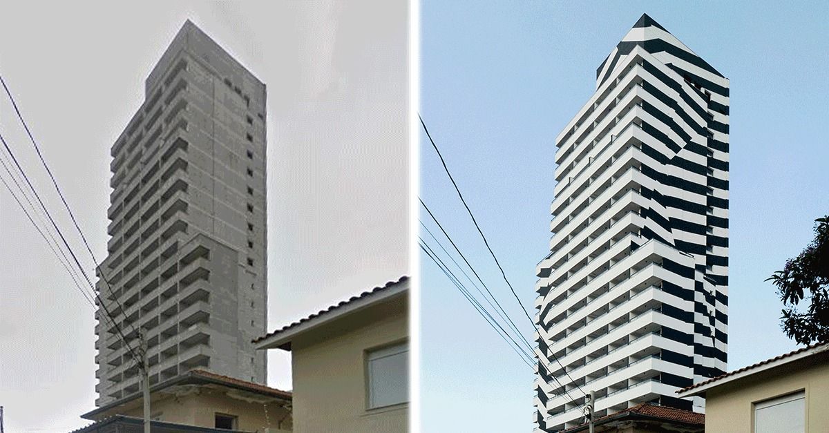
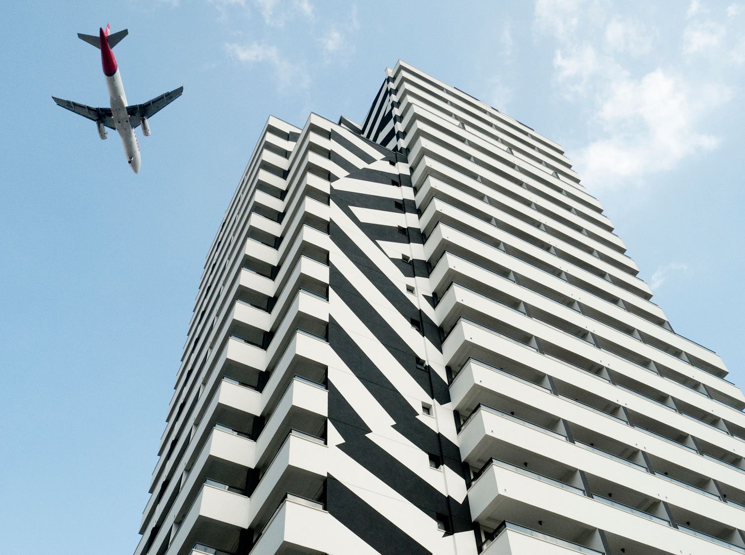
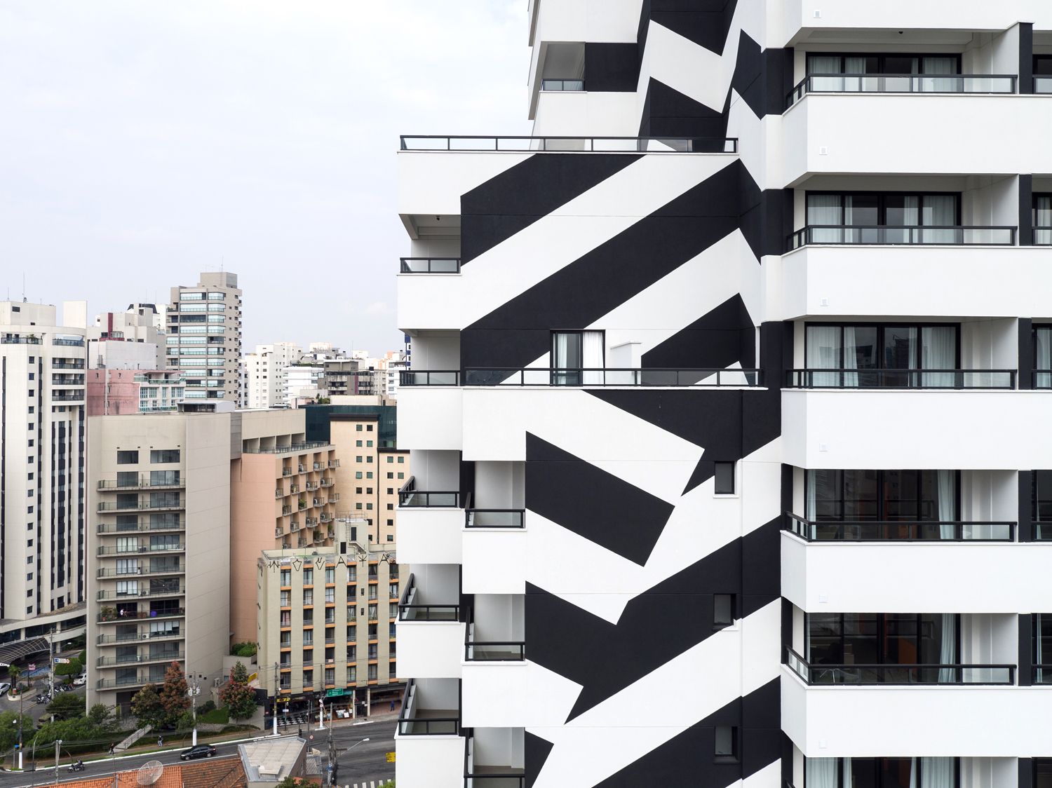
„The blank walls on São Paulo’s famous road, Minhocão resemble canvases, making the road look like a city-sized gallery” – claim the designers, who, building on this idea, displayed the imaginary habitants of the building on the neighboring wall, following the dimensions of the original one. In another project, they experimented with inverting the division of the building: highlighting the contrast of black and white, they broke its horizontal and vertical division with diagonal bands.
Emogram X CQIFS | Miklós Kiss

Eco-friendly passenger transport | Airbus
