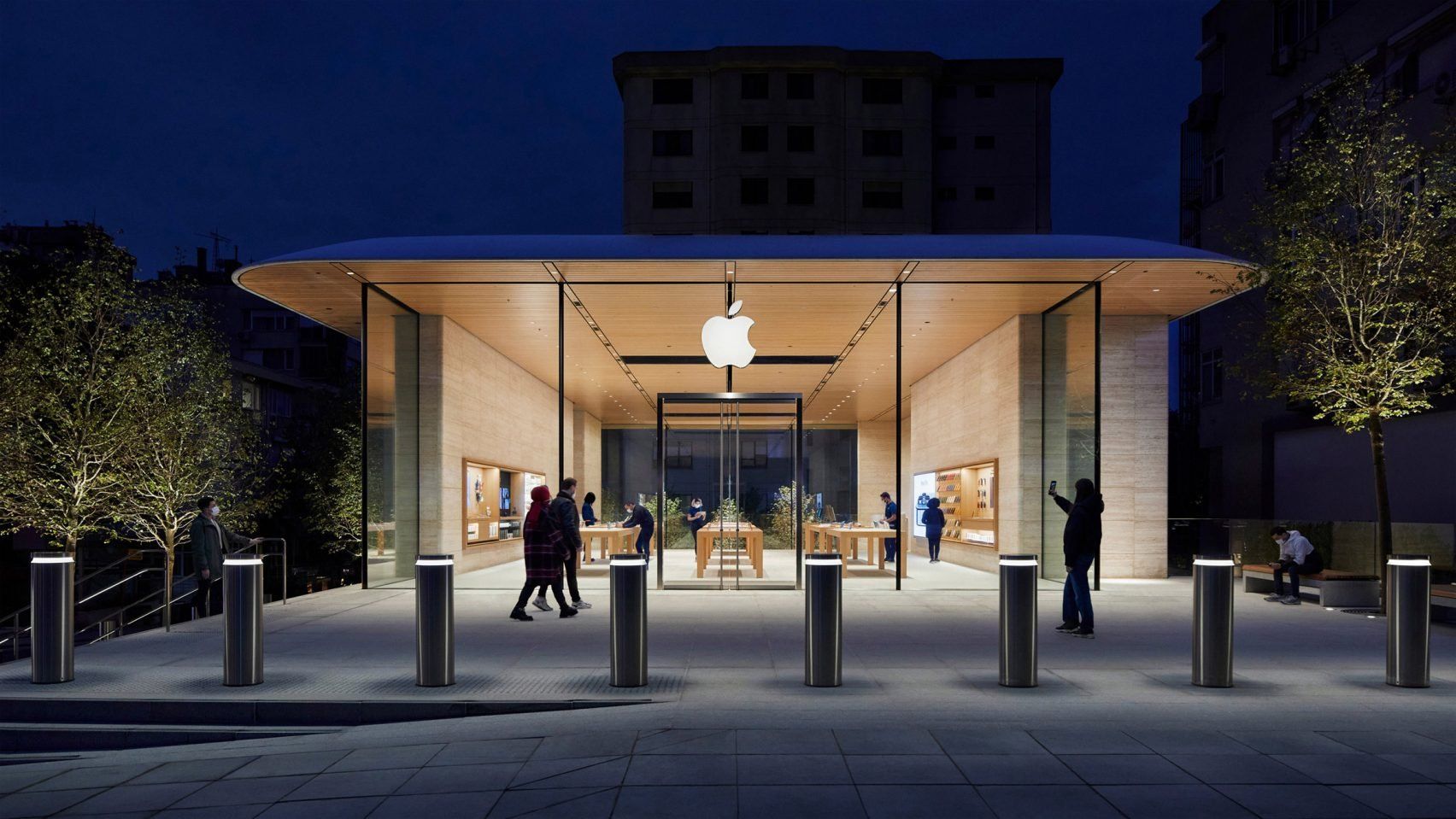
British architecture studio, Foster + Partners, designed an Apple Store in the heart of Turkey’s bustling city.
What at first glance appears to be a single-story building is set back from the street frontage, with the fully glazed space, which is actually two stories, flanked on two sides by travertine stone walls. Apple’s third store in Istanbul is a true reflection of the company’s visual identity and credo, with an illuminated logo in the center of the glazed façade.
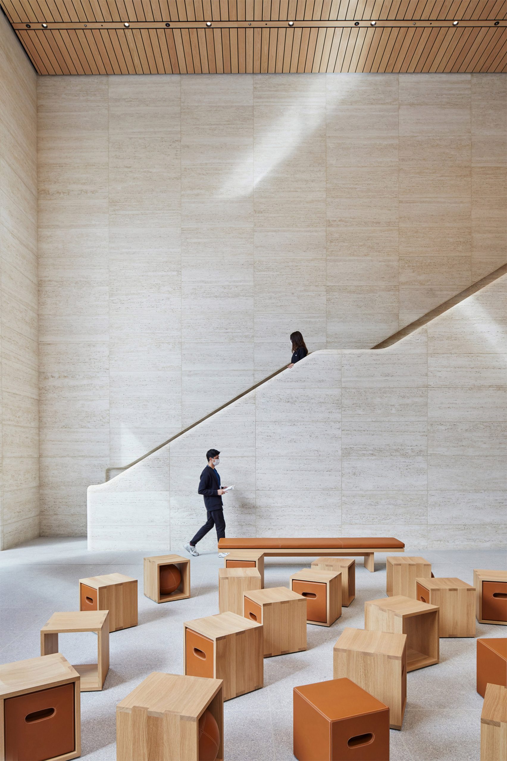
Photos: Nigel Young
Foster + Partners | Web | Facebook | Instagram
Source: Dezeen
more to read
v4
Joining forces in the region: the Visegrad startup landscape
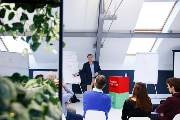
The startup ecosystem of the V4 region is blooming. To prove this to you, Hype&Hyper, with the contribution of the Design Terminal, is now launching a series of articles that aim to dig deep into this topic. Unicorns in Hungary, promising new rising star businesses and the importance of
news
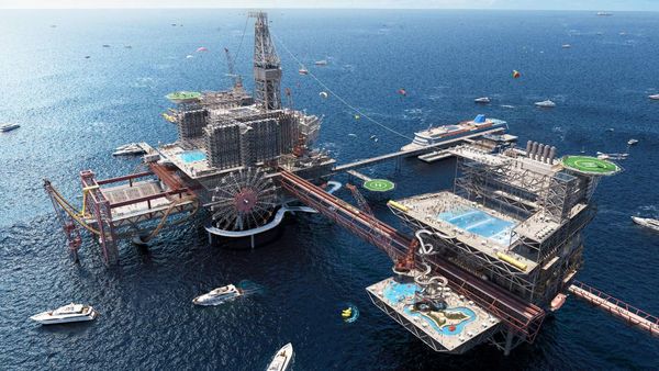
Oil rig converted into a theme park
Rollercoasters arrive at an offshore oil platform in the Arabian Gulf: the site in Saudi Arabia will be home to a new amusement park.
Three hotels, several restaurants—one offering ‘undersea’ dining—and a whole range of extreme attractions and watersports are planned for the 150,000 sqm oil rig,
east
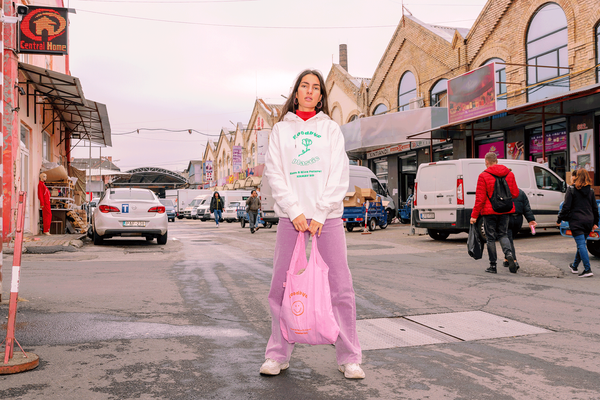
Kamay Ko says goodbye to plastic
One of the founding principles of the Budapest-based Kamay Ko brand is sustainability: their products are not only environmentally friendly in their materials and production, but also contribute to sustainable living. Since all the plastic used by mankind is most likely still to be found somewhere on Earth, Kamay Ko


