Today brings us to the end of the DIALOG thematic month, where we have explored the digital vs. analog theme from many angles. This time, the counterpoint to the hyper-realistic architectural illustration style (dreamscape and renderporn), the so-called post-digital trend, is on the table. Freehand drawings, watercolors, montages and hybrid techniques follow!
It’s a question, however, if these two schools are really so sharply separated, or is it just the way they appear to the outside observer? We asked three Hungarian architectural firms with a particular illustration style (other than hard-line renderings) to share their view on the subject. Our guides will be the thoughts (and, of course, the illustrations) of BIVAK, GUBAHÁMORI and Paradigma Ariadne.
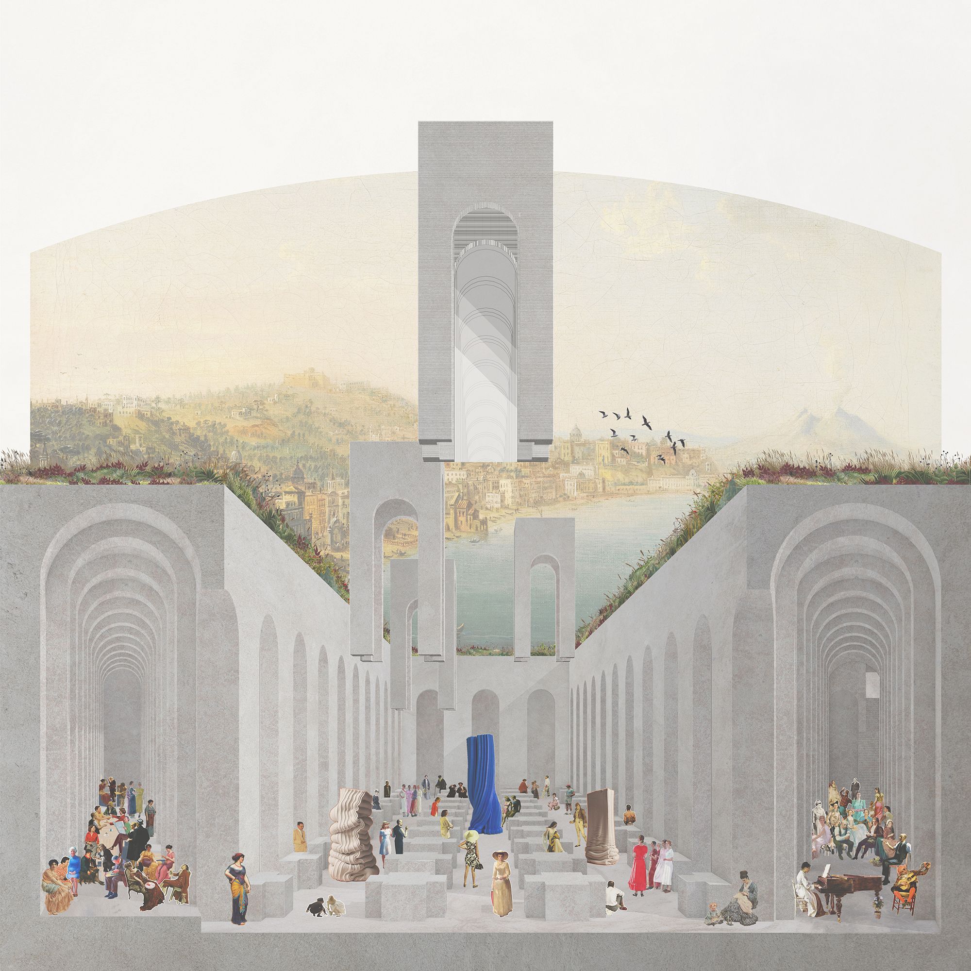
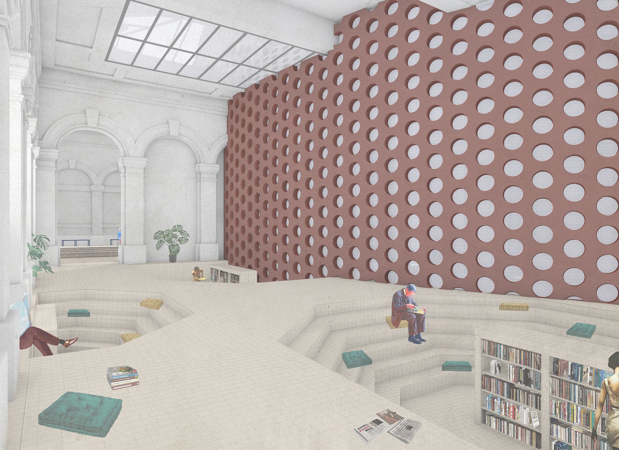
Architectural illustrations, whether CGI renderings, hand-crafted or mixed media, are primarily communication tools, between architects and clients on one hand, and within the staff of the architectural firm, on the other. In the age of social media, publishing visuals also adds depth to the external image of the office: it colors and nuances the image of their vision and ethos, which can be greatly enhanced by the chosen technique. In the columns of Hype&Hyper, we’ve explored this topic on several occasions, including dreamscape, which is closely linked to the so-called renderporn movement. They are hyper-realistic architectural fantasies, the results of 3D modeling software, and they are either deceptively realistic or painting a utopian picture that looks like an idealized reality.
BIVAK
We like to “think with our hands” and believe in the power of abstract representation.
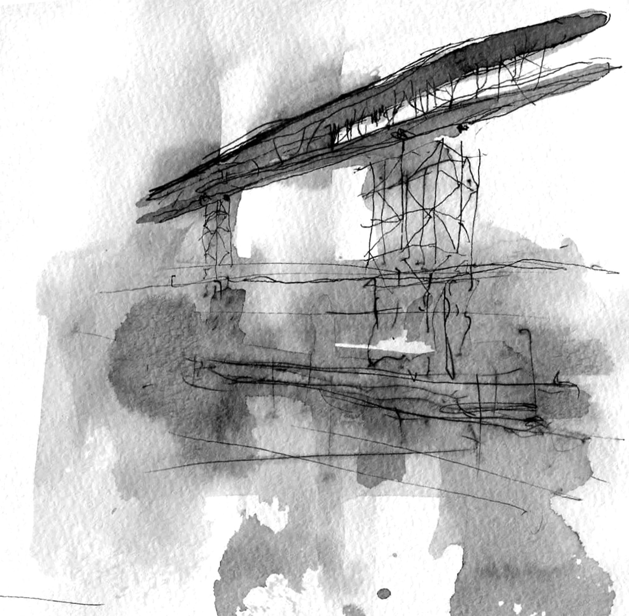
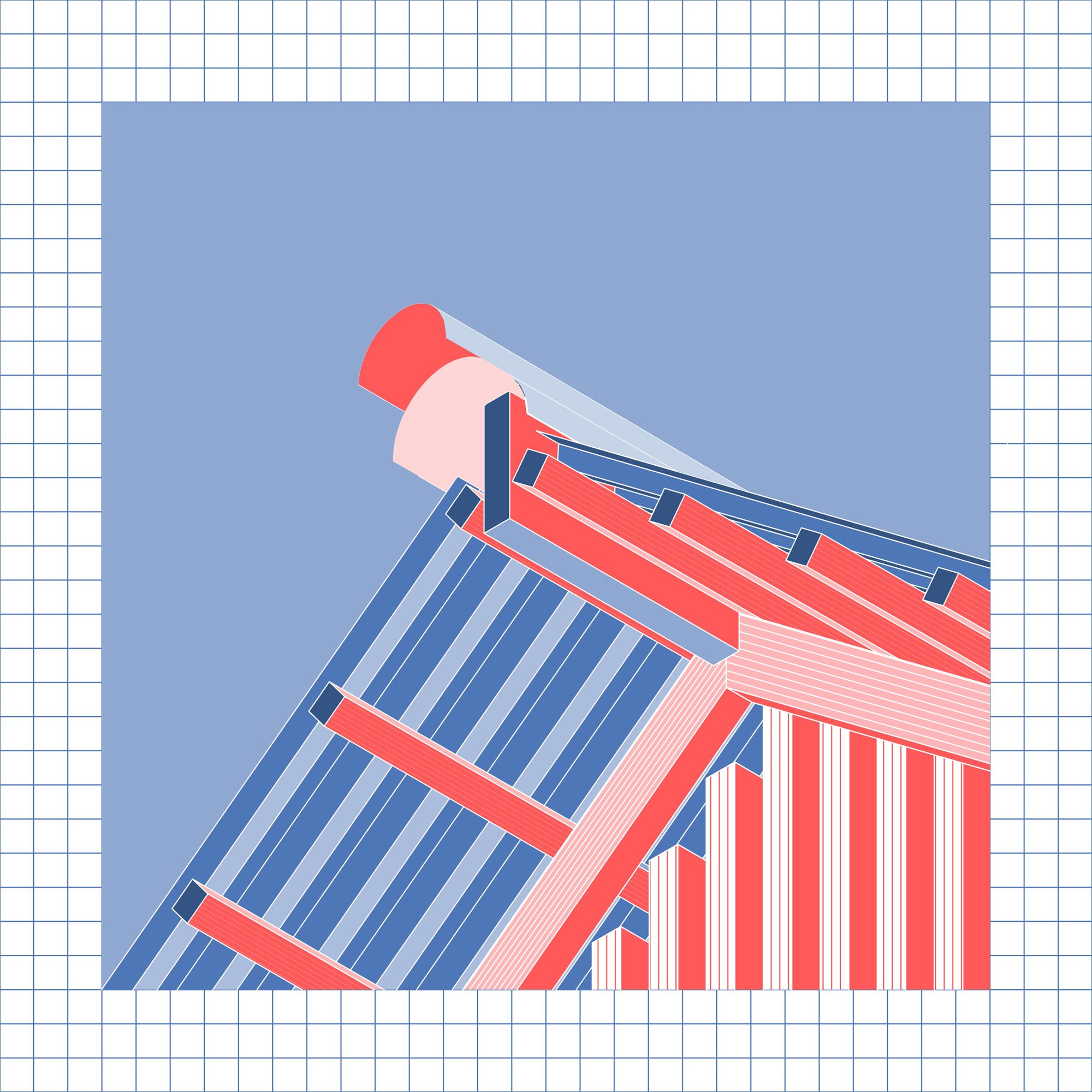
“In the last twenty years, the architects’ design table has undergone a drastic transformation, with fewer and fewer drawing tools and more and more digital props. Although photo-realistic visual designs are very persuasive (especially when the presentation is not for professional decision-makers), they also risk being superficial in thinking. Meanwhile, there is a mystical nostalgia and a sense of timelessness surrounding the hand-made drawings,” shared Tamás Máté and Áron Vass-Eysen, founders of Bivak.
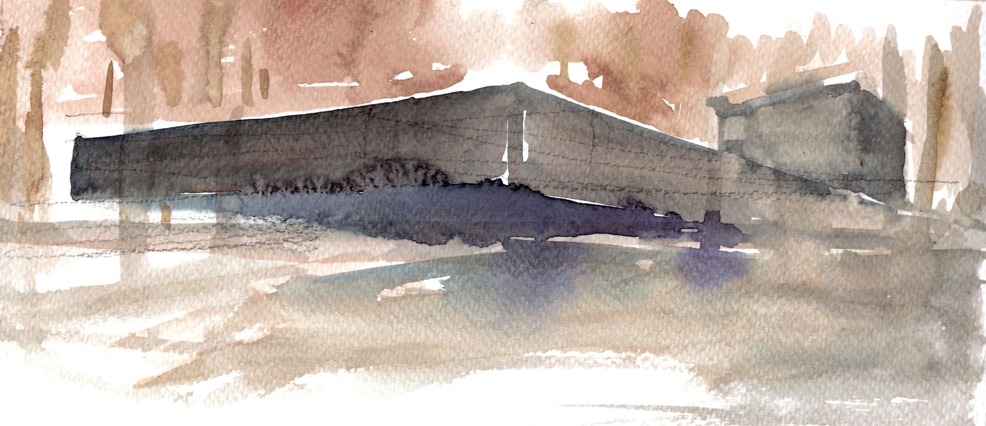
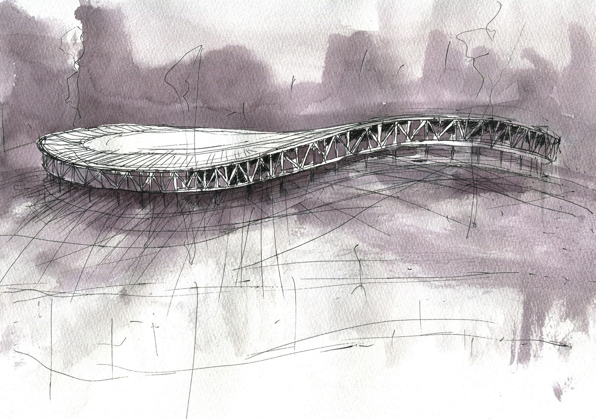
“Our creative method is very much based on manual drawing. This means that we like to ‘think with our hands’ because this method leaves room for the designer’s intuition, and we often experience that the ‘hand precedes the brain.’ In practice, this can be divided into two main areas: drawing and modeling, from the first sketch to the iron models for presentation. We see both as manifestations of our thoughts. For us, they are obvious and effective tools that are an integral part of our design identity. We also make a distinction between thoughtful drawings/sketches and presentation graphics. Both are an important part of our practice, and at the design briefings, we always present those drawings that were not made with aesthetic quality in mind. Modeling also accompanies the design process, from the first ‘half-folded sheet of paper’ to the carefully crafted abstract nutwood mass model. They are always intended to capture an idea or a designer’s statement, seeking the essence. It is astonishing to see, at the end of a successful construction project, how much information has been brought together in the first outline sketch. For presentation purposes, we prefer digital and manual hybrids. We feel we can more accurately present the concept and atmosphere through these own hybrids. The technique of these varies from project to project, constant experimentation within our office. We believe in the power of abstract representation,” they explain.

GUBAHÁMORI
There is a certain charm to just how the combination of different techniques produces an often less controllable but expressive result.

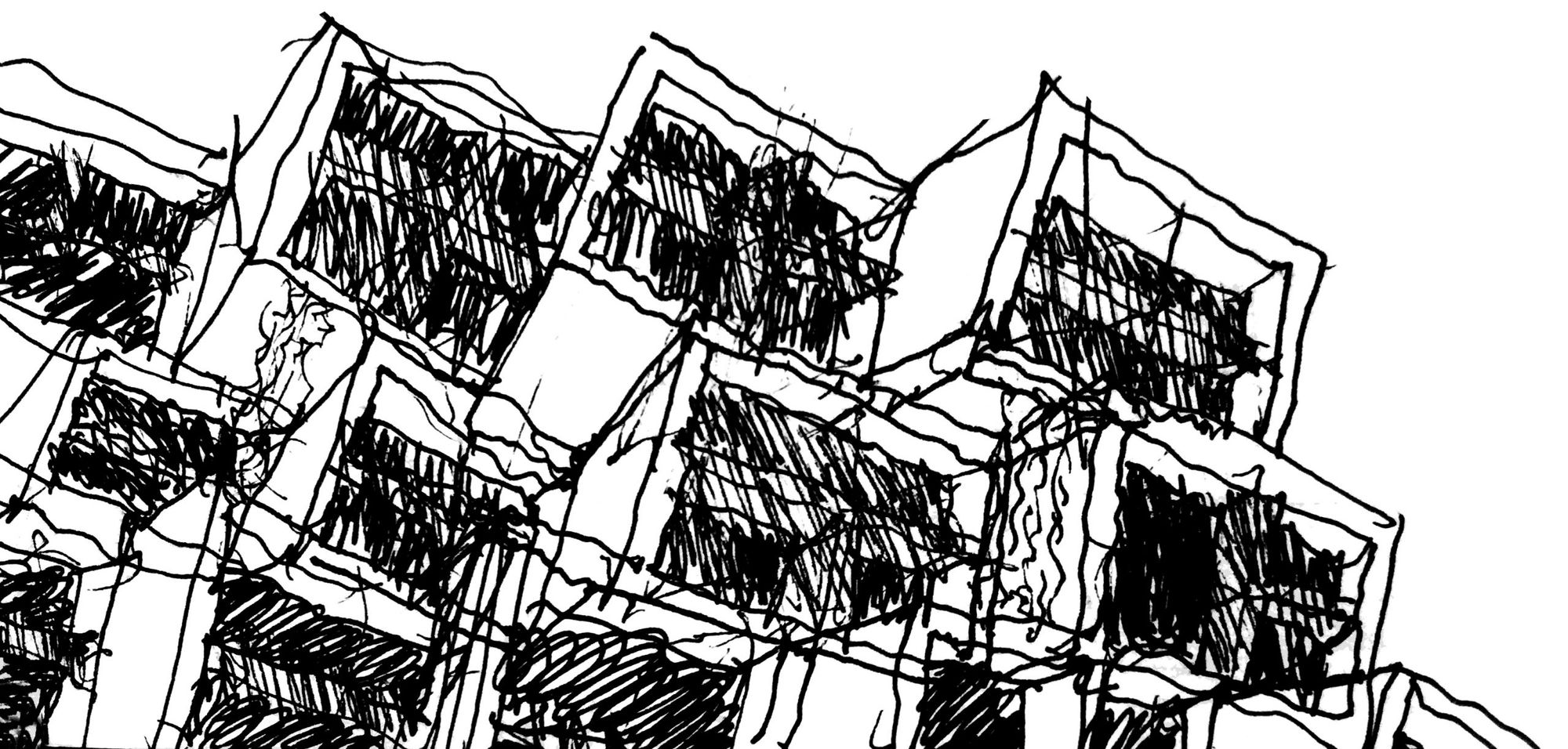
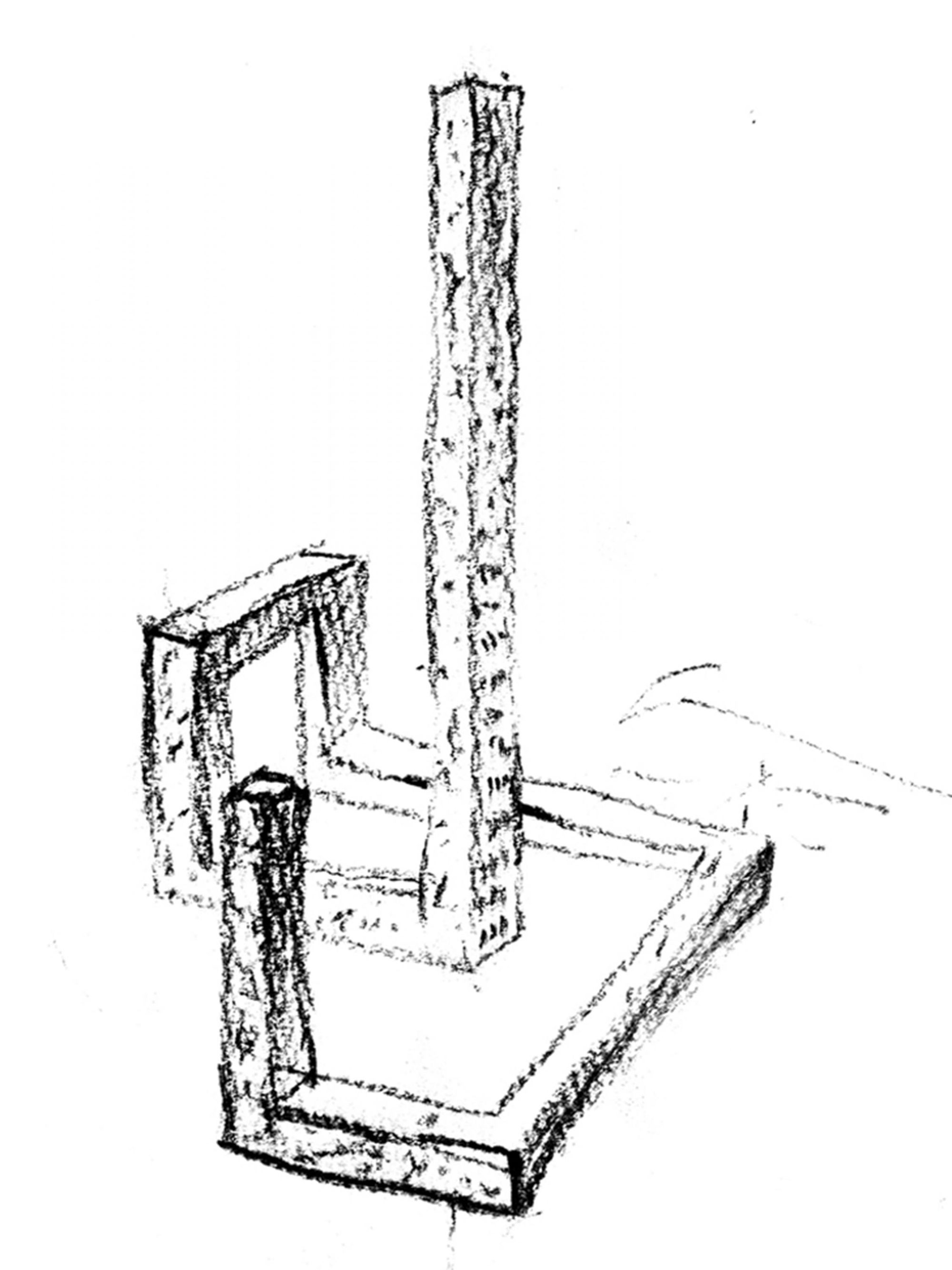
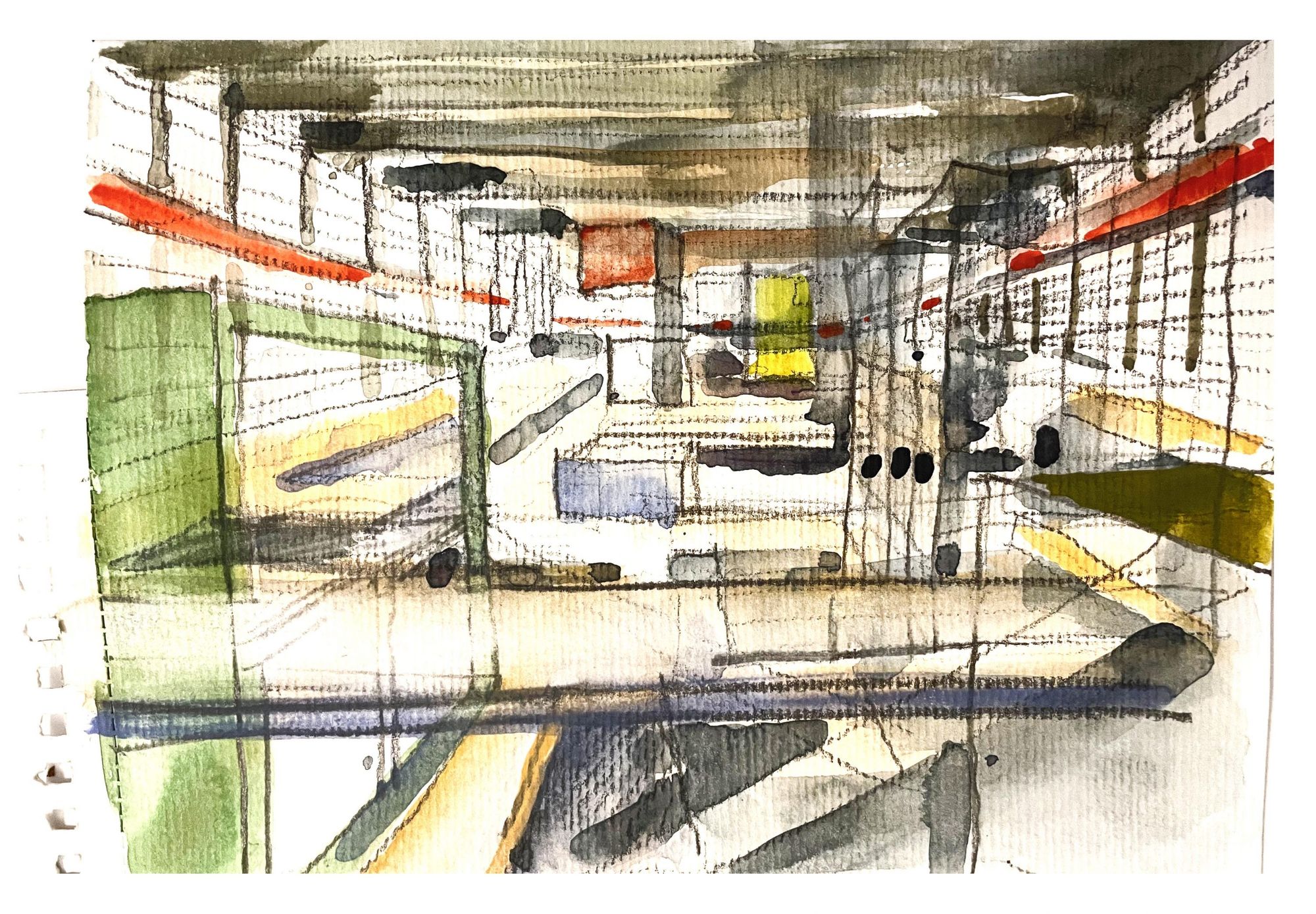
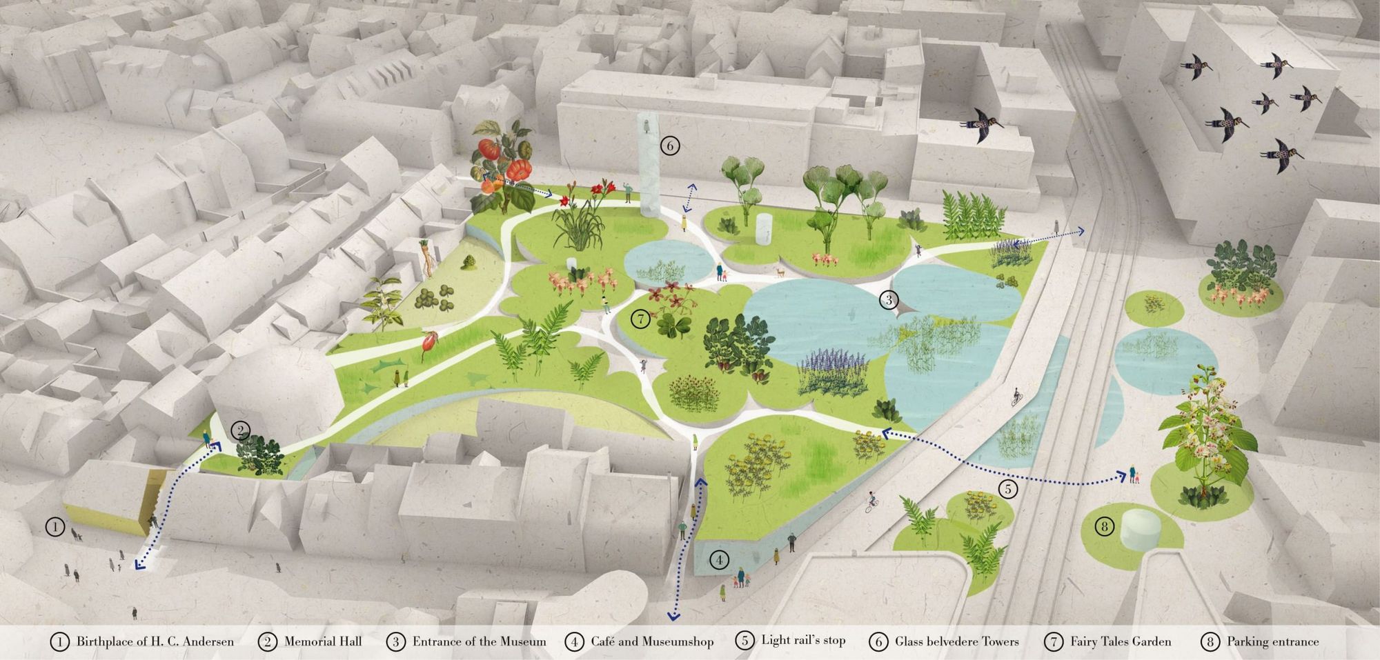
“When we started the practice, we had a certain consciousness that we didn’t want to go in the direction of photo-realistic representation, which was emerging very strongly at the time. We have always been more drawn to an experimental attitude. We strive to present a project with a technique that best conveys its architectural idea. Thus, we’ve already created visual designs using textures of crumpled paper surfaces or scanned images of pressed flowers, too. We like to combine analog and digital techniques: at times, we digitally render the photographed spaces of hand-built models, at other times, we use freehand drawing elements to arrange a raw computer render. At this year’s Venice Architecture Biennale, for our model exhibited in the Polish pavilion, for example, we modified a 3D printed model with several layers of crystallizing material. And for works on an urban planning scale, we find that we could more effectively convey information about the project through a short animation,” says Sándor Guba and Péter Hámori.
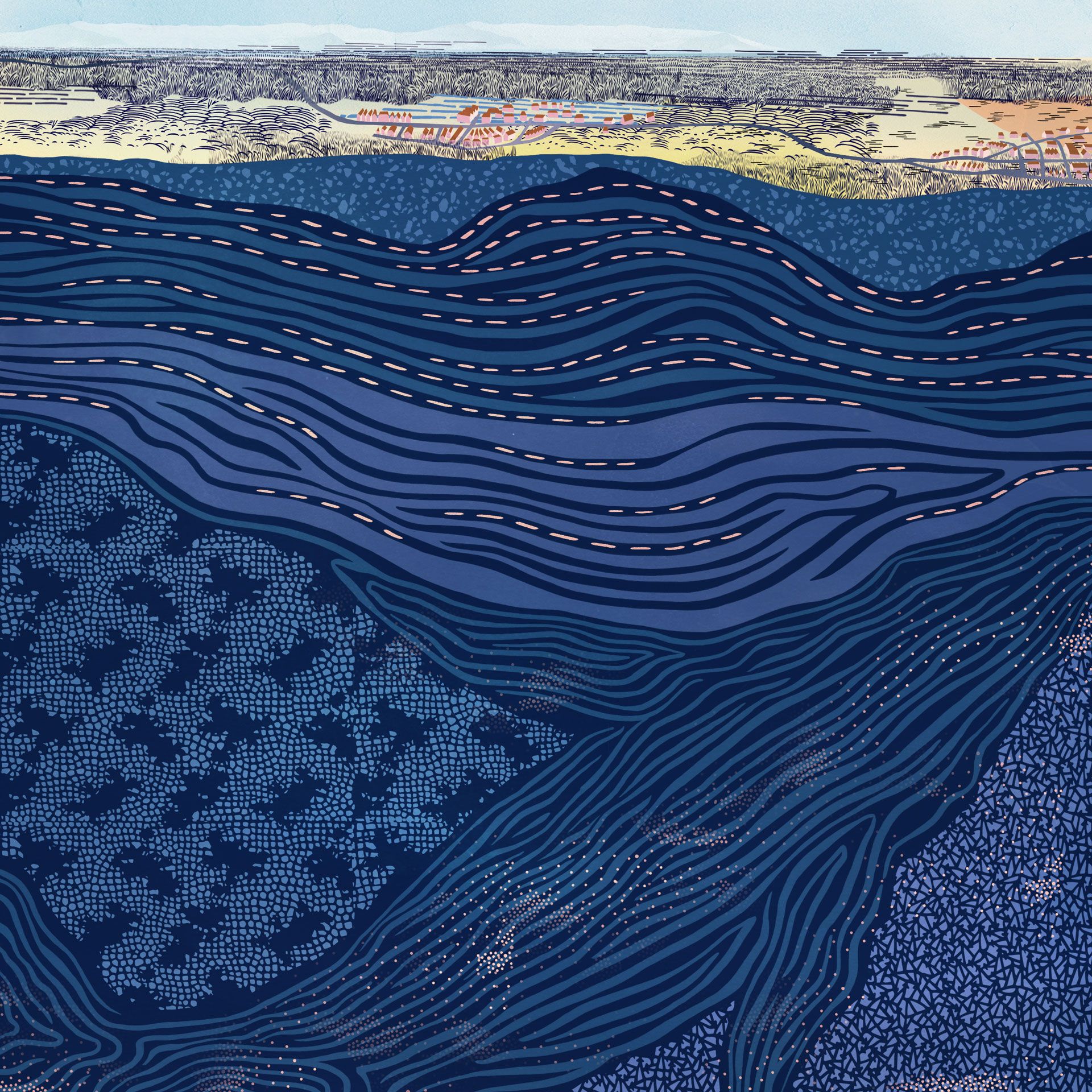
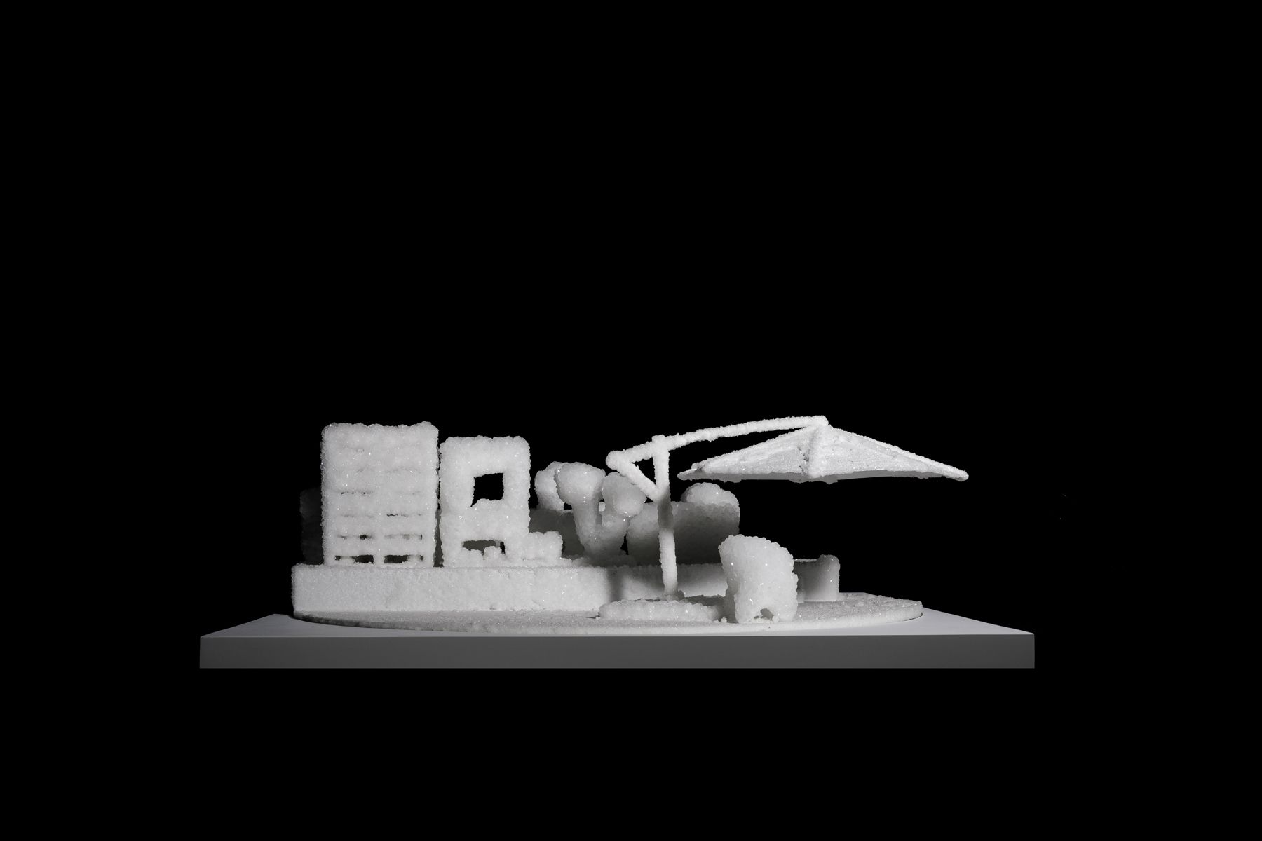
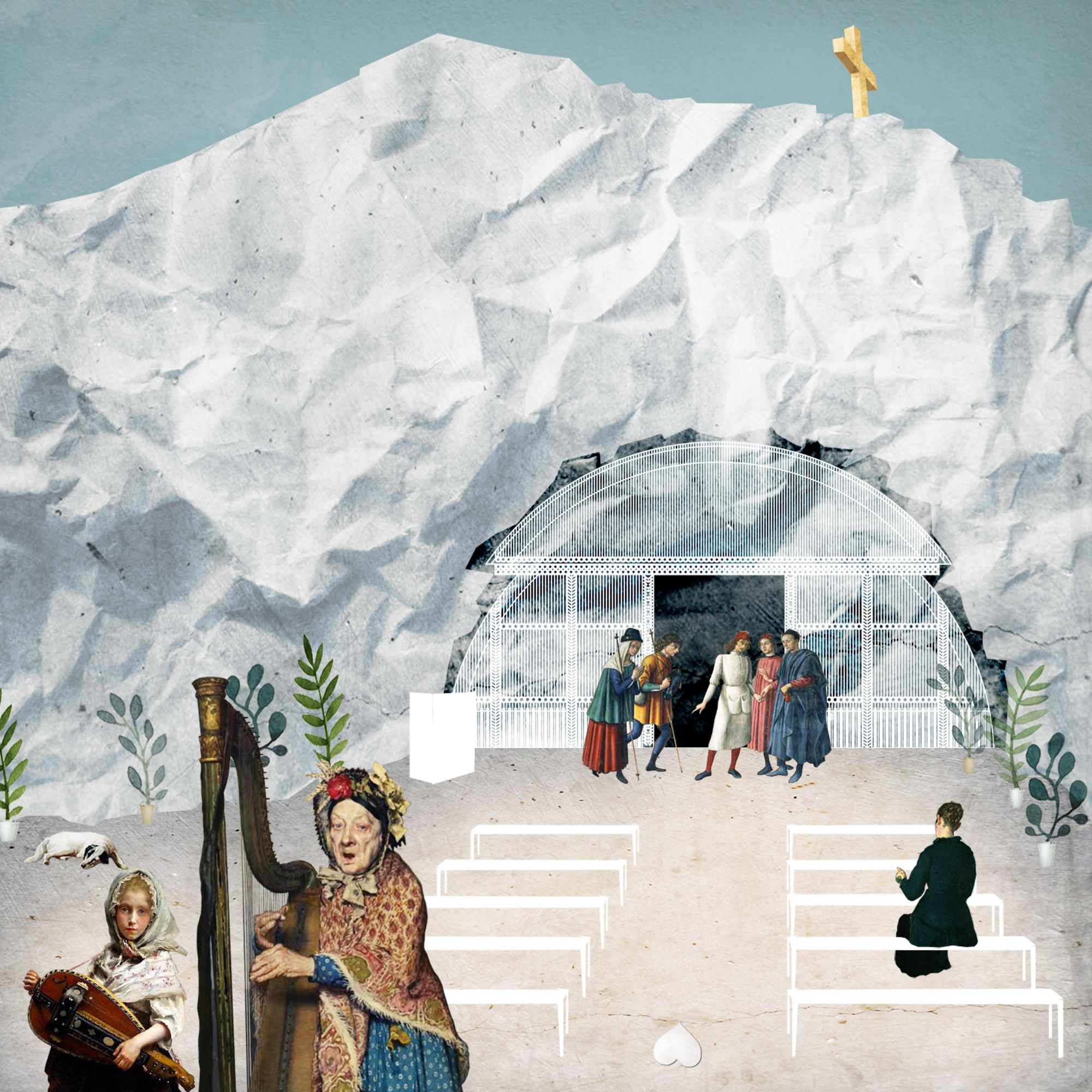
“There is a certain charm to just how the combination of different techniques produces an often less controllable but expressive result. And for all this, we tend to draw inspiration from areas outside architecture: paintings, gastronomy, the natural environment around us. But we would like to emphasize that these are means of expressing architectural ideas, not their ends,” added Sándor and Péter.
Paradigma Ariadné
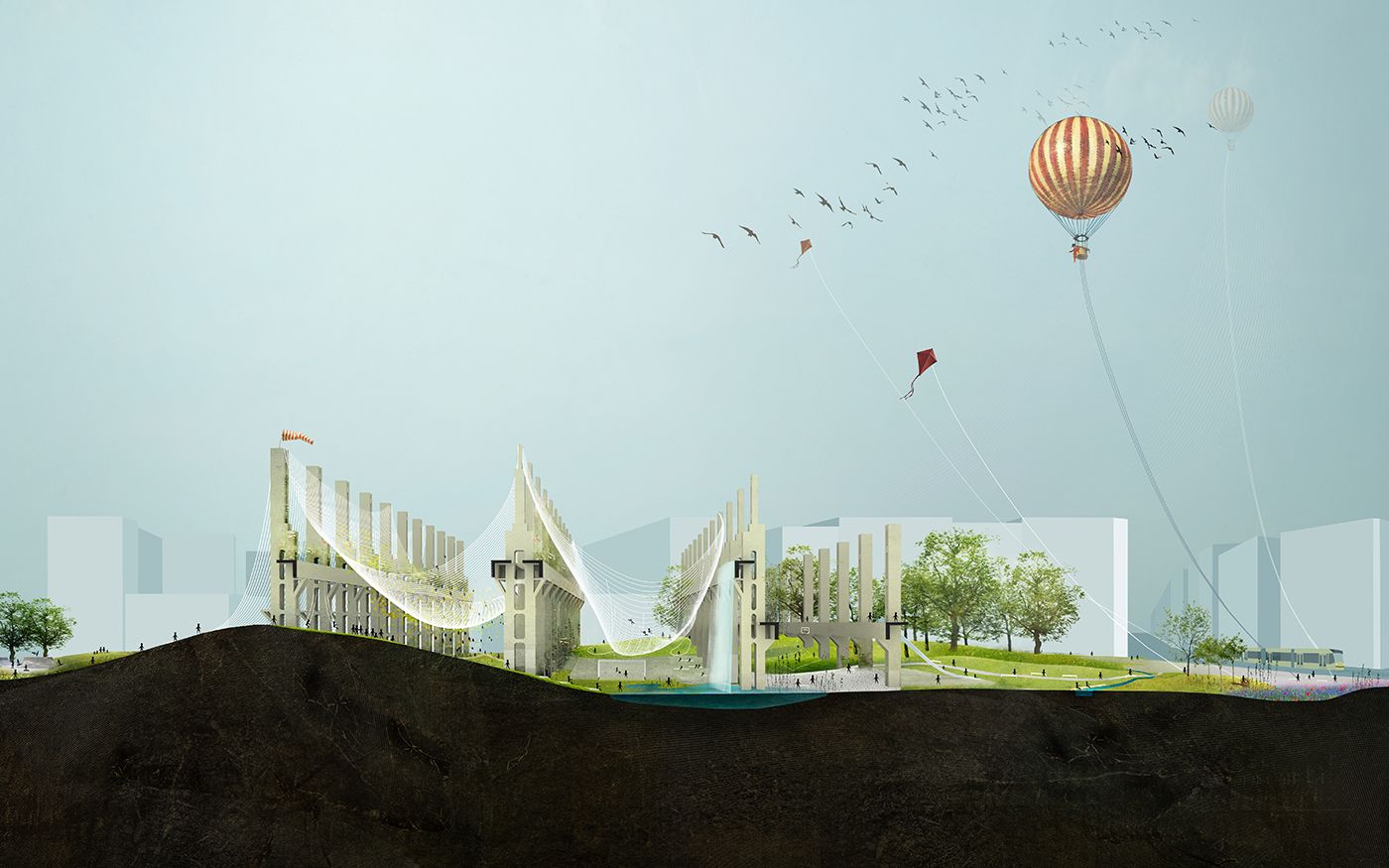
The technique is mixed, but the choice of viewpoints and croppings are identity-forming.
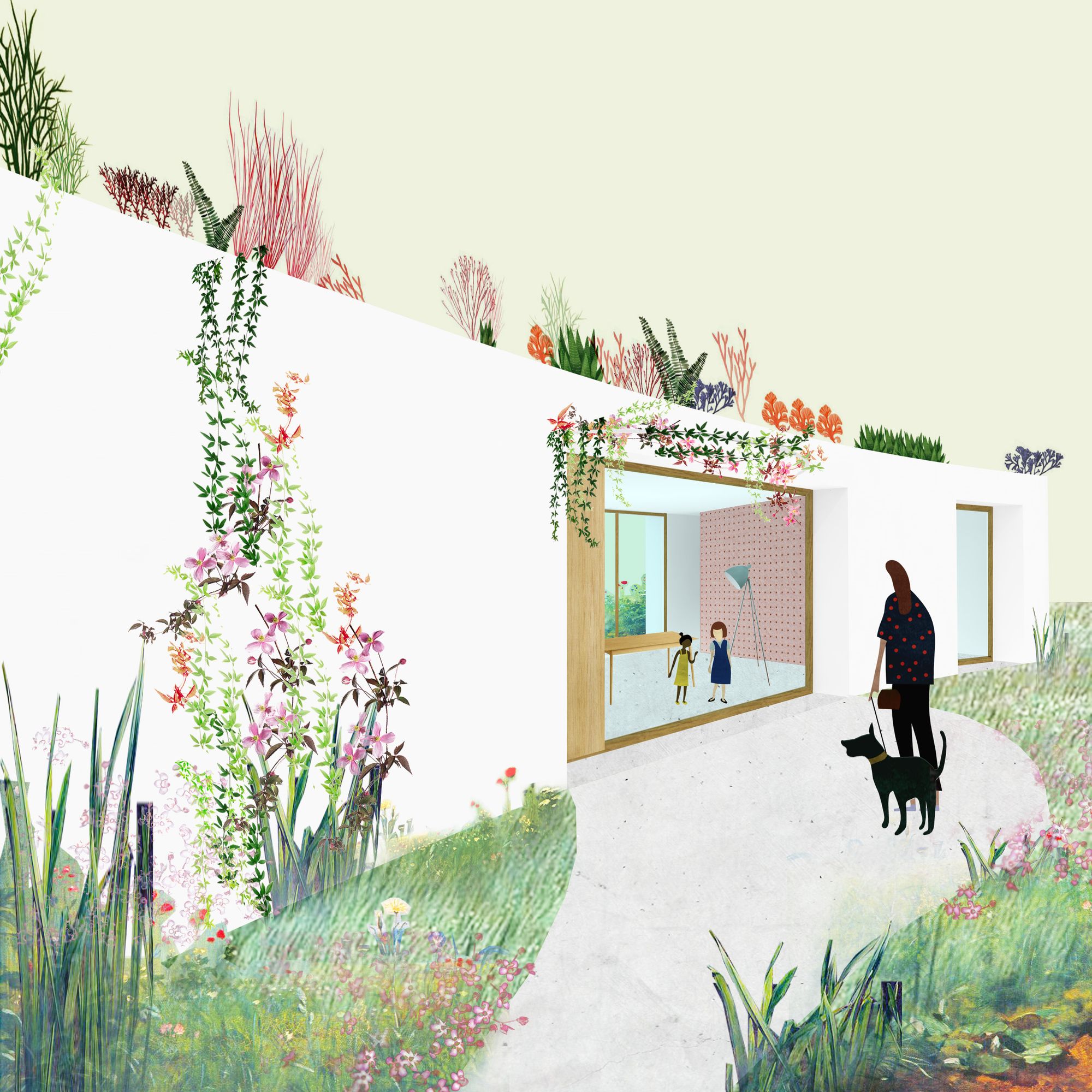
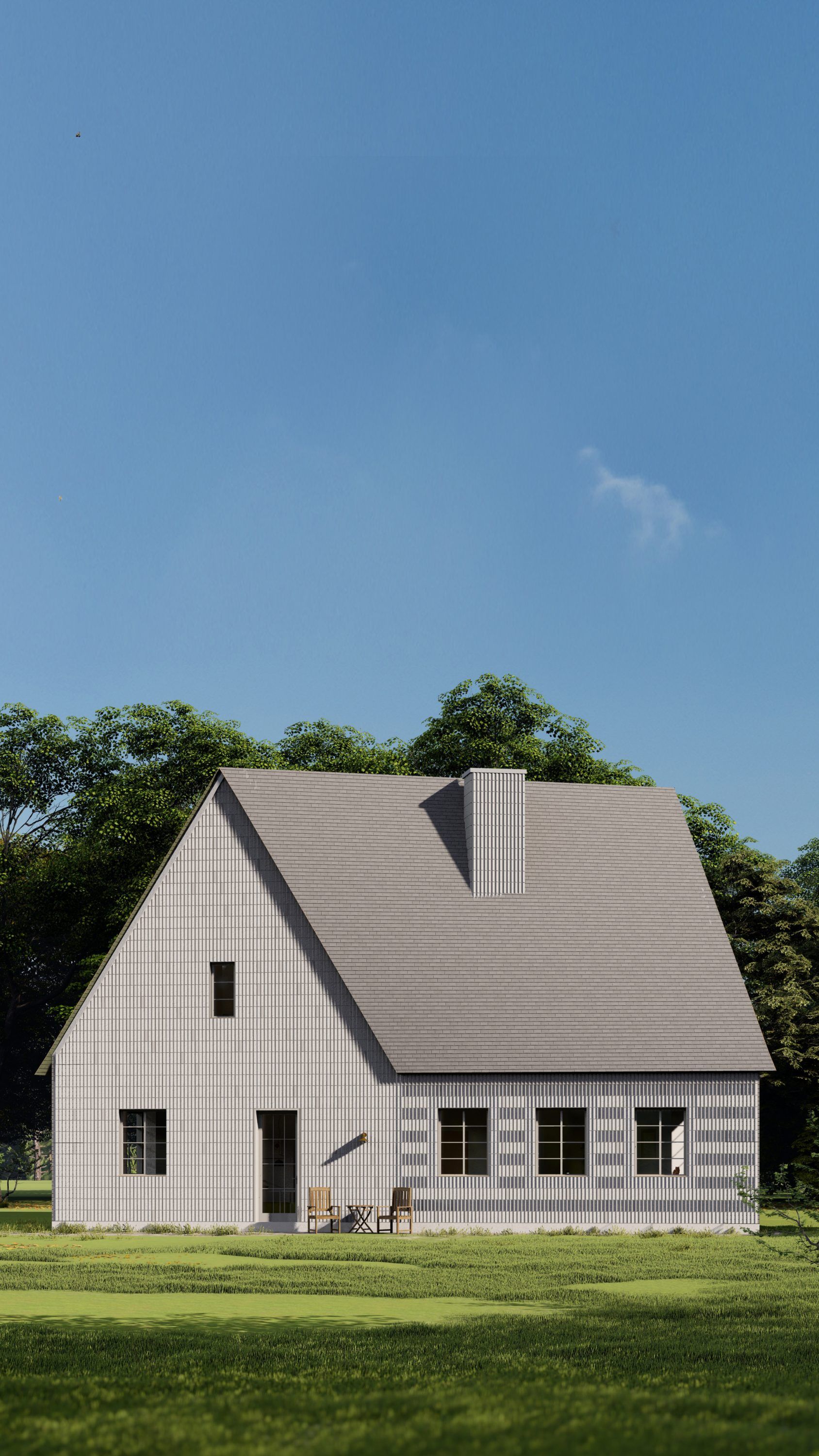
“We are only a five-year-old studio, but we’ve made sure right from the start that we operate as a company. As a result, the hand-crafted, post-digital rendering and illustration techniques typical of contemporary young firms (which we are following closely) are only present in waves. This stems from two things: firstly, the drawing techniques our colleagues know or like, and secondly, how we judge the client. For some people, photo-realistic rendering works better because they need that illusion of reality to believe that what we have designed is what they want. So for us, the technique is mixed, but the choice of viewpoints and cropping is identity-forming. We are meticulously careful about the angles and cropping we use to present our designs. And we reproduce this in the photos once the design is complete. This is how it happened that we have been photographing our designs ourselves for almost a year and a half now, because there is a certain ‘look’ how we want our works to be seen,” says Dávid Smiló, one of the founders of the studio.
“Then, of course, there are the drawings that help us in our own design process. They are also very mixed in style, but we have a certain standard of graphic design that has made its roots in the office. One of the most important functions of this graphic design quality is to make the design process more pleasant. This may sound strange at first, but when you sit down with a concept design, it feels much better to discuss its further development over beautiful and elegant drawings. This was also noticed by our colleagues, who have organized a series of mini-exhibitions to showcase this phenomenon. The exhibition is a retrospective selection of drawings condemned to be thrown away, presenting sketches and drafts created on a one-year scale. It’s very interesting to see how similar drawing patterns emerge during our various works,” continued David.
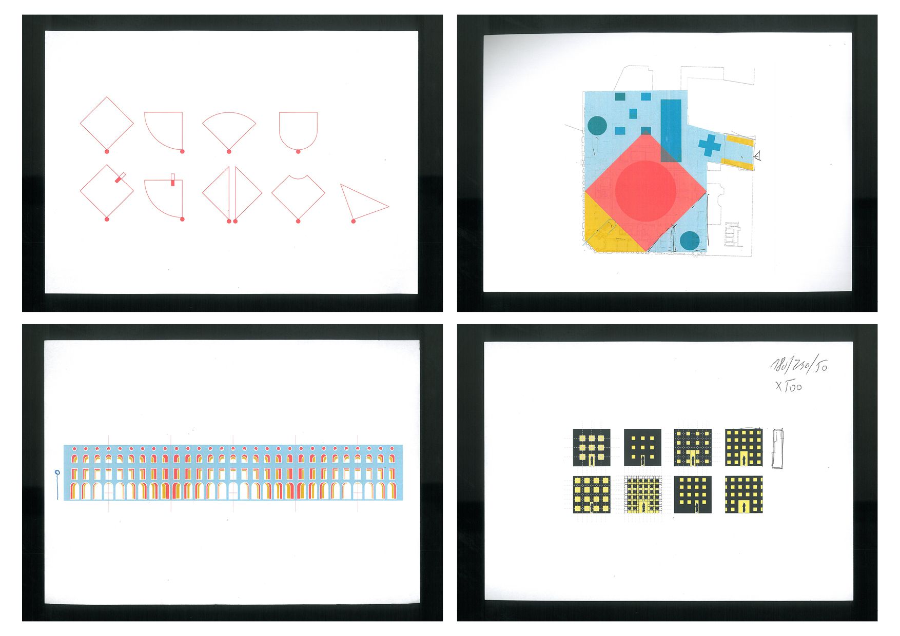
“The different representation methods are all tools for us ultimately. And they can be used in an outstanding or an average way too. An image made with a collage technique can also be embarrassing, and a purely photo-realistic render can also be artistically demanding. But going further, a normcore drawing done simply in ArchiCAD can also be an exciting drawing statement. The important thing is that architects should have the desire to use the tool in the most beautiful way possible,” concludes David. And this closing thought frames the whole issue perfectly.
BIVAK | Web | Facebook | Instagram
GUBAHÁMORI | Web | Facebook | Instagram
Paradigma Ariadné | Web | Facebook | Instagram
Not just a background noise | The Hype&Hyper team's favorite podcasts
Hungarian designers present their latest collections at Budapest Central European Fashion Week
