The Hübris brand is not something you can walk past by. They had beers titled “Dr. Béla” and “Jézus ereje” (Holy Christ) at the very beginning, and today even those will remember the Hübris brand name who choose drinks in the deli based on labels. Their partner in crime in creating the new image was studio NUR, who are likewise unavoidable when it comes to branding. We interviewed them.
Hübris, founded by Ádám László and Marcell Tóth, has a unique approach to artisan brewing, merely because, as they say it, Hübris is “artisan beer minus artisan”. According to them, “one must not put green pesto marzipan in a beer to make it interesting”, and we can’t agree more. Hübris did something else: they created a new artisan beer brand, and not only did they focus on harmonizing the flavors, they also dedicated enough attention to branding. They did not leave it to chance: they turned to studio NUR, the team of Laki Eszter. We asked the members of Hübris (Ádám László) and studio NUR (Réka Imre) about the new image.
“I feel so good, it’s almost Hubris” – the saying originally came from Marci. As a matter of fact, this encompasses the entire ars poetica of your brand. “Hybris” is an ancient Greek concept, with several meanings: on the one hand, it means arrogance and overconfidence, and it also denotes the status when men drift apart from God, and make themselves almighty. Why did you choose this name?
Ádám: For us, hubris means that we make something perfect, almost god-like. Creating something perfect is, of course, impossible, but if one gives up, there’s no point in it at all. By the way, choosing the name was quite spontaneous: it came to us during a trip in Berlin, practically out of nothing. Since then, we became quite fond of it and it somehow became inseparable from us.
You debuted at Főzdefeszt in 2015 with your own beer. I believe that at this time, you had a completely different, less clean image. When did you realize that you needed a new one? And I suppose this not only meant a different logo, but also repositioning your brand. How did this happen?
Ádám: After 3-4 years of contract brewing and “homeless” brewing, we launched our own plant in 2018 in Székesfehérvár. With the launch of the new brewery, it became obvious to us that the brand needed a change – for several reasons. On the one hand, our taste changed a lot during the years: we became much closer to plain and clean flavors. On the other hand, we didn’t want to fall in line with just another comic book-like image. For this, we needed Matyi Ónodi Szabó creative “boss”, of course, who held our hands and who (after a few glasses of beer) knew exactly in what direction we needed to proceed, and he didn’t let us drift off from that road.
How did you find studio NUR? How did your collaboration with Laki Eszter’s team start off?
Ádám: The road was leading to Eszti and her team from two sides. One of my good friends, Vera told me once: “hey, you should work with Eszti”, I remember this quite clearly. Then “Papesz” (Matyi Ónodi Szabó) knew that the brand needed a simple and direct image, and studio NUR also ranked high on his top list. After the first few meetings, it became clear for everyone that we wanted this collaboration and so we started our work together, which, I think it is safe to say, was smooth sailing. We were on the same page from the very first moment and the image was created relatively quickly, within one and a half months.
When Hübris asked you to design a new image for them, what was your first thought? How did the design process start off? What was it like to work with the guys?
Réka: We already felt at our first meeting that there was quite an extraordinary impetus and determination in them. We also went all in with the design process due to the strict deadlines. Probably this was the most complex image that we designed with such short deadlines, yet in such smooth manner and in such good atmosphere, in complete harmony with the client.
Nowadays it can be seen at more and more Hungarian brands that they take a more conscious step towards branding: they not only want a new image or packaging, but also look for art directors for each project. I understand something similar happened at Hübris, too. What does art direction mean exactly in your case? Could you explain this a bit?
Réka: It was very important that the visual appearance reflect the communication tone of the brand. We worked together with Mátyás Ónodi Szabó, who came up with the “Hübris is the new classic” and “Artisan beer minus artisan” slogans, amongst others. The new image is essentially the translation of these succinct and funny sentences into a visual message. We had to come up with a graphical appearance that is fresh and surprising at the same time, but which also creates a sense of familiarity: as if we have been seeing Hübris on the beer shelves of stores for ages.
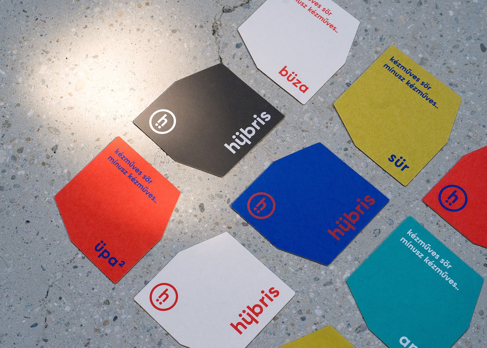
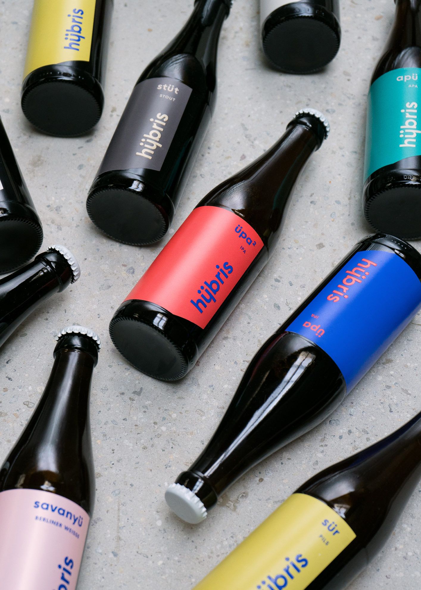
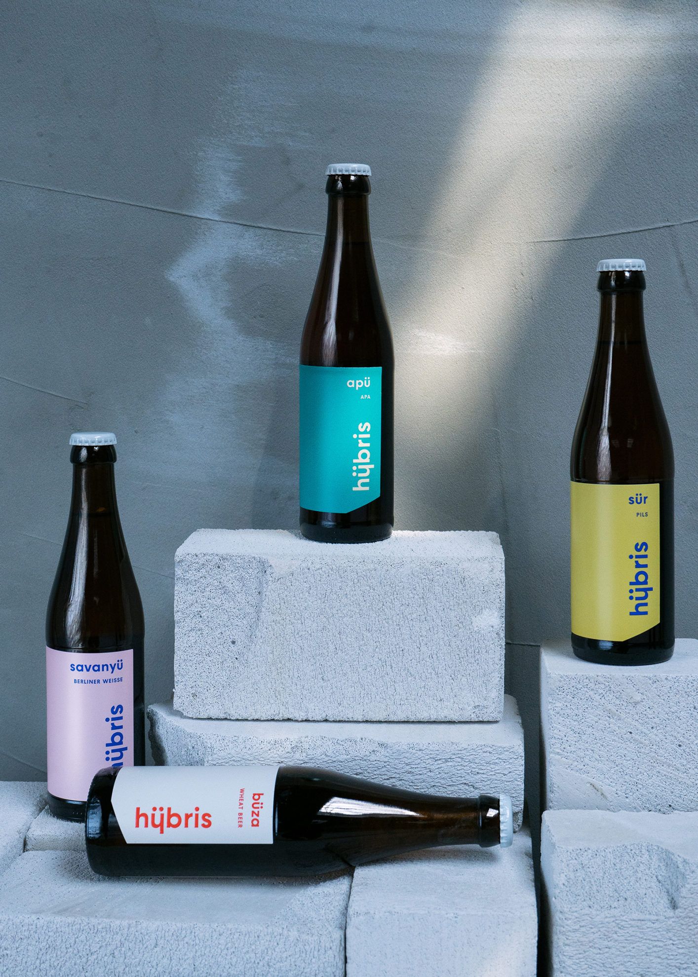
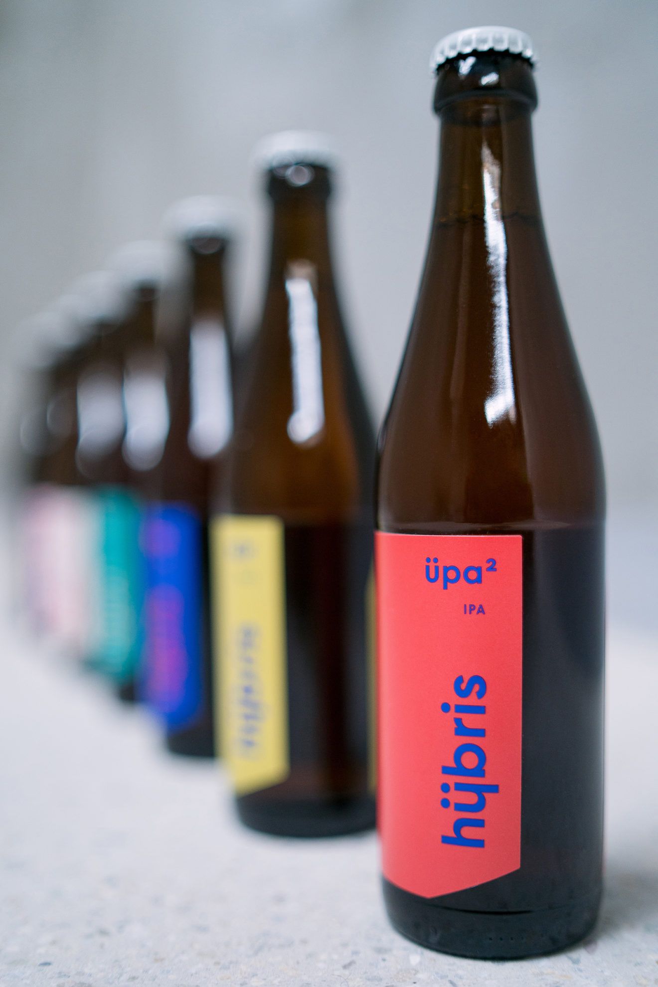
The image of Hübris is totally different from that of other artisan breweries, it almost jumps off the shelf: it is clean and immensely simple, yet definitive and eye-catching, and somewhat playful at the same time. How did you manage to achieve this effect?
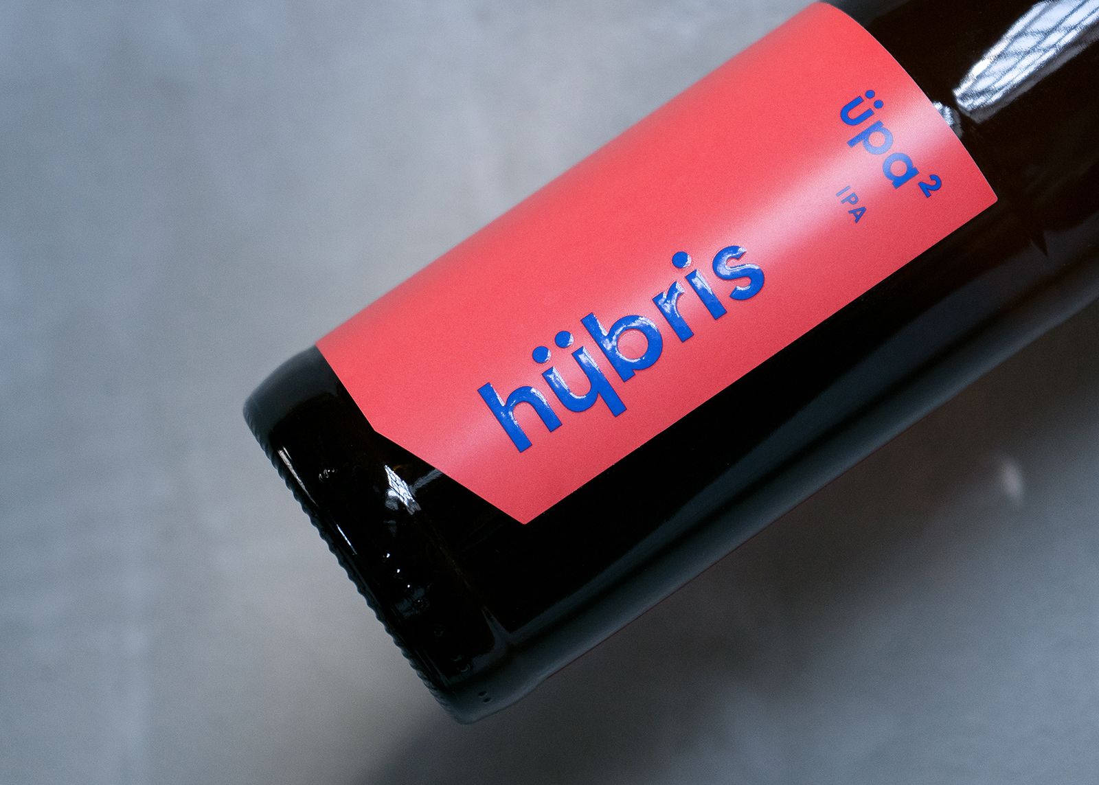
Réka: What we wanted was, indeed, not to follow the illustrative and comic book-like path that is so popular amongst artisan beers nowadays, but to create a timeless image that addresses everyone, by drifting off from every other currently cool trend. This is why we decided to use a much more minimalist line, characterized by large color patches, unique cut-off shapes and emphatic typography. In the logotype, we playfully referred to the two-fold pronunciations of the original Greek “hybris” by lengthening the stem of the letter “ü”, and we turned this character over to a letter “h” in the emblem. We also used the two dots below the letter “h” as an additional graphical element, for example instead of the end-of-the-sentence “…” signs. In the case of the beer labels, we highlighted the logotype with embossed lacquer, this way, if someone holds the bottle in their hand, they can also feel the letters. We can thank our type designer friend Naske Laci (Naske Studio) for the font. This was the second time we have worked with him. Laci created the “Hübris Sans” font by transforming his existing font family, the Moholy Sans, which we used in the logotype and the entire image.
This kind of exciting-minimalist image is much more widespread in the case of foreign products, than it is here, in Hungary. What do you think, did you manage to conquer the slightly more conservative Hungarian audience?
Ádám: We have almost only received positive feedback so far. It seems that we managed to steal the hearts of Hungarians, too. We think simplicity is timeless. We don’t want to over-explain anything, there is no need for it. We rather want to create classics, without unnecessary frills. I think people understand this both here at home and abroad.
Photos: János Szabó R.
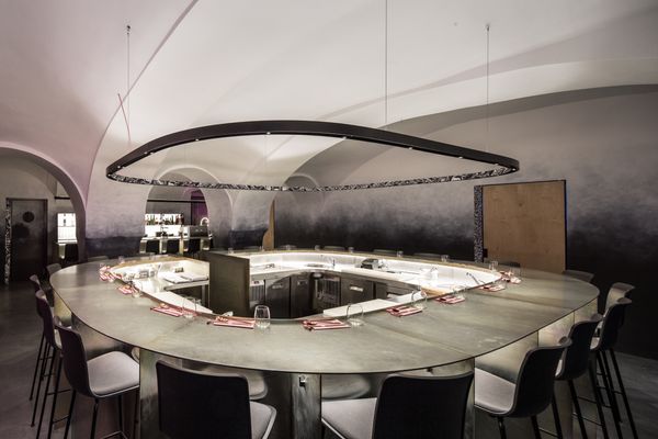
IASAI Bar | Bratislava
HYPE | Weekly program guide