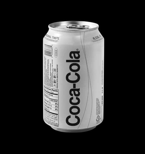
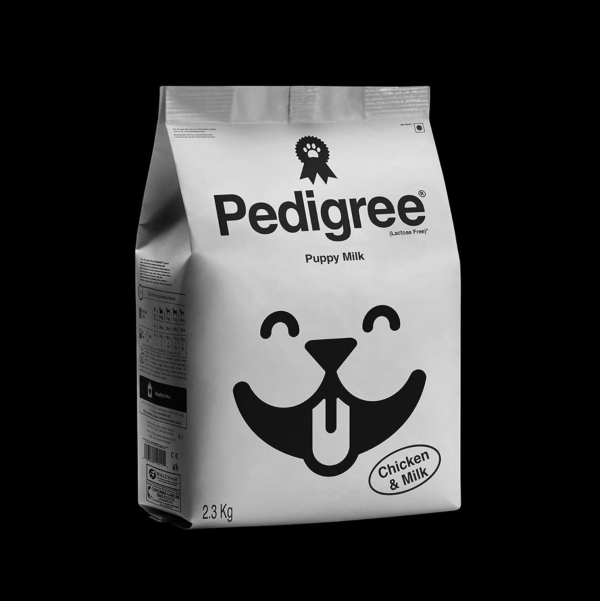
Truth be told, all of us must be kind of sick of all the packaging/brand/product redesign concepts, as everyone tried to stand out with this genre in either period of the “high school – third-year university student” life phase, approximately with the same efficiency as we all did something similar on the dance floor of some club in the same period. Let’s just forget it all, right?
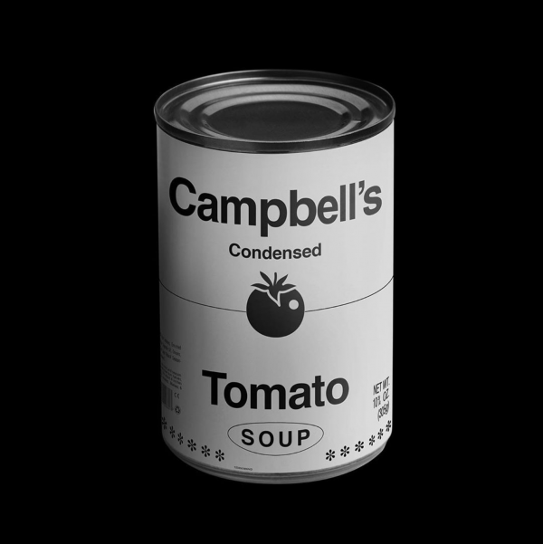
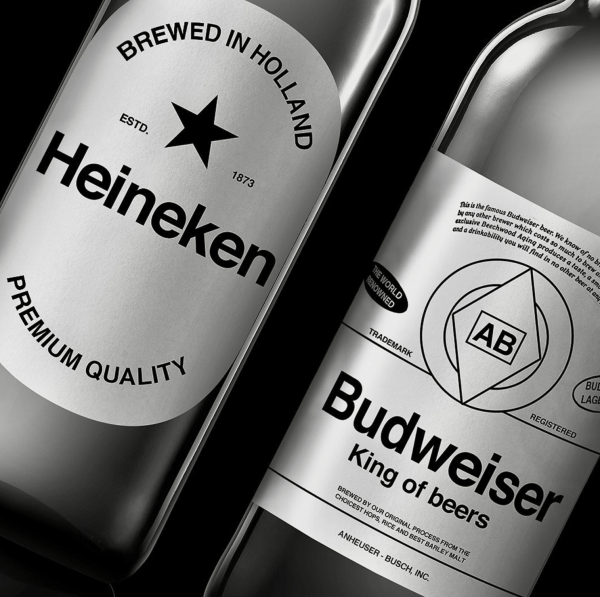
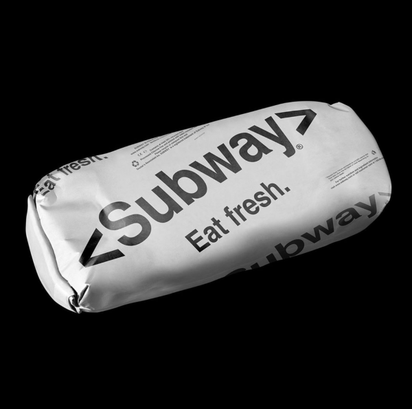
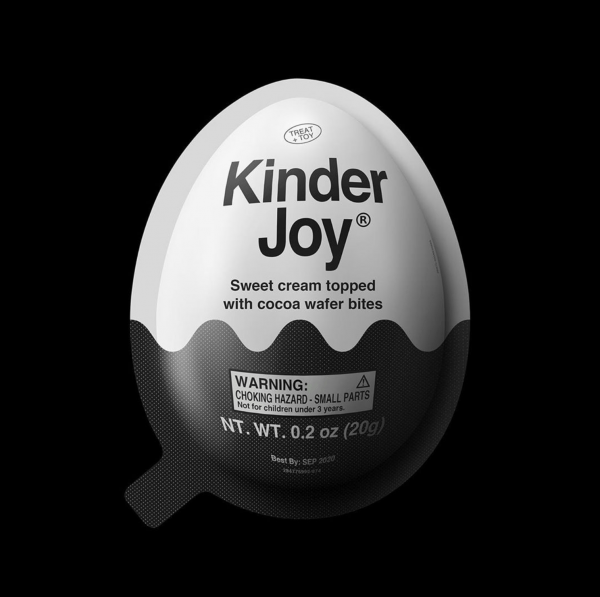
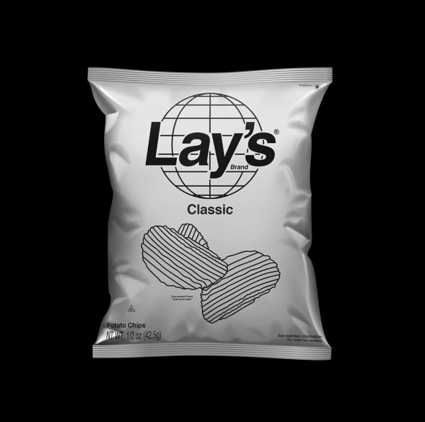
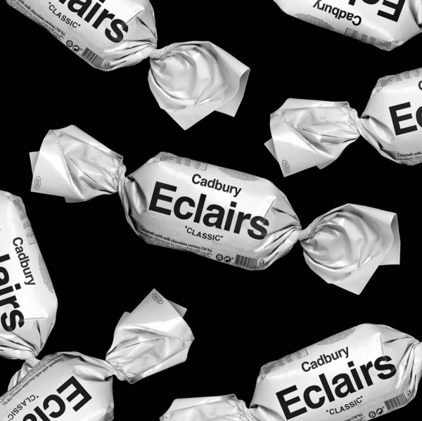
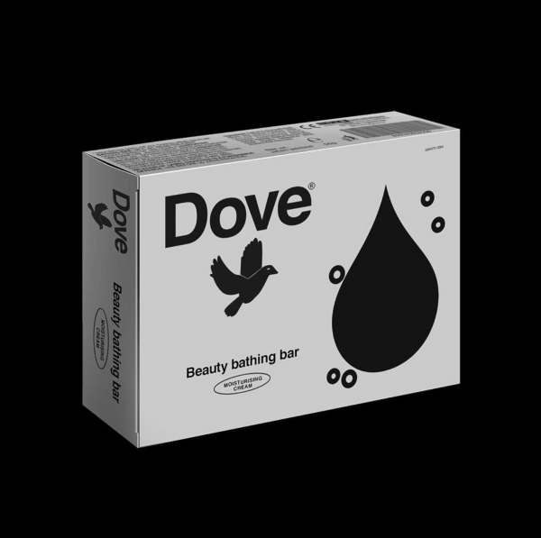
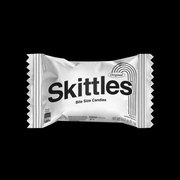
Sometimes, however, we encounter fun solutions like the one below that are worth taking a look. In addition, minimalist re-design is the top (bottom) of it all, because literally they are dime a dozen even today.
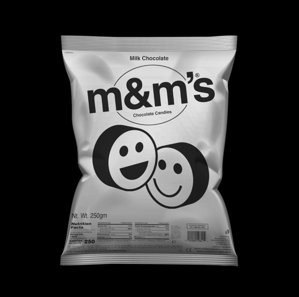
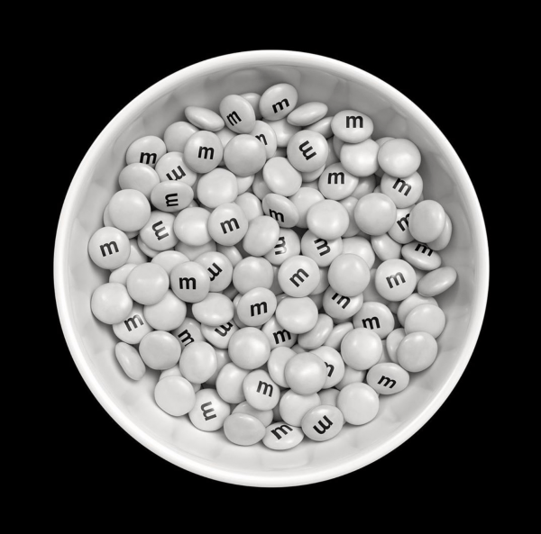
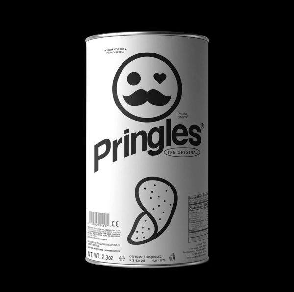
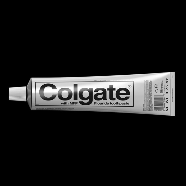
And now, in spite of it all, paying respect to the designer for opting for the brutalist direction instead of minimalist solutions, we publish a concept of this kind. Firstly, because we like almost everything that comes from brutalism, secondly, because it is done well, and thirdly, because we fancy it. And that is all.
The designs were made by Kunel Gaur, and were published on his Instagram account. Several other projects of Gaur can also be found here:
https://www.instagram.com/kunelgaur/


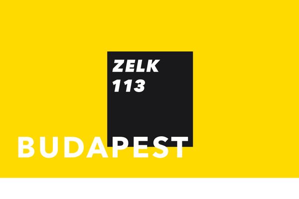
SQUARE-ANGLE – Zoltán Zelk
