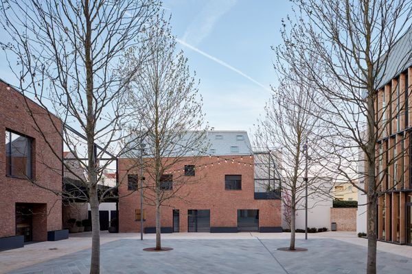
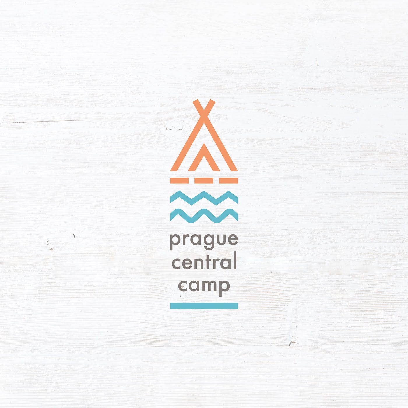
Clean, light, clear and unique at the same time: this is how the new visual identity of Prague Central Camping can be described the best. The pics will get you in the mood for a long weekend, for sure!
Written by: Márk Szolomayer
Even though planning trips is not ideal at the moment, dreaming about it is still an option. If you have a thing for camping in tents or RVs and haven’t been in Prague lately, look no further: here’s your destination for next summer.

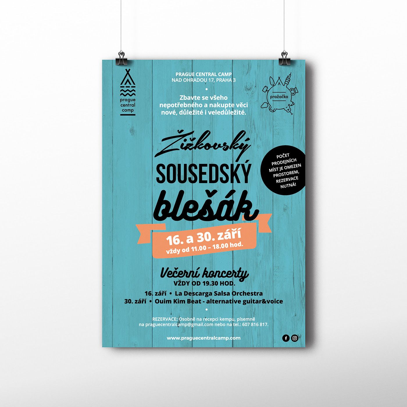
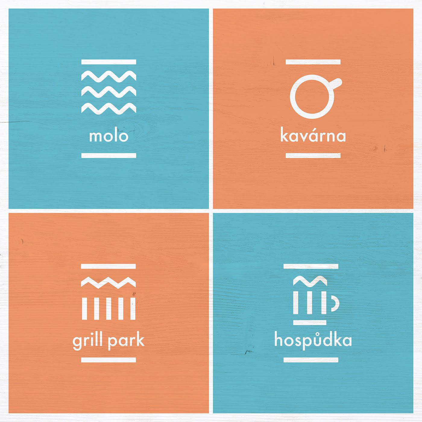
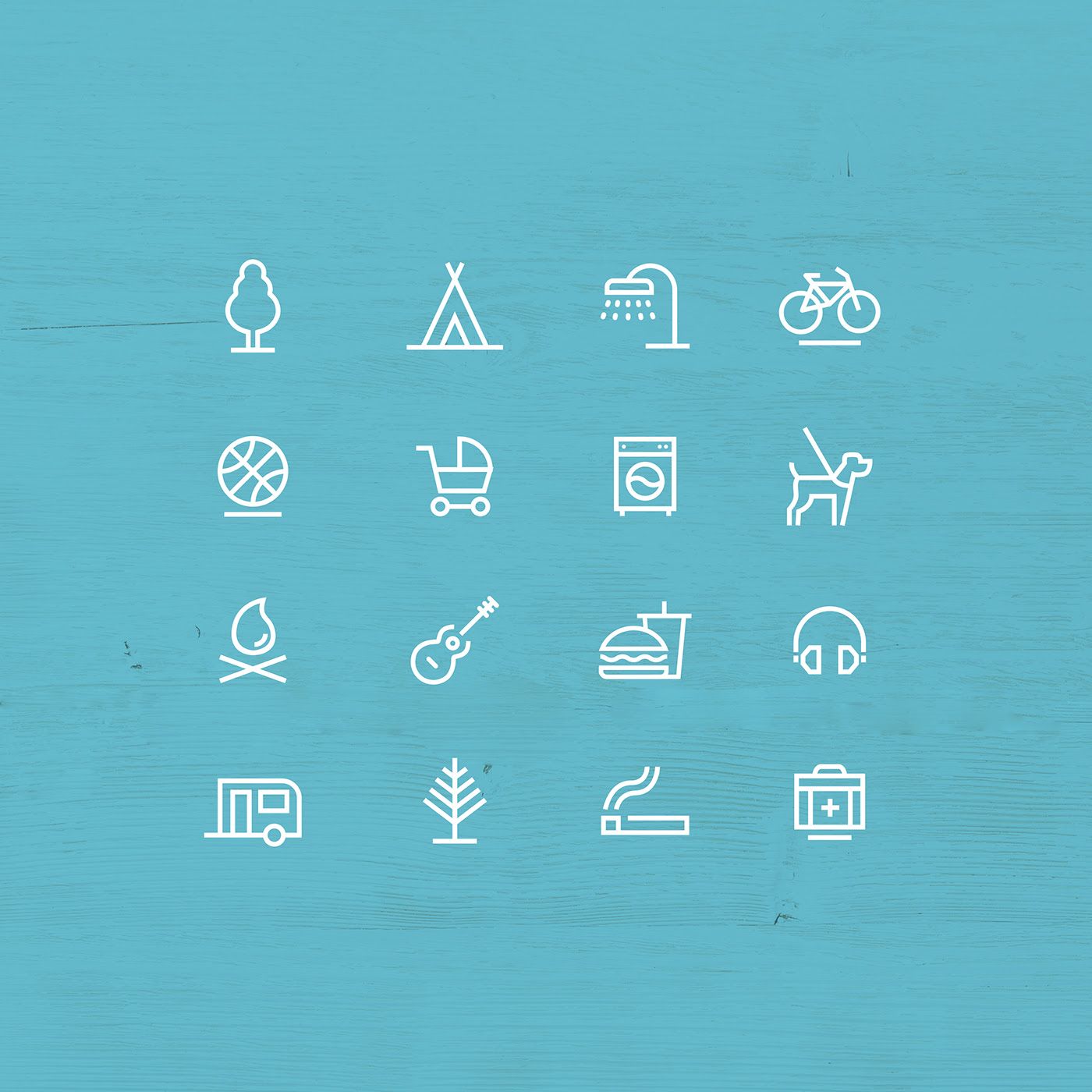
The new visual identity of Prague Central Camp designed by Czech graphic designer Alexandra Tycová uses only two colors, making a clear reference to land and water. Icons constitute the other keystone of the visual identity, with a design that couldn’t be more minimalist and easier to comprehend. The logo resembling a teepee appears virtually everywhere, may it be the entrance of the camping site or the menu of the restaurant.
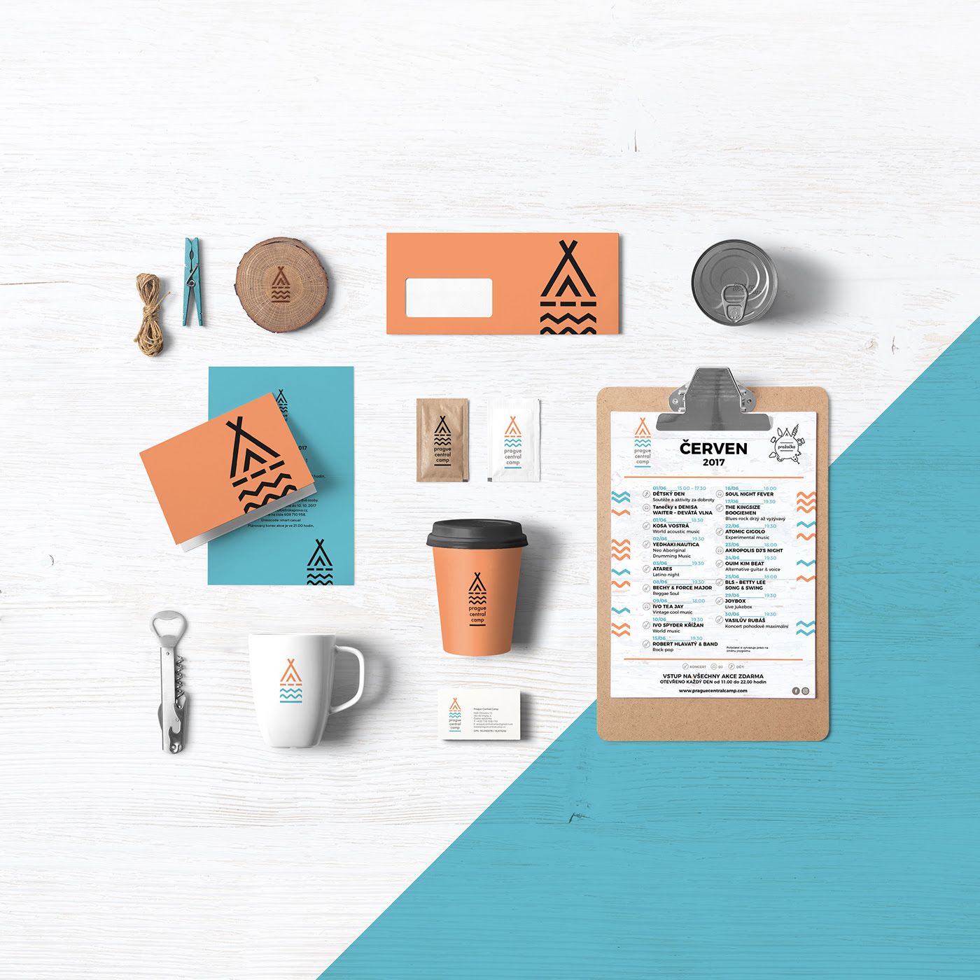
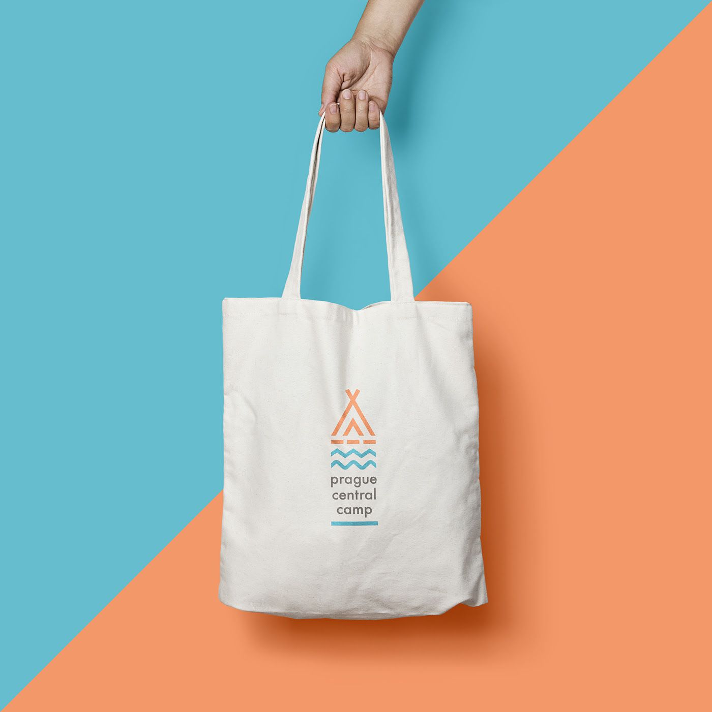
Those looking for something to take with them at the end of the trip can buy one (or more) of the canvas totes with tents on them or the enameled mugs.
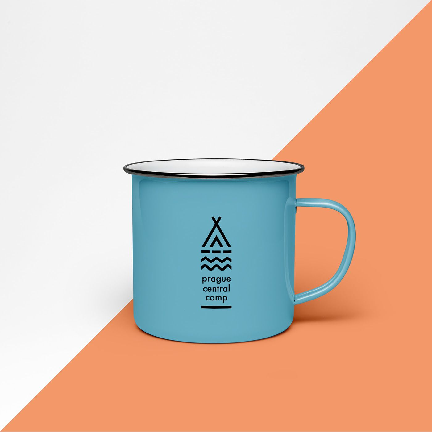
Source: Behance
Architect studio BIG to design tech hub in Bratislava

Floating memories | Marietta Varga’s latest series
