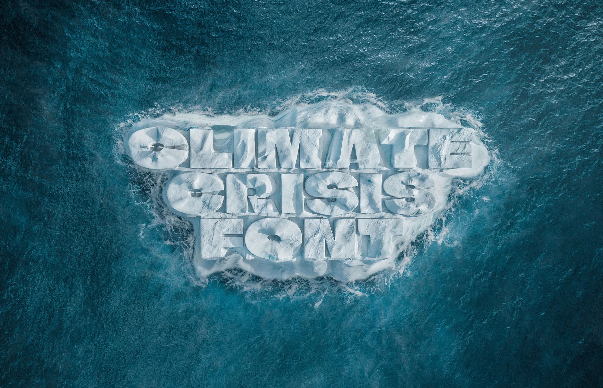
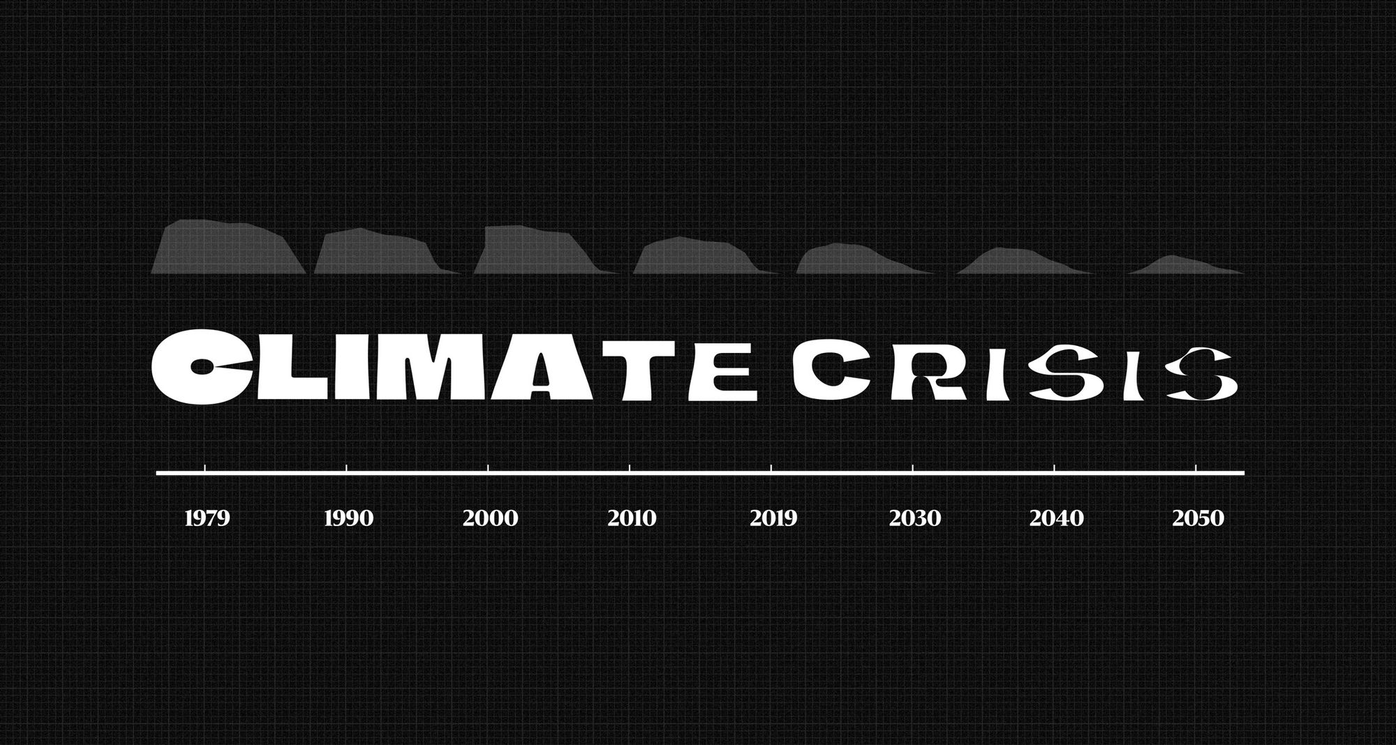
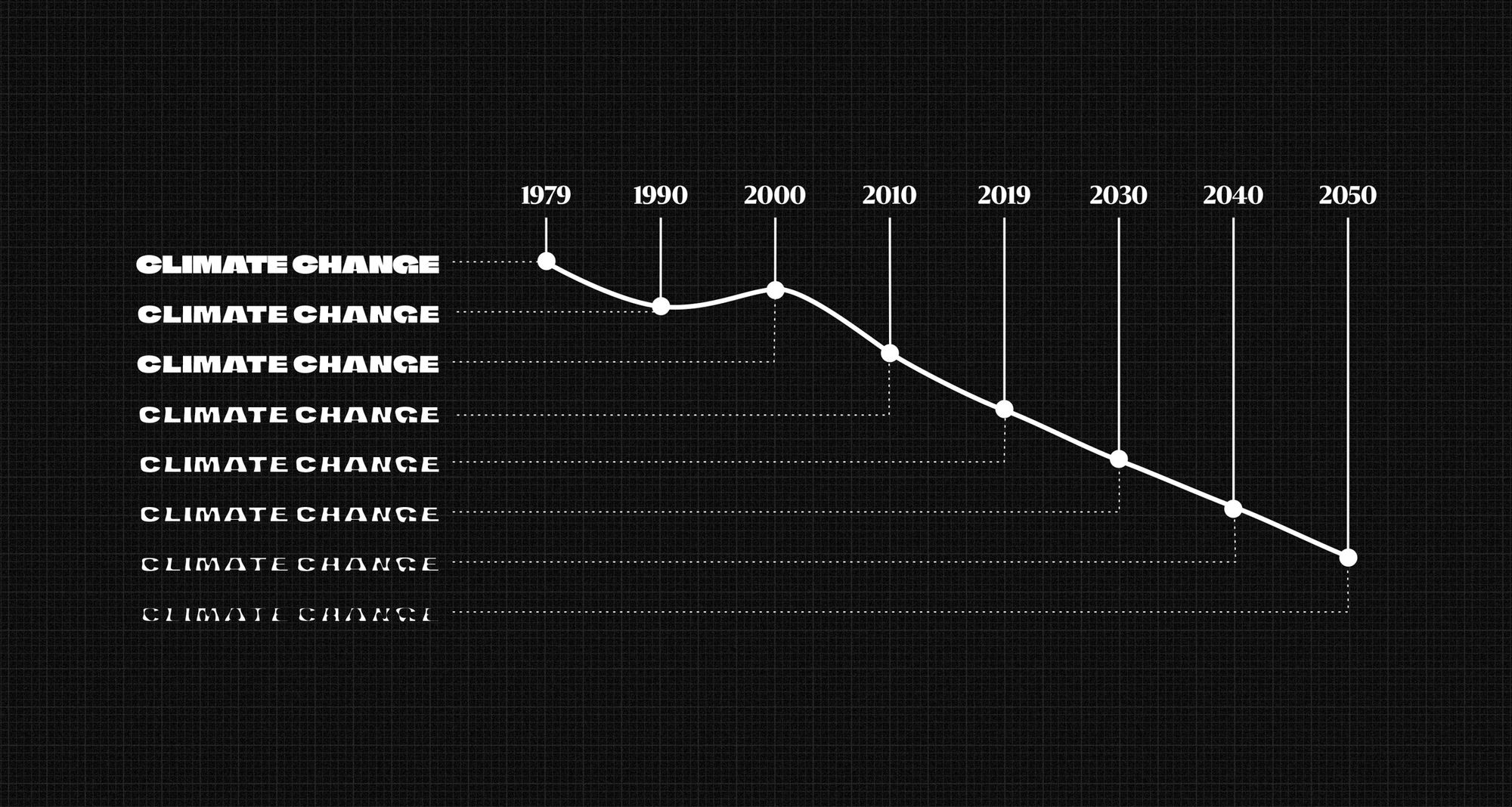
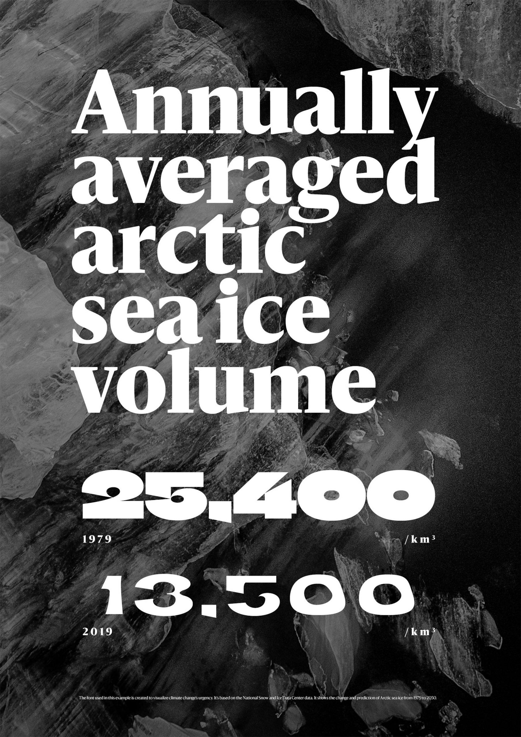
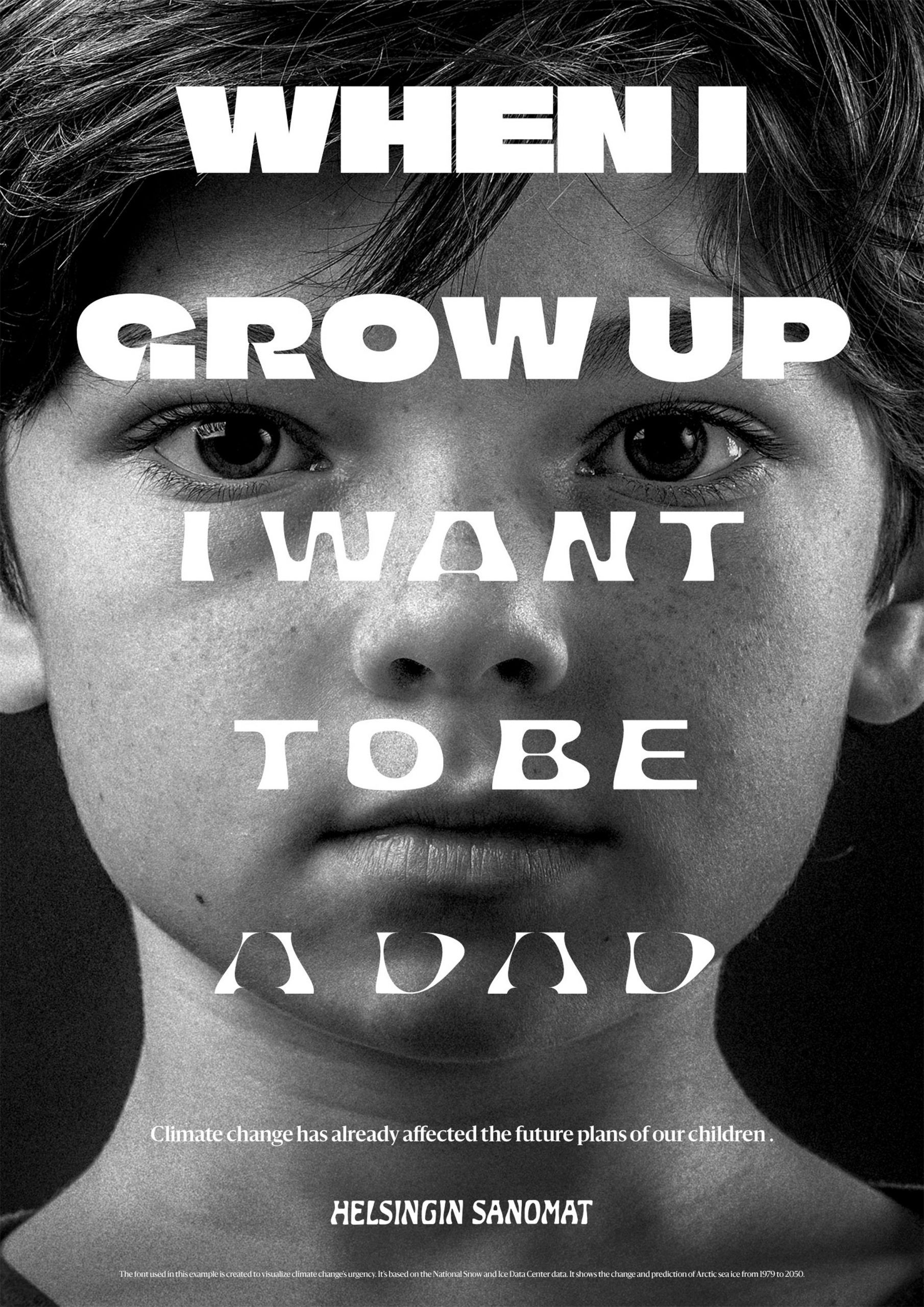
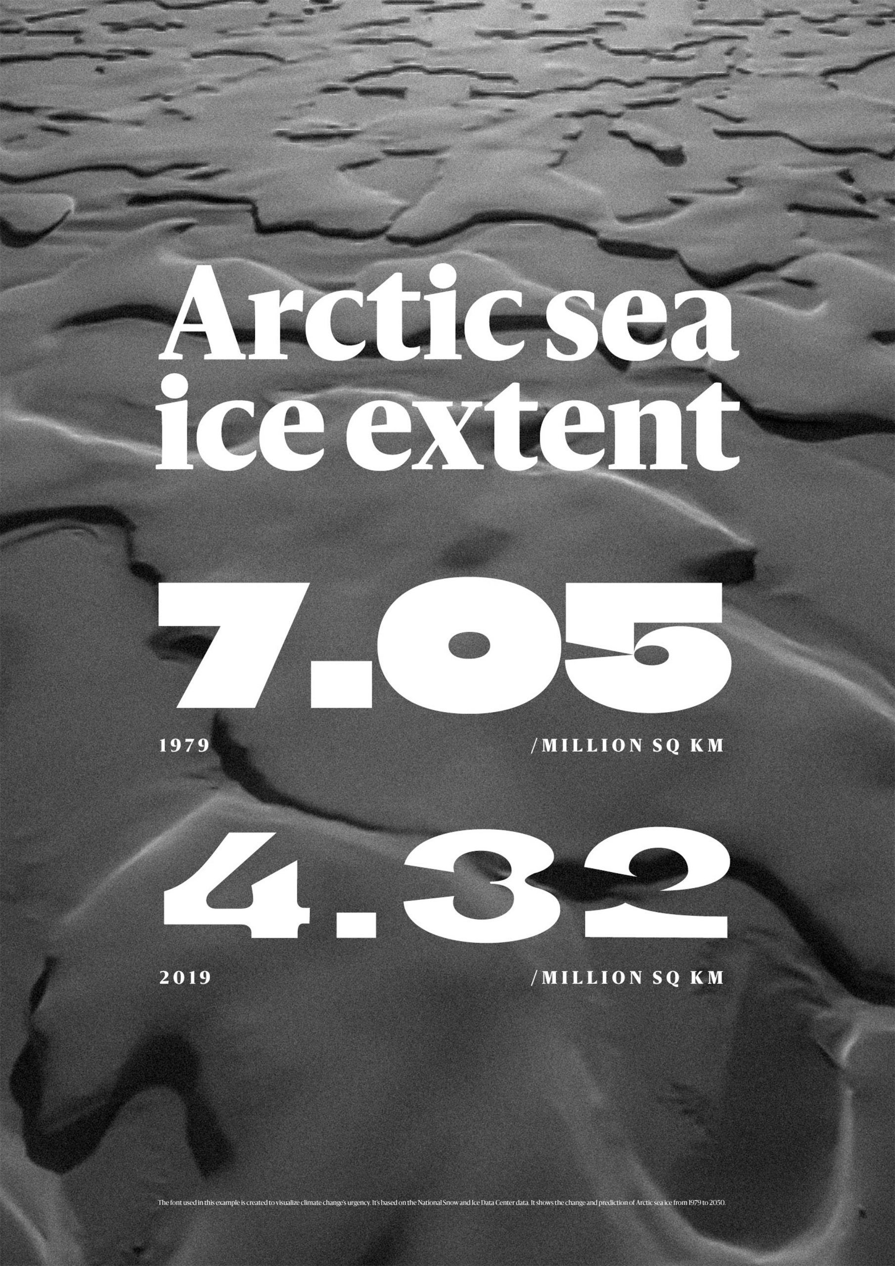
Finnish newspaper Helsingin Sanomat draws attention to the melting ice caps of the North Pole with its Climate Crisis Font, which is an excellent illustration of what global warming is capable of.
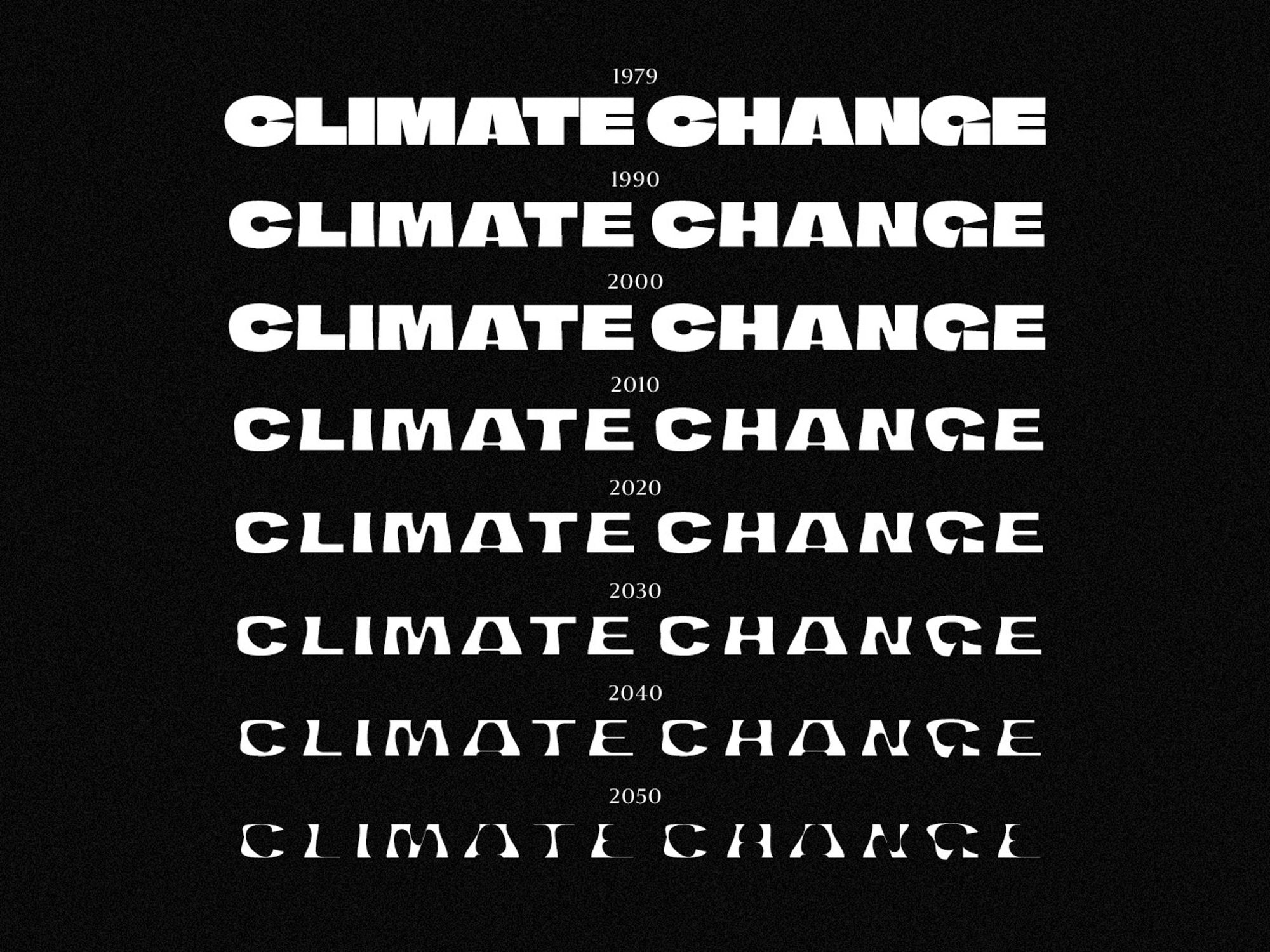
While with traditional fonts, we can choose from preset styles such as bold or italic, the special feature of the Climate Crisis Font is that it responds to the world’s changes. The boldness of characters is determined by the passage of time, symbolizing the years between 1979 and 2050: on this timescale, each year has a different version connected to it. In its 1979 version, the font is at its thickest, much like the ice on the poles, and over the years, the letters’ silhouette becomes more and more curved and thin, as if they were melting or sinking into the ocean like ice.
The font by Helsingin Sanomat is free to download for anyone.
Helsingin Sanomat | Web | Facebook | Instagram
Source: Dezeen
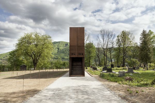
Monument in a First World War cemetery | Banská Bystrica, Slovakia
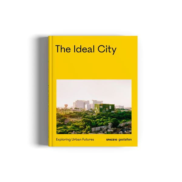
Exploring urban futures | gestalten X SPACE10
