Does your town have an iconic independent store that has been around for what seems like forever?—the question can be found in the description of the latest project of the Polish Traffic Design. The team, known for its aesthetic rethinking of the city streets, has this time transformed the window of one of Gdynia’s iconic delicatessen shops, in an unconventional way typical of the Traffic Design’s philosophy.
The Aldek store in the center of Gdynia, which has been operating since 1994, has everything related to cooking and food. Thanks to its diverse range of products, it has managed to survive despite the arrival of different chains, but its visual appearance has worn out over the years. The grocery store at the bottom of the modernist building has been on the Traffic Design’s to-do list for a long time, so as a result of the opinion poll conducted on the team’s social media platforms, it has been marked as the site of a further transformation. When they approached the owners, they voted with complete confidence in their ability to design.
“The biggest challenge was to come up with a visual style that would be contemporary and refreshing, but at the same time wouldn’t feel too exclusive for this kind of establishment. We wanted to keep the casual vibe and really show off that simple, everyday places like a local grocery store can benefit from cooperating with a designer, especially now, when this segment of the market is dominated by global chains,” said Renia Maj, project designer at Aldek and member of Traffic Design. Thus, the basic concept was to create a dedicated, unique design that could not have been possible to realize in the case of a chain store. As Renia pointed out, “it was both a challenge and an opportunity”.
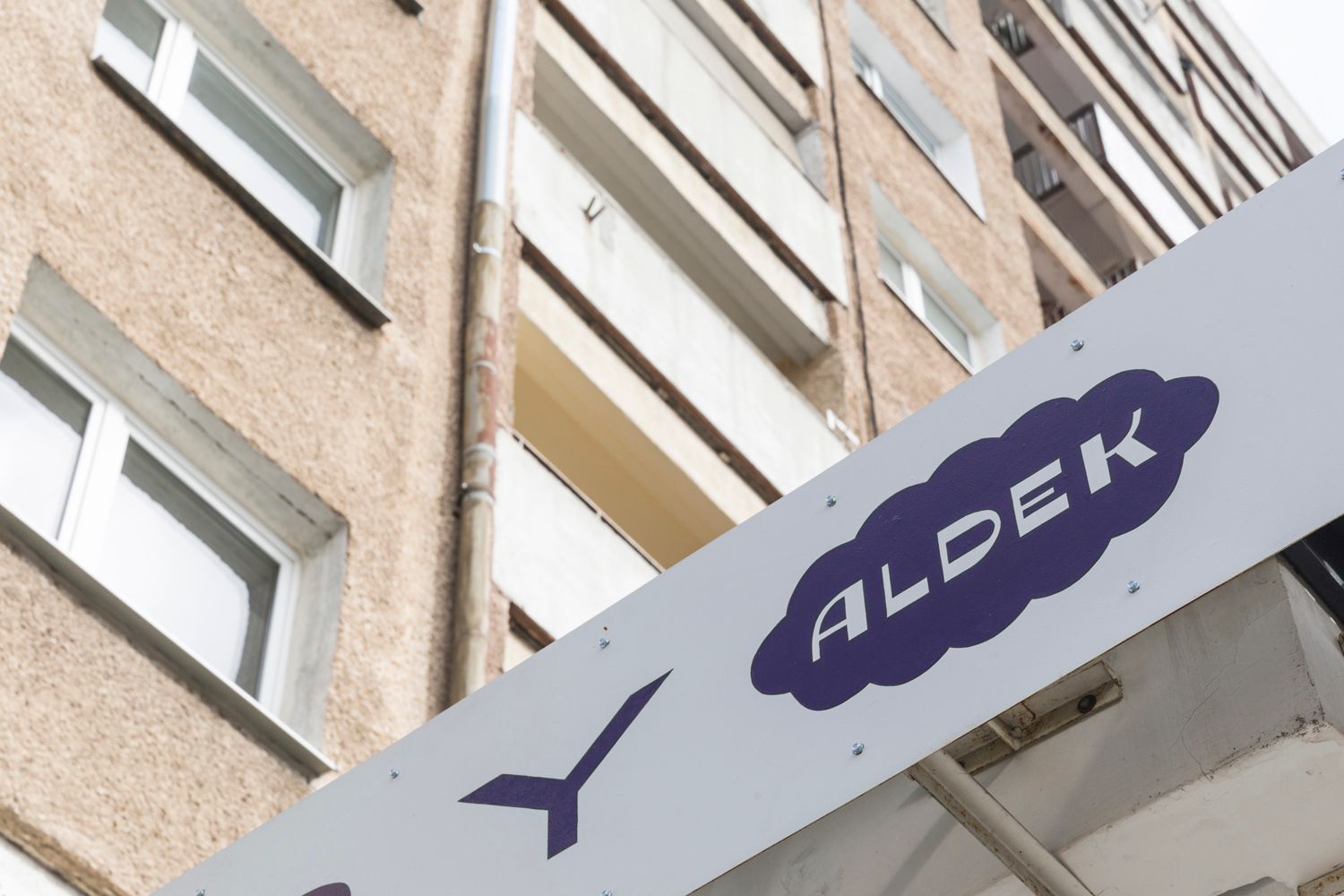
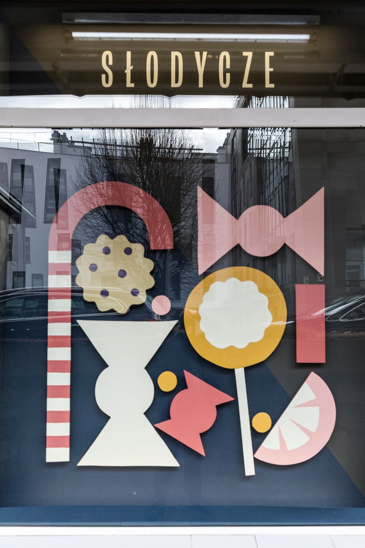
“We did not aim to create a logo or a key visual that could be easily replicated in many locations. Instead, we focused on designing typography that would fit the architectural context of the store. We focused on creating the visual identity of a place, not a brand. Our aim is to highlight the quality and diversity of the products offered by the store through the use of unique and artisanal techniques instead of the usual production methods,” she said.
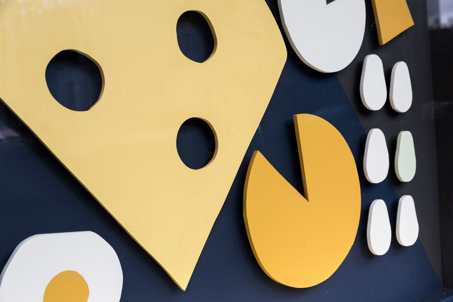
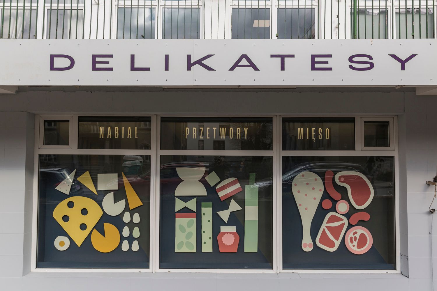
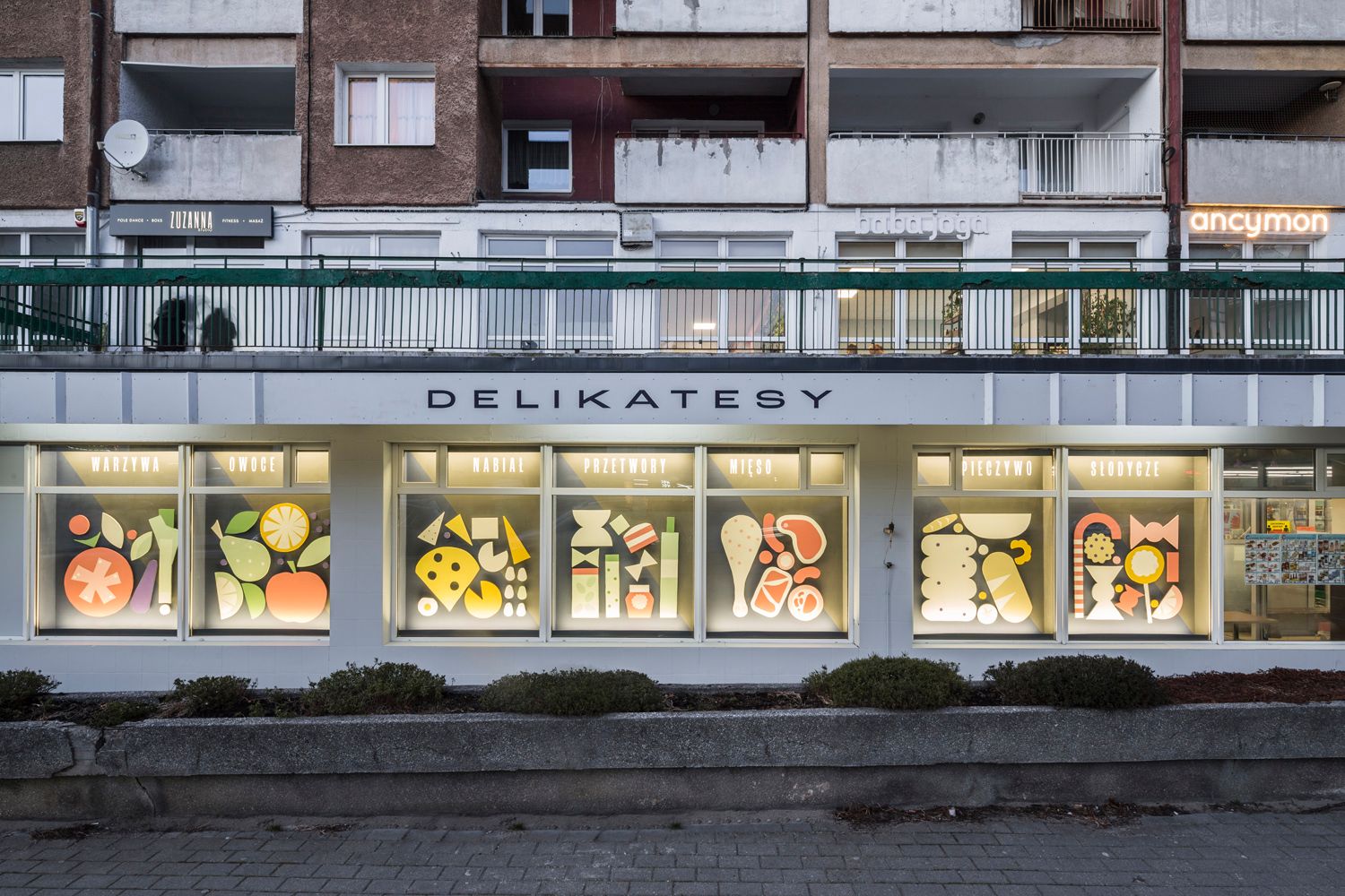
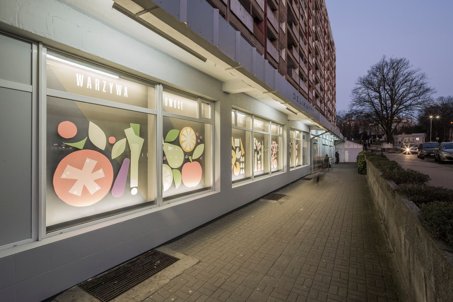
As part of the redesign, the first step, which is indispensable but not usually linked to the design process, was to clean the space, remove old signs and repaint the façade to create a suitable space for the placement of new elements. Since Traffic Design did not want simple vinyl graphics, the Aldek store window is decorated with a wooden, food-induced installation, which is about 47 meters long: the glass surface of the showcase shows symbols of various fruits, sweets, vegetables, meat and dairy products. All the wooden elements took their final shape in the workshop of Traffic Design, where they were cut, painted and assembled.
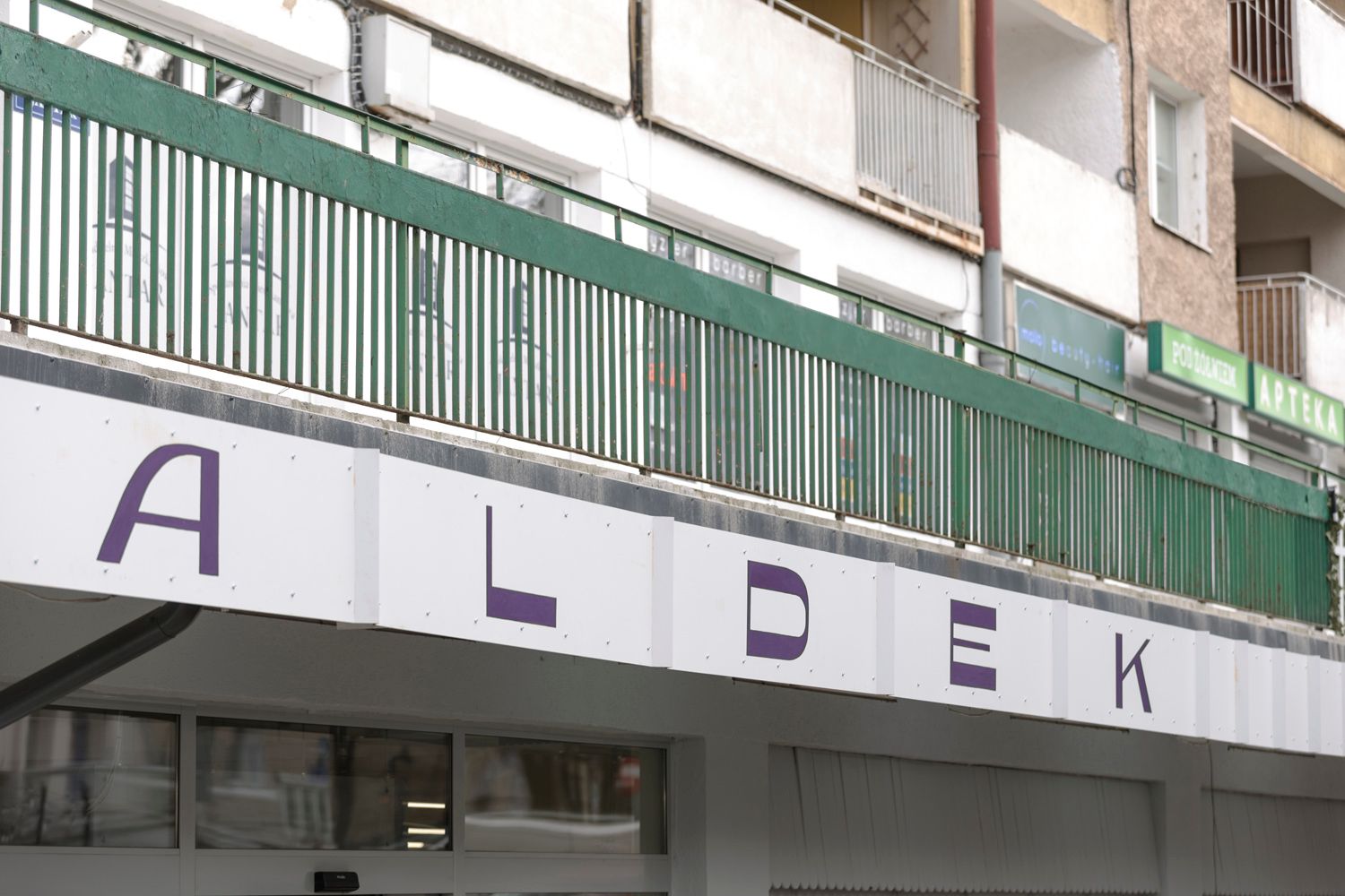
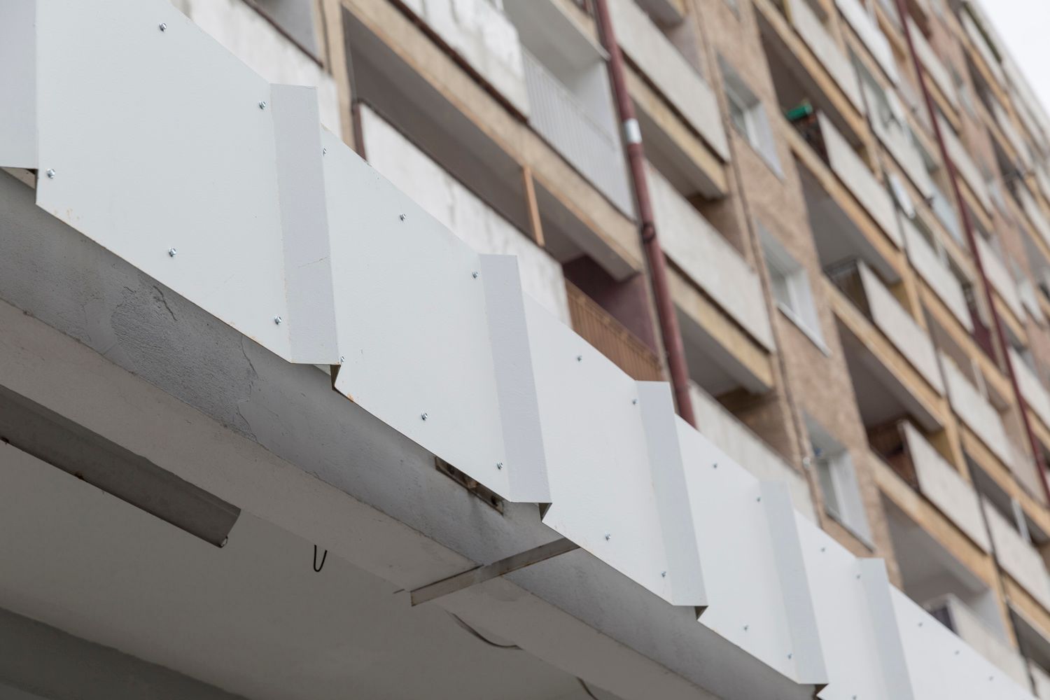
Another important aspect of the visual appearance of the storefront and windows was that the new elements were placed in a way that the interior of the store became visible through them. Previously, this was not possible due to the scaffolding that was put near the windows. The other essential element of Aldek is the new nameplate, which was given a new life in the form of a hand-painted, curved sheet: the special feature of this is that the gaps between the letters on it are filled by accordion folds, so the nameplate becomes an architectural element of the building.
“We have done quite a bit of local business redesigns, not only in Tricity, (a frequent designation of the town complex formed by the municipalities of Gdańsk, Sopot and Gdynia—the Ed.), but also in Warsaw and other parts of Poland. We always pick a local store or a craftsman’s workshop and approach the owner to discuss their willingness to participate and their needs—in this way this project was similar to our previous works. However, I think it is the first time we put so much thought into window displays,” Renia added.
Traffic Design | Web | Facebook | Instagram

NUBU launches its new sub-brand with the invovement of people with autism
A Jaques Tati film inspired the new MONOCLE furniture collection by Katarzyna Jasyk
