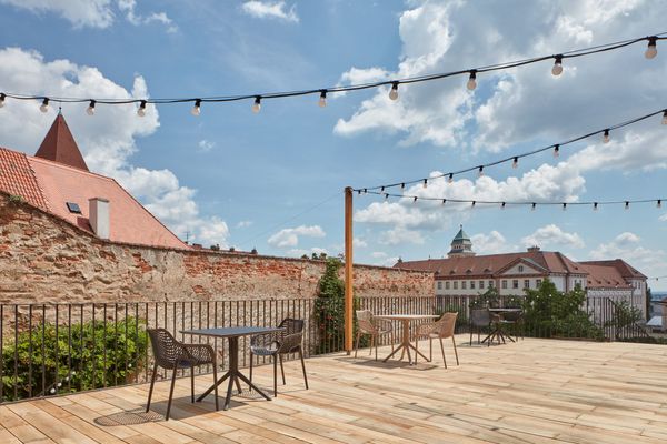
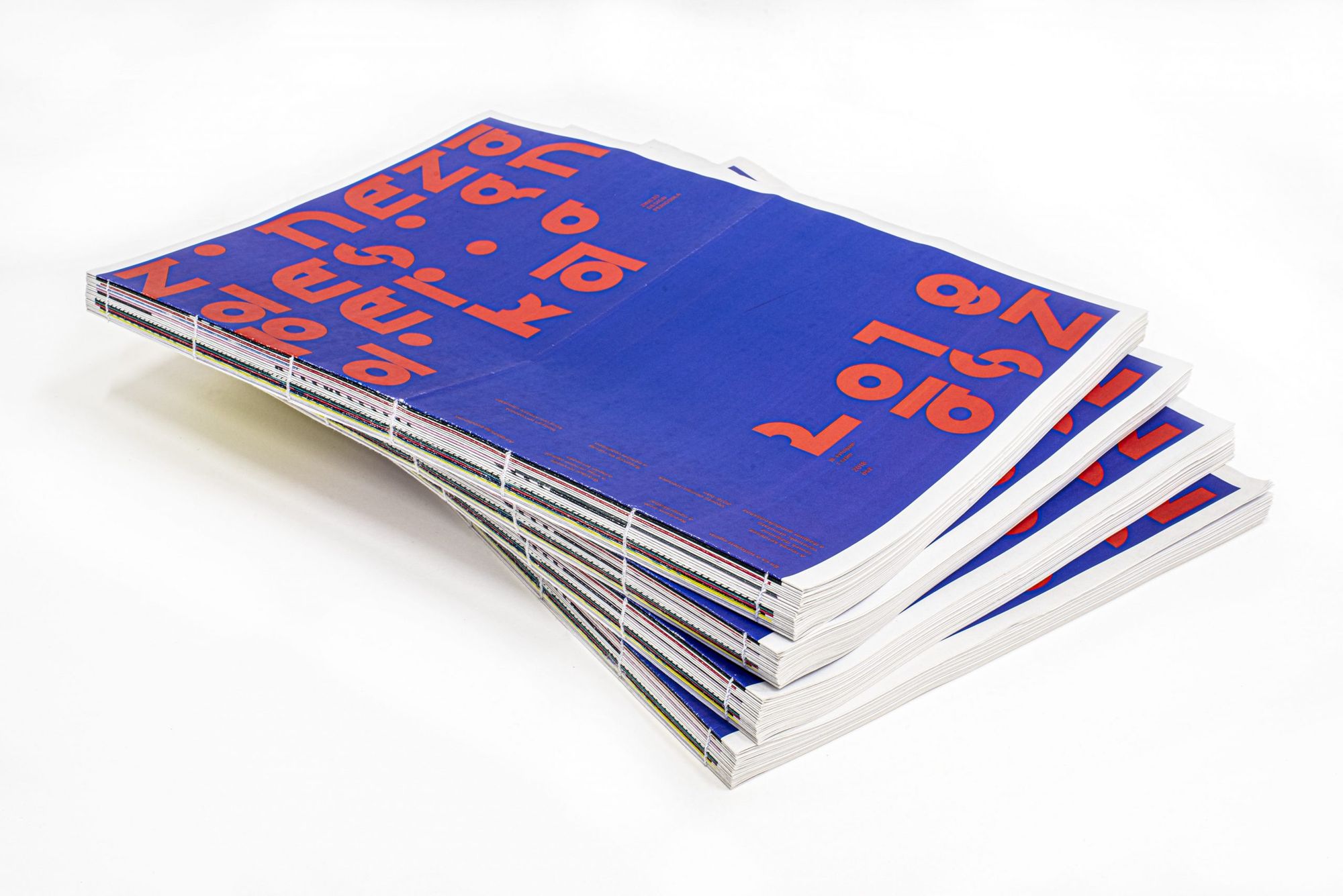
The works of the graphic designer students of the Media and Design Department of Eszterházy Károly University, the Zinezős are now showcased and open to the public in an exhibition opened under the title ‘Zizi a Telepen’. Those interested can flip through the most exciting issues of the biannual design periodical in Telep’s gallery.
It’s always nice to see university initiatives that offer a possibility for both practice and experiments, and that in addition to shaping the professional community of participants, also take a step beyond the walls of the institutions and open towards the public. I had the same experience with MOME’s Inspiráló Designelmélet (Inspiring Design Theory) lecture series as a design and art theory student, and I consider Zinező, the design periodical edited by the students of the Media and Design Department of Eszterházy Károly University a project of the kind, too. The Zinező (“Zizi” in short) is a playground of styles and a training ground of classic layout processes at the same time. Its name came from putting together the words színező (meaning coloring in Hungarian) and zine, which is quite clever if we think about how Zinező is really the colorful, experimental terrain of desktop publishing.
“I wanted to work with the students on a task in which we make creative and unique papers by observing the specific and very classic typographic and graphic design rules, while experimenting with their and our borders” – explains Szabolcs Süli-Zakar, the founder of Zinező and the consultant of the graphic design students.
In general, a zine can vary both in terms of content and format, so Zizi’s broadsheet size shouldn’t surprise us either. The largest broadsheet used to be the standard format of daily papers, but owing to its inefficiency, its use soon faded out, and is now experiencing a renaissance as the preferred format of unique art publications.
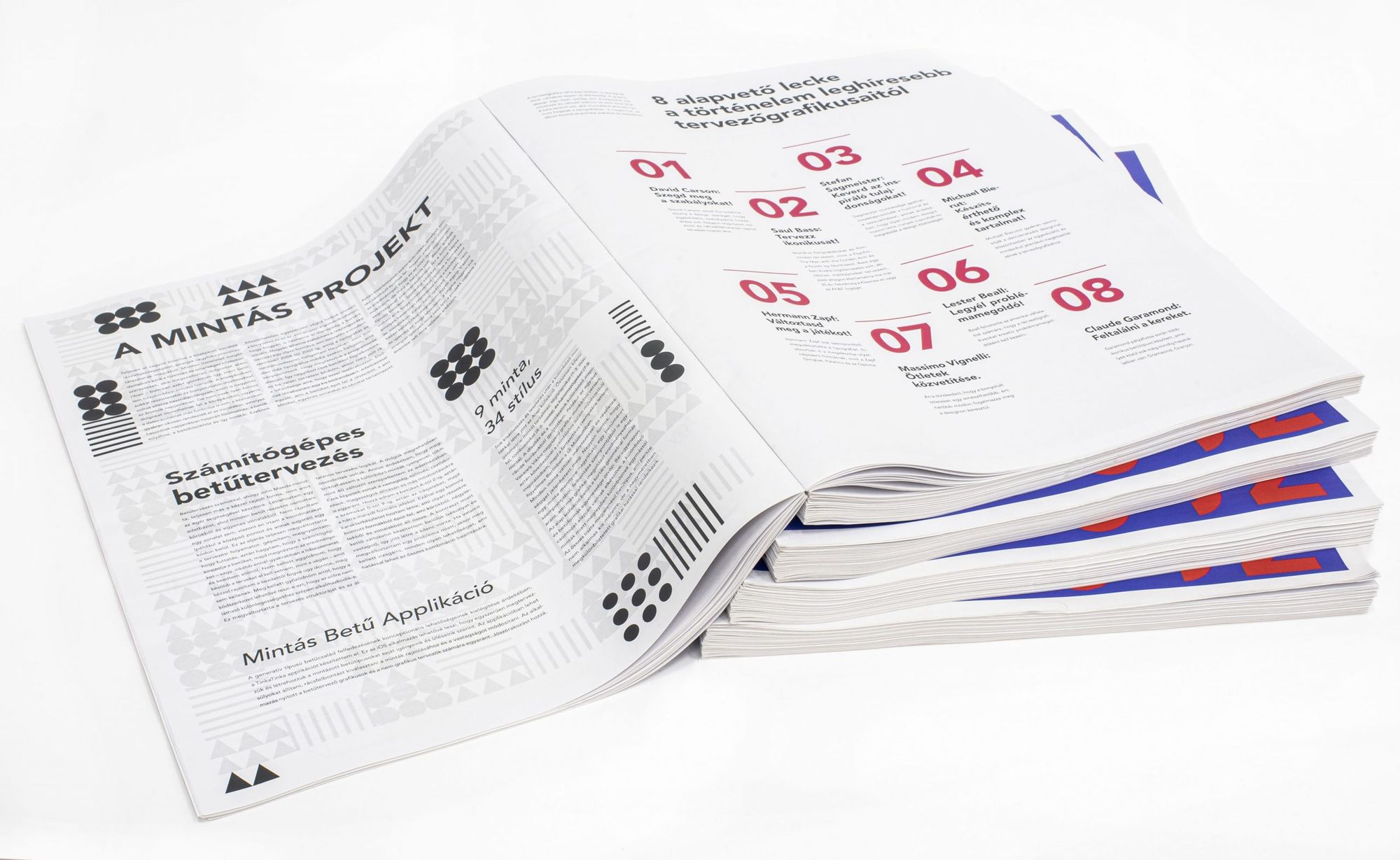
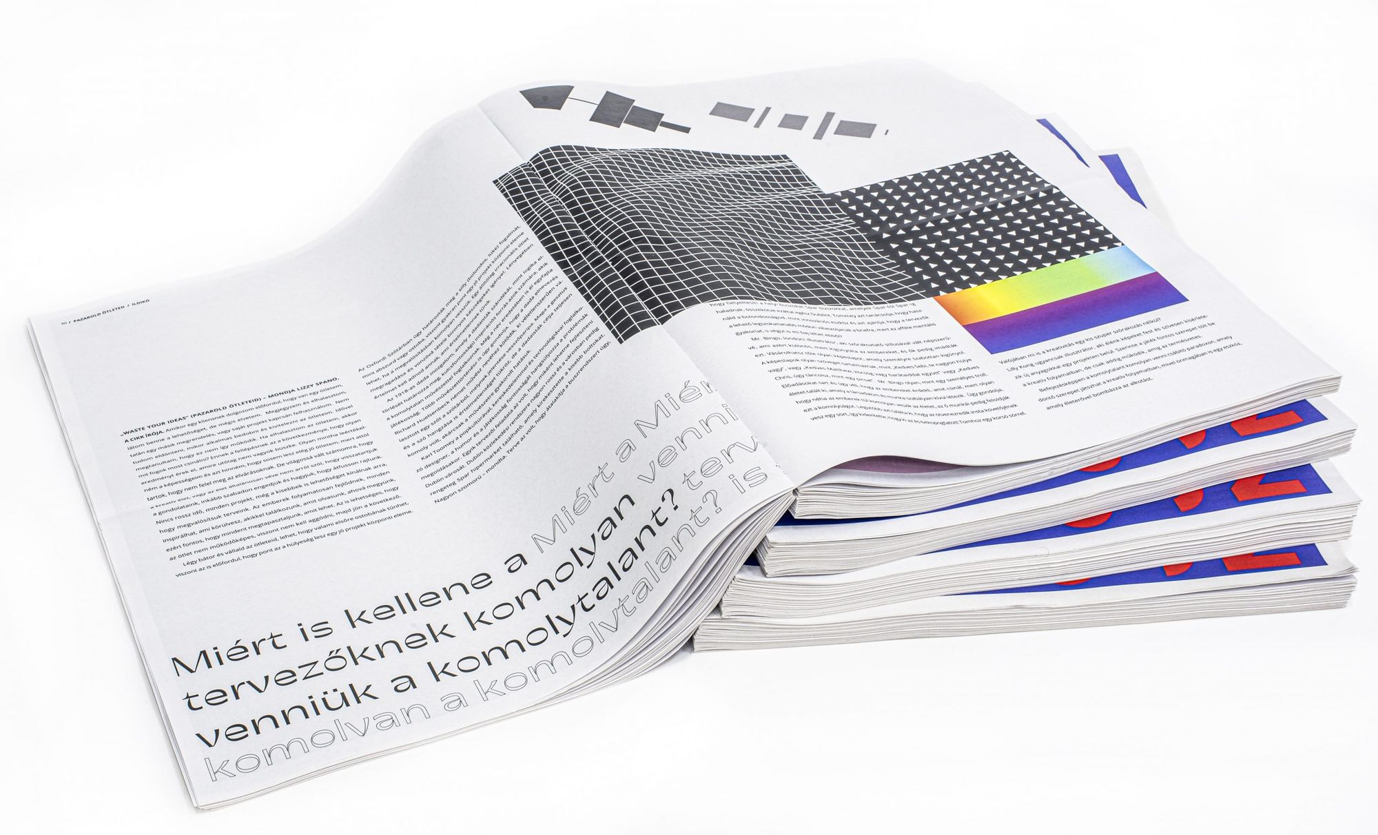
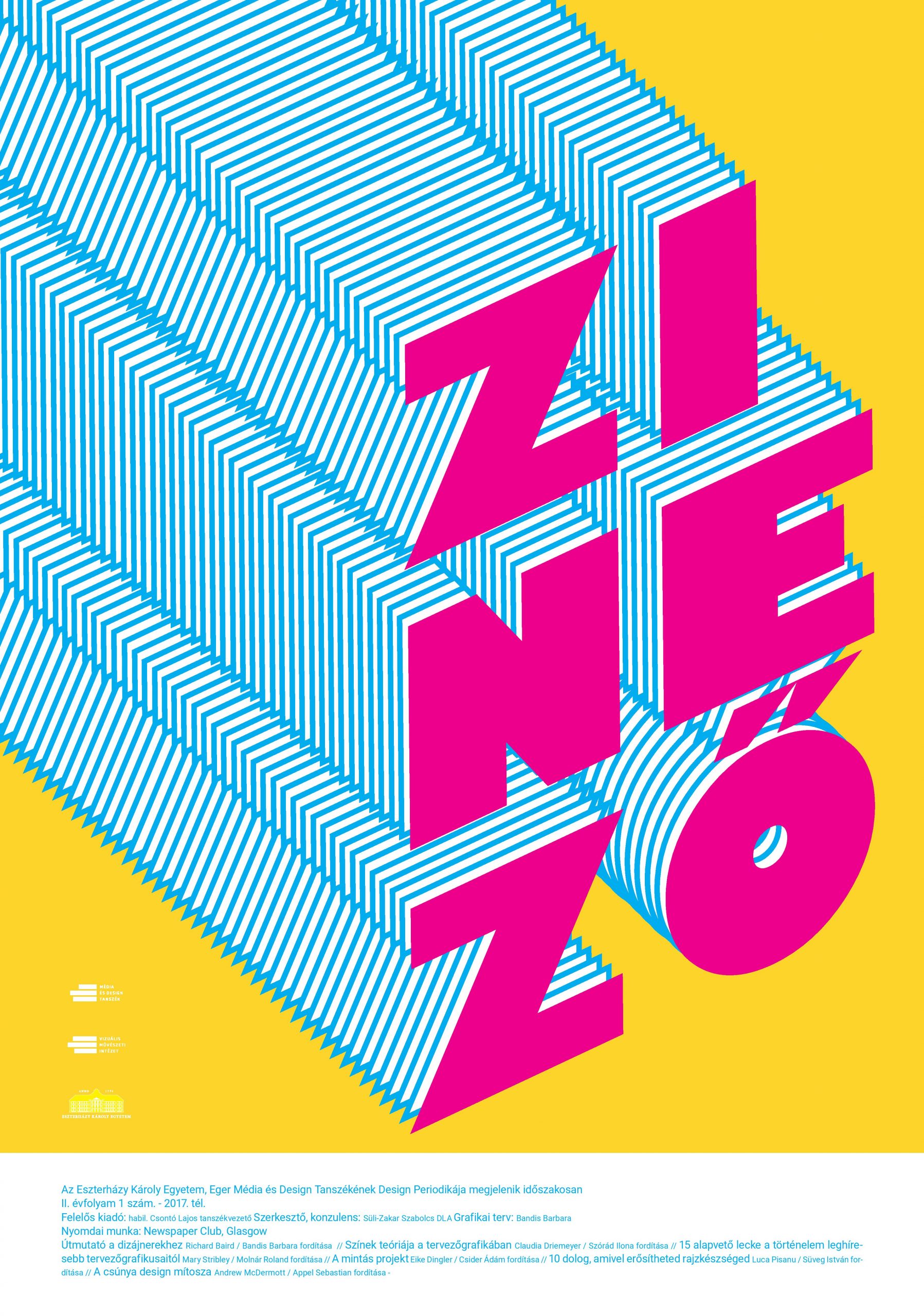
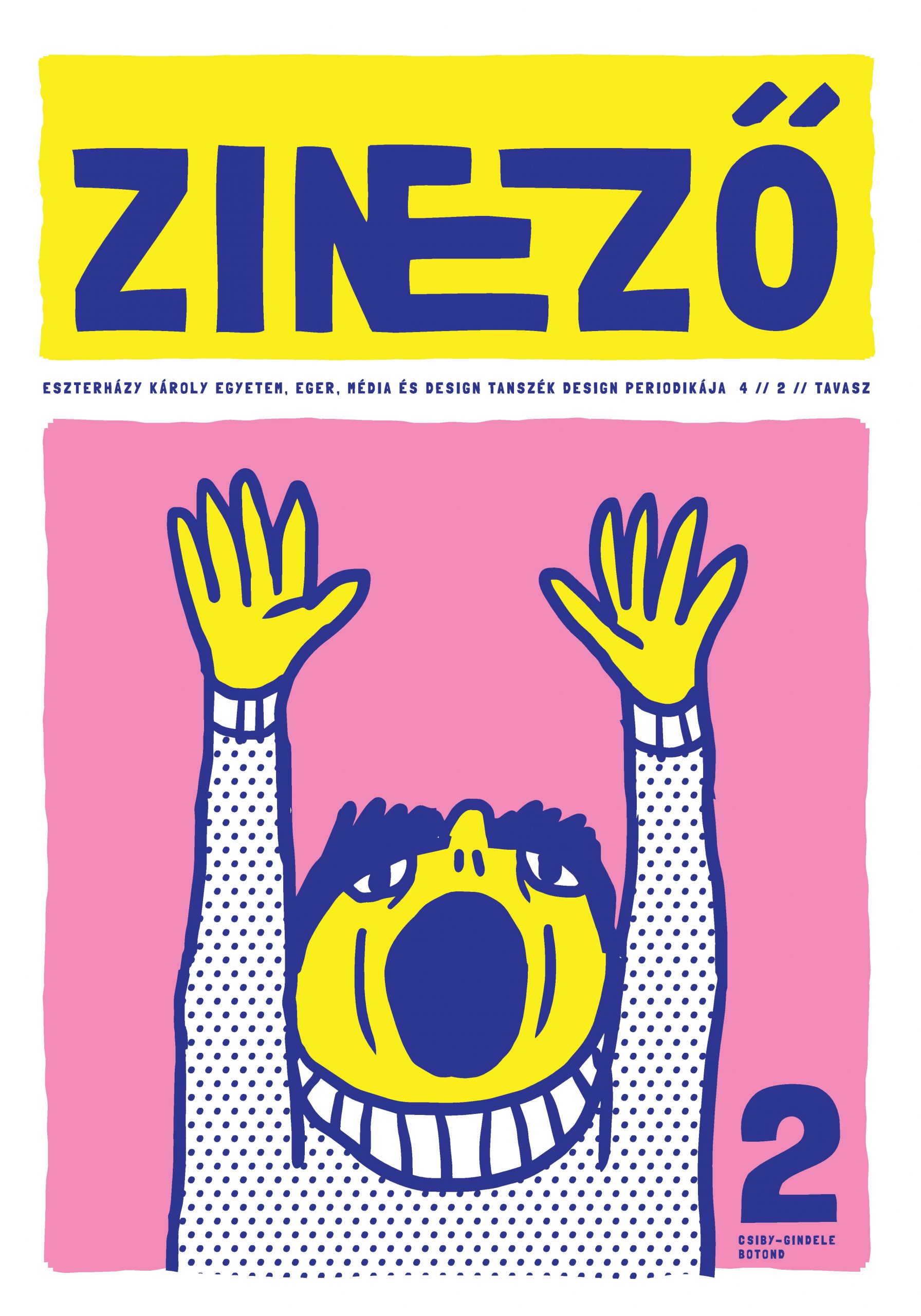
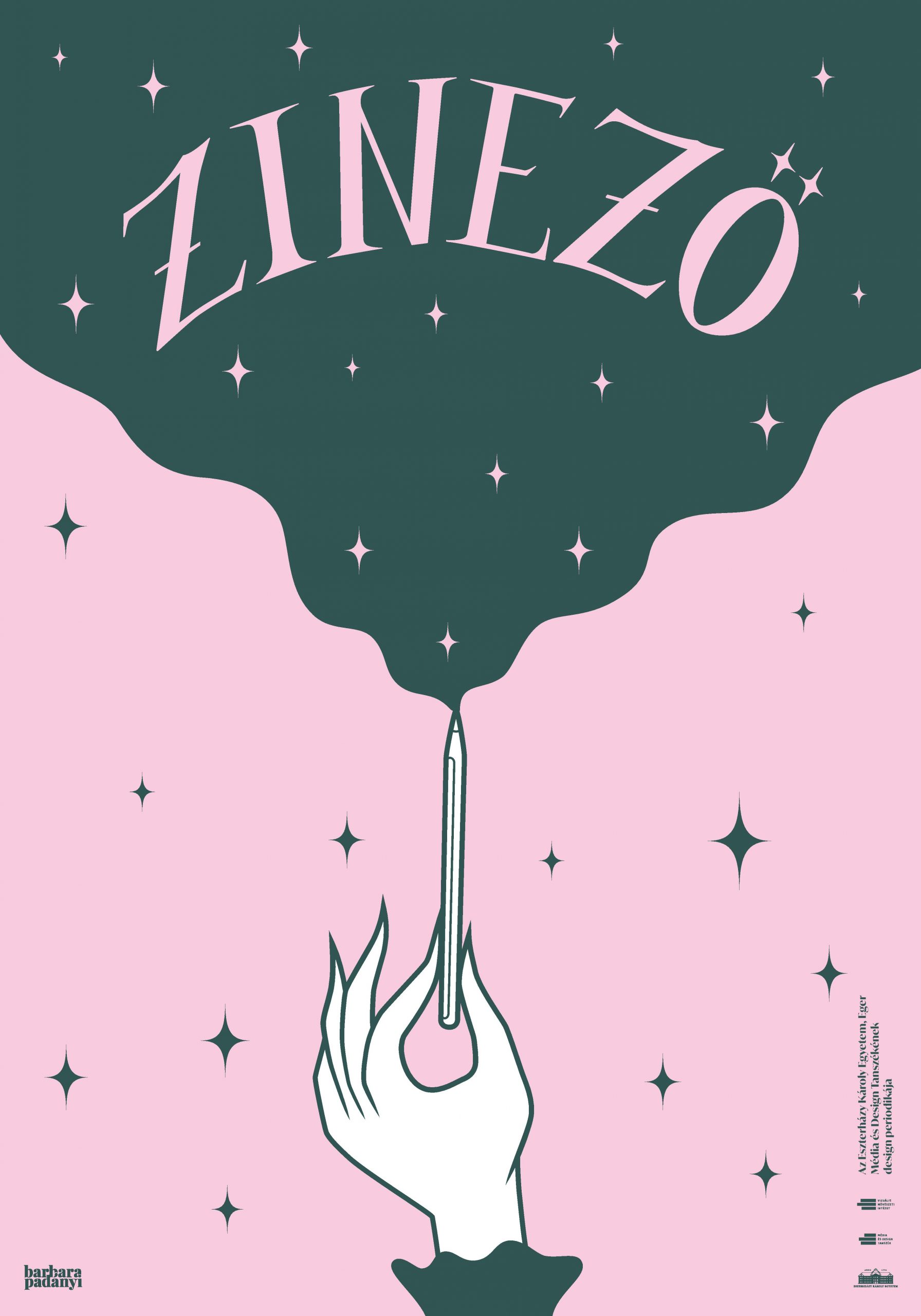
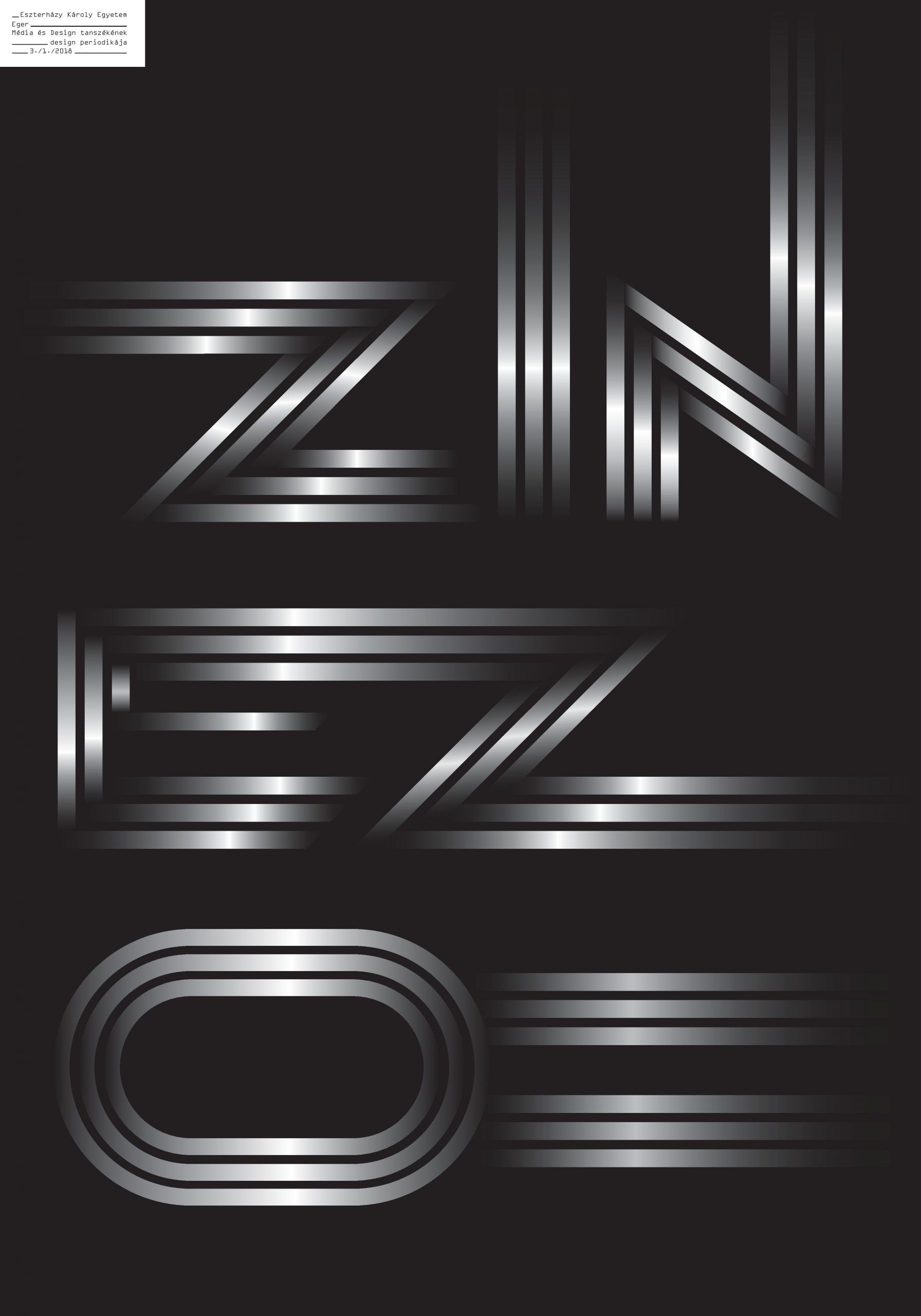
“The design process starts with the composition of the Zinező’s content. Every student has to bring an English language article on graphic design, either recent or not older than two or three years, with a one-two page length. Then everyone translates their selected copy to Hungarian, and then every students gets the Hungarian versions of all articles. The projects becomes truly creative and free at this point, as there are no further requirements, everyone composes the order of articles and the visual world of the publication themselves” – explains Botond Csiby-Gindele, a former student the course of design.
And what can we read about in Zinező? Virtually everything that may give some guidance to an entry-level designer on how to approach the profession. For example about the ten biggest typography mistakes, the leading graphic design trends, the “myth of ugly design”, or how Pentagram chooses its new partners. The articles already reading well on their own are complemented and made more comprehensible and fascinating by the various graphic solutions applied by students.
The broadsheet-sized Zinezős are then printed with a digital offset in Newspaper Club in Glasgow and the audience can flip through them at exhibitions or at the semi-annual display at the university.
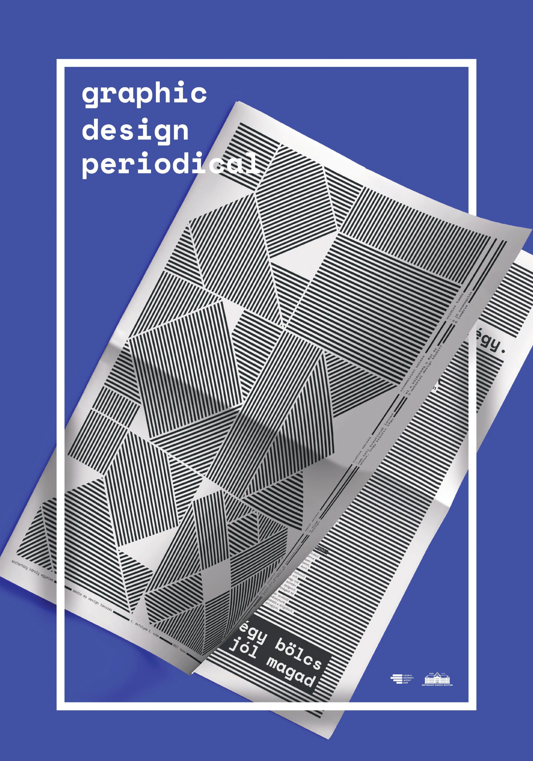
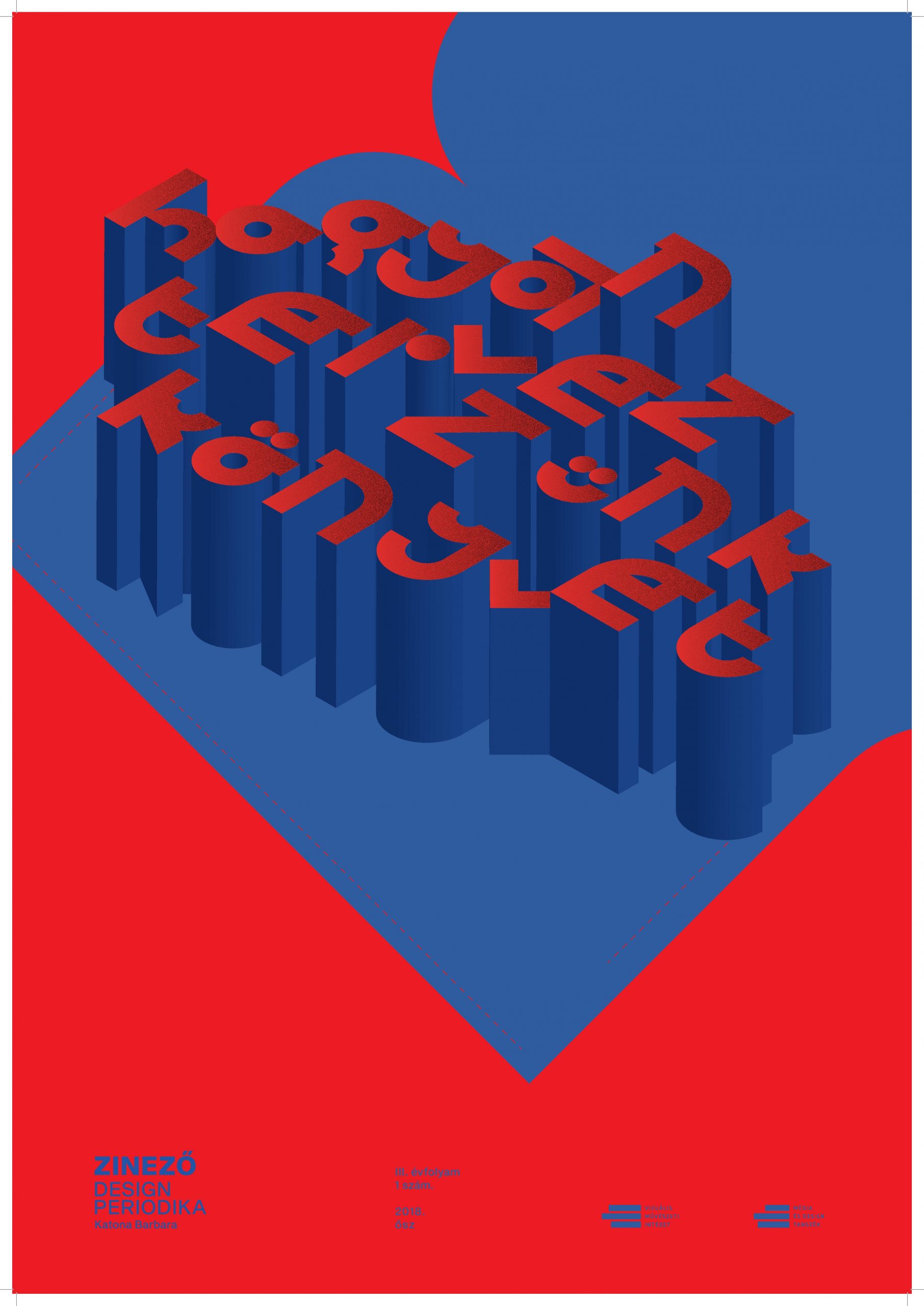

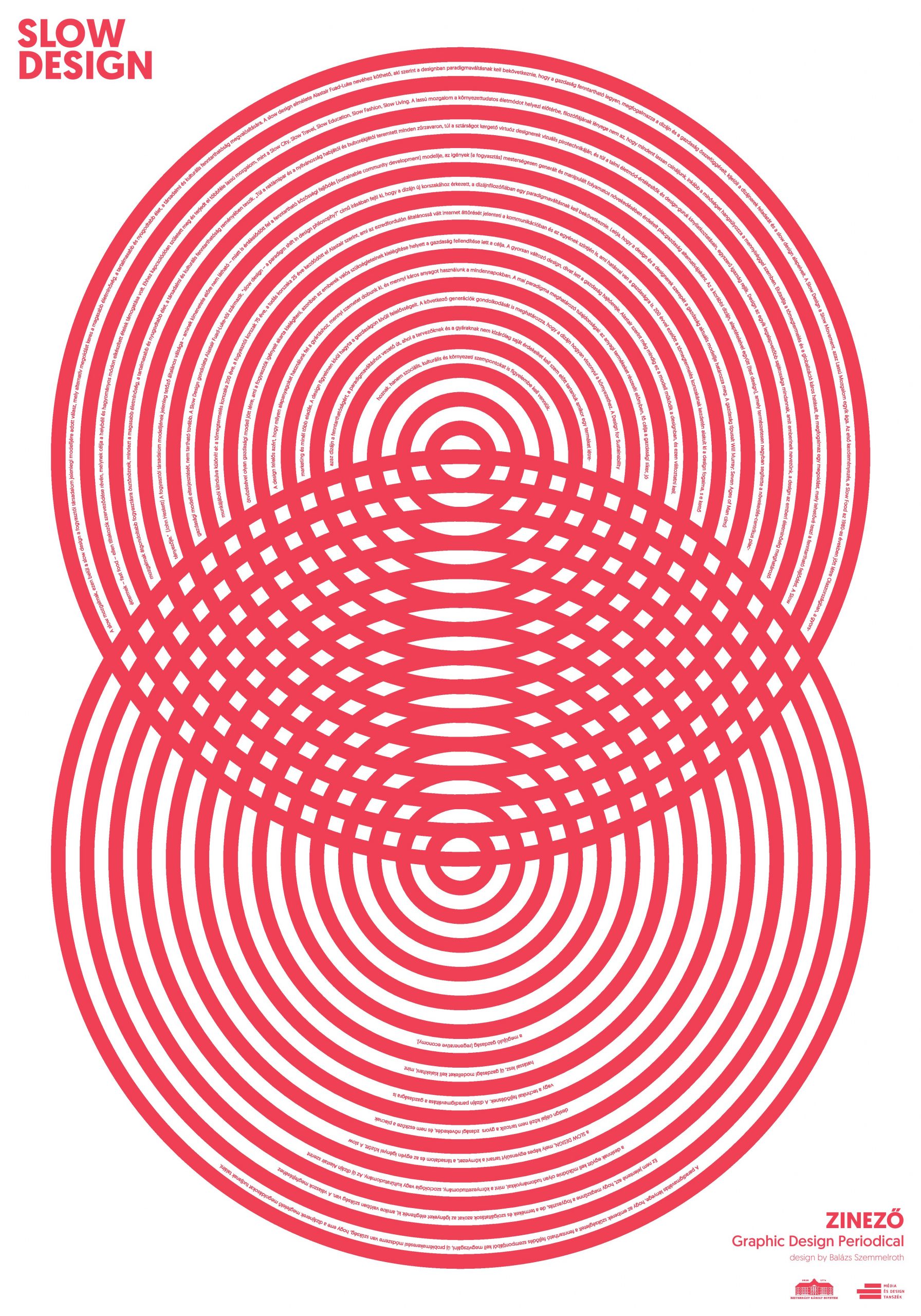
The exhibition opened at Telep showcases the prints made for the Zinezős and we can also check out the broadsheet-sized Zinező selection of the past four years. The Zizi a Telepen exhibition is open until October 24.

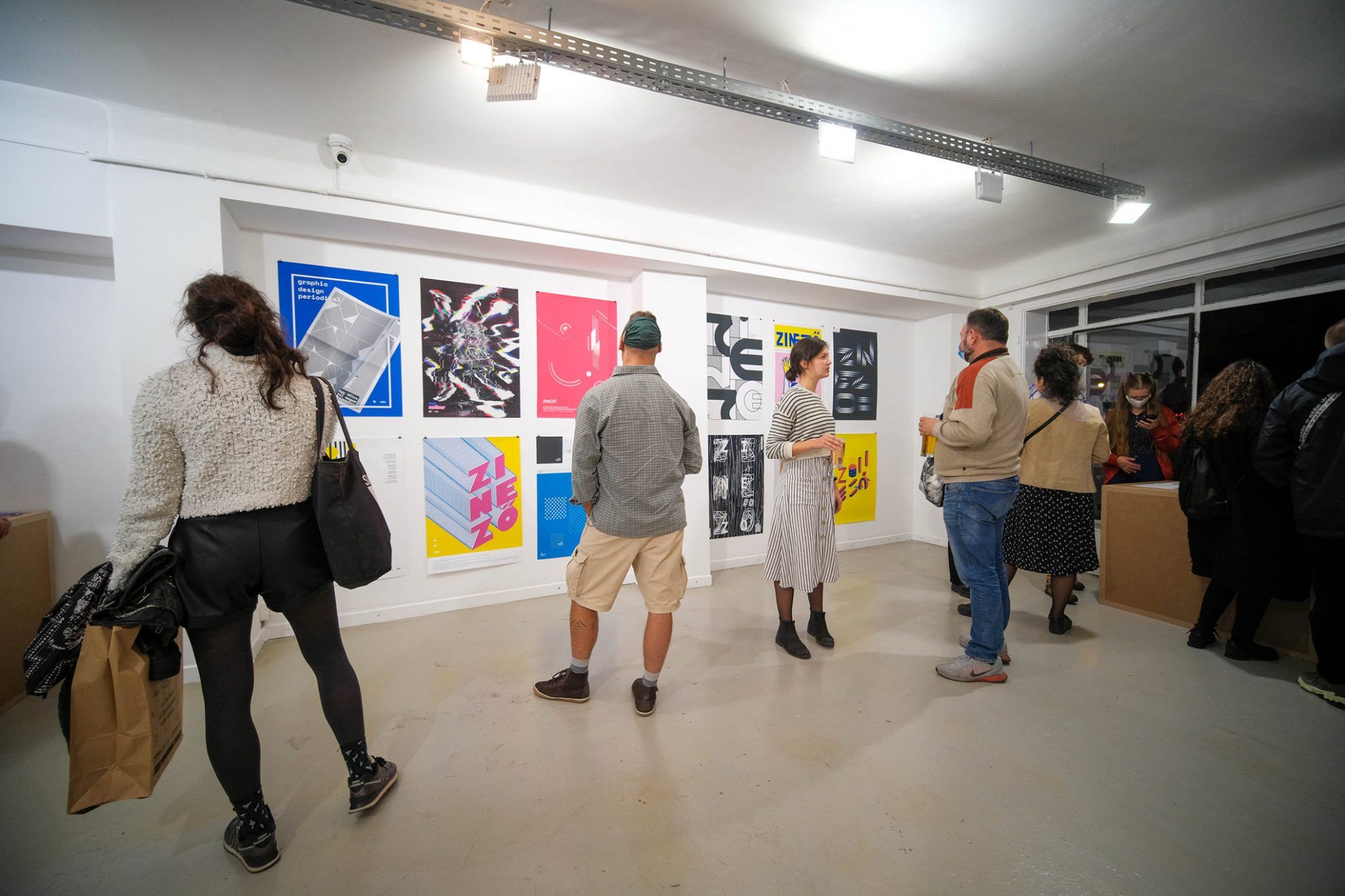
Exhibiting designers: Melinda Antal, Sebastian Appel, Barbara Bandis, Dorottya Bodnár, Botond Csiby-Gindele, Ádám Csider, Sándor Dalmadi, Pál Elekes, Angéla Erdős, Barbara Jászka, Veronika Blanka Kasza, Barbara Katona, Áron Kedves, Zsolt Kolcsár, Roland Molnár, Barbara Padányi, Mónika Rudics, Balázs Szemmelroth, Tamara Szilágyi, Ilona Szórád, Melissza Sztojka, Boglárka Técsi, Tamás Vajdics
Showreel: Balázs Szemmelroth
Kindergarten Nová Ruda | Liberec, Czech Republic

Highlights of Hungary 2020 | Miki357
