Are architects happy when their signature marks can be seen all around their portfolio? How can a brand’s vision be communicated through interior design? Many exciting questions emerged while Márton Lengyel introduced URBA architect studio to us.
Márton Lengyel and Rita Vízkelety have already been part of several professional groups before they decided to establish their own studio. They founded URBA Studio in its current form four years ago, and they have been consciously developing and expanding it ever since: although initially their clientele consisted mainly of restaurants and catering units in the capital, they have also designed the interiors of several embassies and ministries, and they also take on architectural jobs. We interviewed Márton Lengyel about the past, present and future of their studio.
Since when do you exist and how did you became URBA?
I have co-founded URBA studio with my partner, Rita, with whom I got acquainted back at the University of Technology. During university, I worked for traditional architect offices, but I already knew at the time that I wanted to go my way. Luckily, my first orders started to arrive: my first job was Ankert, with Amoeba Group. Then I worked with two other architects under numbernow: this is when Ramenka and Etap were born, for example. Then approximately four years ago, Rita and I decided to continue on our own, under the aegis of URBA. At the same time, we kept our references we had with our previous groups, so this step can really be seen as continuation.
How big is URBA’s team at the moment?
Over the years, we had two children, with whom Rita spends most of her time at home, so we make our decisions together, but I am the one managing our daily business. We have a permanent graphic designer and three contracted architects. For some time now, we also like to engage subcontractors for the different projects. Earlier I was inclined to take on every task, but now we work much more as a team.
What do you mean by you wanted to go your own way? What are the most important points or principles along which you prefer to work?
On the one hand, it is important to me that I invest energy into each and every design task, to associate it with a thought that’s sound, unique and well-substantiated.
On the other hand, so that the final result is a success, I had to learn to choose my clients well. A significant change compared to the beginning is that in the last period, I am able to judge based on one or two conversations whether we will be able to work together or not. If I have a feeling that we don’t, then I say no to the project even if it’s good, because I learnt that it’s simply not worth dedicating the studio’s time to something that will not be of reference value.

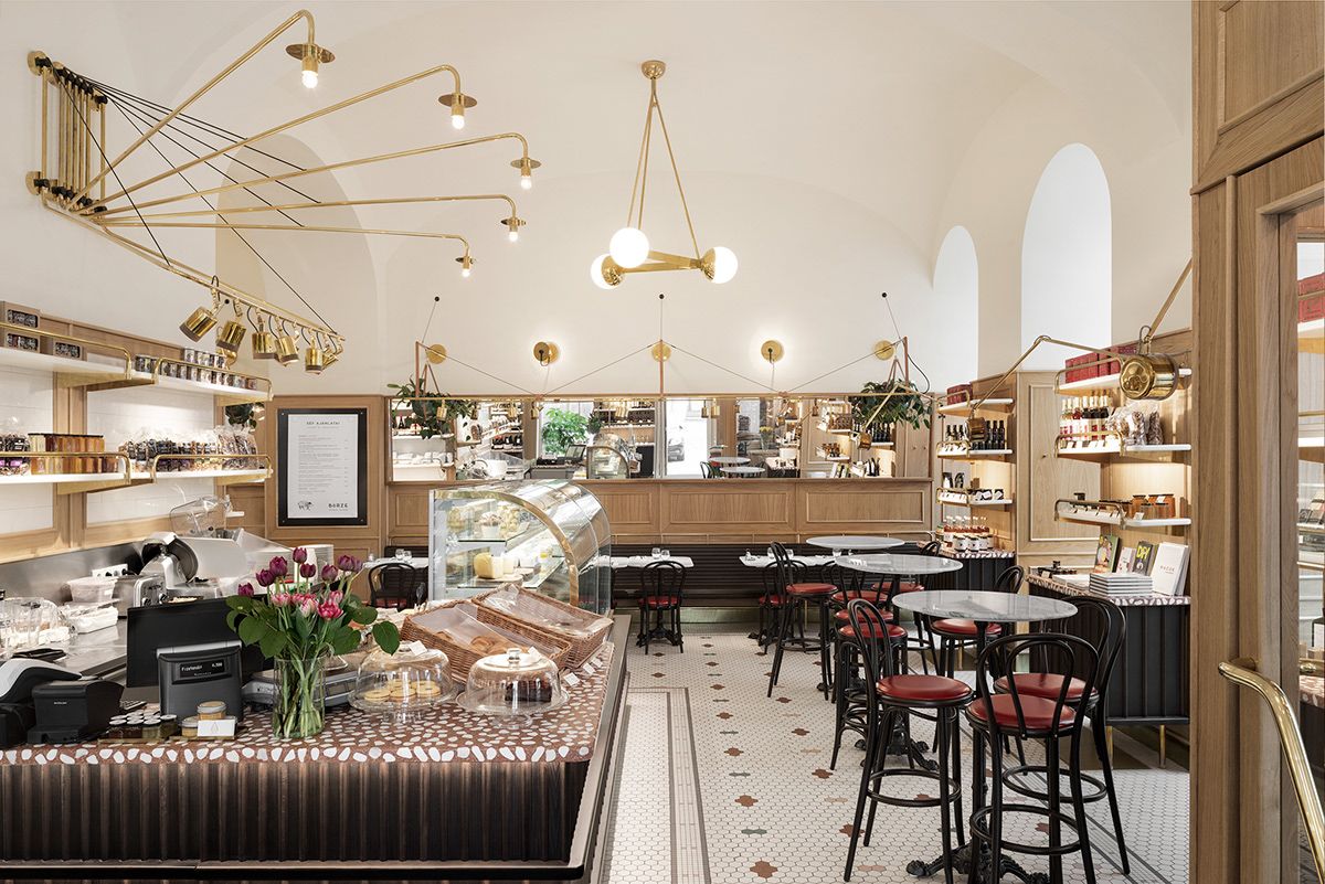
To me it seems that even in your works that seem to be different at the first sight, for example Ramenka and Börze,there still is some kind of similarity. Many architects and designers are trying to avoid being pigeonholed, even though a recognizable mark can also be a positive trait. What do you think, do you have something of the kind?
It’s interesting because this had bothered me for a long time. It’s also a difficult question, because it is not easy to judge our own works from the inside. One thing we do in every project we take on is designing meticulously, and figuring out everything to the last nail. Maybe this can give a kind of harmony or coherence that make our spaces recognizable.
Why we are afraid of that as designers is a thought-provoking question. If I look at the great designers of the past centuries, they all had signature marks, which is not a bad thing. By the way I was just starting to change this in the past period, and
I started to get used to the thought of us having style. There is something liberating in this, because through this it feels like we don’t have to start every project from square one, but we improve, polish and continuously develop it as the continuation of the previous one.
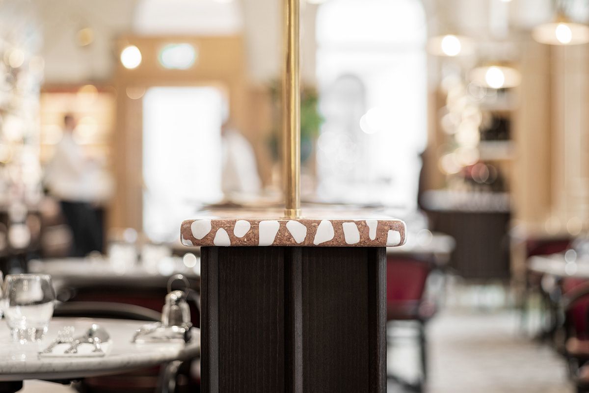
Many people say that Börze is a minimalistic space, to my greatest surprise. To me, it is rather rich, because we meticulously designed even the lamps, for example, too, and the hexagon mosaic floor was also custom designed. Maybe logical space organization can give a clean feeling to people.
One of the new and exciting projects of your portfolio is Hotel Pentimento. At first sight, it makes me think of the style of young French architect studios. Can you tell us some definitive features or sources of inspiration?
Yes, it’s possible that there are some parallels with this line, if I think of how we give something adjusting to the bourgeois milieu, in a modern or historicizing nature.
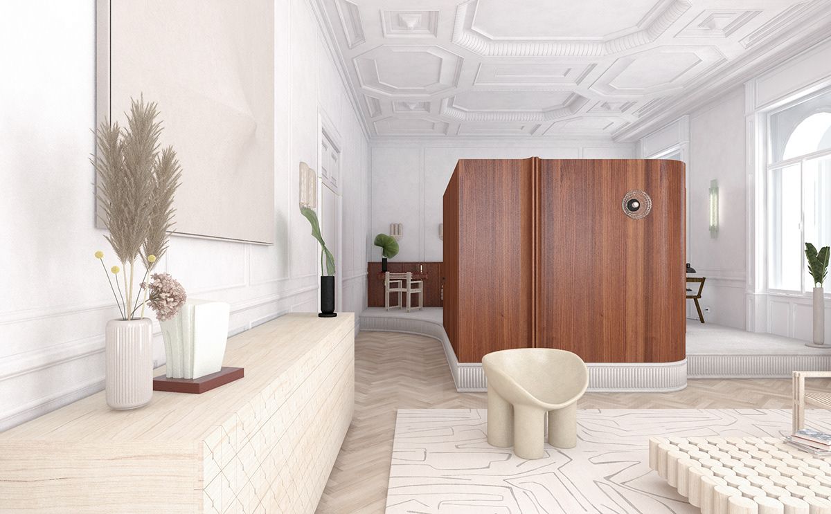
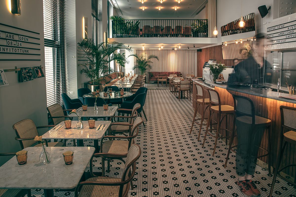
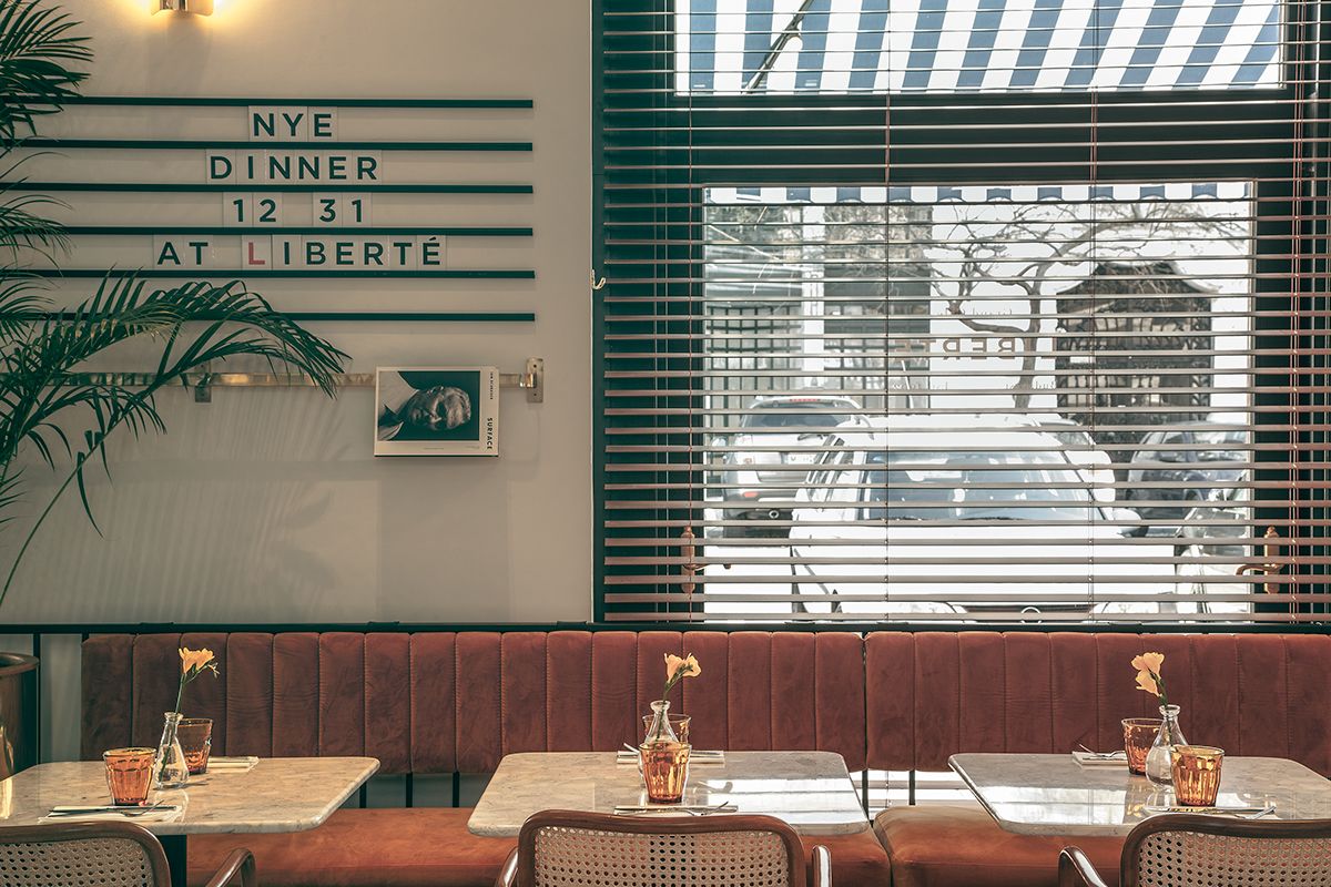
All in all I see a great demand for making some kind of reference to the past in the space. In the case of Liberté, the client set out the direction, the era (mid century modern), and we were able to carry over these features, resulting in a modern effect in general. We did something very right in that project, because people keep coming to us saying that they would like to see that nostalgia in their spaces. I think this is true for today’s world in general: maybe the era when people only needed functional spaces has come to its end. We love to surround us with objects that tell stories. As a designer, I can fully put myself into this situation, and although I imagine my own living space much more lean, I would also include furniture from several eras and several designers, thus giving life to the space.
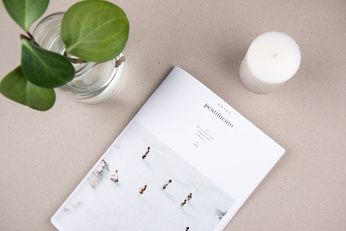
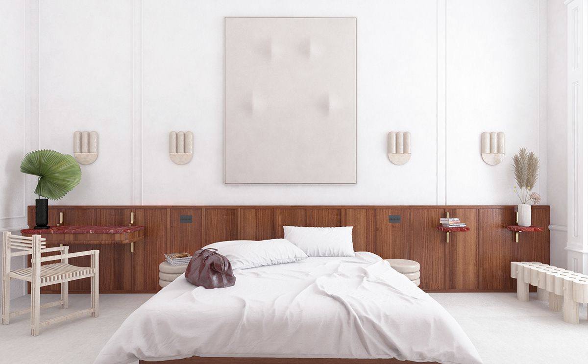
Hotel Pentimento had an interesting start: we weren’t asked to create an interior design layout, but a complete brand vision for the hotel in progress. In the past period, these types of projects shifted into a marked conceptual direction, so this is an existing requirement today. This was our job in the tender we did for Archikon, who was looking for an interior design concept as the architect of the project.
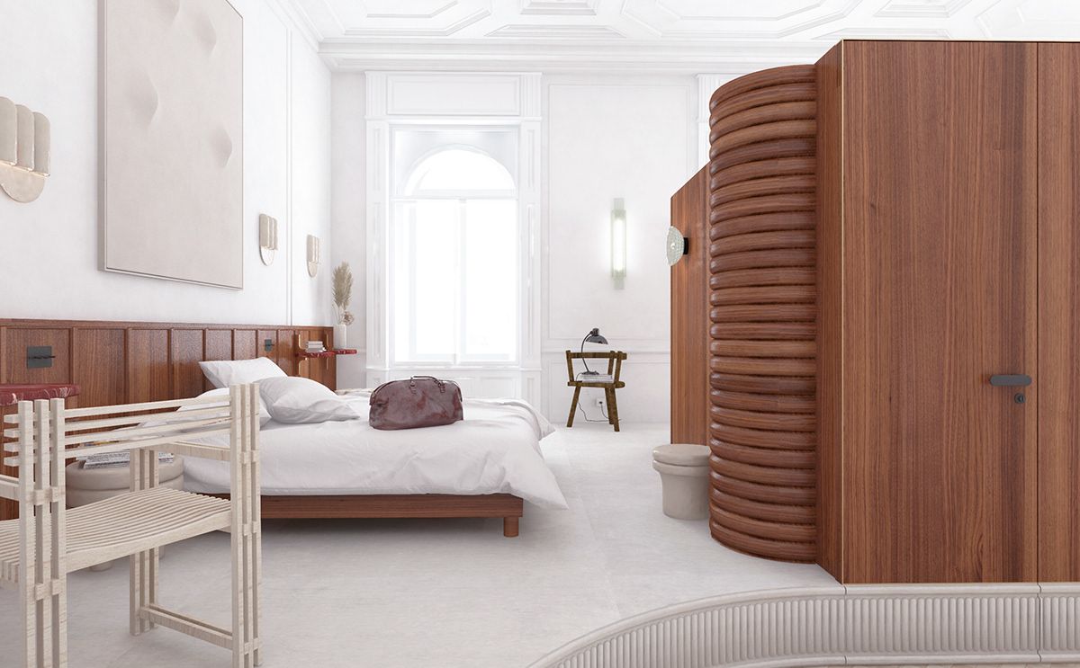
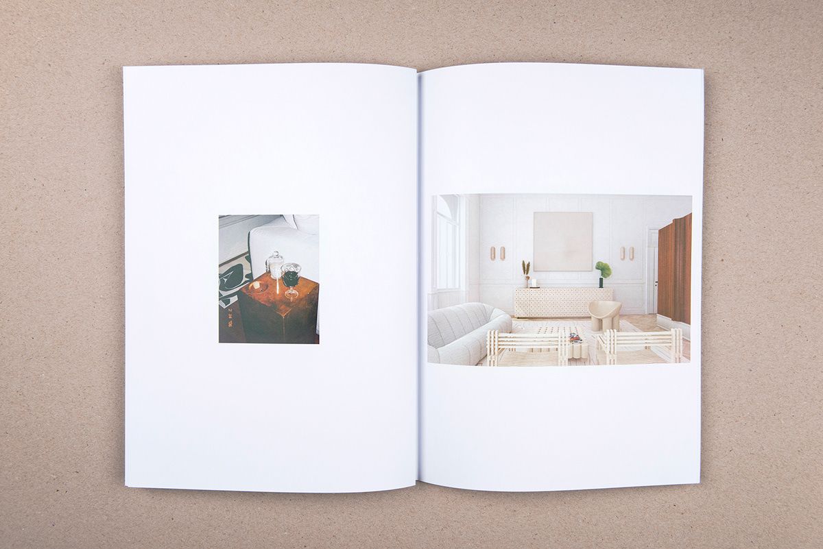
The building itself is a house built in 1890 in Benczúr utca. Its space on the mezzanine floor is spectacular, so we thought we would present the concept through the design of this space. Our idea was to reflect the personality and lust for life of a mystical character, a former resident of the building, a sophisticated lady. With this, a strong mentality was born, which could be carried through the entire project.
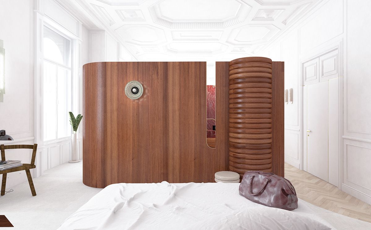
The space itself has marvelous attributes: the ceiling, the doors and windows, the white contour on the walls. It was a challenge, however, how we could fit the bathroom into this 5×10 meter floorplan, without messing up the space. We only saw this possible if we put it in the center, separated from everything – but we didn’t want to simply put a bathtub right in the middle as they do it in many cases. Therefore, we placed it into a box, which is a smart and interesting object – just like a magic box, giving away hints, deceiving the eye and showing a different face from every angle. This central element gives the spirit of this whole space.
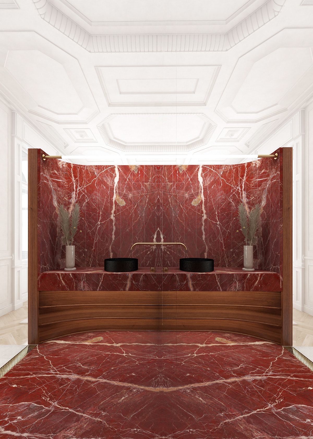
Finally we presented the concept from an angle as if someone had already spent a few nights in this apartment and already experienced the feeling coming with it. Our design didn’t win, but winning wasn’t our goal. What makes a tender truly liberating is not having direct contact with the client. Therefore, I only wanted us to have fun while working on this project. And we could also show to Archikon how we work, and this proved to be fruitful: since then, we ended up having a very exciting project together in the building of the Ministry of Agriculture.
This is the only job on your website that wasn’t implemented. Why did you decide to present it anyway?
Although it wasn’t implemented, Hotel Pentimento became one of my favorite references. Up until six months ago, we wouldn’t have shared a job that was not implemented, but as we switched profiles, and now we primarily specialize on interior design, we considered it important to show what we do, what our mentality is like, as even though these projects are more large-scale, they also take longer, and so they cannot be presented in a completed, final form for years.
What justified this change of profile, and what does this mean for the future?
I primarily started to work in hospitality sector in Budapest, which meant that a restaurant or bar owner contacted me directly with a job. We decided 1-1.5 years ago that we would consciously open to architect offices because this way it would be easier to get closer to larger scale and more high-quality projects. This means that while before we primarily worked on the interiors of cafés, restaurants and stores, now we designed an embassy (Algerian Embassy in Budapest, with Földes and Partners office), the spaces of the building of the already mentioned Ministry of Agriculture, but we could also mention the metro station at Blaha Lujza tér, which rather points to the direction of architecture. This is our other aspiration: as by default we are all architects, we would like to get more architectural jobs in the future, too. Currently we have a ten building assignment, with eight detached houses and two condominiums.
INCLUSIVE | Senzo
Quarantine through the lens of photographers
