The primary consideration when creating a dietary supplements family is to use the highest quality ingredients. However, there is often less attention paid to packaging, even though creating a bold identity can increase not only the number of sales, but also the popularity of a given brand.
This is also the case with the Ukrainian brand of food supplements Perla Helsa, which has entrusted the creative team of the Orchidea Agency with rethinking the appearance of their products. The company, which places great emphasis on sourcing raw materials and developing progressive formulas, originally made its packaging in-house, and did not follow any guidelines that could be important when it came to marketing.
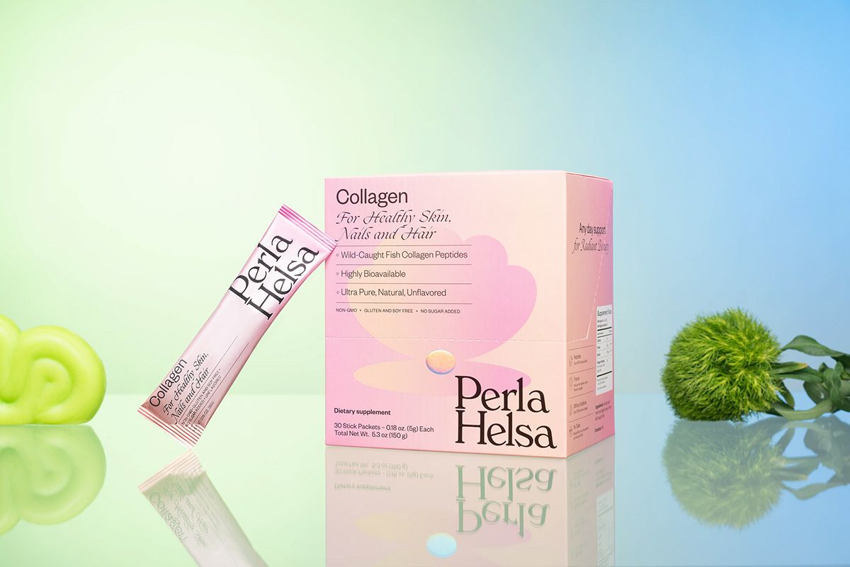
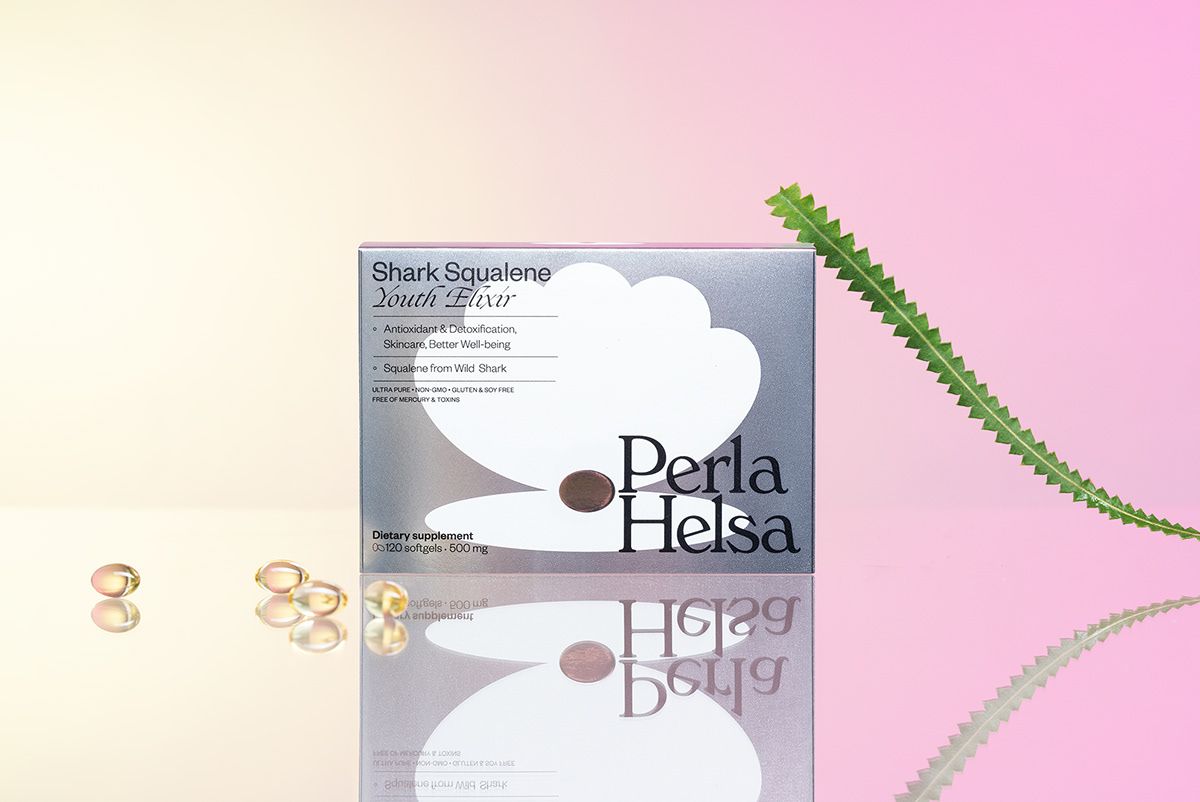
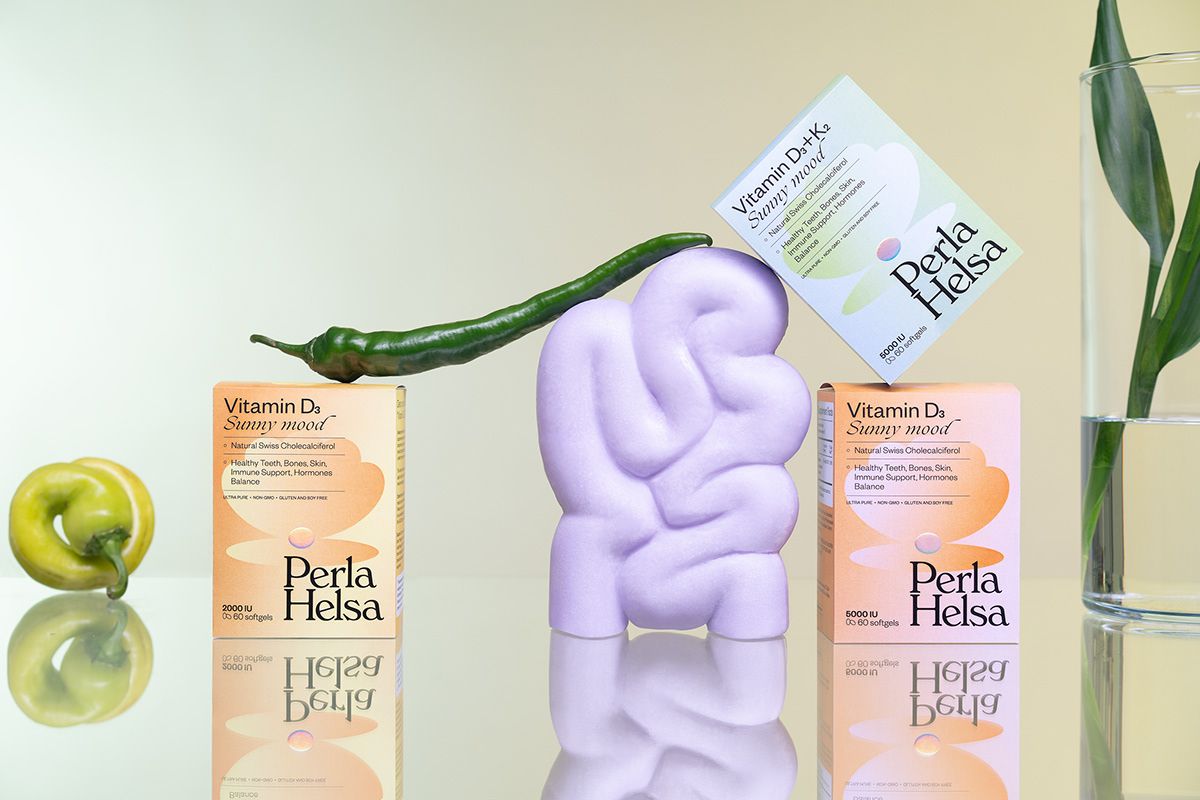
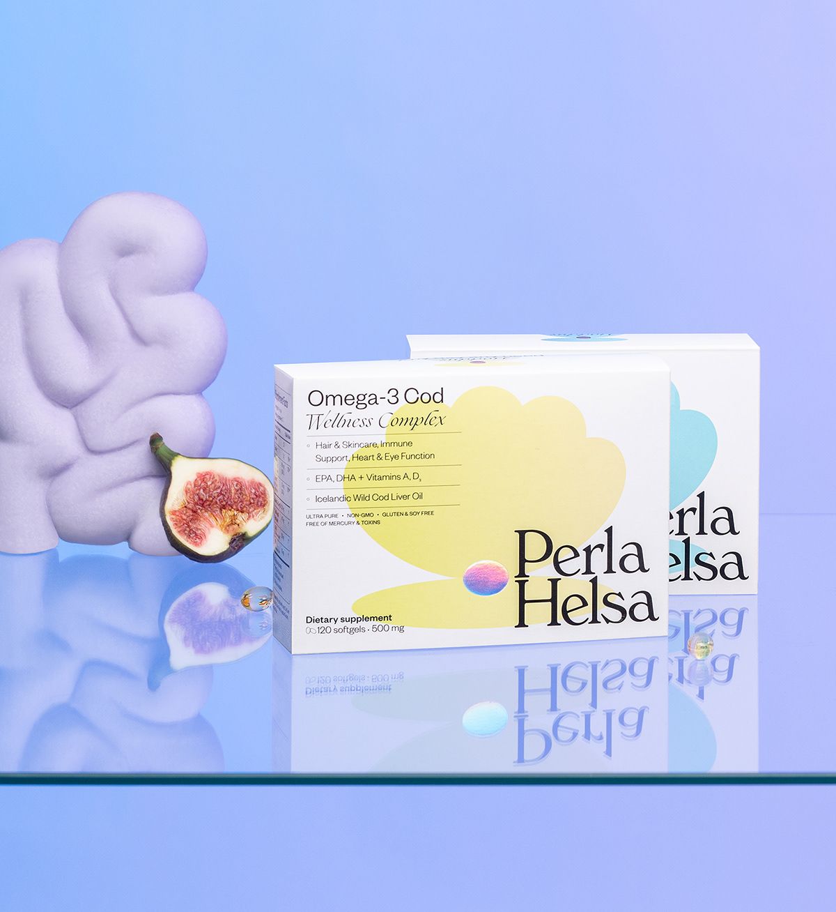
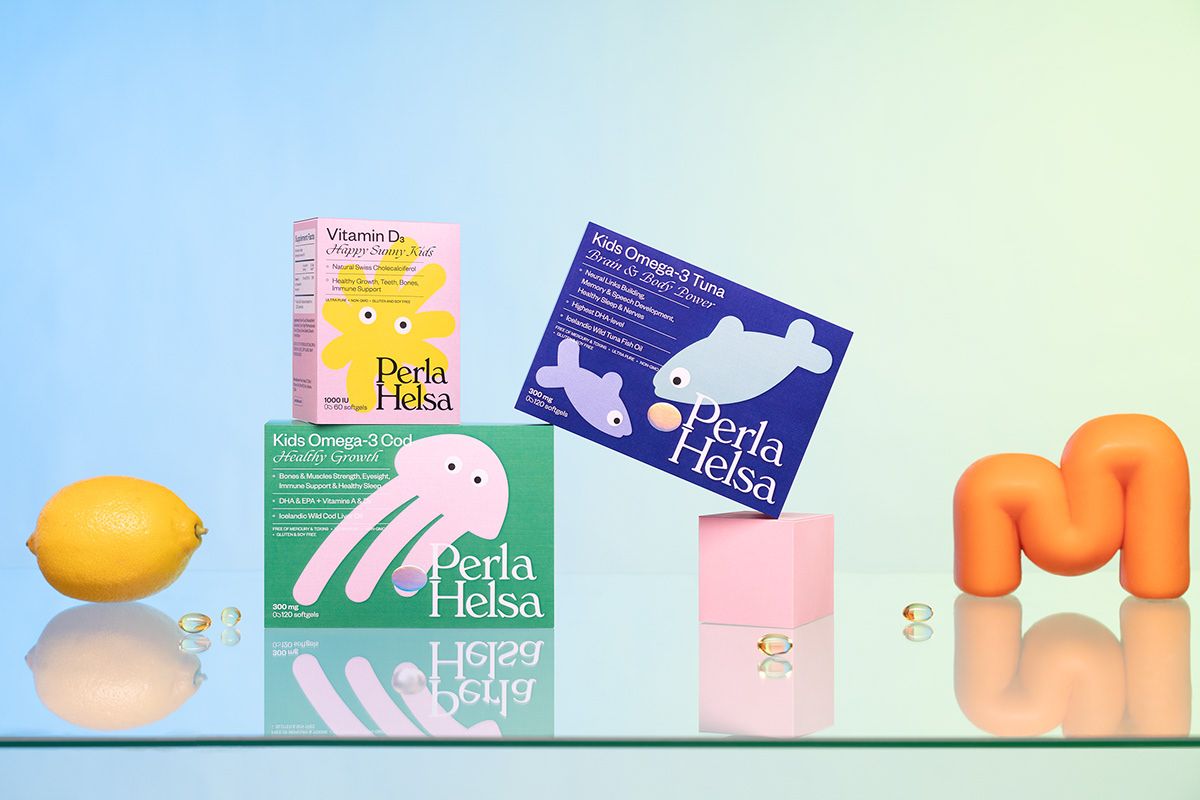
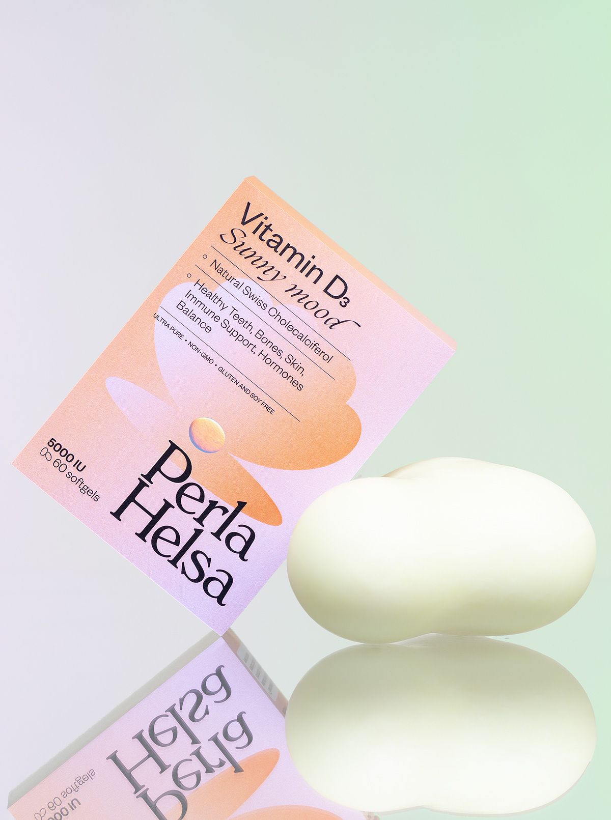
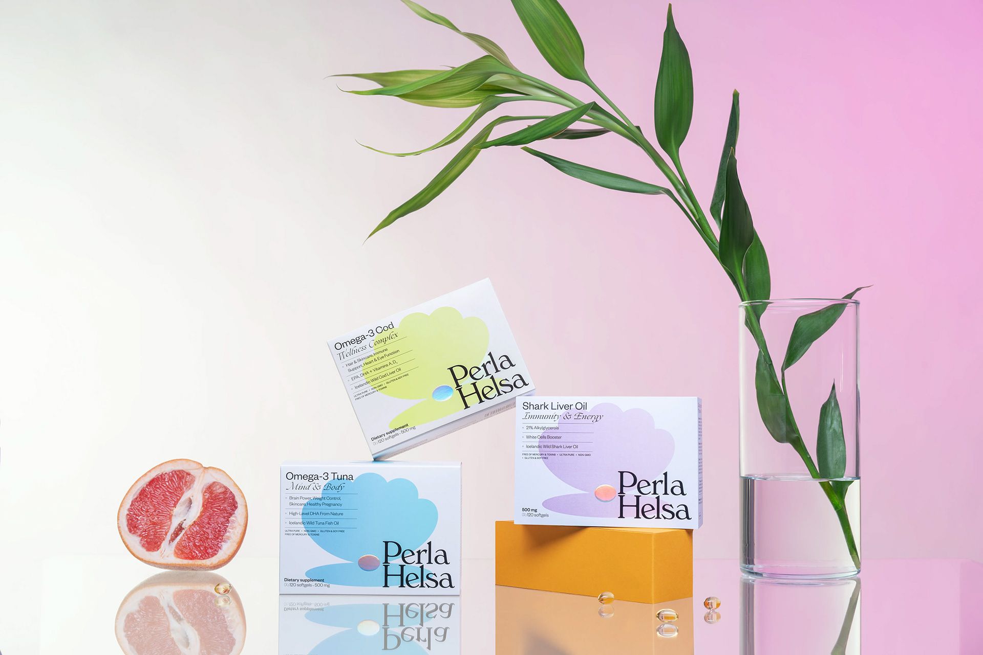
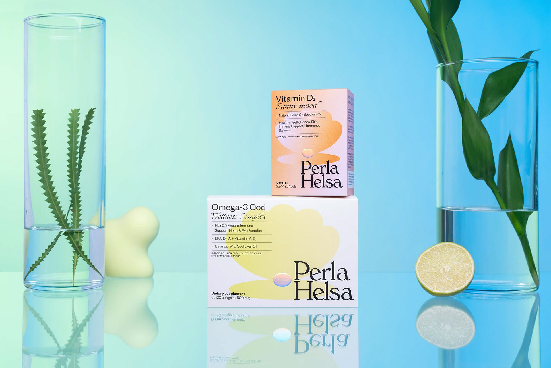
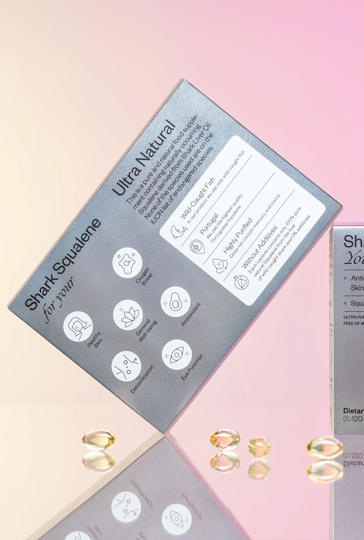
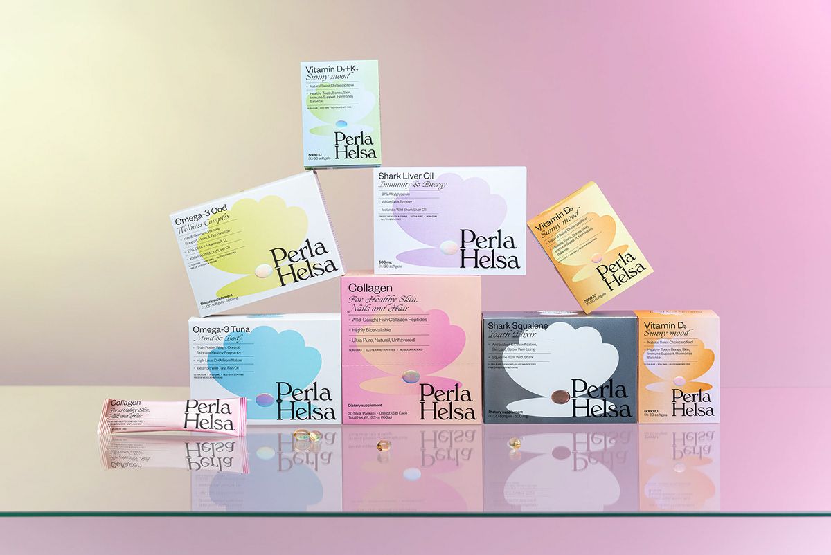
Ninety percent of the capsules are bought by women, plus people of mixed ages, so a diverse audience had to be addressed through the design. That is why the color of the packages is characterized by diversity: the pastel base is always complemented by a stronger, more vibrant shade, yet the overall effect remains harmonious and tasteful. The characteristic feature of the brand was the shell and the silvery pearl in it, which can be easily seen from afar, which also indicates the appearance of the pills. In the case of products intended for children, they also wanted to follow this line, but here we can also find illustrations depicting animals. The logo has been placed in the bottom corner for each product, giving unity and harmony to the composition that evokes the atmosphere of the seventies.
Perla Helsa | Web | Facebook | Instagram
Orchidea Agency | Web | Facebook | Instagram

NATO’s biggest challenge | Interview with Janne H. Matláry

On sustainability for a secure future | Planet Budapest 2021 x Hype&Hyper
