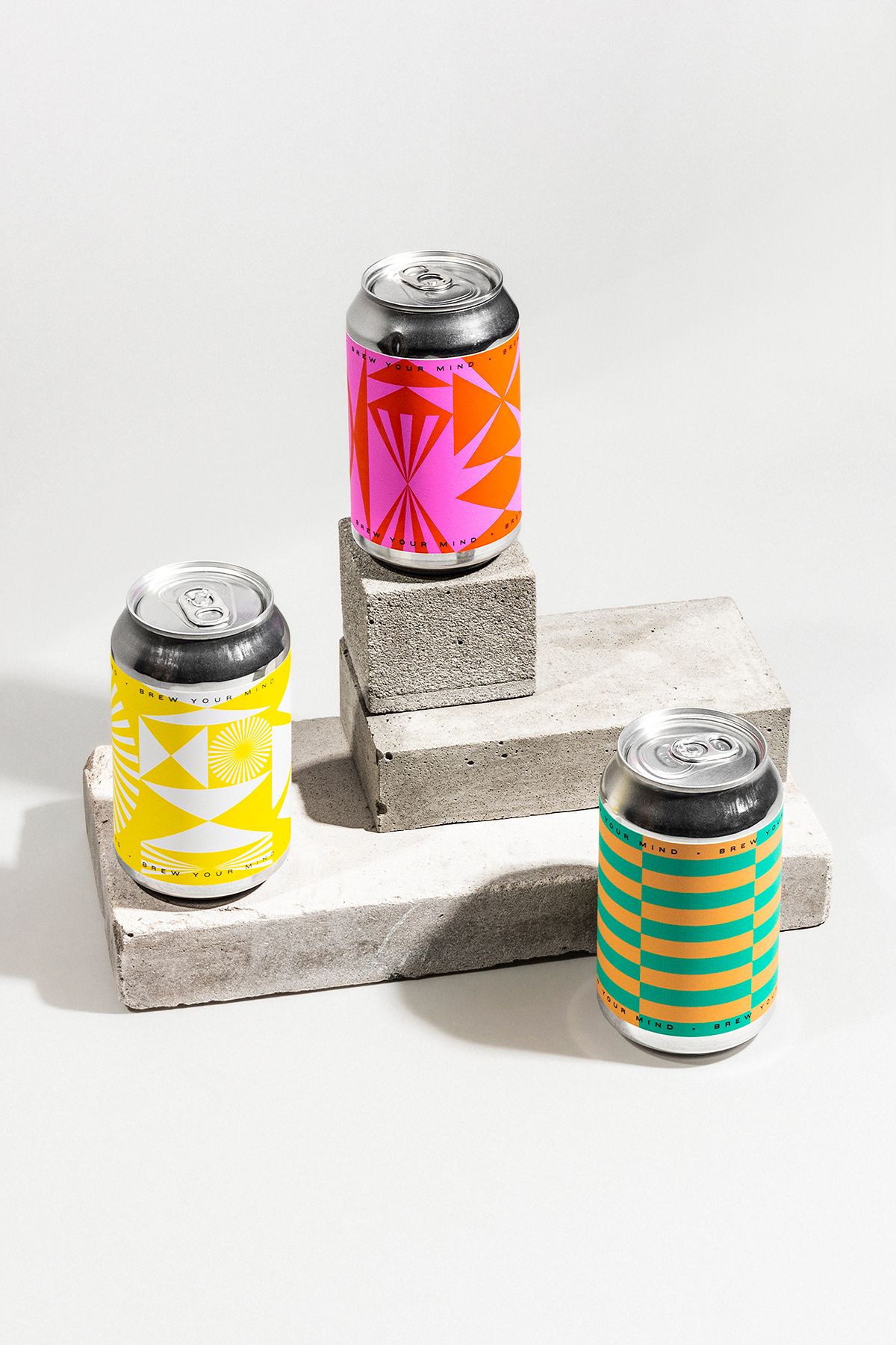
Modular geometric forms evoking flavors combined with pastel and loud colors: Classmate Studio designed noteworthy labels for the latest products of Szekszárd-based brewery Brew Your Mind.
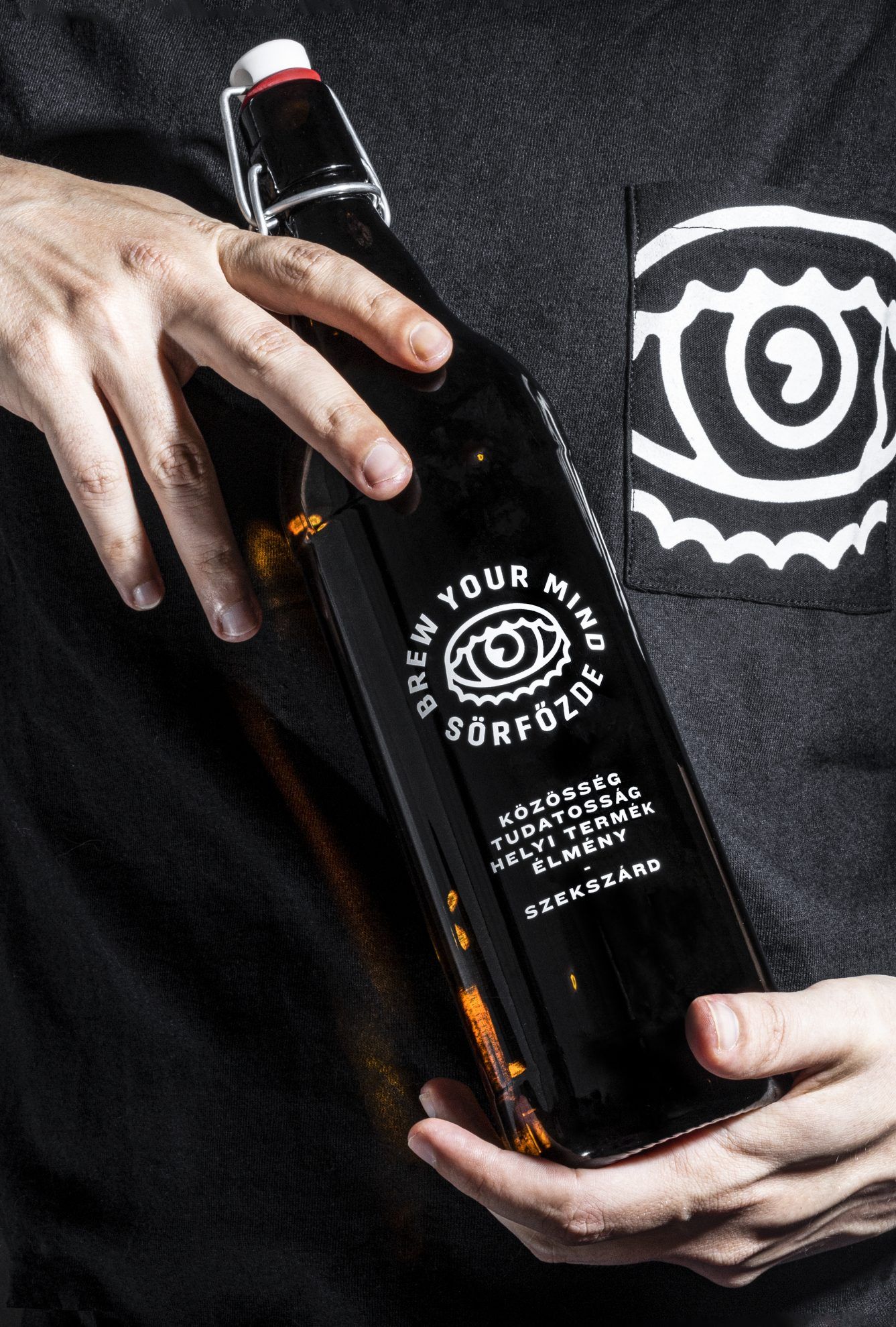
Brew Your Mind is, in reality, much more than a simple brewery. The founders, Olivér Himmel and Ákos Bihari won’t compromise when it comes to the quality of their beers. The beers of Brew Your Mind spend approximately two to three weeks in a freezer set to 2 degrees Celsius before they get on the table of consumers. Beer is more of a tool than a goal for them, therefore they organize a lot of workshops, musical, art-related and free time events, thus building a real community in their hometown.
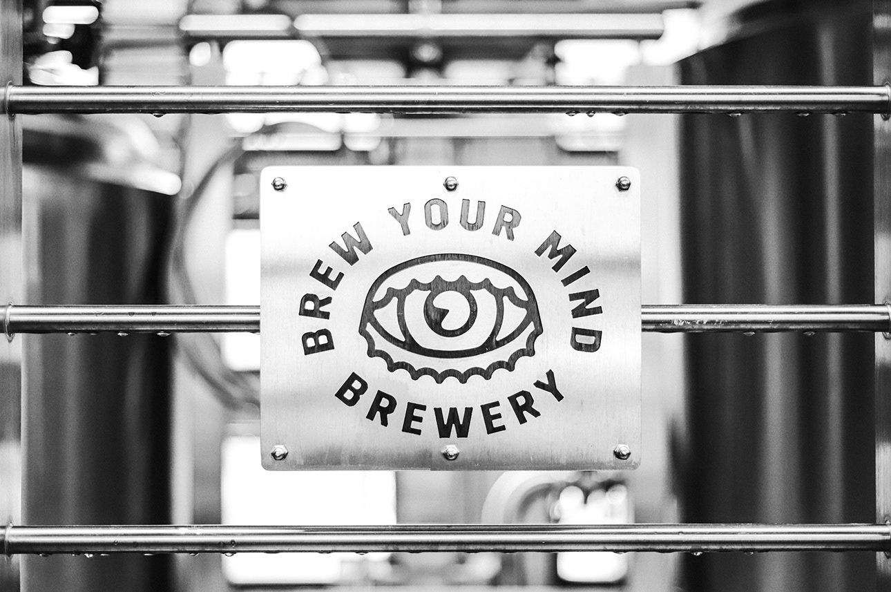
The brand’s progressive and innovative mentality comes hand in hand with a groundbreaking visual world, too, brought to life by Classmate. Studio. The two groups have been working on interesting projects and experiments for almost three years now – this is how the latest label designs of the brewery came to life, too.
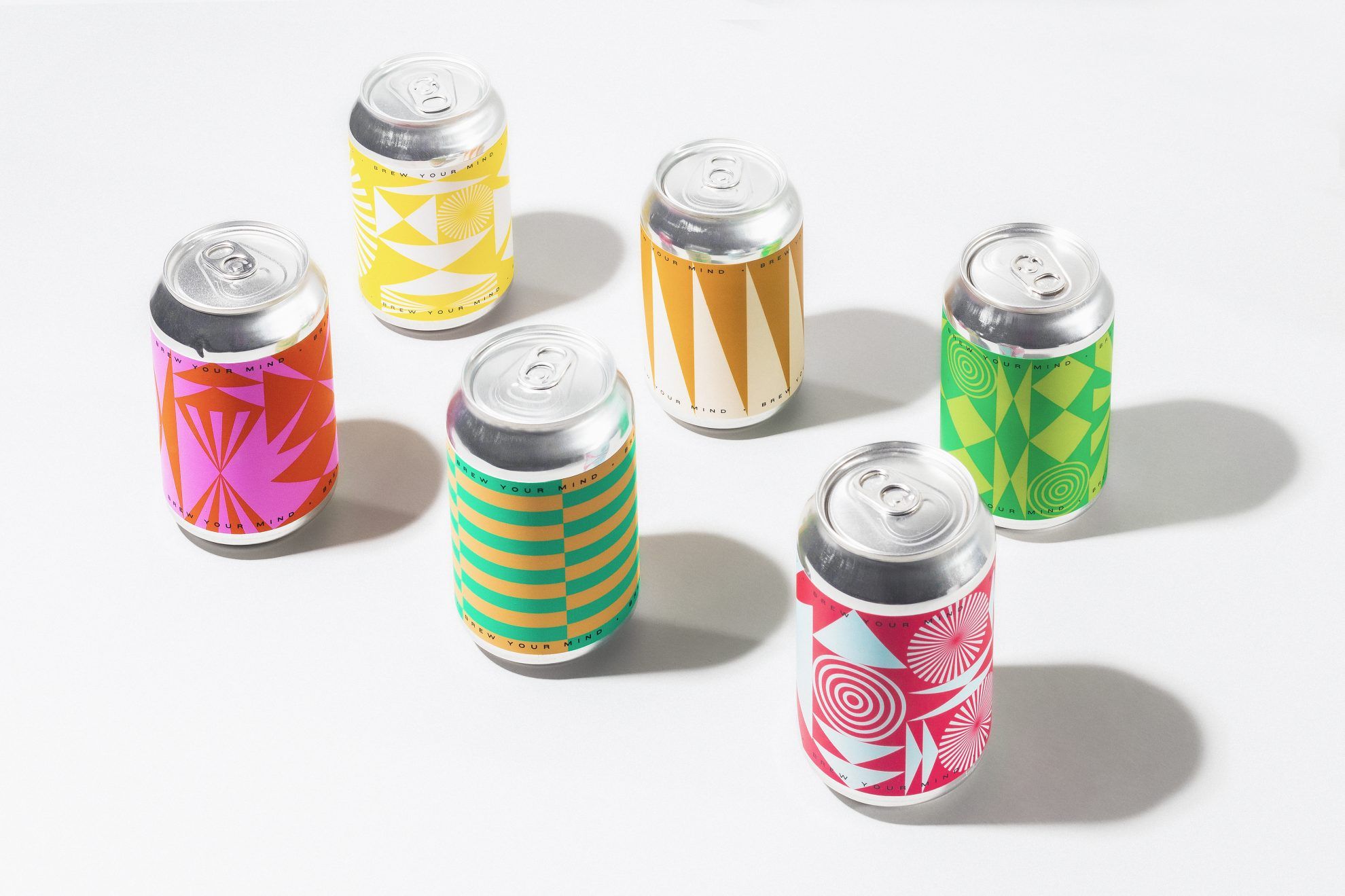

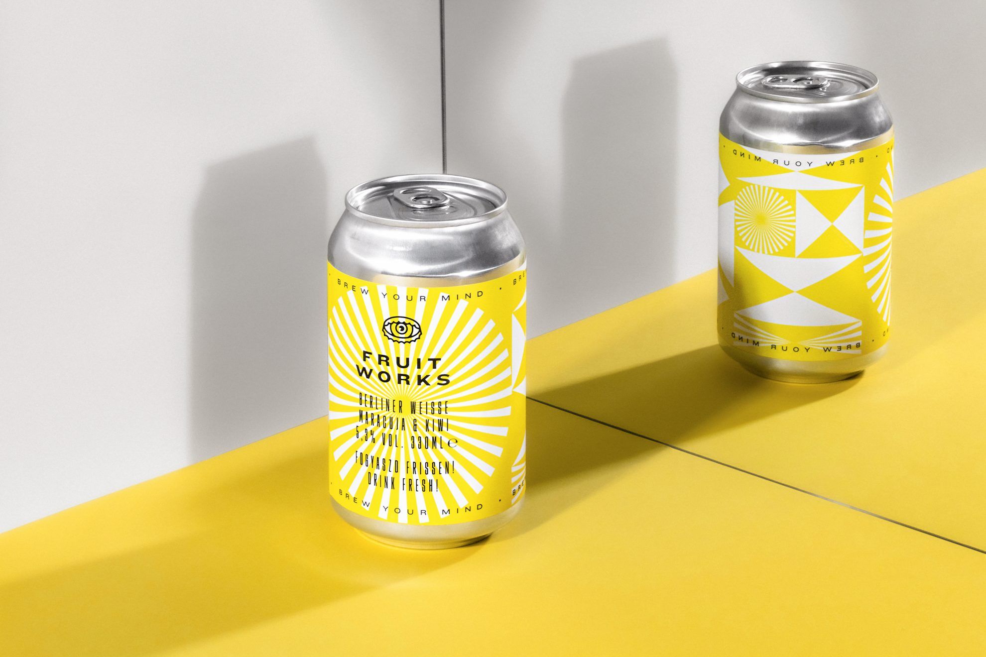
Brew Your Mind is continuously testing and perfecting their recipes, thus they have made at least 51 different beers and the accompanying labels over the years. There are cases when certain flavors are the different versions of previous recipes, but it also happens that they start working on a new beer with a whole new concept, which later grows out to be a new series. One of this series is, for example, the Lagers perfected in 2020 and the Fruit Works with a more sour flavor – Brew Your Mind and Classmate Studio decided to differentiate the new beverages from the previous ones also in a visual sense.
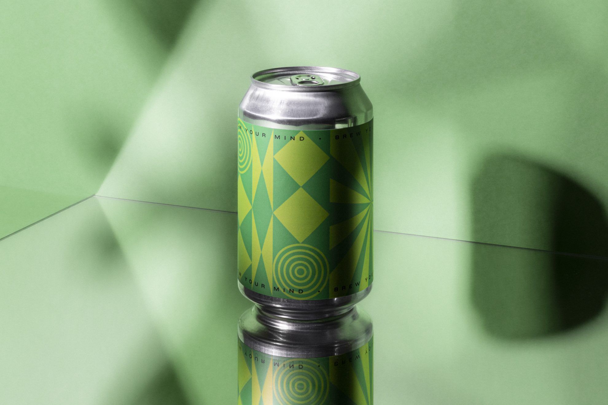
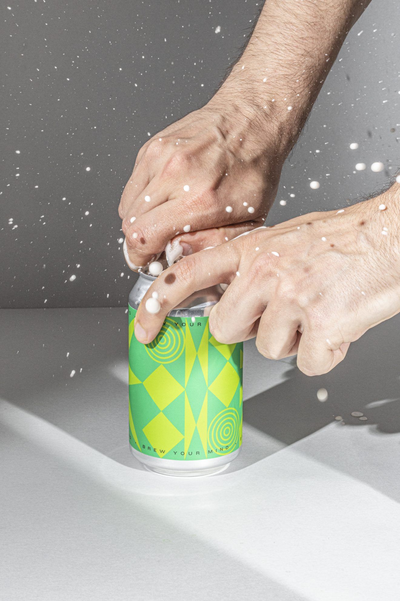
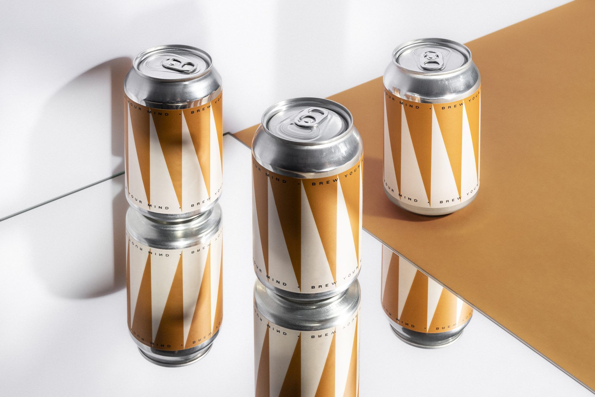
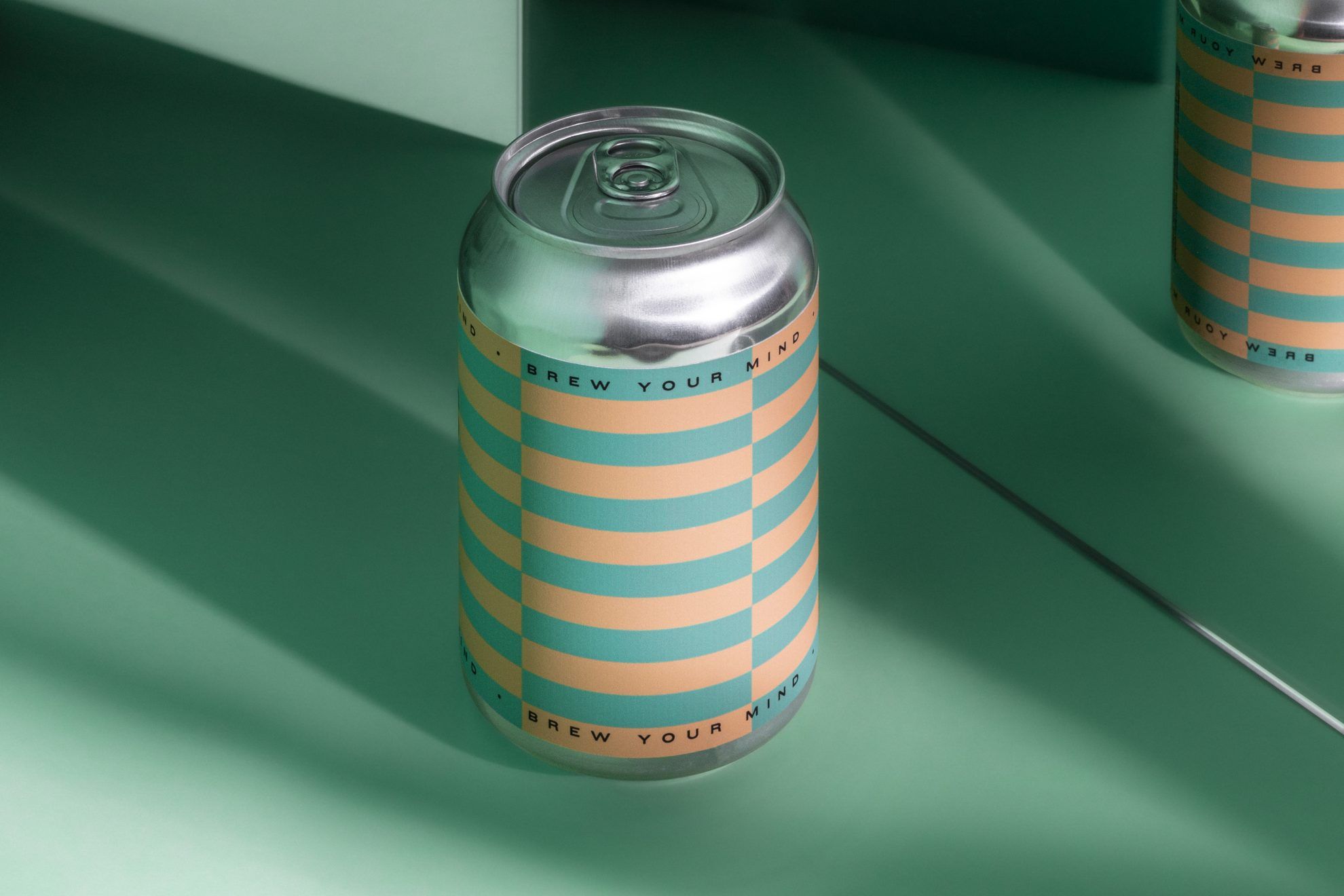
Similarly to the originals, the new designs also convey the duality of the preciseness so characteristic of the brewery and the idea of „blow your mind”. When creating the labels, the studio placed the emphasis on the organized typography and the geometric basic forms– the patterns formed this way can be modularly adjusted for every new beer label. This way, the label seems to get in motion before our eyes, working really well with the slightly sour and bitter, but still simple flavors.
The color palette accompanying the designs of the labels were inspired by the different, more subdued or diverse flavors of the beers, therefore the designs feature both loud and pastel tones.

If you’d like to explore the other works of Classmate Studio, read our interview with the team here.
Classmate Studio | Web | Facebook | Instagram | Behance
Brew Your Mind | Web | Facebook | Instagram
NON+’s latest collection AIR was inspired by nature
Budapest by Labrosse | Margaret Island Water Tower
